Gaining insights from data is a key role of data analysts in the workplace. One of the most popular ways to understand simple data sets is by creating a box and whisker plot in Excel.
It’s a simple way to pull valuable information from data without using more advanced data modeling techniques. Anyone can create a box and whisker plot in Excel with these step-by-step instructions.
Here’s a breakdown of what you’ll learn in this article:
- What is a box and whisker plot?
- The parts of a box and whisker plot
- How to make a box and whisker plot in Excel
- Key takeaways
Let’s dive in.
1. What is a box and whisker plot?
A box and whisker plot is a type of data modeling that helps visualize how numbers are distributed in a given dataset. Instead of a bar or line graph to display data, a box and whisker plot uses its shape to convey information.
The central value, the variability of distribution, and the highest and lowest values are easy to find in a box and whisker plot, which is why many data analysts use this data visualization method to compare different data sets and determine the meaning of their results.
Many organizations use box and whisker plots to measure various key performance indicators, such as:
- Financial audits
- Sales performance
- Customer trends
- Product performance
- Team productivity
- Other various demography
As the business intelligence market continues to grow, knowing how to create and interpret a box and whisker plot will be crucial for those working in business analytics.
2. The parts of a box and whisker plot
A box and whisker plot is named for its unique shape that helps analysts discover data. It is made up of a rectangle (box) with two lines (whiskers) attached at each end. It can be arranged either upright or lengthwise without distorting the data. For the sake of simplicity, we will use a lengthwise box and whisker plot for our examples.
Let’s talk about the key elements of a box and whisker plot. The box and whiskers both hold crucial information about the data it displays. These elements are easy to read if you understand what you are looking at.
There are five key pieces of information that go into creating this type of plot:
- Minimum
- First quartile
- Median
- Third quartile
- Maximum
Minimum
The minimum of a box and whisker plot is located on the far left whisker and is the first point on the chart when read left to right. This number represents the smallest value in the dataset.
First quartile
The first quartile of a box and whisker plot is located at the leftmost end of the rectangle, where the minimum whisker attaches to the box. This number represents the location of the 25th percentile in a dataset or the number that 25% of data falls below.
Median
The median of a box and whisker plot is demarcated by a line drawn inside the box. This number represents the center of the numerical data.
Third quartile
The third quartile of a box and whisker plot is located at the rightmost end of the box, where the maximum whisker is attached.
The number represents the location of the 75th percentile in a dataset or the number that marks the beginning of the top 25% of the information.
Maximum
The maximum of a box and whisker plot represents the largest number in the collection of data and is located at the rightmost end of the whisker on the right of the box.
However, as you might already know, not all data falls neatly into a clean set of data. Now and again, datasets will also contain outliers or numbers falling way outside the range displayed on the box and whisker plot. Outliers don’t seem to follow the pattern of the rest of the data and can be considered an anomaly. Anomalies are sometimes flukes in the data and can sometimes be attributed to errors. However, outliers are still an important part of the dataset.
If a data set has outliers, the box and whiskers will represent 1.5 times the interquartile range instead of the minimum or maximum. Outliers are typically indicated by a small circle on the note where they are located. Unfilled circles are for suspected outliers, and filled circles represent known outliers.
3. How to make a box and whisker plot in Excel
Creating a box and whisker plot in Excel is a great way to organize data and make visualizing the distribution of information easy.
Plus, it’s not as difficult as you might think. We’ll show you two different ways to create a box and whisker plot in Excel so that you can better analyze business data and make better decisions.
Here are step-by-step instructions for creating a box and whisker plot in Excel with any dataset:
Making a box and whisker plot in Excel: The long way
Step 1
First, you’ll need a data set. Enter all your numerical data into a column in your Excel worksheet, i.e., cells A1 through A10.
Step 2
In the next column, select an empty cell and type MIN, Q1, MED, Q3, and MAX. Then in the column next to it, insert the Excel formula for each value. For example:
=MIN(A1:A10)
=QUARTILE(A1:A10,1)
=MED(A1:A17)
=QUARTILE(A1:A10,3)
=MAX(A1:A10)
The values for each corresponding formula will appear in each cell.
Step 3
In the next column, retype the MIN value in the cell next to the calculated MIN value. Below it, subtract the MIN from each value in the calculated Q1, MED, Q3, and MAX columns.
Step 4
Now highlight the new column made up of the differences between the MIN and calculated values you created in Step 3. Click Insert, then Bar, then Stacked Bar. A graph appears!
Step 5
Click on the newly generated graph and select Switch Row/Column from the editing menu. Now select the leftmost box in the graph and right-click to find and click Format Data Series.
Step 6
To complete the box, click Fill, select No Fill, then Close. Your box has been created!
Step 7
Now it’s time to add the whiskers on each side of the box. Start with the left side using this path:
Click the leftmost red box > Layout tab > Error Bars > More Error Bar Options > Error bars with Standard Error.
Back to the Layout tab > Error Bars > More Error Bar Options > Mins > then type the difference between the values for Q1 and MIN into the Fixed Value field. Then click close. Remove the red by following Step 6.
Step 8
Then move on to the right side using this path:
Click on the leftmost purple box > > Layout tab > Error Bars > More Error Bar Options > Error bars with Standard Error.
Back to the Layout tab > Error Bars > More Error Bar Options > Plus > then type the difference between the values for Q3 and MAX in the Fixed Value field. Then click Close. Remove any unwanted fill colors by following Step 6.
Making a box and whisker plot in Excel: The shortcut
Fortunately, Microsoft 365 offers an easier way to create box and whisker plots:
Step 1
Select your dataset from an Excel worksheet.

Step 2
Go to the Insert tab and navigate to Recommended Charts. Click the dropdown and select Box and Whisker.
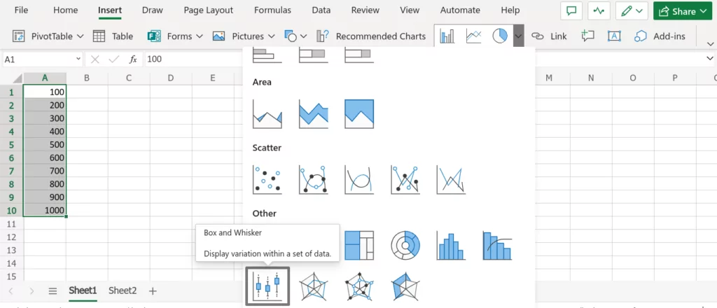
Now, you should have something that looks something like this:
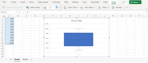
If you would like to change the layout or how the data is displayed, click on Format in the Chart tab and make your adjustments as needed.
Although this example only displays a set of data in a simple box and whisker plot, you can use box and whisker plots to organize multiple sets of data at once.
In any typical situation, you probably have more than just one row of data to track. Let’s take a look at charting multiple data sets in excel using a box and whisker plot:
Step 3
First, be sure that your data is organized into columns. Then select the set of data you want to use to create a box and whisker plot:
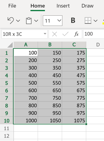
Step 4
Just like we did in Step 2, go to the Insert tab and navigate to Recommended Charts. Click the dropdown and select Box and Whisker.
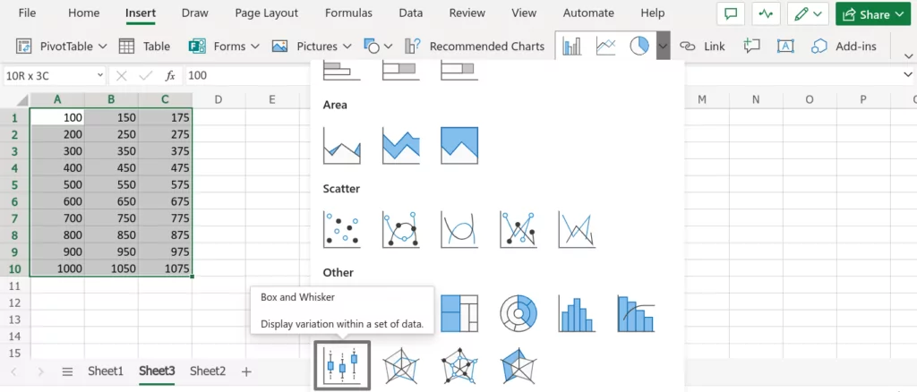
Step 5
Now, you have an easy to read box and whisker plot to help you organize and analyze your data!
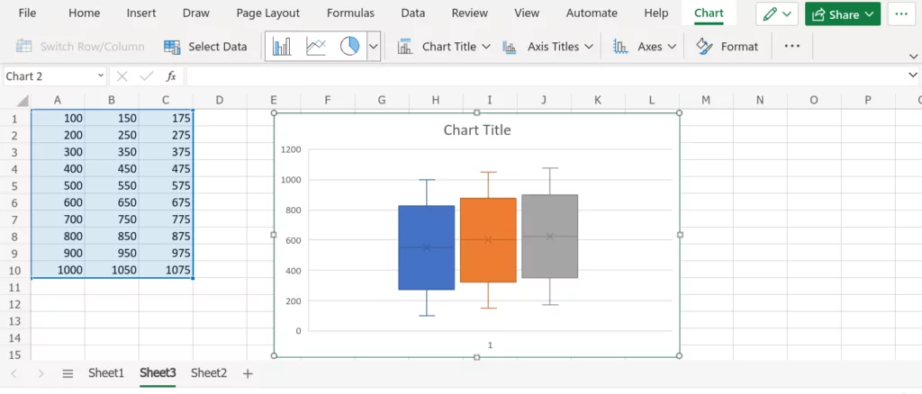
Again, use the Format and other design tools to customize your chart with a title, Axis Titles, colors, and more.
Who knew that such a powerful chart could come from one of the most common desktop tools. Microsoft Excel is a great platform for creating Box and Whisker charts without any drama.
4. Key takeaways
There are several analytics tools for business professionals, but Microsoft Excel comes with everything you need to create box and whisker plots. Excel box and whisker plots are a great way to visualize data for various business purposes that require data modeling, as long as the dataset isn’t too large.
There are five key points of information that box and whisker plots address to make it easy to extrapolate valuable insights without spending hours pouring over data. We also went over the two ways to create a custom box and whisker plot in Excel so that you can choose the method that best suits your needs.
If our article has sparked your interest, check out this free, 5-day data analytics short course. This hands-on course will give you an introduction to data analytics, allow you to work through data exercises and give you insights on how to make the switch to analytics if it’s right for you.
You may also be interested in the following articles:
