A fundamental way of interpreting the stories hidden in data is by using data visualization. Using charts, plots, and graphs, data analysts can spot visual clues that they might otherwise overlook. From pie charts to heat maps and line graphs, there are many data visualization approaches. But one of our personal favorites is the humble bubble chart.
So what exactly is a bubble chart? And how would you go about creating one? In this post, we’ll answer all your pressing questions. When you’re finished reading you should be well-versed in the power of the bubble chart!
You can use the clickable menu to jump to the section of your choosing.
- What is a bubble chart?
- When to use a bubble chart
- How to create a bubble chart in Excel
- Bubble chart best practices
- Alternatives to the bubble chart
- Next steps
Ready to burst the bubble chart? Then let’s go.
1. What is a bubble chart?
A bubble chart, or bubble plot, is a type of data visualization used by data analysts who want to plot three distinct variables. It is similar to a scatter plot, which plots two data points along two axes. On a scatter plot, the pattern of points reveals if there is any correlation between the values. We show this correlation using a line of best fit.
Meanwhile, on a bubble chart, the single points of the scatter plot are replaced by bubbles representing a third dimension of data, shown by each bubble’s size. A smaller size means a smaller value, while a larger size means a greater one. Bubbles can also be labeled or color-coded, allowing us to categorize the values.
Scatter plot vs. bubble chart example
To illustrate, the following image shows a real comparison of a scatter plot and a bubble chart:

This scatter plot shows temperature in degrees celsius on the horizontal x-axis against sales of a product in dollars on the vertical y-axis degrees. The correlation between warmer weather and increased sales is marked using a line of best fit.

Meanwhile, this bubble chart plots the manufacturer suggested retail price (MSRP) of various automobiles against their horsepower. The size of the different bubbles shows how many units of each model the manufacturer has sold (using different colors and name labels to categorize the models).
Although this makes it look simple, you’ll learn that, without care, bubble charts can easily be over complicated or used for the wrong type of data. If your bubble chart is too overcrowded, there might be a better type of visualization to use. We’ll explore this further along in the article.
2. When to use a bubble chart
Now we understand what a bubble chart is, when might you use one?
As we’ve established, the primary purpose of a bubble chart is to display and compare three dimensions of data simultaneously. The chart’s x and y-axes represent two variables of the data (typically numeric), while the bubble’s size represents a third variable (also numeric). However, having three data points doesn’t automatically mean a bubble chart is the best solution. You’ll have to learn to use your judgment here.
If you want to compare the cost, efficiency, and emissions of different types of transportation, a bubble chart would be a good choice. Similarly, if you want to visualize the results of a survey with multiple questions or compare the heights, weights, and income of different groups of people—a bubble chart could work well. However, if the third variable does not correlate well with the first two (or if there are many categories within your dataset), consider avoiding a bubble chart and choosing a simpler visualization in its place.
3. How to create a bubble chart in Excel
If you’re relatively new to data analytics (in fact, even if you’re not) one of the best ways to create a bubble chart is using Microsoft Excel. Excel has a bit of an unfair reputation for being complicated to use. But once you’ve got to grips with it, it’s a powerful data visualization and wrangling tool.
Excel comes with a ton of inbuilt functionality for creating charts and graphs that effectively visualize data. On top of that, it has many built-in formulas to automate complex calculations. Let’s look at the steps you need to take to create a basic bubble chart in Excel.
1. Get your data ready and open it in Excel
Before you get started creating a bubble chart in Excel, you need a clean dataset. This should include at least three columns of numerical data, one for each axis of the chart; the horizontal x-axis, the vertical y-axis, and the z-axis (represented by the size of the bubbles) Import this data into Excel, making sure the columns of data, from left to right, are in the order that you want them on the final chart, i.e. ‘x, y, z’.
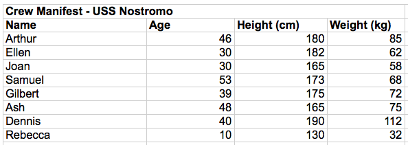
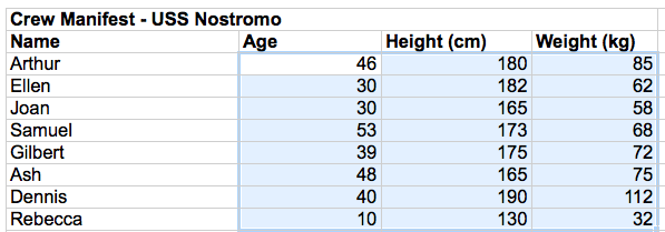
2. Select the data in the table that you want to use for your bubble chart
Next, select the data you want to use for the bubble chart. If your dataset has more than three columns, select the three you want to represent in your bubble chart. Don’t select column or row titles.
3. Click the Insert tab > Charts Group > Scatter Charts
Now, click on the Insert tab or ribbon. This might vary depending on whether you’re using Microsoft 365 or an older version of Excel. Once you’ve found the Insert tab, navigate to the bubble chart option under Chart Groups > Scatter Charts.
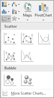
This is how the image tab looks on Excel 365.
4. Select the “Bubble” chart type
Next, select the bubble chart type. You’ll find two options available: 2D or 3D. Depending on your version of Excel, you might have to click OK, or it might automatically generate the chart for you.
Either way, your chart should now appear in your worksheet. Sense check the chart, ensuring it accurately represents your data. As you can see, our chart matches our data table. However, it lacks detail, so we’re not done yet!
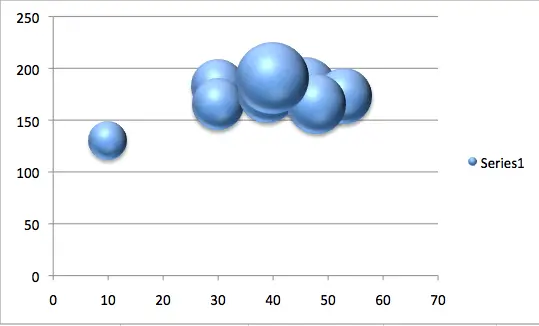
5. Customize your chart
Once you’ve generated your basic chart, there are several ways to customize it. In Microsoft 365, navigate to Chart Tools, look for the Design tab and then find the Chart Styles group to choose the style of chart you want.
You can also edit the chart directly using the Format tab or by selecting individual elements of your chart and adjusting them as needed. This comprehensive tutorial from Microsoft explores all the elements you can customize on your bubble chart.
However, to illustrate the sorts of changes available here are some of the customizations we’ve made to our chart:
- We have added a title to our chart, including labels and axis titles.
- You can also consider deleting your chart’s legend if it doesn’t serve a useful purpose. Legends (or keys) are great for explaining symbols on complex datasets. However, for a dataset as small as this, we’ve opted to label the individual bubbles instead.
- Finally, the bubbles were very crowded on the original render, making them hard to interpret. To fix this, we’ve adjusted the minimum and maximum values on the x and y-axes to give the bubbles a little more breathing room.
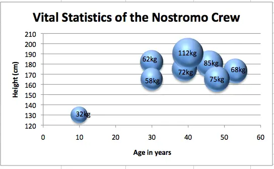
While our chart isn’t perfect, even with a few tweaks, it is a vast improvement on the original version generated by Excel.
Creating a bubble chart in Excel is surprisingly straightforward. You probably didn’t expect it to be so simple! The best way to learn all the elements, of course, is to experiment and play around. For more Excel tips, check out these 10 essential Excel features for data analysts.
4. Bubble chart best practices
While ‘pretty’ data visualizations are great, they should also be functional. In short, data visualization should represent data in a meaningful way that tells you something new. If it doesn’t, then there’s not much point in spending time on it.
Like any other data visualization, bubble charts follow best practice rules to ensure they clearly represent useful information. A few best practices for bubble charts include:
- Using appropriate bubble sizes
- Using colors to encode data
- Using a legend or key to annotate the data for larger datasets
- Avoiding clutter by hiding gridlines and using limited data points
- Being sure to maintain appropriate titles and/or labels
Let’s take a look at each of these in more depth
Bubble size
The size of the bubbles can have a significant impact on the way data is represented and understood. If the bubbles are too small it may be difficult to see the patterns or relationships between data points. Meanwhile, if the bubbles are too large, the chart may become hard to interpret. It’s a good idea to experiment with different data types on the z-axis to see which reveals new information most clearly. For instance, data with a broad range of values might be better suited to this aspect of the chart, as opposed to data where the values are all close together (meaning the bubble sizes will be similar and won’t tell you anything new).
Colors
When using colors to encode data in a bubble chart, it’s necessary to use a palette that’s easy to distinguish. For example, you might use a light color for low values and a dark color for high values. At the same time, it’s vital to consider accessibility. Avoid using colors that are hard for those with impaired vision to see.
Legend
A legend, or key, is a graphical representation of the meaning of symbols on a chart. It usually appears as a box or table beside the chart. A bubble chart’s legend might include a reference bubble demonstrating the value of a given bubble’s size, allowing you to estimate values at a glance.
Legends aren’t always necessary but can be useful, especially for charts with more plot points. If you’ve ever come across a chart without one (you’ll often find poor data visualization on news websites, for example) you’ll know how frustrating they can be, as they don’t always make it clear what you are looking at.
Title and labels
A title and labels are useful for annotating a bubble chart. The title should briefly explain what the chart represents. For smaller datasets, consider using labels instead of a legend. Alternatively, use a legend and dispense with labels. If your legend explains the color coding, for example, labels achieving the same goal might not be necessary.
Always use labels on your axes, though—these are a must-have as they help readers understand the chart at a glance. There are exceptions to this rule, but it’s rare.
General clutter
Clutter is the enemy of any data visualization, and a bubble chart is no exception. It’s not always easy to balance the right amount of information with the right amount of clean space. One way to avoid clutter is to hide gridlines or unnecessary labels.
Since bubble charts usually require more real estate on the page than a scatter plot, you can also consider plotting fewer points than you would for a scatter chart. While many points help reinforce a scatter graph, too many on a bubble chart quickly become cumbersome to interpret. Managing clutter is a bit of an art form!
5. Alternatives to the bubble chart
There are many alternatives to the bubble chart. Remember: even with three data points, there may be better options for drawing insights from your data. Three alternatives to the bubble chart include:
The scatter plot
While we’ve explored the similarities and differences between bubble charts and scatter plots, we haven’t explored when you would use a scatter plot for a dataset with more than two data points, which is sometimes the case. If you have three or more data points with little correlation between them, savvy application of scatter plots can often reveal more information than a bubble chart would.
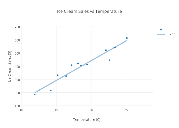
For instance, consider a bubble chart that shows a strong correlation between two variables (such as temperature and ice cream sales) but little correlation with the third variable (the customer’s age). In this case, plotting the third data point merely overcomplicates the graph and obscures any useful insights. Instead, using a scatter plot with the two correlated data points would be a more sensible option.
Similarly, if you have several data points, let’s say six, with three pairs of correlating data, you will get more information from three scatter plots (mapping the correlating pairs) than from two bubble plots that clutter the correlating pairs with an unrelated third data point.
Geographical bubble map
A geographical bubble map is a data visualization that shows the distribution of a numeric variable by geographical location. On a bubble map, bubbles are placed at specific locations, with their size corresponding to the value of the variable being visualized.
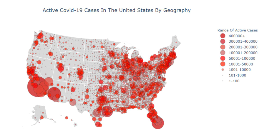
Take this example of active Covid cases in the US—it’s immediately clear which areas of the country are experiencing the highest rates of infection. In general, bubble maps are great for comparing values against geography and are often much clearer than a standard bubble chart.
Clustered bar chart
A clustered bar chart is a type of bar chart used to compare two or more variables. Unlike a standard bar chart—with one bar for each data point—a clustered bar chart has several bars for each data point. A key distinction between a clustered bar chart and a bubble chart is that the former emphasizes categorical data, while a bubble chart emphasizes numeric values.

While this doesn’t exclude numerical data from a bar chart, as our example shows, bar charts allow you to represent data in clusters, in this case, financial data across annual quarters. The categories in this chart are the different locations, shown by the different colors of the bars. This approach makes it very easy to make a like-for-like comparison, which may not be as clear on a bubble chart.
It’s easy to lose yourself in the fascinating world of data visualization. For more, check out the most common types of data visualization or explore some of the most interesting data visualization examples.
6. Next steps
You should now have a strong understanding of when and how to use bubble charts for data analysis. In this post, we’ve explored how bubble charts are used, when you might use one, and even how to create a basic bubble chart using Microsoft Excel. We’ve also touched on some best practices and have explored alternatives to bubble charts and when you might use them.
It’s now time for you to put your new skills to the test. Why not play around in Microsoft Excel, or see what data plotting tools you can find? You’ll soon see that data visualization can be one of the most creative and enjoyable aspects of any data analytics project. And the best way to learn is to dive in and get your hands dirty!
Looking for more data analytics tips and tricks? Sign up for this free, five-day data analytics short course, or check out the following guides:
