Seeking some inspiration for your data analytics portfolio?
Whether you’re a newly qualified data analyst or a seasoned data scientist, you’ll need a portfolio that pops. While data analytics portfolios are traditionally about highlighting your work, they also need to show off your personality, your communication skills, and your personal brand.
In this post, we highlight our top nine data analytics portfolios from around the web. This includes screenshots, tips, and examples for how you can show your best side. While your portfolio should naturally include some strong projects, how you present yourself and your work is just as crucial as the content you’re sharing.
We’ll start by explaining why a data analytics portfolio is so important. If you want, you can skip straight to the good stuff using the menu below.
- Harrison Jansma
- Naledi Hollbruegge
- Tim Hopper
- Ger Inberg
- James Le
- Yan Holtz
- Anubhav Gupta
- Jessie-Raye Bauer
- Maggie Wolff
- Data analyst portfolio FAQ
First, though…
What’s the point of a data analytics portfolio?
As the first thing an employer sees, a strong data analytics portfolio needs to highlight your best work.
Given the complexity of data analytics, it might seem that a visual portfolio isn’t the best approach. The detail of data analytics projects can indeed be a bit mundane at times, but this is why a strong portfolio is so vital. Creating an engaging narrative is far more effective than simply linking to pre-existing code (although that’s required, too, of course).
Rather than simply telling people what you do, use visuals (where possible) to bring your work to life. After all, storytelling is a key skill for data analytics, a field where facts and figures are used to weave a narrative. Taking inspiration from the following, you’ll soon see how you can combine words, projects, and visuals to create a portfolio that shines.
1. Harrison Jansma
Who is Harrison Jansma?
Harrison Jansma is a US-based data process manager at Capital One. His website shows a clear passion for automating tedious tasks using tech. He also has a presence on Medium.
What makes Harrison Jansma’s data analytics portfolio so great?
Harrison’s data analytics portfolio is a good example of how to use a portfolio to show off your personality. While he includes some sample projects of his work, just as much focus goes into creating a sense of his personal brand, using fun graphics, choice words, and a taste of his interests.
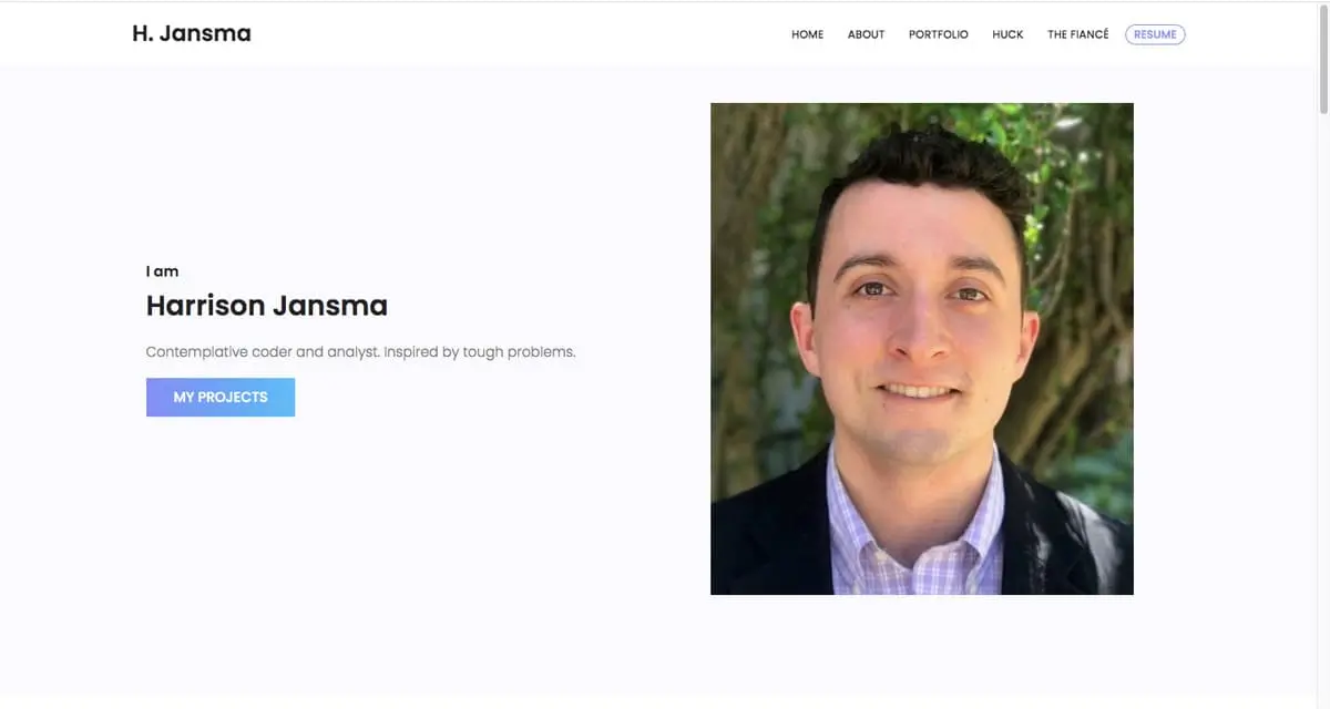
Right on the homepage, we see a large photograph of Harrison’s friendly face, and a short quote: ‘Contemplative coder and analyst. Inspired by tough problems.’ This description is intriguing and drives us on. Below, Harrison highlights his interest areas and his three most recent projects as exemplars.
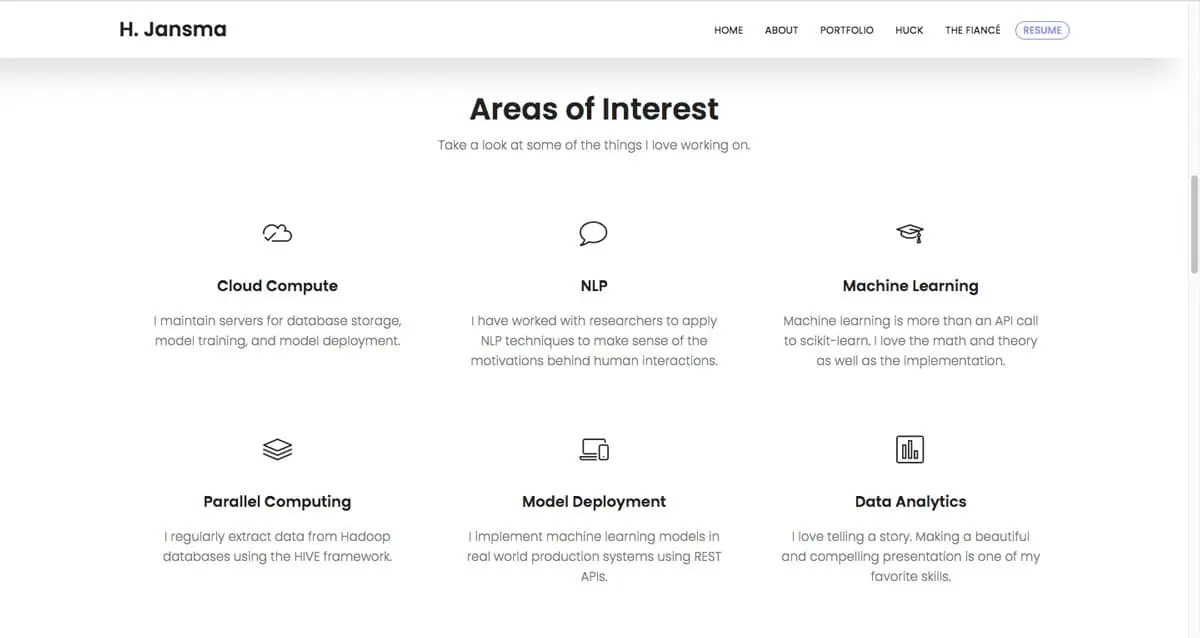
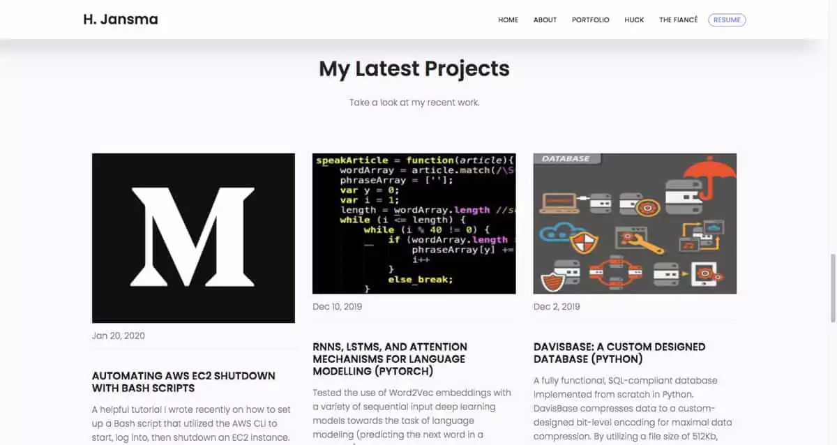
This is a clever approach. Sometimes it’s hard to know which projects to share. Incorporating exemplar projects on your homepage is a good way to highlight them while having the option for people to see more if they want to.
It’s also worth noting that Harrison doesn’t get into detailed case studies on his website. Instead, he links directly to his projects. This is quite common practice.
What can we learn from Harrison Jansma?
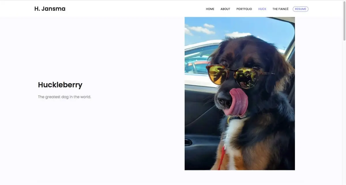
These days, it’s important to cultivate your personal brand. Harrison Jansma shows us how to introduce personality to your portfolio. He even has a page including pictures of his dog! While it’s your choice how much you want to share about yourself, Harrison’s approach humanizes him while remaining unobtrusive and professional.
Key takeaway
Showcase your best work, with an option for viewers to read more. And if you add a dash of personality, your portfolio examples needn’t be super slick.
View Harrison Jansma’s full portfolio website
2. Naledi Hollbruegge
Who is Naledi Hollbruegge?
Naledi is a freelance consulting analyst and social researcher based in the UK. She believes that data has the power to make the world a better place, and wants to play her part in that process. Sounds pretty admirable!
What makes Naledi Hollbruegge’s data analytics portfolio so great?
There’s a clear drive in Naledi’s portfolio to find clients. With this in mind, the first thing Naledi flags is her ability to carry out all the key jobs of a data analyst (collecting, processing, and visualizing data). She then dives right in with a quick introduction followed by some project samples.
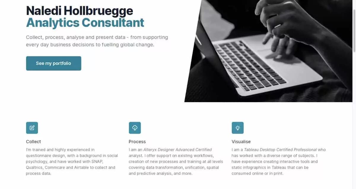
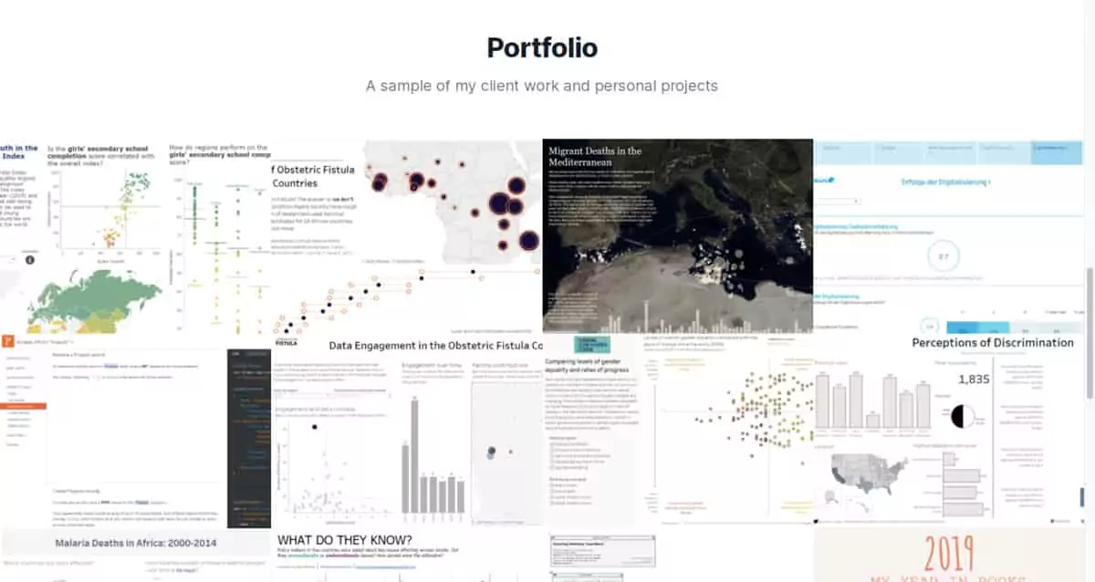
This portfolio is a prime example of good storytelling. First, Naledi tells us what she can do. Next, she demonstrates it with some projects that highlight those skills, adding an extra layer to the tale. While remaining professional, she also gives us a taster of her interests.
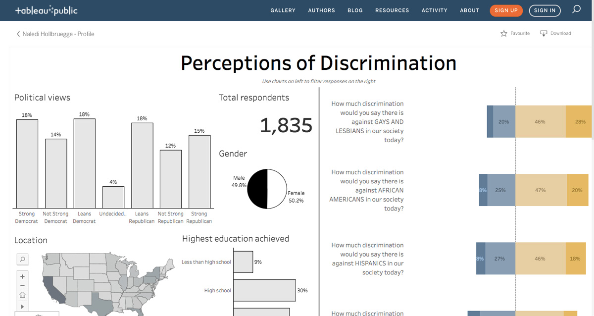
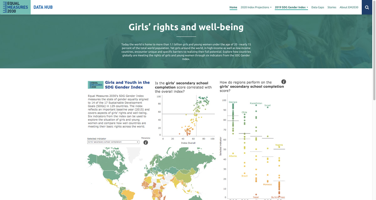
For instance, she has a clear focus on social justice. This is shown with her link to a Tableau project exploring perceptions of discrimination. Another project explores girls’ rights and well-being. Naledi has implicitly shown us her ethics, strengthening the value of her business proposition. This is something to consider when creating your portfolio projects.
What can we learn from Naledi Hollbruegge?
Naledi demonstrates how to use your portfolio to tell a story. She achieves this brilliantly with a combination of personal statements and supporting projects. In addition to her portfolio, she also maintains a blog where she writes about her interests. Combined, these aspects all tell us that she believes in the power of data analytics to change the world. That would certainly make us want to hire her!
Key takeaway
For some, data analytics is just a day job. That’s fine. But combining client work with personal projects will show that data analytics is more than just a professional interest—it’s something you’re dedicated to.
View Naledia Holbruegge’s full portfolio website
3. Tim Hopper
Who is Tim Hopper?
Tim Hopper is a data scientist, machine learning engineer, and cybersecurity software developer based in the US.
What makes Tim Hopper’s data analytics portfolio so great?
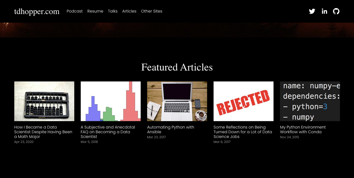
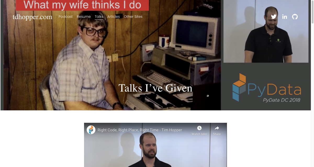
Tim’s is a great example of a multimedia portfolio. Rather than bombarding us with a list of his past projects, he’s given us a taste of his interests and expertise using a variety of different methods. This includes a combination of humor, podcasts, articles, and videos that tell us what he does and show us how he works. The details of his projects, meanwhile, are available on his GitHub (which he links to in numerous places on his website).

On his homepage, Tim quickly grabs our attention with unobtrusive but bold visuals, and a headline that tells us his key skills: ‘Machine Learning. Cybersecurity. Python. Software Engineering. Math Jokes.’ This provides a nice taste of his experience, as well as his personality. Notice that the top menu includes links to Tim’s podcasts, talks, and articles, as well as other sites of interest. He also links out to his social media: Twitter, LinkedIn, and GitHub. These offer more in-depth information about his professional background.
Interestingly, Tim doesn’t use his portfolio to discuss specific projects. This is an admittedly bold move. Instead, he sells himself as a thought leader and data influencer, writing about his experiences and sharing talks and podcasts about his time as a data scientist.
This is a high-risk but high pay-off strategy, and Tim executes it well. While this approach is better suited to more experienced data scientists, that doesn’t mean we can’t learn from it. Using articles, videos, and podcasts gives him a legitimate excuse to enrich his portfolio with additional media. His website is also laden with personality. He has a sense of humor, which is an appealing quality in itself.
What can we learn from Tim Hopper?
Tim shows us that you don’t need a traditional portfolio to make an impact. By creating a distinctive personal brand, you can boost your profile with more than just sample projects. By including his articles, videos, and podcasts, Tim has given us direct proof that he is a competent communicator and data scientist. If we want to find out more, we can contact him via his numerous social media platforms.
Key takeaway
Think about the different ways you can spice up your portfolio. While we always recommend including sample projects (which Tim hasn’t done) you can definitely still enhance your offering by evidencing your other interests. Create a unique offering that nobody else can compete with.
View Tim Hopper’s full portfolio website
4. Ger Inberg
Who is Ger Inberg?
Ger is a Dutch freelance data scientist with a background in software engineering. He has a flair for data visualization and machine learning.
What makes Ger Inberg’s data analytics portfolio so great?
Ger Inberg’s portfolio is a standard website, created using a WordPress template. When we see this, we might wonder why he hasn’t used the opportunity to demonstrate his web design skills. But no matter…After a brief introduction, Ger’s portfolio projects are the very next thing we arrive at.
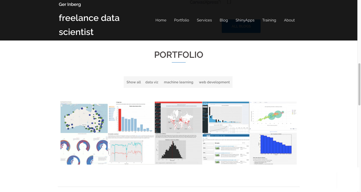
Using a simple but effective menu, it’s clear at a glance where Ger’s skills lie: data visualization, machine learning, and web development. Viewers can also filter projects by clicking on the relevant topic. But then, Ger directs us to a page where we can view data visualization apps that he’s created using R-Shiny (an R package for interactive web apps). Now we see his web design expertise in action! By showing data right in the app, he’s demonstrating both his visualization and web development skills—a great combination that highlights his expertise without shouting about it.
What can we learn from Ger Inberg?
Something noteworthy about Ger’s portfolio is that he has chosen interesting and topical datasets for his portfolio projects. These include things like global life expectancy, the spread of the coronavirus, and even an overview of which major cities are dominated by digital nomads (i.e. those who use tech to work remotely—a bit like Ger himself!)
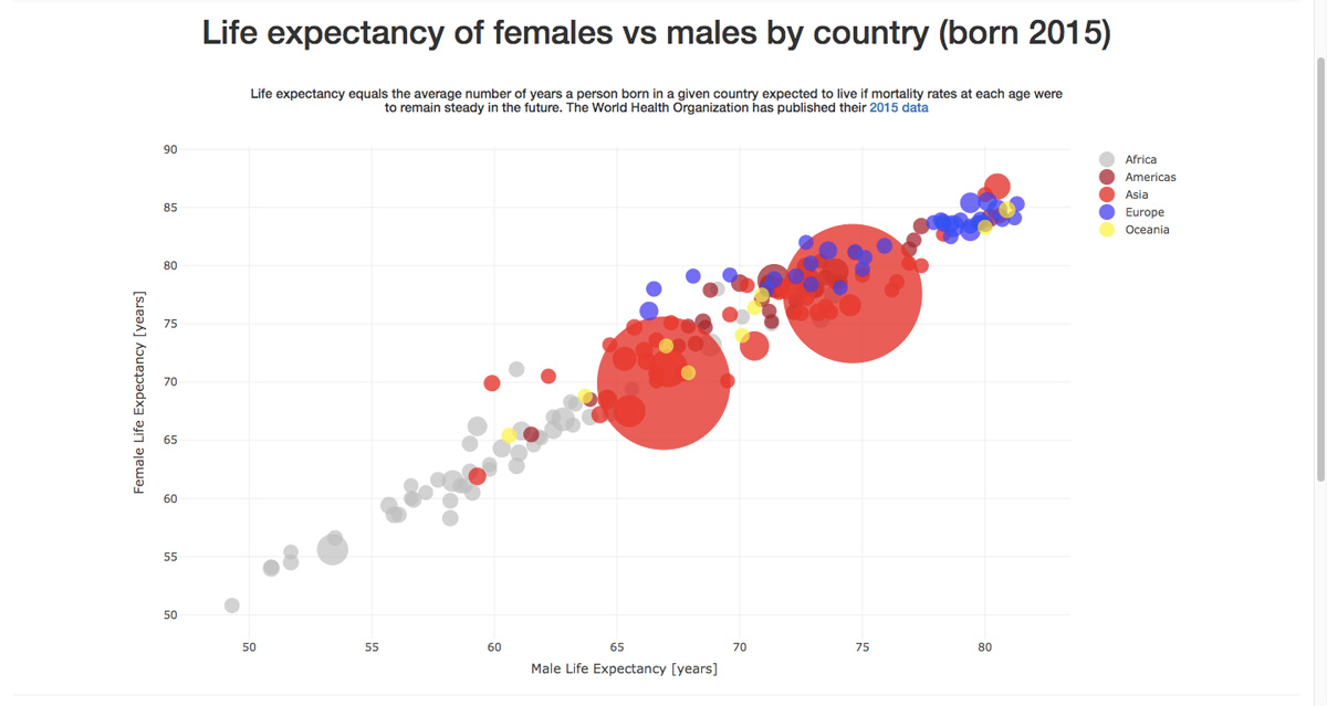
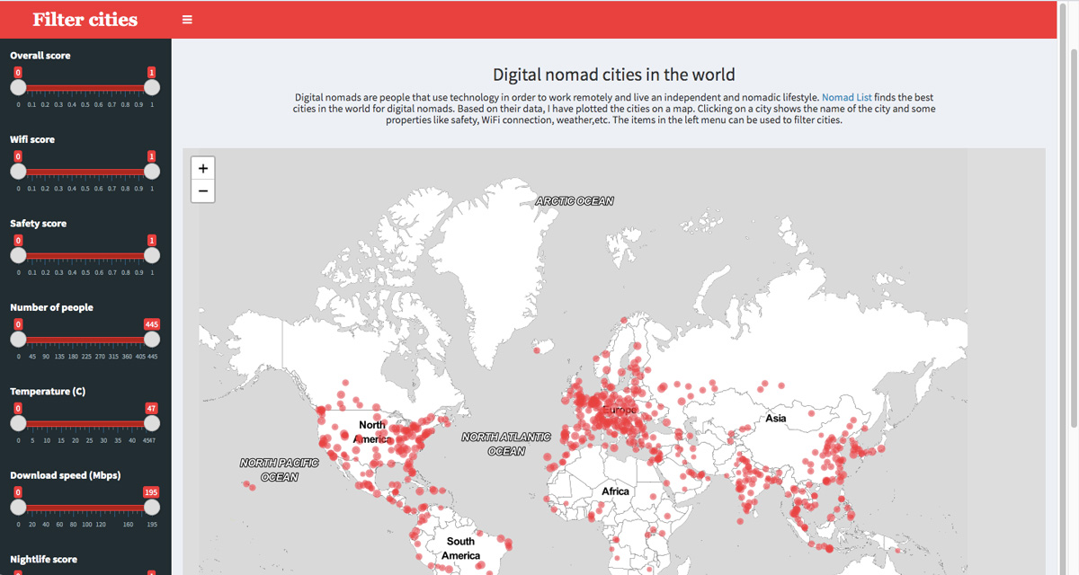
While data analytics portfolios need to include code and other technical information, it’s good to balance granular detail with interesting datasets, and something a bit more interactive and visual.
Key takeaway
Keep things visual if you can. Creating dedicated interactive apps or dashboards will show your coding capabilities (if you have them) as well as your ability to create memorable visualizations.
View Ger Inberg’s full portfolio website
5. James Le
Who is James Le?
James Le is a data scientist, machine learning researcher, journalist, and podcaster. His enthusiasm is infectious—his portfolio makes it clear that he eats, sleeps, and breathes data science!
What makes James Le’s data analytics portfolio so great?
James Le’s website is nothing if not comprehensive, detailing all his data science exploits. While this could easily be overwhelming, he neatly breaks his website down to help visitors focus on what they’re looking for. Namely, his journalism, his academic research, and—in our case—his data analytics expertise.
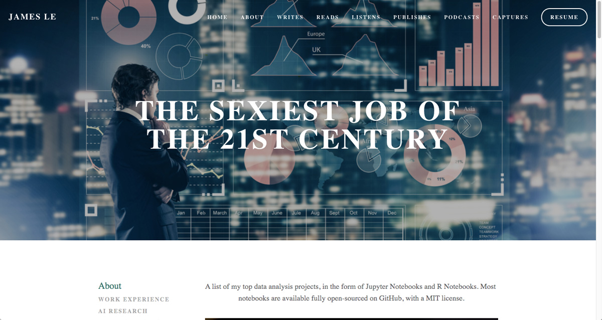
Clicking through to James’ data analytics portfolio, the header is immediately attention-grabbing. The headline ‘The sexiest job of the 21st century’ tells us that he doesn’t take himself too seriously. His portfolio remains professional, though. He also has a separate coding portfolio, as we see below.
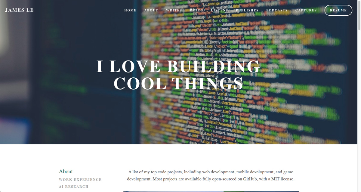
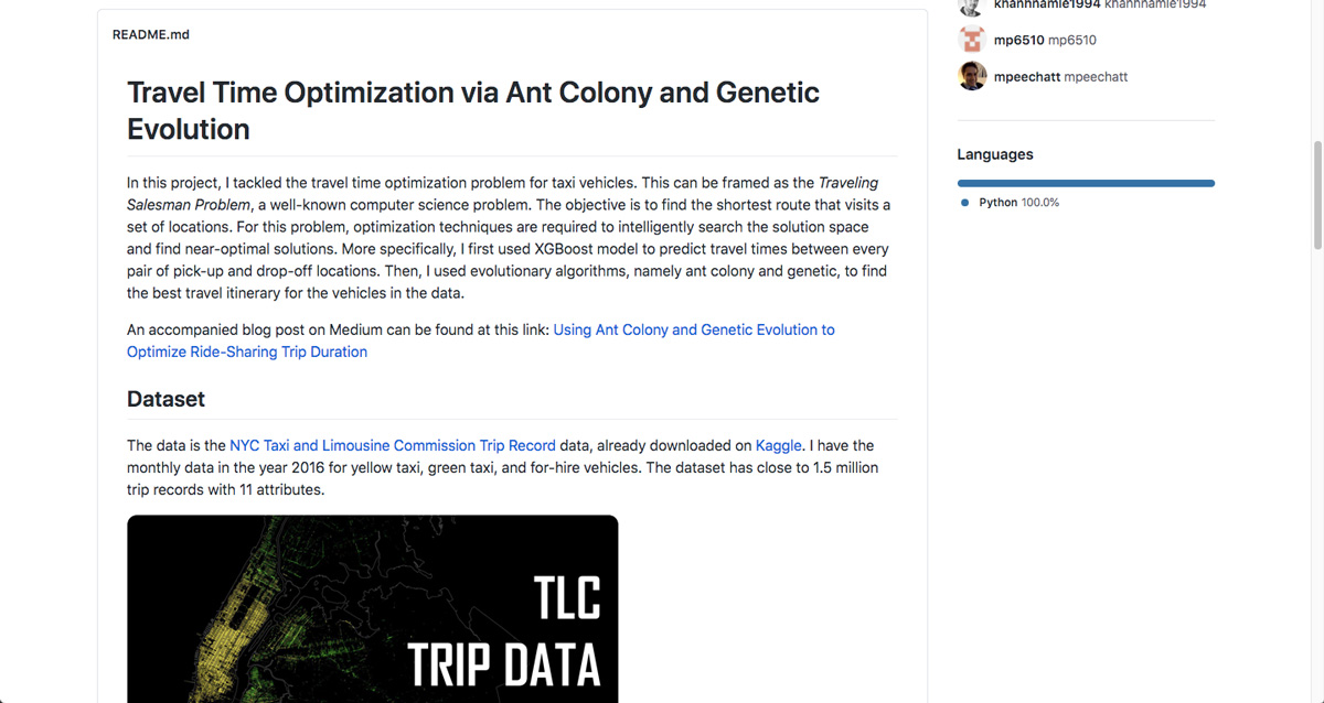
Once again, James uses a headline that isn’t afraid to show a little personality. This helps bring to life what could otherwise be quite dry content. What do we mean? Well, most of James’ projects are code-based, linking directly to files on GitHub. However, he’s still managed to keep his portfolio popping by using bright splash images. These provide a nice visual front-end. To illustrate this, the first image below is what we see on James’ website. The second is the notebook document that we click through to on GitHub.
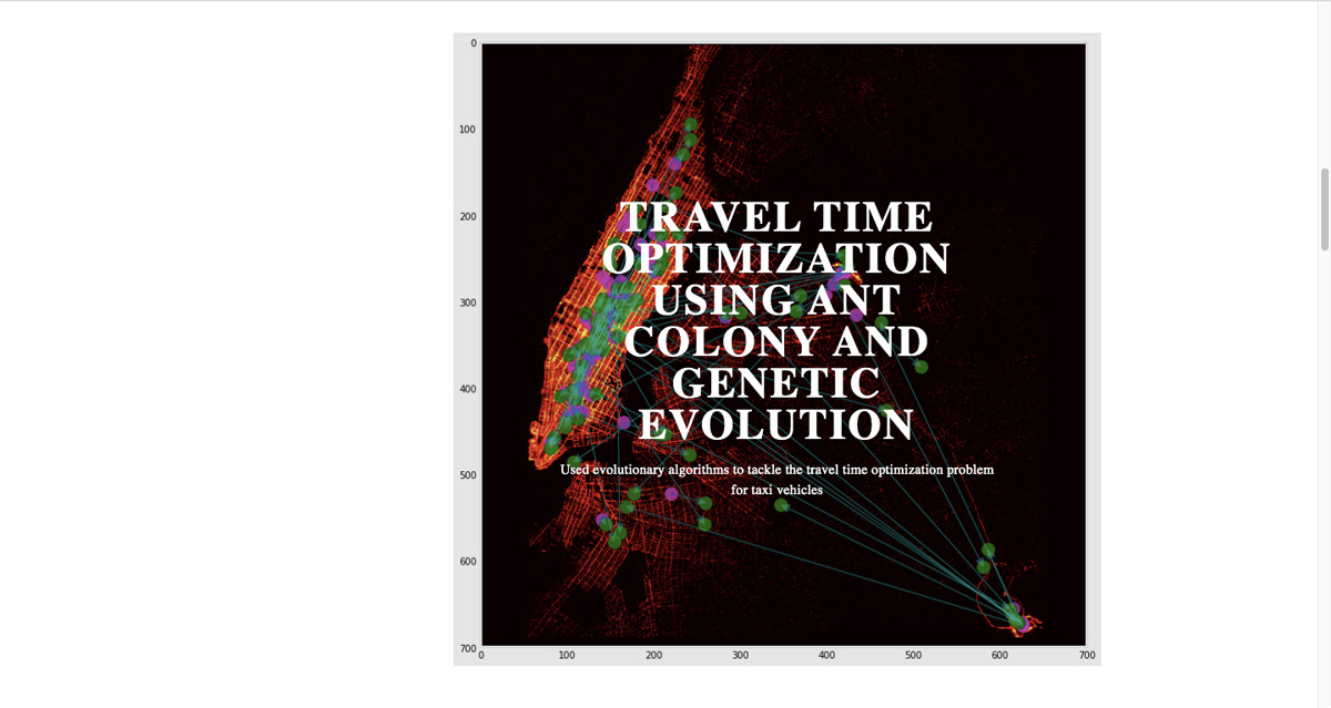
What can we learn from James Le?
James does a fantastic job of presenting all his projects using Jupyter Notebook and R-Notebook. These formats (a bit like interactive MS Word documents) combine interactive code with text and visual elements to present data analytics work clearly and consistently. Readers know what they’re getting.
Key takeaway
If data visualization isn’t your strongpoint, create portfolio projects using Jupyter Notebook or R Notebook. These tools are designed for presenting data analytics findings. You can host them on GitHub and hide the link behind a more appealing visual image on your portfolio.
View James Le’s full portfolio website
6. Yan Holtz
Who is Yan Holtz?
Yan is a data analysis and visualization specialist. He works as a software engineer at Datadog, a global cloud-monitoring service headquartered in the USA.
What makes Yan Holtz’s data analytics portfolio so great?
For style and substance combined, Yan Holtz’s data analytics portfolio is something to aim for. From the moment you land on his homepage, the interactive design (by Yan himself) grabs attention and shows off his skills.
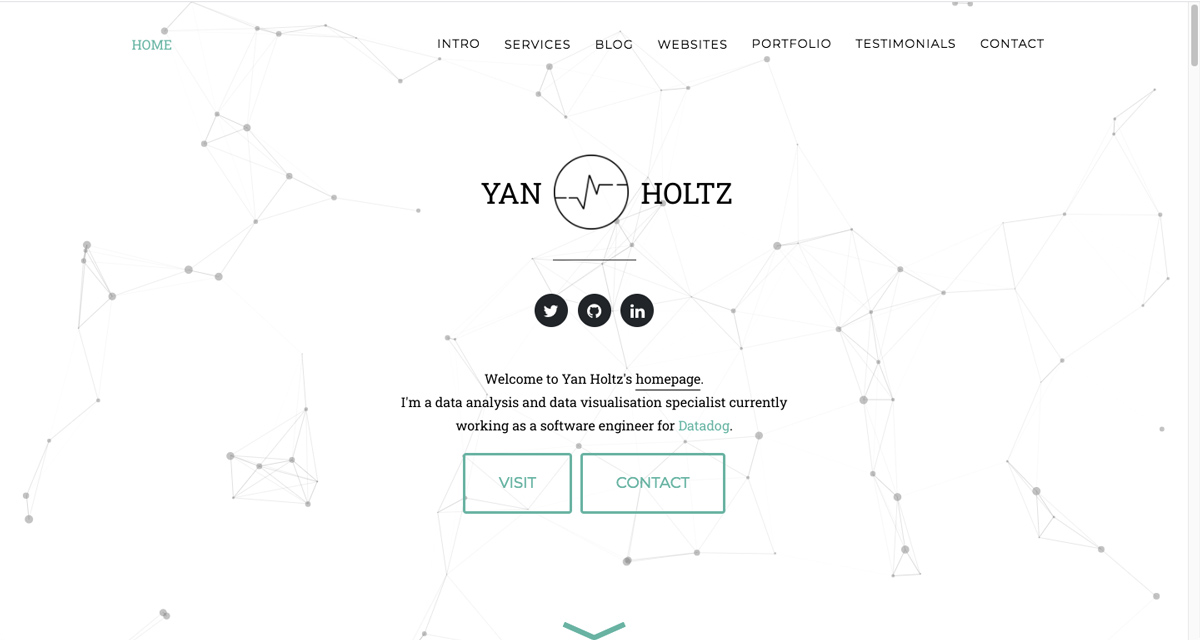
See those geometric shapes on the homepage? They’re not just pretty to look at. They’re also dynamic and interactive, responding to the movement of the mouse. This is technical stuff; Yan’s clearly no novice. Of course, your own portfolio doesn’t need these fancy extras, but it highlights what you can achieve if you’re feeling ambitious.
What’s more, this is not a case of style over substance. It would have been easy for Yan to simply create a slick front-end that links out to other websites, such as GitHub. Instead, for each project, he’s created an appealing pop-up, offering a clear overview of what he’s worked on. As a reader, this makes for a satisfying user experience. Once we’re done, we can finally explore his projects in more detail via an app, or on GitHub.
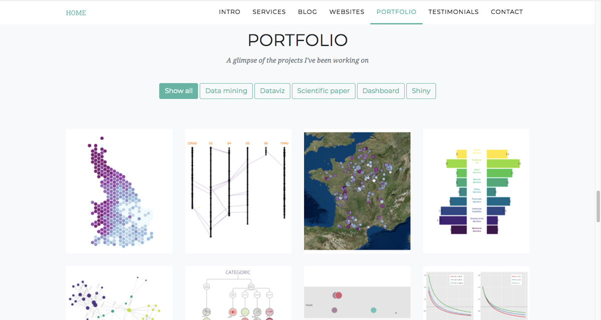
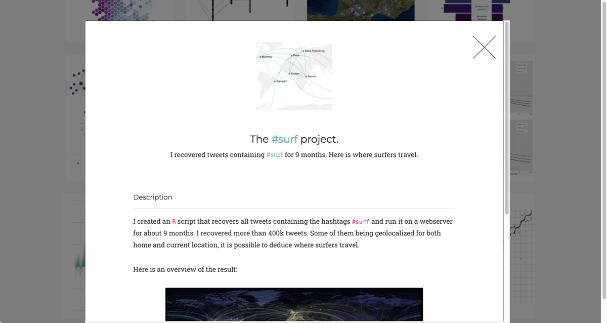
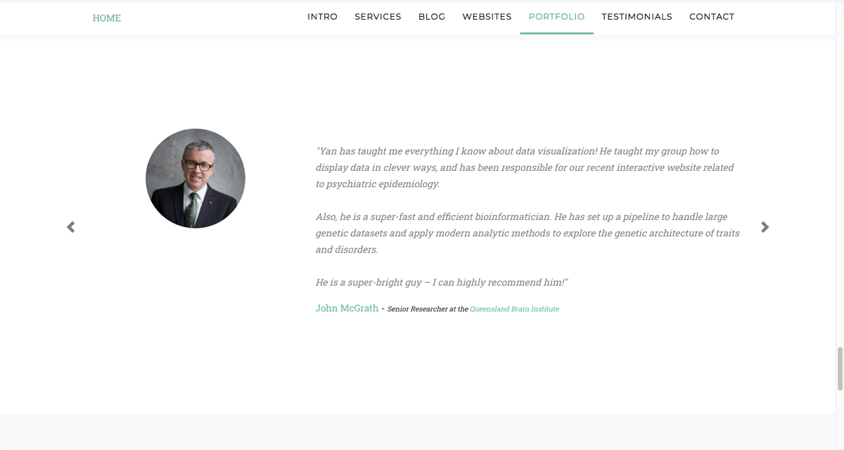
Lastly, Yan also offers a broad range of project types from genotype sequencing, to where surfers travel. He’s implicitly telling us that (although he specializes in data visualization) he can work with all kinds of datasets. He tops this all off with customer testimonials, something many portfolios neglect to include.
What can we learn from Yan Holtz?
Yan’s eye for detail is what makes his portfolio a winner for us. He’s executed the entire thing with seemingly-effortless panache. This shows what a difference it makes if you invest extra time into your portfolio. While the level of interactivity on Yan’s website is by no means necessary, it’s a nice demonstration that a little extra focus can make a big difference. But it’s not just the code—even just the testimonials, or keeping his case studies self-contained (rather than linking directly to projects on GitHub) makes an impact.
Key takeaway
Show that you have an eye for detail. Pay attention to your design, the language you use (and the spelling!) as well as the projects you’re promoting.
View Yan Holtz’s full portfolio website
7. Anubhav Gupta
Who is Anubhav Gupta?
Anubhav Gupta is a data analyst and graduate from the School of Information at UC Berkeley. He’s worked at several global cybersecurity companies.
What makes Anubhav Gupta’s data analytics portfolio so great?
What makes Anubhav’s portfolio stand out is how compact it is. All the supporting information is contained on one short web page—two quick scrolls from top to bottom. The benefit of this approach is that nobody will get bored or lose track of where they’re at.
The first thing we see is a clear, unfussy headline. This tells us everything we need to know—who Anubhav is and what he does.
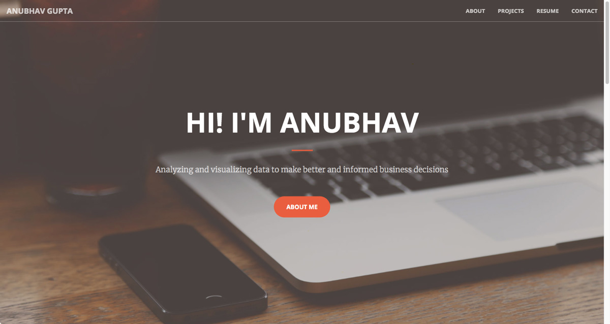
Next, Anubhav introduces himself in a little more detail—still nothing heavy, he’s saved the details for his resume—but it gives us a taste of his interests, experience, and personality.
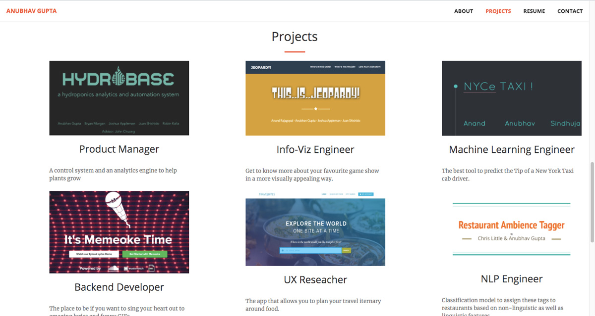
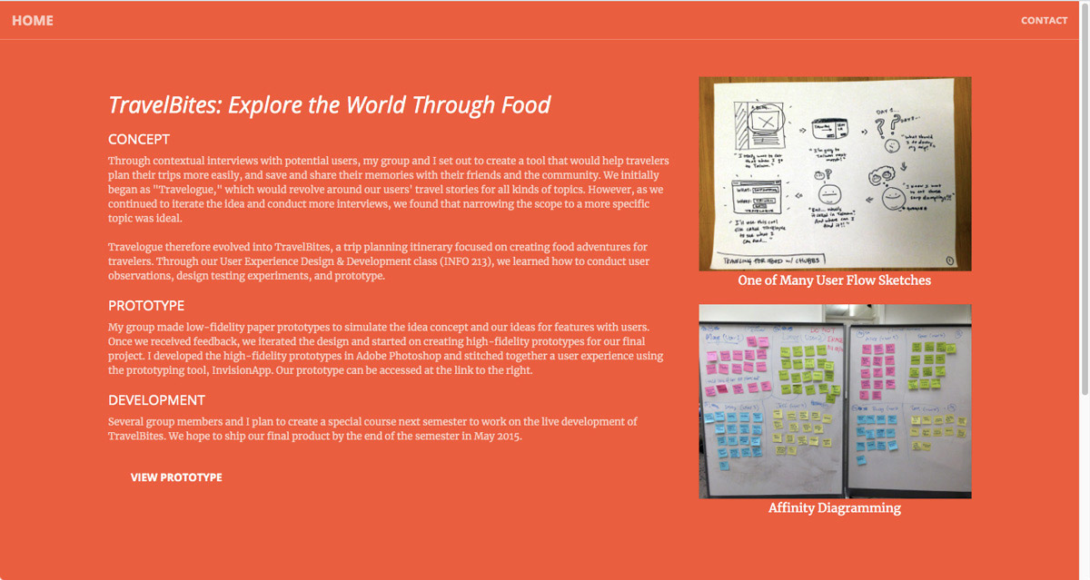
Finally, Anubhav dives right in with his projects. His projects take a slightly different approach from many of the others we’ve looked at. He primarily focuses on his roles, e.g. as a product manager or machine learning engineer, rather than the project content. He saves the detail for his case study pages. Each of these makes good use of headings, images, and neat layout to keep the messaging clear, compelling, and consistent.
What can we learn from Anubhav Gupta?
Despite having the skills to create a ‘flashy’ portfolio, Anubhav has gone for clarity and precision first and foremost. He’s provided bite-sized information which nevertheless covers everything that it needs to. Ultimately, his portfolio shows us that less is sometimes more and that a little humility goes a long way. Remember, it often demonstrates greater confidence to include a smaller handful of projects rather than stuffing in everything along with the kitchen sink. Sometimes less is more!
Key takeaway
Keep your portfolio simple. A few short, confident sentences about who you are and a couple of sample projects are all you need.
View Anubhav Gupta’s full portfolio website
8. Jessie-Raye Bauer
Who is Jessie-Raye Bauer?
Jessie-Raye Bauer is a data scientist working at Apple. She has a Ph.D. from The University of Texas at Austin and is trained in cognitive psychology and statistics.
What makes Jessie-Raye Bauer’s data analytics portfolio so great?
Jessie-Raye Bauer’s portfolio is an interesting example of where a career in data analytics can take you. Just like many of the other portfolios we’ve explored, Jessie-Raye focuses on her skills, adding a dash of personality. However, her portfolio is distinctly academic in feel. You might expect a data scientist of Jessie-Raye’s caliber to show off more. But she doesn’t need to. As a data scientist at Apple, she is at a point in her career where her experience largely speaks for itself.
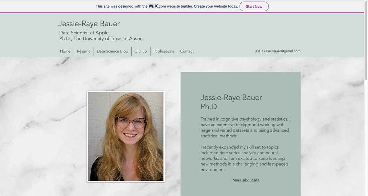
Unlike many data science portfolios, Jessie-Raye hasn’t included links to projects in the traditional sense. Instead of linking right to GitHub projects or using traditional case studies, Jessie-Raye has chosen to showcase her work via her blog. This is more appropriate for her skill level. The complexity of the work she’s doing lends itself well to the detailed medium of a blog. It’s also in keeping with her more academic background.
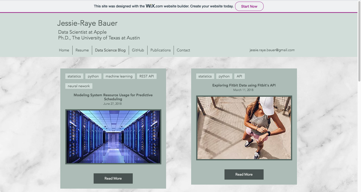
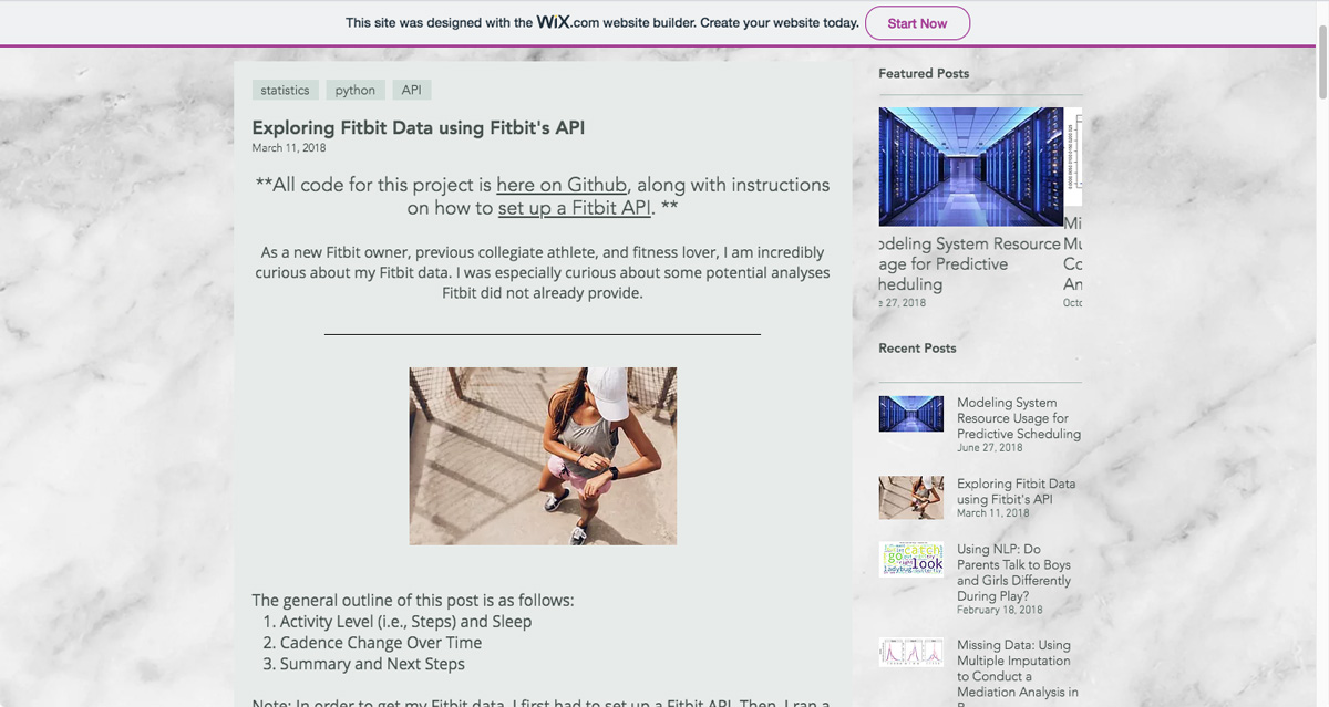
A blog is an interesting way of exploring the data analytics journey alongside the author. By blogging, readers can share experiences, rather than merely reading about completed projects. This is always more engaging and insightful. Jessie-Raye also uses topics that interest her personally. For instance, one blog post is all about how to create your own Fitbit API, which begins with an explanation that she is a new Fitbit owner.
What can we learn from Jessie-Raye Bauer?
There’s nothing overly ambitious about Jessie-Raye’s portfolio. It’s even been built using a template. This tells us that those at the top of their game (who, it should be noted, are also those who often have hiring power) aren’t necessarily focused on how slick or flashy your portfolio is. As we can see from Jessie-Raye Bauer, it’s ultimately the content that matters.
View Jessie-Raye Bauer’s full portfolio website
Key takeaway
Consider alternative options for showcasing your work. Could you use a blog? An app? Heck, could you even create a visual data analytics essay, a bit like this one? Consider what novel approaches you can take that will help you to stand out.
9. Maggie Wolff
Who is Maggie Wolff?
Last, but by no means least, Maggie is a seasoned data scientist and product analytics aficionado currently working for American Express Global Business Travel.
What makes Maggie Wolff’s data analytics portfolio so great?
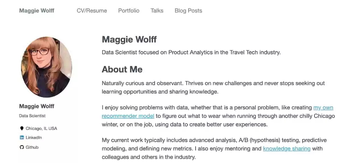
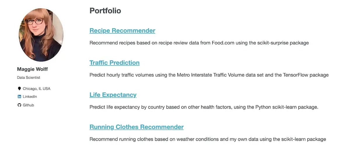
Maggie has created an excellent example of a clear, attractive, accessible GitHub portfolio site. Don’t confuse the simplicity for the work of a rookie—this is a thoughtful site, showing a bit about her, her CV/resume, portfolio projects, and her related passions of the talks she gives as well as some blog articles exploring her journey into data science.
What can we learn from Maggie Wolff?
It’s easy to get wrapped up in the design and layout of your own site, wanting to show things off in the coolest way possible. But ease off, and make sure that your website is simple to negotiate around. It’s vital when constructing your site to think about the user, in this case, potential hiring managers and future contacts.
View Maggie Wolff’s data portfolio site
Key takeaway
While it might not be one of the flashiest examples out there, that is precisely the point—Maggie’s data analyst portfolio is effective. For someone who is involved in so many things, it lays them out easily and accessibly.
10. Data analyst portfolio FAQ
What should I put in my data analyst portfolio?
Your data analyst portfolio should showcase your skills and experience in the field. This can include projects you’ve completed, data visualizations you’ve created, and analyses you’ve conducted. It’s important to ensure that your portfolio demonstrates your ability to work with real-world data and solve complex problems using data analysis techniques.
Do data analysts need portfolios?
While a data analyst portfolio isn’t strictly necessary, it can be a valuable tool in showcasing your skills and experience to potential employers. A well-crafted portfolio can help you stand out from other candidates and demonstrate your ability to work with real-world data. Additionally, creating a portfolio can help you develop your skills and gain practical experience in data analysis.
Can I make 100k as a data analyst?
Yes, it is possible to make 100k as a data analyst, but it depends on a number of factors, such as your level of experience, the size and location of the company you work for, and the specific job responsibilities. Generally, more senior roles, such as data science manager or data architect, are likely to pay higher salaries than entry-level data analyst positions.
How do I start a data portfolio?
To start a data portfolio, begin by identifying projects or analyses that showcase your skills and experience in data analysis. This can include analyzing publicly available data sets or completing projects for non-profit organizations or local businesses. Use data visualization tools, such as Tableau or Power BI, to create visually compelling representations of your findings. Finally, ensure that your portfolio is well-organized and easy to navigate, with clear descriptions of each project and your role in completing it.
And that’s the end of our list! If you’re considering a new career path in data analytics, why not check out our list of the best online data analytics courses to get your career-changing journey on its way, or get a taster with our free, five-day data analytics short course? You can also find more portfolio inspiration below:
