Data. We create a lot of it. While exact figures vary, it’s estimated that we produced a staggering 59 zettabytes of data in 2020 alone, with that figure expected to grow exponentially year-on-year.
With so much information flying around, it’s not surprising that data analytics has become such an indispensable area of expertise. As businesses, governments and other organizations make their way in the world, drive innovation and seek to maintain a competitive edge, data analytics is invaluable.
And a key part of this is data visualization. Representing data graphically allows us to spot new insights, carry out high-level analyses and communicate our findings in a clear, concise way. It’s a bit of an art form, too!
If you’re new to data visualization, check out the basic different data viz types. In this post, though, we’re going to indulge in a few aesthetic delights with some of our favorite data viz examples.
Let’s start with a (relatively) simple one…
1. Visualizing a zettabyte
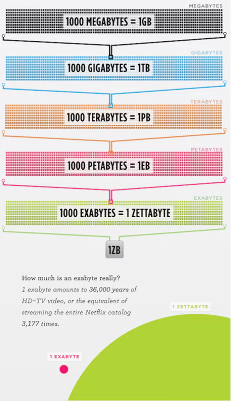
As mentioned, humans created approximately 59 zettabytes of data in 2020. Considering we only reached one zettabyte in the mid-2010s, this is an incredible amount. As the world becomes more digitally connected, our rate of data production will only increase.
While 59 zettabytes are too vast for our puny human brains to comprehend, what about a single zettabyte? Can we picture that? One zettabyte is equivalent to a sextillion bytes. Any clearer? Thought not.
Luckily, before the dawn of the so-called ‘Zettabyte Era’, global IT company Cisco had a go at visualizing this for us.
Source: The Guardian / Cisco
This visualization definitely makes it easier to understand exactly how monumentally huge a zettabyte of data is. That’s the power of data visualization.
2. Network graph of character interactions in the Star Wars franchise
As the amount of data we produce grows, ever-more-complex visualization techniques are required to make sense of it. One increasingly popular form of data viz is the network graph. This allows us to plot the relationship between many different points, or nodes.
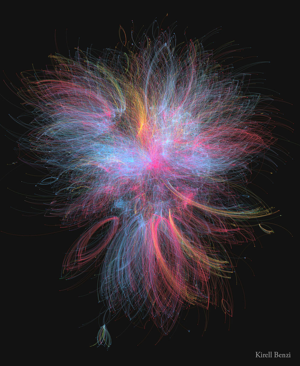
Network graphs are excellent for visualizing connections or groups that emerge from big data. Illustrating this concept beautifully is this stunning visualization by data artist, science communicator, and researcher, Kirell Benzi.
Source: Kirill Benzi
This eye-catching network graph is more than just a pretty image. It tracks the connections between the 20,000-plus characters that exist in the Star Wars universe. Each character is represented by a single node. And each of these nodes is connected by a color-coded line (or ‘edge’) to related nodes.
Red represents the dark side of the force; blue represents the light side; yellow shows criminals and bounty hunters. With over 66,000 connections in total, this shows exactly how powerful (and beautiful) a network graph can be.
3. Heat mapping the potential spread of the Covid-19
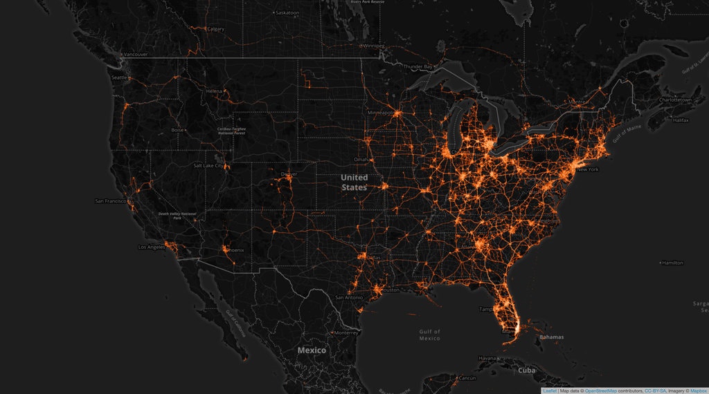
As smartphones track our movements, location-tagged data is fast becoming a common phenomenon. This has proven especially important during the Covid-19 pandemic, as countries scramble to track and trace potential chains of infection. For location data like this, maps are a vital tool. In this example, data viz software provider Tectonix shows us the full potential of location-specific data mapping.

Source: YouTube / Tectonix GEO
This visualization shows anonymized phone data collected in Florida during spring break 2020. Each phone is represented by a single red node. The mist of red tells us that there were a lot of people enjoying spring break. The area highlighted in blue is a single beach in Fort Lauderdale.
Source: New York Times / Tectonix GEO
Tracking each node from this beach, Tectonix shows exactly where individuals traveled at the end of spring break. As a result, we can easily see how far and wide individuals from a single beach may have spread Covid-19.
While this visualization is in equal measures terrifying and beautiful, it’s an excellent example of how we can visualize big data over large geographical areas. To see the full visualization, check out Tectonix’s YouTube channel.
4. 3D mapping of population density
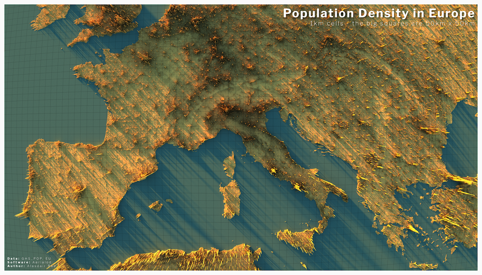
Another common type of map is the 3D map. While some visualizations use 3D elements to add a little flair, the best ones utilize that third dimension to the fullest. This is perfectly illustrated in this visualization by Alasdair Rae, founder of Automatic Knowledge Ltd, a UK-based data analytics company.
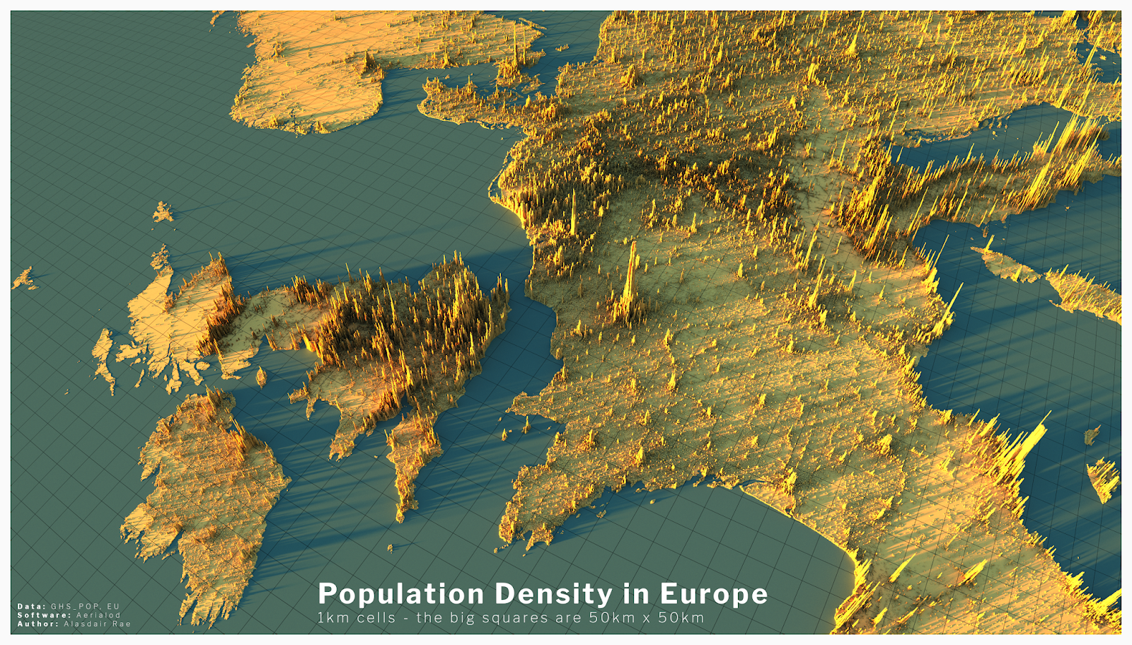
Source: Alisdair Rae / statsmapsnpix.com
Using the EU’s freely available GHS_POP data, these images show population density across Europe. The map is broken down into 1km x 1km squares, with bar heights representing the number of people living in each area. As well as offering a striking render, we can see at a glance where the most densely populated regions are. For instance, Paris, London, Madrid, and Rome all leap out.
An important thing to note about this map is how functional it is. The 3D rendering is pleasing to look at, but these elements serve more than just an aesthetic purpose—they tell us something useful. This is a core principle of data visualization: substance should always come before style.
5. Popular programming languages on the CRAN network
It wouldn’t feel right to do a post about data visualization without some data analytics related themes! With this in mind, our next visualization—a combination of a bubble chart and circular network graph—shows the use of popular programming languages in 300 packages on the Comprehensive R Archive Network (CRAN).

Source: Dr Torsten Sprenger /GitHub
Sourcing data from the TIOBE index (which measures the popularity of programming languages) this visualization shows which CRAN packages were created using which languages. R comes top, followed by C and C++. Less popular languages are represented by smaller circles. The size of each circle is proportional to the number of lines of code used to produce the packages.
If you want to play around with this chart, its creator Dr Torsten Sprenger has shared the data and code on his GitHub profile…go wild!
6. Line graph of global surface temperature
Good data visualization needn’t be flashy. In fact, it’s often better when it’s not. If data might be used to aid things like government policy or decision making, clarity is vital. And line graphs are an excellent tool for plotting time-series data clearly and simply.
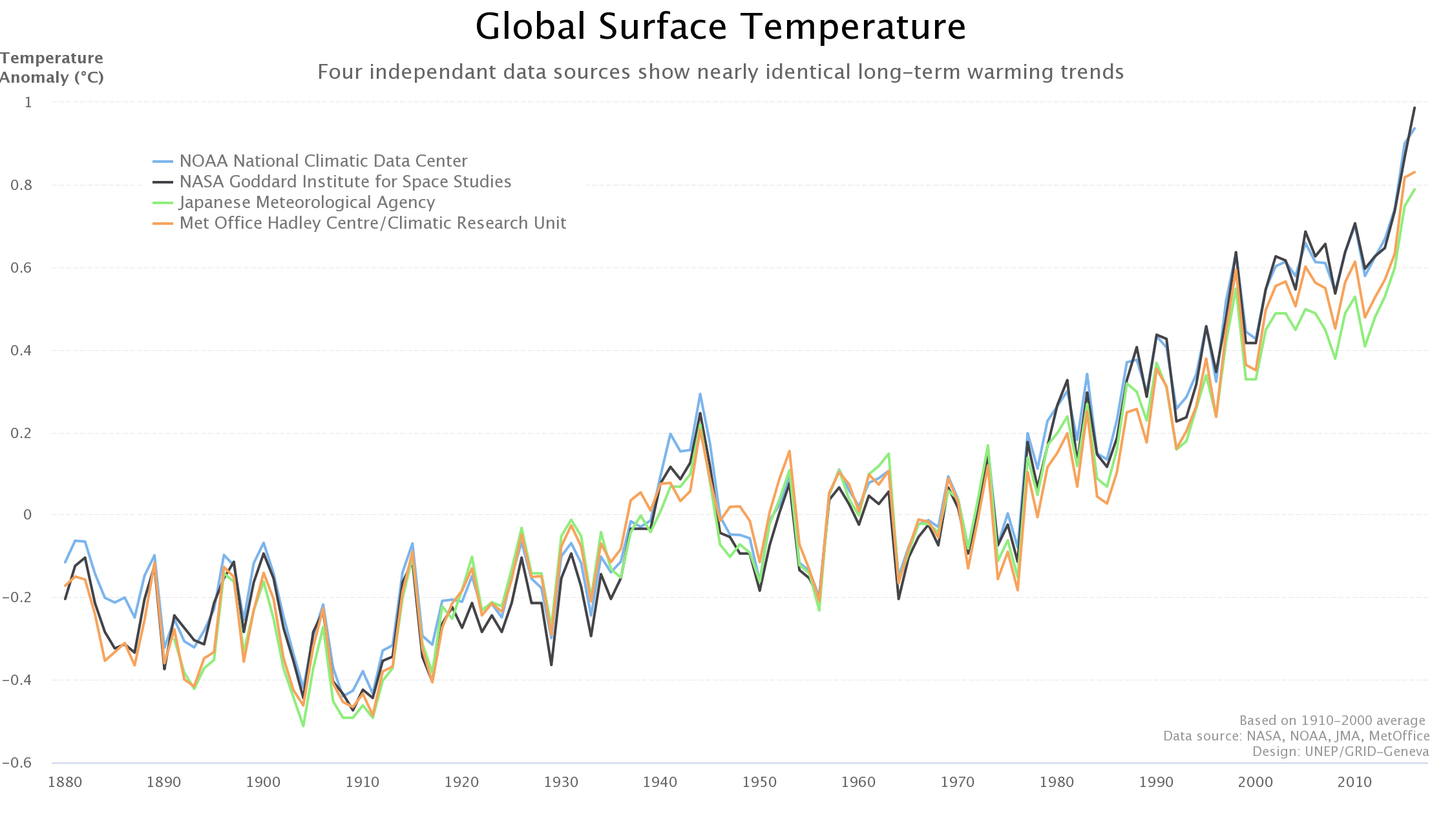
Source: UNEP GRID
This line graph tracks global surface temperatures from 1880 to the late 2010s. Crucially, it includes data from four different sources: NASA, NOAA, the Japanese Meteorological Agency, and the MetOffice. By overlaying these four sources of data, we can immediately see how closely correlated they are. They show an almost identical rise in global surface temperatures over the last 200 years.
While the content of this graph should not be news to anyone by now, it is still an excellent example of how even simple data visualizations can draw powerful conclusions. Presented this way, it is very hard to deny these data.
7. Interactive bubble chart of good government
Visualizations should never be interactive for the sake of it. However, interactivity can also transform the way we see data. Gov | DNA is an award-winning interactive online web tool that explores the factors that contribute to good (and bad) government in countries all around the world.

Source: Werner Helmich
Representing each nation as a bubble, the tool lets you compare different countries at the click of a button. For instance, you can track each country’s world happiness score against variables like employment, life expectancy, press freedom, and corruption. To get the full, immersive experience, we highly recommend checking out the interactive tool for this one. If you’re anything like us, you’ll lose hours on it!
8. Streamgraph of immigration to the US
Streamgraphs are a type of area chart often used to compare time-series data. While not always suitable for an in-depth analysis, they are great for providing a broad overview. They’re also visually compelling, especially when they’re interactive.

Source: Talia Bronshtein / insightfulinteraction.com
This beautiful streamgraph, created by data journalist Talia Bronshtein, plots the nationality of different immigrants to the United States over 200 years (1820 to 2015). And its findings jump right out. For instance, we can immediately see that during the wartime period (1939-1945) immigration to the US almost stopped.
We can also see that while most immigrants before WW2 came from countries like Austria-Hungary, Italy, and Russia; by the late 2000s, the bulk of immigration was coming from Asian and South American countries.
Streamgraphs are excellent for spotting patterns quickly and easily. Be sure to check out the full interactive version of this one on Talia’s website.
9. Sculptural heat map of Chile’s 2010 earthquake
Data visualization isn’t just for data analytics. As we’ve said, it can be an art form. And we weren’t speaking metaphorically!
In 2010, the artist Janet Echelman was commissioned to create a sculpture representing the interconnectedness of the 35 nations of the Western Hemisphere. That year, there had been a huge earthquake in Chile. The event was so seismic that it created a huge tsunami and shortened the Earth’s day by 1.26 microseconds.
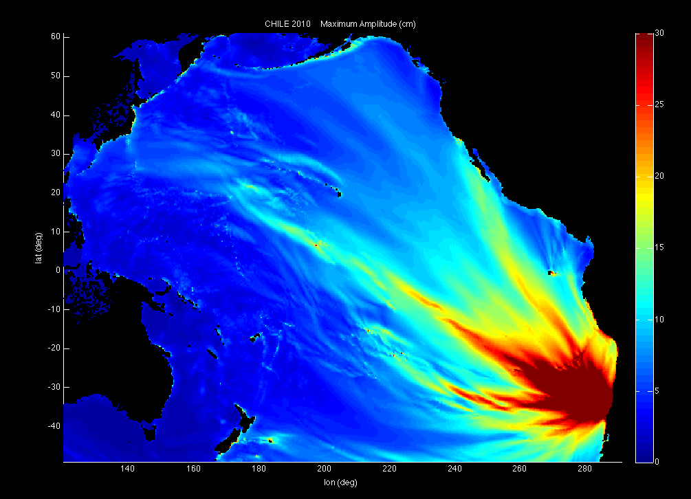
Source: NOAA / PMEL / Center for Tsunami Research
This image shows a heatmap of the tsunami caused by the earthquake, as modeled by the US National Oceanic and Atmospheric Administration (NOAA). Echelman took this and used it as inspiration for her sculpture, which she constructed out of different colored rope suspended from a lightweight frame.

Source: Janet Echelman
The subsequent sculpture, named 1.26, is both a triumph of artistic achievement and a stunning data visualization. It’s also evidence that data viz—and by extension, data analytics—can be just as creative as any artistic field. So if anybody ever suggests otherwise, you know where to point them!
Final thoughts
In this post, we’ve offered a few samples of how informative, beautiful, and diverse data visualization can be.
If we’ve whetted your appetite for more, we recommend checking out videos of the late Hans Rosling, an unrivaled leader in the field of data viz. While we didn’t include his work on our list, he is worthy of an honorable mention.
Like the visualizations in our post, his work is truly inspiring. And, if you’re new to the field, check out our complete introduction to data visualization.
CareerFoundry’s Data Visualizations with Python course is designed to ease you into this vital area of data analytics. You can take it as a standalone course as well as a specialization within our full Data Analytics Program, you’ll learn and apply the principles of data viz in a real-world project, as well as getting to grips with various data visualization libraries.
To learn more about data analytics in general, try our free, 5-day data analytics short course, or read about some more data analytics topics:
