
In data analytics, data visualization is a vital technique for pattern-spotting and presenting findings. But what are the most common types of data visualization? Let’s find out.
Data visualization (or ‘data viz’) is one of the most important aspects of data analytics. Mapping raw data using graphical elements is great for aiding pattern-spotting and it’s useful for sharing findings in an easily digestible, eye-catching way. And while the priority should always be the integrity of your data, if done well, data visualization can also be a lot of fun.
Master the art of data viz and you’ll soon be spotting trends and correlations, all while flexing your creative muscle. But before we can unlock all these benefits, we first need to understand the basics, including the different types of data visualization and how they’re used. In this post, we’ll cover 13 of the most common ones, starting with…
1. Pivot tables

Source: evolytics.com
You might not think of tables as a form of data visualization, but they are! When dealing with vast repositories of information—ones that are too large to easily comprehend—pivot tables help us summarize key statistics in a single view. The type of information collected in pivot tables might include sums, means, or other numerical summaries.
While pivot tables aren’t always the most visually inspiring form of data viz, they are useful in the right context. For instance, highlight tables, as shown in the image, use different shades or colors to easily flag the highest and lowest values in a dataset. Sometimes, this is all you need, making pivot tables a basic but effective form of data viz. They are also commonly used to underpin more complex forms of data visualization, hence making it on to our list. You can learn how to create a pivot table here.
2. Boxplots

Source: dimensionless.in
Another useful (if not particularly flashy) type of descriptive visualization is the boxplot (also known as a box-and-whisker plot). Like pivot tables, boxplots are useful for visualizing a dataset’s key statistics. We can use them to represent minimum and maximum values, the median value, and the lower and upper quartiles (i.e. the median of the lower and upper halves of the data).
Boxplots are what is known as ‘non-parametric.’ This means they display variation in a data sample without making any assumptions about the data’s distribution. This makes them useful for exploratory and explanatory data analysis, i.e. getting to understand a dataset’s key features before drawing any broad conclusions about it.
3. Scatterplots

Source: displayr.com
A scatterplot (also known as a scattergraph, scattergram, or scatter chart) displays the relationship between two variables on an x- and y-axis. Each item of data is shown as a single point, creating the chart’s visual ‘scatter’ effect. When there are three interrelated data points (i.e. if there’s a z-axis) 3D scatterplots are also possible.
Scatterplots are best used for large datasets where time is not a significant factor. For instance, a simple scatterplot might measure people’s weight against height. This would help identify any correlation between the two measures. However, because other factors affect the data (e.g. people’s weights are also related to their diet) scatterplots are best for inferring relationships between variables rather than drawing firm conclusions. Nevertheless, they are an excellent tool for hypothesis creation.
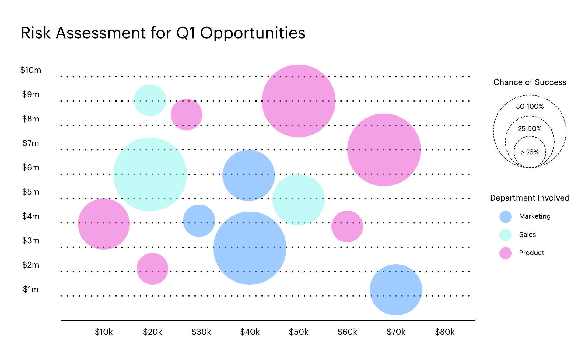
A common variant of the scatterplot is the bubble chart. Displaying different-sized circles (rather than single points), bubble charts represent three dimensions of data, rather than the usual two.

Source: lucidchart.com
4. Line graphs

Source: data-to-viz.com
Line graphs, or line charts, are a simple but effective staple for representing time-series data. They are visually similar to scatterplots but represent data points separated by time intervals with segments joined by a line. This allows for quick observation of features like acceleration (when the line goes up), deceleration (when the line goes down), and volatility (when the line moves up and down erratically).
While the simple line graph shown represents a single dataset, more complex line graphs may overlay several lines to represent different data. This is useful for spotting correlations or deviation. A common example of a line graph in action is the measure of stock market behavior or resource costs over time, e.g. the price of gold over several years.
Want to learn how to create data visualizations? Follow this free introductory data visualization tutorial. You’ll learn, step by step, how to create bar charts, line graphs, and more in Google Sheets, for a real dataset!
5. Area charts

Source: anychart.com
Area charts, similar to line charts, are also used for tracking data over time. However, in an area chart, the space between the plotted line and the x-axis is shaded or colored for visibility. This is particularly useful for highlighting the difference between multiple variables, or for measuring overall volumes (rather than highlighting the difference between discrete data points).
For example, in the image provided—which is known as a stacked area chart—the most important factor to note is the volume of products sold in each country, which is represented by the shaded areas. A common variant on the area chart is the streamgraph, where data is plotted around a central axis to minimize so-called ‘wobble.’

Source: flowingdata.com
6. Bar charts

Source: datavizproject.com
Another common visualization—one you’ll no doubt be familiar with from school—is the bar chart. Bar charts are a simple but highly effective way of plotting categorical data against discrete values. The heights (or widths) of the bars are in direct proportion to the values they represent. This makes bar charts an excellent way of comparing discrete variables at a glance.
Some bar charts cluster bars into groups of two or three (or more) allowing you to compare numerous variables at different points in time. Another variation is the stacked bar chart, which divides each bar into separate sub-bars, one stacked on top of another. This allows for the introduction of additional variables.
 for sales of clothing, equipment, and accessories at various shopping locations (presented on the x axis)")
Source: chartio.com
7. Histograms

Source: internetgeography.net
Although visually similar to bar charts, histograms are not the same thing. Bar charts measure categorical data, while histograms measure the distribution of numerical data, i.e. the frequency with which a discrete data point appears in a dataset.
In a histogram, each bar represents how often a data point falls within a given range. For example, each column might represent different age groups (20 to 29, 30 to 39, and so on). This makes histograms excellent for summarizing large amounts of continuous data without needing to inspect every single value.
If you struggle to distinguish between bar charts and histograms, look out for spacing—there should always be a space between bars on a bar chart (to signify that the categories are discrete) while there should be no gap between the bars on a histogram (signifying that the data are continuous). You’d be surprised how often people get this wrong though, so keep your eyes peeled!
You can learn how to create a histogram in Excel in this step-by-step guide.
8. Pie charts

Source: University of Texas at Austin
Another visualization you may remember from school is the pie chart. While pie charts are similar to bar charts in that they represent categorical data, this is where the similarities end. The main difference (besides how they look) is that bar charts represent numerous categories of data, while pie charts represent a single variable, broken down into percentages or proportions.
Each ‘slice of the pie’ in a pie chart is proportional to the quantity it contributes to the whole, i.e. the entire circle. For this reason, pie charts are best-suited to data that is split into about five or six categories…add more than that and it quickly becomes too complex to effectively represent the data.
9. Network graphs

Source: networkofthrones.wordpress.com
As sources of data grow more complex and interconnected, so must the visualizations we use to represent them. Enter network graphs, which are used to show how different elements of a network relate to one another. Each element in a network graph is represented by an individual node, interconnected to related nodes via lines. This approach is excellent for visualizing clusters within the larger whole—patterns that can otherwise be hard to spot.
The joy of this type of visualization is that you can represent networks with varying degrees of complexity without impacting the usefulness of the visualization. In fact, the more elements and connections a diagram includes, the more likely it is to help you spot the larger clusters hidden in the data.
10. Geographical maps

Source: ubs.com
One of the most versatile types of data visualization is the geographical map, which can bring life to a whole range of different location-specific data. A common example is the distribution of vote share during an election, like that shown in the image.
Maps can be used in diverse ways. For example, geographical heat maps use color to show the variation of a particular element over a given area, offering visual clues about data distribution. A simple example is the social media company Snapchat, which uses heat maps to show where the highest density of snaps are being shared.
Other types of maps include dot distribution maps (which combine the idea of a scattergram with a map) and cartograms, where the size of geographical locations are distorted to match the proportion of a selected variable, e.g. world population.

Source: metrocosm.com
11. Radar charts

Source: Middlebury College, Vermont
Radar charts (also known as spider charts) are useful for representing multivariate data (i.e. data that incorporate more than one variable) in a two-dimensional format. They are commonly used to compare features between different observations. They are also helpful for identifying outliers or commonality between observations.
Radar charts usually work by overlaying two or more variables on the same axis, using different colored lines to distinguish between them. For example, you might use a radar chart to compare the features of three different products, including aspects like price, durability, cost of production, and so on. Radar charts are also commonly used in sport to compare athletic performance, as displayed in the image.
12. Treemaps

Source: Ali Zifan, CC BY-SA 4.0, via Wikimedia Commons
Treemaps are a type of data visualization that are excellent for displaying hierarchical data, usually in the form of nested rectangles. This involves breaking each category down into smaller rectangles, which represent sub-categories.
Treemaps are commonly used to display things like products or distribution of disk space by location or file type. Because they make efficient use of space, they are excellent for displaying thousands of different categories in a limited amount of real estate. This ability to represent highly complex data makes them a popular visualization in data analytics and data science.
13. Venn diagrams

Source: lucidchart.com
Last but not least: the classic Venn diagram. Venn diagrams use a series of overlapping shapes (usually circles, but sometimes ellipses or other abstract forms) to highlight common features between different groups of items. Each area created by the overlapping shapes represents features that groups share in common. Where circles don’t overlap, the groups do not share features in common.
Venn diagrams are useful for quickly visualizing the relationship between different groups of data. However, be aware that they can easily oversimplify these relationships. If you try to tackle this by adding more data, they can quickly become cumbersome. As a result, Venn diagrams are best used for descriptive purposes.
Next steps
In this post, we’ve introduced a handful of core data visualizations. Despite their simplicity, these visualizations are highly versatile. Even just these few techniques can be used to make sense of complex datasets. After all, data visualization is all about simplicity and clarity. If you’re new to data viz, you’ll find a complete introduction to the topic here.
Once you’ve mastered the basics and explored a few visualizations of your own, you’ll be in a great position to start experimenting. Combine different graphics, play around with colors and shapes, and of course, try blending the different types of visualization. You can also play with interactivity by using some different data viz tools.
While the best visualizations are usually the simplest, that shouldn’t stop you trying new approaches and discovering novel ways of visually representing information. You’ll be surprised how many combinations and possibilities there are, and what insights you will uncover.
CareerFoundry’s Data Visualizations with Python course is designed to ease you into this vital area of data analytics. You can take it as a standalone course as well as a specialization within our full Data Analytics Program, you’ll learn and apply the principles of data viz in a real-world project, as well as getting to grips with various data visualization libraries.
Next, to learn more about data analytics, why not try our free, 5-day data analytics short course? You can also read more introductory data analytics topics: