A histogram is a popular chart for data analysis in Excel. It is similar to a column chart and is used to present the distribution of values in specified ranges.
Excel provides a few different methods to create a histogram. In this article, I’ll show you two different methods and explain the advantages and disadvantages of each method.
Learn more Excel analysis skills with CareerFoundry’s free 5-day data short course.
I’m going to cover:
- What is a histogram?
- How is a histogram different from a column chart?
- How to create a histogram in Excel with the histogram chart
- How to create a histogram in Excel using a formula
So, let’s dive in.
1. What is a histogram?
A histogram is a chart that shows the frequency distribution of a set of values. The frequency distribution of these values are arranged into specified ranges known as bins.
Examples of using a histogram include grouping performance scores into ranges, grouping values into ranges of years, or survey responses grouped into age brackets. A histogram is a type of data visualization.
You can learn all about what data visualization is in this guide, and we’ve also collected some great data visualization examples.
2. How is a histogram different to a column chart?
A histogram is very similar to a column chart, but they are not exactly the same. A few differences between the two charts include:
- The purpose of a histogram is to present frequency distribution e.g., the count of exam scores grouped into ranges. Column charts compare values e.g., the total sales value of six different products.
- The X axis of a histogram must be in order of its size e.g., 1-5, 6-10, 11-15. A column chart does not need to be in a specific order. The order depends on its purpose.
- The X axis is formed of intervals or bins in a histogram. A column chart typically has text values in this axis, such as names of cities.
- There are no gaps between the columns of a conventional histogram.
- 100% of the values in a data set must be included in a histogram. A column chart could be used to compare only the top 5 products.
3. How to create a histogram in Excel with the histogram chart
The first method to create a histogram in Excel is to use the built-in histogram chart.
This chart is available in Excel 2016 and later, so if you have an earlier version of Excel, you can follow the second method provided in this post.

There are 41 scores in this data, and we want to create a histogram that distributes the scores over intervals of 10 starting from the score of 40, and ending with 100 (the maximum score).
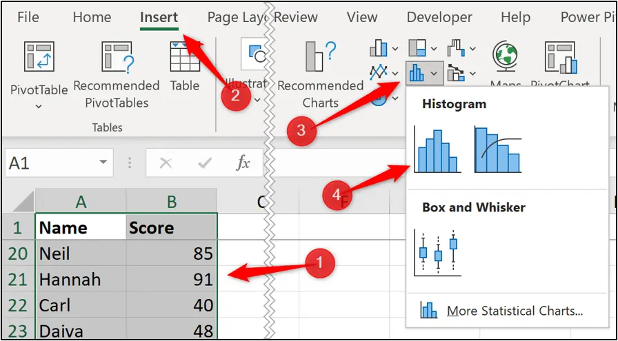
- Select range A1:B42.
- Click Insert > Insert Statistic Chart > Histogram.
The following histogram is inserted. It has grouped the scores into four bins.
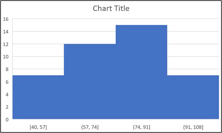
This is nothing like what we require, so we need to edit the axis options.
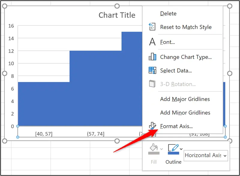
- Right click on the category axis (x-axis) and click Format Axis.
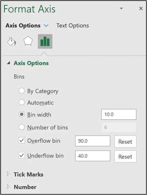
- Click the Axis Options category.
- Type 40 for the Underflow bin. This is the score that the bins will start from.
- Type 90 for the Overflow bin. Scores of 91 or above will be included in this final bin.
- Specify a Bin width of 10. This creates bins in intervals of 10 from 40.
An alternative to specifying a bin width would be to use the option to specify the number of bins required.
The histogram is now looking good.

An important thing to know is that the upper value of a bin is included, and the lower value is not (except for the first bin).
So, if there is a score of 60, this is included in the (50, 60] bin and not the (60, 70] bin. This is specified by the different brackets in the axis, but this is not clear to the reader.
Some general improvements can be made to the histogram chart, such as editing the chart title, adding data labels, and changing the colors of the columns.
These techniques are not covered in this article as our focus is on creating the histogram. There are many chart formatting options.

The advantages of using this method to create a histogram are that we do not need to prepare bins in advance or write complex formulas. It is all controlled by the built-in chart and the options available.
The disadvantages are that it is only available in Excel 2016 or later and that you are confined to the abilities of the built-in chart. It lacks versatility.
4. How to create a histogram using a formula in Excel
Using a formula to count the occurrences in each bin provides more flexibility for your histogram. This is my preferred method and also works in all versions of Excel.
This method involves inserting a column chart instead of the histogram option and then formatting it to look like a conventional histogram.
We will use the same exam score data used in the previous example, but two of the scores have been changed to less than 40.
First we need to create the source data for our chart. This is the bins and the frequency of exam scores in each of those bins.
The following image shows the source created in this example. The bins are typed into range G4:G10 and the COUNTIFS function is used to count the occurrences of the scores for each bin.
=COUNTIFS($B$2:$B$42,”>=”&E4,$B$2:$B$42,”<=”&F4)
The values in ranges E4:E10 and F4:F10 have been used to assist the COUNTIFS function. It makes it easier to change if the size of the bins changes in the future. These columns will be hidden as nobody wants to see them.

To create the histogram:
- Select range G4:H10
- Click Insert > Insert Column or Bar Chart > Clustered Column.

The following column chart is inserted. It looks great already, but we will make some general improvements and then remove the gap between each column.
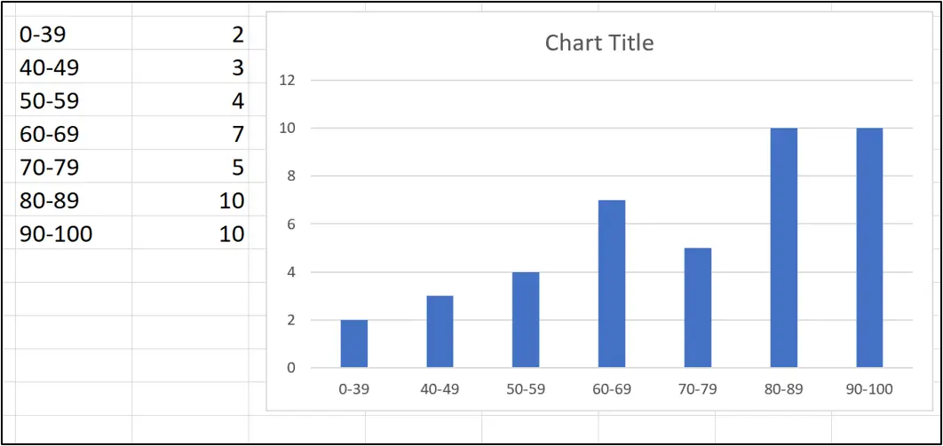
3. I have made the following changes to the column chart.
- Edited the chart title to “Exam Score Distribution”
- Formatted the columns to a green colour
- Removed the value axis (y-axis)
- Removed the horizontal gridlines
- Added data labels above each column
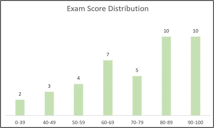
4. To remove the gap between each column, right click on one of the columns and click Format Data Series.

5. From the Format Data Series pane, Click the Series Options category and change the Gap Width to 0.

The gap between the column is removed making it look like a typical histogram.

By creating our own bins, this method provided more flexibility for our histogram. The first bin is for scores less than 40. And then the bins are in intervals of 10. The rigidity of the built-in histogram chart prevents this freedom.
This chart is also very easy to change in the future, as we just need to edit the values in the cells of the source data.
Finally, because the category axis (x-axis) is generated from range G4:G10, we were able to make it appear how we wanted.
Final thoughts
Histograms are used to present the distribution of data arranged in intervals, known as bins. There are a few different methods to create a histogram in Excel. The method you choose will depend on your data, the level of flexibility required and how often your data changes.
For a hands-on introduction to the field of data analytics, try out this free five-day short course. And, for more Excel tutorials, check out the following:
