Identifying and dealing with outliers can be tough, but it is an essential part of the data analytics process, as well as for feature engineering for machine learning. So how do we find outliers? Luckily, there are several methods for identifying outliers that are easy to execute in Python using only a few lines of code. Before diving into methods that can be used to find outliers, let’s first review the definition of an outlier and load a dataset. By the end of the article, you will not only have a better understanding of how to find outliers, but also know how to work with them when preparing your data for machine learning.
We’ll cover all of this using the following headings:
- What is an outlier?
- How do you find outliers in your dataset?
- Finding outliers using statistical methods
- Working with outliers using statistical methods
- Wrapping up and next steps
To skip to any section, use the clickable menu.
What is an outlier?
When exploring data, the outliers are the extreme values within the dataset. That means the outlier data points vary greatly from the expected values—either being much larger or significantly smaller. For data that follows a normal distribution, the values that fall more than three standard deviations from the mean are typically considered outliers.
Outliers can find their way into a dataset naturally through variability, or they can be the result of issues like human error, faulty equipment, or poor sampling. Regardless of how they get into the data, outliers can have a big impact on statistical analysis and machine learning because they impact calculations like mean and standard deviation, and they can skew hypothesis tests. A data analyst should use various techniques to visualize and identify outliers before deciding whether they should be dropped, kept, or modified.
Review this article to learn more about the different types of outliers:
Data Analytics Explained: What Is an Outlier?
Loading and describing example data
The examples throughout this article use the Uber Fares Dataset available on Kaggle.com. Download the CSV to follow along. It has nine columns and 200k rows. These are the fields we will use:
- key — a unique identifier for each trip
- fare_amount — the cost of each trip in usd
- pickup_datetime — date and time when the meter was engaged
- passenger_count — the number of passengers in the vehicle (driver entered value)
Load the data into a dataframe using Python and the pandas library. Import the numpy and Plotly express libraries as well. Use pip install if your Python environment is missing the libraries.
Once the data is loaded into a dataframe, check the first five rows using .head() to verify the data looks as expected. If everything looks good, let’s drop the columns we don’t need.
#import dependencies
import pandas as pd
import numpy as np
import plotly.express as px
#load the data into a dataframe
df = pd.read_csv(‘uber.csv’)
#check the first 5 rows
df.head()
#drop the unnecessary columns
df = df.drop(columns=([‘pickup_longitude’, ‘pickup_latitude’, ‘dropoff_longitude’, ‘dropoff_latitude’]))

df.head()
Using pandas describe() to find outliers
After checking the data and dropping the columns, use .describe() to generate some summary statistics. Generating summary statistics is a quick way to help us determine whether or not the dataset has outliers.
df.describe()[[‘fare_amount’, ‘passenger_count’]]

As we can see, the fare_amount and passenger_count columns have outliers. For example, the max fare_amount is 499 while its mean is 11.36. The mean is sensitive to outliers, but the fact the mean is so small compared to the max value indicates the max value is an outlier. Similarly, the max passenger_count is 208 while the mean is 1.68. Since this value is entered by the driver, my best guess for the passenger_count outlier is human error. As we explore the data using additional methods, we can decide how to handle the outliers.
How do you find outliers in your dataset?
Finding outliers in your data should follow a process that combines multiple techniques performed during your exploratory data analysis. I recommend following this plan to find and manage outliers in your dataset:
- Use data visualization techniques to inspect the data’s distribution and verify the presence of outliers.
- Use a statistical method to calculate the outlier data points.
- Apply a statistical method to drop or transform the outliers.
We will explore three different visualization techniques that tackle outliers. After visualizing the data, depending on the distribution of values, we will pick a technique to calculate the outlier data points. Finally, after calculating the outliers, we will discuss three techniques for handling in preparation for data modeling.
How do you visualize outliers?
Now that we’ve taken a quick look at the statistics, let’s perform exploratory data analysis using visualizations to get a better look at the outliers compared to the rest of the data points. There are several different visualizations that will help us understand the data and the outliers. The type of plot you pick will depend on the number of variables you’re analyzing. These are a few of the most popular visualization methods for finding outliers in data:
- Histogram
- Box plot
- Scatter plot
I prefer to use the Plotly express visualization library because it creates interactive visualizations in just a few lines of code, allowing us to zoom in on parts of the chart if needed.
Find outliers and view the data distribution using a histogram
Using a histogram, we can see how the data is distributed. Having data that follows a normal distribution is necessary for some of the statistical techniques used to detect outliers. If the data doesn’t follow a normal distribution, the z-score calculation shouldn’t be used to find the outliers.
Use a px.histogram() to plot to review the fare_amount distribution.
#create a histogram
fig = px.histogram(df, x=’fare_amount’)
fig.show()
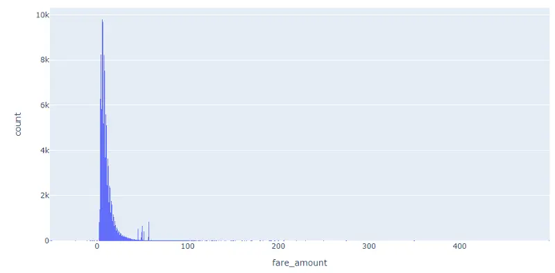
Notice the data does not follow a normal distribution. Since the data is skewed, instead of using a z-score we can use interquartile range (IQR) to determine the outliers. We will explore using IQR after reviewing the other visualization techniques.
Find outliers in data using a box plot
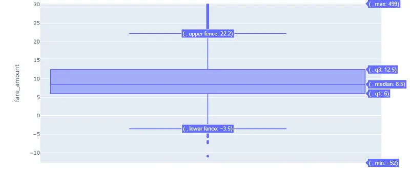
Begin by creating a box plot for the fare_amount column. A box plot allows us to identify the univariate outliers, or outliers for one variable. Box plots are useful because they show minimum and maximum values, the median, and the interquartile range of the data. In the chart, the outliers are shown as points which makes them easy to see.
Use px.box() to review the values of fare_amount.
#create a box plot
fig = px.box(df, y=”fare_amount”)
fig.show()

As we can see, there are a lot of outliers. That thick line near 0 is the box part of our box plot. Above the box and upper fence are some points showing outliers. Since the chart is interactive, we can zoom to get a better view of the box and points, and we can hover the mouse on the box to view of the box plot values:
Find multivariate outliers using a scatter plot
Using a Scatter plot, it is possible to review multivariate outliers, or the outliers that exist in two or more variables. For example, in our dataset we see a fare_amount of -52 with a passenger_count of 5. Both of those values are outliers in our data. On the x-axis use the passenger_count column. On the y-axis use the fare_amount column.
Use px.scatter() to review passenger_count and fare_amount.
fig = px.scatter(x=df[‘passenger_count’], y=df[‘fare_amount’])
fig.show()
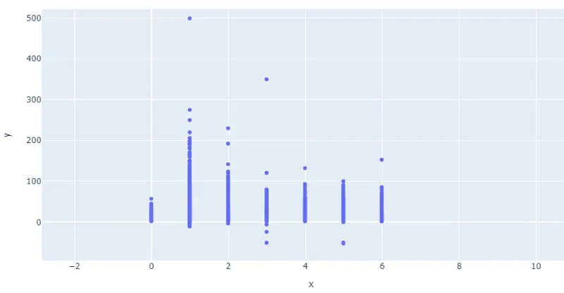
Since the plot needs to include the 208 passenger_count outlier, I recommend zooming in to get a better look at the distribution of the data in the scatter plot.
Finding outliers using statistical methods
Since the data doesn’t follow a normal distribution, we will calculate the outlier data points using the statistical method called interquartile range (IQR) instead of using Z-score. Using the IQR, the outlier data points are the ones falling below Q1–1.5 IQR or above Q3 + 1.5 IQR. The Q1 is the 25th percentile and Q3 is the 75th percentile of the dataset, and IQR represents the interquartile range calculated by Q3 minus Q1 (Q3–Q1).
Using the convenient pandas .quantile() function, we can create a simple Python function that takes in our column from the dataframe and outputs the outliers:
#create a function to find outliers using IQR
def find_outliers_IQR(df):
q1=df.quantile(0.25)
q3=df.quantile(0.75)
IQR=q3-q1
outliers = df[((df<(q1-1.5*IQR)) | (df>(q3+1.5*IQR)))]
return outliers
Notice using .quantile() we can define Q1 and Q3. Next we calculate IQR, then we use the values to find the outliers in the dataframe. Since it takes a dataframe, we can input one or multiple columns at a time.
First run fare_amount through the function to return a series of the outliers.
outliers = find_outliers_IQR(df[“fare_amount”])
print(“number of outliers: “+ str(len(outliers)))
print(“max outlier value: “+ str(outliers.max()))
print(“min outlier value: “+ str(outliers.min()))
outliers
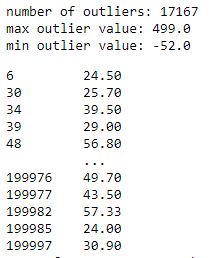
Using the IQR method, we find 17,167 fare_amount outliers in the dataset. I printed the min and max values to verify they match the statistics we saw when using the pandas describe() function, which helps confirm we calculated the outliers correctly.
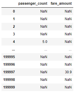
We can also pass both fare_amount and passenger_count through the function to get back a dataframe of all rows instead of just the outliers. If the value is not an outlier, it will display as NaN (not a number):
outliers = find_outliers_IQR(df[[“passenger_count”,”fare_amount”]])
outliers
Working with outliers using statistical methods
After identifying the outliers, we need to decide what to do with them. Unfortunately, there is no straightforward “best” solution for dealing with outliers because it depends on the severity of outliers and the goals of the analysis. For example, since we think the value 208 in the passenger_count was caused by human error, we should treat that outlier differently than the outliers for fare_amount. Here are three techniques we can use to handle outliers:
- Drop the outliers
- Cap the outliers
- Replace outliers using imputation as if they were missing values
I’ll go over those in detail now.
Drop the outliers
Using this method, we essentially drop all the outliers from the data, excluding them from the analysis and modeling. Although this technique is quick and easy, it isn’t always the right solution and can reduce the amount of data if there are a lot of outliers present. For example, using the IQR method to identify the outliers, we will lose 17,167 rows.
Copy and paste the find_outliers_IQR function so we can modify it to return a dataframe with the outliers removed. Rename it drop_outliers_IQR. Inside the function we create a dataframe named not_outliers that replaces the outlier values with a NULL. Then we can use .dropna(), to drop the rows with NULL values.
def drop_outliers_IQR(df):
q1=df.quantile(0.25)
q3=df.quantile(0.75)
IQR=q3-q1
not_outliers = df[~((df<(q1-1.5*IQR)) | (df>(q3+1.5*IQR)))]
outliers_dropped = outliers.dropna().reset_index()
return outliers_dropped
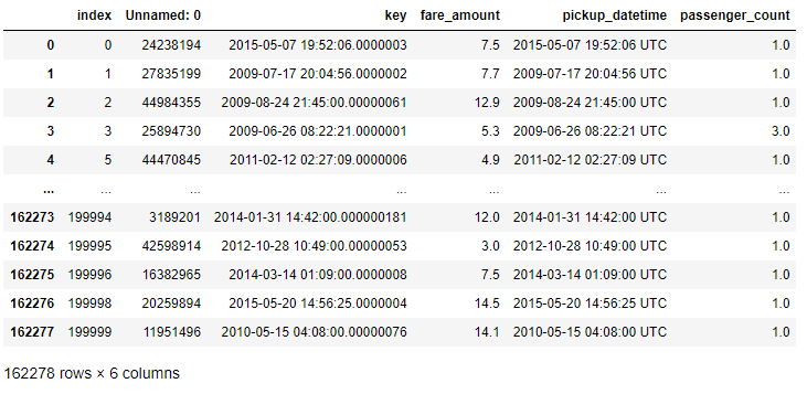
Notice the dataframe is only 162,278 rows once all the outliers have been dropped from fare_amount and passeger_count. After dropping the outliers, it is best to create new visualizations and reexamine the statistics.
Cap the outliers
In this technique, we essentially set a limit for the min and max outlier values. Anything above or below the cap gets set to the capped min or max respectively. For example, if we set the cap max for fare_amount at 20, any outlier above 20 will be set to 20. This technique is used when you can assume that all outliers express the same behaviors or patterns, meaning the model wouldn’t learn anything new by allowing the outliers to remain.
To cap the outliers, calculate a upper limit and lower limit. For the upper limit, we will use the mean plus three standard deviations. For the lower limit, we will calculate it as the mean minus 3 standard deviations. Keep in mind, the calculation you use can depend on the data’s distribution.
upper_limit = df[‘fare_amount’].mean() + 3*df[‘fare_amount’].std()
print(upper_limit)
lower_limit = df[‘fare_amount’].mean() – 3*df[‘fare_amount’].std()
print(lower_limit)
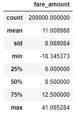
Based on our calculated limits, any outliers above 41.06 will be set to 41.06. Likewise, any outlier below -18.34 will be set to -18.34.
After calculating the upper and lower limit, we use the numpy .where() function to apply the limits to fare_amount.
df[‘fare_amount’] = np.where(df[‘fare_amount’] > upper_limit,
upper_limit,
np.where(
df[‘fare_amount’] < lower_limit,
lower_limit,
df[‘fare_amount’]
)
)
We can use .describe() to verify the min and max values have been capped as expected:
df.describe()[[‘fare_amount’]]
Replace outliers using imputation as if they were missing values
The third technique for handling outliers is similar to capping the values. Instead of using a capping calculation, use whatever imputation technique is being used on the missing values. For example, if the fare_amount column had missing values, we might find it appropriate to fill in the missing values using the mean. Since that is how we treat the missing values, we would do the same thing for the outliers.
Use a function to find the outliers using IQR and replace them with the mean value. Name it impute_outliers_IQR. In the function, we can get an upper limit and a lower limit using the .max() and .min() functions respectively. Then we can use numpy .where() to replace the values like we did in the previous example.
def impute_outliers_IQR(df):
q1=df.quantile(0.25)
q3=df.quantile(0.75)
IQR=q3-q1
upper = df[~(df>(q3+1.5*IQR))].max()
lower = df[~(df<(q1-1.5*IQR))].min()
df = np.where(df > upper,
df.mean(),
np.where(
df < lower,
df.mean(),
df
)
)
return df
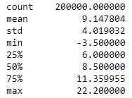
We can pass fare_amount through the impute_outliers_IQR function to transform the outliers into the mean value. We can use .describe() to verify the function works.
df[‘fare_amount’] = impute_outliers_IQR(df[‘fare_amount’])
df.describe()[‘fare_amount’]
Wrapping up
As we’ve seen, finding and handling outliers can be a complicated process. Luckily Python has libraries that make it easy to visualize and munge the data. We started by using box plots and scatter plots to analyze univariate and multivariate outliers. Then we used the interquartile range (IQR) calculation to find the data points in our skewed data. Lastly we tried three different feature engineering techniques to handle the outliers in the dataset.
Remember, sometimes leaving out the outliers in the data is acceptable and other times they can negatively impact analysis and modeling so they should be dealt with by feature engineering. It all depends on the goals of the analysis and the severity of the outliers.
You may also be interested in this online workshop we held on outliers with data scientist Dana Daskalova:
For a deeper taste of what data analytics involves, try our free, five-day data analytics short course. Want to learn more about a career in data? Take a look at the following:
