Data science is a fascinating field that aims to solve challenging problems like self-driving vehicles and artificial intelligence (AI). Back in 2021, long before today’s generative AI hype caused by ChatGPT, there was another AI story in the news.
Real estate company Zillow Group shut down its home buying program, that used predictive analytics to forecast the price of homes into the future. Although they could have spent more resources tuning their algorithm, they found the potential risks outweighed the benefits.
In practice, predicting the price of homes months into the future is certainly a challenge—even for the most sophisticated algorithms. However, at its core, predicting a home’s value is simply a regression problem, since a home’s price is a continuous variable based on many independent variables like rooms, location, year built, and so on. Even simple linear regression—one of the simplest algorithms—can be used to price homes.
In this tutorial, we will briefly introduce regression analysis and look at linear regression examples. If you’d like to learn more data skills, try this free data short course.
Use the clickable menu to skip ahead to any section:
- Regression analysis 101
- What is linear regression?
- Using Python to solve a bigger problem
- Assumptions of linear regression
- Building a linear regression model using scikit-learn
- Evaluating the linear regression model
- Linear regression modeling code review
- Conclusion and next steps
With that, let’s get started.
1. Regression analysis 101
In data science, regression analysis is primarily used in prediction and forecasting tasks.
Essentially, regression techniques fit a line to the data, which allows you to estimate changes to the dependent variable (for example, price) as changes occur to the independent variables (for example, size). Linear regression models assume the data have a linear relationship, and thus fit a straight line to it. Other regression models, like logistic regression, fit a curved line to the data.
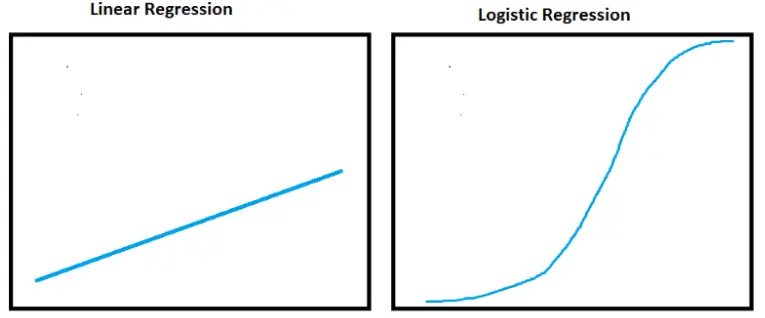
Regression analysis is a versatile set of techniques, because they are relatively easy to compute and explain compared to systems like neural networks and deep learning.
Beyond a method for making predictions, regression analysis can also be used for things like identifying significant predictors and understanding the strength of relationships within the data.
2. What is linear regression?
One of the most common forms of regression analysis is linear regression. It’s classified as a supervised learning algorithm. Simple linear regression is the term used when the linear regression model uses a single dependent variable and a single independent variable. When there are multiple variables, it is called multiple linear regression.
The linear regression algorithm draws the line of best fit through the data. It can do this by solving for the regression coefficient that minimizes the total error. To calculate the line of best fit we typically use Ordinary Least Squares (OLS).
Want an in-depth look at linear regression? Check out our beginner’s guide in this article!
We won’t dwell on the mathematics, but will do a quick explanation of the equation. It is important to know the basics of the linear regression calculation if you need to explain the predictions. The simple linear regression model equation is this:
prediction = intercept + slope * independent variable + error :

y is the predicted value of the dependent variable.
a is the intercept. Think of this as where the line would cross the x axis (x=0).
B is the slope of the line.
x independent variable.
e is the error or variation in the estimate of the regression coefficient.
All of this sounds complex, but can be done in a few clicks within a spreadsheet or a few lines of code within Python.
A Simple Example
An easy way to understand simple linear regression is to imagine we want to sell a house and have to determine a price. To determine price, first figure the finished square footage of the home is 1280.
Using that information, let’s look at sale prices of similarly-sized homes in the surrounding area. Say we find five houses that are roughly the same size, all recently sold for slightly different prices:
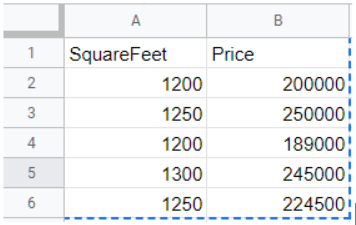
If we plot the prices by square footage, we’ll notice an upward trend showing price increases as square footage increases.
Using Microsoft Excel, enter the data into columns A and B respectively and create a chart by clicking Insert > Chart. Note: this can also be done in Google Sheets.
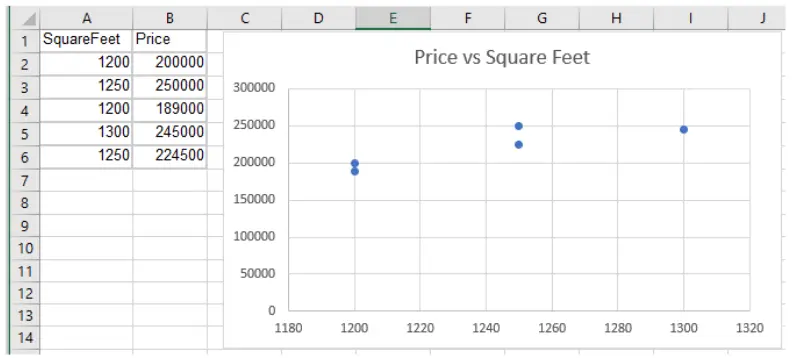
To predict the price of the home, fit a trendline to the data in the chart.
Click Chart Elements > Trendline. Mark the Trendline checkbox. Make sure the Linear option is selected within the Trendline options. A trendline will appear.
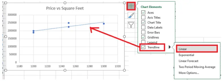
Using the trendline, we can predict the price of the 1280 square foot home should be around $245,000.
In Excel, open the Data Analysis tools and select Regression. A summary of statistics will appear in a new sheet by default. Notice the intercept and X Variable (slope) values. Plug those values into the above equation, along with the house’s square footage, to get a simple price prediction:
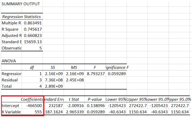
The negative intercept tells you where the linear model predicts house price (y) would be when square footage (x) is 0. Solve for y by using the Intercept and X Variable coefficient values:
y = -466500 + 555*1280
= -466500 + 710400
= 243900
So there you have it! We just priced a house using a simple linear regression algorithm and calculation. It is that simple.
3. Using Python to solve a bigger problem
Simple linear regression in Microsoft Excel is useful when you only have a couple variables to work with and a small dataset.
However, if you have hundreds of variables and millions of rows of data (like Zillow Group likely had) you will need a tool like Python to manipulate the data and build the multiple linear regression model, since there are two or more X variables.
Continuing with the house price example, let’s add a few more variables into the data. I am using a modified copy of the free Kaggle House Pricing data in this example.
You have two options to get the data:
- Download the raw data from Kaggle, unzip the files and clean the data yourself.
- Download the clean example version from my GitHub repo.
Reviewing the Data
I’ve reduced the data down to 11 columns of numeric data, from the original 81 columns in the dataset. Columns that store categorical data and strings have been removed since engineering those columns to work with the algorithm is beyond this tutorial.
Start by importing dependencies (sandas, Plotly Express, and scikit-learn) and data from the train.csv file.
import pandas as pd
import plotly.express as px
from sklearn.model_selection import train_test_split
from sklearn.linear_model import LinearRegressionfrom sklearn.metrics import mean_absolute_error
Read the CSV file into a DataFrame. Use .head() to display the first 5 rows and print the shape. Review the column names too.
#read training data csv file
train = pd.read_csv(r”C:\Users\bendgame\Desktop\house-prices\train.csv”)
print(train.shape)
train.head()

Notice there are 11 columns and 1431 rows in the train dataframe. Below is a description of the columns:
- SalePrice: The property’s sale price in dollars. This is Y, or the target variable that you’re trying to predict .
- LotArea: Lot size in square feet
- GrLivArea: Above grade (ground) living area square feet
- BsmtFullBath: Basement full bathrooms
- BsmtHalfBath: Basement half bathrooms
- FullBath: Full bathrooms above grade
- HalfBath: Half baths above grade
- BedroomAbvGr: Number of bedrooms above basement level
- KitchenAbvGr: Number of kitchens
- Fireplaces: Number of fireplaces
- GarageCars: Size of garage in car capacity
4. Assumptions of linear regression
Linear regression is most useful on data that meets certain assumptions.
I’ve already filled in missing values and removed some outliers, but understanding how to review the data to make sure it is a good fit for linear regression is important. Follow this checklist to make sure your data is a good fit for the approach:
- The dependent and independent variables should have a linear relationship.
- The independent variables are not all highly correlated. Check multicollinearity using a correlation matrix.
- The outliers are handled appropriately since they can have a heavy impact on results. Check for outliers using a scatter plot or other charts.
- The data follows a multivariate normal distribution. Check for normality using a goodness of fit test.
Although I’ve performed some pre-processing on the data, let’s review some techniques for checking and visualizing the data. In general, reviewing data before modeling is called exploratory data analysis.
Use pandas .describe() to display statistics about the columns. Looking at the statistics can help identify things, like outliers and standard deviation.
train.describe()
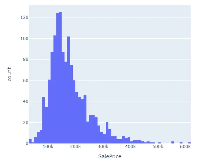
Use Plotly Express histogram to review the distribution of SalePrice. We want it to follow a normal distribution and can use different scaling techniques to transform it if needed. For example, consider using a log transformation on SalePrice since it is a bit skewed.
px.histogram(train, x=’SalePrice’)
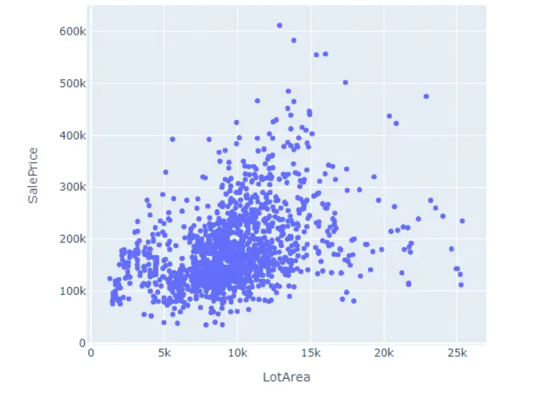
Use a scatter plot to look for outliers and check the relationship between variables. Check variables SalePrice and LotArea for example. Remember, linear regression is sensitive to outliers.
px.scatter(train, x=’LotArea’, y=’SalePrice’)
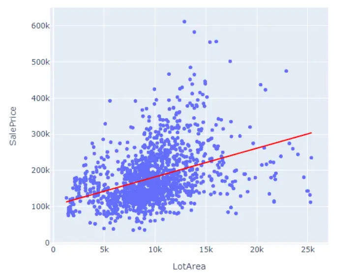
If the statsmodels python library is installed, one of the fantastic features of Plotly Express is we can perform simple linear regression in one line of code:
#install statsmodels lib if needed
#!pip install statsmodels
#perform simple linear regression
px.scatter(train, x=’LotArea’, y=’SalePrice’, trendline = ‘ols’, trendline_color_override=”red”)
Use the scatter_matrix to view multiple scatter plots at the same time. Depending on the number of columns in the dataframe, consider specifying the ones passed into scatter_matrix to make it easier to see.
px.scatter_matrix(train[[‘SalePrice’, ‘LotArea’,GrLivArea’]])
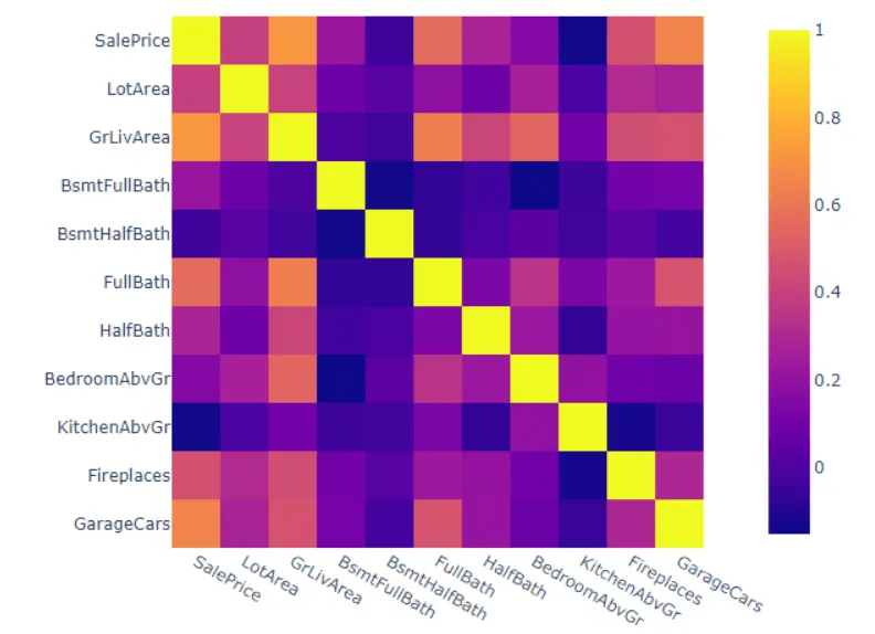
Lastly, check the correlations using the .corr() function. This can help us check for multicollinearity. It is common to use a heatmap to visualize correlations.
print(train.corr())
px.imshow(train.corr())
5. Building a linear regression model using scikit-learn
Creating a linear regression model and generating predictions is only three lines of code, thanks to scikit-learn.
However, we must first separate the target variable (SalePrice) from the data. Then we must split the dataframe into a training set and a testing set. Splitting the data into a training and testing set is a best practice in terms of model validation.
Use scikit-learn’s train_test_split() function to split the data.
#create target variable
y = train[‘SalePrice’]
#create array of features
x = train.drop(columns = ‘SalePrice’)
#split the data into train and test sets
xtrain, xtest, ytrain, ytest = train_test_split(x, y, test_size=.55, random_state=42)
Next, instantiate a linear regression model and fit the data.
model = LinearRegression()
model.fit(xtrain, ytrain)
Now that the model has been trained, it can be used to predict prices. In practice, before pushing a model to production to be used for real predictions, it goes through rigorous evaluation. We can generate the predictions on the xtest dataset and compare them to the ytest values to see how close the predictions are to the real prices.
#Predicting the prices
pred = model.predict(xtest)
#look at the top 5 predictions vs top 5 real
print(pred[:5])
ytest[:5]

We can see the predictions are close, but far from exact. As data scientists, we want to understand how much error exists in the model, so that we can compare multiple models and select the best one. To better understand the error, we must use a model evaluation technique.
6. Evaluating the linear regression model
We won’t know how accurate our model is unless we use a method for evaluating the line of best fit.
One popular way of evaluating a model is using a technique called Mean Absolute Error (MAE). It is easy to understand because it is the average absolute value between the predicted point and the actual point.
#appy mean absolute error
mean_absolute_error(y_true=ytest, y_pred=model.predict(xtest))

We can see the MAE is over 26,000 in the test set. A smaller value is better since we want accurate predictions.
Other popular evaluation metrics include Mean Squared Error (MSE), Mean Absolute Percentage Error (MAPE), and R-squared. It is common to see multiple evaluation techniques used when evaluating a model because they all measure slightly different things.
7. Linear regression modeling code review
Congratulations! You’ve just built a multiple linear regression model in Python, used it to predict house prices, and evaluated the model’s accuracy. All in just a few lines of code:
#create target variable
y = train[‘SalePrice’]
#create array of features
x = train.drop(columns = ‘SalePrice’)
#split the data into train and test sets
xtrain, xtest, ytrain, ytest = train_test_split(x, y, test_size=.55, random_state=42)
#build the model
model = LinearRegression()
#fit the model
model.fit(xtrain, ytrain)
#Predicting the prices
pred = model.predict(xtest)
#look at the top 5 predictions vs top 5 real
print(pred[:5])
print(ytest[:5])
#appy mean absolute error
mean_absolute_error(y_true=ytest, y_pred=model.predict(xtest))
8. Conclusion and next steps
Linear regression is a useful tool in the data analysis toolbox, and is capable of achieving great results in many use cases.
Beyond pricing homes, regression analysis is used in all kinds of tasks, like identifying stock trends, understanding consumer behavior, and analyzing medical research.
We just went through two linear regression examples to explain how it works, how to calculate a prediction, and how to visualize the line of best fit. In only a few clicks in Excel or a few lines of code in Python, you can apply linear regression to your data.
If you’re interested in learning more about linear regression, you may be interested in checking out our free, 5-day data analytics short course.
You could also check out other articles in our series on data analytics:
