Tableau offers data visualization software and enterprise tools for analysts to easily create and share interactive visualizations, dashboards, and workbooks through its hosted platform. It was acquired by Salesforce in 2019 and is one of the most popular business intelligence tools used by analysts, alongside Power BI and Looker.
To learn more about the tool in-depth, check out our previous article on Tableau, and how it is used by data analysts.
In this post, we’ll be looking at how analysts of all skill levels can best leverage Tableau in their workflow, giving step-by-step guides to creating Tableau visualizations and dashboards, and showing how to publish visualizations to Tableau Server.
- How do data analysts use Tableau?
- Creating Tableau visualizations (a step-by-step guide)
- Publishing Tableau visualizations
- Summary and next steps
1. How do data analysts use Tableau?
Tableau’s drag-and-drop interface makes it easy for beginners to create intermediate and advanced visualizations that provide needed context for business decisions. As no coding ability is required, data analysts from varying technical backgrounds can create intricate and advanced dashboards simply by using Tableau’s built-in charts and algorithms.
A typical workflow consists of uploading data sources through Tableau’s data connectors, cleaning the data, performing exploratory data analysis through basic chart creation, modeling, and publishing analytical outputs.
As we’ll see below, Tableau makes it easy for you to share your analytical projects through their dashboarding tool, where you can point-and-click your way to integrating different visualizations into a cohesive dashboard for publication.
2. Creating Tableau visualizations (a step-by-step guide)
1. Importing datasets
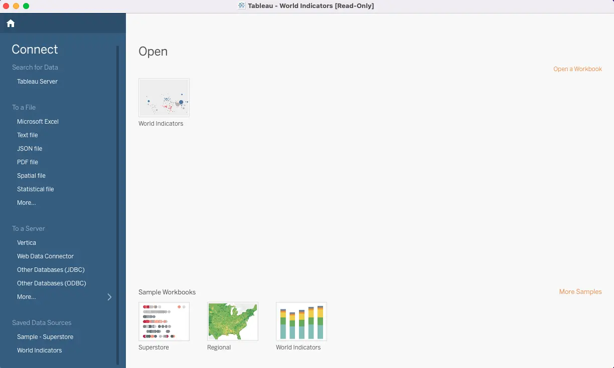
First, start by importing data directly into Tableau Desktop through a wide range of supported data connectors, including spreadsheets (such as Excel), text files (such as JSON), and cloud databases on enterprise servers (AWS, Azure, Google Cloud). When Tableau is launched, the full list of connectors and file types can be found on the left Connect pane.

For Tableau Server and Tableau Online, the process works similarly, except that you will have to create a new workbook first before the Connect to Data option appears. The availability of certain data connectors may vary depending on your license.
For a data file or type not listed, Tableau does provide some support to create custom connections. Tableau also encourages users to make use of the Tableau Community’s Ideas forum to suggest new connectors and vote for useful ones. If you have an idea that receives broad support, it may be added to the official product roadmap!
2. Creating a bar graph
Bar charts are one of the best visualizations to display categorical variables. In Tableau, this is done by dragging and dropping the variables onto the input fields. For a bar chart, you can drag the categorical variable from the Measures section into Columns and the target measure of frequency into Rows. This will automatically generate a bar chart with labeled axes.
If Columns has time series data, Tableau may not automatically create a bar chart due to the date variable. Under Marks on the left of the chart, select Bar from the drop-down options to change it.
If you’re looking to impress your audience with a more advanced bar chart that displays the decomposition of different subcategories under the aggregated frequency, drag the subcategory variable to Color under Marks on the left hand side. This provides a breakdown of any underlying trends or patterns that are masked under aggregated frequencies.
3. Creating a line graph
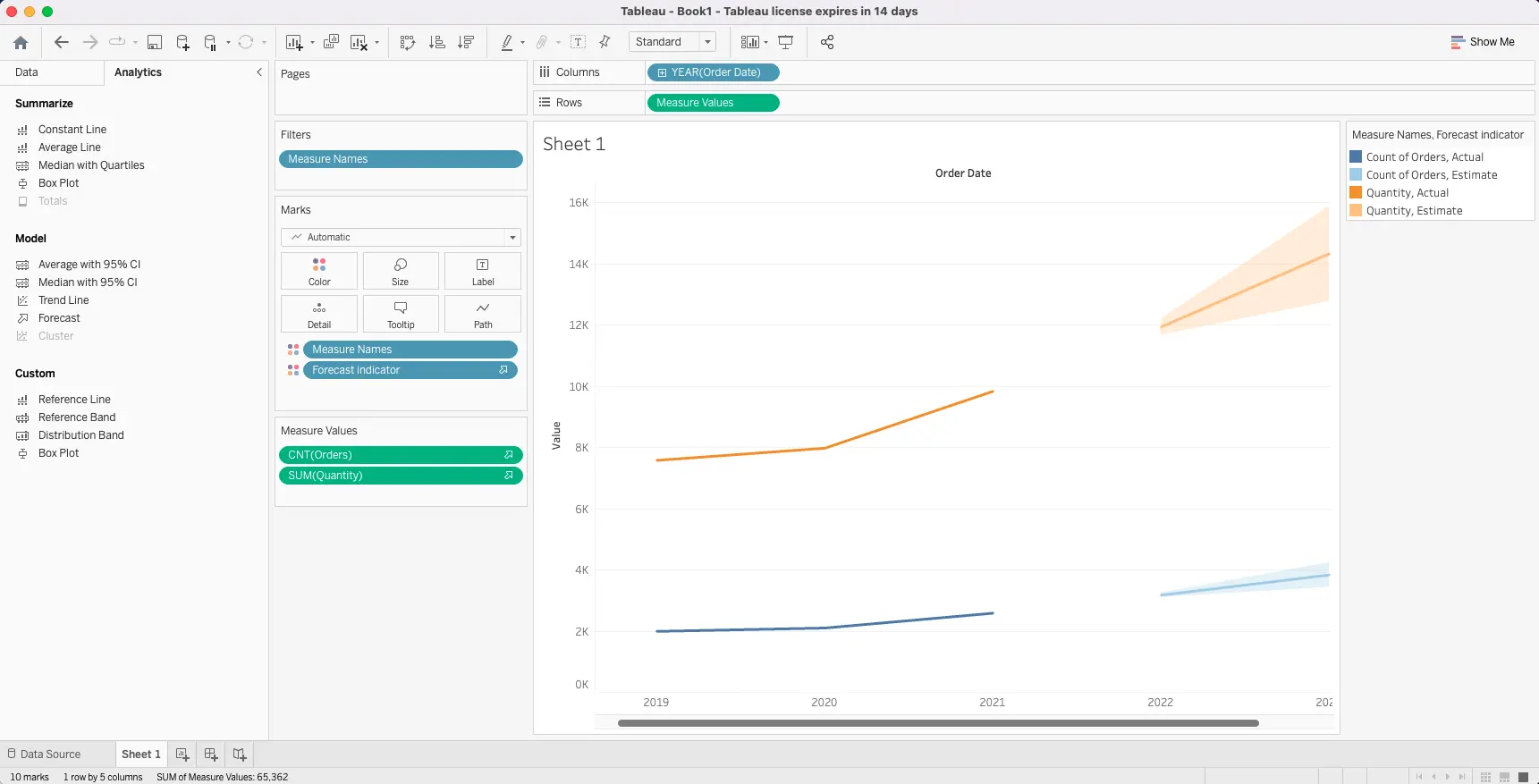
Line charts are often used to visualize time series data as they are better than tables or bar charts at representing progression over time. In Tableau, drag the y-variable (Year) from the Data section into Column and the x-variable (Quantity) into Rows. This automatically creates a line chart.
What about if you wanted to compare different x-variables over time? Try dragging the second x-variable (Orders) into Rows. Two line charts will be created stacked on top of each other. To standardize the axes for accurate analysis, right-click the second axis and select Synchronize Axis, or blend the two charts into one by dragging the second x-variable onto the y-axis and release the mouse.
Take things a bit further by adding a forecast through Tableau’s built-in forecasting model. In the top-level panel, click on Analytics, and drag the Forecast option (under the Model category) over to the created line graph where a popup Add a Forecast will appear to drop it there.

4. Creating a scatter plot
A scatter plot displays the relationship between numerical variables. This can be created in Tableau by dragging at least one variable into Columns and one variable into Rows.
In this example, select the two variables from the Measures section and drag it into Columns and Rows. If the scatter plot was not automatically generated, select it from the Show Me option panel on the right.
Now, drag the subcategory variable to Color under Marks on the left hand side. This breaks down the data into its different subcategories using colors.
If you want to take a look at overall trends, head over to the Analytics pane to drag the Trend Line option (under the Model category) over to the scatter plot where a popup “Add a Trend Line” will appear to drop it there. Tableau will helpfully create trend lines per the number of subcategories. If you hover your cursor over the trend lines, you will find a handy regression equation generated for each one along with the R-squared value and p-value.
5. Creating a dashboard
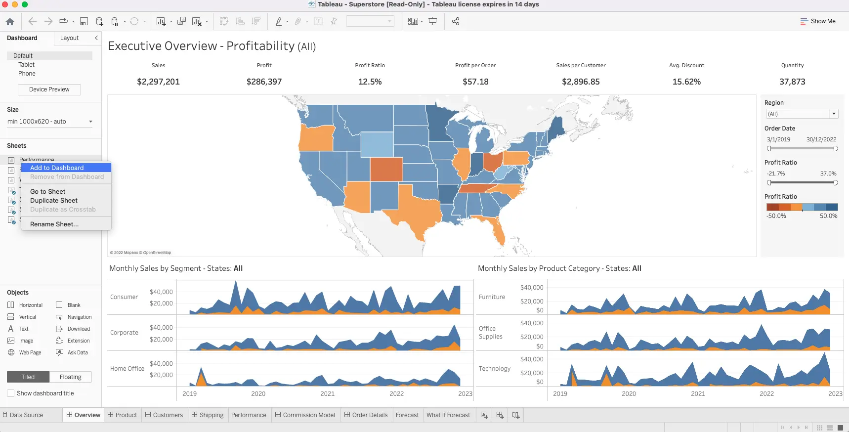
Now that you have sets of different charts, it’s time to create a dashboard. Building a dashboard follows the same process as starting a new worksheet. In the top level menu, click on Dashboard and then select New Dashboard from the drop down. With a dashboard view, the options panel on the left looks different, with options on Size, Sheets, and Objects.
First, set the Size of the dashboard by either selecting preconfigured sizes, or by entering custom dimensions.
Next, drag different charts from the list of Sheets on the left onto the empty dashboard view, and resize visualizations by dragging the bottom right hand corners. To add visualizations from different sheets, simply drag them from the list of Sheets as previously done.
These different visualizations can be interlinked with a filter so that an applied selection on one chart will be applied to the others as well. This can help data analysts look more closely at subcategories for targeted analysis. You can hover over the upper right corner of any visual to select the Use as Filter option and click it to use chosen marks as a filter.
Tableau recommends using Objects to make dashboards more user-friendly and appealing. These include text boxes for contextual information or headers to indicate logical flow, images, buttons to trigger user-actions tied to analytical decisions (such as a URL to the company’s homepage), web pages, blank objects (for adding padding between charts), extensions (for integration with third party tools).

3. Publishing Tableau visualizations
Before publishing your final dashboard, try viewing it in Presentation Mode to get a better idea of how the dashboard is in its finished state and test any interactive elements created.
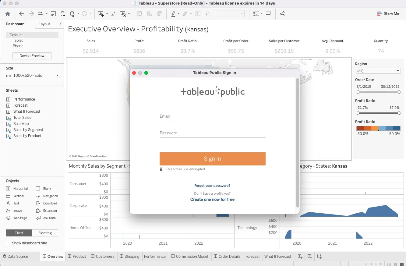
In the top-level menu, click the Server button and then Save to Tableau Public. This will request your credentials or prompt you to create a profile. Next, click Create Data Extract and Save to Tableau Public again, this will lead you to view the dashboard for final review. Finally, click Publish and Share to push the dashboard to Tableau Server. The dashboard can be shared as a link or exported in other formats (for example PDF, PPT, or CSV) for offline use.

4. Summary and next steps
So there you have it! We’ve taken a look at how to create three types of key Tableau visualizations (bar graph, line graph, scatter plot), and how to build them in worksheets before integrating multiple sheets into an interactive and cross-filtered dashboard. Publishing visualizations and dashboards to Tableau Server enables easy collaboration within teams.
CareerFoundry’s Data Visualizations with Python course is designed to ease you into this vital area of data analytics. You can take it as a standalone course as well as a specialization within our full Data Analytics Program, you’ll learn and apply the principles of data viz in a real-world project, as well as getting to grips with various data visualization libraries.
If you’re interested in where visualizations and the world of data analytics can take you, why not try our free, 5-day course? You may also be interested in the following articles:
