They say a picture is worth a thousand words, and this is especially true for data analytics.
Data visualization is all about presenting data in a visual format, using charts, graphs, and maps to tell a meaningful story. It’s a crucial step in the data analysis process—and a technique (or art form!) that all areas of business can benefit from.
In this guide, we’ll tell you everything you need to know about data visualization (also known as data viz). We’ll explain what it is, why it matters, some of the most common types, as well as the tools you can use to create them.
This guide is ideal for anyone who wants to present, communicate, and share data-driven insights.
If you’d like to learn more data analytics skills, try this free data short course.
- What is data visualization?
- Why is data visualization important?
- When should you visualize your data?
- Different types of data visualization and when to use them
- Top data visualization tools
- Best practices and principles for effective data visualization
- Getting started with data visualization
So: What is data visualization? Let’s start with a definition.
1. What is data visualization? A definition
Data visualization is the graphical or visual representation of data. It helps to highlight the most useful insights from a dataset, making it easier to spot trends, patterns, outliers, and correlations.
Imagine you’re presented with a spreadsheet containing rows and rows of data. You probably won’t be able to decipher the data without delving into it, and it’s unlikely that you’ll be able to spot trends and patterns at first glance.
Now imagine seeing the same data presented as a bar chart, or on a color-coded map. It’s much easier to see what the data is telling you, right?
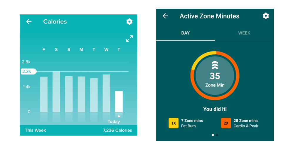
That’s the whole point of data visualization. It makes insights visible to the naked eye, so that virtually anyone can see and understand what’s going on. When done well, data visualization tells a story.
This storytelling aspect is crucial as it makes your data actionable. There’s a huge difference between simply having lots of data versus actually understanding how to use it to drive actions and decisions—and data visualization bridges that gap.
There are two broad categories of data visualization: exploration and explanation. Let’s take a look at those now.
What are the two main types of data visualization? Exploration vs. explanation
We’ll look at specific types of data visualization later on, but for now, it’s important to distinguish between exploratory and explanatory data visualization.
In a nutshell, exploratory data visualization helps you figure out what’s in your data, while explanatory visualization helps you to communicate what you’ve found. Exploration takes place while you’re still analyzing the data, while explanation comes towards the end of the process when you’re ready to share your findings.
Exploration
When faced with a new dataset, one of the first things you’ll do is carry out an exploratory data analysis. This is where you investigate the dataset and identify some of its main features, laying the foundation for more thorough analysis.
At this stage, visualizations can make it easier to get a sense of what’s in your dataset and to spot any noteworthy trends or anomalies. Ultimately, you’re getting an initial lay of the land and finding clues as to what the data might be trying to tell you.
Explanation
Once you’ve conducted your analysis and have figured out what the data is telling you, you’ll want to share these insights with others.
These could be key business stakeholders who can take action based on the data, for example, or public audiences who have an interest in your topic area.
Explanatory data visualizations help you tell this story, and it’s up to you to determine which visualizations will help you to do so most effectively. We’ll introduce some of the most common types of data visualization (and when to use them) in section four.
Want to learn more about data visualization, and try your hand at creating visualizations of your own? Give this free introductory tutorial a go. We’ll show you, step by step, how to create bar charts, line graphs, and more for a real dataset in Google Sheets.
2. Why is data visualization important?
The importance of effective data visualization is rooted in the importance of data analytics in general.
We’re living in an increasingly data-rich world; at the start of 2020, the digital universe comprised approximately 44 zettabytes of data. For perspective, one zettabyte is roughly equal to a trillion gigabytes. By 2025, it’s estimated that around 463 exabytes of data will be created every 24 hours across the globe. An exabyte is equivalent to one billion gigabytes. Basically, we’re producing tons and tons of data all the time.
Data analytics allows us to make sense of (at least some of) that data. From a business perspective, it enables companies to learn from the past and plan ahead for the future. In fields like healthcare, it can help to improve patient care and treatment. In finance and insurance, it can help to assess risk and combat fraudulent activity. Essentially, we need data analytics in order to make smart decisions—and data visualization is a crucial part of that.
Data visualization helps us to understand what certain data is telling us, presenting it in a way that’s accessible to a range of audiences—not just data experts. It’s how you bridge the gap between your expertise as a data analyst or data scientist, and those people who can use or act upon the insights you discover.
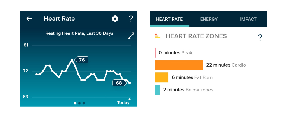
A line graph and a bar chart taken from the Fitbit app.
The advantages and benefits of effective data visualization at a glance
Data visualization allows you to:
- Get an initial understanding of your data by making trends, patterns, and outliers easily visible to the naked eye
- Comprehend large volumes of data quickly and efficiently
- Communicate insights and findings to non-data experts, making your data accessible and actionable
- Tell a meaningful and impactful story, highlighting only the most relevant information for a given context
Now we know what data visualization is and why it matters, let’s take a look at when and why you might need to visualize your data.
3. When should you visualize your data?
Aside from exploratory data visualization which takes place in the early stages, data visualization usually comprises the final step in the data analysis process. To recap, the data analysis process can be set out as follows:
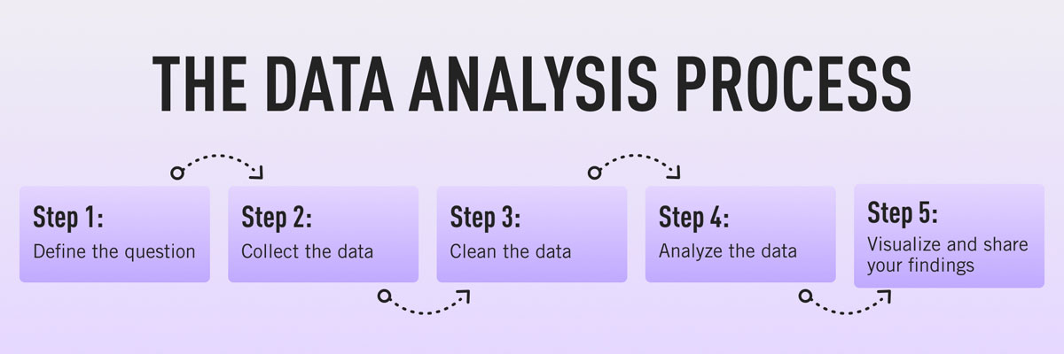
- Define the question: What problem are you trying to solve?
- Collect the data: Determine what kind of data you need and where you’ll find it.
- Clean the data: Remove errors, duplicates, outliers, and unwanted data points—anything that might skew how your data is interpreted. You can learn more about data cleaning (and how to do it) in this guide.
- Analyze the data: Determine the type of data analysis you need to carry out in order to find the insights you’re looking for.
- Visualize the data and share your findings: Translate your key insights into visual format (e.g. graphs, charts, or heatmaps) and present them to the relevant audience(s).
Essentially, you visualize your data any time you want to summarize and highlight key findings and share them with others. With that in mind, let’s consider what kinds of insights you can convey with data visualizations.
What is data visualization used for?
Within the broader goal of conveying key insights, different visualizations can be used to tell different stories. Data visualizations can be used to:
- Convey changes over time: For example, a line graph could be used to present how the value of Bitcoin changed over a certain time period.
- Determine the frequency of events: You could use a histogram to visualize the frequency distribution of a single event over a certain time period (e.g. number of internet users per year from 2007 to 2021). Learn how to create a histogram in this guide.
- Highlight interesting relationships or correlations between variables: If you wanted to highlight the relationship between two variables (e.g. marketing spend and revenue, or hours of weekly exercise vs. cardiovascular fitness), you could use a scatter plot to see, at a glance, if one increases as the other decreases (or vice versa).
- Examine a network: If you want to understand what’s going on within a certain network (for example, your entire customer base), network visualizations can help you to identify (and depict) meaningful connections and clusters within your network of interest.
- Analyze value and risk: If you want to weigh up value versus risk in order to figure out which opportunities or strategies are worth pursuing, data visualizations—such as a color-coded system—could help you to categorize and identify, at a glance, which items are feasible.
So far, we’ve taken a rather broad, high-level look at data visualization. Now let’s drill down to some specific types of data visualization and when to use them.
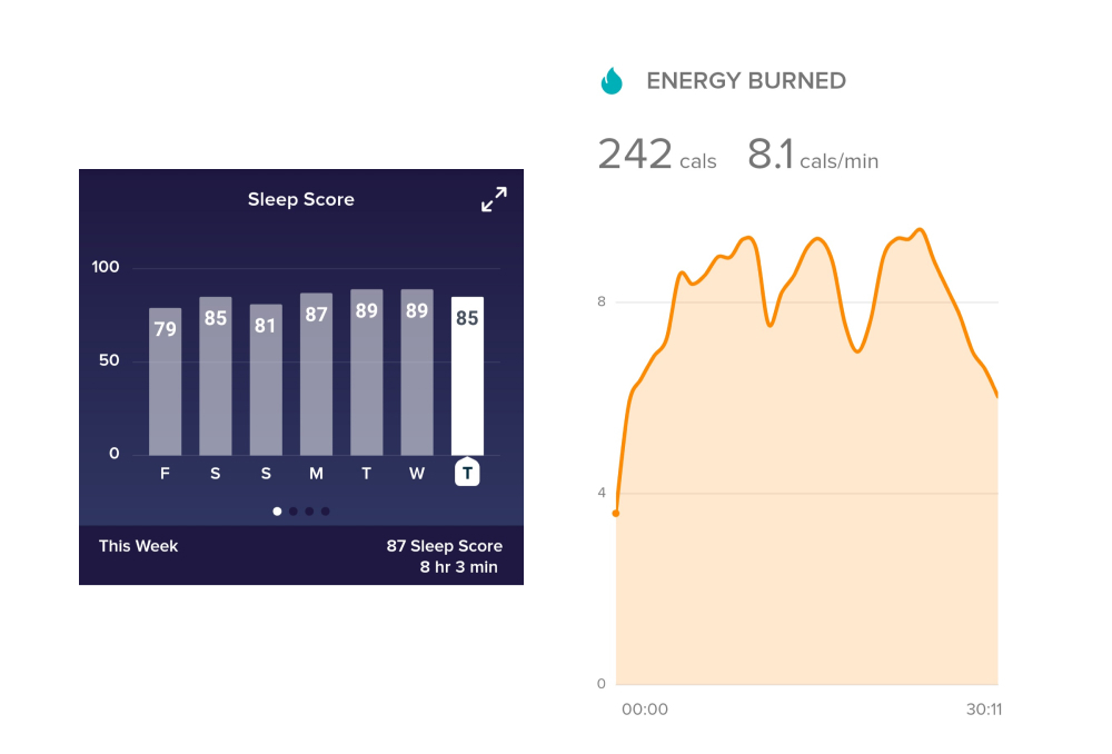
An example of data visualization, as seen in the Fitbit app.
4. How to visualize your data: Different types of data visualization (and when to use them)
There are many different options when it comes to visualizing your data. The visualization you choose depends on the type of data you’re working with and what you want to convey or highlight. It’s also important to consider the complexity of your data and how many different variables are involved. Not all types of data visualization lend themselves to elaborate or complex depictions, so it’s important to choose a suitable technique.
Before we explore some of the most common types of data visualization, let’s first introduce five main data visualization categories.
Five data visualization categories
When considering the different types of data viz, it helps to be aware of the different categories that these visualizations may fall into:
- Temporal data visualizations are linear and one-dimensional. Examples include scatterplots, timelines, and line graphs.
- Hierarchical visualizations organize groups within larger groups, and are often used to display clusters of information. Examples include tree diagrams, ring charts, and sunburst diagrams.
- Network visualizations show the relationships and connections between multiple datasets. Examples include matrix charts, word clouds, and node-link diagrams.
- Multidimensional or 3D visualizations are used to depict two or more variables. Examples include pie charts, Venn diagrams, stacked bar graphs, and histograms.
- Geospatial visualizations convey various data points in relation to physical, real-world locations (for example, voting patterns across a certain country). Examples include heat maps, cartograms, and density maps.
With those categories in mind, let’s explore some of the most common types of data visualization.
Five common types of data visualization (and when to use them)
In this section, we’ll introduce some useful types of data visualization. We’ll also point you to our more comprehensive guide where you can learn about additional data visualization methods and how to use them.
1. Scatterplots
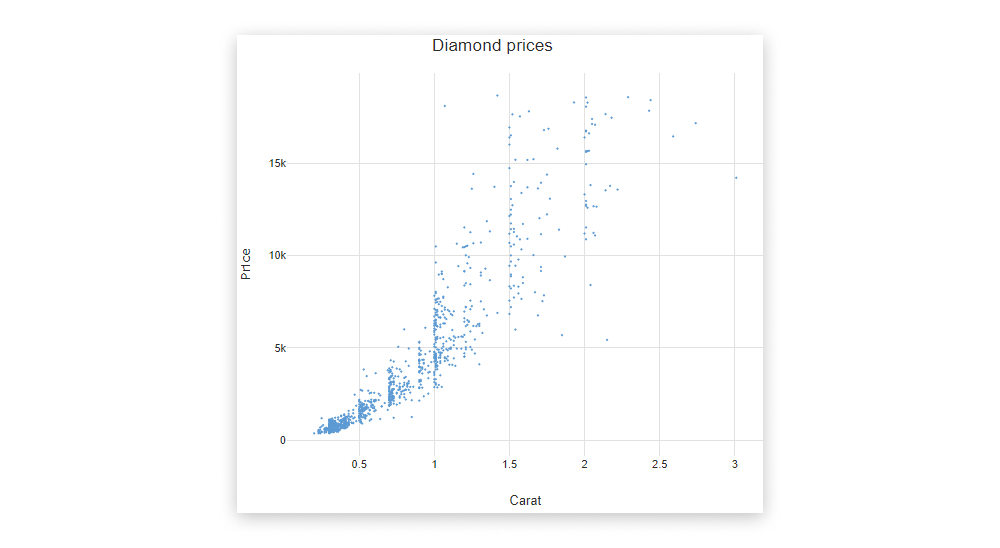
Scatterplots (or scatter graphs) visualize the relationship between two variables. One variable is shown on the x-axis, and the other on the y-axis, with each data point depicted as a single “dot” or item on the graph. This creates a “scatter” effect, hence the name.
Source: displayr.com
Scatterplots are best used for large datasets when there’s no temporal element. For example, if you wanted to visualize the relationship between a person’s height and weight, or between how many carats a diamond measures and its monetary value, you could easily visualize this using a scatterplot.
It’s important to bear in mind that scatterplots simply describe the correlation between two variables; they don’t infer any kind of cause-and-effect relationship.
2. Bar charts
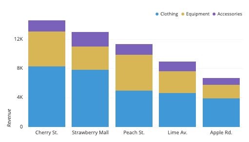
Bar charts are used to plot categorical data against discrete values.
Categorical data refers to data that is not numeric, and it’s often used to describe certain traits or characteristics. Some examples of categorical data include things like education level (e.g. high school, undergrad, or post-grad) and age group (e.g. under 30, under 40, under 50, or 50 and over).
Discrete values are those which can only take on certain values—there are no “half measures” or “gray areas.” For example, the number of people attending an event would be a discrete variable, as would the number of sales made in a certain time period (think about it: you can’t make “half a sale” or have “half an event attendee.”)
Source: chartio.com
So, with a bar chart, you have your categorical data on the x-axis plotted against your discrete values on the y-axis.
The height of the bars is directly proportional to the values they represent, making it easy to compare your data at a glance.
3. Pie charts
Just like bar charts, pie charts are used to visualize categorical data.
However, while bar charts represent multiple categories of data, pie charts are used to visualize just one single variable broken down into percentages or proportions. A pie chart is essentially a circle divided into different “slices,” with each slice representing the percentage it contributes to the whole.
Thus, the size of each pie slice is proportional to how much it contributes to the whole “pie.”
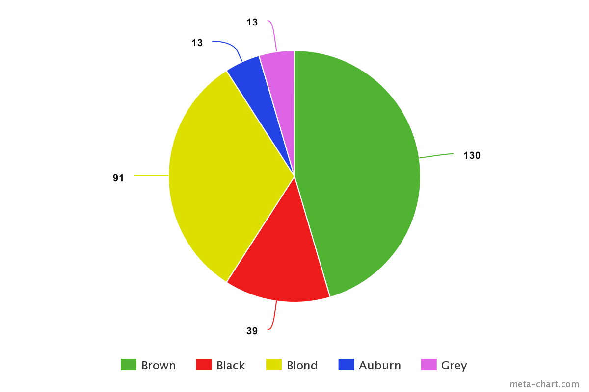
Imagine you have a class of thirty students and you want to divide them up based on what color t-shirt they’re wearing on a given day.
The possible “slices” are red, green, blue, and yellow, with each color representing 40%, 30%, 25%, and 5% of the class total respectively. You could easily visualize this using a pie chart—and the yellow slice (5%) would be considerably thinner than the red slice (40%)! Pie charts are best suited for data that can be split into a maximum of five or six categories.
4. Network graphs
Not all data is simple enough to be summarized in a bar or pie chart. For those more complex datasets, there are a range of more elaborate data visualizations at your disposal—network graphs being one of them.
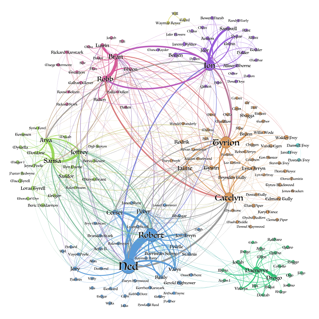
Network graphs show how different elements or entities within a network relate to one another, with each element represented by an individual node. These nodes are connected to other, related nodes via lines.
Source: networkofthrones.wordpress.com
Network graphs are great for spotting and representing clusters within a large network of data.
Let’s imagine you have a huge database filled with customers, and you want to segment them into meaningful clusters for marketing purposes. You could use a network graph to draw connections and parallels between all your customers or customer groups.
With any luck, certain clusters and patterns would emerge, giving you a logical means by which to group your audience.
5. Geographical maps
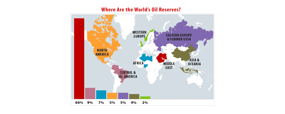
Geo maps are used to visualize the distribution of data in relation to a physical, geographical area.
For example, you could use a color-coded map to see how natural oil reserves are distributed across the world, or to visualize how different states voted in a political election. Maps are an extremely versatile form of data visualization, and are an excellent way of communicating all kinds of location-related data.
Some other types of maps used in data visualization include dot distribution maps (think scatterplots combined with a map), and cartograms which distort the size of geographical areas to proportionally represent a given variable (population density, for example).
Source: pmfias.com
Here, we’ve introduced just a handful of data visualization types. If you want to learn more, check out our complete guide to different types of data visualization and when to use them.
5. Top data visualization tools
When it comes to creating informative, eye-catching visualizations, there are plenty of tools at your disposal.
When choosing a tool, it’s important to consider your needs in terms of the kinds of visualizations you want to create, as well as your own technical expertise; some tools will require coding knowledge, while others are more suited to non-technical users.
In this section, we’ll briefly introduce some of the most popular data visualization tools. If you’re on the market for a data viz tool and want a more thorough comparison, this guide to the seven best data visualization tools will help you. For now, here are our top three data viz tools to get familiar with:
- Plotly: Open-source software built on Python. Plotly is ideal if you’ve got some coding knowledge and want to create highly customizable visualizations.
- D3.js: A free, open-source data viz library built using JavaScript. As with Plotly, you’ll need some programming knowledge in order to use this data viz tool.
- Tableau: Perhaps one of the most popular data analytics tools, Tableau is known for its user-friendliness—you don’t need any coding knowledge to create beautiful visualizations in Tableau. And, unlike some other BI tools, it’s good at handling large volumes of data.
Before deciding on a tool, it’s worth trying out a few options. The good news is that there are plenty of data viz tools on the market—as well as a number of free tools—allowing you to create beautiful and informative visualizations—even if you’re a newcomer to the field.
What are data dashboards?
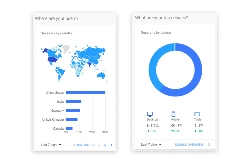
Dashboards are another useful tool for data tracking and visualization. A data dashboard essentially allows you to keep track of multiple data sources, visualizing them in one single location for easy viewing.
A common example is the Google Analytics dashboard, which displays a whole host of visualizations on one page—a geo map showing where your website visitors are located, for example, or a pie chart showing what percentage of your users access your website using specific devices.
If you want multiple stakeholders to be able to access and view certain data insights, a dashboard can help you to create a single hub with easy-to-understand visualizations.
A snapshot of a data dashboard, taken from Google Analytics.
6. What are some data visualization best practices?
Data visualization truly is an art form—but the goal is always, first and foremost, to provide valuable information and insights.
If you can do this by way of beautiful visualizations, you’re onto a winner. So, when creating data visualizations, it’s important to adhere to certain best practices.
These will help you strike the right balance, keeping your audience engaged and informed. Here’s how to excel at data visualization.
1. Define a clear purpose
Like any data analytics project, it’s important to define a clear purpose for your data visualizations.
What are the priorities in terms of what you want to convey and communicate? What should your audience take away from your visualization? It’s essential to have this defined from the outset; that way, you can ensure that you’re only presenting the most valuable information—and giving your audience something they can use and act upon.
2. Know your audience
The purpose of data visualization is to communicate insights to a specific audience, so you’ll want to give some thought to who your audience is and how familiar they are with the information you’re presenting.
What kind of context can you provide around your visualizations in order to help your audience understand them? What types of visualization are likely to be most accessible to this particular group of people? Keep your audience in mind at all times.
3. Keep it simple
When creating visualizations, it’s often the case that less is more.
Ultimately, you want your visualizations to be as digestible as possible, and that means trimming away any unnecessary information while presenting key insights clearly and succinctly. The goal is to keep cognitive load to a minimum—that is, the amount of “brainpower” or mental effort it takes to process information.
Even if the data is complex, your visualizations don’t have to be, so strive for simplicity at all times.
4. Avoid distorting the data
You should strive to present your findings as accurately as possible, so avoid any kind of visual “tricks” that could bias how your data is perceived and interpreted.
Think about the labels you use, as well as how you scale your visualizations. For example, things like “blowing up” certain data segments to make them appear more significant, or starting your graph axis on a number other than zero are both bad practices which could mislead your audience. Prioritize integrity and accuracy!
5. Ensure your visualizations are inclusive
Last but by no means least, make sure that your visualizations are accessible and inclusive.
Think about how colors, contrasts, font sizes, and the use of white space affect the readability of your visualization. Is it easy for your users to distinguish between the data and see what’s going on, regardless of whether they have twenty-twenty vision or a visual impairment?
Inclusivity and accessibility are central to good data visualization, so don’t overlook this step.
7. Getting started with data visualization
By now, you hopefully have a good understanding of what data visualization is and why it matters.
Of course, the best way to get to grips with it is to see it in action. Check out our round-up of some of the most beautiful and informative data visualization examples from around the web.
Keen to give it a go yourself? Why not download a free dataset and see what you can do! If you’d like to learn it more, then check out this list of data visualization courses out there to try.
Data visualization is an excellent skill to have, whether you’re forging a career in the data industry or just want to share valuable insights with your colleagues. If you are pursuing a career as a data analyst or data scientist, be sure to include data visualizations in your data portfolio—it’s something that employers will be looking out for.
CareerFoundry’s Data Visualizations with Python course is designed to ease you into this vital area of data analytics. You can take it as a standalone course as well as a specialization within our full Data Analytics Program, you’ll learn and apply the principles of data viz in a real-world project, as well as getting to grips with various data visualization libraries.
Want to learn more? Try your hand at this free, introductory data analytics short course, and check out the following guides:
