What is interval data and how is it used? What’s the best way to collect and analyze it? Find out in this guide.
These days, many jobs require at least a basic understanding of data analytics. You don’t have to be a specialist to require some fundamental know-how. Whether you work in marketing, sales, or the sciences, data plays an increasingly important role in the modern workplace. One of the first things you’ll need to learn is the four main types of data: nominal, ordinal, interval, and ratio data. In this post, we’ll focus on the third of these: interval data.
To make sure you’re up to speed, we’ll start by summarizing the four different data types and how they relate to one another. We’ll then dive in with interval data to learn a bit more about it. We’ll cover:
- An introduction to the four different types of data
- What is interval data? A definition
- What are some examples of interval data?
- How is interval data collected and what is it used for?
- How to analyze interval data
- Summary and further reading
Ready to learn all about interval data? Let’s go!
1. An introduction to the four different types of data
To analyze any dataset, you first need to know what kind of data you’re working with.
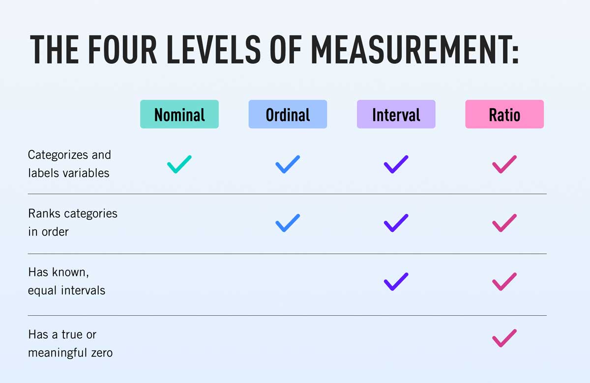
Broadly, data falls into one or more of four categories: nominal, ordinal, interval, and ratio. These scales, or levels of measurement, tell us how precisely a variable has been measured. The four data types are not mutually exclusive but rather belong to a hierarchy, where each level of measurement builds on the previous one.

The simplest levels of measurement are nominal and ordinal data. These are both types of categorical data that take useful but imprecise measures of a variable. They are easier to work with but offer less accurate insights. Building on these are interval data and ratio data, which are both types of numerical data. While these are more complex, they can offer much richer insights.
- Nominal data is the simplest (and most imprecise) data type. It uses labels to identify values, without quantifying how those values relate to one another e.g. employment status, blood type, eye color, or nationality.
- Ordinal dataalso labels data but introduces the concept of ranking. A dataset of different qualification types is an example of ordinal data because it contains an explicit, increasing hierarchy, e.g. High School Diploma, Bachelor’s, Master’s, Ph.D., etc.
- Interval data categorizes and ranks data, and introduces precise and continuous intervals, e.g. temperature measurements in Fahrenheit and Celsius, or the pH scale. Interval data always lack what’s known as a ‘true zero.’ In short, this means that interval data can contain negative values and that a measurement of ‘zero’ can represent a quantifiable measure of something.
- Ratio data categorizes and ranks data, and uses continuous intervals (like interval data). However, it also has a true zero, which interval data does not. Essentially, this means that when a variable is equal to zero, there is none of this variable. An example of ratio data would be temperature measured on the Kelvin scale, for which there is no measurement below absolute zero (which represents a total absence of heat).
Why do the different levels of measurement matter?
Distinguishing between the different levels of measurement helps you decide which statistical technique to use for analysis. For example, data analysts commonly use descriptive techniques (for summarizing the characteristics of a dataset) and inferential techniques (to infer broader meaning from those data). Understanding what level of measurement you have will help narrow down the type of analysis you can carry out. That’s because the level of measurement has implications for the type of calculations that are possible using those data. When collecting data, then, it’s important to first decide what types of insights you require. This will determine which level of measurement to use.
2. What is interval data? A definition

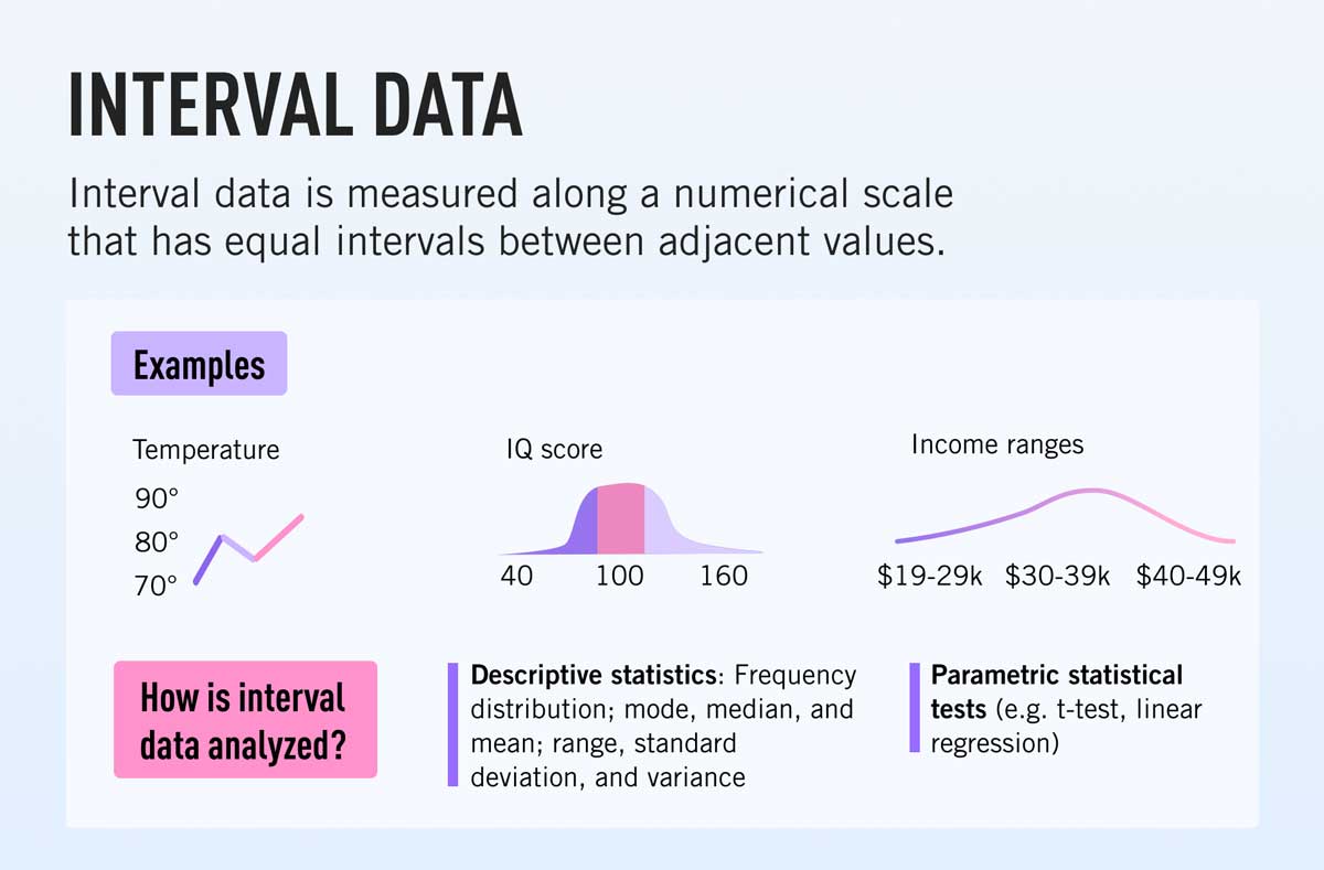
Interval data is a type of quantitative (numerical) data. It groups variables into categories and always uses some kind of ordered scale. Furthermore, interval values are always ordered and separated using an equal measure of distance. A very good example is the Celsius or Fahrenheit temperature scales: each notch on the thermometer directly follows the previous one, and each is the same distance apart. This type of continuous data is useful because it means you can carry out certain mathematical equations, e.g. determining the difference between variables using subtraction and addition. This makes interval data more precise than the levels of measure that come below it, i.e. nominal or ordinal data, which are both non-numeric.
Another distinguishing feature of interval data is that it lacks a ‘true zero.’ Put simply, this means that a measure of zero on an interval scale does not denote the absence of something. By default, this means that zero on an interval scale is simply another variable. For instance, zero Celsius is a measure of temperature that can be preceded by meaningful negative values.
Of the four levels of measurement, interval data is the third most complex. By introducing numerical values, it is eminently more useful for carrying out statistical analyses than nominal or ordinal data.
Key characteristics of interval data
- Interval data are measured using continuous intervals that show order, direction, and a consistent difference in values.
- The difference between values on an interval scale is always evenly distributed.
- Interval datasets have no ‘true zero,’ i.e. they may contain negative values. This means they can be subtracted and added, but when multiplied or divided do not offer meaningful insights (this has important implications for the type of analyses you can carry out).
- Using interval data, you can calculate the following summary statistics: frequency distribution; mode, median, and mean; and the range, standard deviation, and variance of a dataset.
What’s the difference between interval data and ratio data?
While interval and ratio data are both types of numerical data, the main difference is that ratio data has a true zero, while interval data does not. This distinction helps differentiate between the two types. If you are working with quantitative data that contains negative values, you are working with interval data. On paper, this distinction may seem minor, but lacking a true zero has important implications for the types of statistical analysis you can carry out. Using interval data, you cannot calculate the ratios of your values, e.g. through multiplication, division, logarithms, and squares.
3. What are some examples of interval data?
What are some examples of interval data?
- Temperature in Fahrenheit or Celsius (-20, -10, 0, +10, +20, etc.)
- Times of the day (1pm, 2pm, 3pm, 4pm, etc.)
- Income level on a continuous scale ($10K, $20K, $30K, $40K, and so on)
- IQ scores (100, 110, 120, 130, 140, etc.)
- pH (pH of 2, pH of 4, pH of 6, pH of 8, pH of 10, etc.)
- SAT scores (900, 950, 1000, 1050, 1100 etc.)
- Credit ratings (20, 40, 60, 80, 100)
- Dates (1740, 1840, 1940, 2040, 2140, etc.)
As you can see, interval data is all about measuring variables on an equidistant scale where the zero point is an arbitrary figure. Next, let’s explore how interval data is collected and commonly used.
4. How is interval data collected and what is it used for?
Interval data can be collected in various ways. The collection method takes into account important factors such as how the data will be used and the nature of the target population.
Common collection techniques include surveys, interviews, or direct observation. For instance, a survey question might be something like:
- Question: What is today’s temperature in Celsius? Possible answers: -10, 0, +10, +20, +30.
Note that the distance between the intervals is always equal. This is the same as for ratio data. However, what distinguishes interval from ratio data is that the temperature in Celsius can be negative. This is important because it means you cannot carry out ratio calculations, i.e. the Celsius scale goes down to -273.15 degrees, so you cannot say that +20 degrees have twice the value of +10 degrees.
Interval data is also documented through direct observation. For example, a researcher might note the number of people entering a department store at regular intervals to measure the change in footfall. This kind of approach can also be automated using smart technologies. For instance, temperature data is regularly collected using weather satellites. The benefit of automated collection is that it allows you to compare past and present data without needing to measure it directly, which can be impractical.
In reality, because the vast majority of numeric scales have a true zero, most types of quantitative data are ratio data, not interval data. Interval data is generally collected and used for very specific use-cases. However, it is still important to understand the difference.
How is interval data used?
Interval data is most commonly used in areas like statistical research, for grading exams, measuring IQ, applying credit ratings, carrying out scientific studies on a population, or performing measures of probability.
5. How to analyze interval data
The level of measurement you use will inform the type of analysis you carry out on your data. Regardless of scale, however, there are two main categories of analysis you will use: descriptive and inferential statistics.
Descriptive statistics summarize the characteristics of a dataset. Inferential statistics draw comparisons between samples and offer insights (or ‘infer’ information) based on those data. You can learn more about the difference between descriptive and inferential statistics here. For now, let’s explore some common descriptive and inferential techniques you can use on interval data.
Descriptive statistics for interval data
Descriptive statistics you can obtain using interval data include:
- Frequency distribution
- Central tendency: Mode, median, and mean
- Variability: Range, standard deviation, and variance
Let’s look at each of these now.
Frequency distribution
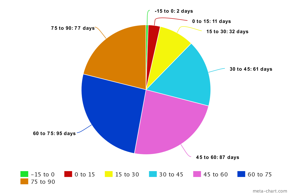
Frequency distribution looks at how data are distributed. Let’s say you take temperature measurements in the city you live in every day throughout the year. Your measurements range from -15 degrees Fahrenheit to +90 degrees Fahrenheit. You might represent this information using a table. Using this simple example, here’s how this might look:

The values in the frequency column show the distribution of temperature measurements across the year. Another method is to visualize the data, for instance using a pie chart.

The important thing to note here is that the relationship between different categories is both hierarchical and evenly spread, i.e. the number of degrees Fahrenheit measured in the category ‘30 to 45’ is the same as the number of degrees Fahrenheit measured in the category ‘45 to 60,’ and so on.
Measures of central tendency: Mode, median, mean
Using interval data, it is possible to measure all three measures of central tendency. These are:
- The mode (the value occurs most often in your dataset)
- The median (the central value)
- The mean (the average value)
It’s easy to identify the mode by looking at the pie chart or pivot table. As we can see, throughout the year, the temperature most often falls somewhere between 60 and 75 degrees Fahrenheit.
We can also identify the median value. This is the value at the center of your dataset. Since measurements in our temperature dataset were taken on 365 days of the year, we can determine that the median value is 183rd value. This is the 45 to 60 degrees Fahrenheit category. The center point of this category is 52.5 degrees, so this is our median value (or the best possible estimate, using grouped data).
Finally, we can calculate the mean temperature. For grouped data, this involves first calculating the midpoint of each group. We can add this to our table. Next, we must find the product of each midpoint and its corresponding frequency, which we can also add to our table.

By dividing the sum of frequency x product by the sum of frequencies themselves, we obtain our mean temperature. Doing a quick calculation (20,437.5 divided by 365) gives us a mean temperature of 56 degrees Fahrenheit.
Measures of variability: Range, standard deviation, and variance
Range, standard deviation, and variance are all important measures of variability that you can extract from interval data.
The range is the simplest measure to determine—it describes the difference between the smallest and largest value. It helps explain the distribution of the data points. Because our weather data is already numeric, we can easily calculate this. Our measurements range from -15 to 90. Doing the math (90 – [–15]) tells us that the range is 105.
The standard deviation (which measures the amount of variation or dispersion in a set of values) and the variance (which measures variability from the mean) are more complex measures to calculate. Rather than getting into detail here, we recommend checking out the difference between variance and standard deviation when you have a bit of spare time to get your head around them!
Inferential statistics for interval data
To analyze quantitative (rather than qualitative) datasets, it is best to use what are known as parametric tests, i.e. tests that use data with clearly defined parameters. You can also use non-parametric tests (more commonly used for qualitative, non-numerical data, i.e. nominal and ordinal data). However, these provide less meaningful insights.
To highlight, here is a handful of parametric tests you can use to explore interval data:
- T-test
- Analysis of variance (ANOVA)
- Pearson correlation coefficient
- Simple linear regression
T-test
The t-test helps to determine if there’s a significant statistical difference between the mean of two data samples that may be related to one another. For instance, is there a difference in average credit rating between adults in the age group 30-40 and the age group 40-50? T-tests are commonly used for hypothesis testing. To carry out a t-test, all you need to know is the mean difference between values of each data sample, the standard deviation of each sample, and the sum of data values in each group.
Analysis of variance
Analysis of variance (ANOVA) compares the mean values across three or more data samples. For instance, is there a difference in credit rating between adults in the age groups 30-40, 40-50, and 50-60? In essence, you can use ANOVA in the same way as a t-test, but for more than two variables. However many variables you have, the t-test will help determine the relationship between the dependent and independent values.
Pearson correlation coefficient
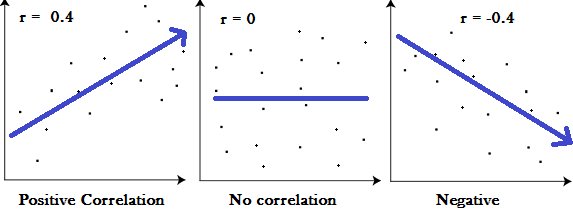
Pearson correlation coefficient (also known as Pearson’s r) measures the level of linear correlation between two sets of variables. For instance, does a relationship exist between someone’s income and their credit rating? By plotting quantitative variables on a graph, we can measure the direction and strength of the linear relationship between them.

A graph of Pearson’s r, demonstrating the difference between a positive, neutral, and negative correlation. Source: statisticshowto.com
Using this approach, values will always fall between 1 and -1. A value of 1 indicates a strong positive correlation, while a value of -1 indicates a strong negative correlation. A value of 0 suggests no strong correlation at all between variables.
Simple linear regression
Simple linear regression predicts the relationship between two variables, or measures the impact of an independent variable on a dependent variable. For instance, can a person’s income be used to predict their credit rating? Simple linear regression uses only two variables, but there are variations on the model. For instance, multiple linear regression measures aim to predict the dependent output variable based on more two or more independent input variables.
Hopefully this offers a helpful summary of some of the inferential techniques you can use on interval data. While we haven’t gone into great detail here, these tests offer a tantalizing taste of the complexity of insights you can obtain if you use the right data with the right model.
6. Summary and further reading
In this post, we:
- Introduced the four scales, or levels, of measurement: Nominal, ordinal, interval, and ratio.
- Defined interval data as a quantitative data type that groups variables into ranked categories, using continuous numerical values.
- Explained the difference between interval and ratio data: Both are types of numerical data. However, interval data lacks a true zero, whereas ratio data does not.
- Shared some examples of interval data: Temperature in Fahrenheit or Celsius, pH measure, IQ and SAT scores.
- Highlighted the descriptive statistics you can obtain using interval data: Frequency distribution, measures of central tendency (mode, median, and mean), and variability (range, standard deviation, and variance).
- Introduced some parametric statistical tests for analyzing ordinal data, e.g. T-test and ANOVA.
To take the next step on your data analytics and statistics journey, why not try ourfree, five-day data analytics short course? You can also read the following posts for more introductory topics:
