What is nominal data and what is it used for? How is it collected and analyzed? Learn everything you need to know in this guide.
There are many different industries and career paths that involve working with data—including psychology, marketing, and, of course, data analytics. If you’re working with data in any capacity, there are four main data types (or levels of measurement) to be aware of: nominal, ordinal, interval, and ratio. Here, we’ll focus on nominal data.
We’ll briefly introduce the four different types of data, before defining what nominal data is and providing some examples. We’ll then look at how nominal data can be collected and analyzed. If you want to skip ahead to a specific section, just use the clickable menu.
- An introduction to the four different types of data
- Nominal data definition
- Key characteristics of nominal data
- Nominal data examples
- How is nominal data collected and what is it used for?
- Nominal data analysis
- Key takeaways and next steps
Ready for a complete introduction to nominal data? Let’s go.
1. The four different types of data (or levels of measurement)

When we talk about the four different types of data, we’re actually referring to different levels of measurement. Levels (or scales) of measurement indicate how precisely a variable has been recorded. The level of measurement determines how and to what extent you can analyze the data.
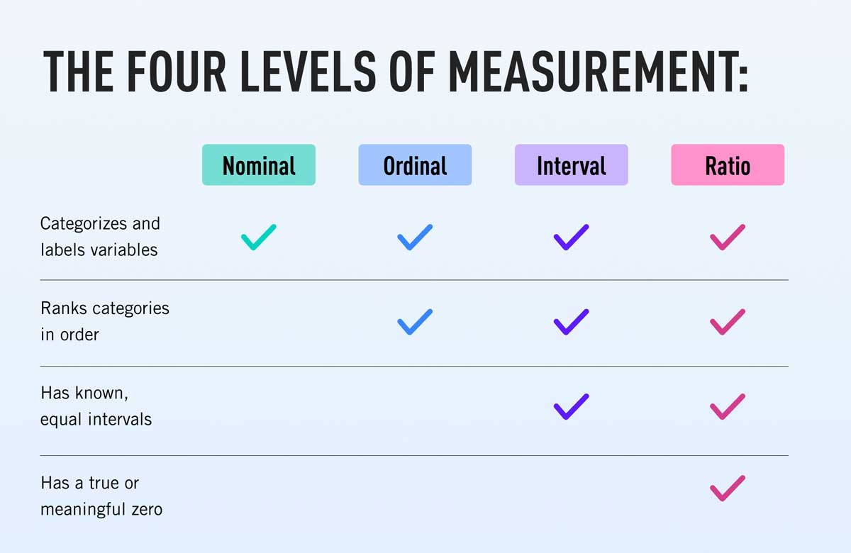
The four levels of measurement are nominal, ordinal, interval, and ratio, with nominal being the least complex and precise measurement, and ratio being the most. In the hierarchy of measurement, each level builds upon the last. So:
- Nominal data denotes labels or categories (e.g. blonde hair, brown hair).
- Ordinal data refers to data that can be categorized and also ranked according to some kind of order or hierarchy (e.g. low income, medium income, high income). Learn more about ordinal data in this guide.
- Interval data can be categorized and ranked just like ordinal data, and there are equal, evenly spaced intervals between the categories (e.g. temperature in Fahrenheit). Learn more in this complete guide to interval data.
- Ratio data is just like interval data in that it can be categorized and ranked, and there are equal intervals between the data points. Additionally, ratio data has a true zero. Weight in kilograms is an example of ratio data; if something weighs zero kilograms, it truly weighs nothing. On the other hand, a temperature of zero degrees doesn’t mean there is “no temperature”—and that’s the difference between interval and ratio data. You’ll find a complete guide to ratio data here.
You can learn more in this comprehensive guide to the levels of measurement (with examples).
What do the different levels of measurement tell you?
The various levels of measurement are important because they determine how you can analyze your data. When analyzing data, you’ll use descriptive statistics to describe or summarize the characteristics of your dataset, and inferential statistics to test different hypotheses. The descriptive and inferential methods you’re able to use will vary depending on whether the data are nominal, ordinal, interval, or ratio. You can learn more about the difference between descriptive and inferential statistics here.
So, before you start collecting data, it’s important to think about the levels of measurement you’ll use.
2. Nominal data definition

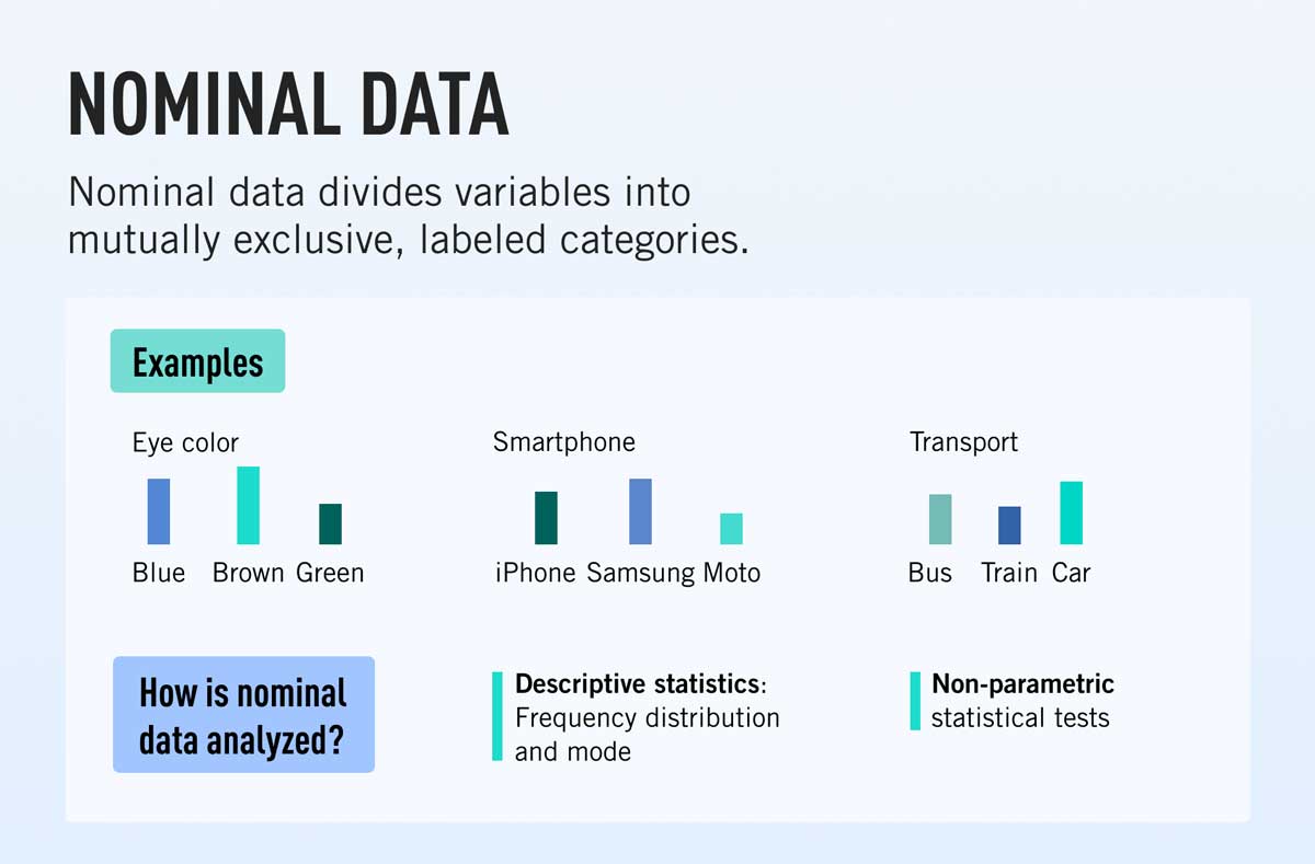
Nominal data is a type of qualitative data which groups variables into categories. You can think of these categories as nouns or labels; they are purely descriptive, they don’t have any quantitative or numeric value, and the various categories cannot be placed into any kind of meaningful order or hierarchy.
At this point, it’s important to note that nominal variables may be represented by numbers as well as words—however, these “number labels” don’t have any kind of numeric meaning. To illustrate this with an example, let’s imagine you’re collecting data on people’s hair color. You might use a numbering system to denote the different hair colors: say, 1 to represent brown hair, 2 to represent blonde hair, 3 for black hair, 4 for auburn hair, 5 for gray hair, and so on.
Although you are using numbers to label each category, these numbers do not represent any kind of value or hierarchy (e.g. gray hair as represented by the number 5 is not “greater than” or “better than” brown hair represented by the number 1, and vice versa).
As such, nominal data is the simplest, least precise level of measurement. You can identify nominal data according to the following characteristics.
3. Key characteristics of nominal data
- Nominal data are categorical, and the categories are mutually exclusive; there is no overlap between the categories.
- Nominal data are categorized according to labels which are purely descriptive—they don’t provide any quantitative or numeric value.
- Nominal data cannot be placed into any kind of meaningful order or hierarchy—no one category is greater than or “worth more” than another.
What’s the difference between nominal and ordinal data?
While nominal and ordinal data both count as categorical data (i.e. not numeric), there is one key difference. Nominal variables can be divided into categories, but there is no order or hierarchy to the categories. Ordinal variables, on the other hand, can be divided into categories that naturally follow some kind of order.
For example, the variable “hair color” is nominal as it can be divided into various categories (brown, blonde, gray, black, etc) but there is no hierarchy to the various hair colors. The variable “education level” is ordinal as it can be divided into categories (high school, bachelor’s degree, master’s degree, etc.) and there is a natural order to the categories; we know that a bachelor’s degree is a higher level of education than high school, and that a master’s degree is a higher level of education than a bachelor’s degree, and so on.
So, if there is no natural order to your data, you know that it’s nominal.
4. Nominal data examples
So what are some examples of nominal data that you might encounter? Let’s take a look.
- Hair color (blonde, gray, brown, black, etc.)
- Nationality (Kenyan, British, Chinese, etc.)
- Relationship status (married, cohabiting, single, etc.)
- Preferred mode of public transportation (bus, train, tram, etc.)
- Blood type (O negative, O positive, A negative, and so on)
- Political parties voted for (party X, party Y, party Z, etc.)
- Attachment style according to attachment theory (secure, anxious-preoccupied, dismissive-avoidant, fearful-avoidant)
- Personality type (introvert, extrovert, ambivert, for example)
- Employment status (employed, unemployed, retired, etc.)
As you can see, nominal data is really all about describing characteristics. With those examples in mind, let’s take a look at how nominal data is collected and what it’s used for.
5. How is nominal data collected and what is it used for?
Nominal data helps you to gain insight into a particular population or sample. This is useful in many different contexts, including marketing, psychology, healthcare, education, and business—essentially any scenario where you might benefit from learning more about your target demographic.
Nominal data is usually collected via surveys. Where the variables of interest can only be divided into two or a few categories, you can use closed questions. For example:
- Question: What’s your favorite mode of public transportation? Possible answers: Bus, tram, train
- Question: Are you over 30 years of age? Possible answers: Yes, no
If there are lots of different possible categories, you can use open questions where the respondent is required to write their answer. For example, “What is your native language?” or “What is your favorite genre of music?”
Once you’ve collected your nominal data, you can analyze it. We’ll look at how to analyze nominal data now.
6. Nominal data analysis
No matter what type of data you’re working with, there are some general steps you’ll take in order to analyze and make sense of it. These include gathering descriptive statistics to summarize the data, visualizing your data, and carrying out some statistical analysis.
So how do you analyze nominal data? Let’s take a look, starting with descriptive statistics.
Descriptive statistics for nominal data
Descriptive statistics help you to see how your data are distributed. Two useful descriptive statistics for nominal data are frequency distribution and central tendency (mode).
Frequency distribution tables
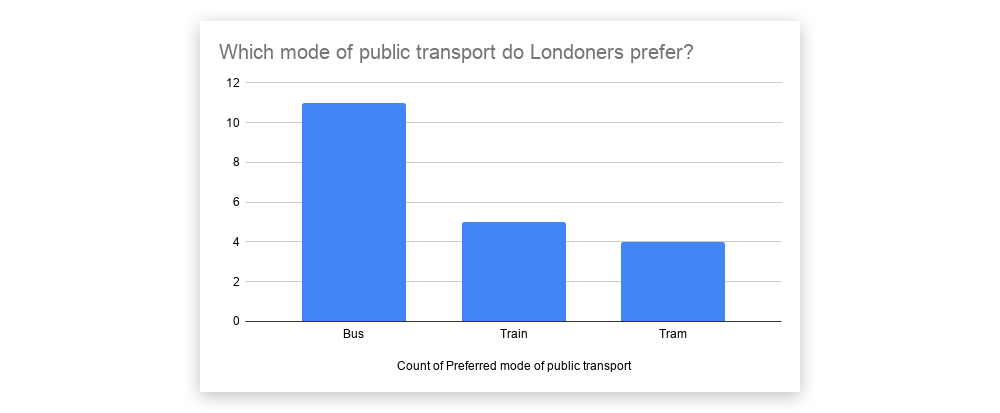
Let’s imagine you’re investigating what mode of public transportation people living in London prefer. In its raw form, this data may appear quite disorganized and unstructured—a spreadsheet containing a column for “Preferred mode of public transport,” a column for “Location,” and a column for “Income,” with the values for each variable entered at random.
Note that, in this example dataset, the first two variables—“Preferred mode of transport” and “Location”—are nominal, but the third variable (“Income”) is ordinal as it follows some kind of hierarchy (high, medium, low).

At first glance, it’s not easy to see how your data are distributed. For example, it’s not immediately clear how many respondents answered “bus” versus “tram,” nor is it easy to see if there’s a clear winner in terms of preferred mode of transportation.
To bring some order to your nominal data, you can create a frequency distribution table. This allows you to see how many responses there were for each category. A simple way to do this in Microsoft Excel is to create a pivot table. You can learn how to create a pivot table in this step-by-step guide.
Here’s what a pivot table would look like for our transportation example:

You can also calculate the frequency distribution as a percentage, allowing you to see what proportion of your respondents prefer which mode of transport. Here’s what that would look like in our pivot table:

Measure of central tendency (mode)
As the name suggests, measures of central tendency help you to identify the “center point” of your dataset; that is, the value that is most representative of the entire dataset. Measures of central tendency include:
- The mode: The value that appears most frequently within a dataset
- The median: The middle value
- The mean: The average value
When it comes to nominal data, the only measure of central tendency you can use is the mode. To identify the mode, look for the value or category that appears most frequently in your distribution table. In the case of our example dataset, “bus” has the most responses (11 out of a total of 20, or 55%) and therefore constitutes the mode.
As you can see, descriptive statistics help you to gain an overall picture of your nominal dataset. Through your distribution tables, you can already glean insights as to which modes of transport people prefer.
Visualizing nominal data
Data visualization is all about presenting your data in a visual format. Just like the frequency distribution tables, visualizing your nominal data can help you to see more easily what the data may be telling you.
Some simple yet effective ways to visualize nominal data are through bar graphs and pie charts. You can do this in Microsoft Excel simply by clicking “Insert” and then selecting “Chart” from the dropdown menu.


(Non-parametric) statistical tests for nominal data
While descriptive statistics (and visualizations) merely summarize your nominal data, inferential statistics enable you to test a hypothesis and actually dig deeper into what the data are telling you.
There are two types of statistical tests to be aware of: parametric tests which are used for interval and ratio data, and non-parametric tests which are used for nominal and ordinal data. So, as we’re dealing with nominal data, we’re only concerned with non-parametric tests.
When analyzing a nominal dataset, you might run:
- A chi-square goodness of fit test, if you’re only looking at one variable
- A chi-square test of independence, if you’re looking at two variables
Chi-square goodness of fit test (for a dataset with one nominal variable)
The Chi-square goodness of fit test helps you to assess whether the sample data you’ve collected is representative of the whole population. In our earlier example, we gathered data on the public transport preferences of twenty Londoners. Let’s imagine that, prior to gathering this data, we looked at historical data published by Transport for London (TFL) and hypothesized that most Londoners will prefer to travel by train. However, according to the sample of data we collected ourselves, bus is the most popular way to travel.
Now we want to know how applicable our findings are to the whole population of people living in London. Of course, it’s not possible to gather data for every single person living in London; instead, we use the Chi-square goodness of fit test to see how much, or to what extent, our observations differ from what we expected or hypothesized. If you’re interested in carrying out a Chi-square goodness of fit test, you’ll find a comprehensive guide here.
Chi-square test of independence (for a dataset with two nominal variables)
If you want to explore the relationship between two nominal variables, you can use the Chi-square test of independence. In our public transport example, we also collected data on each respondent’s location (inner city or suburbs). Perhaps you want to see if there’s a significant correlation between people’s proximity to the city center and their preferred mode of transport.
In this case, you could carry out a Chi-square test of independence (otherwise known as a Chi-square association test). Essentially, the frequency of each category for one nominal variable (say, bus, train, and tram) is compared across the categories of the second nominal variable (inner city or suburbs). You can learn more about how to run a Chi-square test of independence here.
7. Key takeaways and next steps
In this guide, we answered the question: what is nominal data? We looked at:
- Introduced the four levels of data measurement: Nominal, ordinal, interval, and ratio.
- Defined nominal data as a type of qualitative data which groups variables into mutually exclusive, descriptive categories.
- Explained the difference between nominal and ordinal data: Both are divided into categories, but with nominal data, there is no hierarchy or order to the categories.
- Shared some examples of nominal data: Hair color, nationality, blood type, etc.
- Introduced descriptive statistics for nominal data: Frequency distribution tables and the measure of central tendency (the mode).
- Looked at how to visualize nominal data using bar graphs and pie charts.
- Introduced non-parametric statistical tests for analyzing nominal data: The Chi-square goodness of fit test (for one nominal variable) and the Chi-square test of independence (for exploring the relationship between two nominal variables).
If you’re exploring statistics as part of your journey into data analytics or data science, why not try a free introductory data analytics short course? And, for further reading, check out the following:
