Whether you’re a product manager already or working towards a career in this field, you’ve likely heard of a project management tool known as a PERT chart. But what is it exactly, and how can it help you organize your projects with precision?
PERT stands for Program Evaluation and Review Technique. It’s a project management tool used to identify and map out essential tasks, their duration, any dependencies, and the order of completion. It can help you efficiently plan and manage complex projects by identifying key activities and milestones, planning resources, and analyzing project risks.
Curious to learn more? This article will explain what a PERT chart is, how it can help you in the product management process, and provide a step-by-step guide for creating your own charts.
Here are the topics we’ll cover—to skip to a specific section, just use the clickable menu:
- What is a PERT chart?
- How does a PERT chart work?
- How do product managers use PERT charts?
- Gantt chart vs. PERT chart: What’s the difference?
- How to make a PERT chart: A step-by-step guide
- Key takeaways
1. What is a PERT chart?
Basically, a PERT chart is a visual representation of the project timeline and all tasks involved. Both project and product managers can use it as a tool to organize and monitor the progress of their respective projects. It’s also a great way to discover links between work processes, set realistic deadlines, and allocate resources.
A PERT chart typically includes task names and descriptions, estimated duration, and any task dependencies. Dependencies are tasks that need to be completed before another task can begin, such as coding a website before launching the site.
This visual representation of tasks and their sequence gives you a bird’s-eye view of the project timeline, making it easier to identify potential delays or risks and to adjust plans accordingly.
2. How does a PERT chart work?
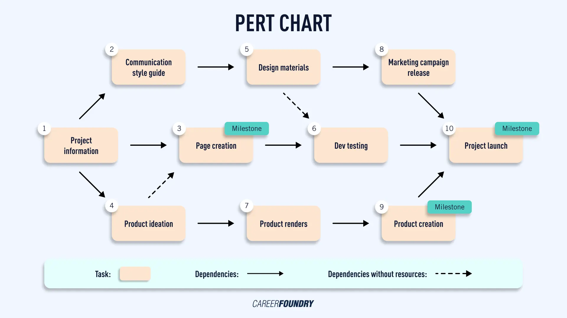
PERT charts look like flowcharts, with each task represented by a box.
Arrows connect one task to another, signifying task dependencies, the order in which activities should be completed, and any overlap between tasks.
Depending on the project’s scope, they might also include milestones and deadlines. But the chart can also be kept more flexible, allowing for changes and updates.
Here is a basic example of such a chart:

PERT chart example
As shown in the image, there are five main elements in a PERT chart:
- Task boxes or nodes—represent each task in the project and contain information regarding the duration, dependencies, and any overlap with other tasks.
- Arrows—connect one task to another and signify the order in which activities should be completed and any procedural links between tasks.
- Dependencies with resources—indicate that tasks must be done sequentially to prevent any delays or problems that could arise due to resource constraints.
- Dependencies without resources—show tasks that can be done in parallel, as each task does not require the completion of another.
- Milestones—mark significant changes and accomplishments throughout the project.
Once the project is outlined in the PERT chart, you can use critical path analysis to identify essential tasks, such as those with the longest duration or critical dependencies. For example, if task A is dependent on the completion of tasks B and C, task A is considered part of the critical path as it cannot move forward until its task dependencies are resolved.
This program evaluation and review technique also helps you identify any potential bottlenecks and develop contingencies for them. Here, you can use the chart to calculate pessimistic, expected, and optimistic times to determine project duration and critical tasks, then adjust your resources and timeline accordingly. This allows you to be more realistic in your planning and avoid any roadblocks due to unexpected delays.
3. How do product managers use PERT charts?
Product managers use PERT charts to visualize the timeline of their product development cycle.
In contrast to a product roadmap—a high-level overview of the product timeline—PERT charts focus on the micro-level details of the development process, allowing product managers to plan out specific tasks, set deadlines, and manage resource allocation more efficiently.
This information makes it easier to anticipate potential issues and delays, as well as assign roles to other team members with a clear understanding of who is responsible for each task. Consequently, product managers can better manage their projects, reduce risks, and make informed decisions. And by taking stakeholders’ input into account, they can ensure that their product meets the expectations of all parties involved.
Let’s consider an example: you are the product manager for a software development project and need to get stakeholders’ approval before proceeding. The stakeholders have requested details about the timeline and how resources will be allocated.
In this case, you could use a PERT chart to provide them with an easy-to-understand visualization of the timeline and resource allocation plan, highlighting any dependencies between stakeholders and tasks. This will give stakeholders a clear idea of how the project is progressing, how resources are being used, and what impact their input has on the project.
4. Gantt chart vs. PERT chart: What’s the difference?
While pert charts and Gantt charts both help project managers plan and manage complex projects by creating a visual representation of the project timeline, they have key differences.
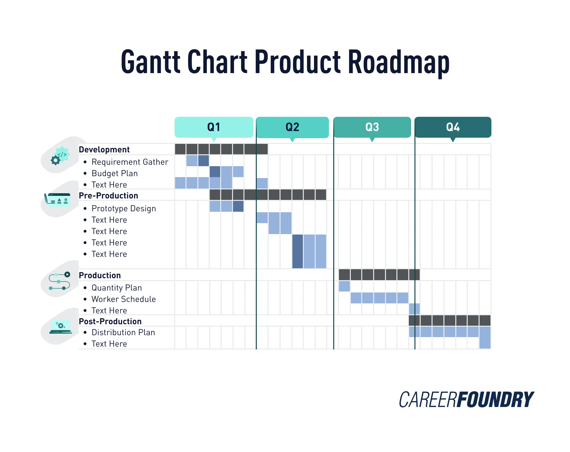
A Gantt chart is a timeline-based bar graph that uses horizontal bars to represent project tasks, their duration, and any task overlap.
Gantt charts are useful for small projects or tasks that have linear dependencies. These are typically tasks with fewer overlapping demands and minimal risk.

Which chart type to use also depends on whether you’re in a project’s planning or implementation stage. Gantt charts work best when managing simple projects that have already been set in motion with an established team.
By contrast, if you’re still in the planning stage of a more complex project and need to envision what it will look like, PERT charts may offer a better solution because they provide a more transparent overview of dependencies between tasks and help you discover potential bottlenecks.
5. How to make a PERT chart: A step-by-step guide
To create a PERT chart with a clear timeline and accurate resource allocation, follow these steps:
Identify project tasks and milestones
Crafting a successful PERT chart starts with understanding all important steps and determining project tasks, goals, and milestones.
Start by listing all activities needed to reach your objectives and assign each task a time frame. Once those are in place, you can lock down the project milestones that will measure progress as you go along. This will provide a clear overview of the entire development process and help you track progress over time.
Analyze task dependencies
Next, determine the task dependencies of each project and identify which tasks need to be completed before others can start. For example, you may have a task that requires input from other stakeholders to complete.
By understanding the connections between different work processes, you can plan out the timeline accurately and spot any potential delays ahead of time.
Allocate resources to each task
Once the dependencies between tasks have been established, you can assign resources to each task.
Make sure that all tasks are allocated the necessary resources for completion and that everyone understands their role in reaching the project’s goals. This will help ensure that no crucial steps are missed, and that progress is tracked accurately over time.
Identify the critical path
Creating a PERT chart also involves identifying the critical path, which is a sequence of tasks that are essential to complete the project on time.
The critical path should include all tasks with dependencies and will help you identify any potential delays in the development process. By understanding these paths, you can anticipate any risks or obstacles that may arise and plan for them accordingly.
Define the project timeline
Mapping out a timeline for the entire project is key to creating a successful PERT chart. Determine how long each task will take and identify where there may be delays or areas of improvement.
For example, you may notice that a particular task takes longer than expected and needs to be split into smaller steps for better time management. This will help you create a realistic timeline and ensure the entire process is accounted for.
Manage project progress
And last but not least, keep track of the entire development process and manage any issues or delays that arise. With a PERT chart, you can easily identify tasks that are behind schedule and adjust your resources. You can also track progress over time to ensure the entire project is on track and all stakeholders remain informed about any changes or updates.
By following these steps, your PERT chart will become an accurate reflection of the project timeline and give you the tools needed to manage progress effectively.
6. Key takeaways
Creating a PERT chart is an effective way for product managers to plan and track the progress of development projects. With a well-crafted timeline, you can discover dependencies between tasks, allocate resources correctly and manage the entire project.
By keeping track of progress and making adjustments as needed, you’ll have a clear overview of the development process as a whole and be able to anticipate any potential delays or issues. As such, PERT charts are invaluable for product managers and those aspiring to join the profession.
Are you interested in becoming a product manager? Get a hands-on introduction to the profession with our free product management course. Covering everything from strategy and design to Agile methodology, the course will give you the tools and understanding you need to start your career in this field.
Enjoyed this blog post? We think you’ll like these, too:
