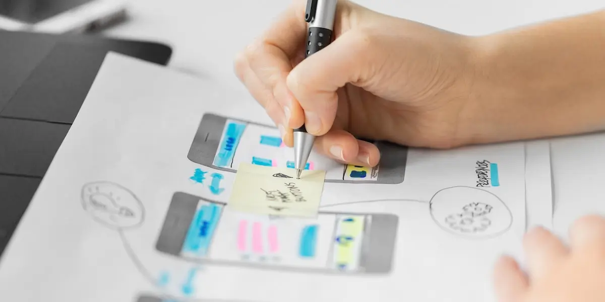
We’ve all encountered websites and applications that make us want to throw our devices across the room in frustration. At least, I hope that hasn’t just been my experience. Fundamentally, a good website UI design enables users to complete the task that they came to the website to do with ease and without confusion.
Truly great UI designers achieve this and more. The best UI websites will please the user by facilitating the frictionless achievement of the task at hand—and also please them aesthetically and experientially.
And that could mean any number of things: a slick, original animated interaction that intuitively draws the user’s attention to a certain element, or an uncluttered, clean design and clever use of white space that imbues the user with a sense of calm, for example.
In this article, I’ll tackle the question of what makes a good user interface—with a bit of help from the Nielsen Norman Group—before diving into eight examples of great website UI design and an explanation of my choice.
Select an example from the clickable menu to jump straight to it, or simply read on.
So, if you’re wondering how to evaluate whether a user interface is good—or even great—how do you decide? I mean, you can determine whether you find a user interface visually appealing, and you can of course use the interface to ascertain whether it’s an intuitive, straightforward experience. But is there anything more objective? More formalized?
How do you know if the website UI design is good?
Personally, I always refer back to the usability characteristics defined by the research company Nielsen Norman Group.
Nielsen defines Usability through the following five characteristics; learnability, efficiency, memorability, errors, and satisfaction.
- Learnability: Can the user complete their tasks with little difficulty?
- Efficiency: Does the interface allow the user to complete tasks in a timely manner?
- Memorability: After leaving a website, how likely will the user be able to remember how to use it the next time they visit?
- Errors: What steps does the interface take to lessen the chance of user error, and how do they let the users correct an error?
- Satisfaction: Does the user enjoy interacting with the design?
And on top of those standards, a great UI should also reflect the personality of the brand in order to stand out from the competition and provide users with a delightful experience. So let’s check out a few examples of where I think companies have gotten their website UI design spot on.
1. Medium
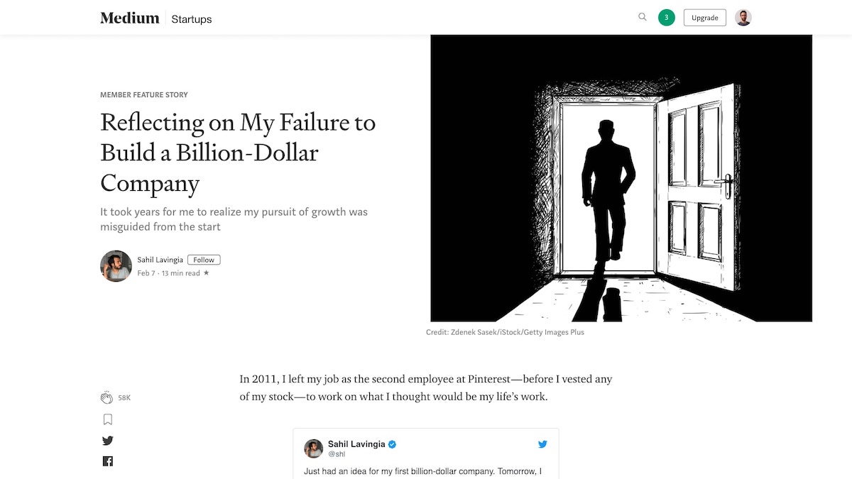
Medium, an online reading and publishing platform, is just as gorgeous as it is functional. With minimal use of color, generous line spacing, and a well-chosen combination of typography, this website gets everything right.
With Medium, content is king. Once a user is logged in, a box appears at the top of the article list with the text “Write here”, enabling and encouraging everyone to get writing quickly.
When users click on the “Write a Story” link, they are presented with an almost empty white page, removing clutter and simply providing a clean space to focus on writing.
Articles are set up in a one-column format, making content easy to digest. With little touches like estimated read time and the ability to highlight and respond directly to specific pieces of articles, Medium truly provides users with an amazing and effortless editorial experience.
2. Virgin America
Bear with me on this one. Just for a moment.
When it comes to helping users complete the process of booking a flight, Virgin America was one of the first – if not the first—to put the user’s interests front and center. For most, booking a flight is a chore.
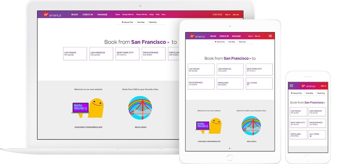
Much like a dishwasher relieves us of having to scrub the dishes, Virgin America’s site stripped back its interface to draw attention to the most important question: “Where would you like to go?” By removing all the surrounding content, the user could immediately start the booking process.
And yes, the site might now look a little dated, but it deserves its place on this list as something of a trailblazer in user-centered interface design. Unfortunately, since merging with Alaska Air, their approach to UI has become decidedly more cluttered.

Back to what made Virgin America’s site great though: Throughout the entire process of booking, the user was reminded of their selection by a bar at the top of the screen showing their current choices. By keeping this information visible, Virgin made it easy for users to constantly see and edit their choices instead of relying on them to recall the information themselves.
The UI here was clearly designed to ensure that a user can focus on completing their goal as quickly and efficiently as possible.
Source: Work & Co
Virgin also made sure to stand out visually from the competition. The use of bright colors, gradients, and fun illustrations created a unique brand personality and experience that sets them apart from other competitors’ websites.
3. Airbnb
The website UI design of Airbnb does two things very well: booking a place to stay and creating trust between two complete strangers.
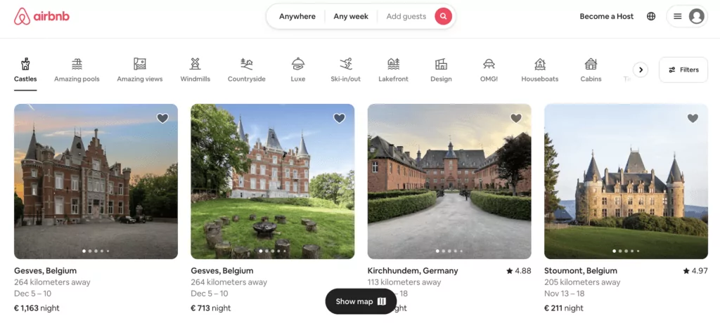
Airbnb, much like Virgin America, has prioritized making it easy to start booking a stay right from the home screen.
Paired with its characteristic use of conversational copy, such as the “What can we help you find, Edward?” below, and helpful cue text, a user is simultaneously and courteously invited and directed to start planning their stay.
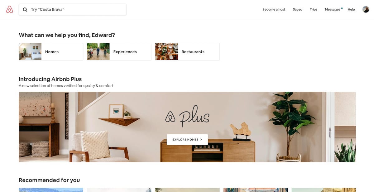
This conversational invite to start searching is a delightful way of portraying the voice of the brand, as well as making the process of finding a place to stay simple.
The only fields you need to specify during this initial search are: choosing a destination users would like to go to, along with the duration of their stay and the number of guests. By leaving out the additional filters until the next step, the process is streamlined, friendly, and approachable.

The listing pages are complete with a description of any additional fees that may be included. This is a very straightforward, easy process for just about any user. The ‘Request to Book’ button sits right under this, and being one of the brightest buttons on the page, invites users to click it in order to finalize their stay.
After a user has requested to book a location, they are taken to a new checkout page. The listing, pricing, and booking information sits to the right of the page to reduce the need for the guest to retain the information from the previous page.
On the left, instead of getting right into the payment, the page prompts you to “say hello to your host and tell them why you’re coming”. By placing this prior to the payment information, it starts a conversation and connection between the guest and host and further invests the user in the experience.
Airbnb takes pride in bringing people together and gives the conversation importance over the transaction—the UI reflects this perfectly.
Airbnb has cleverly thought out its copy and used engaging photos and videos to ensure that the interface conveys an emotional tone that helps create a sense of trust between strangers.
4. Boosted Boards
Now, this is a website UI design with personality. Upon arrival, users are immediately greeted with evocative and dynamic stills of the products on offer.
From an image showcasing the portability of their electric scooter to the explosive action of electric skateboards in action to their newest electric scooter offering, you get a glimpse into their product offering with one quick look.
Directly above these images, the product tabs are clearly laid out for easy navigation.
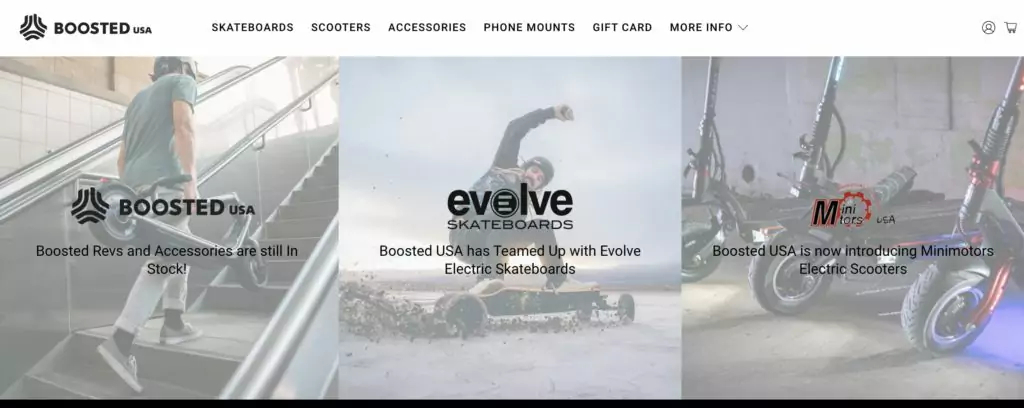
You’re suitably impressed and inquisitive, and now it’s time to see what’s behind all the bold imagery. A click into a product tab gets you down to business—the interface is stripped of color but for the highlight points of the product and any special sale information.
Alongside that, you’re delivered a rundown of the most crucial information alongside a spec breakdown. And, of course, the crucial ‘Add to cart’. What’s stopping you? Very little.

All in all, it’s a great lesson in how to combine different simple but bold graphics and text elements to generate a convincing whole.
5. Dropbox
Dropbox has one of the most easily understandable interfaces by far. Having a folder and file organizational structure is easily recognizable to, you know, anyone who’s ever used a computer before. In terms of learnability, there isn’t much that the average user won’t already know how to do from the start. It’s natural for most users to try dragging and dropping files from their desktops to the page without them even knowing if it’s possible or not, just because it’s so familiar.
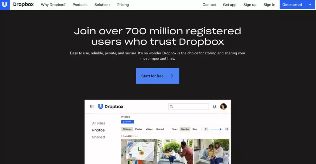
Dropbox’s friendly personality, created by lighthearted illustrations, helps the user feel comfortable when using the product. This addition to the interface makes the product feel like an old friend, ready to help users complete their file-sharing tasks.
And they have—possibly—the best blog design in the world right now. I know, I know, there’s a healthy dose of subjectivity in a comment like that, but rarely have I seen such a successful mix of experimental UI, usability, and multimedia content in one place.
There’s so much attention to detail, with sequenced color palettes and animated icons, and wonderful illustration that is coordinated with all the other wonderful illustrations—it manages to come across as experimental, creative, and consistent. That’s quite an achievement! Check it out!

If you want some help in coming up with an amazing color palette yourself, there are a lot of online color palette generators you can try out. Just be sure to avoid some of these common mistakes UI designers make with color palettes.
6. Pitch
Pitch, a mobile and web application that helps you to build and manage beautiful presentations, is very much a design-led technology company. They want to convince you that they can do for presentations what Slack has done for communications. And they do a pretty good job of it.
Goodbye Powerpoint, hello Pitch.
As soon as you land on their homepage, you can tell that an enormous amount of thought has gone into every single element. You’re immediately greeted with their slogan, which sums up the product: “Stunning presentations. Made together.” Like the website itself, the slogan is simple, direct, and elegant. With two quick lines, it tells you exactly what to expect.
The UI designers at Pitch’s site do a great job of walking the user through an example of what their journey would be like if they were actually using the application. They’ve struck a good balance between clean and comprehensive, avoiding clutter but ensuring the primary product features are covered, so that the site itself really gets out of the way.
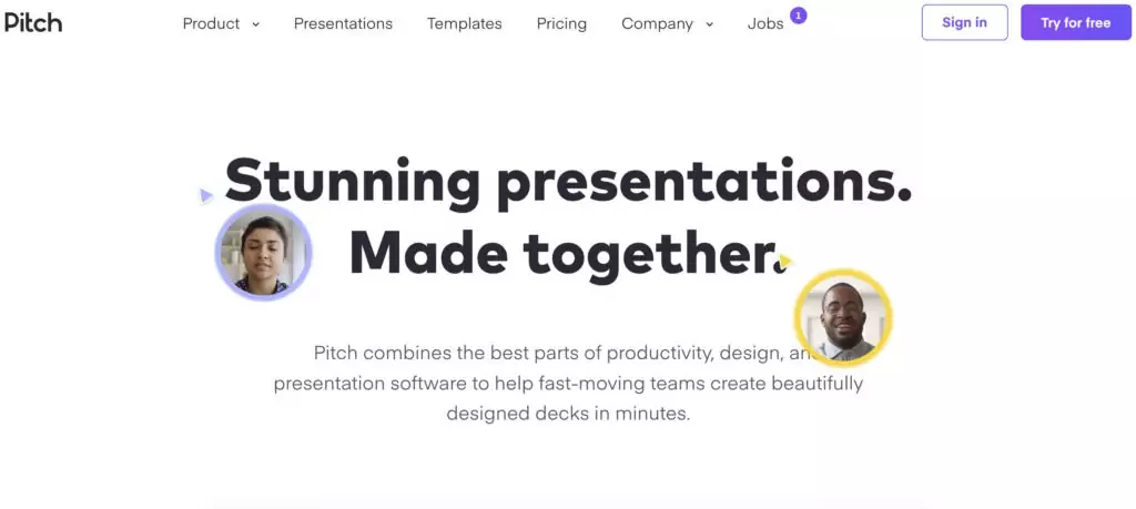
Their site gives a nod to recent design trends with their comprehensive use of illustration, but it errs away from the kind of flat, cartoonish character design that you see on so many sites currently. The Pixar-like use of 3D character design is unusual in this space, and therefore instantly identifiable—if I show you a Pitch hand tomorrow, you’ll recall the company, guaranteed.
And the merits of their website UI design don’t stop there. They’ve also added some smart, subtle dynamic elements and animations which bring the site to life and nudge the user from one scroll to the next. They gently draw your attention from right to left, and the delayed onset of each animation encourages you to pause at each product feature and benefit. You’re left with a sense of gentle familiarity, playfulness, and professionalism—making presentations will never be tedious again!
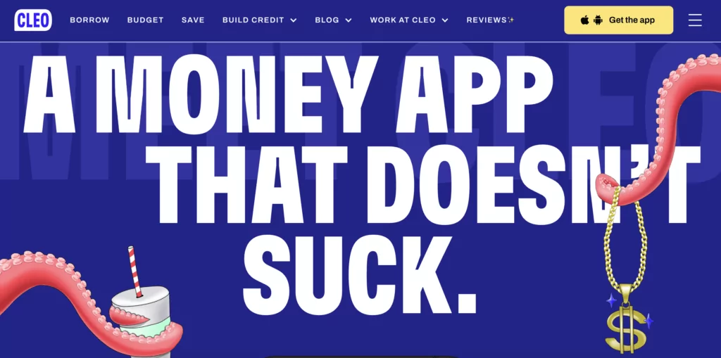
Cleo, a chat-based mobile application that helps you to organize and manage your finances, has also taken an intriguing approach to its UI, which may be of interest to those of you looking to feature more attention-grabbing imagery.
Their focus is obviously on the download, but they incorporate cartoon design and animated graphics alongside the product’s features, using a scrolling approach to walk you through the product’s features.
I like this touch, but unfortunately, the experience as a whole evokes anxiety, with the high contrast between the cheap Ryanair blue and the white, the rushed dynamism of the animations, and the inability to focus on any particular feature.
The old adage that less is more is so often true with UI. Other apps which have developed fantastic landing page experiences include Blinkist and Slack. Blinkist, which is a reading app, has won awards for its product design. And good design is obviously in the company’s DNA.
Just look at the gorgeous color palette below, how they funnel the user’s attention towards the main call-to-action from their imperative-driven slogan, and how they place their product alongside the juxtaposed color scheme.
It draws your focus to the explanation on the left while leading the eye naturally to the product examples so efficiently displayed on the right. So much communicated, so efficiently.

7. Frank and Oak
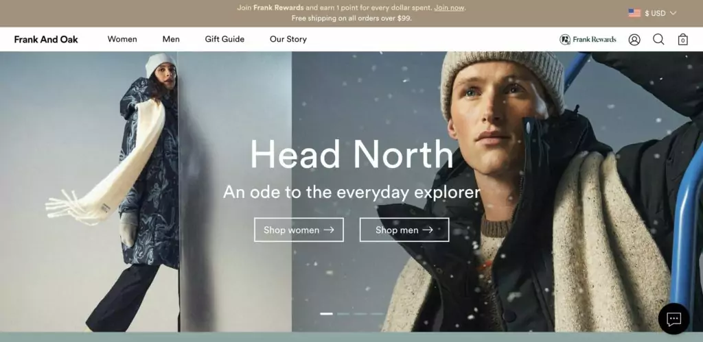
Frank and Oak, a clothing retailer with a strong media and lifestyle focus, uses its UI to grab the attention of its users and their taste in style.
While it is a fairly straightforward online shopping experience from a UX perspective, the company uses bold photography and clean, sans-serif typography to capture the personality of the brand and its target audience.
Despite some bold, sales-driven marketing messaging—Join Frank Rewards and earn 1 point for every dollar spent—their brand image is firmly stamped from the very first touchpoint with the company. Cool, clean, up close, and personal.
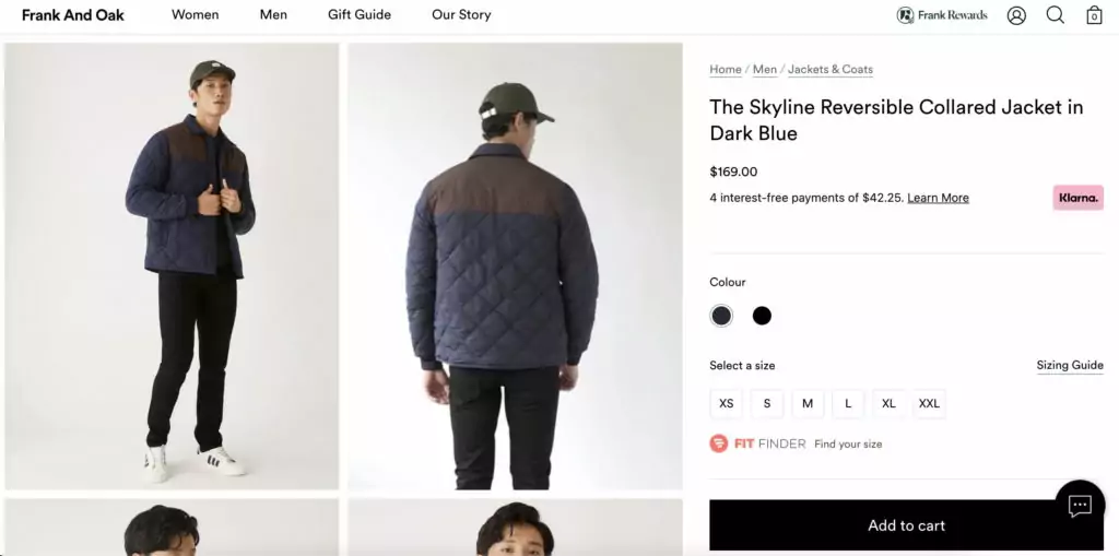
After clicking on an item, the product page is focused on two things: the product photography, and the call to action button, as they are essentially the only colored elements on the page.
With a nice touch, the add-to-cart button won’t work until a size is selected. When a user tries to click the button first, the text switches to ‘Select Your Size’.
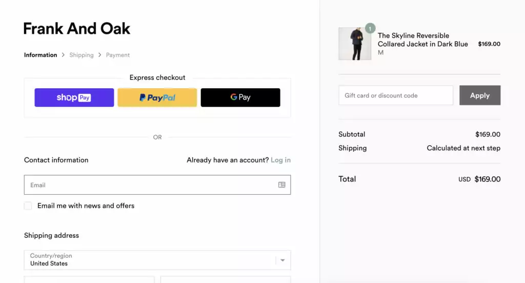
Filling out personal information during the checkout process for the first time is never an ideal experience. It’s unavoidably a clunky process—or, at least, no one has figured out how to make it smooth for first-time buyers.
Frank and Oak do a good job though—they help users out by breaking the form into smaller chunks of input fields to reduce the cognitive load on users. And yes, it’s clean and uncluttered.
By now you will have learned that those are some of my most important criteria for good user interface design!
In all, a lot of the underlying UI—and certainly the UX—of Frank and Oak can be seen on many other websites, but it’s the way they have interwoven a very logical, intuitive user journey, a bold, impactful and clean UI, and a tight, aspirational brand image and messaging that really makes this stand out.
I guess that’s the lesson from the seventh site on the list: good UI can only be great if it arrives hand-in-hand with good UX and well-researched, confident messaging.
8. Semplice Labs
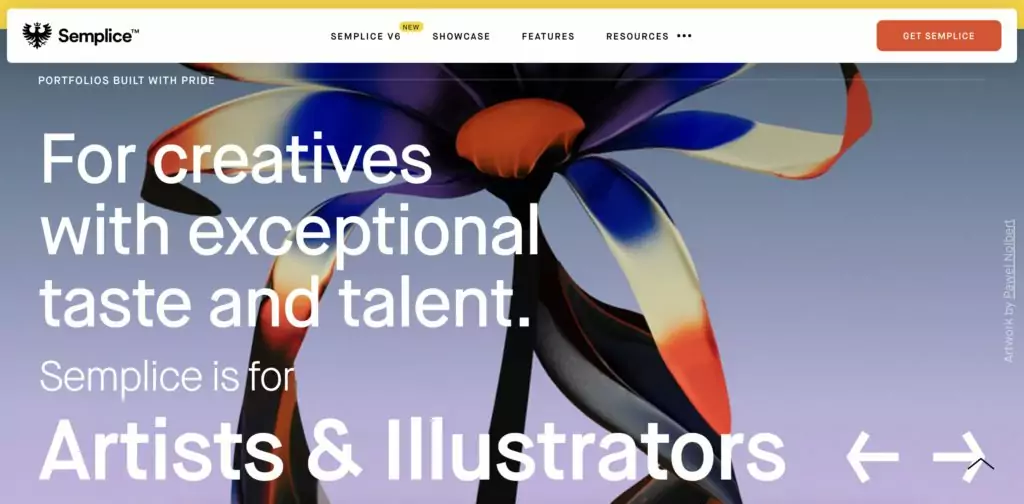
One of my personal favorite examples of a gorgeous and functional UI can be found with Semplice Labs, a WordPress portfolio created by superstar designer Tobias Van Schneider, who’s designed for Spotify, BMW, Google, and even NASA. Suffice it to say he knows what he’s doing.
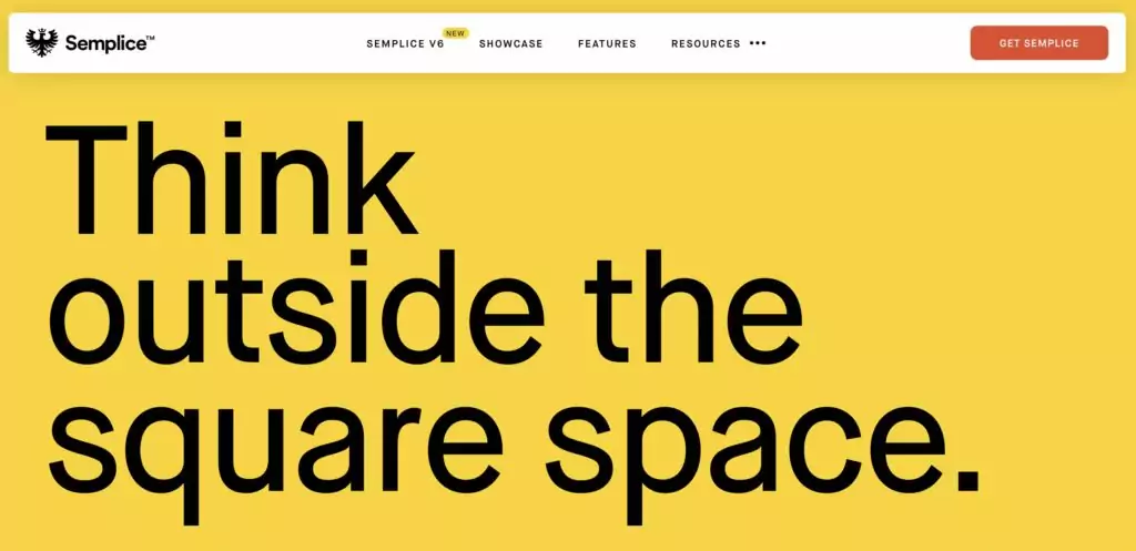
The copy here really speaks to the audience, instructing them in bold, confident terms about Semplice’s best qualities. The rest of the website UI is actually an example of what users of the product can achieve with their own websites. Fluid animations and smooth transitions between pages make this interface memorable and desirable to users.
Conclusion
These are just a few of my favorite examples of good website UI design. Creating a usable, frictionless UI is an essential part of creating a positive connection with a user, not to mention making sure that it’s a user-centered design. When designing or evaluating an interface, it’s best to refer to the usability guidelines set forth by Nielsen in order to build a product that provides the best possible user experience.
If you’re interested in becoming a qualified UI designer, I recommend taking a structured UI design course. Speaking as a former student at CareerFoundry, I can not only vouch for their UI Design Program’s quality and effectiveness in training me and landing me a job—they offer a job guarantee in conjunction with the course—but also for the fact that the whole experience was thoroughly enjoyable.
Want to learn more about UI design? Check out these great articles:
- 10 Examples Of Beautiful Blogs That Have Nailed Their UI Design
- 9 Examples Of UI Design Portfolios That Will Inspire You
- What skills do you need to become an animation designer?
- 5 UI animation trends to follow
FAQ
1. Which website has the best user interface?
There is no definitive answer to this question, as different websites excel in different aspects of website UI design. However, some websites that are often cited as examples of excellent UI design include Airbnb, Dropbox, and Virgin America.
2. Where to get UI ideas?
There are several resources you can use to get UI ideas, including design blogs, UI design galleries, design books, and UI design communities such as Dribbble and Behance. You can also find inspiration in everyday objects, such as magazines, packaging, and signage.
3. What makes good website UI?
Good website UI design is characterized by several key factors, including clear navigation, consistent branding, user-friendly layouts, fast loading times, and accessibility. It should also be visually appealing and easy to use, with intuitive controls and clear feedback.
4. What is a UI site?
A UI site is a website that is specifically designed to showcase examples of UI design and provide resources for UI designers. These sites may include galleries of UI design examples, articles on UI design best practices, and tutorials on UI design techniques. Some examples of popular UI sites include Smashing Magazine, UX Collective, and A List Apart.
