It’s no secret that blogs are the pillar of any successful company website. A frequently updated blog will drive traffic to the brand, guide users with targeted content, and act as a vital tool to engage with the broader community.
Alongside being a low-cost marketing strategy with a lucrative payoff, blogs are also the perfect way to establish your brand identity and grow a loyal following.
Creating engaging, information-rich content for your readers, however, is only half of the job: equally important is presenting the content in a visually stimulating way. When it comes to blog design, there are a variety of different factors to look at—from font sizes and text width, to hierarchy and calls-to-action. Uninspiring blog design is a sure fire way to lose interest—or even customers.
Are you a budding UI designer exasperated by boring blogs? We’ve rounded up ten blogs and online magazines that showcase the very best of creative editorial design. To help us on our way, I’ve enlisted the expertise of CareerFoundry’s resident UI designer Amy, who’ll be shedding light on why each blog has hit the nail on the head with their UI design.
Without further ado, let’s jump right in!
- Six-Two
- Annual digest
- Clever
- Coda Story
- Nourisheats
- Girlboss
- Dropbox
- Help Scout
- The Outline
- Pixelgrade
1. Six-two
Powered by the global youth travel brand Contiki, Six-Two boasts robust travel guides jam-packed with gorgeous imagery that instantly makes us want to pack our bags and set off for some serious wanderlusting.
Six-two have taken the popular ‘tiling’ feature and put their own spin on it—mixing blog posts in with text, and playing around with image size. While they’ve got some interesting features going on, they’ve kept the color scheme fairly basic—mostly sticking to pastel colours with the occasional splash of dark pink. Six-two has managed to strike a perfect balance between fun and informative.
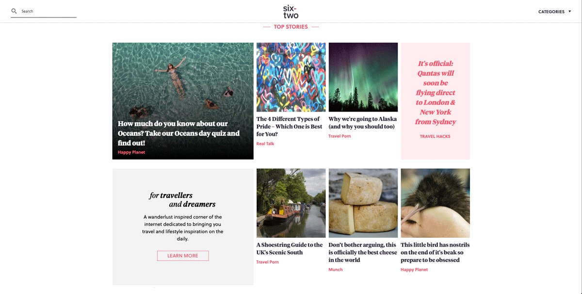
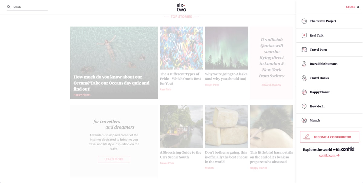
Amy says: The content is organized rhythmically on a consistent grid, which lets the reader know what to expect. They’ve made the site even more effortless to navigate by creating a repetition of grouped elements (in this case, image, headline, and tag) making it clear which content belongs together. The designer has also emphasized certain pieces of content by making the group larger, which creates a clear hierarchy—and lets the reader know what to read first!
Interestingly, they’ve chosen to place the search function on the left of the interface, and the main menu on the right. This goes against standard UI conventions—but the use of recognizable iconography (such as the magnifying glass for search and the downward facing arrow to indicate more content) means it’s still useable. All in all, the simple UI reduces friction for the user—in turn creating a great user experience.
2. Annual Digest
When it comes to blog design, simplicity often trumps complexity. This is undoubtedly the case with Annual Digest by Curate Mag. Aimed at entrepreneurs and young professionals, Annual Digest is an online magazine featuring a collection of thought pieces that both reflect on the past year and inspire for the year to come.
Using large fonts and images is currently a super popular UI design—and Annual Digest has totally nailed it. It’s impossible not to be captivated by the use of color and drawn in by the digestible article titles.
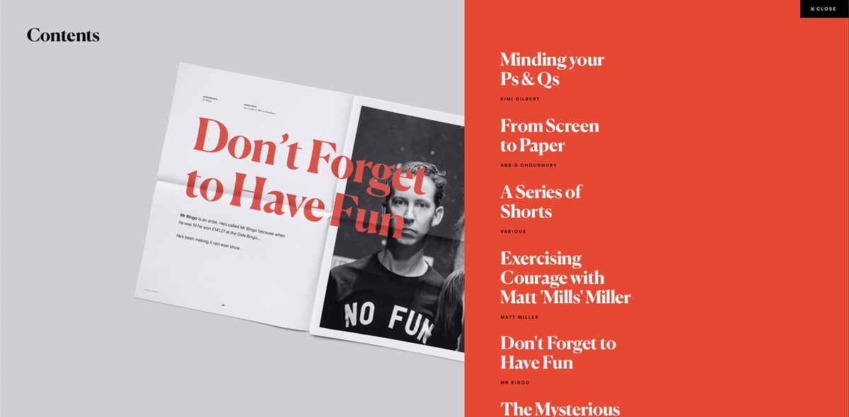
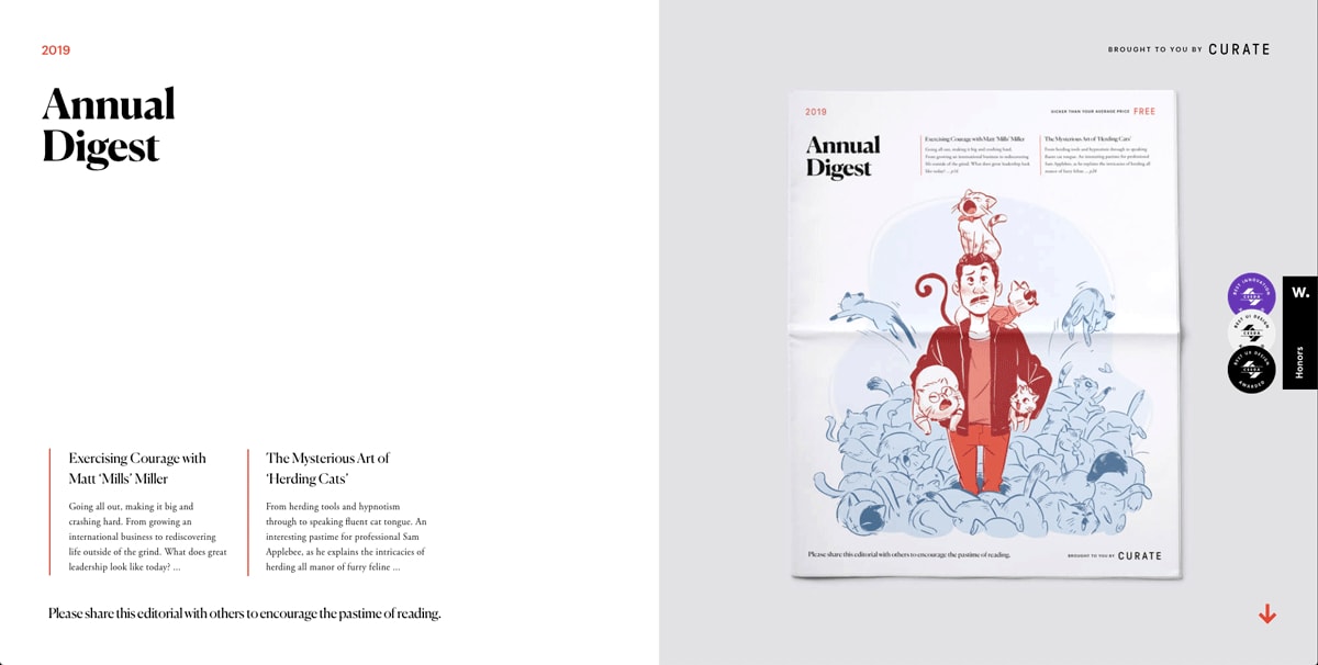
Amy says: There is a lot of content presented on this page—but the designer’s clever use of variety keeps the reader interested. Combining subtle animations and transitions with bold imagery and a large typeface make for highly enjoyable navigation. What’s most striking about this site is the excellent execution of the typography; the clever combination of fonts is elegant and sophisticated, without being too serious.
I’m equally impressed by the use of white space. Having vast stretches of white space lets the content breathe, and the images speak for themselves, facilitating a high-end and trustworthy tone. The juxtaposition of vibrant orange against a monochrome color palette is also incredibly visually stimulating. I could keep scrolling on this website all day!
3. Clever
Clever by Architectural Digest is an online magazine celebrating international design talents, championing industry innovation, and featuring home decor inspiration.
This fabulous publication is somehow minimalist, chic and eccentric at the same time—with vibrant colors that hum of 80s retro pop art, and blocks that almost feel 3D. While the actual design itself is relatively stripped back, it’s jam-packed to the brim with character.
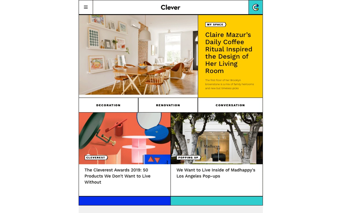
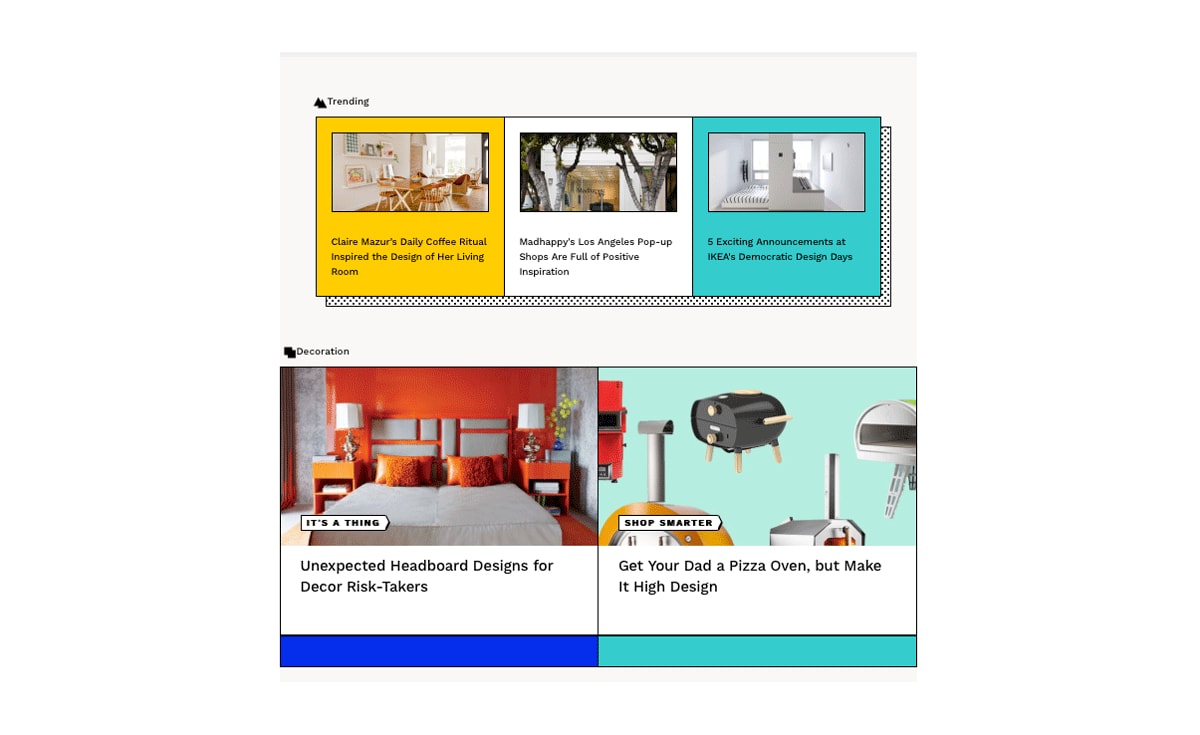
Amy says: The Mondrian style—colorful mosaic-like grids based on the designs of Dutch painter Piet Mondrian—is what initially grabs my attention on this website. Straight away, I can tell that this blog is going to be art and design focused.
The designer uses a progressive rhythm to create a content hierarchy, adding a refreshing twist to the content card structure most commonly used by online publications. The interface is bright and makes good use of bold colors and patterns—a combination that can go catastrophically wrong if overdone.
While the color palette is bold, the high contrast between the colors themselves paired with the bold geometric font choice tells me that the designer has reflected on the site’s accessibility. All the UI elements on this page work harmoniously together to promote unity. This level of attention to detail is no small feat!
4. Coda story
Coda story is an online political journal, covering topics ranging from humanitarian crises to disinformation stories. Coda story asserts that they are “format agnostic”—meaning they don’t adhere to the structural conventions of other blogs.
With a list of documentaries, longreads, shortreads and animations, the Coda story publication is proof that political content doesn’t need to be dull to be taken seriously.
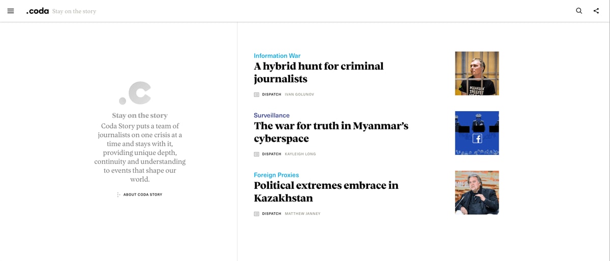
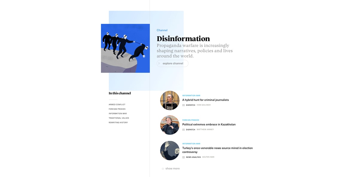
Amy says: I like how they’ve grouped the information related to each channel. As with some of the previous examples, the designer uses proximity to group content—but this time, the topics are cleverly color coded.
The structure of each group is repeated, reducing the cognitive load created by the site’s complex navigation. Within each channel overview, the user has the opportunity to explore the channel more deeply. The option to ‘show more’ content without being redirected to another page also gives the user a sense of control.
The great use of whitespace and the lack of distractions is conducive to the subject matter of the content: serious topics need clean interfaces. However, that’s not to say that the site is uninspiring! The subtle yet uplifting animations provide well-needed balance to the website’s tone.
5. Nourisheats
Aiming to inspire readers to commit to a healthy diet, the Nourisheats blog is the epitome of clean, aesthetically pleasing design. This lifestyle blog boasts vibrant, drool-worthy food photography—made evermore eye-catching against the site’s simple grey and white color palette.
Compared to other lifestyle blogs, Nourisheats have opted not to bombard their readers with subscription pop ups, or promotional banners. Instead, they’ve let the imagery do the talking.
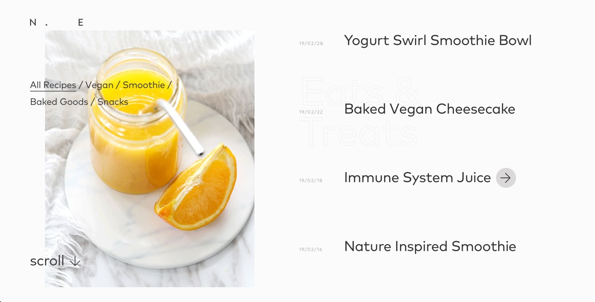
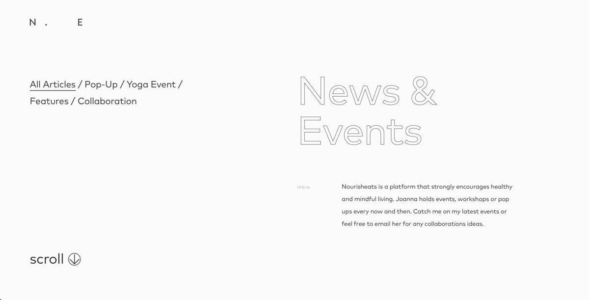
Amy says: This blog is oozing with personality; from the bang-on-trend pastel color scheme down to the myriad of micro-interactions. It’s evident from the get-go that this is a lifestyle blog. This was clearly a real passion project for the designer.
While it may seem like there’s a lot going on, they’ve achieved consistency throughout the blog along with the use of usability tips like scroll/swipe labels—meaning it doesn’t take too long for the user to get their bearings.
Considering all the complicated features on the site, load times are surprisingly quick! Perhaps the best thing about Nourisheats, however, is that the site is just as beautiful and responsive on mobile.
6. Girlboss
On the other end of the spectrum, the Girlboss magazine is everything but understated. Set against the backdrop of just about every color under the sun, Girlboss brands itself as a magazine for working millennial women that doesn’t take itself too seriously.
Girlboss doesn’t just play with different colors—they’ve also got a different font for pretty much every sentence, and have decided to keep readers on their toes with a mix of photography and illustration. Each section of the website feels like its own unique entity.
With its eye-catching color palette, lack of font uniformity and overall mischievous tone, the Girlboss magazine has all the makings of a blog that will have you continually coming back for more.
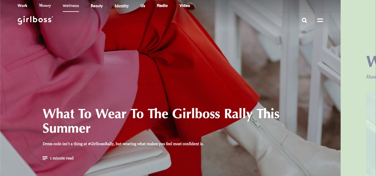
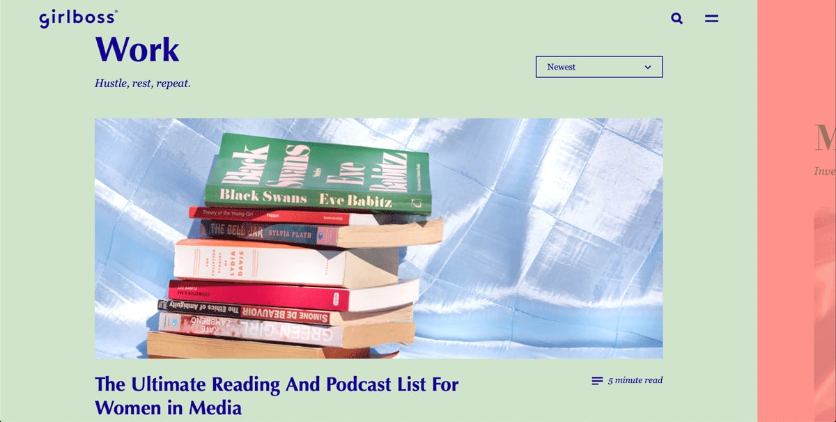
Amy says: The most notable feature on the Girlboss website is the color palette: bold colors, combining pastels with deep, rich hues and oversaturated neons. Exciting as this color palette is, future designers should always consider users with varying grades of color blindness. The more variety you have in your color values (brightness, saturation, etc.), the harder it becomes to ensure adequate contrast.
The desktop website has got a horizontal swipe, which is a design standard more commonly associated with mobile interfaces. While this initially takes some getting used to, the designer has provided two more traditional navigation options: an easily accessible navigation at the top of the page, and the typical hamburger menu in the top right.
Once you’ve taken a minute to get your head around these quirks, the layout is relatively straightforward. The handy filter offering the reader the choice between viewing “new” or “popular” content is a nice touch and gives the reader a sense of agency. The cherry on top? They’re championing diversity throughout the imagery, which also reflects the brand well. It might seem obvious, but diversity representation is a common oversight when designing a blog—so well done to them!
7. Dropbox
Productivity tool Dropbox has demonstrated its creative flair with this quirky and colorful blog. On top of dazzling us with a vivacious color scheme, the designers behind the Dropbox blog have paid homage to artistic zines with a simple graphic style that would typically be associated with print design.
The captivating tongue-in-cheek illustrations command attention and allow for the typography to be stripped back and take a secondary role.
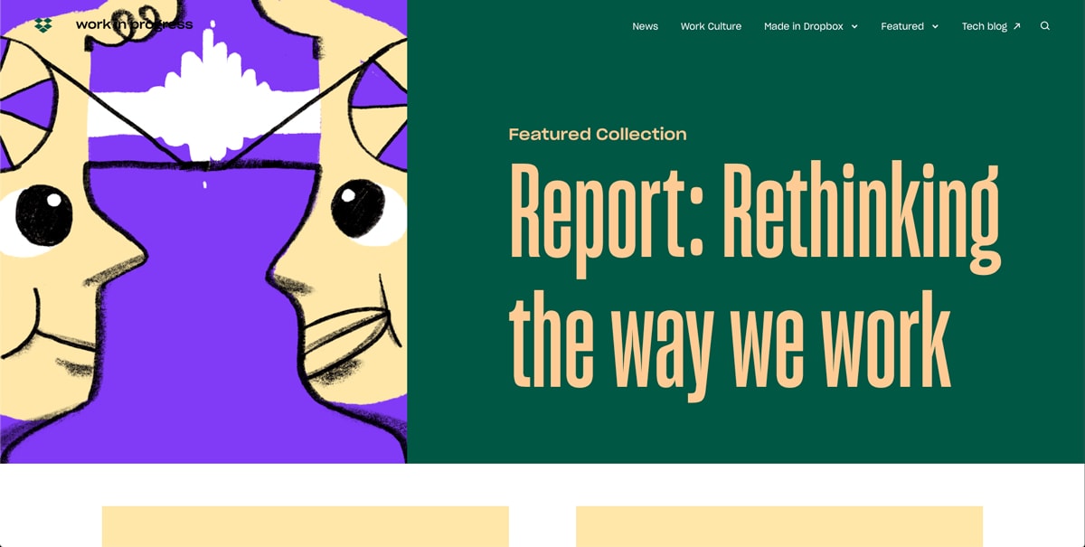
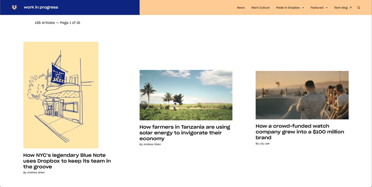
Amy says: We’re used to a very clean, minimalist UI from Dropbox—but over the past few years, they’ve built a design system which experiments with color and font styles, giving their brand an artistic edge.
Although all of these principles wouldn’t necessarily work together on the product itself, they are put to good use on the blog. The UI is fun without being immature, and works well with the content—rather than distracting from it. The intuitive hover effects nicely direct the user flow, and the animated call to action at the bottom of the page is a real treat!
8. Help scout
Help Scout, makers of customer service software, have limited the use of copy and embraced negative space on a dynamic yet uncluttered interface. It’s hard not to be enticed by the bright, block colors and straightforward copy that lets us know what the post is going to be about.
The real hero of this blog, however, is the illustrations. There’s nothing worse than going to a blog and seeing the same reused free stock image you’ve seen on a hundred different websites. The bespoke (and frankly adorable) illustrations tailor-made for each blog post are a real treat, and definitely make us want to click.
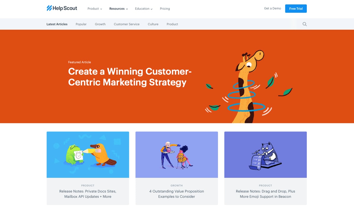
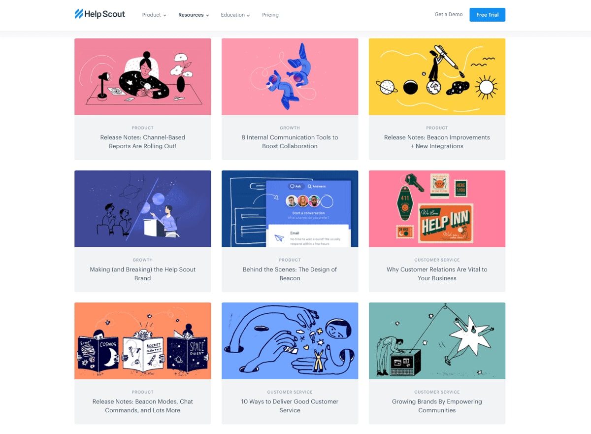
Amy says: I love the simplicity of this site. The content is exceptionally well organized, and all elements follow design standards—keeping cognitive load to a minimum through recognition. It’s highly responsive, easy to navigate, and beautifully branded through the illustration. I particularly enjoy the consistent iconography!
9. The Outline
At first glance, it’s evident that The Outline is unlike any other online magazine currently on the scene. Marketing itself as a “new kind of publication,” The Outline boasts distinctly unfiltered content, including everything from political digests to lifestyle tips.
Perusing The Outline will take you on a journey of discovery—as if each section has been designed by someone different. With its near-fluorescent color scheme and comedic imagery, in contrast with its minimalist navigation, The Outline website is a visual feast—breaking every possible design convention available.
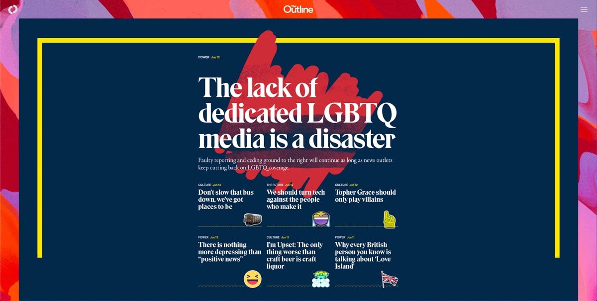
Amy says: Although this interface might seem busy and chaotic at first glance, The Outline’s designers have intentionally applied ‘anti-design’ techniques—a trend that moves away from modern, minimalist interfaces, and instead embraces garish imagery and clashing colors that echo the nostalgia of 90s MTV artwork. Browsing through this website, you simply can’t help but be seduced by the eye-catching content and provocative imagery!
The small animations complement the overall design, providing the user with feedback and gratification without being distracting. I’m enthralled by the use of “content teasers”—such as quotes, quizzes, or just images with no text—which add variety to the page and break up the written content. The overwhelmingly stimulating visuals are balanced nicely with clear structure and repetition, making it a fascinating website to navigate!
10. Pixelgrade
With an energetic homepage, clear calls to action, and even a section for related logos to demonstrate the credibility of each published article, the Pixelgrade blog is a prime example of a blog which tells the brand’s story.
They’ve kept the same color palette as the main site, which establishes continuity with the brand. While it might not be the fanciest blog on this list, it’s incredibly digestible.
![]()
Amy says: This blog has an instantly recognizable brand identity, and I love the ‘scrapbook’ feel that they’ve emulated with the imagery. I also applaud them for assigning a color to each category so that content can be grouped by similarity.
The sizeable text is hugely effective in commanding the reader’s attention. In the blog posts themselves, they’ve used imagery to break up the text—enticing readers to stick with it until the end. While opting for a grid-based layout isn’t exactly ground-breaking, it keeps the interface clean and the content digestible.
Conclusion
So there we have it: 10 blogs, magazines and online publications that have captured the reader’s attention and used their imaginations with their UI design.
More and more companies are catching on to the fact that ensuring your blog content is rich with relevant, interesting, and shareable information, as well as being visually and aesthetically engaging, is worth investing some time (and money) in!
Want to learn more about what makes great website design? Check out these articles on our blog:
