Storyboards are an excellent option for UI designers who need to pre-visualize the creating process or user experiences.
With storyboards, you can also chronologically convey each element, stage, or shot to visualize your project ideas.
Storyboards can help you visualize different projects, like sales pitches, animations, and movie storyboards. In this article, we’ll discuss UI storyboards, particularly, and give some storyboard examples from which you can take inspiration.
If you’re looking to get stuck into creating your first one already, we’ve made a step-by-step guide to storyboarding for that.
Use this menu to explore specific sections of the article:
- What is a UI storyboard?
- Types of UI storyboard
- How do you make a UI storyboard?
- Some tips for making a great storyboard
- Four UI storyboard examples
- Wrap-up
Let’s start with the basics.
1. What is a UI storyboard?
A UI storyboard is a visual representation of the user interface of your website or product. The storyboards make it easy to visualize user interaction with your product.
This simplifies your work as a UI designer because your visual user story gives you a clear idea of how to create your product. It also saves you time because you avoid the trial-and-error cycle in the product creation process.
If you want to learn more about them, we’ve created a full beginner’s guide to storyboards.
Besides this, there are other benefits of storyboarding, which include:
Identifying key design elements
By visualizing your user’s experience, you can overcome personal biases and prioritize the critical design elements that will solve the user’s pain points.
Helping you pay more attention to your product
With your design on paper or a digital storyboard, it is easy to note mistakes, problem areas, or gaps in your user story. It is also easy to note different scenes that make your storyboard clearer.
Boosting your creativity
Visual representation has also been proven to encourage creativity, especially since humans process visual art or data 60,000 times faster than we do text. As a result, you are more likely to develop a better product.
Ensuring a good presentation
Explaining your digital product ideas to your clients is easy, since they can see them on the storyboard. Again, this is way easier to comprehend than the text-only script.
2. Types of UI storyboard
You can use different storyboard styles to visualize your UI storyboard. Here are the three popular methods you should familiarize yourself with, as well as some storyboard examples to go with it:
Traditional storyboarding style
This is the most popular storyboarding method.
It was the storyboard style used for animated films like Mickey Mouse and other Walt Disney productions in the past, but it is used to date. The method consists of the drawing of rough sketches, as shown in this example:

Source: StoryboardThat
As you can see in this storyboard example, the creator uses stick-figure sketches. You can also see the character’s emotions. The captions make the design easy to understand.
Digital storyboarding style
This style of storyboarding is more modern and uses special storyboarding tools.
Digital storyboarding software allows you to start from a basic design, but you can also use pre-designed templates.
Then you can add more modern elements like a voiceover or motion, which is very common in UI storyboard examples.
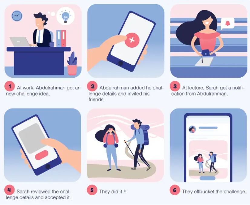
Here’s one of these at work:
Source: Sara Eldebissy on Behance
This is a storyboard of the off-bucket app project.
The storyboard follows the main character, who gets a challenge idea and sends it to a friend. The friend receives the challenge, accepts it, and they both meet up to do the challenge. The whole thing is a great example of flat design at work.
Thumbnail storyboarding style
Much more old-school, these storyboards are done on paper.
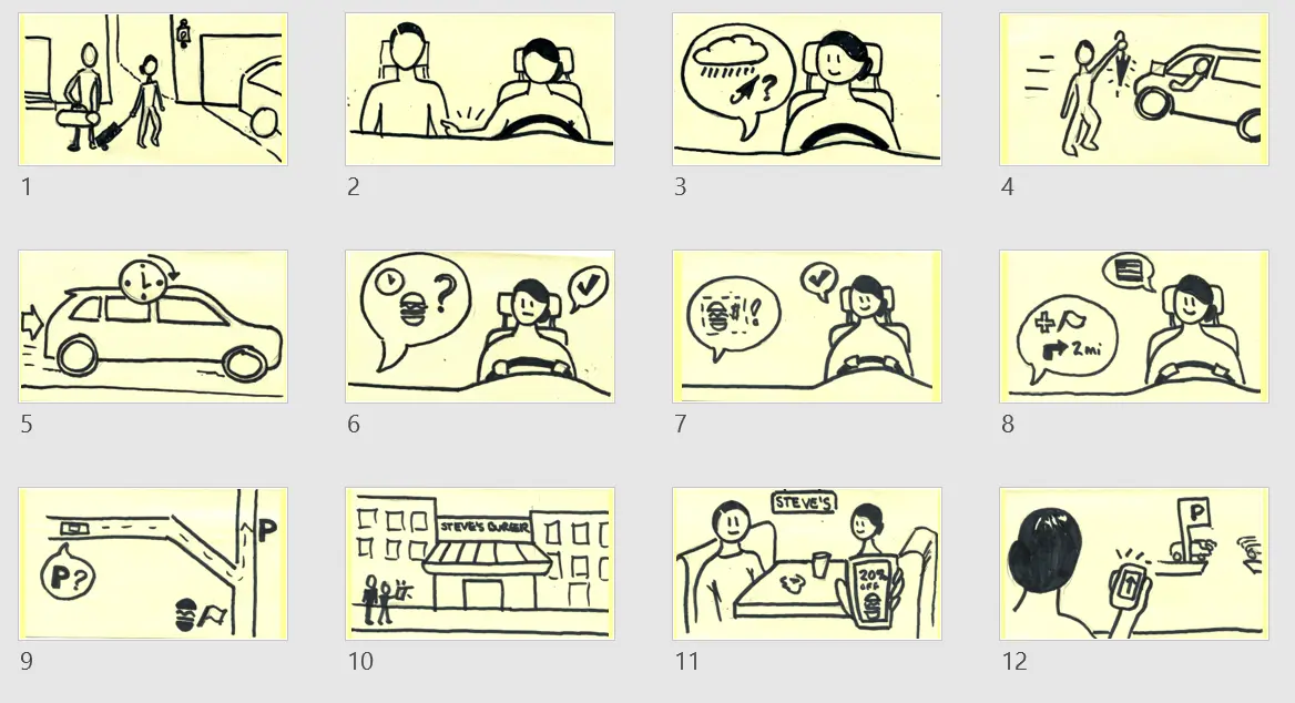
However, unlike the traditional ones, these are not hyper-detailed storyboards. Here’s an excellent thumbnail storyboard example:
Source: Cheryl Platz on Medium
This specific storyboard is a rough sketch representing a multi-environment, connected-device scenario for Windows Automotive.
Most thumbnail UI storyboard examples are rougher sketches of traditional storyboards drawn in small sizes. They only take a maximum of two sheets of paper. You can use a thumbnail storyboard as a draft before you make a refined traditional storyboard.
Your choice of UI storyboard style is determined by your personal preference, a project’s need, or the client’s requirements.
3. How do you make a UI storyboard?
Before making your storyboard, ensure you have a project script and understand the user scenario you want to create.
That defines your entire storyboarding process and makes it easy to decide the type of storyboard to use.
Once you have that, you can get down to making your storyboard, which you can do by following these steps:
Segment your script
First, divide your story into different stages. That makes it easy to develop sequence ideas.
Use your script to get this step right, and add notes and scene ideas. The notes and ideas should be details that help you create a quality storyboard and product later. For instance, you could note website design best practices if you’re working on a website.
Create panels
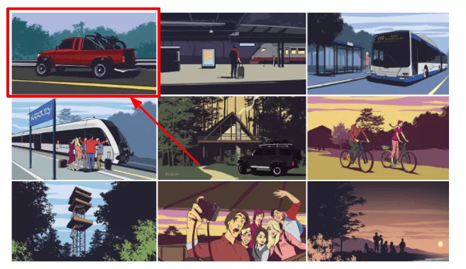
Then for each stage, create panels that represent an individual shot or scene on a blank storyboard. They can either be rectangular or square. Here’s an excellent example of panels:
Source: G A R R on Behance
The specific panel style shown in the storyboard example above is rectangular. Also, note that the panels are separated by white spaces. This differentiates the panels and also makes the panels look neat.
Sketching
The next step is sketching your panels. How you do this depends on the UI storyboarding style you chose.
You don’t need to create complex sketches. As long as they represent your idea, you should be fine.
Also, remember the notes you made on your script earlier on? You can refer to them whenever you get stuck in this stage.
Arrange panels and add scene details
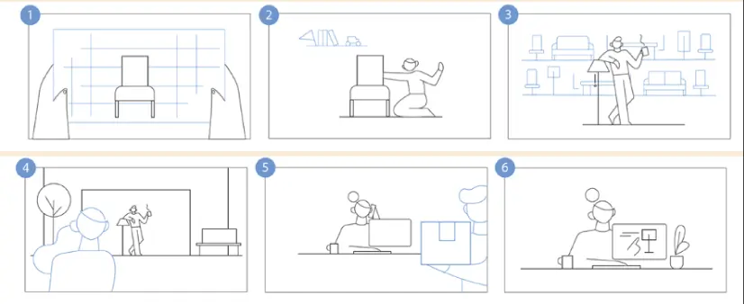
The final step is arranging your panels in chronological storyboard format and filling in the details for each scene. If you use the digital storyboard style, you can arrange panels on the storyboarding software, like in the following example:
Source: GraphicMama
But for the hand-drawn storyboard, you will have to pin your panels to a poster board.
Once you’ve arranged your scenes, you can add descriptive captions, titles, numbers, or other guiding details. If you are the design project lead, you could develop a style guide to help your team members master each project’s voice and tone.
Second opinions
When you’re done with your storyboard, share it with at least one other person and request feedback.
It could be a production team member or other colleagues. Then, you can modify your sketches or panels to match the input. If you were pitching to a client, you can present it to them afterward.
A good storyboard will result from the excellent execution of every step. That’s because, with storyboards, each step determines how well the next works out.
4. Some tips for making a great storyboard
Storyboarding is an engaging and rewarding process, but only if you do it right. To help you get it right, here are some of our best tips borrowed from various UI storyboard examples:
Fully understand and consider your user focus. Be clear on who your audience is, and adjust your tone, setting, and storyboard outlook to match this. That will make it easier to create good user scenarios.
Ensure your scenes are arranged chronologically. That prevents disjointed scenes and smooth transitions between shots and scenes. For instance, if you’re working on a storyboard with multiple characters, have scenes that explain how and why they need to be together.
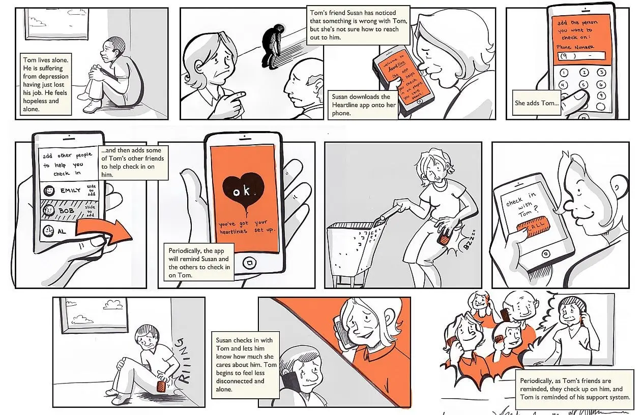
This Heartline app storyboard is a great example. It explains how the characters are related through descriptive scenes and captions. There are also multiple close-up sketches that show more product details, making the story easy to follow.
Source: Chelsea Hostetter, Austin Center for Design on Miro
Next, ensure your storyboard is easy to understand. The best way to do this is by ensuring your sketches outline the problem and the solution your product is solving. For instance, say you are designing a plane booking platform.
You need to show the problem users are having with booking planes and how your product solves that. Also, use simple language for your scene details to make your storyboard more comprehensible.
Finally, invest in storyboarding software to streamline your process. You are also more likely to create a beautiful storyboard with the help of software because you have ready-made UI storyboard templates.
5. Four UI storyboard examples
So far, you already understand the UI storyboarding concept and what makes a good storyboard.
Now let’s look at some fantastic UI storyboard examples I created that you can emulate:
1.
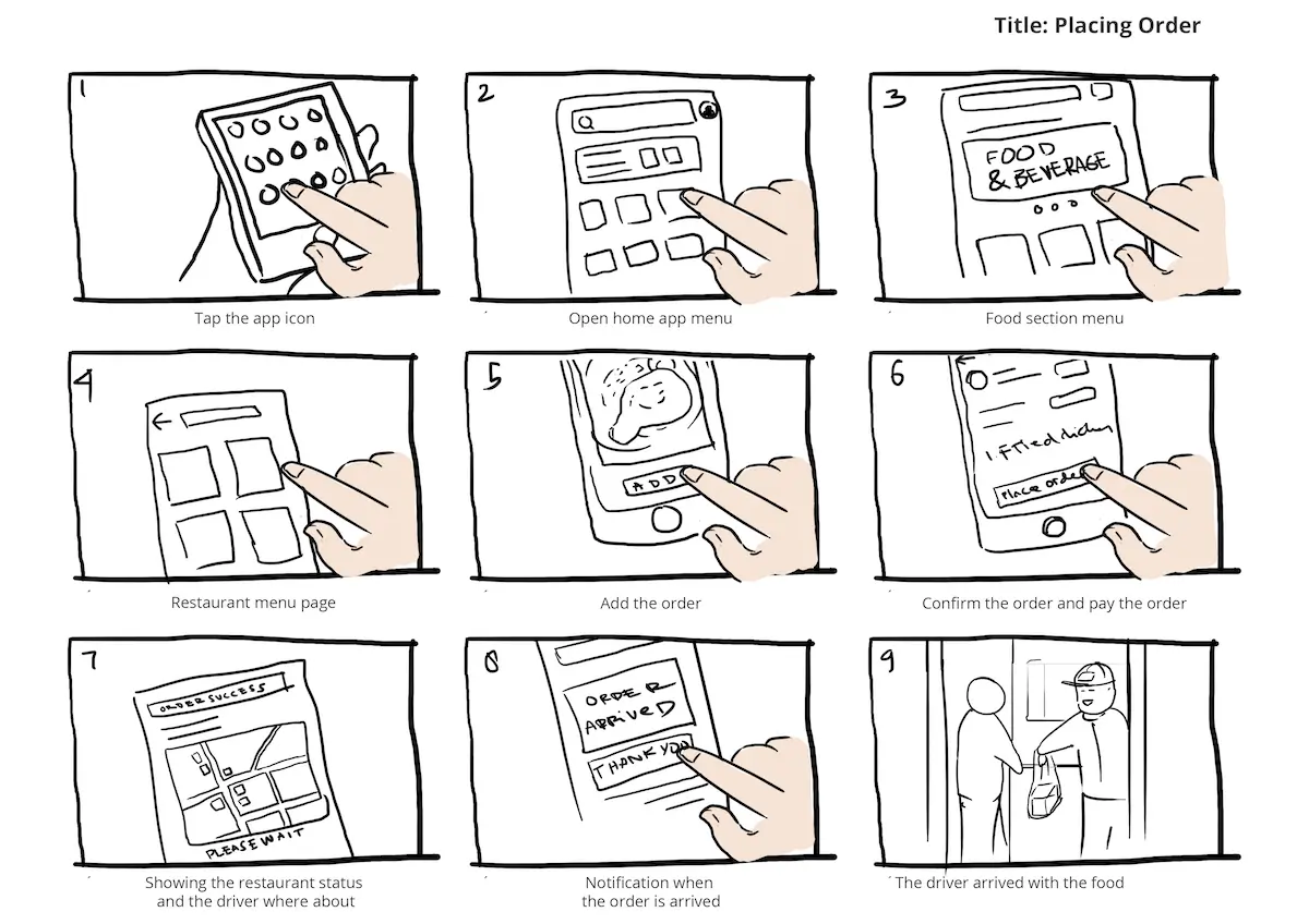
The UI storyboard example is an online food ordering and delivery product. You can tell this by following the order of the panels. This is one of the best UI storyboard examples, because it has every element that a storyboard requires.
As you can see, it has a title and captions in each scene. It is also numbered chronologically. These elements make it easily understandable despite it being a rough sketch.
2.
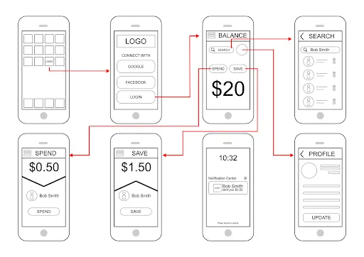
Next is this wireframe storyboard. Although this storyboard is not as detailed as most UI storyboard examples, the scenes are easily understandable. You can also easily follow the product’s user journey.
3.
Template source: Template.net
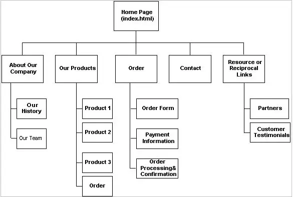
This wireframe is a snippet of a website storyboard. This storyboard example is pretty easy to follow. You can tell that this is a website project from a glance, which is the best feature of the design.
Also, it is very easy for wireframe storyboards to appear cluttered, but this one is done neatly with enough space between each element.
4.
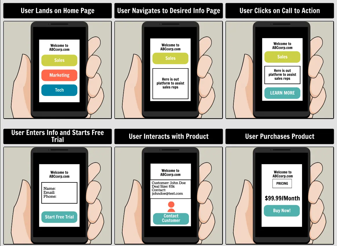
Template source: Storyboard That
This snippet is one of the best digital UI storyboard examples, as it’s more detailed and appealing than the other sketches.
The captions are also detailed enough to show how the user interacts with the product from one scene to the next. The graphics in the sketches also make it easy to follow the whole design.
There are multiple UI storyboard examples you could get inspiration from. But remember, the goal is to create a storyboard that brings your UI design storyline to life.
Wrap-up
Storyboarding is a visual storytelling concept popular in different creative processes in the entertainment industry. However, it has also proved to be crucial to the UI designing process.
As discussed above, there are many benefits to creating a UI storyboard before jumping into the creation process. UI designers enjoy efficiency, a boost in creativity, and even save time that they can use instead to improve a product.
Besides a storyboard’s importance, we have also discussed storyboarding tips to help you create an excellent one. We also gave UI storyboard examples that we hope will inspire you.
Learning how these things work and the thinking behind them is a crucial part of being an effective UI designer. If you’d like to learn more about creating wireframes, color theory, and typography, then take our free, five-day UI design short course.
If you are looking to learn more about the world of UI design and grow your skills, here are some of the articles you should check out:
