In the eyes of future employers and clients, a UI designer is only as good as their portfolio. But what does an impressive UI design portfolio actually look like—and how can you take your portfolio to the next level?
Whether you’re a UI designer in the making who’s starting from scratch, or an experienced designer looking to breathe new life into your existing portfolio, we’ve rounded up nine gorgeous UI design portfolios that will serve as inspiration. As we go through them, we’ll highlight some best practices and key takeaways that will help you to take your UI design portfolio from “okay” to “eye-catching.”
Before we dive in, let’s touch on why UI design portfolios are so vital, and some general notes on what they should include. Rather skip straight to the portfolios? No problem, simply select one from the list below!
- Sam Small
- Jeremiah Shaw
- Mengdi Zhang
- Bady
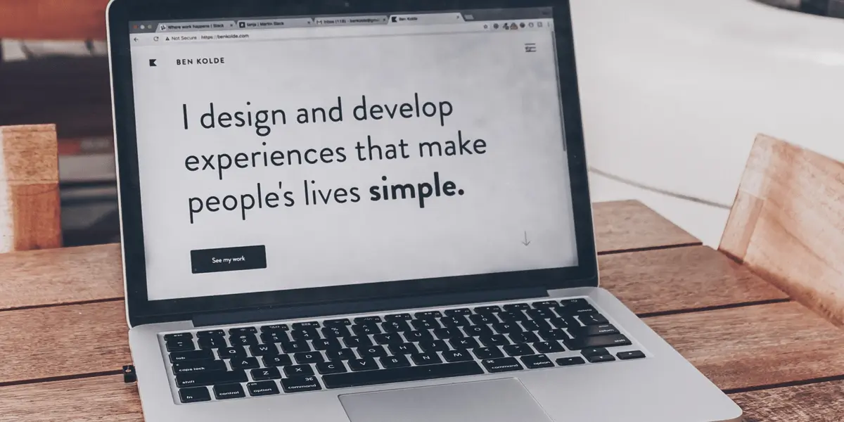
- Tom Parkes
- Stefan Hiienurm
- Bradley Haynes
- Corey Snyder
- Sinem Kurt
What’s the point of a UI design portfolio?
A UI design portfolio is so much more than cherry-picking your favorite projects and arranging them neatly in a visual gallery. It’s an opportunity to showcase your methodology, how you rationalize your design decisions, and your creative flair—as well as giving future employers and clients an insight into what it might be like to work with you.
UI design portfolios should have the perfect balance of personality, practicality, and information, ensuring your projects and case studies are presented in an aesthetically pleasing and easy-to-follow manner. Ultimately, portfolios are about storytelling; who are you, where do your passions lie, and what design principles do you follow?
With that in mind, let’s look at nine amazing UI designers who have really nailed their portfolios—and what we can learn from them.
1. Sam Small
Kansas City based UI/UX designer Sam Small has a passion for design—and it’s immediately crystal clear when you land on his portfolio homepage. With a background in web design, branding and identity, environmental graphics, and advertising, his portfolio is a testament to his versatility.
After a brief yet enticing headline summarizing his offering in a single sentence, we’re inevitably curious to know more about Sam—and sure enough, his portfolio delivers. Boasting clean, bright colors, Sam’s portfolio is a real feast for the eyes. He cleverly uses a blue gradient as the background that changes as the mouse moves around, adding a playful touch of dynamism.

When we get to his projects, we can see that Sam’s expertise stretches far beyond UI. He takes a multidisciplinary approach to brand identity, interlacing bold imagery with informative text—and even the odd abstract animation—to give us the full scope of the project. At the beginning of his “Joey Watson Ceramics” project, Sam provides us with an initial round-up of the project, plainly stating the role he played, the client, collaborators, and when it was completed. This kind of context is vital for providing clarity for future employers and clients who may not have the time to go through the project in full.

All round, Sam’s portfolio is clear, informative, and intriguing.
What can we learn from Sam Small?
One thing every UI design portfolio needs is personality—and Sam’s portfolio is oozing with it. Use a high-impact introduction to intrigue your readers into finding out more about you and your work, but don’t make them work hard to find the essential information about the role you played in your projects. Keep things short and sweet, with the opportunity to discover more if they have the time.
Key takeaway
Every portfolio should be a chance to really showcase your creative flair, so don’t make it boring. Using bold colors, for example, can make your portfolio all the more engaging without being distracting!
2. Jeremiah Shaw
Jeremiah Shaw is an artist/designer focused on 3D illustration, animation, interface design, and branding, currently working at Google.
There are several devices at play in Jeremiah’s portfolio that are impressive. First of all, he’s opted for a right sidebar for his navigation rather than a standard left-hand sidebar. He even takes it a step further by flipping the text on its side to be read vertically rather than horizontally. While it’s always a risk to challenge conventional UI design patterns, it’s really paid off—giving the otherwise stripped-back homepage a subtle edge.

Playing to the ever-growing trend of dark interfaces, Jeremiah pairs a sophisticated black color with white words and colorful geometric figures to create an alluring, bold contrast that instantly grabs our attention.
So, what about his projects? Featuring minimal text and a clean, stripped back layout, Jeremiah lets his imagery do the talking. Jeremiah demonstrates that he can implement cutting-edge UI design trends, but it’s also clear that he’s got a unique style that remains consistent—proving he can both follow guidelines and challenge them.

For his Geo Jam Band project, we see the transformation from pencil sketches to the final product, which gives us a glimpse into his creative process. Touches like these provide fantastic insights into your design approach, and Jeremiah has really nailed them!
What can we learn from Jeremiah Shaw?
Showing how your work would actually look in “real world” apps is a great way of unlocking the reader’s imagination. In his “Nike Badges” project, Jeremiah Shows us exactly what his work would look like within the app “in-situ.” He even features people holding the app after a workout. Clients love to see a polished product, and this attention to detail will only strengthen the story you’re trying to convey.
Key takeaway
Sometimes less is more, and you can’t go wrong with a clean, easy-to-follow presentation!
View Jeremiah’s full portfolio website.
3. Mengdi Zhang
According to her portfolio, New York-based product designer Mengdi Zhang strives to create emotional connections and social values through design. Right off the bat, we get to know her personality through her personal values.
The first thing you see on Mengdi’s portfolio is a stunning illustration of a boat, which instantly tells us that she’s so much more than just a designer. What further grabs our attention is her decision to opt for a one-screen layout, meaning you have to click right rather than up or down to view more pages.

When it comes to her projects, Mengdi’s kept her text thorough. She provides clarity on her creative process, giving us a clear explanation of what she brings to a collaborative project. Mengdi’s projects showcase a wide variety of skills, from both UI and UX design to drawing and illustration.

While her projects are more text-heavy than the portfolios we’ve seen so far, she’s cleverly highlighted keywords that make the text scannable. Scannability of your portfolio is a hugely important thing to consider; when a potential employer or recruiter is looking at hundreds of portfolios a day, they must be able to gauge what they need to know about your process within a matter of minutes.
What can we learn from Mengdi Zhang?
Scannability doesn’t have to come at the expense of a thorough and well-explained portfolio!
Key takeaway
If you need to go into detail, highlight key words.
Mengdhi’s work is now available on their Dribble page.
4. Bady
Remember the previous portfolio, when we talked about the importance of scannability? Singapore based UI designer Bady’s portfolio hits the nail on the head. Without having to navigate away from the homepage, a quick scroll down provides us with an overview of his projects, a short round-up of his experience, and a list of his key clients. This means that within a few minutes, we’ve learned everything we need to know about who Bady is.

The real magic of Bady’s portfolio, however, shines through in his projects. In his “Happy 2 help” project, it’s immediately clear that Bady is not one to skimp on the details. Juxtaposing gorgeous imagery with just the right amount of information as he takes us through every stage of the design thinking process, Bady’s project ticks all the right boxes—from framing the problem, right through to the feedback stage. He even includes style-guide elements outlining his color palette choices, which gives us yet another window into his design approach.

Another awesome feature of Bady’s portfolio is a journal in blog form. Having a blog tells us that Bady is truly passionate about his craft and documenting his improvement. It’s details like this that make Bady’s portfolio stand out against the crowd.
What can we learn from Bady?
Bady’s portfolio proves that the more supporting visuals you can include to provide relevant context for your design thinking process, the better. Don’t limit yourself to just images and text: sketches, wireframes, style guides, flow charts, and journal entries will really elevate your portfolio from good to great.
Key takeaway
Having a “blog” element to your portfolio will add another dimension to your already multidisciplinary offering.
Bady’s portfolio is now available on his Dribble profile instead.
5. Tom Parkes
The second we arrive onto Tom Parkes’ portfolio homepage, we can sense that he’s a cut above the rest. Using parallax scrolling to bring the content to life, Tom Parkes introduces himself as a digital designer with a focus on ethical branding. With nine years of experience under his belt, he names user interface design, brand design, and illustration as just a mere few of the core skills in his arsenal.

Delving into his projects reveals the full spectrum of Tom’s talent. In his “Timechain” project, Tom exercises a clever use of white space to break up the blocks of content and imagery. He opts for bold, impactful color choices, and implements bite-sized pieces of information to support—rather than overshadow—his designs. Playful animations reveal behaviors we wouldn’t otherwise see from a still image, which adds another dimension to his project. Tom’s portfolio certainly leaves a lasting impression!

What can we learn from Tom Parkes?
If there’s one thing that’s clear from Tom’s portfolio, it’s that he’s not afraid of bold choices—and you shouldn’t be either. Not many people would opt for an illustrated dinosaur to represent a security app as Tom did, but as long as you can justify your decisions, there’s no reason why you can’t experiment a little!
Key takeaway
Pairing bold colors with white space will make your layout fresh, exciting, and enjoyable to navigate.
View Tom’s full portfolio on his website.
6. Stefan Hiienurm
Experience and product designer Stefan’s website is the perfect example of a well-rounded portfolio. It starts with a short yet impactful “about me” section, before taking us on a journey of discovery through his projects.

Clicking into his financial mobile banking app project, Stefan’s remembered a few things that designers commonly forget. First of all, he’s included success metrics with his mention of app store ratings. Secondly, he’s listed his awards—which tell us just how successful he is.

While he doesn’t have a large number of projects on display, the projects he does feature are extremely well-thought-out. Balancing bold headlines with snackable insights, Stefan keeps the text to a minimum and lets his UI designs do the talking. He’s played with image placements, following an uneven pattern that avoids repetitiveness.
Another striking feature is his approach to typography and color. I can’t help but be taken aback by his color choices; bold but not overpowering, Stefan’s clearly abreast of color and typography trends, and it shows.
What can we learn from Stefan?
Demonstrate your ability to interpret design trends by putting your own spin on them, as Stefan has with his responsive color system. Edgy for the sake of edgy is never a good idea, but in Stefan’s case, a modern, cutting-edge color palette lends to his designs.
Key takeaway
It’s better to display five amazing projects than 20 sub-par ones. Quality trumps quantity every time.
View Stefan’s full portfolio over on his portfolio website.
7. Bradley Haynes
Product designer Bradley’s portfolio is a testament to the power of good storytelling. Opting out of a conventional homepage, Bradley’s portfolio gets right to the point, displaying his project for travel giant Lonely Planet. The use of imagery in Bradley’s work is immediately striking, and it quickly becomes clear that he’s a design mastermind. Using complementary colors and text to frame the imagery perfectly, Bradley’s designs flow like a waterfall.

Breathtaking aesthetic aside, Bradley includes the perfect level of detail needed to gauge the role he played in his projects. It’s clear from his array of high-profile clients (Lonely Planet and Airbnb, to name a few).

What can we learn from Bradley?
Bradley’s portfolio proves that a homepage is not always necessary. Without any introduction to who he is or where he’s from, we have no choice but to get to know Bradley through his incredible work.
Key takeaway
Subtle animations go a long way!
View Bradley’s full portfolio on his website.
8. Corey Snyder
Tangerine Industries is the personal portfolio of award-winning interactive designer Corey Snyder—and why he’s won so many awards is almost immediately evident the second you arrive on his site. Featuring projects that stretch across a range of sectors, it’s clear that Corey is something of an all-rounder.

The first thing we notice on Corey’s site is the eye-catching orange color, which is beautifully complemented with a muted beige. It’s clear that Corey has a strong grasp on the value of color harmony, and the more we navigate the site, the more we get the sense that this is a portfolio unlike any other. He’s also opted for a horizontal scrolling effect, which takes some getting used to—but ultimately makes the website all the more fun to use.

When it comes to his projects, Corey places a heavy emphasis on thought process, problems, and solutions. He gives us a fantastic insight into his design approach by supporting his solutions with visual examples and including quirky featured quotes that frame the problem in a personal, relatable way.
What can we learn from Corey Snyder?
Giving us insights into your thought process can really humanize the project, and allow the reader to put themself in your shoes. The more information you include about your thought process throughout the project, including learnings, mistakes, and changes in direction, the more we’ll get an idea of what it would be like to work with you.
Key takeaway
Play around with your navigation; it will only make you stand out more!
View Corey’s full portfolio on their website.
9. Sinem Kurt
We couldn’t round off this list without including a little CF portfolio magic, now could we? CareerFoundry UI design graduate Sinem finished the program in 2019 and is now a UX/UI designer. Let’s look at what makes her portfolio worthy of being on this list.

Straight away, Sinem’s made sure that no visitors to her website have to do any digging to find what they’re looking for. Her homepage has everything: an overview of case studies, testimonials, and an “about me” section with a strong emphasis on her personal values. Scannability, check!

Delving into her “Plantasy” case study, Sinem hasn’t left anything out. Kicking off with an overview that identifies the project’s end goals, Sinem details the competitor analysis, interviews, surveys, and user personas, all organized in a structured and easy-to-follow layout. Of course, her visuals are far from an afterthought, taking us on a visual and well-signposted journey from ideation to completion. In her “inner peace” project, she also includes a typography style guide element that really tells us how deeply she’s considered every feature.
What can we learn from Sinem Kurt?
Sinem is obviously more junior than some of the other designers on this list, but that doesn’t mean she’s skimped on any details. Like Sinem, it’s crucial to think about what questions a potential employer might ask you about this project, and include any information you may have missed out.
Key takeaway
Being a junior designer doesn’t have to mean the quality of your work takes a hit!
View Sinem’s full portfolio on their website
And that concludes our list of inspiring UI design portfolios! For further inspiration for UI design portfolios, be sure to spend some time on sites such as behance, dribbble, and site inspire. If you’d like some prompts to help generate content for your portfolio (and keep your design thinking muscles flexed), check out this article: 5 Design challenges for the budding designer.
To learn more about UI design, take a look at these articles over on the blog: