When it comes to designing a compelling user interface, color is widely considered to be a designer’s most powerful tool. But there’s so much more to a website’s color palette than randomly choosing shades that jump out at you. Diving into the details of color theory will reveal that there are a lot of particularities to comprehend. That’s where we come in!
To help you along your way, we’ve created a handy glossary of the essential terms that will help you get a deeper understanding of how color works as you navigate your first user interface.
Let’s dive right in!
1. Color Theory
Primarily based on Isaac Newton’s color wheel, color theory is a practical framework employed by UI designers when choosing a color palette for their interfaces, mixing colors, and striving towards color harmony.
2. Primary Colors
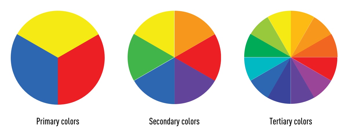
The primary colors are red, blue, and yellow. These are colors you can’t create by combining two or more other colors.
3. Secondary Colors
The secondary colors are orange, purple, and green—in other words, colors that are created as a result of combining any two of the three primary colors.
4. Tertiary Colors
The tertiary colors are magenta, vermillion, violet, teal, amber, and chartreuse. Tertiary colors are created by mixing a primary color with a secondary color.
5. Hue
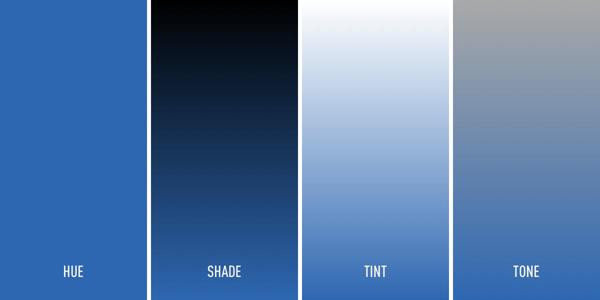
Hue refers to the pure pigment of a color, without tint or shade. For this reason, any one of the six primary and secondary colors can be considered a hue.
6. Shade
Shade refers to how much black is added into the hue, or the darkening of a color.
8. Tint
The opposite of shade, tint refers to how much white is added to a color. In other words, the lightening of a color.
9. Tone
Tone is the result of a color that has had both white and black added to it. In other words, tone refers to any hue that has been modified with the addition of grey—as long as the grey is purely neutral (only containing white and black).
10. Color temperature
Warm colors contain shades of yellow and red; cool colors have a blue, green, or purple tint; and neutral colors include brown, gray, black, and white.

11. Color harmony
Color harmony is the result of combining colors that promote aesthetic harmony, and are visually pleasing for the human eye. Color harmony is what most designers strive to achieve when creating their interfaces.
Want to understand color harmony better? This blog post by zevendesign details how the various color harmonies can be used in design.
12. Color models
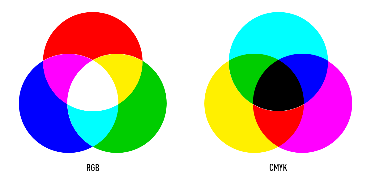
Color has two different natures: the tangible colors which can be seen on the surface of objects, and colors that are produced by light. These are known as the additive and subtractive color models. RGB stands for red, green, and blue, and is based on the additive color model of light waves that dictates that the more color you add, the closer the color gets to white. On the other hand, CMYK is known as the subtractive color model, which obtains colors by the subtraction of light. CMYK stands for cyan, magenta, yellow, and black.
13. Color palette
A color palette is a combination of colors used by UI designers when designing an interface. There are six color palettes commonly used by designers; monochromatic, analogous, complementary, split-complementary, triadic, and tetradic.
14. Monochromatic
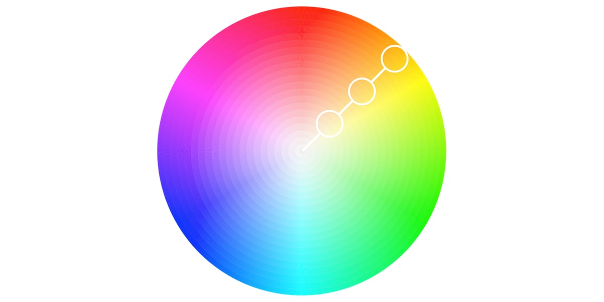
A popular choice with designers, monochromatic color palettes are formed using various tones and shades of one single color.
15. Analogous
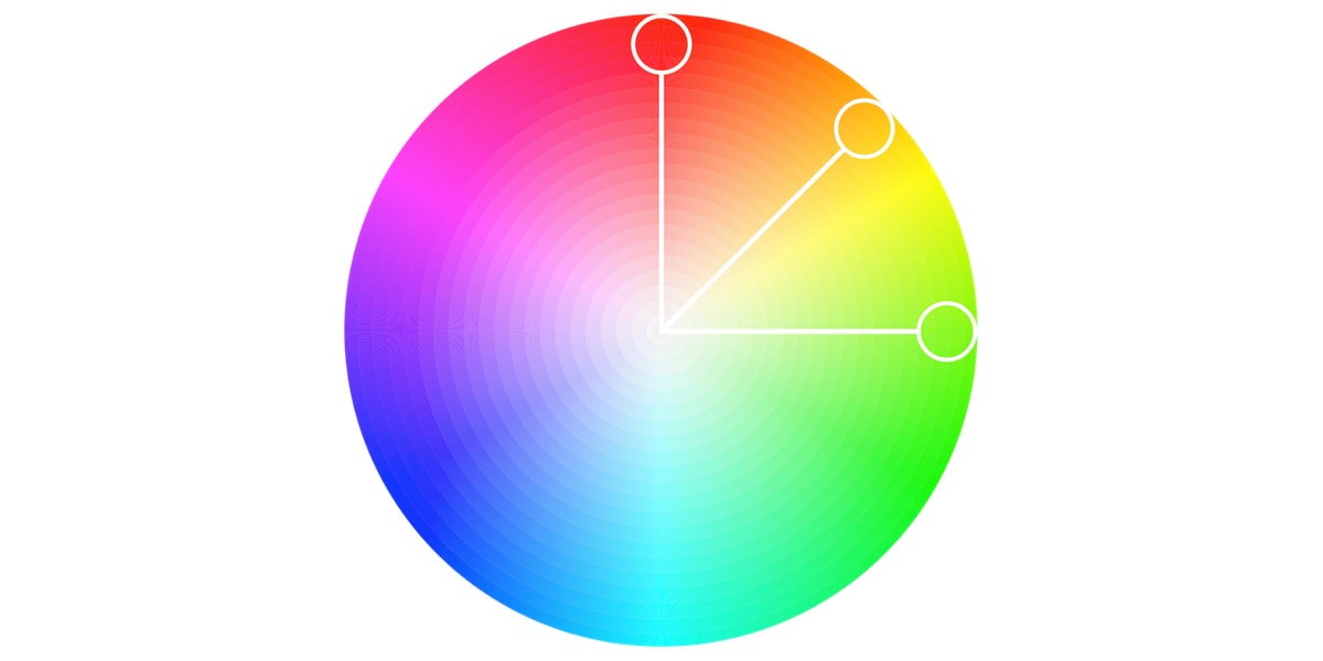
An analogous color palette is formed of three colors that are located next to each other on the color wheel. Analogous color palettes are commonly used when no contrast is needed—for example, on the background of web pages or banners.
16. Complementary
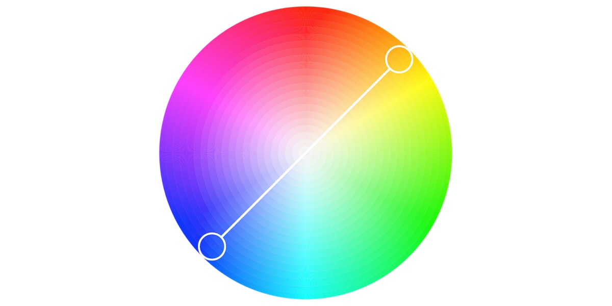
Complementary color palettes are comprised of colors that are placed in front of each other on the color wheel. While the name may suggest otherwise, complementary color palettes are actually the opposite of analogous and monochromatic color palettes, as they aim to produce contrast. For example, a red button on a blue background will stand out on any interface.
17. Split-complementary
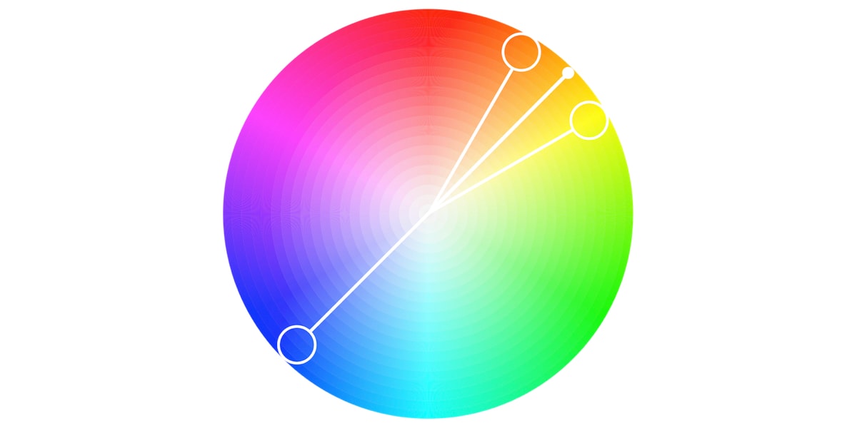
The split-complementary color palette differs from the complementary color palette only in that it employs a higher number of colors. For example, if you choose the color blue, you’ll then need to take the two colors that are adjacent to its opposite color, which in this case would be yellow and red.
18. Triadic
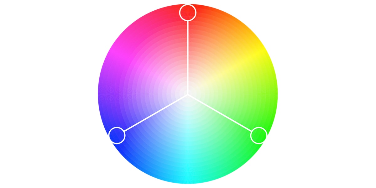
The triadic color scheme is based on three separate colors that are equidistant on the color wheel. Most designers employ the triadic color scheme by choosing one dominant color and using the other two colors as accents.
19. Tetradic
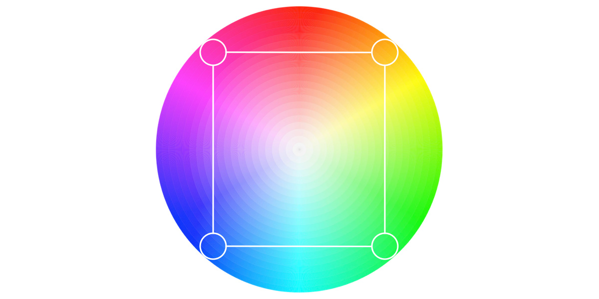
Commonly used by more experienced designers, the tetradic color scheme employs two sets of complementary pairs—four colors from the color wheel in total that should form a rectangle when connected. While it’s a little harder to balance, it makes for a visually stunning end effect!
20. Color psychology
Color psychology is the study of how colors can influence human mood and behavior. According to color psychology, the human mind subconsciously reacts and interprets colors in a way that influences our actions. For example, yellow evokes positivity, youth, joy, and playfulness.
So there we have it, the twenty essential terms you need to know as you begin your journey to mastering the science of color! To learn more about color and color theory, check out this recording of an event we hosted, explaining how to choose color for your UI design. For further reading, take a look at these articles:
