Long before someone registers a sentence or takes in a layout, a user interprets the choice of color on a user interface. Color is design’s most powerful tool, and while some classic color palettes are here to stay, our approach to color continues to evolve.
Keen to keep your finger on the pulse of 2025’s hottest color trends? Let’s take a look at the colors that will set our world alight this year.
Here are the trends we’ll cover:
- Monochromatic with a twist
- Dark mode color palettes
- Nature-inspired color palettes
- Pantone’s classic blue
- Vintage color palettes
- The future is bright(ly colored)
Off we go!
1. Monochromatic with a twist
Monochromatic color palettes (various tones and shades of one single color) have long-since been a popular choice for UI designers. They’re easy on the eye, simple to process—and above all, they promote overall harmony. This year will see designers take a step back from the trendy black/white/grey and instead opt for more unique color families, like dusky blues and greens. By switching up the color but sticking to the same formula, designers will be able to experiment and bolster their website’s contrast while still maintaining balance and unity. Win-win!
2. “Dark mode” color palettes
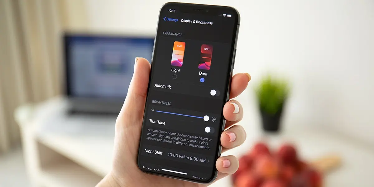
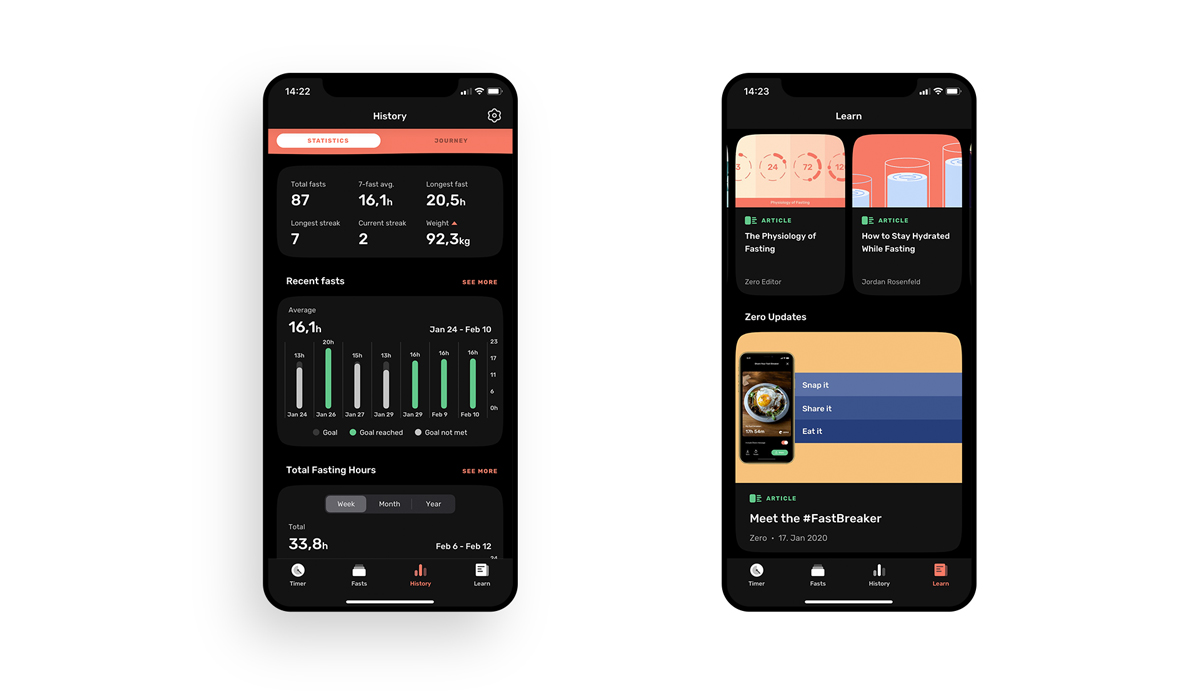
Offering users a reduction in eye strain and screen glare, dark mode is fast becoming a preference for mobile device users. The growing popularity of dark interfaces is paving the way for innovative color palettes that stand out on dark backgrounds, as well as in juxtaposition with whitespace. In 2025, we’ll see designers experiment with this popular aesthetic by contrasting saturated dark and edgy color palettes with accents of bright and bold colors.
3. Palettes inspired by nature
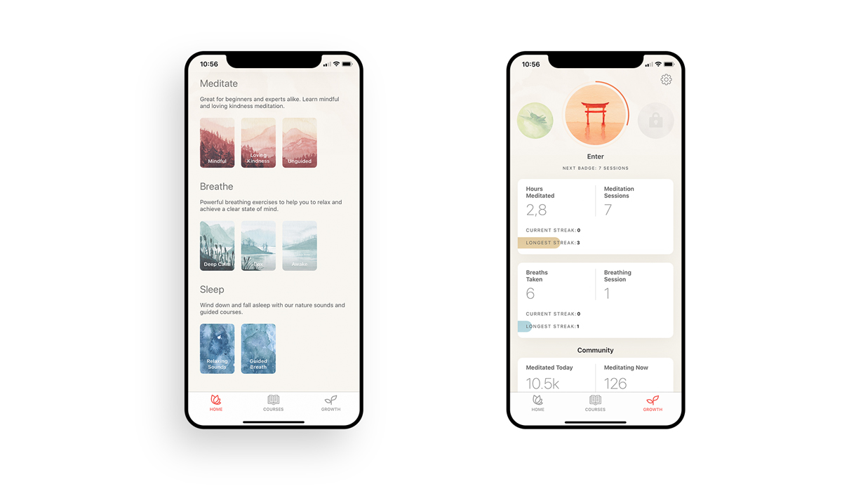
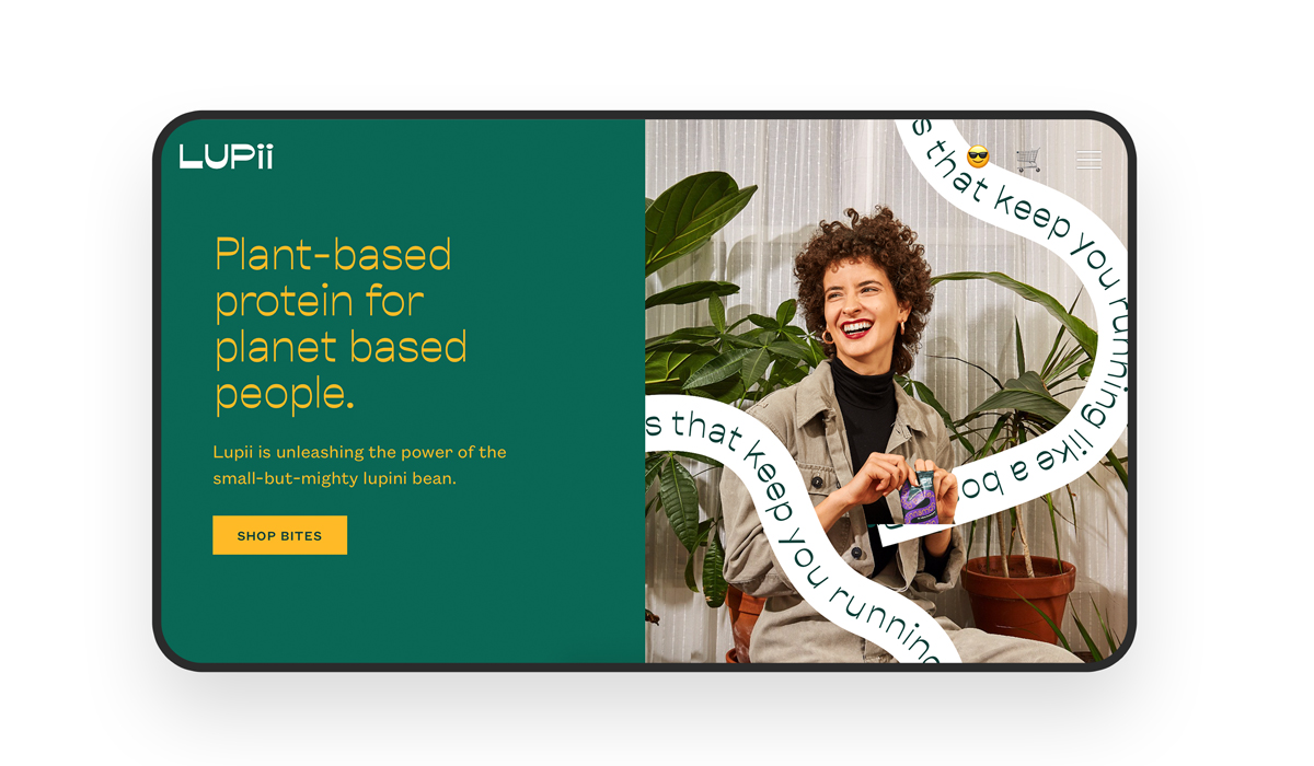
In our tech-centric culture, is it any surprise that we’re turning to colors that promote peace, calm, and tranquility? With a growing desire to counterbalance the technology that makes us feel overwhelmed and stressed out with wellness practices, colors synonymous with nature will emerge as one of 2025’s biggest color trends. Inspired by nature, designers should experiment with greens, blues, creams, and browns. Basically, using any color that will make your users feel relaxed and soothed as they navigate the interface will have you onto a winner.
4. Pantone’s classic blue
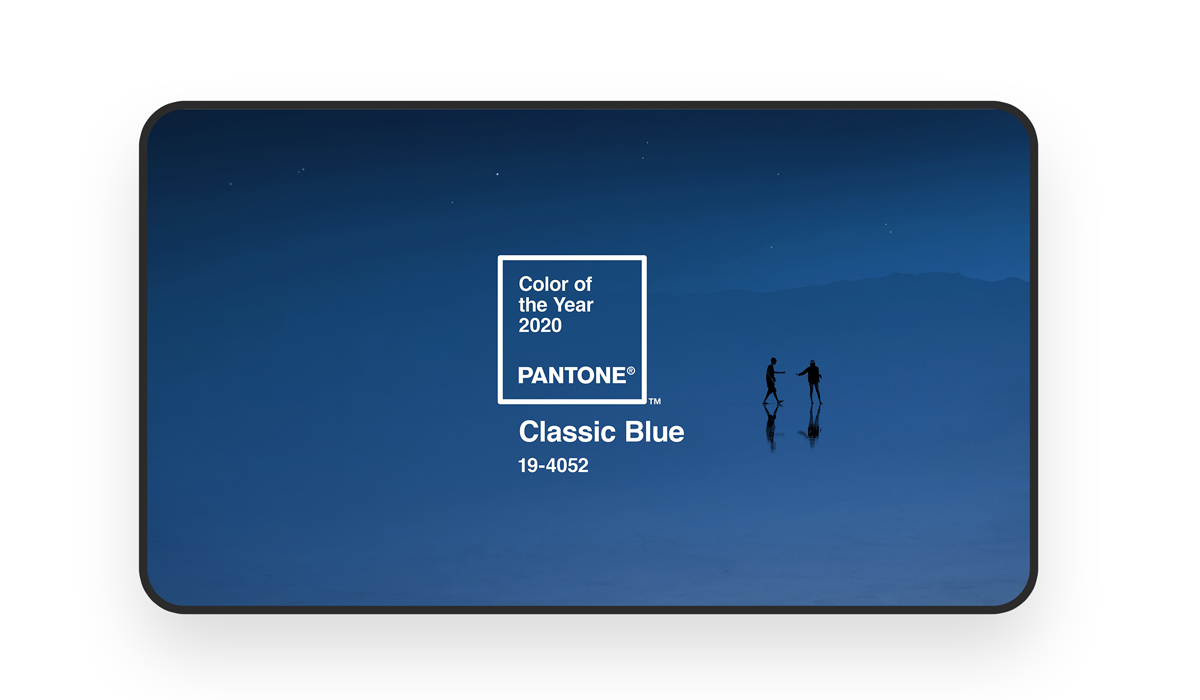
What would a color trends blog post be without a mention of Pantone’s coveted color of the year? Way back in 2020, Pantone announced its color of the year as being “19-4052 Classic Blue”, a timeless shade that falls somewhere between mid-tone and deep blue on the color spectrum. So far, there’s no sign of it slowing down.
According to color psychology, blue is synonymous with intelligence, maturity, and trustworthiness – explaining why it’s by far the most popular color when it comes to branding. Simple and elegant, get ready to see 19-4052 Classic Blue pretty much everywhere this year.
5. Vintage color palettes
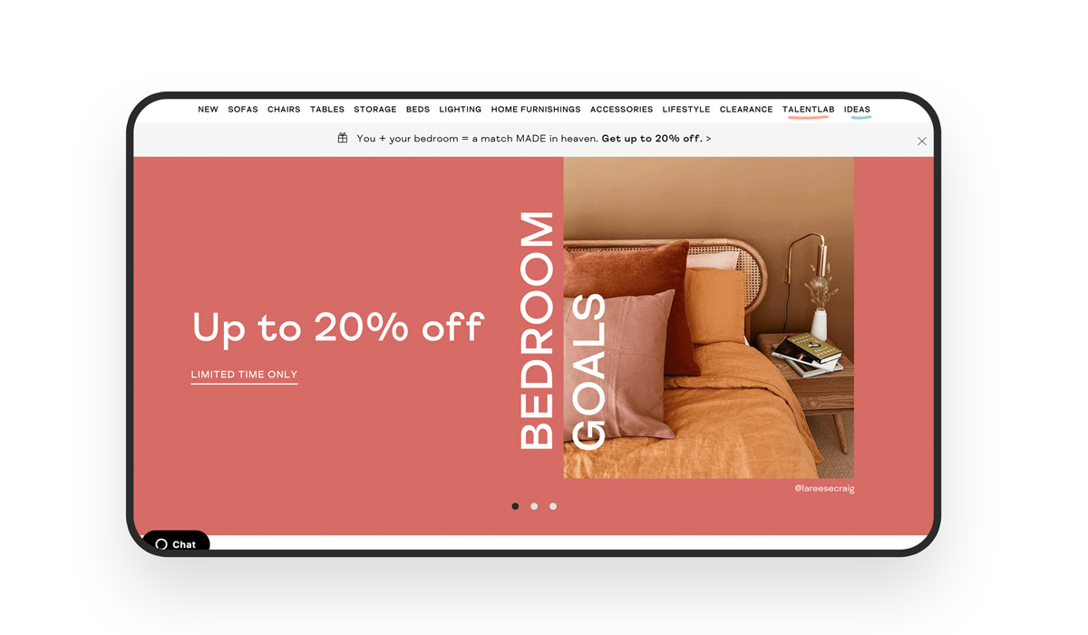
Who doesn’t love a throwback? While vintage-inspired colors take us back to a simpler time, they’re also set to take the UI design world by storm in the new decade. Ok, we know, drawing inspiration from vintage anything isn’t new, but what is new is the modern twist designers have been putting on these classic colors. Muted, retro colors like mustard or deep red, contrasted with fresh, bright pastel colors and neons will breathe new life and create entirely new palette genres off the back of the colors we know and love.
6. The future is bright(ly colored)
If these trends tell us one thing, it’s that it’s essential to strike a balance between challenging conventions and achieving color harmony. Paying attention to these trends will ensure you keep your color palettes creative and fresh while providing your users with an enjoyable experience while navigating your interfaces!
Learn more about the use of color in design with our guide to color symbolism.
To learn more about UI design, take a look at these blog posts:
