For UI Designers, Sketch is a huge breath of fresh air.
I think I’m not alone when I say: thank goodness Photoshop is no longer the go-to piece of software for designing user interfaces.
Enter Sketch.
Sketch is tailored to UI design and has a stellar feature-set that allows us to focus on designing beautiful interfaces, without all the bulk of Photoshop or Illustrator.
But Sketch isn’t without its own difficulties and learning curve: It can still be an intimidating piece of software to a beginner.
That’s why I’m going to share my list of the 5 most common Sketch mistakes I come across. Avoiding these common mistakes will help you design more efficiently, which will save tons of time and frustration!
If you’d like to skip to one particular section, simply use the clickable menu:
- Not using symbols
- Improperly naming layers and artboards
- Not using Guides, Grids, and Layouts
- Not using Artboard templates
- Not using plugins
- Final thoughts
1. Not using symbols
Sketch has a ton of built-in features that allow you to get from A to B as quickly as possible. But what if you don’t know about these features?
For example, maybe you’ve seen the term “symbol” in Sketch and thought “What the heck is a symbol and how do I use it?” Symbols are actually one of the most powerful time-saving features of Sketch. If you’re not using them, you’re making your life considerably harder!
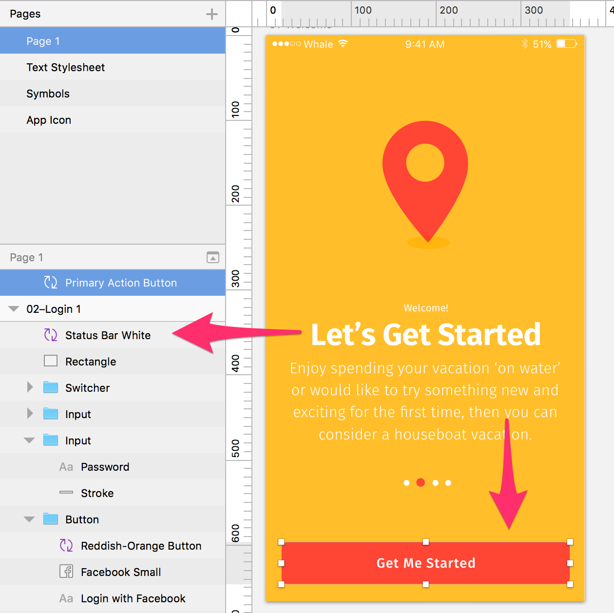
Symbols are simply layers that can be reused over and over again. If you make a change to a symbol, each instance of this symbol is updated. So no more making a tweak on one artboard only to have to make the same tweak on 10 others!
2. Improperly naming layers and artboards
Once you start getting into a groove with a design, the last thing you want to worry about is the naming of your layers and artboards!
But many beginners underestimate how important it is to keep a logical and descriptive naming scheme.
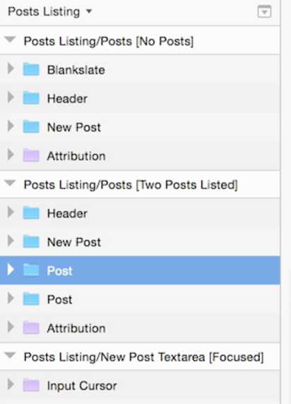
First and foremost, a good naming scheme can make a document much easier to navigate. Imagine that you work on a file, then a month goes by before you open it again.
Without properly named layers and artboards, it can be nearly impossible to remember what was where. And forget searching for a particular layer!
Having a properly named file also means that other designers will be able to open it up and pick up right where you left off without having to waste time searching for things.
Trust me, the worst thing you can do to another designer is drop a poorly organized file on them. It reflects badly on you and doesn’t make for a good working relationship!
The Utility of Good Naming
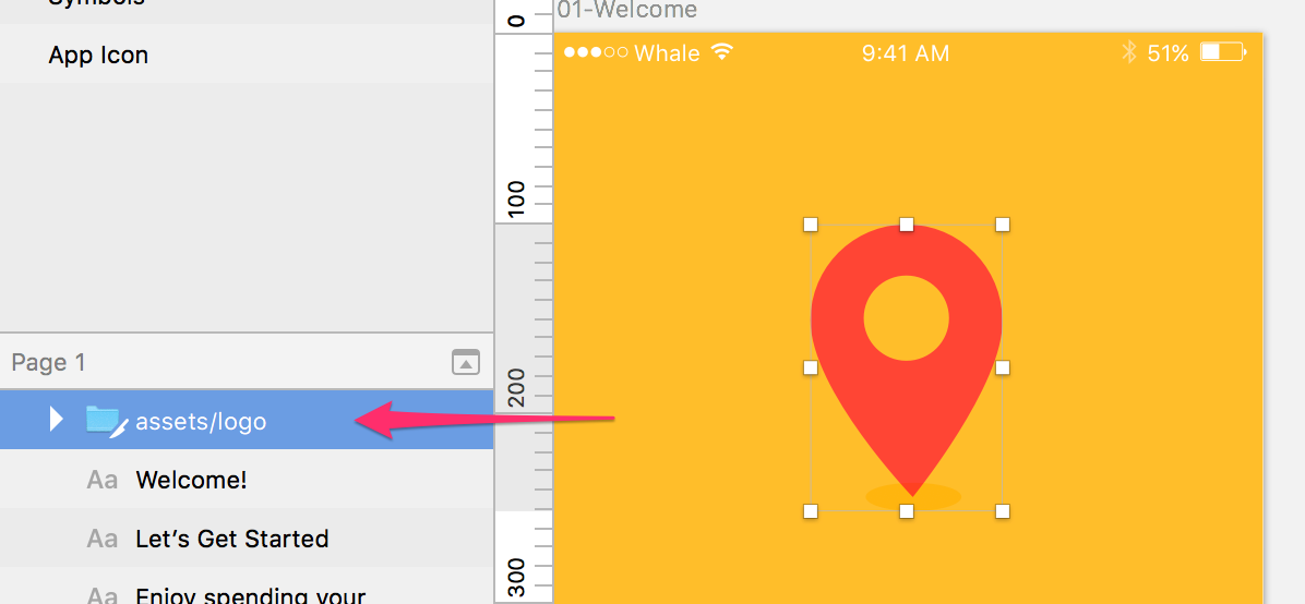
A good naming scheme does more than just make a file easy to navigate, it makes the export process easier too! Did you know that if you name a layer, group, or artboard “assets/logo”, then export that layer, it will actually create the “assets” folder and put the image file in it?

So next time you create a layer, artboard, page, or anything else in Sketch, take the time to give it a logical name that describes what it is. You’ll thank yourself later, and others will thank you too.
3. Not using Guides, Grids, and Layouts
Sketch comes with tons of tools to help you design UI quickly and efficiently. Among these are guides, grids and layouts, all of which work in different ways, but are here to help you keep your designs symmetrical and lined up.
Guides
Guides allow you to create a structure that design elements will snap to. Since guides won’t be exported in your final design, they allow you to create guidelines that can be removed at any time.
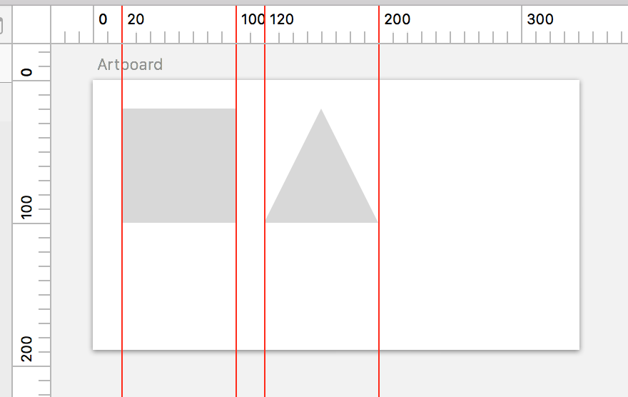
You can create a guide by simply clicking and dragging one out from the rulers to the top and left side of your canvas. If you don’t see any rulers, go to Canvas >> Show Rulers to enable them.
Sketch also has a feature called Smart Guides. These aren’t guides you create yourself, instead Sketch tries to guess at measurements and alignments as you move objects around.
Try it yourself by creating two shapes, then moving one of them around. You’ll see these red guides appear in order to help you align your shape.
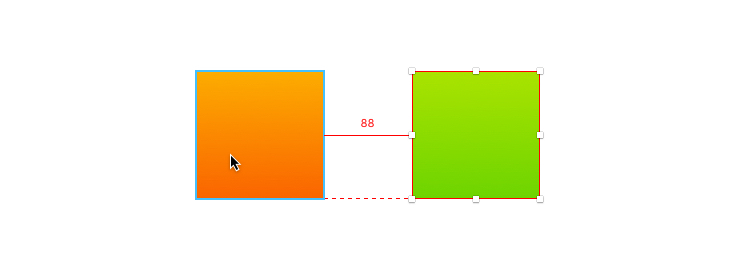
Smart Guides are huge time savers but can sometimes get in the way or be a little bit annoying. If you’re not a fan of them, you can disable them by clicking View >> Canvas >> Show Smart Guides.
Grids
A grid is comprised of lines that cover an entire artboard in order to give you a universal guide for keeping things aligned.
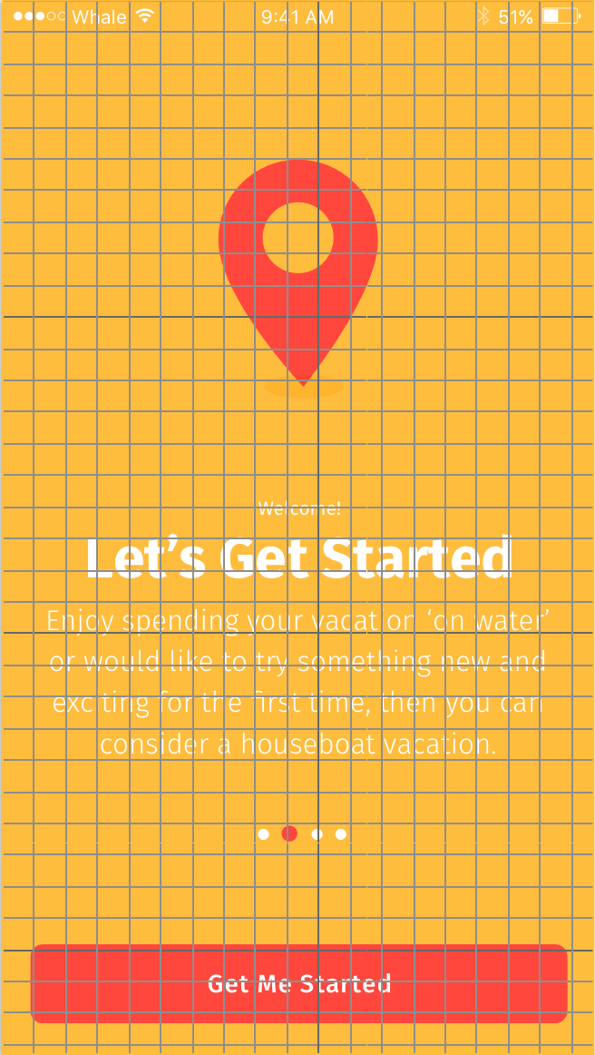
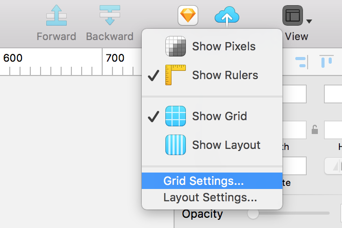
You can tweak the spacing and color of your grid by going to Layout >> Grid Settings.
Layouts
Layouts work in a similar way to grids. Their purpose is to help you keep things aligned. But instead of classic grid lines, a layout provides vertical and horizontal columns that can be used to keep elements consistently aligned and sized correctly throughout your design.

Layouts are especially useful for web and mobile layouts where the viewport size may change depending on browser or device dimensions.
4. Not using Artboard templates
Another way to save tons of time and headaches down the road in Sketch is by using the premade artboard templates that ship with the software.
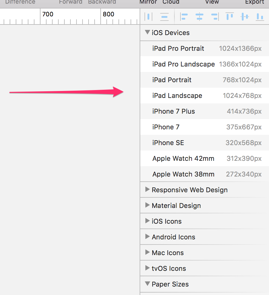
You can access these templates by simply clicking the artboard tool (Insert >> Artboard), then you’ll see the available templates in the Inspector to the right.
Sketch offers useful starter templates for Desktop, iOS, Android, icons and other things, which helps take the guesswork out of knowing which artboard sizes to start with.
5. Not using plugins
Sketch is certainly a powerful program for designing UI, but it can’t do everything!
That’s where plugins come in: Plugins extend the power of Sketch by adding extra functionality.
The first thing I recommend doing is downloading Sketch Toolbox, which will help you search for and manage your Plugins.
Once you’ve done that, spend some time browsing plugins and see what sort of functionality is out there!
I highly recommend the Icon Font plugin for easily adding icons to your Sketch designs and the Magic Mirror plugin, which creates beautiful UI presentations.
These are only a couple that I use every day, but check out Sketch’s plugin repository for some other essential Sketch plugins.
Final thoughts
Sketch may seem like a simple program on the surface, but hiding under the hood are tons of powerful features that will save time and make your designs much more manageable as they grow larger.
If you’d like to take your understanding of Sketch to the next level and begin a lucrative career in UI Design, check out my UI design course!
What are some other Sketch mistakes you’ve made? Share them in the comments below!
