A good search experience can make or break a user’s experience. It’s an essential part of navigation, especially with more content-heavy websites and mobile apps. But it’s a great example of how good design can be invisible. While users expect search to work perfectly, it often goes unnoticed unless it fails. This article is all about bringing to light some of the key design decisions that go into a good search experience.
Search begins when the user starts looking for an item and it ends when they’ve found what they’re looking for. Designers need to guide users through each step along the way as efficiently and painlessly as possible, taking into account the type of content presented and users’ needs with it.
In this article, I’ve divided the search flow into the 4 main steps below and described some best practices and considerations for each one.
- Initiating the search
- Entering the search input (keywords)
- Viewing a list of search results
- Viewing individual item pages
After reading, check out some searches on your favorite websites or in your favorite apps and see if you can see any of the choices that went into the design process.
How to design a good search experience: Best practices
1. Initiating the Search
As users, it might feel like every search bar is the same, but it’s not quite that simple. Designers have to think about how search fits into the larger navigation experience of the site. While search is ubiquitous, it’s not always the best way for users to explore content on a given site or app. For instance, users often show up to an ecommerce site like Amazon looking for a specific item or type of item. Search is an incredibly efficient way for them to find what they’re looking for. On a news site, however, users typically want to explore content more unpredictably. Search should still be available to these users, but designers can steer them toward a browsing-heavy approach that’s more suitable for the content on the site. The prominence of the search bar should guide users toward the appropriate navigation style for the content.

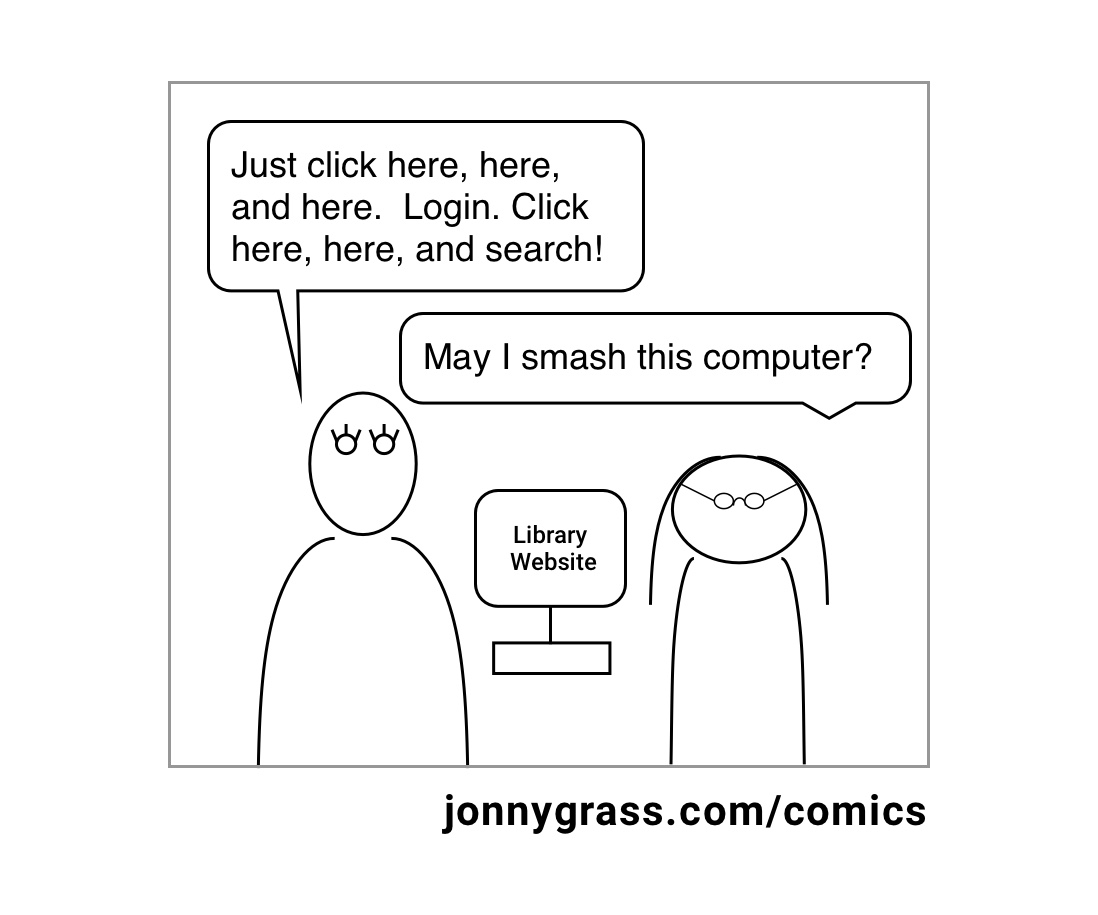
As a librarian, I helped users find content in a very search-heavy process. But the lack of prominence of the search bar was often mismatched with how important search was to the process.
How do you make a search bar more or less prominent? Research suggests that the position, contrast, and size of the search bar all contribute to the search bar’s prominence on the page. Making search available throughout the app vs. just on a specific page is another way you can raise or lower its profile. A third consideration, especially on mobile devices, is whether to display a full search bar or just a search icon that expands to a search bar when tapped. All of these decisions should be carefully designed to match the product’s content and users’ expectations about how to navigate it.

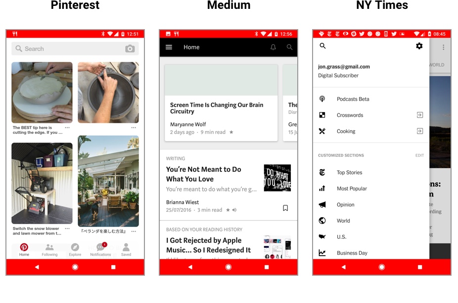
Pinterest uses a universal search bar to encourage search, while Medium offers an expandable search to suggest browsing. NY Times goes one step further by putting an expandable search inside a menu.
2. Entering Search Input
Once users have initiated the search, designers need to help them get the most out of it. Autocomplete can be a powerful tool for helping users improve their search keywords. but just like initiating a search, there’s more design to autocomplete than meets the eye. Autocomplete suggestions typically come in three types: common keywords, keywords from search history, and scoped searches. A scoped search is when you apply filters (or scopes) in the initial search to limit results to a specific section of the site.
Research has shown that people misunderstand scoped searches. They rarely realize when results have been limited to a particular category from the get go, so if they don’t see what they’re looking for, they assume it’s not there. Nielsen Norman Group research also shows that “users are more likely to change the search scope in retrospect than during their first search attempt,” so scoping and filtering should be deferred until later. Autocomplete should include suggested keywords and search history, though, which guide users toward better search terms that are more likely to find what they want.
Whenever possible, autocomplete suggestions should also use visual cues to differentiate suggestions. For example, suggestions that come from search history can use an icon or text to show this, and bold fonts can draw attention to the differences between the suggested keywords. Any included scopes or filters should be emphasized by using a contrasting font color, font style, or clear labels as visual cues.

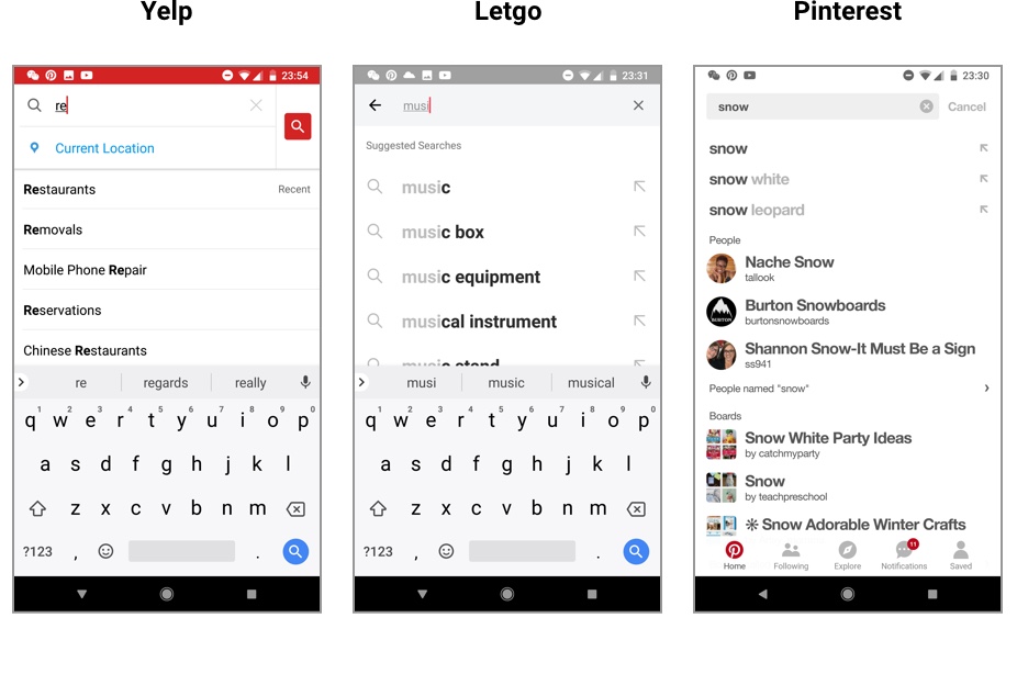
Yelp’s ‘Recent’ label indicates suggestions from recent search history. Letgo uses bold to clearly show the distinctions between search suggestions. Pinterest has labels that show scopes of suggested search terms.
Check out these 96 annotated design examples of autocomplete suggestions to learn more about best practices!
3. Viewing Search Results
The search results page needs to both show users the results of their search and allow them to easily refine their search as needed. One way to make this easy is to display the search bar with users’ search terms in it at the top of the results page. This not only reminds users of their current search, but it makes it easy to run a new search in a snap.
Now is the time for scopes and filters to shine. Filters at this stage give users the control they need to find exactly what they want. Search filters or a filter icon should be prominently displayed, and filters should be relevant to users’ needs. Once selected, applied filters should always be visible and easy to cancel or change.

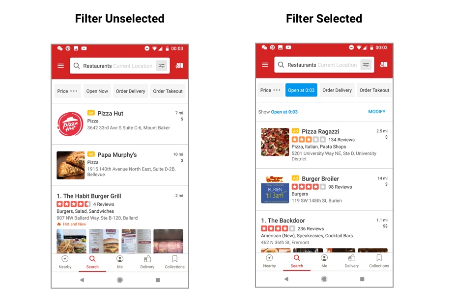
Yelp clearly displays the current search in a search bar at the top of the screen. Users can filter results by tapping filters at the top and remove selected filters by tapping them again.
On mobile search, it’s especially important to focus on the input method for each search filter. As with any time users input data on a mobile device, it’s important to choose the most appropriate input control for each item. Using sliders for price ranges, toggles for two mutually exclusive choices, and check boxes for ‘Select all that apply’ options will make this process as smooth as possible. Pre-filling any information you can, such as location information, will also save users time and frustration.
There are tons of articles about how to best design mobile input controls for usability, and Apple and Google give detailed instructions for iOS and Android devices, respectively.
4. Viewing Item Pages
Once users have a relevant set of search results, they can drill into each result for more information. At this stage, their primary goal is to compare and evaluate.
Comparing apples and oranges is notoriously difficult, so item pages need to have consistent information. Whether they’re product pages, user profiles, video content, or something else, the information on item pages needs to be consistent across all items. How can you decide which unicorn cupcake to buy if some pages show the ingredients and price while others don’t? Yet this Baymard Institute study showed that more than 60% of ecommerce sites didn’t list the same basic information on all product pages, making it really difficult for users to compare these products.
For the same reason, item pages should play up relevant information and play down less key info. While some users might want to see full spec sheets on products or very detailed metadata about a film, the majority of users need a handful of key details. Presenting the most commonly needed information in an easily scannable format lets users evaluate an item’s relevance quickly so they can move forward with it or keep looking. Advanced comparison tools can show users key information of a few items side-by-side, making it even easier to find the right item.
Check out 120 annotated product pages and 51 mobile product pages for some good examples of best practices in action.
And if you’d like to see (and learn from) UI design mistakes, read this article: 10 Common UI design mistakes (and how to avoid them).
Like anything in UX design, the best search solution depends on what works for your users, but these best practices and considerations can give you a good launching pad.
Want to learn more about UI design? Here are a few other guides that you’ll find helpful:
