It’s no secret that choosing the right colors for your website’s design is crucial to ensure the online success of your product. But a color palette is so much more than a simple aesthetic consideration. Just like fonts and style, colors impart a tone and emotional impact that affects how your customers perceive your brand—and that makes color a powerful design tool in its own right.
When executed properly, the right color palette can prompt new visitors to your website, strengthen your branding, and drive sales and leads. But with an overwhelming 16.8 million colors to choose from, creating a harmonious color palette—and successfully implementing it into the design of your website—can be quite a challenge. That’s where we come in!
In this blog post, we’ll guide you through the process of choosing a unique color palette for your website—breaking it down into nine easy to follow steps.
Here’s what we’ll cover:
- Crash course in color theory
- What is a color palette?
- Why is a color palette important for your website?
- How to choose your color palette in 9 steps
- Final thoughts
Let’s get started!
1. Crash course in color theory
Before we get stuck into choosing the actual colors that will comprise your color palette, let’s have a quick refresh on what color theory is—and why it’s so essential in website design.
If you’re more of a visual learner, check out this video presented by CareerFoundry UI design mentor, Olga. Olga explains what you need to consider when choosing a color palette, things to avoid, and top tips for picking the right color scheme:
Based on Isaac Newton’s color wheel, color theory is a framework that informs the use of color in art and design. Known colloquially as “the science of color,” designers rely on a foundational knowledge of color theory to guide them in understanding the psychology behind choosing the perfect color scheme for a website or app.

Let’s recap on some of the core principles of color theory:
- Color categories: There are three color categories: primary colors (red, blue, and yellow), secondary colors (orange, purple, and green), and tertiary colors (magenta, vermillion, violet, teal, amber, and chartreuse).
- Color variants: There are four color variants: Hue (the pure pigment of a color), shade (hue + black), tint (hue + white), and tone (hue + black and white).
- Color systems: there are two color systems: Additive and Subtractive. The additive color model (RGB) stands for red, green and blue, and dictates that the more color you add, the closer the color gets to white. As the additive model forms the basis of electronic screens, this is the color model used by UI and graphic designers.
- Color harmony: Color harmony refers to the process of arranging colors to create an attractive and balanced composition. Harmonic colors contribute to a positive first impression of the website or application.
- Color temperature: Color temperature refers to whether a color is warm or cool. Warm colors contain shades of yellow and red; cool colors have a blue, green, or purple tint; and neutral colors include brown, gray, black, and white.
- Color relativity: A color’s appearance can be influenced by the colors that surround it and the light that shines on it.
To learn more about color theory and the psychology of colors, head over to our complete guide to color theory on the blog.
2. What is a color palette?
A color palette is a collection of colors that work harmoniously together, and form the foundations of digital branding. Today, digital designers most commonly create color palettes using a combination of HEX codes, also known as hexadecimal values. This is a way of communicating to the computer which colors you want to display on the screen.
While early iterations of computers only included eight-color digital palettes, designers can now select an endless array of shades and hues from the color wheel.

What are the different types of color palettes?
While there are a seemingly infinite number of colors available to designers, there are five color palettes that UI designers most commonly use.
- Monochromatic: Monochromatic color schemes are formed using various tones and shades of one single color.
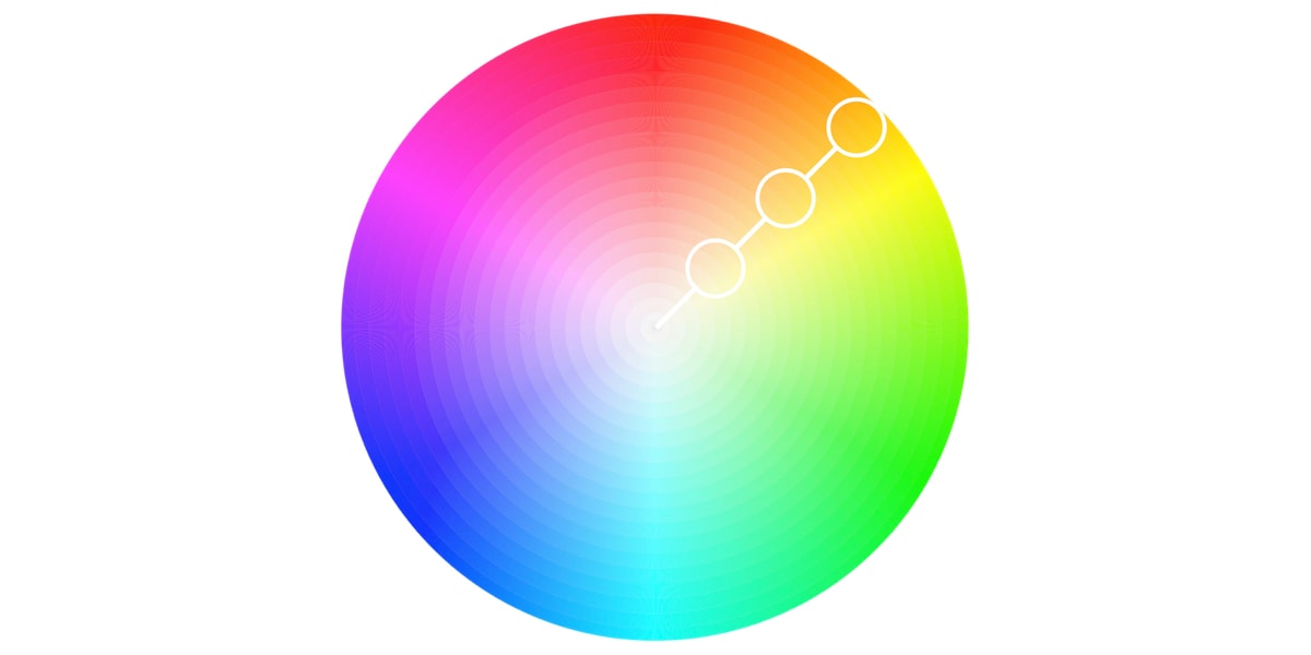
- Analogous: Often used when no contrast is required, an analogous color scheme is formed of three colors that are located next to each other on the color wheel.
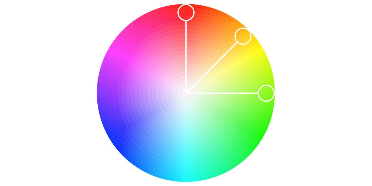
- Complementary: Aimed to produce contrast, complementary color palettes are comprised of colors that are placed in front of each other on the color wheel.
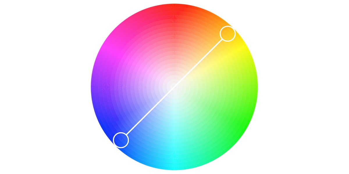
- Split-complementary: Similar to a complementary color palette, split-complementary color palettes employ a higher number of colors.
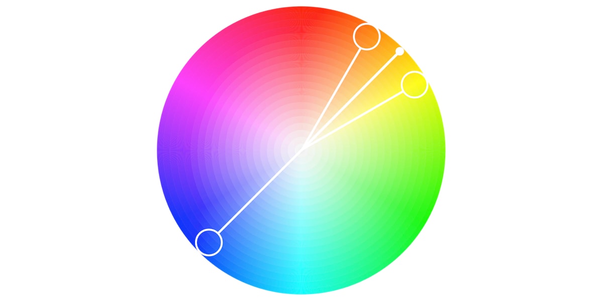
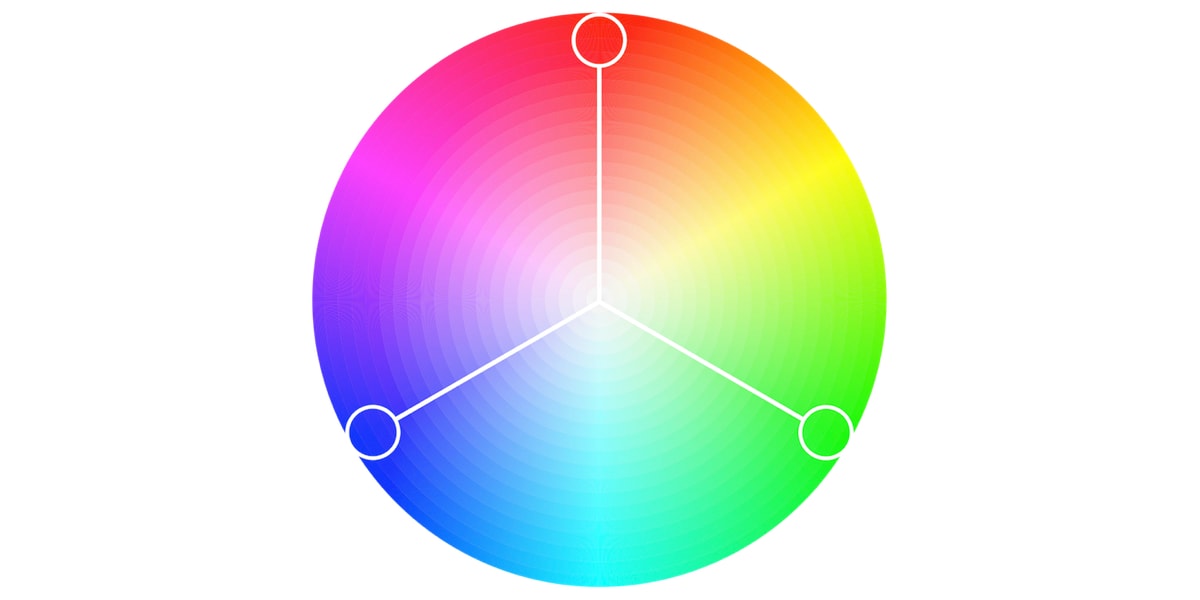
- Triadic: The triadic color scheme is based on three separate colors that are equidistant on the color wheel.
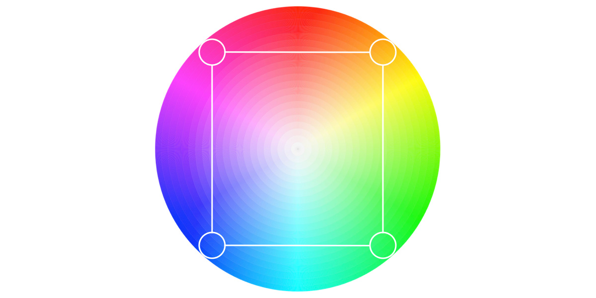
- Tetradic: Commonly employed by more experienced designers, the tetradic color scheme employs two sets of complementary pairs—four colors from the color wheel in total that should form a rectangle when connected.
3. Why is a color palette important for your website?
Let’s look a little bit further into why color palettes are so vital for communicating your brand story to your audience.
Color palettes form the foundation of your brand
An architect wouldn’t design a house with no blueprint. Similarly, no designer should create visual assets without a robust color palette to guide them. Brands and colors are indistinguishably connected—and while your color palette can change as your brand evolves, it’s imperative to have a strong foundation in place from the get-go. Your color palette will inform all your brand’s visual elements (e.g., graphics, fonts, icons, and images) to ensure everything works harmoniously together.
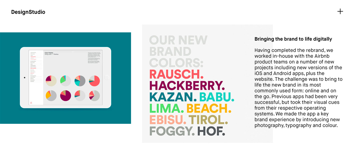
Airbnb branding by Design Studio
Color palettes are essential for a good user experience
A well-thought-out out color palette can elevate a website’s design from good to exceptional. On the other hand, a mediocre color palette can detract from a user’s overall experience—or even interfere with the website’s usability. Clashing colors can make text difficult to read, and a strong color system can guide users around the site with ease. A color palette will ensure that sections, categories, and functions are separated, all the while ensuring the website is still enjoyable to use.
Color palettes establish consistency
If your logo is green and black, but your business card is red and pink, this is going to confuse your customers and dilute your brand credibility. The same goes for smaller differences, like using maroon when you usually use bright red. Whether or not it’s conscious awareness, even these minor inconsistencies can negatively impact brand perception. A consistent color palette makes your brand easily recognizable and memorable.
Color palettes make for a more efficient design experience
Could you imagine how frustrating and time-consuming it would be if every time you created a visual asset, you had to double-check exactly what HEX codes you’ve used previously? Or worse yet—if you had to make new color choices every single time? By having your color palette easily accessible to anyone making design choices in your business, you can save yourself considerable time and effort in the later stages of the website’s design.
Color palettes distinguish you from the competition
Doing your research on color psychology and opting for colors that vastly differ from those of your competitors will ensure you stand out against the competition as the obvious choice.
4. How to choose your color palette in 9 practical steps (with examples)
Now we’re all up to speed, let’s dive into how to create an awesome color scheme for your website that your users will emotionally identify with.
Step 1: Get to know your user base
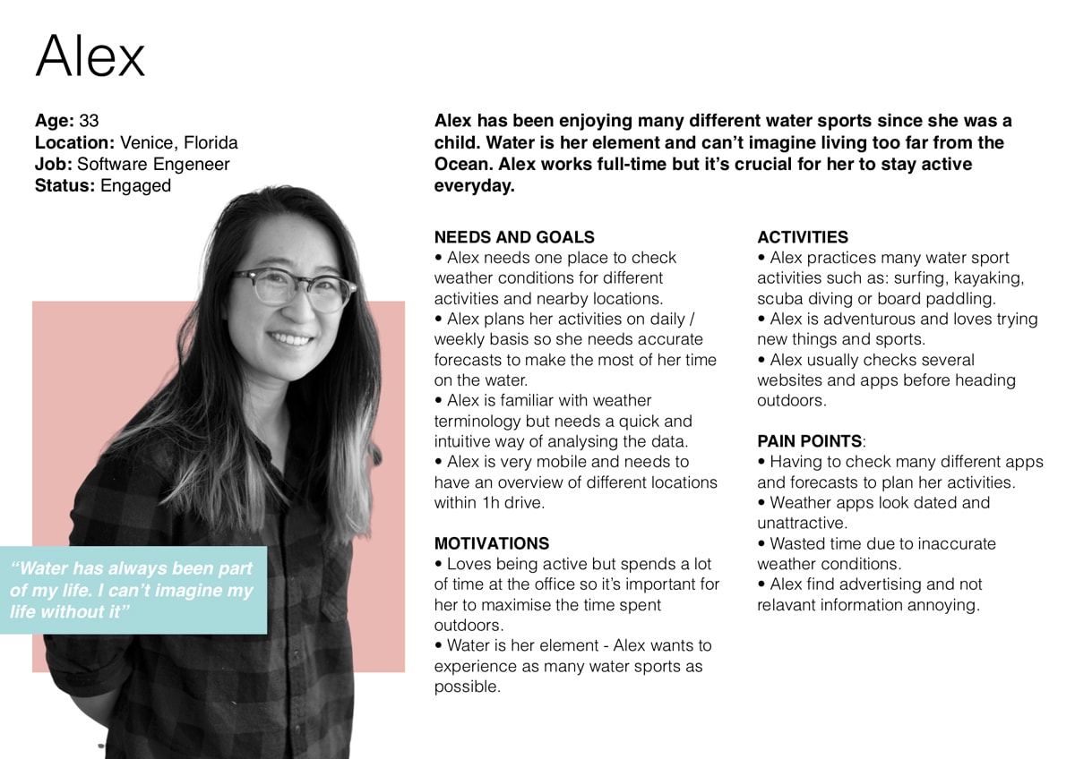
Before you even get started with choosing your color palette, you need to establish who your audience and target demographic is. Create some user personas and build out some profiles. Some key questions to ask at this stage are: What are the common traits and expectations of your target demographic? What are their ages, and how tech-savvy are they? Who are your competitors, and what would you do differently/better? Even if you fall into the demographic of your target audience, don’t make any assumptions about color preference!
Conducting structured, thorough research on your target audience will not only help you to fine-tune the story you want to communicate, but it will also help you to prevent a potentially catastrophic design failure that will deter your target audience.
Step 2: Get inspired
Now that you understand who exactly your user base is, you can start gathering inspiration for your color palette. There are so many ways to go about this, from creating a mood board to building up an inspiration library. Think back on some of your favorite websites, and do some reverse engineering on their color palette. How have they used a dominant color in relation to their accent colors? Have they gone for a monochromatic or analogous color palette? How have they experimented with contrast?
If you’re drawing a blank thinking of some websites that have nailed their use of color, sites like Dribbble and Behance are great places to start! We’ve also written a guide on blogs that showcase beautiful UI design to get you going.
Step 3: Use color psychology
Color psychology is the study of how colors can influence human mood and behavior. According to color psychology, the human mind subconsciously reacts and interprets colors in a way that influences our actions. It’s the reason we choose one brand over another or are more likely to click on a green button over a red one. Of course, emotional responses to colors can depend on a range of personal factors, including gender, cultural experiences, and age.
If you want to create a color palette that attracts your target audience and accurately tells your brand story, it’s essential to have a basic understanding of color psychology. To get you up to speed, this handy infographic outlines some of the most common color associations:
- Orange is energetic and warm. Some common associations with orange include creativity, enthusiasm, lightheartedness, and affordability.
- Red is the color of blood, so it’s often associated with energy, war, danger, and power but also passion, desire, and love. Some common associations with red include action, adventure, aggression, and excitement.
- Yellow evokes positivity, youth, joy, playfulness, sunshine, and warmth.
- Pink evokes feelings of innocence and delicateness, gratitude, romance, softness, and appreciation.
- Blue is perceived as authoritative, dependable, and trustworthy. Common associations with blue include calmness, serenity, confidence, dignity, and security.
- Green is the color of nature. It symbolizes growth, freshness, serenity, money, health, and healing.
- Black represents power, elegance, and authority. Common associations with black also include class, distinction, formality, mystery, secrecy, and seriousness.
Step 4: Start with greyscale
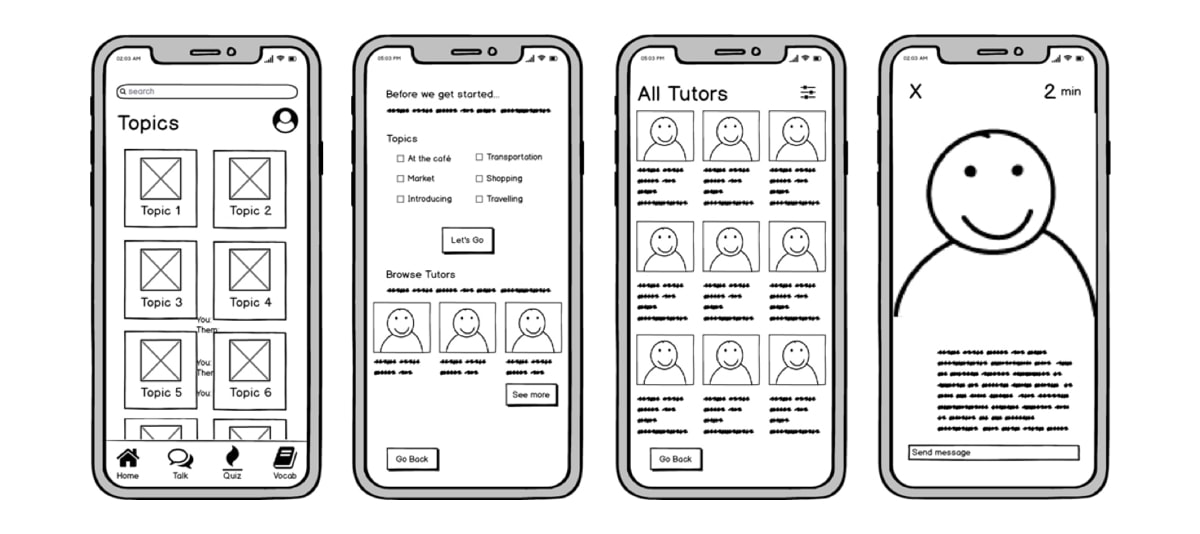
I know what you’re thinking; “how will starting with greyscale help me with choosing a color palette?” but hear me out! Creating a draft in greyscale (using various shades of grey to indicate lighter and darker colors) will enable you to ensure usability is the focus rather than getting distracted by the website’s overall aesthetic. Start by wireframing each page, think carefully about the layout of each element, and reflect on how you’ll optimize white space. In conjunction with a good color palette, a clear hierarchy of type and elements will contribute towards great user experience.
Step 5: Reflect on what colors go well together
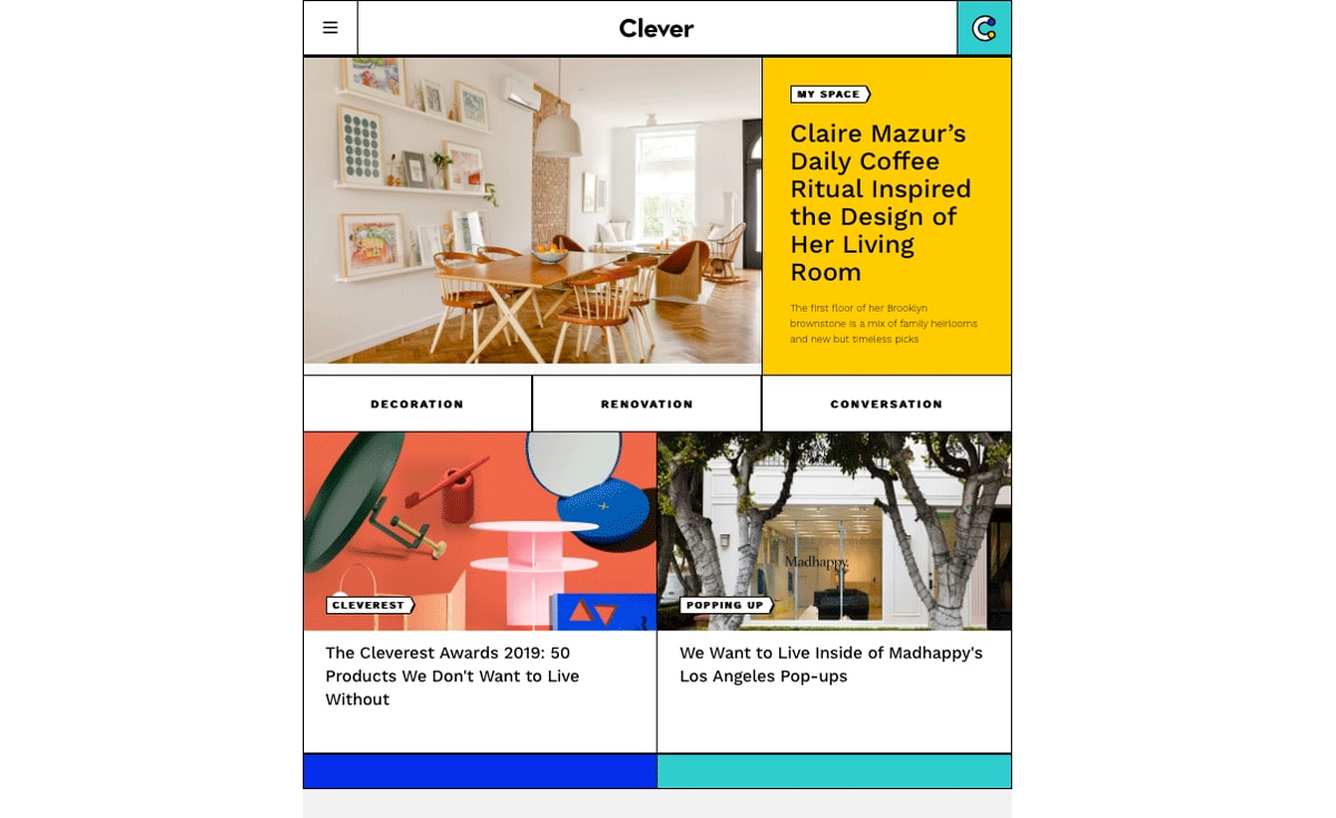
A color palette shouldn’t exceed six colors, but to start with, most designers opt for four. These should be made up of one dominant color, one standard color (used primarily for text, such as black or grey) and two accent colors.
Your dominant color is what your customers will forever associate with the brand, so it’s essential that you take your time and experiment when choosing this. Look back at the color associates; if you had to describe your brand in one word, what would it be? What is the dominant color of your competitors? What is the color that you feel your target audience would respond best to?
Once you’ve chosen your dominant color, refer back to the five-color palettes and use that as your reference for building out your accent colors. Note: you’re free to add more or fewer colors depending on your brand personality, and the aesthetic you’re aiming for. You should be striving towards color harmony, so always keep that in mind.
Step 6: Add in some contrast
Color contrast is core to any interface, as it makes each UI element noticeable and distinct. User interfaces containing only shades from the same color family are unlikely to draw users’ attention—and, moreover, run the risk of being a complete headache to navigate. On the other hand, if copy and background colors contrast each other too much, the text could become illegible.
Designers control the level of contrast, depending on what the interface aims to accomplish. Experienced designers strive to create a mild degree of contrast and apply high contrasting colors only for elements that are supposed to stand out—such as call-to-actions. This ties into my next point…

Step 7: Use the 60-30-1 rule
Stemming from principles of interior design, the 60% + 30% + 10% rule is commonly employed by designers to ensure the colors used remain balanced. This formula dictates that 60% of your website should be made up of your dominant hue, 30% should be your secondary color, and the remaining 10% should be your accent color. The formula works because it allows the eye to move comfortably from one focal point to the next. No matter how many colors you have in your color palette, this formula will keep things harmonious, allowing your user’s eyes to navigate from one focal point to the next with ease.
Step 8: Are you adhering to UI design conventions?
Remember earlier, when we talked about the role that color plays when creating a great user experience? Alongside being aesthetically pleasing, your website should be accessible and easy to navigate. It’s tempting to want to challenge design conventions by being experimental, but edgy designs that keep usability as an afterthought can result in a confusing website that makes your users work a lot harder than they need to.
Users have become used to common interface elements behaving in a certain way, so staying consistent with UI design conventions will reduce the cognitive load for your users, and allow them to navigate the interface intuitively.
Some common UI design color conventions include:
- Using a dark color for text to ensure legibility
- Keeping light colors for backgrounds
- Using contrasting colors for accents (as mentioned above)
- Sticking to classic call-to-action colors—such as red for a warning sign
Step 9: Time for user testing!
No matter how much you adore a specific color, color palettes should never be a matter of personal preferences—nor should they be based on the whim or taste of your client. The emotional response that color can illicit is not to be taken lightly; it can make or break the relationship a brand has with its customer base. Remember: a website should be intended for the user!
Getting user feedback at the earliest opportunity will ensure you’re creating an interface using colors that your users will love and identify with. Find out how to conduct a user testing session in this comprehensive guide.

Source: Anurag Goyal
5. Final thoughts
Choosing the right color palette for your website should never be overlooked. Choosing a color palette also shouldn’t be an exercise in trendiness or edginess, driven by personal taste or subjectivity. While it’s incredibly easy to get carried away (especially with so many colors on offer), it’s crucial to take your time and conduct user testing as early and as often as possible.
To learn more about color, check out these blog posts:
