What constitutes having the best UI design? Is it an impressive color palette or an engaging layout? Is it adhering to UI design conventions—or is it plain old simple usability?
Truly great UI achieves all this and more. Exceptional user interfaces won’t just facilitate the seamless achievement of the task at hand—they’ll also be aesthetically enjoyable for the user to navigate.
To illustrate just how versatile good UI design can be, we’ve rounded up nine of the best UI design examples that will provide a healthy dose of inspiration for your next project. While the examples on this list may have different design principles and various functions, they’ve all achieved effective UI design that captures users’ imaginations while keeping usability at the forefront.
To go to a particular UI design example directly, use this clickable menu:
- Dribbble’s card design
- Mailchimp’s usability
- Dropbox’s responsive color system
- Pinterest’s waterfall effect
- Hello Monday’s white space
- Current app’s color palette
- Rally’s dynamism
- Cognito’s custom animation
- Spotify’s color gradients
Ready? Off we go!
1. Dribbble’s card design
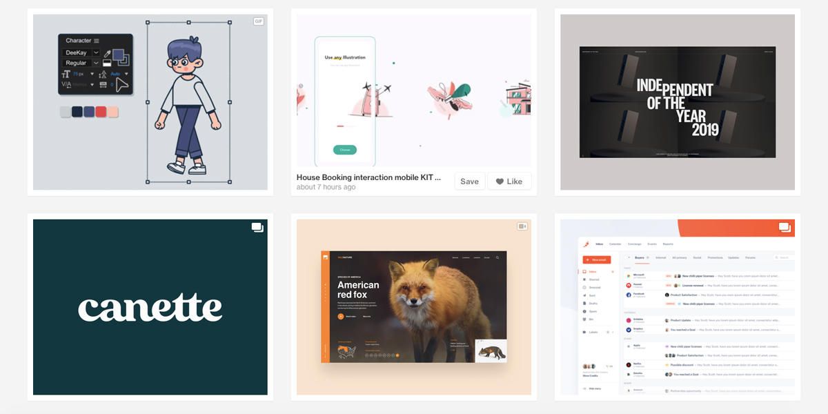
Traditionally taking the form of a small rectangular module filled with images and text, cards serve as an entry point for users to learn more details about a product or feature. Dribbble uses cards to display the myriad of creative and innovative projects uploaded to the site by designers every day, allowing the user to get a colorful and aesthetically harmonious overview.
This card-based design is an ingenious approach to featuring work and capturing users’ attention.
2. Mailchimp’s usability
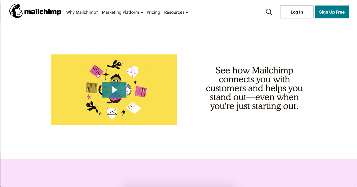
While newsletter creation might not be what pops into your head when you think of good UI design, Mailchimp’s newly-refreshed intuitive website makes newsletter management stress-free and straightforward.
Since its recent redesign, the web UI is clean, flat, and primarily typographical, featuring helpful and visually pleasing guides for new users. To further the functionality, Mailchimp has incorporated a subtly-animated pointer to indicate where to click. What’s not to love?
3. Dropbox’s responsive color system
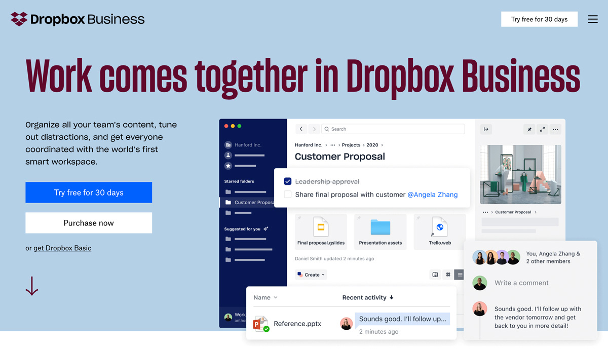
Responsive colors are a growing trend in UI design, and household brands are progressively adopting them. Instead of having a single symbolical color used in the brand’s logo, responsive colors enable brands to have multiple predefined colors or a dynamic color system, that takes on the color of its environment.
The Dropbox website is a perfect example of how responsive design is a fantastic way to keep users engaged as they navigate your website. Exploring the site will take you on a journey of discovery, with every page seemingly having its own unique color palette. All the more reason to buy into the product itself!
4. Pinterest’s waterfall effect
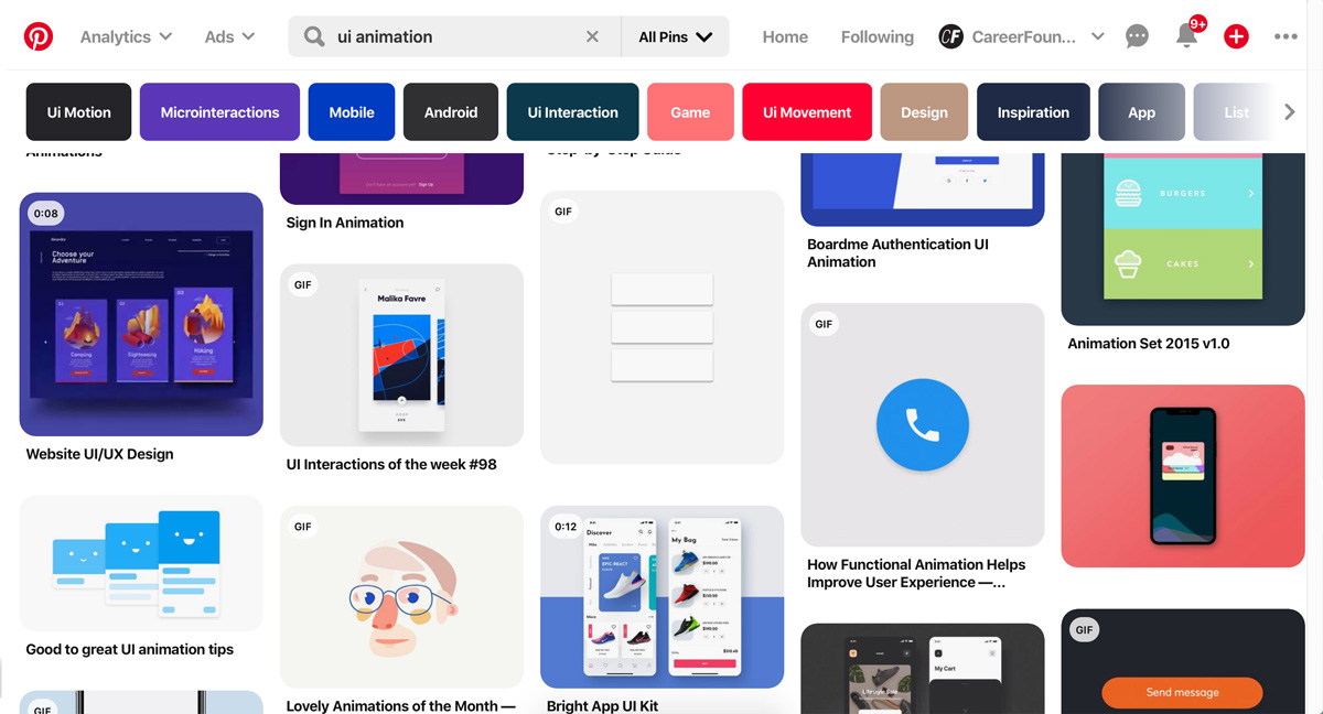
What would a UI design examples inspiration blog post be without a nod to Pinterest’s iconic user interface? As bonafide card design pioneers, Pinterest combines card design with a waterfall flow to provide users with a uniquely smooth and seamless experience.
By giving each card a subtle shade when interacting with the mouse, Pinterest has smartly enhanced visibility and given the elements the perception of “clickability.”
5. Hello Monday’s white space
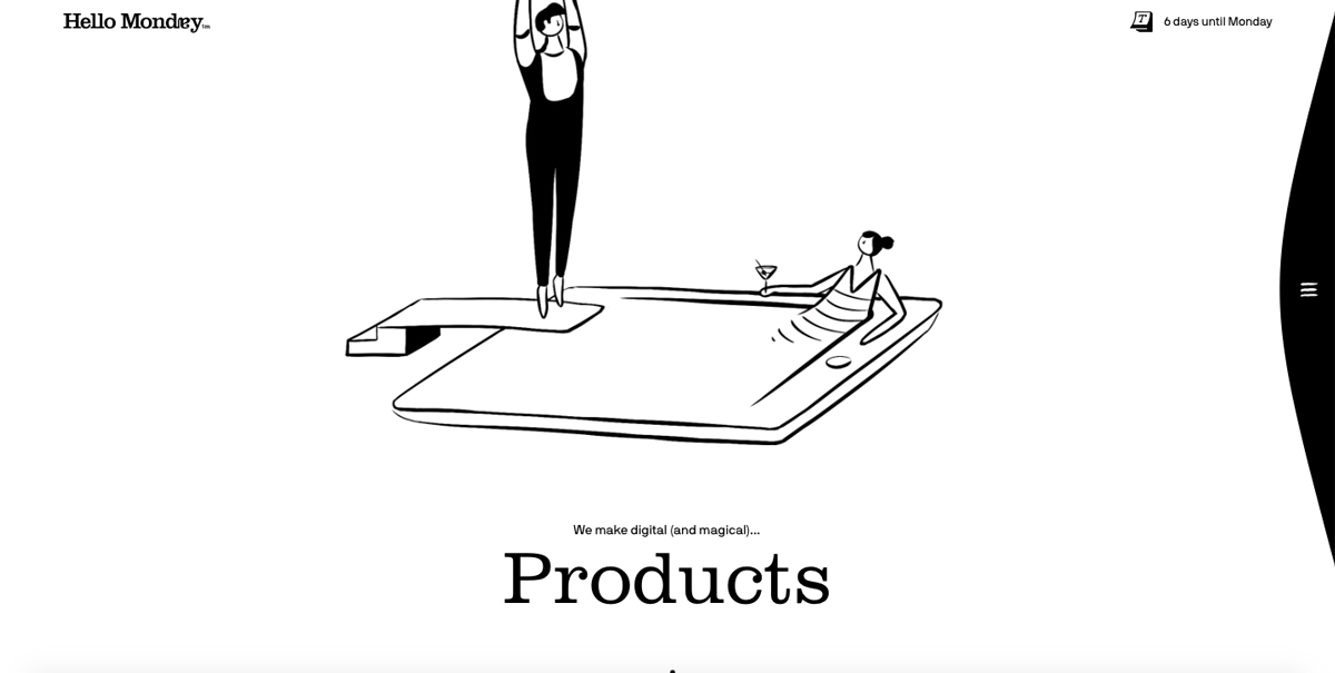
When elements fight for attention, nothing can stand out. When there is a spotlight on one element, it can truly shine. Surrounding UI elements with white space allow the message of the element to sink in.
White space is something that the Hello Monday creative studio home page has mastered perfectly. Featuring micro and macro empty spaces, the Hello Monday website allows the user to focus on one feature at a time, while still delivering heaps of meaning to the user.
6. Current app’s color palette
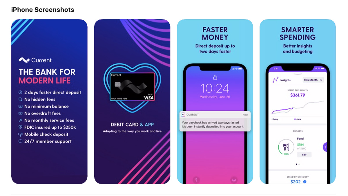
Created for teenagers, Current is a parent-controlled debit card—and corresponding app—aimed at promoting good financial decisions and demystifying financial responsibility. With their key demographic in mind, the designers behind the app have redefined the stiff and stuffy stereotype of finance with bright colors, cool fonts, and unique backgrounds.
Despite the daunting subject matter, the app boasts a simple and straightforward UI—clearly identifying tasks, budgets, and actions to take
7. Rally’s dynamism
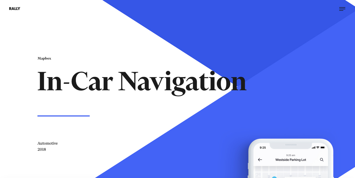
Digital studio Rally have paired interaction and animation with a clean interface and delicate color match to make their website unique. Oozing with dynamism, their “click the arrows to get more info” feature is one of the most stylish design elements on the site.
Echoing Dropbox’s choice, they’ve also opted for a responsive color palette—making the website all the more delightful to navigate.
8. Cognito’s custom animation
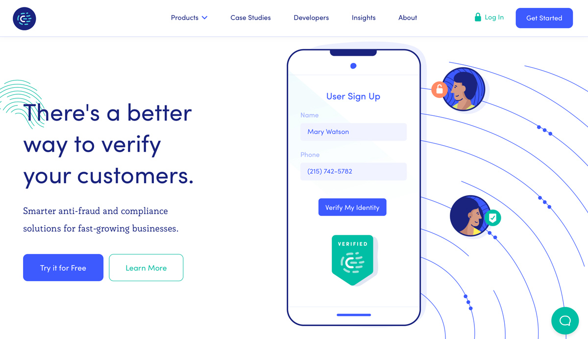
Custom illustrations haven’t just made the Cognito website stand out from the generic, they’ve also created a friendly and inviting environment for the users. A fun illustration can give websites or mobile apps their own personality, making them more memorable.
To make the interface stand out even more, the Cognito’s illustrations come to life with complex motions. This dynamism both captures users’ attention and illustrates the brand’s offering at a glance.
9. Spotify’s color gradients
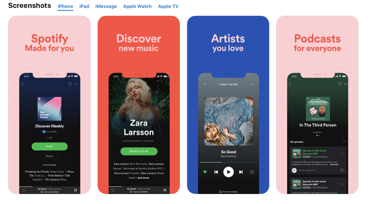
It’s no secret that color gradients are becoming ever more favored by UI designers over flat colors. Powerful when used intentionally, color gradients are a go-to when the need to convey emotions or highlight a certain design element arises. Alongside boasting an extensive music collection, household brand Spotify has demonstrated effective use of color gradients that make the app even more fun to use.
So there it is—nine examples of great UI design to inspire you ahead of your next project. Want to learn more about UI design? Check out these articles over on our blog:
- How to become a user interface (UI) designer: A step-by-step guide
- Are UI designers in demand? Here’s the current industry outlook
- 10 examples of beautiful blogs that have nailed their UI design
FAQ
1. What are UI designs?
UI design is the visual and interactive aspect(s) of a product or service that users interact with to perform tasks or functions. A UI designer aims to design the layout, structure, and presentation of information in a way that is easy for users to understand and interact with.
Good UI design includes usability, impressive color palettes, engaging layout, and adherence to UI design conventions. Exceptional user interfaces won’t just facilitate the seamless achievement of the task at hand—they’ll also be aesthetically enjoyable for the user to navigate.
2. Where can I find good UI design examples?
There are a number of exceptional online resources to find good UI design examples. These include:
Behance
Dribbble
Awwwards
Pinterest
And any number of design inspiration blogs.
