Have you ever seen a color that has immediately reminded you of a particular brand? Maybe you’ve struggled to feel relaxed in a room that has a clashing color scheme, or returned an item of clothing you got as a gift because the color wasn’t quite right.
Colors have the immeasurable power to inform our mood, emotions, and thoughts. Research conducted by the Institute for Color Research reveals that people make a subconscious judgment about a product within 90 seconds of seeing it, and between 62% and 90% of that assessment is based on color alone.
User interface (UI) designers have the challenging task of incorporating color into their interface in a way that poignantly communicates a brand’s visual identity. While it might seem like a website’s color palette is a matter of the client’s personal taste, in reality, UI designers rely on a framework called color theory: a multilayered set of guidelines that informs the use of color in design.
In this guide, we’ll take you through everything you need to know about color theory—from mastering the fundamentals of color variants right through to choosing the right color palette for your user interface.
Here’s what we’ll cover:
- What is color theory?
- Introduction to the color wheel
- The importance of color harmony
- Additive and subtractive color models
- Introduction to color palettes
- What are the different types of color palettes?
- How to choose a color palette
- The best online tools for choosing a color palette
- Final thoughts
Before we jump in, check out this video presented by CareerFoundry UI design mentor, Olga. Olga explains what you need to consider when choosing a color palette, things to avoid, and top tips for picking the right color scheme:
1. What is color theory?
Let’s start at the basics: what actually is color theory?
Color theory is a framework that informs the use of color in art and design, guides the curation of color palettes, and facilitates the effective communication of a design message on both an aesthetic and a psychological level.
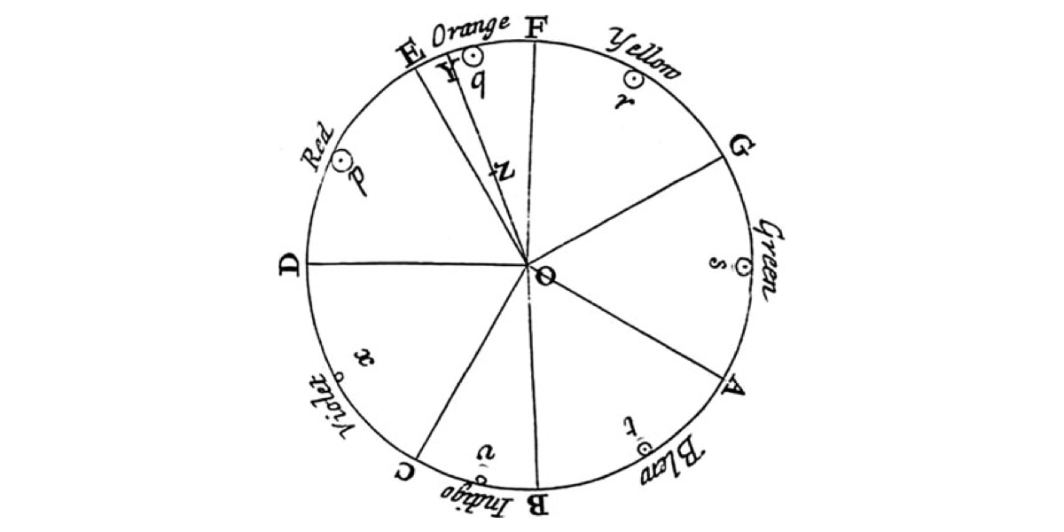
Modern color theory is largely based on Isaac Newton’s color wheel, which he created all the way back in 1666. The basic color wheel displays three categories of color; primary colors, secondary colors, and tertiary colors. If you remember learning about these in art class, well done—you’ve already grasped the basics of color theory!
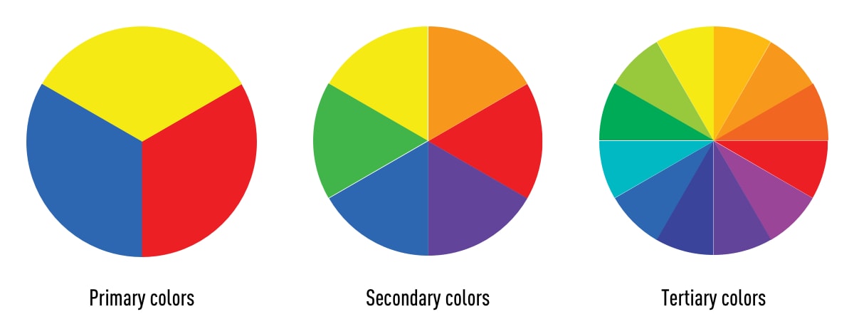
Let’s have a quick refresh on what these color categories entail:
- Primary colors are colors you can’t create by combining two or more other colors. The primary colors are red, blue, and yellow.
- The secondary colors are orange, purple, and green—in other words, colors that can be created by combining any two of the three primary colors.
- Tertiary colors are created by mixing a primary color with a secondary color. The tertiary colors are magenta, vermillion, violet, teal, amber, and chartreuse.
2. Introduction to the color wheel
You might be thinking, “there are way more than 12 colors out there.” You’re right—and they can all be found on a more advanced version of the color wheel.
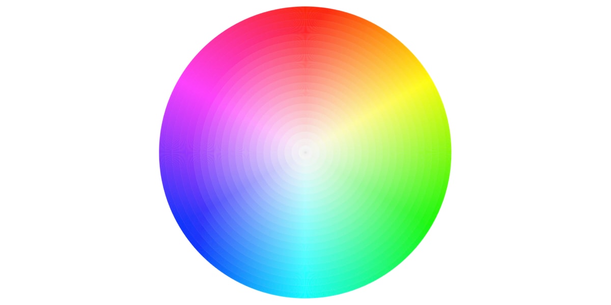
The color wheel doesn’t just chart each primary, secondary, and tertiary color—it also charts their respective hues, tints, tones, and shades. By visualizing how each color relates to the color that comes next to it on a rainbow color scale, the color wheel helps designers to create bespoke color palettes that promote aesthetic harmony. Let’s dive into these color variants a little deeper:
Hue
Hue refers to the pure pigment of a color, without tint or shade. In that respect, hue can be interpreted as the origin of a color. Any one of the six primary and secondary colors is a hue.
Shade
Shade refers to how much black is added into the hue. As such, shade darkens a color.
Tint
The opposite of shade, tint refers to how much white is added to a color. As such, tint lightens a color.
Tone
Tone is the result of a color that has had both white and black added to it. In other words, tone refers to any hue that has been modified with the addition of grey—as long as the grey is purely neutral (only containing white and black).
Color temperature
Even if you’re a self-confessed design newbie, you’ve likely heard the terms “warm, cool and neutral” tossed around in relation to color. This is referred to as color temperature, and it’s an essential consideration when it comes to color theory.
Warm colors contain shades of yellow and red; cool colors have a blue, green, or purple tint; and neutral colors include brown, gray, black, and white. The temperature of a color has a significant impact on our emotional response to it. Within the psychology of colors, for example, warm colors show excitement, optimism, and creativity, whereas cool colors symbolize peace, calmness, and harmony. But we’ll talk a little bit more about color psychology later on!
3. The importance of color harmony
Arguably the most crucial aspect of color theory, color harmony refers to the use of color combinations that are visually pleasing for the human eye. Color palettes can either promote contrast or consonance, but as long as they make sense together, they can still result in a visually satisfying effect.
When it comes to UI design, color harmony is what all designers strive to achieve. Based on the psychological need for balance, color harmony engages the viewer and establishes a sense of order. A lack of harmony in a color palette can either result in an interface being under-stimulating (boring) or over-stimulating (chaotic and messy).
Unsure about what a user interface looks like? Check out our guide on what a user interface is, and what you might find within one.
4. Additive and subtractive color models
Now that we’ve mastered the color variants, we can move on to adding and subtracting color. Color has two different natures: the tangible colors which can be seen on the surface of objects, and colors that are produced by light. These two types of color are known as the additive and subtractive color models. Let’s take a closer look at what they mean.
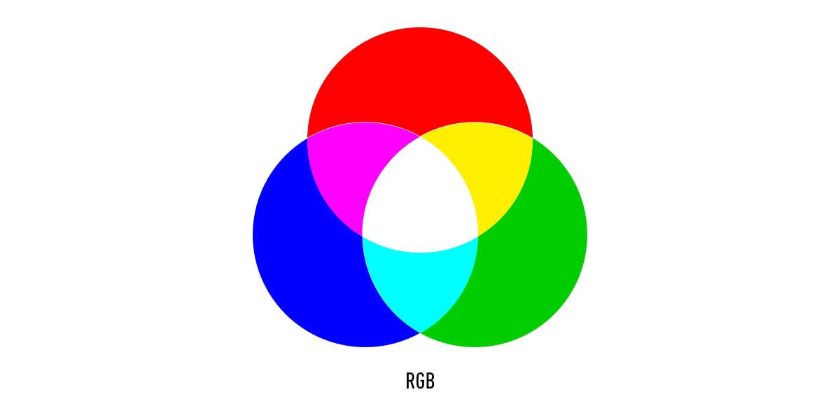
The additive color model (RGB)
RGB stands for red, green, and blue, and is based on the additive color model of light waves that dictates that the more color you add, the closer the color gets to white. The RGB color model forms the basis of all electronic screens, and as a result, is the model used most often by UI designers.
The subtractive color model (CMYK)
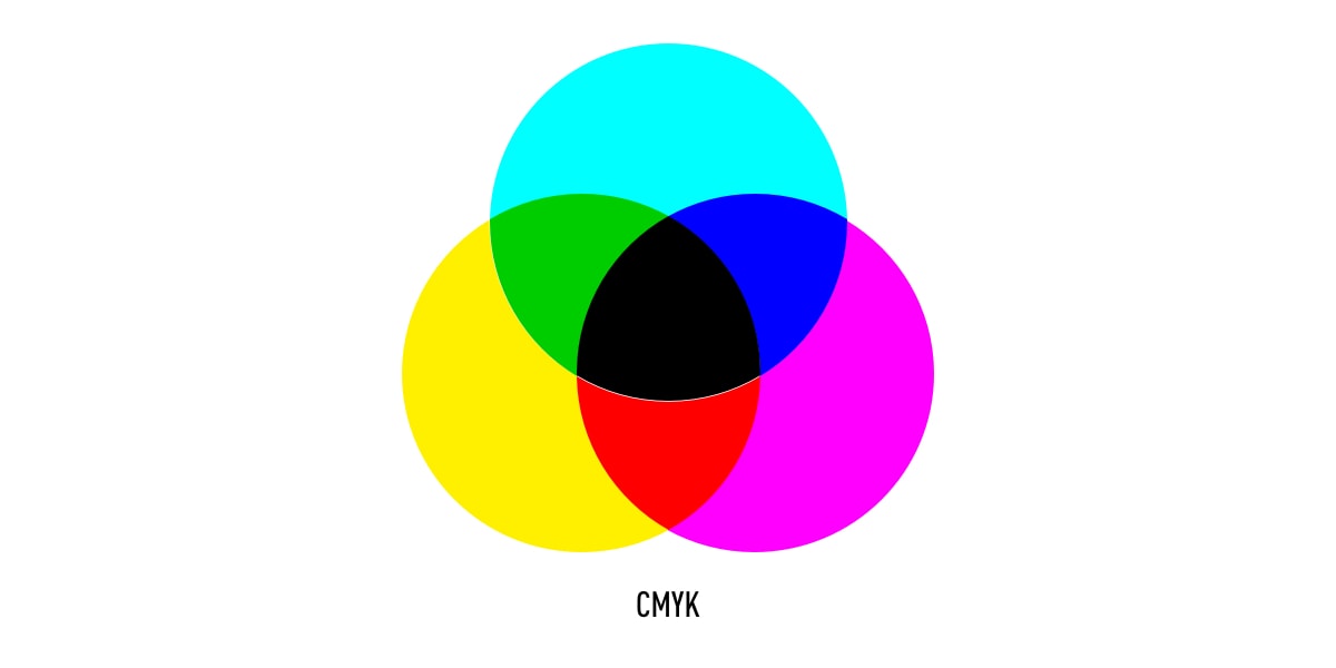
On the other hand, CMYK is known as the subtractive color model, which obtains colors by the subtraction of light. CMYK stands for cyan, magenta, yellow, and black, and it is mostly used in physical printing.
5. Introduction to color palettes
So far, we’ve explored the various forms that a color can take, and gotten acquainted with the color model that you’ll use as a UI designer. Now, let’s dive into the fun part: color palettes!
A color palette is a combination of colors used by UI designers when designing an interface. When used correctly, color palettes form the visual foundation of your brand, help to maintain consistency, and make your user interface aesthetically pleasing and enjoyable to use.
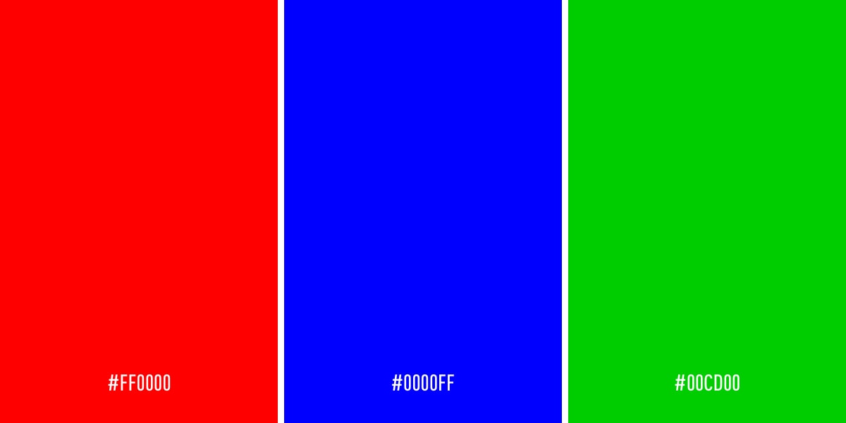
While color palettes date back thousands of years, color palettes are commonly used in digital design, presented as a combination of HEX codes. HEX codes communicate to a computer what color you want to display using hexadecimal values. Back in the ’90s, most digital color palettes only included eight colors. Now, designers have a myriad of shades and hues from the color wheel to choose from.
Over the next few sections, we’ll learn how to choose and interpret a color palette to ensure you’re creating the best possible interface for your users.
6. What are the different types of color palettes?
Colors can be combined to form one of five color palettes that are commonly used by UI designers. Let’s go through them together.
Monochromatic
A popular choice with designers, monochromatic color schemes are formed using various tones and shades of one single color.
Analogous
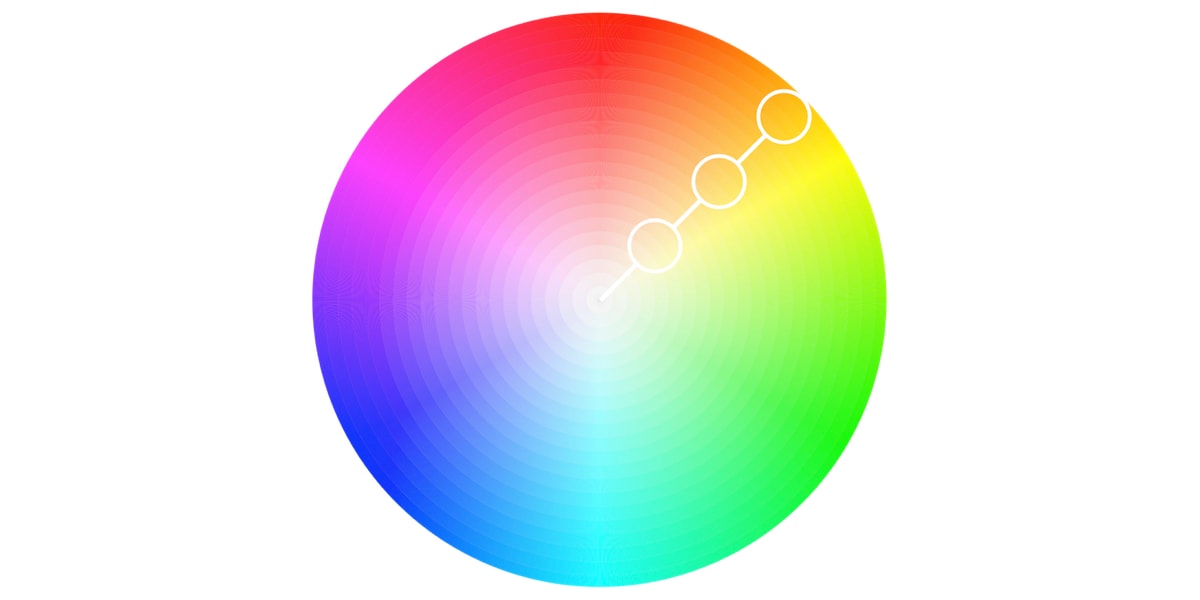
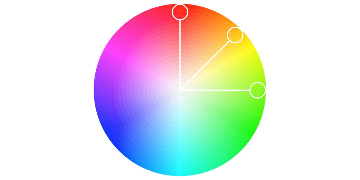
An analogous color scheme is formed of three colors that are located next to each other on the color wheel. Analogous color palettes are commonly used when no contrast is needed—for example, on the background of web pages or banners.
Complementary
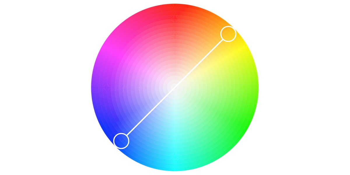
Complementary color palettes are comprised of colors that are placed in front of each other on the color wheel. While the name may suggest otherwise, complementary color palettes are actually the opposite of analogous and monochromatic color palettes, as they aim to produce contrast. For example, a red button on a blue background will stand out on any interface.
Split-complementary
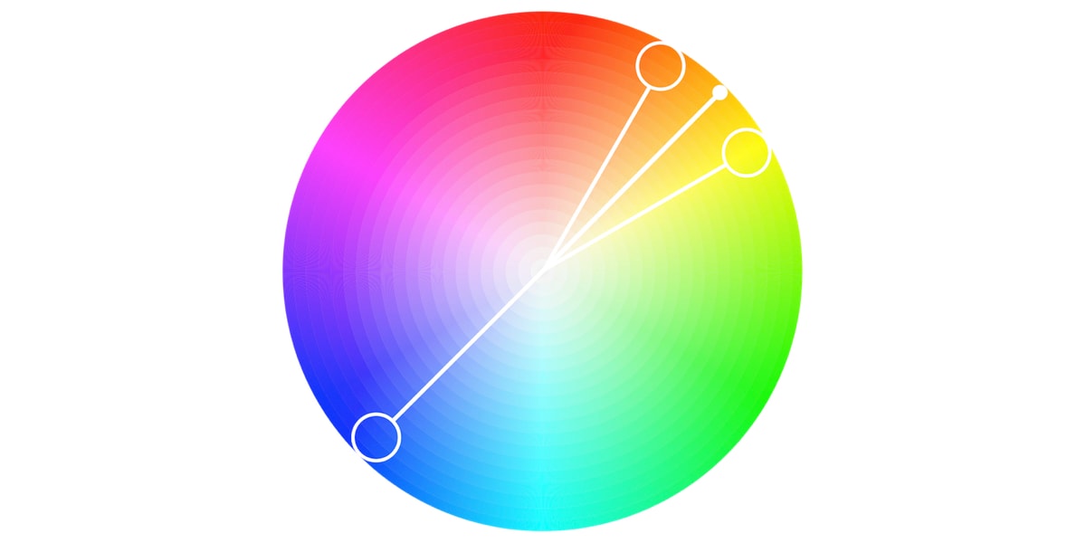
The split-complementary color palette differs from the complementary color palette only in that it employs a higher number of colors. For example, if you choose the color blue, you’ll then need to take the two colors that are adjacent to its opposite color, which in this case would be yellow and red.
Triadic
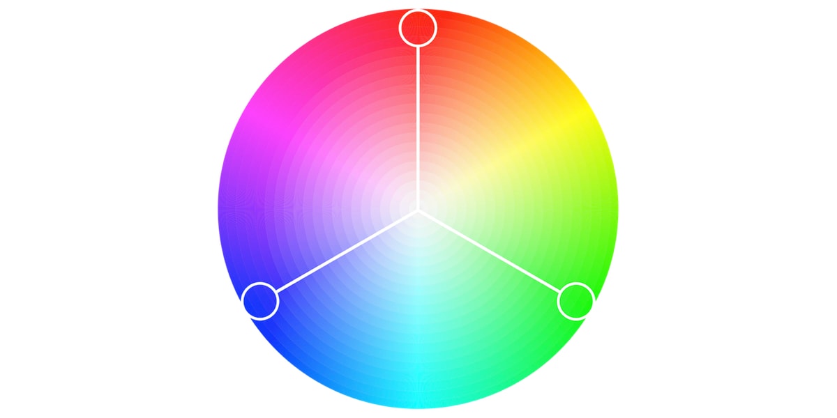
The triadic color scheme is based on three separate colors that are equidistant on the color wheel. Most designers employ the triadic color scheme by choosing one dominant color, and using the other two colors as accents.
Tetradic
Commonly used by more experienced designers, the tetradic color scheme employs two sets of complementary pairs—four colors from the color wheel in total that should form a rectangle when connected. While it’s a little harder to balance, it makes for a visually stunning end effect!
7. How to choose a color palette
Now that we’ve mastered the basics of color theory, let’s look at how you can use this newfound knowledge to select a color palette that tells your brand story and resonates with your audience.
When choosing a color palette for your user interface, here are a few things to consider:
Research your audience
Emotional responses to colors are can depend on a range of personal factors, including gender, cultural experiences, and age. Before you get started with choosing your color palette, be sure to establish who your audience is. What are their common traits, and what are their expectations? What brands relating to yours are popular among your target audience—and how can you out-do their designs?
Conducting structured, thorough research on your target audience will not only help you to fine-tune the story you want to communicate, but it will also help you to prevent a potentially catastrophic design failure.
To learn more about how to become a better designer, check out our article on how to avoid the 10 most common UI design mistakes!
Consider color psychology
With clarity on your target audience, it’s time to look at the psychology behind your potential brand colors. Color psychology is a branch of psychology surrounding the influence of colors on human mood and behavior. According to color psychology, the human mind subconsciously reacts and interprets colors in a way that influences our actions.
If you want to create a color palette that attracts your target audience and accurately tells your brand story, it’s essential to have a basic understanding of color psychology. To get you up to speed, let’s take a look at some of the most common color associations below:
- Orange is energetic and warm. Some common associations with orange include creativity, enthusiasm, lightheartedness, and affordability.
- Red is the color of blood, so it’s often associated with energy, war, danger, and power but also passion, desire, and love. Some common associations with red include action, adventure, aggression, and excitement.
- Yellow evokes positivity, youth, joy, playfulness, sunshine, and warmth.
- Pink evokes feelings of innocence and delicateness, gratitude, romance, softness, and appreciation.
- Blue is perceived as authoritative, dependable, and trustworthy. Common associations with blue include calmness, serenity, confidence, dignity, and security.
- Green is the color of nature. It symbolizes growth, freshness, serenity, money, health, and healing.
- Black represents power, elegance, and authority. Common associations with black also include class, distinction, formality, mystery, secrecy, and seriousness.
Choose your colors wisely
Commonly, color palettes are made up of six colors. These colors should include one dominant color, four accent colors, and one standard color for your text (which is usually black or grey). Your dominant color is what your customers will forever associate with the brand, so be very careful when reflecting on what this color should be. Take your time to get inspired, keep the color associations in mind, and do some user testing if you have to.
Note: you’re free to add more or fewer colors depending on your brand personality, and the aesthetic you’re aiming for. Choosing monochromatic, analogous, or complementary colors will help you to achieve a streamlined color palette. Remember: color harmony is the goal here!
Don’t skimp on contrast
Color contrast is core to any interface, as it makes each UI element noticeable and distinct. User interfaces containing only shades from the same color family are unlikely to draw users’ attention—and, moreover, run the risk of being a complete headache to navigate. On the other hand, if copy and background colors contrast each other too much, the text could become illegible.
Designers control the level of contrast depending on what the interface aims to accomplish. Experienced designers strive to create a mild level of contrast and apply high contrasting colors only for elements that are supposed to stand out—such as call-to-actions. This ties into my next point…
Stick to UI conventions
When working with colors, it’s easy to get carried away with aesthetics over practicality. Of course, your interface should be visually pleasing—but it also needs to be accessible, easy to navigate, and enjoyable to use. Of course, it’s great to be experimental—but challenging design conventions with “edgy” designs can confuse your users, and make them work harder than they need to.
Some common UI design color conventions include:
- Using a dark color for text to ensure legibility
- Keeping light colors for backgrounds
- Using contrasting colors for accents (as mentioned above)
- Sticking to classic call-to-action colors—such as red for a warning sign
Sticking to these conventions will reduce the cognitive load for your users, and allow them to navigate the interface intuitively.
Get feedback
Want to know if you’re onto a winning color palette? Conduct some user testing! Color palettes should never be a matter of personal preference, no matter how much you adore the colors you’ve chosen. As we saw when discussing color associations, the emotional response that color can illicit is not to be taken lightly; it can pretty much make or break the relationship a brand has with its customer base.
Getting user feedback at the earliest opportunity will ensure you’re creating an interface using colors that your users will love. Find out how to conduct a user testing session in this comprehensive guide.
8. The best tools for choosing a color palette
When it comes down to the actual task of choosing a color palette for your interface, it’s easy to feel like you have no idea where to start. Luckily, there is a myriad of helpful tools and online color palette generators currently available to give you a dose of inspiration and help you to choose a color palette for your design.
Below, we’ve rounded up the three best tools for generating online color palettes. Take your pick!
Adobe Color
Poised as the “bread and butter” resource for all digital creatives, Adobe Color has just about every color palette out there. Compared to other color scheme generators, Adobe Color is a lot more comprehensive—so don’t make it your go-to if you want something quick and simple. Among Adobe Colors’ key features is a color palette generator that pulls colors from the images you upload.
Coolors
Coolors is a useful and beginner-friendly color palette generator, perfect for getting to grips with HEX codes. You can click through random premade color palettes, play around with shades and hues, and save your favorite colors to build your own custom palette. But it’s even more fun to play around with their generator. Once you find a color you love, simply copy-paste it into any external application and start designing!
Adobe Illustrator color guide
Adobe Illustrator Color Guide sets itself apart with its popular ‘color guide’ feature. Once you’ve chosen a color, the color guide will generate a five-color palette for you. It will also provide you with a range of tints and shades for each color in the palette. If you switch your main color, the color guide will automatically refresh the corresponding colors to ensure your accent colors are complementary.
9. Final thoughts
If you feel like this was a lot of information to take in, don’t worry! You don’t need to become an expert in color theory in order to be a successful UI designer. Color theory is an extremely complex science that many people dedicate their entire lives to studying. Grasping the basics will help you to understand the psychology behind choosing the perfect color palette for your website or app.
Looking for some UI design inspiration? Check out these blog posts:
