Color has the power to evoke emotion, call others to action, or convey an important message. Psychologists worldwide have dedicated years of study to the effect of different colors on our psyche and how they influence our behaviors.
It’s no wonder that the use of color is carefully deliberated before being integrated into the products and brand content of different companies.
The introduction of different AI tools to the product design process has helped tasks like selecting color combinations and palettes be much easier and less tedious than before.
One such product has revolutionized this phase of the design process: Khroma, an online, AI-assisted color generation tool.
In this article, we’ll look at how Khroma has revolutionized product design and the best ways to utilize this helpful tool in your UX/UI design. Here’s what we’ll cover:
Let’s get started!
1. What is Khroma?
Khroma is an AI-powered color palette generation tool created with designers in mind. Using artificial intelligence, Khroma learns the colors designers like to work with and allows them to search, discover, edit, and save them in an online database.
Created by designer George Hastings, Khroma is inspired by another useful color design tool called Color Claim. Color Claim is Tobias Van Schneider’s collection of just over 100 color combinations that he has generated over the years, displayed in a typographical format.
Hastings was motivated by Schneider’s work but found it limited and wanted to create something more extensive and easier to generate than coming up with the palettes by hand.
Therefore, he thought to employ the use of AI to generate and display limitless color combinations effortlessly and via various formats.
Since Khroma’s birth, this revolutionary AI has learned and been trained by thousands of popular color palettes used and created by humans from all over the web. The result is an unlimited database of personalized color palettes that designers can access, edit, and save on their web browsers.
How it works
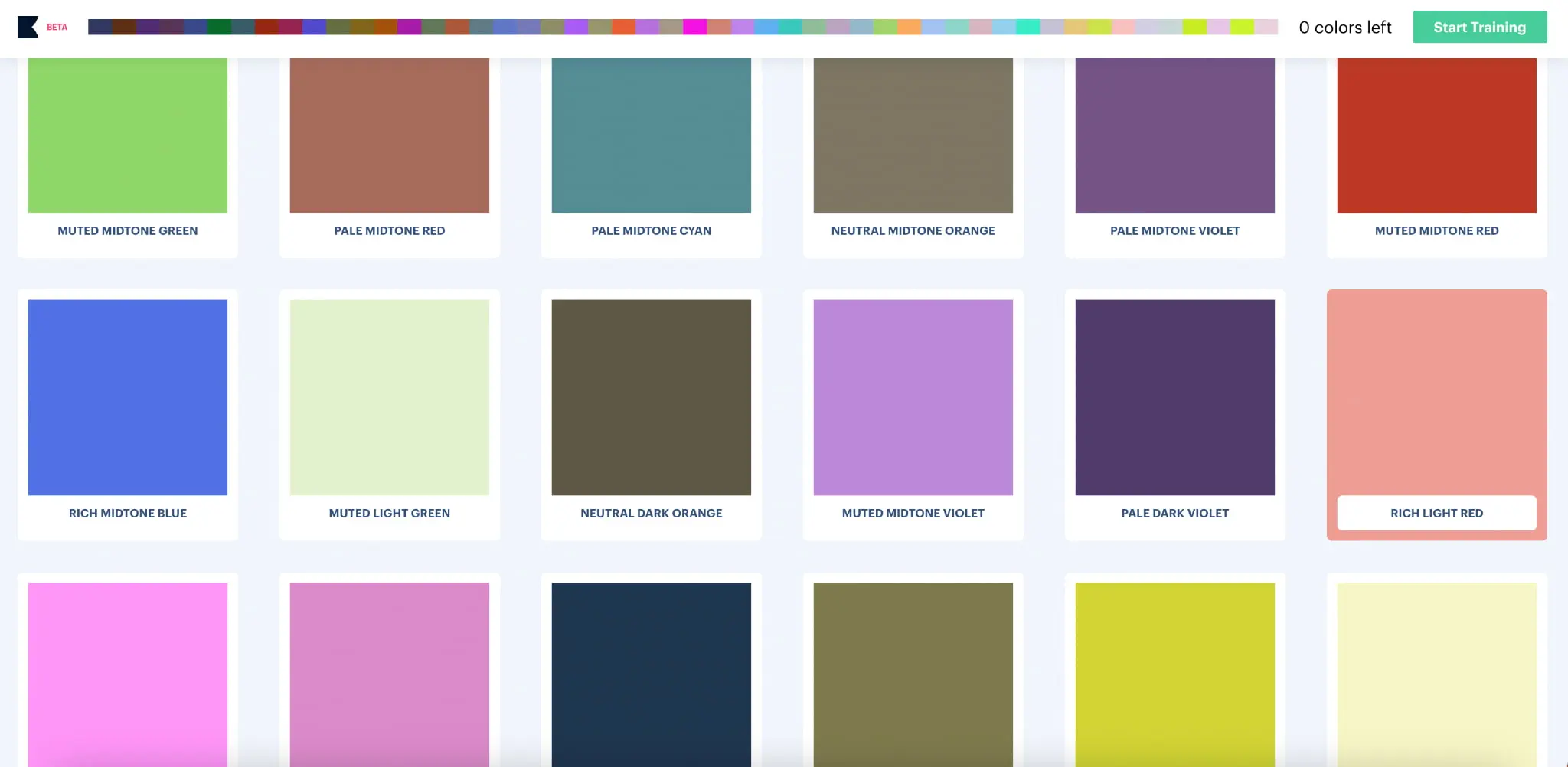
Khroma is an extremely user-friendly and completely free resource. When visiting Khroma.co, users will be asked to select 50 of their favorite colors from a large selection. The AI then generates an endless number of color combinations based on the favorites you selected.
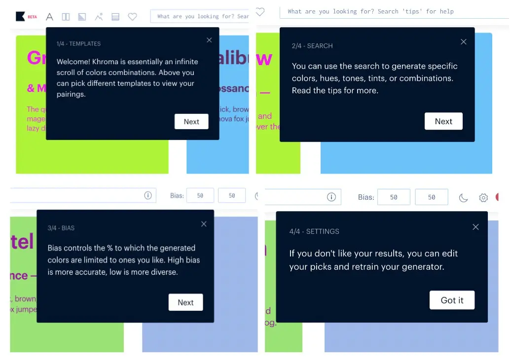
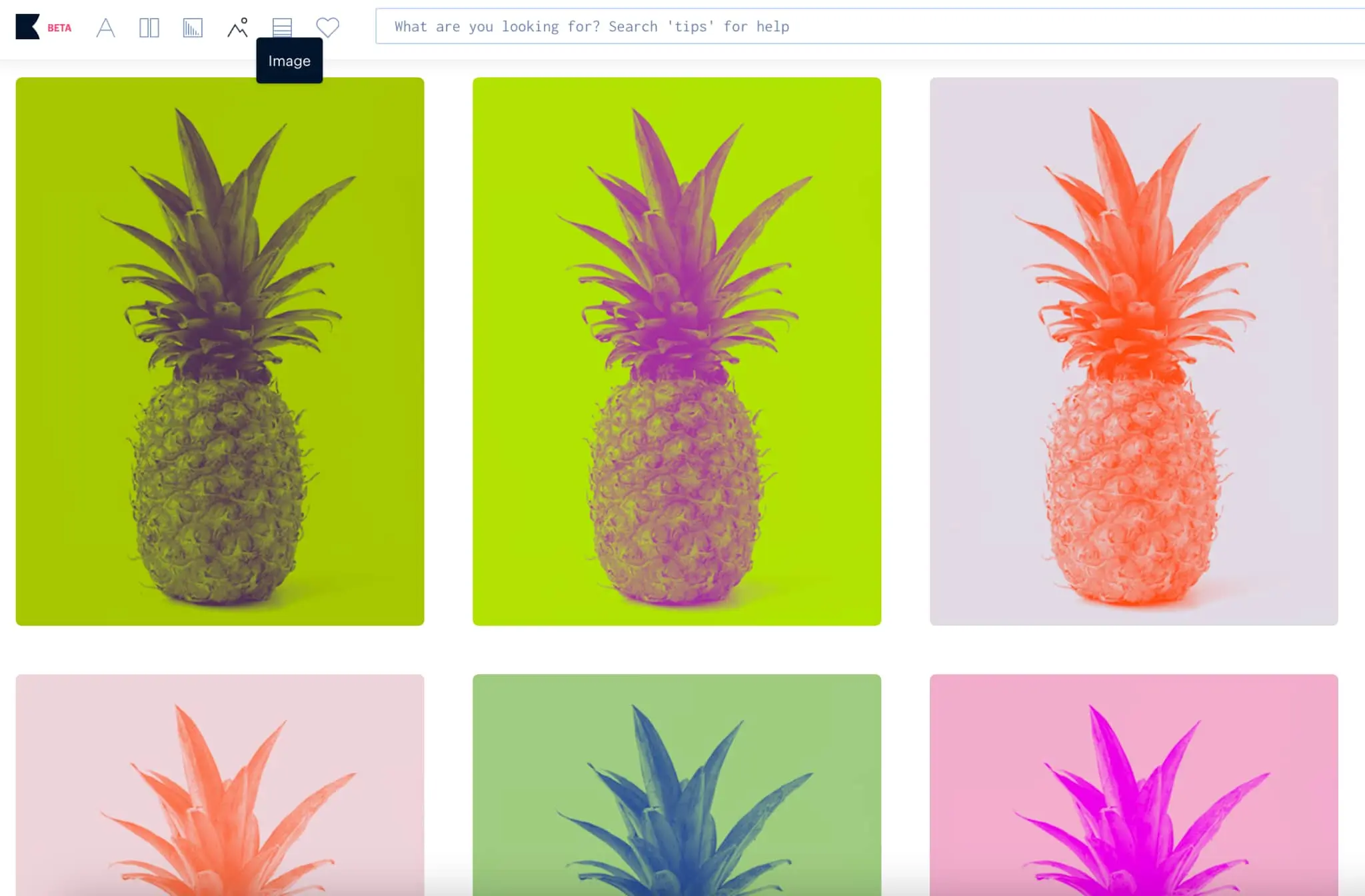
Once your color palettes have been generated, Khroma gives you many options to search through and edit them. You can view the palettes as text, image, gradient, or in a custom-uploaded picture.
Users are also given the option to filter and search for specific palettes based on color, hue, tint, hex, and RGB value. Khroma allows you an unlimited library to save your favorite selections and access their CSS codes, WCAG accessibility ratings, and color names.
Here are examples of the different ways you can view the computer-generated palettes:
Type
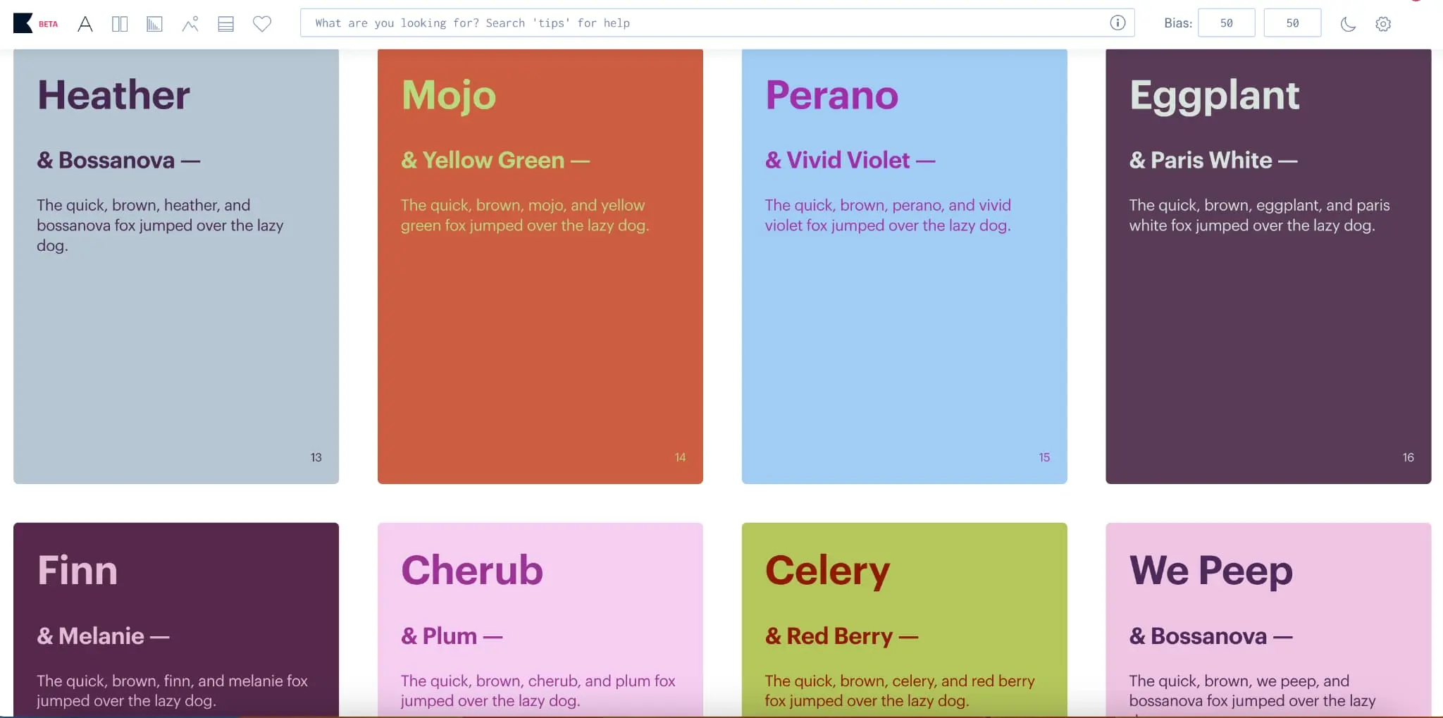
Poster

Gradient
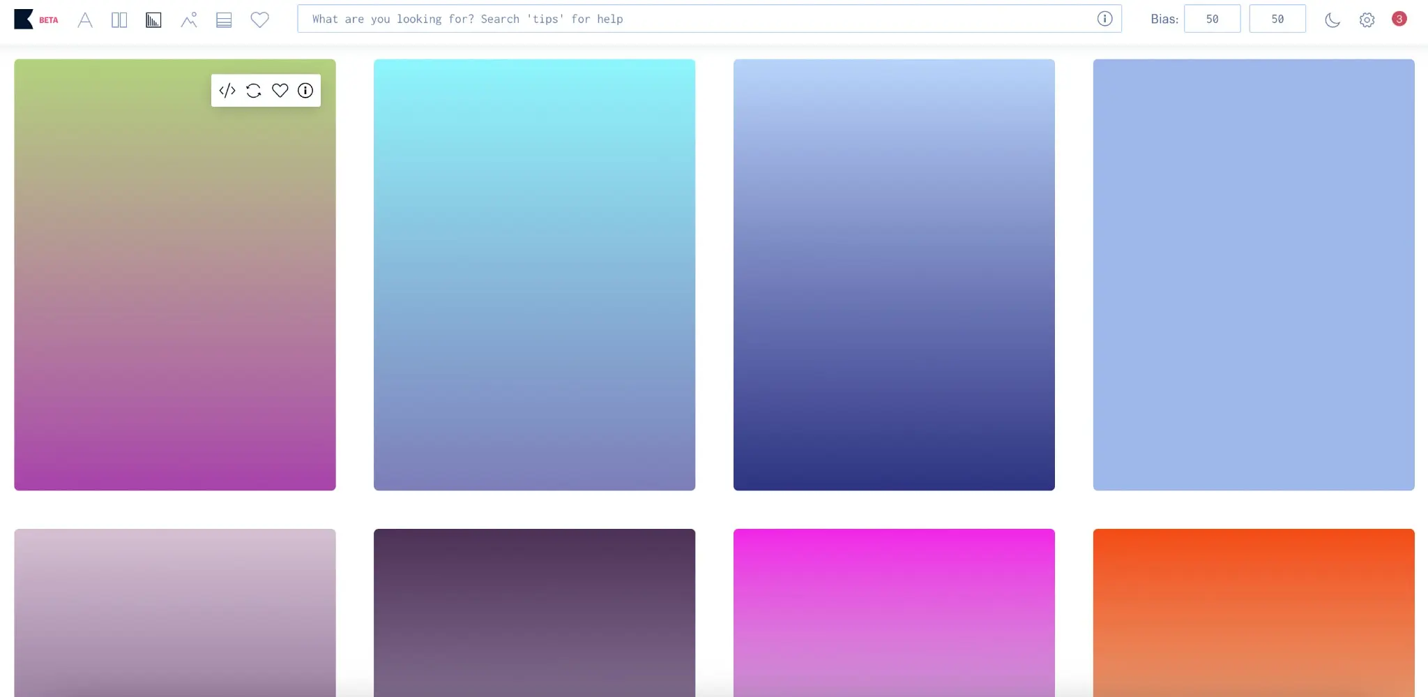
Image
Palette
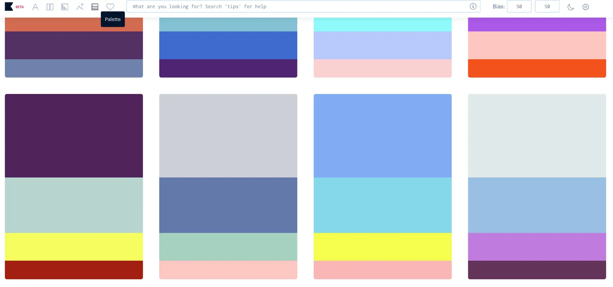
Khroma is an extremely accessible and user-friendly platform with endless color combinations for a variety of projects. The ability to save work on the online database makes it easy to view your favorite selections from your browser at any time without having to pay.
It’s a great choice to use your projects as a designer or a useful tool to collaborate with clients, stakeholders, and other design teams.
Khroma helps give your brand or product a unique and effective edge by using the power of color to evoke emotion or induce an intended call to action.
2. How to use Khroma
Selecting the right color palettes for your designs is a crucial step in the design process.
Not only does color impact the user’s first impressions and the emotions they feel when viewing your product, but it also affects accessibility, readability, and, therefore, the overall usability of your design.
As such, Khroma is an ingenious tool for UX and UI designers alike. Here are some ways to incorporate using Khroma in your design process:
1. Ideation
This phase of the design process is a great place to introduce using Khroma. This is generally the place where your first ideas are beginning to form, and you’re getting an idea for what sort of solution you’ll create for the problem at hand.
Many designers choose to create mood boards at this time in their process to start laying out the general theme and feel of the product at hand.
Using Khroma at this stage could help set the foundation for the overall feel of the website, app, or brand and what sort of emotions you’re trying to evoke through color.
Bring Khroma to a brainstorming session or sit down with stakeholders to pick their favorite colors and go through which palettes you think will set the right tone and convey the proper message for the product.
You can also select multiple palettes that fit your needs and save them to test out later on.
2. Prototyping
Now it’s time to integrate the colors you’ve set aside into a real representation of your best ideas for the product. Khroma makes it easy for you to find the color palettes you’ve selected on other prototyping tools by not only providing the name of the color but also the RGB value and the CSS code.
Therefore, no matter what prototyping software you are using, you’ll be able to find and keep track of the colors you’ll be using throughout your designs.
Because Khroma allows you to upload your images into the color generator, you can take the necessary photos and icons you want to use in your designs and apply the correct color palette to them. This helps keep your designs cohesive and in line with the agreed-upon palette.
3. Test
Now that it’s time to test out your designs, you can see how well the generated color palettes you’ve chosen work in your product. You’ll want to pay close attention to any comments about readability and how the users say they feel when using the app or website.
Luckily, if things aren’t working out, you don’t have to scrap your entire color choices. Khroma makes it easy to adjust the palettes and edit the hue, tint, value, etc. so you can address accessibility issues easily.
If at this stage you are still torn between a few color options, you can quickly create different color variations of your prototypes using the palettes Khroma provides and run some A/B testing with the various options.
You can do this for entire screens or upload PNGs of your icons, buttons, and other design elements to test more subtle changes.
4. Re-define
Once you’ve implemented your test results into the final designs, it’s time to look at your product and evaluate if any further changes could be made to improve the designs.
After a while on the market, you might find it necessary to re-brand or switch up your color schemes.
Fortunately, Khroma can save all your color preferences so you can go back and access some of your other favorite colors and palettes.
Or, you can use other saved palettes for new projects that work well with similar color schemes. If it’s a completely different sort of project, you can refresh the auto-generated options or edit your original 50 selected colors to come up with even more variations.
3. Closing thoughts
Khroma is a practical and convenient AI tool that has taken what other previous color selection tools lacked and found a solution.
Its database is unlimited and provides a plethora of useful methods to view, edit, and save your favorite selections to use for designs throughout your career.
It’s versatile, user-friendly, and can come up with more color palettes than you could ever do on your own in a faster and more organized way.
Interested in learning more? Try our free UI design short course.
Want to learn more about color theory and different UX/UI design tools? Check out these related articles on the blog below:
