Much has been said about the importance of consistency in UI design – and with good reason. User interfaces that aren’t consistent often yield confused and frustrated users and can drive even the most promising products to failure.
But what exactly is consistency in UI design? Consistency in UI design is concerned with making sure elements in a user interface are uniform. They’ll look and behave the same way. This helps constantly prove a user’s assumptions about the user interface right, creating a sense of control, familiarity, and reliability.
To develop consistency in UI design, you should aim to be consistent with device UI guidelines and behaviors, other similar apps/sites, and with your own design.
Device UI Guidelines and Behaviors
Different platforms have different UI and usability guidelines you should observe when designing. If you are designing the user interface of an iOS app, for example, you should familiarize yourself with the iOS Human Interface Guidelines and strive to adhere to them. If you are designing for Android, you should take a look at Material Design.
Consider Shift, the time zone planner by Tapmates, available to both Android and iOS users. At a quick glance, the screens of both devices displaying Shift in the image below look the same. But if you look closer, you’ll notice a few subtle changes, like the placement of navigational elements within the header. These stem from differences between the guidelines for both platforms. In Shift’s case, the designers observed guidelines specific to each platform and made adjustments on both versions to be consistent with them.

[In the video below you’ll see me explaining the importance of consistency in UI design. Check it out!]
Other Similar Apps/Sites and General Practice
It is no secret that your users will spend time on other apps, some which are pretty similar to yours. As a result, they’ll be familiar and comfortable with popular patterns, rules and interactions used in them or elsewhere. Taking this into account and modeling your design with them in mind is a great way to increase usability. You’ll “piggy back” off knowledge users have accumulated from previous experiences and won’t have to worry about them being confused by a new or unfamiliar user interface.
This doesn’t mean ripping off somebody else’s design. You don’t want to copy another app. You want to familiarize yourself with what UI patterns are being used and what is being done elsewhere to improve your own design.
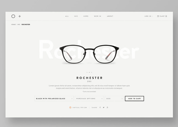
Think about e-commerce sites and the placement of shopping carts on them. We normally look to the top right corner to check out what we’re about to purchase, right? If you were designing the user interface of an e-commerce site, like the lovely example below by Catherine Irma Elita, you’d want to consider placing your shopping cart in a similar position.

Your Own Design
Placement, styling, type choices, and layout are only a few elements that should remain consistent throughout your entire user interface. If you’ve placed navigational elements within the header of your app on screen A, don’t place them within the footer of screen B. Moving, changing or disappearing elements won’t only confuse your users, it will irritate them and might even motivate them to kick your app to the curb.
But hey, what if I want to spice things up a bit to avoid a boring design? Do so strategically. Use inconsistencies moderately to improve your design or increase the usability of a user interface. If it is crucial that your users notice a particular element in your user interface or you need to draw attention to it, make it different. Want to break up a tedious design? Use moderate inconsistencies to add visual interest so long as they don’t get in the way.
Check out the fast gif below. Notice how, even though the content of each screen changes, the position of the navigational elements remains consistent throughout the entire app.
Benefits of Consistency in UI Design
So what will aiming to be consistent with device UI guidelines and behaviors, other similar apps/sites, your own design do for your app and users? A few key benefits are:
Increased Usability
Consistency makes it easier for your users to navigate and use your app because they don’t have to learn new ropes to get around. They know what to expect either because they’ve learned it previously within your app or elsewhere. Naturally, this will help make your users feel comfortable, happy, and will motivate them to remain engaged with your app.
Eliminates Confusion
Consistent user interfaces facilitate communication. Use visual consistency to prioritize content, make it navigable, or highlight important bits of it. By using consistency to create a logical structure and to clearly define where users can find what, you’ll spare yourself confused and frustrated users.
Evoke an Emotional Response
We’ve mentioned that consistency in UI design can make it easier for users to navigate and use your app. This will help your users feel confident in their ability to manage what’s under their thumbs and will evoke a positive emotional response resulting from a pleasant experience.
Consistency in Practice
If you’re pretty new to the UI world, many of these concepts can be difficult to visualize. To better understand what consistency can translate to in practice, check out the examples below of apps that totally ace consistency.

Great Apps: Clear
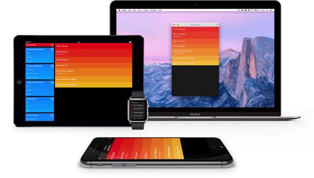
I can’t remember how many times I’ve referenced or used Clear as an example of an app that exemplifies so many great qualities to aim for in UI design. If you aren’t familiar with it, be sure to check it out!
Consistency-wise, it does more than looking the same. I’ve used the app on a few different devices and love that the simple gestures I need to navigate it remain pretty much the same across all of them, even on my Mac. It makes the knowledge I’ve accumulated on how to use the app transferable to all devices, increasing usability.

Great Apps: Duolingo
Duolingo is a fun app designed to help anyone learn a new language. Not only does it do an ace job of making learning fun, it showcases how beneficial styling consistency can be in a user interface.
Buttons, typefaces, navigation elements, and even illustrations within the app are purposefully and carefully designed to be visually consistent with each other. Colors, lighting, and shapes have all been designed to remain consistent throughout the entire app and on all material, like their website, revolving around the app. Not only does it make the app easy to navigate, it makes it feel branded and professional.
This, coupled with cute Duo, makes Duolingo visually pleasant and fun to use, giving the app the power to evoke a strong, positive emotional response.

Great Apps: Hopper
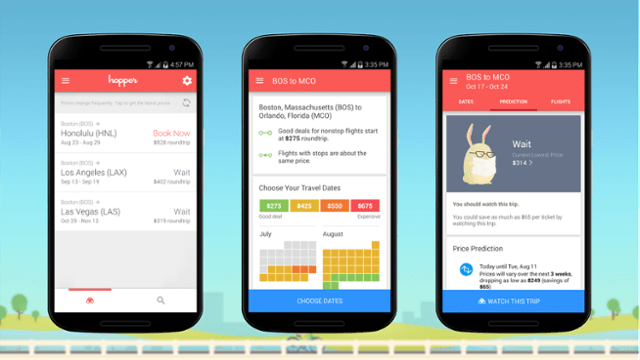
Hopper is an airfare prediction app. It helps you find the best deals on flights and best times to fly by allowing you to keep an eye on specific routes. Whenever prices fluctuate, Hopper will let you know.
As you design, it’s important that you also aim for consistency in layouts and placement. This is especially important when it comes to navigational elements, the very bits your users need to get around.
To better understand what this might look like, check out Hopper. Notice how the menu is always within the header. The header and the important navigational elements it contains doesn’t pull a Houdini or migrate to the bottom. It sits in the same place on every screen.
By now, you probably get how important consistency is in UI design. It’s for this reason that we’ve devoted more than a few words to consistency in our new User Interface Design Course. In it, we explore all the ins and outs of it, how to apply it, and when it may be beneficial to be inconsistent.
Keen to take a closer look at consistency in UI design now? The guys at UXPin have written an awesome (and free!) e-book on the subject. It is packed with great explanations and case studies from companies including Amazon, Dolce & Gabbana, Adobe, and US Airways to help see how the giants out there tackle it. On the site, you’ll also find a few more great, free resources that cover other important topics in UI design, like mobile material design, web typography, and UX design.
You can also check out what the guys at Nielsen Norman Group have to say about consistency. They’ve written a few books and more than a few articles on the subject and those stemming from it. Their Consistency in the Cross-Channel Experience article is an excellent read, especially today when we’ve about a million different screens to account for when we design.
