Typography is so much more than choosing a nice font for your website or app; it’s the art of using typefaces to bring your interface to life. With so much to consider when working with typography, including readability, accessibility, and hierarchy, your use of typography could mark the difference between a good interface and a great one.
In this blog post, we’ll provide you with a handy road map for seamlessly integrating typography into your designs. We’ll look at the role typography plays in elevating a web or mobile interface, and take you through some core principles that will guide your use of typography in UI design.
- What is typography, and why is it important?
- What role does typography play in UI design?
- What are the different elements of typography?
- How to use typography in UI design
- Final thoughts
Let’s jump right in!
1. What is typography, and why is it important?
Before diving into the details, let’s kick off with a quick refresh on what typography actually is—and why it matters so much.
Dating back to the 11th century, typography is all about using typefaces and fonts in a way that makes the copy legible, clear, and enjoyable to read. Typography involves font style, appearance, and structure, aiming to elicit certain emotions and convey specific messages to the end-user. As well as ensuring the typeface lends itself to the visual balance of the website or app, it’s the job of the UI designer to optimize the website’s accessibility by keeping the typography highly readable.
As well as bringing user interfaces to life, good typography will also:
- Build brand recognition by subliminally encouraging your users to associate the typeface featured on your site with your brand
- Influence decision making by observing how users digest and perceive the information conveyed by the text, and
- Hold the attention of the readers by being impactful and memorable.
In the video below, CareerFoundry UI design mentor Olga lifts the lid on why typography matters—and what difference it makes for your users.
2. What role does typography play in UI design?
Typography extends far beyond choosing a nice font for your website. Good, well-thought-out typography is paramount for good user experience—and overlooking its importance could be detrimental.
When users first arrive on a webpage or app, they scan the page rather than reading it. Having a clear hierarchy, and clean typefaces are essential for creating an excellent first impression with the user—and ultimately, keeping them on the page.
Once you’ve caught your users’ attention, the next challenge is about conveying information. As people are accustomed to receiving information in text form, it’s a UI designers’ responsibility to ensure the typeface helps to convey the message rather than distract from it.
Finally, typography should blend seamlessly with the other elements in the interface and act as the glue that holds it all together. It should set the overall tone of the product, working in harmony with the rest of the graphics to create an aesthetically pleasing overall visual balance.
It’s a lot to juggle!

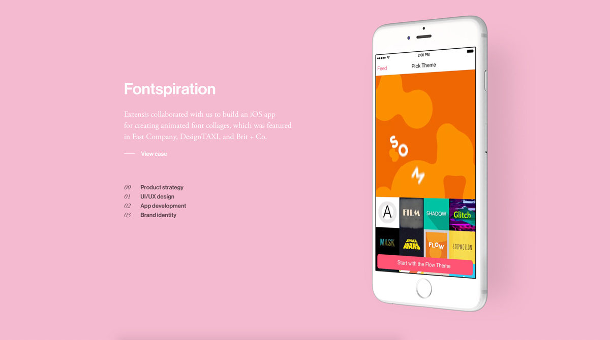
(Source https://www.sfcd.com)
3. What are the different elements of typography?
Before we get to the practical part, let’s remind ourselves of the different elements of typography:
Fonts and Typefaces
Fonts refer to the weights, widths, and styles that constitute a typeface, and a typeface is a family of related fonts. The three basic kinds of typeface are serif, sans-serif, and decorative.
Consistency
Keeping your typefaces consistent is the key to avoiding confusion. Sticking to the same font style will help your readers instantly understand what they’re reading, and begin to notice a pattern.
White space
Also known as ‘negative space,’ white space is the space around text or graphics. It tends to go unnoticed by the user, but proper use of white space ensures the interface is uncluttered.
Alignment
Alignment is the process of unifying and composing text, graphics, and images to ensure there is equal space, size, and distances between each element.
Color
One of the most exciting elements of typography is color. Color has three key components: value, hue, and saturation. A good designer will know how to balance these three components to make the text both eye-catching and clearly legible, even for those with visual impairments.
Hierarchy
Establishing hierarchy is one of the most vital principles of typography. Typographical hierarchy aims to create a clear distinction between prominent pieces of copy that should be noticed and read first, and standard text copy.
Contrast
Like hierarchy, contrast helps to convey which ideas or message you want to emphasize to your readers.
4. How to use typography in UI design
It’s time to put what we’ve learned about typography into practice! Below, we’ve laid out three key steps to use as a guiding reference as you begin to incorporate typography into your interface. We’ll start off by taking you through the process of choosing your fonts, before looking at the two main principles of typography in UI design: readability and scalability.
Choosing your fonts
When it comes to choosing your fonts, there’s a lot to consider; most importantly, the brand’s personality, the product or service on offer, and the audience. With infinite different font designs on offer, each bringing its own mood and style to the table, choosing the right font should not be a quick decision.
While it’s tempting to use multiple typefaces within a single design, it can be overwhelming for the user. If you’re new to font pairing and typography, start by using fonts from the same family—or, in other words, a single typeface. As fonts from the same typeface were created to work harmoniously together, sticking to one typeface will automatically give your interface a more cohesive look.
Many typefaces still come with enough range to ensure that you have ample font variations for different purposes. For example, some typefaces include features like italics, extended, bold, and condensed options. While these do allow for more creative arrangements, playing around too much with font styles should be avoided.
Not all fonts are created equal(ly legible), and when it comes to readability, it’s always better to play it safe. While serif fonts, the go-to choice for print, are traditionally hailed as being more legible—sans-serif fonts lend themselves better for digital interfaces. We’ll talk more about readability in the next section.
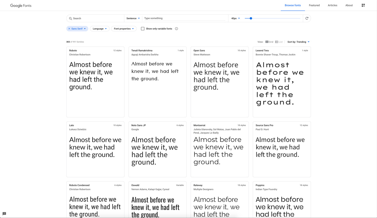
Finally, when choosing a typeface, it’s crucial to ensure your fonts are web browser friendly. Commonly used font libraries such as Google fonts offer web-based font files that can be rendered in a browser with minimal issues. Pro tip: when downloading web fonts, never download more character sets than you need to.
To learn more about what not to do in UI design, check out our handy guide on the common UI design mistakes—and how to avoid them.

Readability refers to the quality of the overall reading experience. UI designers achieve readability by carefully managing the contrast, size, composition, and color of the type. The text on your interface should flow intuitively for your users, keeping the cognitive load at a minimum and remaining accessible for those who may have visual impairments. To facilitate an enriching reading experience for your users, here are some practices to incorporate as you go along:
Formatting
In many parts of the world, users commonly read from left to right, top to bottom—so keeping your text to the left is the first step in ensuring readability. A consistent left edge also provides a place for the eye to return to after finishing each sentence, which makes reading a block of text both faster and easier. When formatting, it’s good practice to avoid having a “widow”, which is a single word on the last line of a paragraph.
White Space
White space is a key way to lessen the amount of text that readers have to absorb one go. Good use of white space will command your users’ eyes, telling them what to read—and how to read it. Use it mindfully and intentionally; skimping on white space may mean your users struggle to distinguish words that are placed too close together. On the other hand, too much white space will be confusing for the user.
Hierarchy
Good hierarchy can be accomplished by employing the use of contrast, paddings, alternating text sizes, and margins.
Line Height
Line-height, also known as leading, refers to how the text is spaced vertically in lines. While the ideal line-height depends on the size of the font itself, if you’re using a standard font size of 16, a line-height of 1.5x is widely considered to be a good starting point. You can adjust your line-height accordingly if your base font size is smaller or larger.
Letter Spacing
Letter-spacing is the spacing between each individual letter. Letter-spacing is often overlooked by designers, but it could make all the difference to your text’s readability. Some basic guidelines to consider when using letter-spacing are:
- Increase letter-spacing with uppercase text
- Decrease letter-spacing when increasing font size
- Decrease letter-spacing when increasing font weight
Line Length
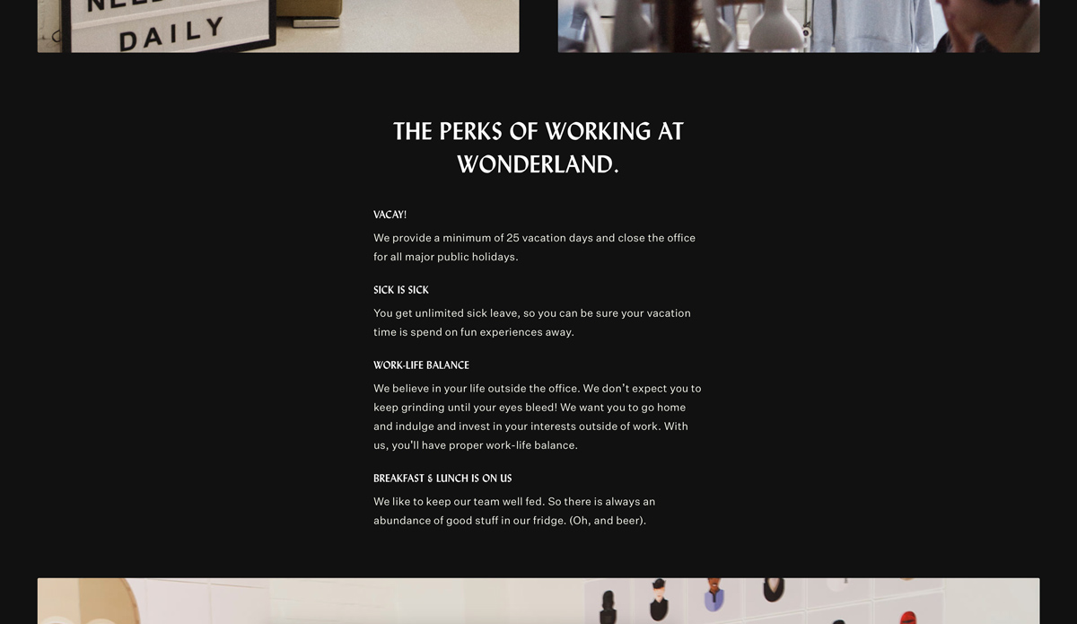
Line length refers to the width of a block of text. Shorter lines are favored, as they’re more comfortable to read. Based on a screen size of 1440px and a base font size of 16, the suggested line length for on-screen text is within the range of 60 to 80 characters. This range can be adjusted to 35 to 45 characters per line for mobile screens.

(Source https://www.wonderlandindustry.com/careers/)
Scalability
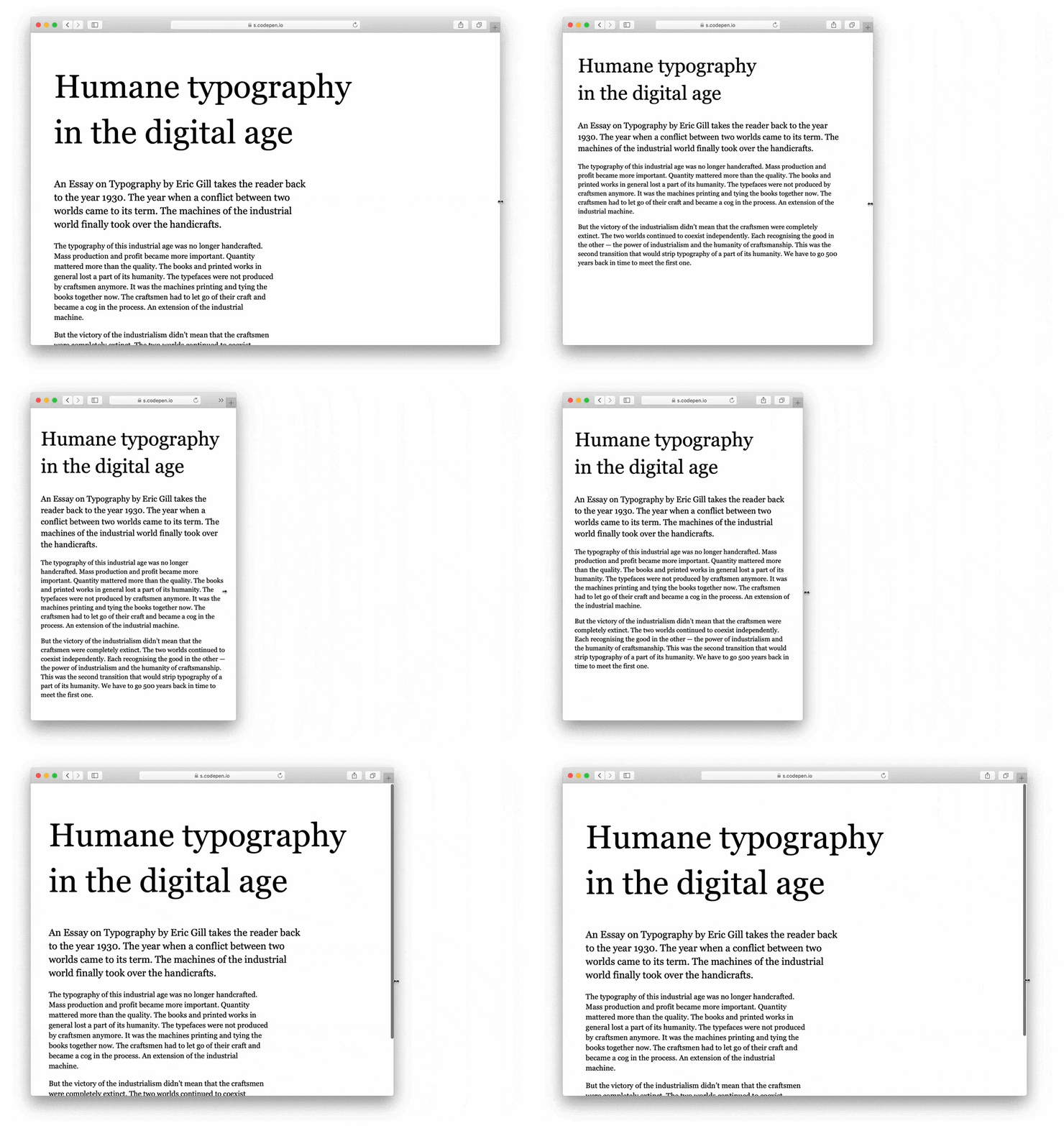
Phew—that was a lot to take in! Last up is scalability, the art of responsive typography. In previous articles, we’ve talked about responsive design, which refers to user interfaces that adapt and re-adjust depending on the screen size. Some typefaces are easily visible when passed at larger sizes, while on the other hand, typefaces with very fine letterforms or overly adorned designs may crack at smaller settings. Ensuring your typography is scalable is a vital step when incorporating typography into your user interface.
Scalable fonts, also known as outlier fonts or vector fonts, are fonts that can be enlarged or reduced without resulting in any distortion. The outline of each character is stored as a mathematical formula. Aside from offering innumerable sizes of each font, scalable fonts have an added advantage in that they make the most of an output device’s resolution. The more resolution a monitor has, the better a scalable font will look.
If your font system (a family of fonts used across your product) includes fonts intended for multi-use, from small labels to larger headlines and bulk content, opt for a typeface that is compatible with multiple sizes and promotes readability and usability in every size. These include Lato, Univers, and Avenir.
When testing the scalability of your text in your interface, be sure to do so with the real text. A Lorem Ipsum placeholder is undoubtedly useful in some cases, but testing the scalability with the letters of the words and sentences that are significant to the interface will give you a much more realistic idea of how well they scale.

Source (https://codepen.io/matejlatin/full/oRLaXy)
Final thoughts
While it might seem like the final cherry on top, typography will rule your UI design—so it’s important to get it right. If you’re not sure where to start, take some time to see what other people are doing. Even following typography hashtags on social media or looking up typography on Pinterest will give you some good ideas of what’s out there. Just remember: as with any UI element, functionality should be at the forefront!
Keen to learn more about UI design? Check out these related blog posts:
