As is the case with any creative career, designers do their best work when they’re inspired—and what better way to get inspired than by browsing some of the unique, forward-thinking work other designers are already doing with UI animation?
Motion and animation in UI design has come a super long way from the gaudy graphics of the early 2000s, and designers continue to play around with some of the core animation principles to produce innovative and memorable digital experiences.
From funky to functional, we’ve pulled together a collection of nine awesome UI animation concepts that are guaranteed to fuel your creativity in 2025.
- MOON animation by Alex Spencer
- Pinky 3D animation by Taras Migulko
- Processing animation by Oleg Frolov
- Kinetic typography motion by Atanas Giew
- Add to cart animation by Aaron Iker
- Snowy background animation by Outcrowd
- Cursor effect by Sebastian Jungbluth
- 404 animation by mochiburen
- Hiring page transition by Aryo Pamungas
Let’s go!
1. MOON animation by Alex Spencer
This quirky animation by Alex Spencer is a great example of how animation can enhance your branding, and tell a story. This dynamic logo features two alternate-sized circles that come together, mimicking the motion of the actual moon when it rises and falls at night. The pastel colors and grain effect also set the tone of the brand; juxtaposing simplicity and sophistication with the playfulness of the geometric shapes.
2. Pinky 3D animation by Taras Migulko
These adorable 3D marshmallow characters are a perfect demonstration of anthropomorphic animation. People are naturally drawn to designs that exhibit human-like traits, and these cute marshmallows do just that. Even subtle motions like closing eyes or hands swinging as they move do wonders for the interactivity of the page. The marshmallow peeking into the frame in the foreground also adds to the 3D effect, giving the page more depth. In short, it makes the user want to step into this world.
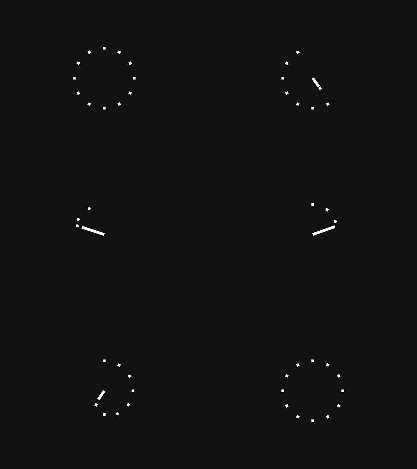
3. Processing animation by Oleg Frolov

Waiting for pages to load or forms to process is one of the biggest pain-points in a user’s journey. Having a visual representation of progress or loading time is a vital way of removing some of that frustration, keeping the users informed, and reinforcing the sense that they’re moving forward. This clock-like animation by Oleg Frolov achieves all of the above by putting a clever spin on the classic progress bar. It’s easy to become fixated on the movements of the squares—and after a while it almost feels like an optical illusion.
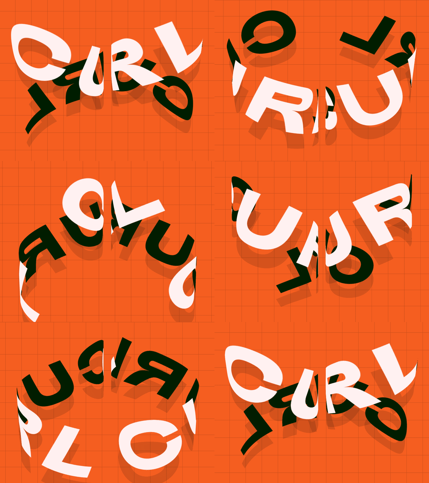
4. Kinetic typography motion by Atanas Giew

Kinetic typography is pretty much everywhere right now. Not only does it bring words to life, it’s also a very powerful branding technique. In this animation of the word ‘curl,’ there are several things at play. Firstly, Atanas cleverly curls the words round in a spiral—adding a double meaning to the word. The addition of a second color for the ‘inside’ of the word also makes it feel more 3D, as if it’s twirling on an invisible pole. The distortion of the background is another simple touch that brings it all together.
5. Add to cart animation by Aaron Iker
Good user experience is all about keeping the user informed, as does this micro-interaction by Aaron Iker. When users click on the ‘add to cart’ button, an animation of a cart being filled up and carted off demonstrates the action in real-time. Though subtle, the transition to ‘added’ also lets the user know when the action is completed—leaving no room for confusion or interpretation.
6. Snowy background animation by Outcrowd
Good UI design is all about enticing users, and creating a welcoming environment that encourages them to explore. What’s more welcoming than a cosy, snowy scene? On this homepage, the only animated element is the snow—the rest of the illustration is static. Despite this, the simple addition of falling snowflakes quite literally brings the scene to life, as if you’ve arrived at a Swiss cabin rather than a website homepage. It’s not distracting enough to obstruct the page’s functionality, but still adds a compelling living element to the user experience.
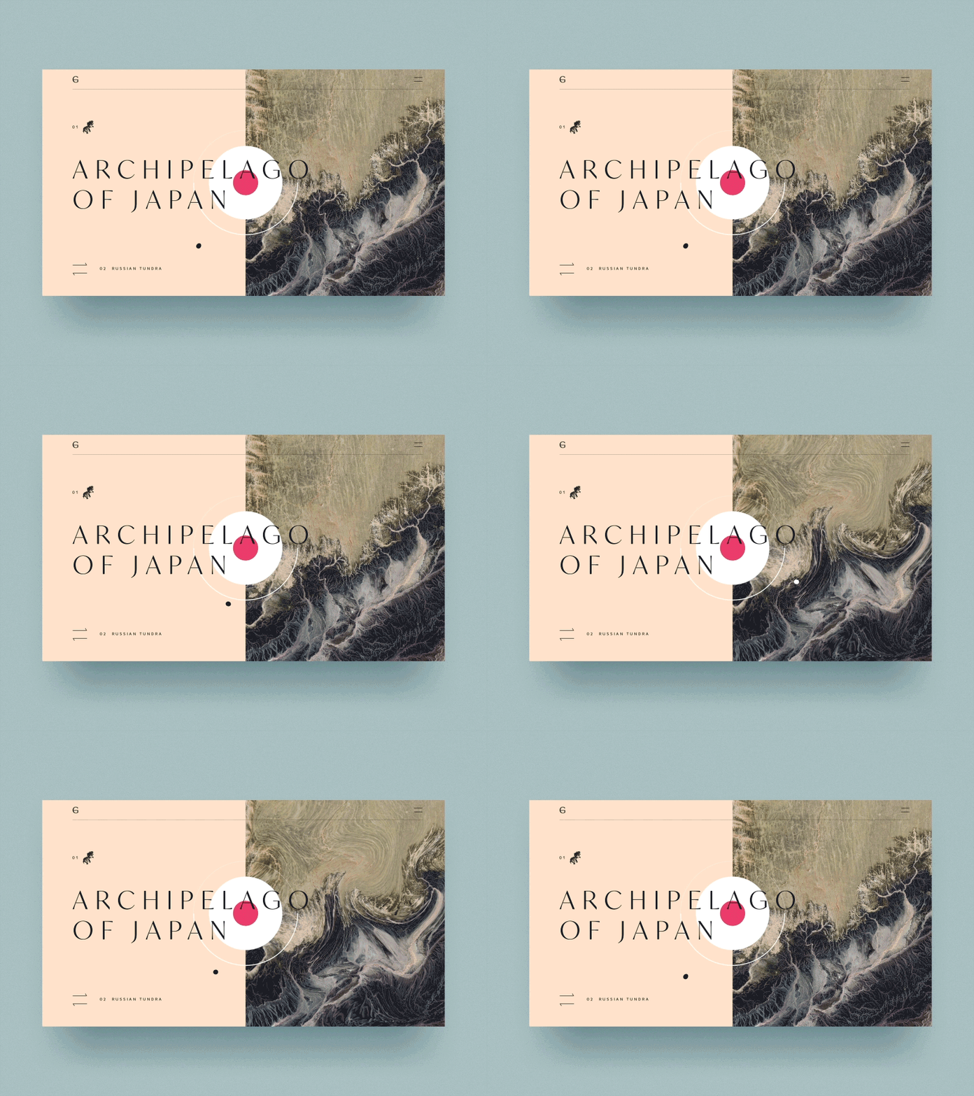
7. Cursor effect by Sebastian Jungbluth

This cool hover effect by Sebastian Jungbluth features an illustration of the sea that distorts when in contact with a cursor. Though simple, hover effects do wonders for interactivity. Users can’t help but explore what other elements will distort when they hover their cursor on them, and it can even become a fun, interactive game. This option to manipulate website elements gives the user a sense of control, and boosts session time by keeping them on the page for longer.
8. 404 animation by Mochiburen
There’s nothing worse than feeling lost on a website, and sometimes the content on a 404 page can make or break a user experience. This animation by Mochiburon is a fantastic example of how a 404 error page can be flipped into something positive. The character of a woman checking her watch and looking around, as if she’s just as confused as you are, shows the user that the company is aligned with you on the problem—rather than sourcing it. The soft swaying of the leaves also evokes a sense of calm, which isn’t something you would expect from an error page. As the cherry on top, the page remains on-brand—suggesting that even though you’re lost, you’re still very much on the same website. Crisis averted!
9. Hiring page transition by Aryo Pamungas
Look at the way each element comes into the frame in this animation. Can you guess what animation principles are at play here? Yep—follow through and overlapping action. On this hiring page, each UI element arrives at its final destination at different speeds—with the background shape even getting larger before coming to a resting position. The subtle difference in speed and motion of each element makes the page feel more natural.
So there we have it, nine awesome examples of UI animations from around the web. From subtle motions to big concepts, every animated element has a huge payoff when it comes to user experience. Don’t be afraid to experiment, all the while keeping functionality in mind, of course.
Hopefully you’ll be inspired to get stuck in with your own animations. Before you do, make sure you’re familiar with these animation guidelines for UX and UI designers. And, if you’d like to continue exploring, we recommend giving one of these blog posts a read:
