You’re likely already familiar with the phrase “follow the breadcrumbs”, which means to follow a scattered series of clues back to a person or place.
In the world of UI, “breadcrumbs” means much the same thing.
Like the trail of breadcrumbs left by Hansel and Gretel so they wouldn’t get lost in the woods, UI breadcrumbs are a navigational tool that website and app users might get lost without!
So what are the different varieties of UI breadcrumbs, and when should they be used or avoided?
This article will give you the full lowdown on best practices for breadcrumbs and demonstrate their use in a selection of inspirational examples.
To jump ahead to a certain section, you can use this clickable menu:
- What are UI breadcrumbs?
- Types of UI breadcrumbs
- Best practice for UI breadcrumbs
- Four inspirational examples of UI breadcrumbs
- Final thoughts
1. What are UI breadcrumbs?
UI breadcrumbs are a standard wayfinding device that enables users to easily navigate their way between different sections within the hierarchical structure of a user interface or website.
These breadcrumbs often appear as a family tree of links, which indicate the current page, and its ancestors (the page that came before it, the one before that, and so on).
A link to the home page should appear as the root node in this chain, with the subsequent pages separated by a symbol, such as “/” or “>”. This breadcrumb trail usually sits just under the website’s global navigation, or main menu.
2. Types of UI breadcrumbs
UI breadcrumbs can be split into three categories.
Location-based
Location-based breadcrumbs highlight the user’s location within an interface or website’s page hierarchy. These breadcrumbs are particularly useful for aiding wayfinding in large systems containing multiple levels.
A typical location-based breadcrumb trail would be shown as:
Home page > Section page > Subsection page
Attribute-based
Attribute-based breadcrumbs help users orient themselves by indicating information that categorizes the current page.
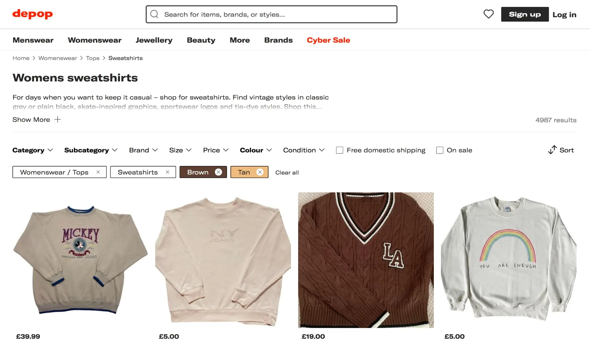
This type of breadcrumb trail is common in online marketplaces, as the resulting “attribute tree” is particularly handy in narrowing down features and qualities of products when shopping for items.
Here’s a typical example of attribute-based breadcrumbs, seen when hunting for sweatshirts on Depop.

Source: Depop
Pathway-based
Pathway-based breadcrumbs show every step the user has taken to arrive at the current page. These breadcrumbs are dynamically-generated, as they show the user’s unique history while they navigate their way through the UI.
In this sense, pathway-based breadcrumbs can be used as a back or undo feature, allowing the user to jump between sections of a site without fear of getting lost.
They are, however, of questionable use—as most users browse wildly, creating a meandering and confusing path. They are also invalid for users who are dropped into a deep recess of the UI from an outside source.
3. Best practice for UI breadcrumbs
When are UI breadcrumbs needed?
UI breadcrumbs are most useful in large, multi-leveled hierarchical sites or systems, where users are at risk of losing their way after a series of twists and turns. By this token, breadcrumbs are not needed on single-page sites, or interfaces with no logical grouping or hierarchy.
UI breadcrumbs should never replace the UI’s global navigation system or the local wayfinding bar within a site section. They should be deployed as a supplementary navigational component, which augments the traditional menu that usually appears at the top left of every site, without making it obsolete.
Breadcrumbs and polyhierarchical sites
One school of thought says that breadcrumbs should not show multiple pathways in the architecture of a polyhierarchical website (one where multiple “parent” pages link to a single page).
This is because illustrating more than one pathway risks cluttering the top of the page, and confusing users.
That said, marketplaces dealing with products that don’t easily fit into one genre may find it difficult to allocate a primary trail to certain items (skip to example four for more on this).
Breadcrumbs on mobile
Creating breadcrumbs for mobile UIs can quickly become more hassle than it’s worth.
On smaller screens, long breadcrumb trails run the risk of wrapping to multiple lines—consuming valuable real estate on a small, already crowded page.
Line breaks in a breadcrumb chain can also paint a confusing picture, or inadvertently misrepresent the architecture of a site.
The usual tactic of making breadcrumbs small and unobtrusive becomes problematic on mobile, as the trail may become hard to read and manipulate. Shortening the trail to just one crumb, which points up a level to the preceding ancestor page, can provide a solution for this.
Breadcrumb formatting
Breadcrumbs tend to work best when the font size is significantly smaller than that of the surrounding text, so the trail doesn’t become obtrusive.
As touched on earlier, each crumb is usually separated by a symbol. These dividers often appear as a “/” or a “>”, but less common symbols function in much the same way. This is more of an aesthetic decision.
Each crumb should be a link, apart from the crumb relating to the current page. A link that goes nowhere is of no use to anybody. To save users from any wasted effort, some kind of emphasis—through underlining or color—can highlight the fact that the “current page” crumb isn’t worth clicking on.
Contemporary UI breadcrumbs are no longer exclusively present as a chain of links. Below are some examples of innovative, inspirational breadcrumbs.
4. Four inspirational examples of UI breadcrumbs
The Guardian
UK news giant The Guardian offers a sleek breadcrumb design that evokes the feeling of reading a broadsheet newspaper. Rather than acting like a trail of yarn in a labyrinth, these breadcrumbs display the site’s page hierarchy—not the user’s journey through it.
Breadcrumb convention is politely ignored, as the current page (emphasized in bold) sits in place among its siblings, rather than at the end of the list. This suggests an index or list of contents.

Source: The Guardian
Adidas
As you can see here, Adidas have incorporated a “back” breadcrumb at the beginning of the trail, allowing users to easily retrace their steps. This creates an unusual hybrid of attribute and pathway-based breadcrumbs.

Source: Adidas
Microsoft Windows
A classic example of location-based breadcrumbs is Microsoft’s “Breadcrumb Bar”, an essential tool for navigating the various iterations of Windows, and in many ways the inspiration for most modern breadcrumbs.

Source: Microsoft
Waterstones
Going against standard breadcrumb wisdom, Waterstones have decided to show all possible paths leading to this classic novel. The result—for better or worse—is three stacked trails of attribute-based breadcrumbs.

Source: Waterstones
While potentially overwhelming, this multi-layered approach can provide detailed guidance for navigating UIs that contain numerous, overlapping categories.
5. Final thoughts
UI breadcrumbs are a supplementary form of navigation that helps users reach pages within the structure of an interface. They can be particularly useful in aiding navigation within multi-layered, hierarchical sites—but are pointless on single-level web pages.
Typically, each node in the trail links to a relevant page, with the crumbs becoming more specific as the user drills down into the site. The three types of breadcrumbs—location, attribute, and path-based—make different pathways through the UI’s architecture available to the user.
While breadcrumbs have become incredibly commonplace, they are not always necessary and can clutter a page while performing the same role as an existing menu. Also, in the age of heavy mobile use, long breadcrumb trails of tiny text are not the most user-friendly tool.
If you want to learn more about UI, try our free UI short course.
And if you found this article interesting, you’ll likely enjoy these:
