User interface (UI) elements are the parts we use to build apps or websites. They add interactivity to a user interface, providing touchpoints for the user as they navigate their way around; think buttons, scrollbars, menu items and checkboxes.
User interface (UI) designers use UI elements to create a visual language and ensure consistency across a product—making it user-friendly and easy to navigate without too much thought on the user’s part.
Knowing your UI elements will allow you to recognize opportunities to use them in your designs, helping you design clear and simple interfaces.
In this guide, we explore some of the most common user interface elements, considering when and why you might use them.
Ready? Let’s go.
UI Elements: A Comprehensive Glossary
UI elements usually fall into one of the following four categories:
- Input controls allow users to input information into the system. If you need your users to tell you what country they are in, for example, you’ll use an input control to let them do so.
- Navigational components help users move around a product or website. Common navigational components include tab bars on an iOS device and a hamburger menu on an Android.
- Informational components share information with users.
- Containers hold related content together.
Here is our list of the most common and important UI elements:
1. Accordion
Accordions let users expand and collapse sections of content. They help users navigate material quickly and allow the UI designer to include large amounts of information in limited space.
2. Bento Menu
A bento menu, named after bento boxes, represents a menu with grid items. As you read along, you’ll begin to notice UI designer is just another word for a foodie—we love to name our UI elements after food.
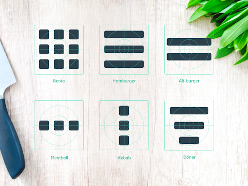
Image by Alex Lockwood
3. Breadcrumb
These little trails of links help users figure out where they are within a website. Often located at the top of a site, breadcrumbs let users see their current location and the proceeding pages. Users are also able to click on them to move between steps.
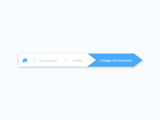
Image by Sharon Olorunniwo
4. Button
Traditionally displayed as shapes with a label, buttons are a vital user element that tells users they can perform a particular action, like submitting.
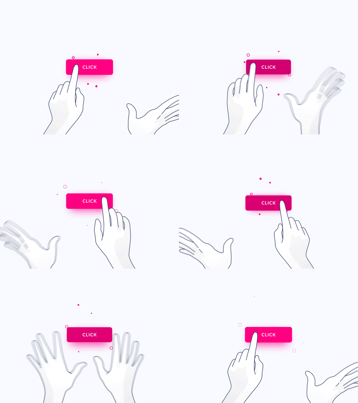
Image by Gal Shir
5. Card
Super popular these days, cards are small rectangular or square modules that contain different kinds of information—in the form of buttons, text, rich media, and so on. These user elements act as an entry point for the user, displaying different kinds of content side by side which the user can then click on.
Cards are a great UI design choice if you want to make smart use of the space available and present the user with multiple content options, without making them scroll through a traditional list.
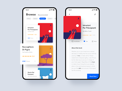
Image by Crank
6. Carousel
Carousels allow users to browse through sets of content, like images or cards, often hyperlinked to more content or sources. The biggest advantage of using carousels in UI design is that they enable more than one piece of content to occupy the same area of space on a page or screen. If you decide to use carousels, be sure to follow these guidelines set out by the Nielsen Norman Group.
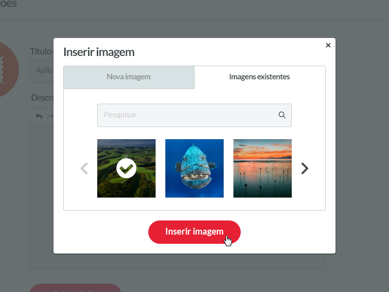
7. Checkbox
In UI design, a checkbox appears exactly as the name suggests: a little square box on the screen that the user can check or uncheck. A checkbox allows users to select one of multiple options from a list, with each checkbox operating as an individual. Checking the checkbox marks it with a little tick! Some common use cases for this element include forms and databases.
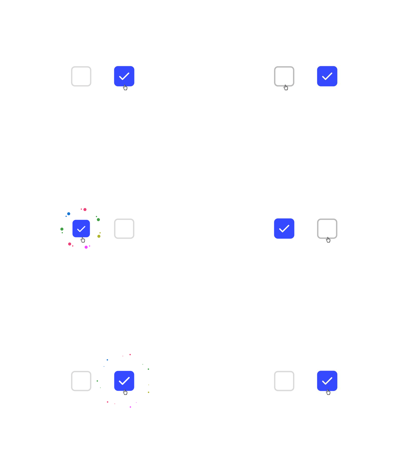
Image by Shakuro
8. Comment
Pretty common around interfaces today, comments display content users input into the system in chronological order. You’ve seen them around social media engines and on blog posts.
9. Döner Menu
A döner menu is a variation of the more well-known hamburger menu. While a hamburger menu consists of three lines of equal length stacked one on top of the other, a döner menu consists of a vertical stack of three lines of different lengths: a long line, a shorter line below it, and an even shorter line underneath that! This UI element represents a group of filters.
10. Dropdown
This controversial UI element allows users to select an item from a list that “drops down” once they click on it. To learn more about why this element has a lousy rep, check out this naughty presentation.
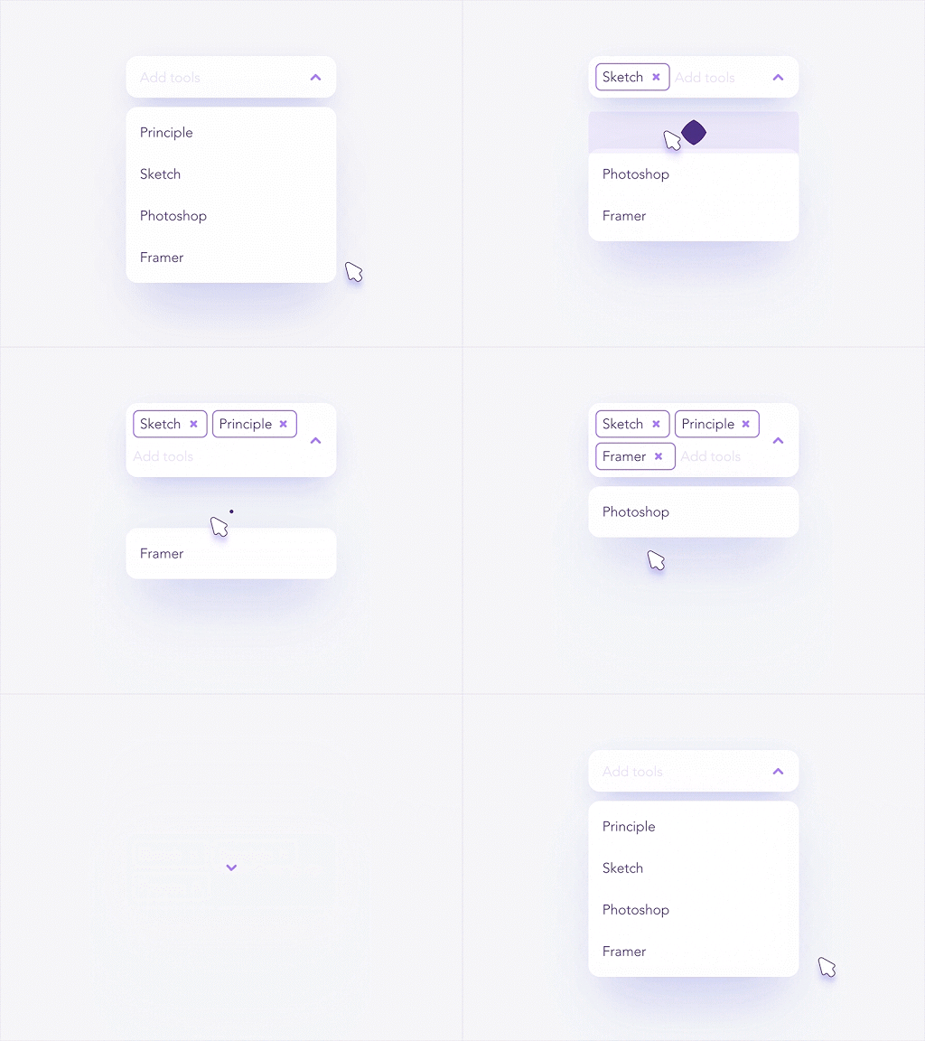
Image by Shakuro
11. Feed
Here is an inescapable one! Feeds display user activity in chronological order. The content varies and can range from simple text to images to video. Think Twitter!
12. Form
Forms help users input sets of related information into the system and submit them. Think of all the boxes asking for shipping details when you order something online.
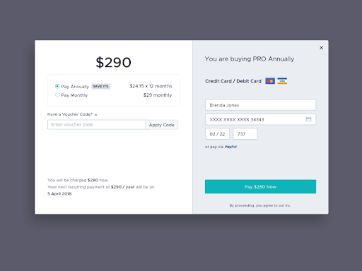
Image by girithaara
13. Hamburger Menu
These three little horizontal lines look slightly like America’s quintessential meal and represent a list menu. You’ll commonly find the hamburger menu on the top left-hand corner of apps and most likely containing a group of navigation links.
14. Icon
Icons are images used to communicate a variety of things to users. They can help to better communicate content or can communicate and trigger a specific action. You can learn how to design icons from scratch in this step-by-step guide to the icon design process.
![]()
Image by Eddie Lobanovskiy
15. Input Field
Input fields are, quite simply, a place for users to enter content into the system. They aren’t just limited to forms, either—search bars are input fields as well.
16. Kebab Menu
We’ve covered the hamburger menu and the döner menu: now for another (non-edible!) UI element: the kebab menu. Consisting of three vertical dots, the kebab menu represents a set of grouped options.
17. Loader
Loaders can take on many, many forms—designers enjoy getting creative with them. Loaders are designed to let users know the system is completing an action in the background and should wait.
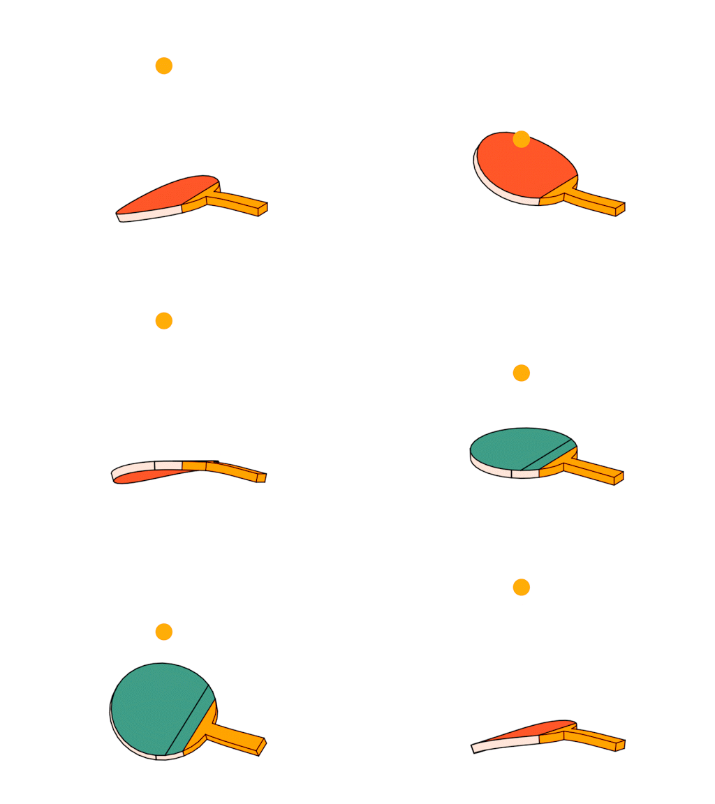
Image by Kickass
18. Meatballs Menu
Yet another member of the menu family is the meatballs menu—a set of three horizontal dots. The meatballs menu signifies that there are more options available, which are revealed when you click on the menu dots.
19. Modal
A modal window is a small box containing content or a message that requires you to interact with it before you can close it and return to your flow.
Think of the last time you deleted an item on your phone. The little message that popped up asking you to confirm that you wanted to remove it is a modal.
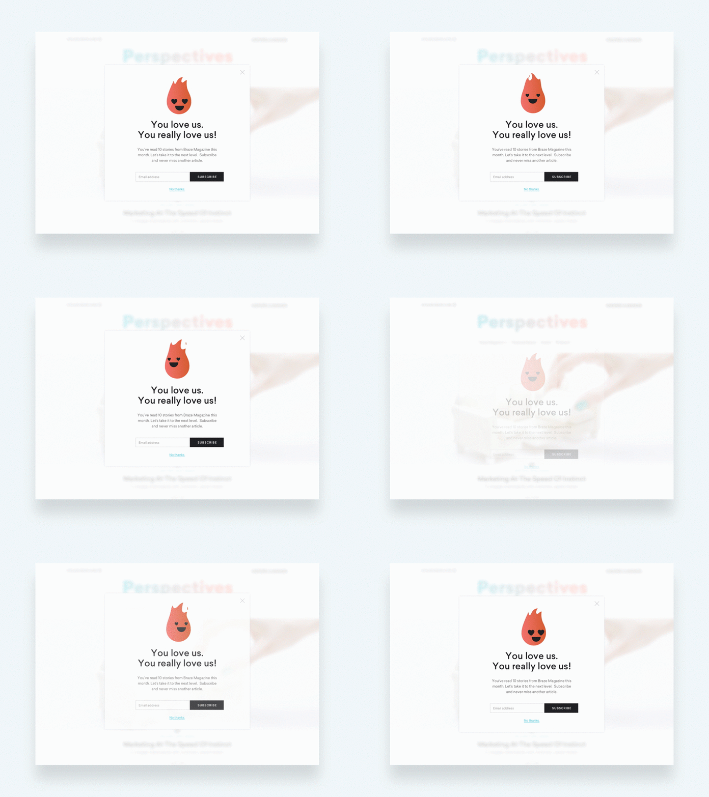
Image by Joshua Krohn
20. Notification
You’ll find these little red dots everywhere on interfaces today. They let us know there is something new, like a message, for us to go check out.
However, notifications don’t just tell us someone has liked one of our posts—they can let us know an error occurred, or a process was successful.
21. Pagination
Typically found near the bottom of a page, pagination organizes content into pages. Pagination lets users know where they are within a page and click to move into other sections.
22. Picker
Date and time pickers let users pick dates and times. The advantage of using pickers over input fields is the ability to keep all the data users enter tidy and consistently formatted in a database, making information manageable and easy to access.
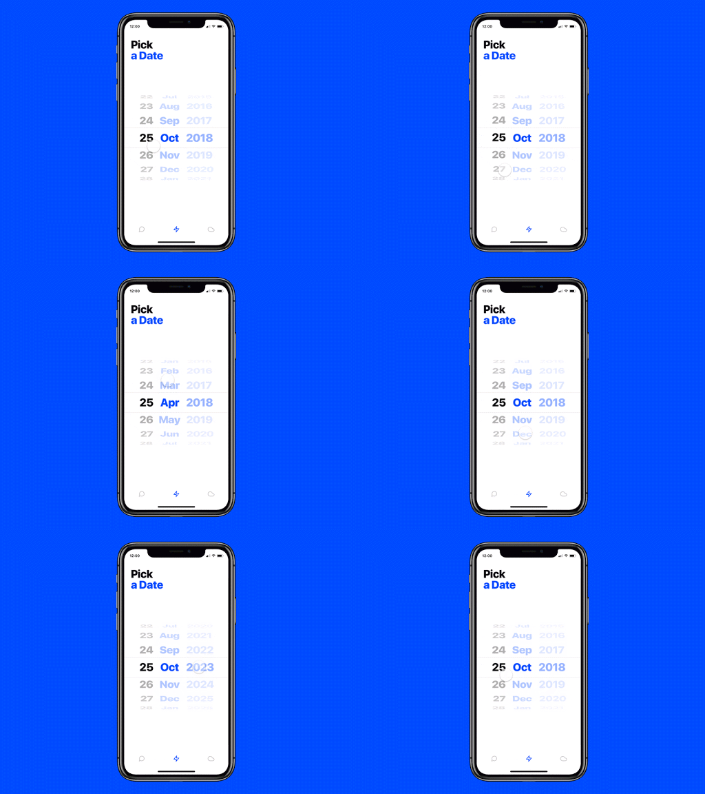
Image by Edoardo Mercati
23. Progress Bar
Progress bars help users visualize where they are in a series of steps. You’ll commonly find them on checkouts, marking the different stages a user needs to complete to finalize a purchase, like billing and shipping.
24. Radio Buttons
Often confused with checkboxes, radio buttons are small circular elements that let users select one option among a list. The key here is noting that users can only choose one option and not multiple options like they can with checkboxes.
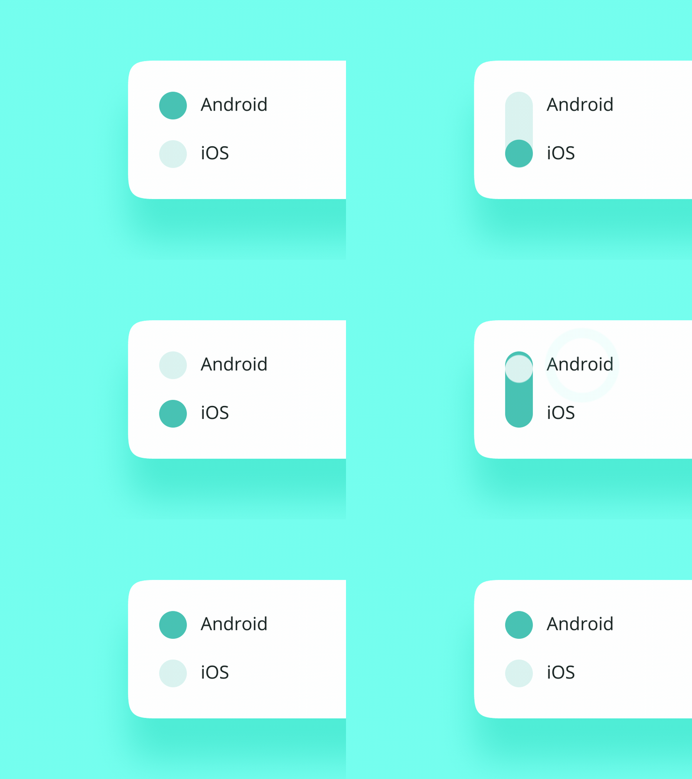
Image by Oleg Frolov
25. Search Field
Commonly represented as an input field with a little magnifying glass inside of it, search fields allow users to input information to find within the system.
26. Sidebar
A sidebar displays a group of navigational actions or content literally on the side of a page. It can be visible or tucked away.
27. Slider Controls
Sliders are a common UI element used for selecting a value or a range of values. By dragging the slider with their finger or mouse, the user can gradually and finely adjust a value—like volume, brightness, or desired price range when shopping.
28. Stepper
Steppers are two-segment controls that also let users adjust a value. However, unlike sliders, they allow users to alter the value in predefined increments only.
29. Tag
In UI design, tags are essentially labels which help to mark and categorize content. They usually consist of relevant keywords which make it easier to find and browse the corresponding piece of content. Tags are often used on social websites and blogs.
30. Tab Bar
Tab bars appear at the bottom of a mobile app and allow users to quickly move back and forth between the primary sections of an app.
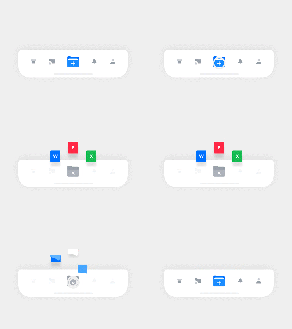
Image by Hoang Nguyen
31. Tooltip
Tooltips provide little hints that help users understand a part or process in an interface.
32. Toggle
Think of toggles as on and off switches. They let us do just that: turn something on or off.
Final thoughts
And that’s it for our glossary of the most important UI elements!
If you’d like to learn more about user interface design, check out this video:
If you enjoyed this article, you may also be interested in taking a look at the following articles:
- What Are Gestalt Principles? A Guide For UX and UI Designers
- 8 Websites With Really Awesome User Interface Design
- 5 Common questions I get asked as a UI designer
FAQ
1. What are UI elements?
User interface (UI) elements are the parts we use to build apps or websites. They add interactivity to a user interface, providing touchpoints for the user as they navigate their way around; think buttons, scrollbars, menu items, and checkboxes.
UI designers use UI elements to create a visual language and ensure consistency across your product—making it user-friendly and easy to navigate without too much thought on the user’s part.
2. What are some examples of UI elements?
Common UI elements include:
Breadcrumbs
Checkboxes
Dropdowns
Forms
Icons
Input fields
Notifications
And many more.
3. What are the key elements of UI design?
UI elements usually fall into one of the following four categories:
Input controls allow users to input information into the system. If you need your users to tell you what country they are in, for example, you’ll use an input control to let them do so.
Navigational components help users move around a product or website. Common navigational components include tab bars on an iOS device and a hamburger menu on an Android.
Informational components share information with users.
Containers hold related content together.
