Communication plays a central role in both user interface (UI) and user experience (UX) design. Understanding how your users perceive and interpret your work is key. The Gestalt Principles can help you do so.
Developed by Gestalt psychologists, the Gestalt Principles describe how we interpret and process complex stimuli around us. They state that our minds have a tendency to group and organize elements and do so in predictable ways. The ways in which our mind does so are summarized in the Gestalt Principles.
In this guide, I’ll introduce you to the five Gestalt Principles and how they contribute to user-friendly design.
A Brief History Of The Gestalt Principles
During the 1920s, German psychologists Max Wertheimer, Kurt Koffka and Wolfgang Kohler studied human perception and chaos. They were invested in understanding how our mind goes about making sense of our chaotic surroundings.
Through observation, Wertheimer, Koffka and Kohler theorized that we tend to group elements, recognize patterns, and simplify complex imagery. But we don’t do so randomly—our efforts tend to fall under certain principles. They called these principles the Gestalt Principles.
Since their conception, the Gestalt Principles have been adopted by designers of all disciplines. UI and UX are no exception.
The 5 Gestalt Principles
If you’re here, chances are that you’re working to build a career in tech. Whether you’re an aspiring UX designer or a budding UI professional, the Gestalt Principles can help you to understand how the end user will interpret and navigate your work. Now let’s explore each of these principles in detail. To illustrate each Gestalt Principle, we’ve selected a great Dribbble shot. The 5 Gestalt Principles we’ll take a look at are:
Feel free to use the clickable menu to skip to a Gestalt Principle that piques your interest. Now, let’s begin.
1. Proximity
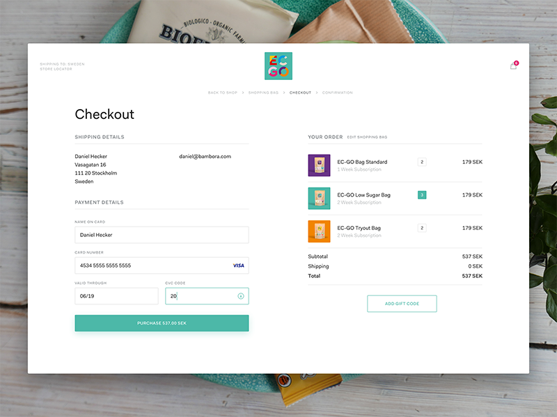
The principle of proximity states that we tend to perceive elements as a group when they are close to each other. To better understand it, consider the cool checkout form by Mattias Johansson below. Pretty neat, huh?

Source: Dribbble
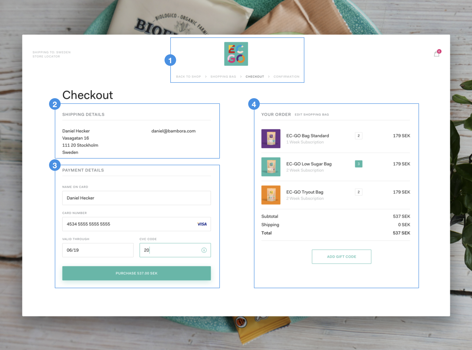
In it, we see four main groups of elements, marked and numbered below.

These groups don’t sit inside boxes or have clearly delineated borders around them. Yet we perceive them as separate clusters of content. We do so because the elements in each section sit close to each other.
If you look a little closer, you’ll notice subgroups in each group. In group 3, each input field and label are perceived as a separate group. In group 4, each list item is perceived as another. This is the principle of proximity in action.
2. Similarity
Throw a bag of M&Ms on a table and your mind will immediately start to group them by color. Red will be one group, green another, and yellow a third. We’re inclined to group elements that look like each other.
In the Dribbble shot below by Sherzod Mirzaakhmedov, size is used to communicate relationships. Theaters and movies that have the same characteristics are set on tiles that are the same size. By quickly skimming the page, we’re able to tell which theaters and movies belong to the same groups. Informative and visually appealing!

3. Continuity
Ever notice how your eyes like to travel along lines, following and flowing with them? Our mind has a tendency to follow paths and group elements that are aligned with each other. This is the principle of continuity.
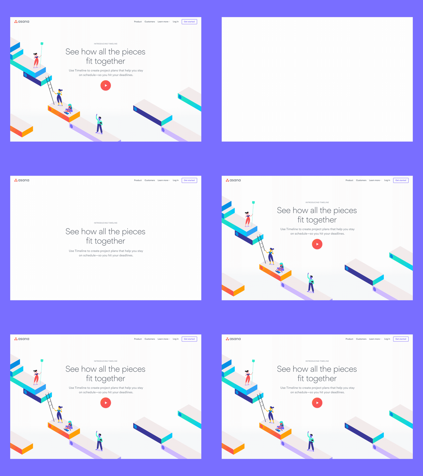
We can use lines to capture and guide users towards important elements within an interface. Devin Jacoviello creatively uses a series of platforms to engulf and guide users to Asana’s tool Timeline’s value proposition on his landing page.

4. Closure
Given the chance, our mind will opt for simplicity. Since a whole is easier to process than multiple parts, we’ll fill in the gaps or connect the dots to complete implied shapes or images.
Loaders are a common element in user interfaces today. Whenever a product needs a little more time to complete a task, like refreshing or processing a payment, loaders will let us know the product is still working in the background.
Khrystyna illustrates the principle of closure in her loader below. The moving, developing lines in the animation never really touch each other and yet we see a circle.

5. Connectedness
Out of all five Gestalt Principles, connectedness is arguably the easiest to grasp. Connectedness states that we tend to group elements when they are connected to each other. That’s it!
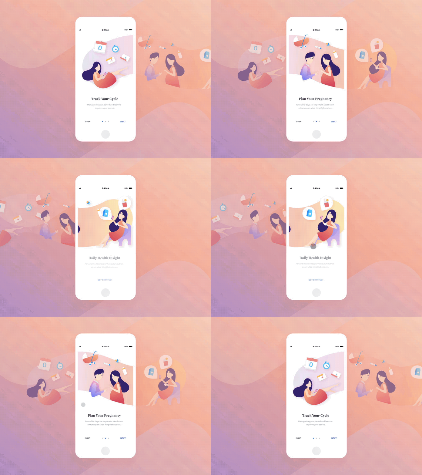
Many apps feature onboardings these days. These are the first few screens you see when you pop open a new app. Often, they’ll feature stunning animations and graphics and will share the best parts of your newly-downloaded app with you.
We’ve shared an onboarding by Paperpillar below. In it, the lovely couple lives inside a pink bubble. It houses the characters and elements around them, grouping them visually.

Gestalt Principles: Over to You!
Once you’ve got a solid grasp on them, it is easy to see the Gestalt Principles everywhere you look in UI and UX design. The next time you pop open your favorite app or find yourself enjoying a website, ask yourself: are any of the Gestalt Principles being applied here? Do they work alone or are they being used in combination?
To help train your brain, make it a point to analyze every great app you come across, make notes and draw inspiration from it. Then, practice! Soon enough, you’ll be building your first great product with the help of Wertheimer, Koffka and Kohler.
It may also help you to build up a list of design resources to bolster up your knowledge, skills, and provide inspiration—we’ve provided six free resources in this video, presented by UX designer Dee Scarano:
If you want to learn more about creating awesome designs, check out the following articles:
- Get Inspired: 8 Websites With Great User Interface Design
- A UI Design Glossary For Beginners: Learn The Most Common Terms
- How To Become A UI Designer: A Step-By-Step Guide
FAQ
1. What are the Gestalt principles?
Developed by Gestalt psychologists, the Gestalt Principles describe how we interpret and process complex stimuli around us. They state that our minds have a tendency to group and organize elements and do so in predictable ways. The ways in which our mind does so are summarized in the Gestalt Principles.
2. What are the 5 Gestalt principles and meanings?
The 5 Gestalt Principles are:
- Proximity
- Similarity
- Continuity
- Closure
- Connectedness
3. What is the importance of the Gestalt theory?
The Gestalt Principles can help UX and UI designers understand how the end user will interpret and navigate their work. They provide a framework to effective and easy-to-understand designs that are visually appealing.
