Whether you’ve heard of Fitts’s Law or not, you’ve definitely seen examples of it in real life.
From the pedals in your car to the buttons in your iPhone’s operating system—you’ve probably touched something that was influenced by Fitts’s principles.
Fitts’s Law is a predictive model of human behavior, and it’s all around us. From websites to mobile apps, user interfaces to physical dashboards, and almost every tangible product that we interact with daily.
Once you start seeing these seemingly obvious concepts, you won’t be able to stop noticing them.
In this article, we’ll cover what Fitts’s law is, and how it applies to UI design, as well as check out some examples of it.
If you’d like to skip ahead to a particular section, simply use the clickable menu:
- What is Fitts’s Law?
- How does Fitts’s Law apply to UI design?
- Five examples of Fitts’s Law in UI design
- How to learn UI design
- Final thoughts
1. What is Fitts’s Law?
In 1954, a psychologist named Paul Fitts created a predictive model that describes how quickly people can select a target.
A target is what the user is trying to interact with. It could be a button to tap or a form field that needs to be clicked into. This model is commonly used in human-computer interaction.
Fitts’s Law establishes that the further away a target is and the smaller the size of the target, the longer it takes for a user to acquire.
Large targets that are close by have the lowest interaction cost, while small targets that far away have the highest interaction costs.
But what is an interaction cost?
Interaction costs
The Nielsen Norman Group defines interaction costs as “the sum of efforts—mental and physical—that the users must deploy in interacting with a site to reach their goals.”
So, if a user can find an answer they’re looking for without needing to scroll, tap, or explore, they’re experiencing zero interaction cost. If a user has to locate a menu, scroll through over a dozen options, and click a small button to complete their form, that’s going to be a higher interaction cost.
Ideally, UX and UI designers aim to make these costs as low as possible. The lower the interaction cost, the better the usability of their app.
Designers can minimize interaction costs by following Fitts’s Law and minimizing reading, scrolling, clicking, typing, waiting for pages to load, attention switches, memory load, and exploring to find relevant information.
The Fitts’s Law equation
Fitts’s Law states that the time it takes to acquire a target is a function of the size of the target and the distance to the target.
Here’s the equation:
MT = a + b * log₂ (2D/W)
Let’s break that down:
- MT is the time it takes to select a target
- a + b are constants set by the type of device
- D is the distance from the starting point to the target
- W is the width of the target along the axis of motion
Typical applications of Fitts’s Law
While these applications may seem like common sense, they’re important to point out. Why?
Because Fitts’s Law is one of the most ignored psychological principles of design!
Here are some examples of it being used:
- A button to complete an action that is close to the active elements
- Important elements that are made larger so that they’re easier to select.
- Interactive lists that are as short as possible
- The shortest path to the desired CTA
- Menus are in the top corners of the screen on desktops and the bottom of the screen on mobile
2. How does Fitts’s Law apply to UI design?
Essentially, this principle can be noticed throughout any interface that involves using a mouse or finger.
It’s used in user interface design to decide the proper sizes of interactive elements, the best location for them, and to notice potential usability issues.
Fitts’s Law brings safety, convenience, and usability into UI design.
Consider safety measures for heavy machinery: the shutdown button is almost always large, red, and easier to press than the startup button. Convenience in mobile apps would be those that make their login buttons fit within the thumb zones.
Fitts’s Law is the reason buttons on websites are large, and menus are usually located in the upper corners of your screen.
UI designers can tell people what to do by placing significant calls to action close to related forms or headlines. This is where users expect to see them and can easily click them with low effort.
Fitts’s Law concepts for UI Design
- Size: larger targets are usually best. Try large elements, that have clear boundaries, and are entirely clickable.
- Distance: minimize movement. Think about the space between buttons, locating important actions by the prime pixel and thumb zones, and decrease the distance between elements with a similar function. This is similar to the Gestalt principle of proximity.
- Effort: use prime and magic pixels. Make your interactive elements easy to click and easy to find.
What is the prime pixel?
The prime pixel is where a user’s cursor is located on the screen when they open a website or application. It’s the point where the user will carry out all of their tasks from.
This is why right-click menus exist—they’re naturally closest to the prime pixel.
On mobile devices, the prime pixel is the area where your thumbs naturally hover. They are also known as the thumb zones.
You’ll notice that menus on your iPhone are usually at the bottom of the screen where your thumbs are.
Ideally, designers would make all of their desired calls to action as close as possible to that point. However, the prime pixel isn’t totally predictable because the user’s starting point is usually different every time.
While it’s nearly impossible to predict the exact prime pixel, it is possible to predict the likely prime pixel based on the actions taken by the user while using your application. Here are three examples of that:
- Google’s search bar is always located in the middle of the screen, with the search button directly next to it
- Logins are usually located in the upper right-hand corner of a website’s navigation
- Forms are typically in the direct middle of the page with a large “submit” button at the end of the form
What are magic pixels?
Magic pixels are the four corners of a screen, the top edge, and the bottom edge of a screen. The magic pixels create boundaries. Your cursor cannot move beyond these points. They are almost always the furthest away from the prime pixel.
Designers use conventions like the center of the screen, the corners, and the thumb zones on mobile as guides for optimal placement because they can’t predict the prime pixel.
Having a standardized website that’s easy to navigate is just as important as proximity to CTAs, as you’ll learn by using tricks such as the Rule of Thirds.
Because they are so far from the prime pixel, magic pixels are typically reserved for standard functions. You’ll notice that exit, minimize, account controls, log-in, and full-screen buttons are in the top corners of your screen.
Even though they aren’t usually close to the prime pixel, the corners and edges of the screen are always in the same place, and you can’t move past them. That makes them easy to reach quickly.
Web designers won’t be able to take advantage of the corners of the screen as efficiently as a native user interface can.
Thus, they rely on the next-best zone of magic: the center of the screen.
3. Five examples of Fitts’s Law in UI design
1. Google
Source: Google
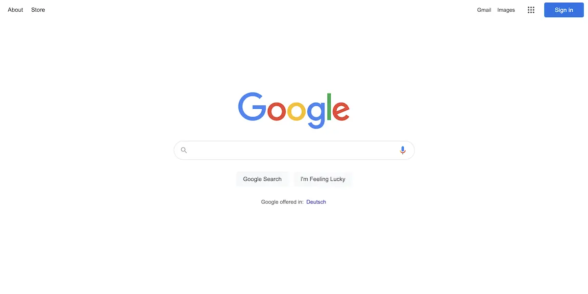
Google puts its search field in the center of the screen and menu options in the upper corners. This utilizes magic pixels and likely prime pixels.
The “Google Search” button is directly below the search input field, and the entire button is clickable, an example of a mental model.
Right next to the “Google Search” button is “I’m Feeling Lucky,” a comparable button that’s grouped hierarchically.
2. iPhone
Source: WCCFtech
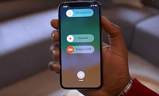
After reports of users’ iPhones shutting down accidentally in their pockets, iPhone implemented a new shutdown method.
These measures are sort of the opposite of Fitts’s law. Shutting down an iPhone has high interaction costs so that a user doesn’t accidentally do so.
First, the user must press two buttons to trip the shutdown screen, then they need to swipe the “slide to power off” feature.
The cancel button at the bottom of the screen is closer to the thumb zones and easier to tap, making it more likely that the user will cancel out than shut down.
3. Spotify

Source: Spotify
Spotify’s desktop app allows users to access commonly used functions through the right-click menu.
This makes it so that the prime pixel can almost always be optimally utilized. A user doesn’t even have to move their mouse from its starting point to access their most used actions.
4. AirBnB

Like Google, Airbnb centers its search form, keeps the search function next to the search form, and incorporates a magic pixel menu.
Source: AirBnB
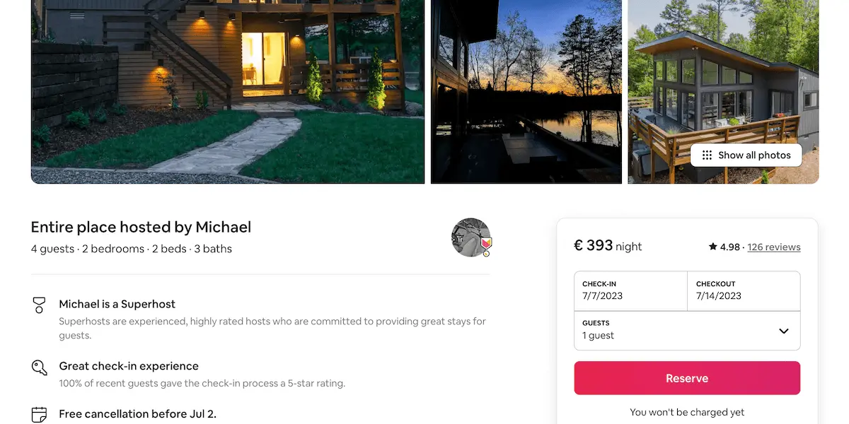
Airbnb continues to use Fitts’s law throughout their website—including in the size and color of the “reserve” button shown here.
5. Nest

Source: Nest
The Nest thermostat is a shining example of Fitts’s law.
According to this predictive model, pie menus are more efficient. However, this principle is largely ignored in favor of easier-to-design linear menus.
Nest embraces the pie menu in their device’s interface.
With just two gestures, a user can operate the entire unit with very little interaction cost, despite its compact size.
4. How to learn UI design
As you can see with these examples, discovering the underlying design principles behind everyday interactions is just one of the joys of learning UI design.
The first steps to learning it is by getting familiar with not just the principles but also examples of bad UI design—so you know what to avoid!
Dipping your toe in the field via a free short course or online tutorial is a great way to get a grasp if it’s for you or not.
In this video, pro designer Elizé gets you started by introducing you to UI:
Once you’ve got a feel for it, start planning your path to becoming one, by checking out UI design bootcamps or career-change programs, to find the right one for you.
5. Final thoughts
While Fitts’s Law is a great starting point for usability guidelines, it’s not always right. Data will always reveal more than theory. The best way to know if your design is user-friendly is by testing it on real users.
It’s always beneficial to ask questions and seek a deeper understanding as to why things are working. Use theory as a starting point, and then think practically about what you’re applying that to in the real world. “Laws” like these are simply guidelines to consider, not blindly follow.
Think about how you’re spacing and sizing buttons, where you can limit interaction costs, and how you position the calls to action on your website or application.
If you’re just making your first steps in UI design and want to get more into the mindset, taking our free 5-day short course will teach you about the principles behind the likes of color theory and typography choices.
If you’d like to read more about UI design, check out these articles:
