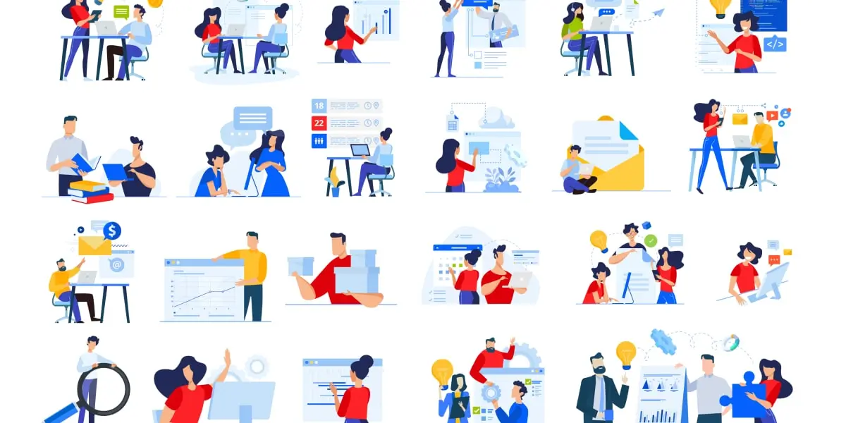
In the early 2010s a new user interface (UI) design trend came on the scene: flat design. It was sleek, modern, and minimalist. It was bold and exciting.
Before flat design, skeuomorphism was the popular style. Skeuomorphism is when designs use realistic representations of physical objects. Safari’s old compass logo or the original Instagram logo, for example. Skeuomorphism often used textures, complex graphics, and overstyled typography.
Flat design removed those clunky design choices, making websites faster, easier to read, and more compelling for users. In 2012 with the release of Windows 8, flat design took off. The trend has had staying power. Over ten years later, we still use flat design in websites, UIs, graphic design, and apps.
In this article, we’ll explore everything you need to know about flat design:
- What is flat design?
- Eight examples of flat design
- What is semi-flat design?
- When should you use flat design?
- Flat design and animation
- Introducing flat design 2.0
- Flat design takeaways
1. What is flat design?
Flat design is a minimalist design style that is two dimensional. Inspired by Swiss style, it features contrasting color palettes, minimalist typography, white space, crisp edges, and grid-based layouts.
Flat design is a streamlined and modern way to deliver information fast. It involves not shading, no added glare, and no highlights that are often used in other design styles to make images look three dimensional.
It was made popular by the release of Windows 8 (2012) and Apple’s iOS 7 (2013). With a focus on cleanliness and hierarchy, flat design creates functional websites that deliver information in a fast and straightforward way.
Six characteristics of flat design
Flat design is a modern design style that consistently maintains minimalist, 2D features. Here are six signs that what you’re looking at is flat design.
- Contrasting colors: often bright colors, flat design relies on distinct contrast to send visual cues to users.
- 2D styling: simple shapes and no realistic images.
- Simple typography: typically sans-serif fonts are the choice of flat design. It loads fast, it fits with minimalist style, and it’s easy to read.
- White space: negative space helps designers indicate which part of the page they want users to focus on and makes the website more readable.
- Grid-based layouts: usually flat design is symmetrical and uses a grid for the layout and hierarchy.
- Simplicity: symbolic icons, abstract forms, no textures, and no gradients.
How do UI designers use flat design?
Flat design allows UI designers to think of their designs more as a functional tool rather than aesthetic. Since the success of their work is based on the value that the design brings to the user more than aesthetic appeal, many UI designers love flat design.
Since flat design can be subtle, UI designers need to help users navigate their website without too much styling. They use negative space, contrasting colors, animations, and vector illustrations to show the user how to interact with their designs. The grid-based layout of flat design also helps UI designers efficiently lay out an intuitive interface.
The simplicity of flat design also allows UI designers to deliver a clear message more easily. Bold sans serif fonts and contrasting colors allow designers to communicate a strong message. Some projects will call for bright colors to set a mood, while others set the tone with simple neutrals that contrast well.
If you’d like to learn more about how to choose the right color, this short video from UI designer will show you what to consider:
For UI designers, flat design is all about creating crisp and clean user experience. The key to a frictionless flat UI is clear indications and consistency. That means consistent colors, icons, and fonts, alongside distinct CTAs and hierarchical navigation.
2. Eight examples of flat design
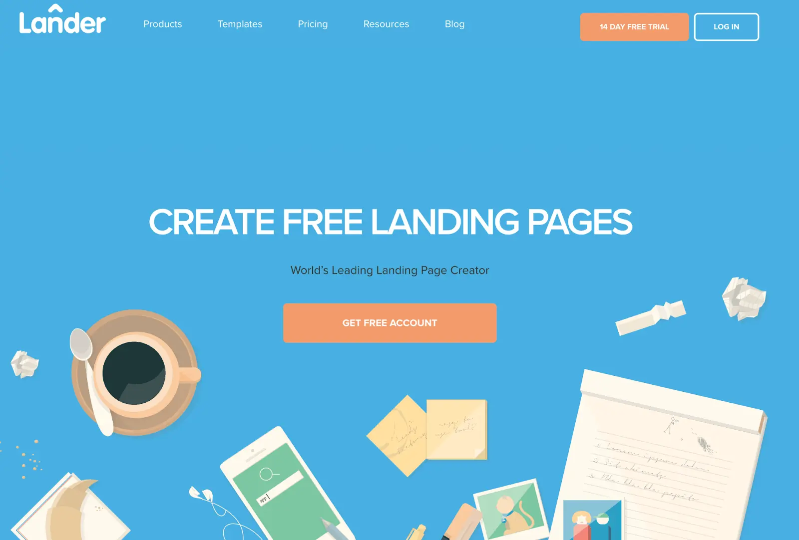
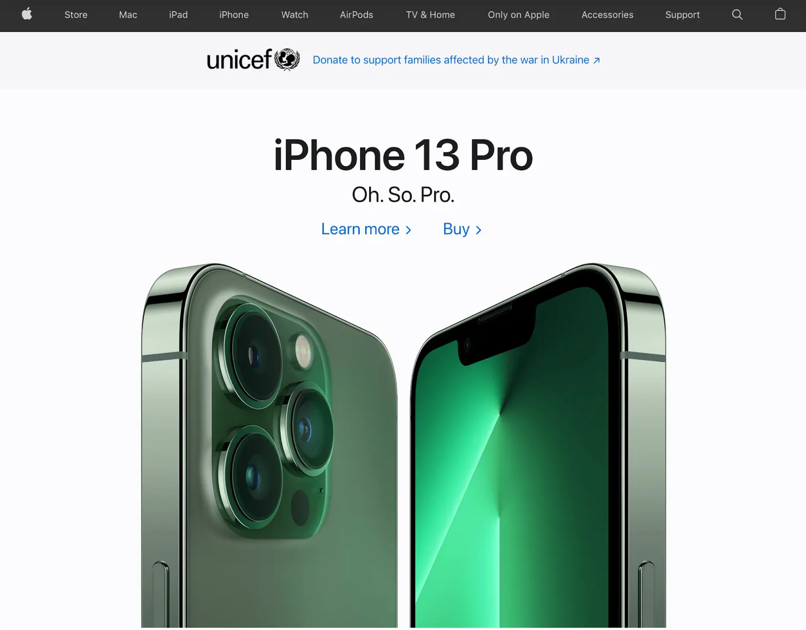
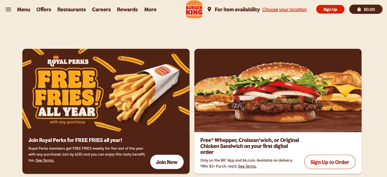
Flat design has been a UI trend since 2012. You can find hundreds of websites and apps that were created with this style. In fact, once you learn to recognize the style, you’ll see it everywhere. Here are eight stellar examples of flat design from popular websites:
Burger King
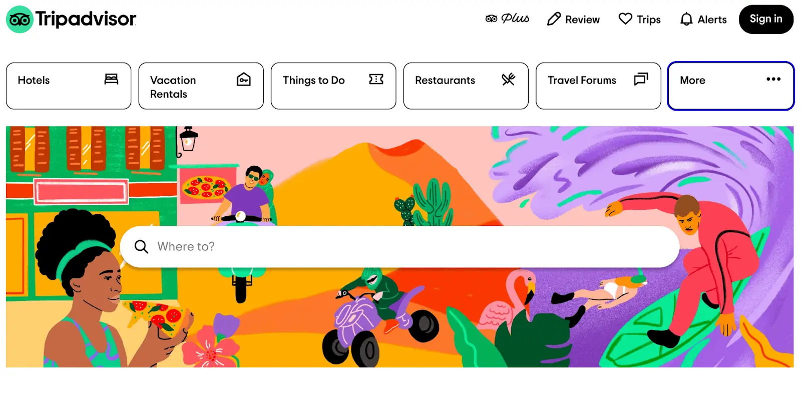
Trip Advisor
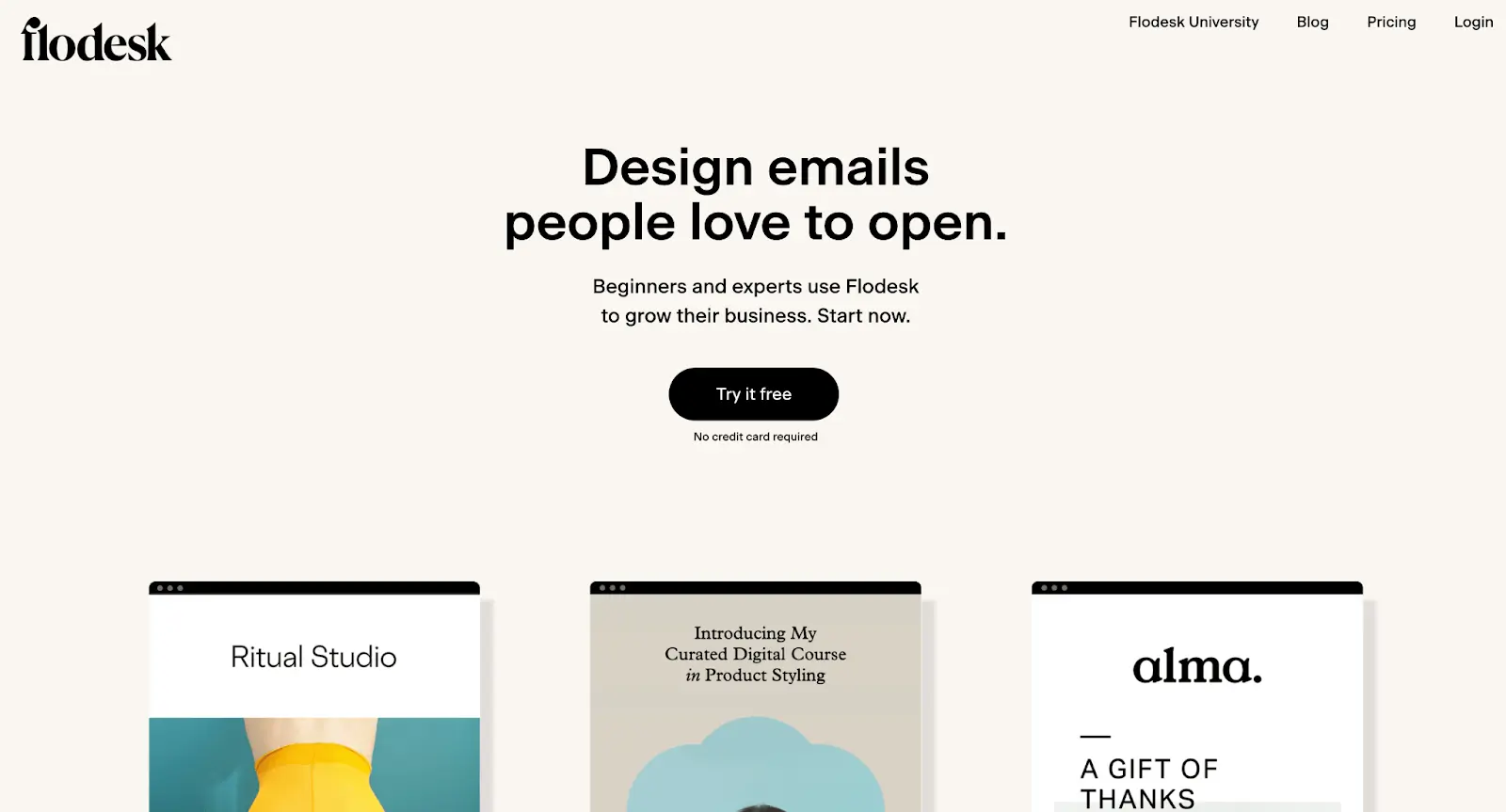
Flodesk
Lander
Apple
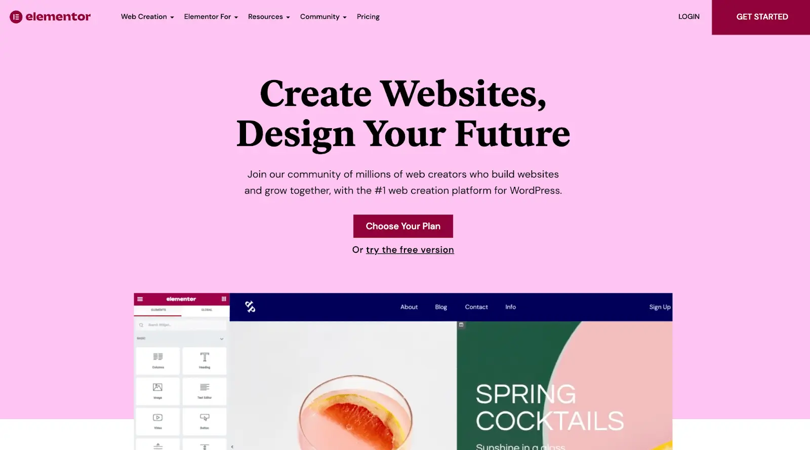
Elementor
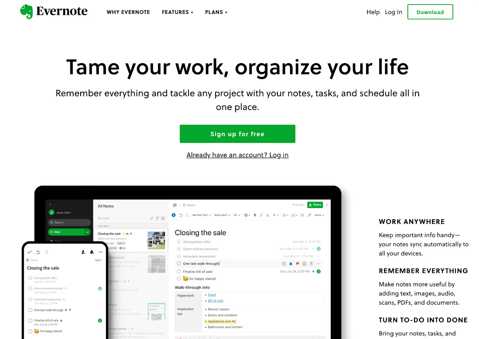
Evernote
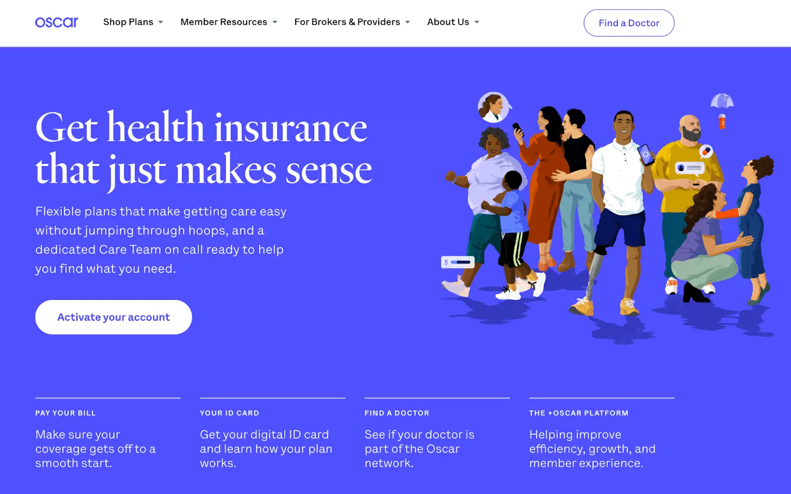
Oscar
3. What is semi-flat design?
Semi-flat design is essentially flat design, but with shadows and layering added back in.
After a few years of monitoring this trend by the Norman Nielsen Group, some user testing suggested that basic flat design can be too minimalist. Because of this, some designers started making adjustments to their designs in order to make them more user-friendly.
With semi-flat design, designers began indicating more direction for their users by adding shadows under buttons and using arrows and animations to indicate next steps. They also use highlights and layers to accentuate clickable elements further.
As these usability features gained momentum, semi-flat design morphed into flat design 2.0, also sometimes called “Flat 2.0” or “almost flat.” We’ll talk more about that later!
4. When should you use flat design?
Flat design can be used to create icon sets, typography, apps, graphical user interfaces, websites, motion graphics, infographics, and games. If you want to create simple, efficient and on-trend designs, flat design is a great option.
Some of flat design’s main benefits are better SEO (Search Engine Optimization), lower bounce rates, good accessibility and responsiveness, faster load times, and increased user interactions. If you’re redesigning a website that is struggling in any of these areas, flat design might be the solution.
If you’re simply looking to try out flat design or begin learning flat design principles, you could start with creating an icon set. Icons and vectors are foundational parts of flat interfaces but they’re more manageable to experiment with than creating an entire website.
Pros of flat design
Flat design is more than just a modern, simple style. On a deeper level, it can help websites perform better. Plus, it’s practical and efficient to use from a UI designer’s perspective. Flat design can improve readability, loading times, SEO, and user experience. Flat websites are often beneficial to users, designers, and search engines alike!
Users benefit from flat design’s minimalist style because flat websites are usually easier to read. The grid-based designs are more responsive on mobile devices. Simplified vectors and distraction-free minimalism often allow for quicker navigation, too. White space in combination with clean fonts lead to readable and legible websites.
A website’s SEO can improve with flat design, too. With less complex images and a simplified design, most flat websites hold the fastest loading times. Plus, with better navigation users often stick around longer. Easy to read native fonts help web crawlers easily index a flat website as well.
UI designers will find that flat websites are often the easiest to create. Here are just a few reasons why:
- Scalable and easy to iterate which makes them a good choice for long-term designs
- Applicable to any niche
- Optimized for accessibility and mobile by design, too
Cons of flat design
As awesome as flat design can be, it has its drawbacks too. Nielsen Norman Group analyzed flat design over its first three years of popularity. They found that overexposure to flat design elements can reduce their user efficiency because they simplify things to the point that users don’t understand what’s clickable and what isn’t.
Some examples of “overminimalism” include Google’s icon redesign in 2020, and Microsoft Windows 8. When flat design becomes too flat, it removes the key signifiers that indicate what is actually clickable, leaving users confused.
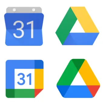
When flat design is taken too far it may include the removal of raised buttons, underlined and colorful hyperlinks, and action text alongside icons and buttons. These are classic indications of something a user should interact with.
5. Flat design and animation
While flat design boasts minimalism, that doesn’t mean you can’t use animation!
As we’ve seen in our complete guide to animation, it’s a great way to show users how to interact with your design. Animations can also be used to keep visitors entertained while something loads, or to provide feedback.
Animations are a simple way to show where buttons are, indicate what to do next, or get a user’s attention. Animation can be used for storytelling, buttons, logos, adding dimension, and in hero graphics.
5. Introducing flat design 2.0
Flat design 2.0, also known as semi-flat design, is flat design but with a few practical features added back in. Designers subtly show users what to do by adding depth and context to areas of the website or app that they want users to interact with.
When designers realized that over-minimalism led to bad user experience, they started adding back in some of the things that were removed in their original flat designs.
Shadows, highlights, hover animations, and gradients are three ways flat design 2.0 differs from basic flat design. At this point, original flat design is becoming outdated and flat 2.0 is the way to go.
Google took this one step further in 2014 and released Material Design. One of our UX design buzzwords, Material is essentially a flat design system that prioritizes efficient design and good user experience, it t aims to standardize web and app design.
Google’s Gmail is a great example of flat design 2.0. In the latest version, small black captions pop up when you hover over icons, so that users know their function and that they’re clickable.
Many other sites are using flat 2.0 by adding shadows behind their buttons. Apple uses flat 2.0 by adding gradients to their app icons to bring some dimension to their user interface.
6. Flat design takeaways:
Now that flat 2.0 and material design are on the scene, basic flat design is slowly phasing out.
But these two new modalities wouldn’t even be around if flat design hadn’t set the trend to begin with. Here are the five most important things you need to remember about flat design and how to use it in your own work.
- Flat design is a minimal approach to UI, web, and app design that boasts speed, readability, scalability, and simplicity.
- Avoid getting too minimal when using flat design. We’re now in the era of flat 2.0. Use shading, gradients, and animations to get your point across!
- To start learning how to use flat design, try making an icon set! Vectors are a simple way to dip your toes into the ideas of flat design. If you need more help, we’ve created a step-by-step guide to designing an icon.
If you’d like to learn more about UI design, check out these articles:
