Ever found yourself accidentally posting something you didn’t mean to? Ended up in the community support forum of an app seeking answers, only to find the other users are just as lost as you are? Ever been driven into a state of frenzy by music that started playing when you entered a site because you have no idea where it’s coming from—or how to make it stop?
If you answered yes to any of these questions, you’ve most likely been a victim of bad UX.
What is bad UX design?
When done well, UX design is virtually invisible to its users. It’s when a UX design feature has been executed poorly that it sticks out like a fox in a hen-house. Sometimes UX design is so bad that it becomes counterproductive—begging the question: “What was actually going through the designer’s head when making this design decision?”
There are lots of reasons for bad UX: perhaps the designer prioritized aesthetics over usability—the classic form-over-function problem—or perhaps the designers based their designs on their own assumptions rather than rigorous user research. Perhaps they integrated an intrusive feature, such as a pop-up, in an attempt to push a user to carry out a particular action.
Typically, if the user has to dig deep to achieve what they want to achieve, feels forced to do something they don’t want to or gets lost in your user flow, the UX design needs to be improved.
UX professional Maureen Herben gives a detailed breakdown of what constitutes bad UX design in this video:
10 Bad UX Examples
The following ten examples of UX design fails are great examples of what not to do in UX—from basic blunders that any rookie designer could make, to obvious oversights from tech giants who should know better.
To help us along our journey of discovery in bad UX, I’ve enlisted the expertise of resident UX designers Jeff and Amy, who’ll explain why each is an example of bad UX, and how each could be improved.
Finally, we’ll offer up some key lessons to help designers to avoid making such misguided design decisions in the future.
Popcorn at the ready? Let’s dive in!
1. WhatsApp’s delete message feature
WhatsApp rose to fame as the number 1 chat app thanks to great UX and a clean interface—making it all the more surprising to see it on this list.
We’re all familiar with the following scenario: you’re drafting a personal message to send to a close friend on WhatsApp, and you accidentally send it to someone else—perhaps a work contact, or someone you don’t know very well. No problem! Thanks to WhatsApp’s ‘delete for everyone’ feature, you can delete it and pretend like it never happened.
Actually, scratch that last part. Here’s what instead happens when you delete your message:
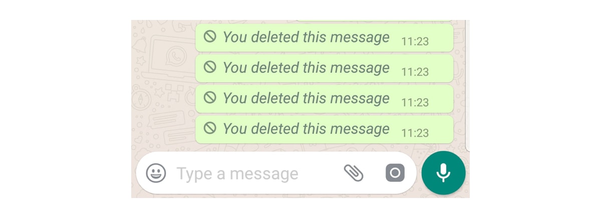
Why it’s bad UX: Informing the recipient that the sender has deleted a message somewhat defeats the purpose of deleting it in the first place. In fact, this looks way more suspicious and is likely to prompt an awkward “why did you delete the message?” type of response. Yikes.
Jeff says: Ideally, it should actually delete the message. But if (for some reason) that’s not possible, they should be clear about what’s actually going to happen in the messaging. What they’re doing here is blocking the message instead of deleting it. If you’re going to block it, say you’re going to block it. Maybe they could call it something like “obscure this message” so that it sets the stage for the user to understand what is happening.
Amy says: Another approach, like in Gmail, is to offer the sender a grace period of, say, 10 seconds—during which time the sender is able to delete the message without the recipient knowing.
The key takeaway: make sure that the function of the feature matches up with the users’ expectations set by the messaging.
2. Netflix hover auto-play
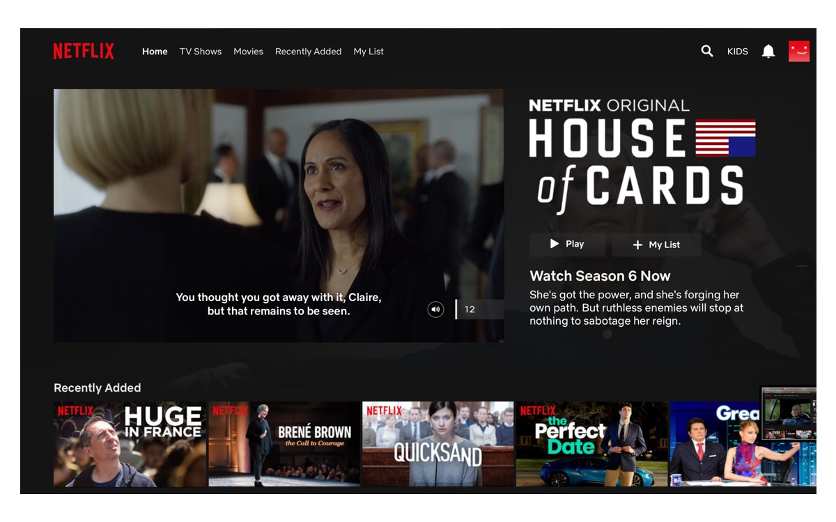
The Netflix autoplay feature has been perturbing viewers since it was first rolled out in 2015. Even a split-second hover over the TV show or film thumbnail instigates the auto-play of a looped trailer or montage.
This means that if users want to see the details or information of the show they’ve clicked on or hovered over, they’re unable to do so without a loud trailer playing.
[via huffpost.com]
Why it’s bad UX: Auto-anything means the designers have made huge assumptions about the users’ desires.
Amy says: Just don’t do it! Anything with automatic audio is really disorientating, especially if your attention is elsewhere.
Jeff says: I really hate this feature. I find myself tiptoeing around the hover areas with my mouse in the margins so I don’t trigger the autoplay. Audio is the biggest problem here, so it shouldn’t be set as “on” by default. This is a rule that has been around since MySpace offended everyone with auto-play music in the early 2000s. Even Facebook and Instagram know better by setting videos to mute by default.
Netflix is obviously trying to boost engagement, and I know they do a lot of A/B testing, so I’m sure they have data that this increases views. But I think this is a case of watching the wrong metrics.
I would run an A/B test where audio is muted by default, vs. the annoying way. Check to see how many users exhibit rage behavior such as erratic scrolling or exiting the platform. In other words, mute it!
The key takeaway: If a feature gets in the way of a site’s usability or hinders users from seeing key information, it simply shouldn’t be there.
3. Ryanair’s booking platform
If you fly frequently with Ryanair, you’ve likely been left tearing your hair out over its booking platform. I mean, who knew booking a simple weekend getaway could be such a headache?
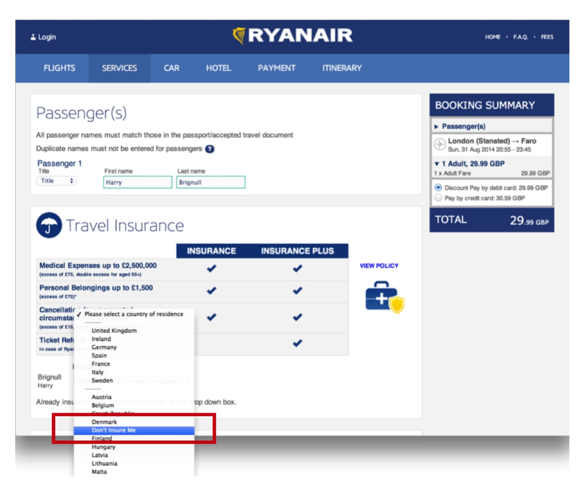
Ryanair’s booking interfaces could be considered an example of “dark UX”. This is the term for sneaky UX design tactics that make the experience complicated and confusing enough to trick users into spending more money than they need to—in this case with hidden add-ons.
Below, we can see that the option of no insurance is buried within a totally unrelated menu, making it difficult for users to find it.
[via 90percentofeverything.com]
Why it’s bad UX: Dark UX is the opposite of user-first design. Rather than considering the functionality and usability of a platform, dark UX deliberately confuses and misleads users into choosing certain options over others, normally in the interest of generating more revenue for the company.
It essentially turns any user flow into an assault course that users have to navigate, rather than a simple process. Learn how to create an effective user flow in this guide.
Jeff says: I think this dark pattern is called Hidden Costs, wherein they add something to your costs without asking you. This takes the control away from the user and is intentionally deceptive (the definition of dark patterns). Instead, they should show the benefits of insurance and let the user decide.
Top tip: don’t bury the way out in a long dropdown. Most users won’t give up, they’ll just hunt for the option you’ve hidden and hate your brand for making them do it. Is that the kind of user experience you want?
Amy says: From a user-first perspective, this is, of course, a no-go, as it leaves the human feeling annoyed, disgruntled, and even cheated. Building trust with your users is what drives customer loyalty, retention and praise.
The key takeaway: Transparency is key to building a good relationship with your users, and infinitely more valuable than the short-term gratification of your users spending a little more money than they meant to.
4. Apple’s storage management system
During those priceless, time-sensitive moments that deserve to be captured on camera so that they can be cherished forever more—like your child walking for the first time, or spotting your favorite celebrity in your local coffee shop—there’s nothing worse than being confronted with this message:
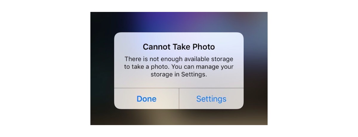
Why this is bad UX: There’s no indication of what the users’ options are here. There should be a clear sense of just how many pictures need to be deleted in order to take a new picture in that moment, or just how much storage needs to be cleared. Without this snapshot information, users are less inclined to head to settings to make the necessary amendments.
Amy says: The worst thing about this for me is the lack of information. If I hit “done” what will happen? If I hit “settings” will it take me to exactly the right place I need to be in order to take the photo and tell me what I need to do?
Absolutely not. It’s a check-mate—all the while I’ve missed the perfect photo opportunity while wasting time trying to figure out which button to choose. A better solution would be to provide two distinctly different button labels that describe exactly what happens next.
Jeff says: I actually switched to the Google Pixel because Apple constantly bugs you for updates which ultimately slow down your phone. The way that Google Photos navigates this is much better: they offer a smart suggestion for photos that can be deleted. Perhaps photos of printouts of text are good candidates, as many people take pictures of things to remember them, then they are never looked at again.
Really, ANY suggestion for ways to help that aren’t blocking a potential life-changing photographic moment would be useful. It is a difficult problem, but they are offering the appearance of functionality without actually letting the user function.
The key takeaway: Make it easier for users to create space.
5. Super long dropdowns
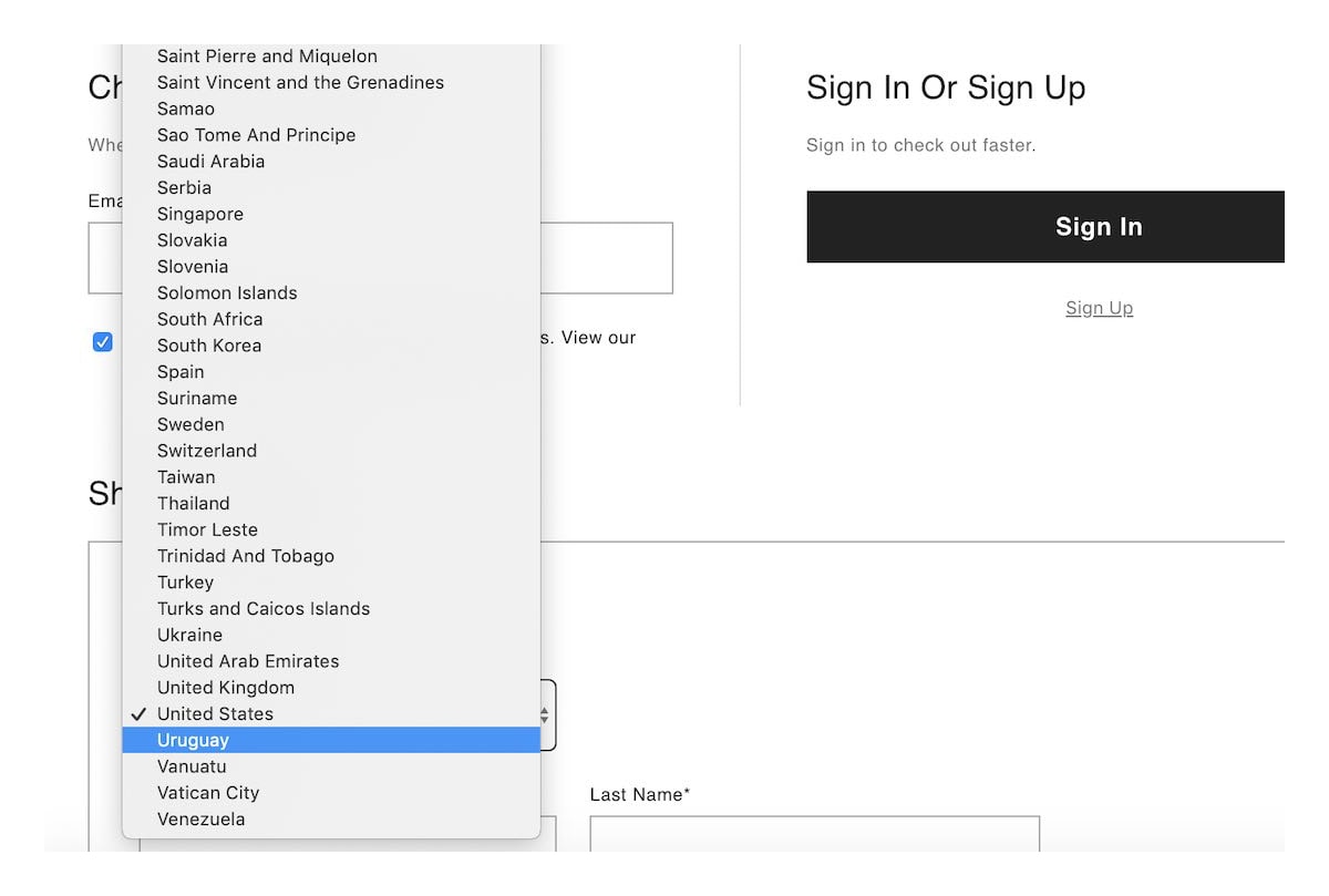
At some point, we’ve all had to pick our nationality from a seemingly infinite dropdown and no search bar in sight. There’s an added layer of inconvenience if you’re from somewhere like the UK that has multiple names (United Kingdom/Britain/Great Britain) and you find yourself scrolling through an endless sea of countries just to find yours.
[via baymard.com]
Why it’s bad UX: Long dropdowns with no subheadings or filters are hugely time-consuming for users, especially those who are unsure of what they’re looking for.
Jeff says: Throwing giant lists of things into a dropdown is like throwing all your dirty clothes into a closet and slamming it shut. It does the trick, but it won’t help you in the future. Instead, organize the countries based on natural divisions—like Europe or Asia. Even better, filter the dropdowns to only include countries within one continent at a time. Once they’ve decided their continent, the dropdown should only show countries within that area.
Amy says: In some cases, a text entry field with autocomplete would do the job. Filter options are also a great way to narrow down the list in the first place.
The key takeaway: Dropdowns should be avoided if there are more than 10 options.
6. This classic password kerfuffle
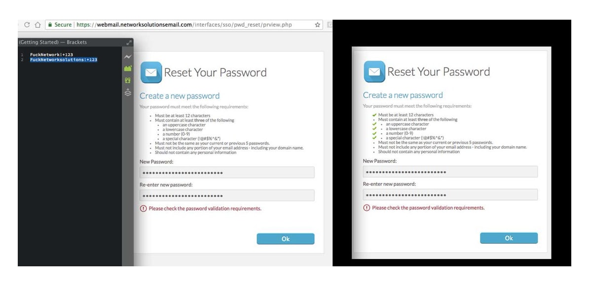
Cue the collective scream of frustration on this one. As if we don’t already have a million passwords to remember, there’s nothing more frustrating than unnecessarily complicated password requirements like the ones below.
Complex passwords are more difficult to remember, meaning you’re more likely to waste time constantly creating new passwords to replace the old ones.
[via pbs.twimg.com]
Why it’s bad UX: A long list of requirements to create a password is time-consuming and unnecessary. Because the user is unlikely to remember the new, million-letter-long password, they’re more likely to write it down somewhere or paste it into their notes—which makes it more unsafe than requiring them to create a quick, easy-to-use password that is personal to them.
Amy says: I also hate having to type the password twice when signing up for an account. It’s much better when you’re able to toggle show/hide password so that you can actually see what you’ve entered.
Jeff says: Difficult password requirements are especially bad UX because they’re created by security experts who have no idea how difficult it is for humans to remember things.
For a simple website, I like the approach that some banks have taken: instead of requiring a super complicated password, ask for a list of different things.
You could ask for a picture, a location, and an obscure fact that the picture reminds them of. This complicates the task of guessing whilst does the same job as adding numbers and characters to an already complex password.
The key takeaway: Make it easy for users to log in with their social media accounts, or at the very least, make creating a new password a quick, straightforward process with an extra security question to bolster the safety.
7. O2’s live chat system
In the picture below, we can see that o2 has clearly encouraged their users to use the live chat box to “chat now” in real time with their customer service team—but hadn’t quite accounted for their actual capacity to respond to every customer. As a result, the customer was placed in a queue instead of being able to chat immediately with a team member (as was advertised).
Great work @O2 Why encourage me to start a live chat session then immediately stick me in a queue? #ux @uxepicfails pic.twitter.com/cA41W5SPkV — Alex Colbeck (@AColbeck) January 10, 2016
Why it’s bad UX: Encouraging something that you can’t actually deliver is misleading and counterproductive.
Jeff says: I think a lot of companies made this mistake when chat platforms became easily available on websites. Companies like Intercom make it super simple to purchase a system to have a live chat. What they don’t tell you is that it will take lots of people power to work that system. Until chatbots can handle an angry grandpa, it’s best to stick with what you can realistically hire for.
If you want to set the right expectations, email is just fine. Make your chat service look like it’s an email rather than something like Slack or WhatsApp, and your customers will be more patient in the end.
Amy says: As someone who actively avoids calling customer service, I really appreciate the chat option and don’t mind waiting a while. However, I find it irritating when a chatbot directs me to the FAQs, assuming I haven’t already done that.
The key takeaway: Only advertise what you can actually deliver!
8. This Hulu app tab
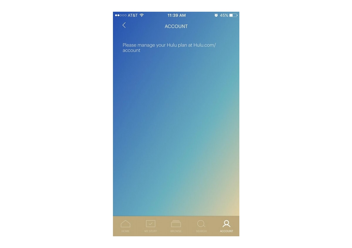
An increasing number of users are turning to apps over native websites—and this can often mean users don’t get the full digital experience of the product or site. Below, Hulu has redirected people to the website in order to manage their Hulu plan, begging the question: what’s the point of even having that tab in the app?
[via uxplanet.org]
Why it’s bad UX: Where apps are concerned, it’s good practice to only have vital buttons on the menu option in order to avoid an unnecessary amount of pixels. The designer of this app has done the complete opposite and added a page that has no function other than to display copy—not even an active redirect.
Amy says: As an employee of many a startup myself, I know the beauty of keeping feature requests as small as possible—and I know that as much as we intend to iterate quickly, it doesn’t always happen. Including the tab in the app but holding off on the functionality for a week or two is not ideal, but acceptable—as long as the app meets the users’ needs in the interim.
Jeff says: Somebody out there patted themselves on the back as they wrote this little bit of copy, but they should have been more focused on why it was there in the first place.
Microcopy can’t solve macro-design errors. It’s perfectly acceptable to limit features in an app, but if you make it appear like you can use a feature, it will let the user down. Remove the tab, then the user won’t have the wrong expectation. It’s that simple.
The key takeaway: Be cautious when omitting key features of an app in the name of simplicity, as it could be at the expense of its usability.
9. Fiverr’s 5 star display
Rather than displaying the number of stars in an explicit form, Fiverr has decided to rebel against standard UX conventions by opting to represent a 5-star rating with…1 star. This is actually more resource-intensive than the option of multiple separate star icons reflecting the rating.

[via uxplanet.org]
Why it’s bad UX: At a glance, users who are used to the near-standardization of an explicit amount of stars representing the rating might assume that the product in question only received a 1-star rating. Having a star next to a number is anti-intuitive to consumers, and thus it may not even register as a rating at all.
Jeff says: I’m so used to using apps like Twitter that at first, I thought this was five different people giving it a star. This is not what the designer intended, I’m sure. They were probably trying to save space and thought “I can design something better than the rest of the designers on the planet.”
There is a reason why you shouldn’t ignore design heuristics: people expect things to work similarly across the internet. I know that can be annoying when you’re fresh out of design school, but it’s the reality.
Amy says: Just show the 5 stars in the first way that you imagined it in your head. Stop trying to win an award, and design things that are usable.
The key takeaway: Don’t make your users have to work extra hard to decipher your own personal ‘unique’ way of doing things.
10. The Juicero juicer
We saved the best ’til last!
The Juicero has been lauded by multiple UX platforms and experts as one of the best examples of bad UX design we’ve seen in the last few years—so much so that it closed its doors in 2017 out of shame.
Nevertheless, it still deserves a place on this list as an apt example of overcomplicated design. The key UX mistake with the Juicero is that you need a solid wifi connection in order to use the juicer. The cherry on top? You also need to download the app on either an Apple or Android phone if you want to actually, you know, make juice.

[via vox.com]
Why it’s bad UX: This is a classic case of what can happen when you focus on aesthetic and exclusivity over functionality and practicality. Having a long list of ‘conditions’ e.g. strong wifi, a certain type of phone, an app, etc. just to get the product to function means there are too many hoops to jump through for the product to be worth the users’ time.
Amy says: What is the problem they were trying to solve while developing this product? “Juice is not complicated enough for me?” A better way of doing this is to spend more time conducting user testing. User testing makes all the difference, folks!
Jeff says: I think this was probably more a case of laziness. The design team thought “everyone has a phone, so let’s skip the interface step and just put it all on the phone. That’ll be cheaper and more fun, right?”
Wrong. Even if they did user research with user groups, those groups were probably very privileged and lead them to believe that everybody has a phone on them when cooking. Obviously, the reality was different. Remember: you are not your target user, designers!
To avoid this, I would do what companies like Nest have done: simplify the physical interface while pushing all the complexity to the app. That way, you get all the basic functionality without the app, and the app can offer things such as timers and special modes. It’s not as good as simplifying the whole interaction process, but it’s better than requiring a phone.
The key takeaway: Placing too much emphasis on cutting-edge design and trends means you could forget about easily-overlooked yet vital steps that make a product functional.
So there we have it: 10 examples of bad UX design, from apps to booking platforms and dysfunctional juicers. As we’ve seen, it’s often highly tempting to opt for aesthetically pleasing designs, or clever, witty messaging over simple, straightforward features. But placing emphasis on user testing will mean you’re guaranteed to design something that works for the user—and that’s what really matters.
Further Reading
- What Does A UX Writer Actually Do?
- 7 Tips For How To Become A Better UX Designer
- UX Design Bootcamps: Expectations Vs. Reality
3. FAQ
1. What is a bad UX design?
Bad UX design refers to a design that fails to provide users with a positive experience while interacting with a product or service. This may include confusing interfaces, slow load times, and poorly organized content.
2. What are the characteristics of bad UX design?
Some common characteristics of bad UX design include difficult navigation, unclear instructions, unresponsive feedback, and irrelevant or distracting content. These issues can lead to frustration and dissatisfaction among users.
3. What are bad vs. good UX designs?
A bad UX design typically leads to a negative user experience, while a good UX design leads to a positive one. Good UX designs are easy to navigate, visually appealing, and provide clear and concise information. They are also designed with the user’s needs and goals in mind, making the product or service easy and enjoyable to use.
4. What is an example of good UI and bad UX?
An example of good UI and bad UX is a mobile app with a sleek and visually appealing interface but with confusing navigation and unhelpful error messages. The app may look great, but if users cannot figure out how to use it or are constantly frustrated by error messages, then the overall user experience is poor.
