When entering a new field, it’s super helpful to find resources that give an overview of key concepts and techniques. When I became a UX designer, one of my guiding resources was Universal Principles of Design, a book that provides 125 principles of all types of design.
But 125 is a lot of principles (don’t worry, I won’t list them all here!). I generally think less is more, and if you can internalize a handful of key ideas and understand how to apply them, you’ll have a good foundation to build from.
With that in mind, here are five principles that I think are key for any new or aspiring UX designer to know—if one of them is of immediate interest, you can simply select it from the menu below and jump straight to it.
After you finish, grab your phone and check out some of your favorite apps to see how well they apply these principles. Or explore our 1 month UX Fundamentals course if you want to try your hand at putting these principles into practice yourself!
The 5 Key Principles Of User Experience Design
1. Hierarchy
Hierarchy is one of designers’ best tools to help users move through a product easily. There are two important hierarchies I’ll discuss here.
Information architecture
The first hierarchy relates to information architecture, which is how content is organized across the app or site. The top level of the hierarchy is usually a primary navigation menu that includes the main sections. This is usually the menu you notice when you first open an app or arrive on a site.
As you click on or hover over each item in the menu, you might see secondary menus that let you get more specific, moving you down the information hierarchy. Individual pieces of content, like an image or a card, will be near the bottom of the hierarchy. As users, we often take this hierarchy for granted because it feels so natural, but it’s essential for a smooth navigation experience.
If you’d like to learn more, check out this beginner’s guide to information architecture. If you want to become the Frank Lloyd Wright of information architecture, I can also highly recommend Information Architecture by O’Reilly Media.
Visual hierarchy
A visual hierarchy is a way that designers help users navigate more easily within a section or page. To create a visual hierarchy, more important content should stand out.
For instance, headings are typically larger than body text and frequently use a different font and weight (like bold). Similarly, interactive elements like links and buttons use different colors to draw attention to their interactiveness.
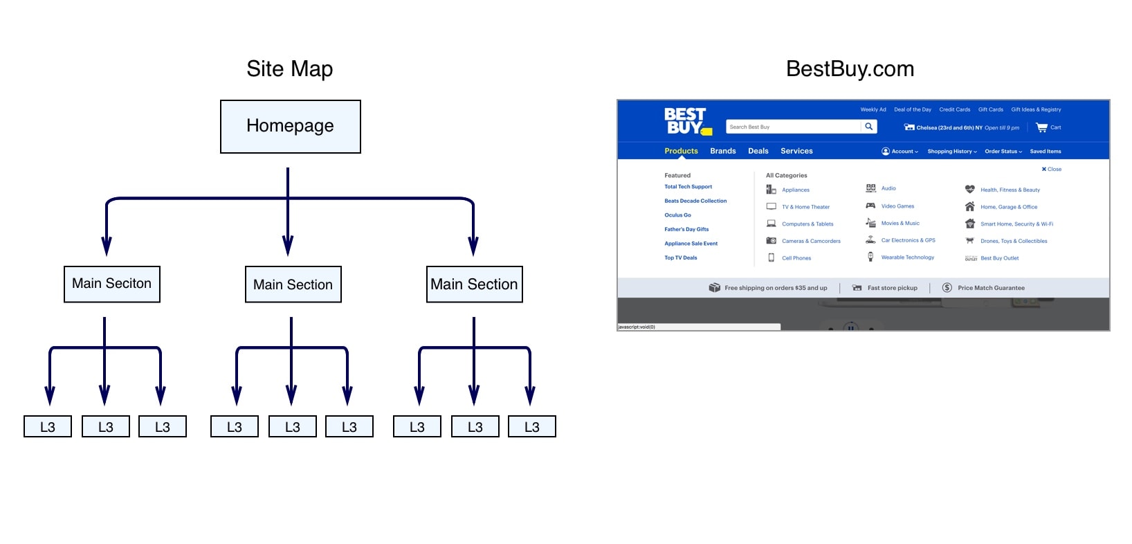
A site map like the one above (left) shows the hierarchical organization of content in the information architecture. On the right, BestBuy.com uses visual hierarchy to put major categories in the primary navigation menu and subcategories in a secondary navigation menu when you hover.
2. Consistency
Users expect products to be consistent with similar products they’ve used in the past. The more familiar your product is, the more easily users will learn it and the better their experience will be.
This is great news for designers because it means you don’t have to reinvent the wheel for every part of your design. While it might be tempting to try something crazy and new, the principle of consistency (and tons of research!) tells us you’re better off sticking to standard patterns for most things.
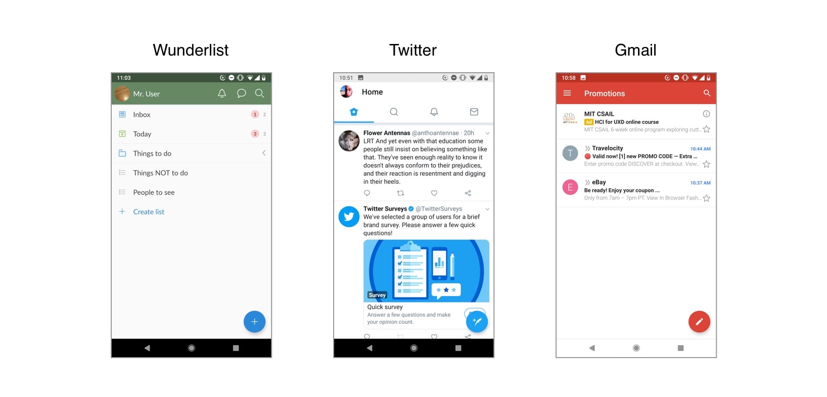
These three apps all use a Floating Action Button (FAB) at the bottom right corner of the app to make it easy for users to accomplish the most important action available on this screen.
More on Consistency…
So how do you make your product consistent with other products? Do you call up other designers and coordinate your designs? Well, you could try, but since consistency is so important, designers typically turn to design languages. A design language is a formal set of guidelines for how to design products for a particular device or format. For instance, if you’re designing apps for iOS, you’ll want to follow Apple’s Human Interface Guidelines. If you’re designing apps for Android, you might want to refer to Google’s Material Design guidelines (as in the example above) or Android’s guidelines.
3. Confirmation
Preventing errors is one of our key goals as designers. When users accidentally delete an item or make an unintended payment, their experience falls apart. Requiring confirmation for any important or irreversible action is one of the best ways to prevent these errors. This type of confirmation gives users an opportunity to reverse an unintentional action or to rethink something they’re not sure of. One common example is an order confirmation screen that lets you review the complete details of an order immediately prior to making an online purchase. Another familiar example is an ‘Are you sure you want to permanently delete this?’ message. Since confirmation actions do require extra effort, they should only be used for actions that will have a significant effect.
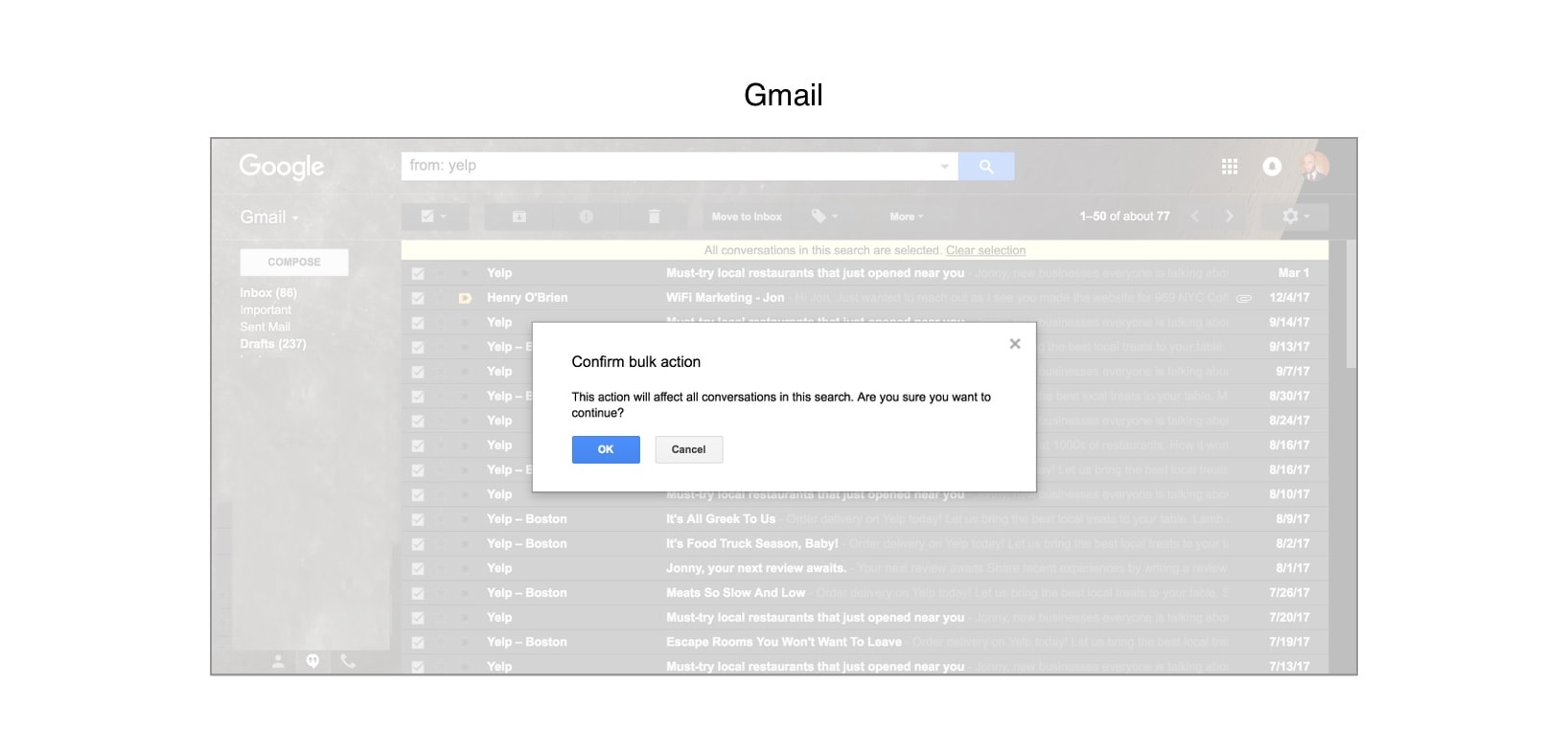
Gmail requires users to confirm before taking the irreversible action of bulk deleting emails.
More on Confirmation…
Check out this Nielsen Norman Group article for guidelines on how to create a good confirmation dialog box.
4. User Control
User control comes into play in a few ways in UX, but generally users have a better experience if you give them control over where they are in the product and what they’re doing. An essential part of user control is helping users easily backpedal or recover from errors. For instance, whenever a user has clicked more than one level down in the hierarchy (remember hierarchy?), they should have a button that can take them back up. Similarly, when a user starts creating a new item like an email or event, a Cancel button should let them abandon the task. An Undo button is also a lifesaver for reversing an unintended or undesired action.
Another way to enhance control is by giving more advanced users (power users) ways to improve their efficiency. Keyboard shortcuts are a great way to do this, as well as templates and macros that let users accomplish repetitive functions more efficiently. Integrations between features and products can help users transfer content, and advanced searching helps users find what they’re looking for more efficiently.
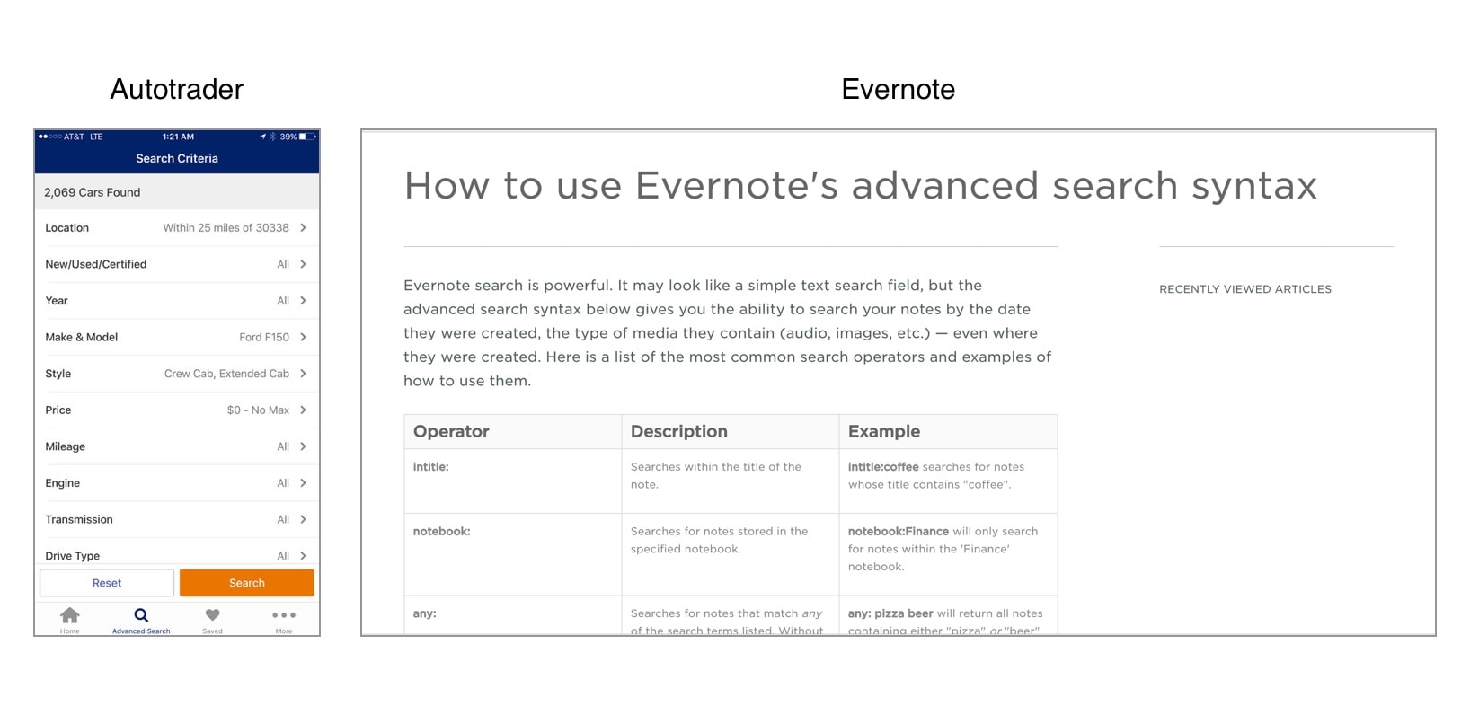
Advanced search options let power users have more direct control over their search experience, helping them find exactly what they need more efficiently.
More on User Control…
Check out this really awesome UX Planet article for more on user control and correcting errors. UX Review addresses designing for power users as well.
5. Accessibility
In digital product design, accessibility typically means designing products so they’re easy for users with disabilities to use. Since we design products for people, it’s crucial that our products can be used by as many people as possible. A unique part of the UX designer role is the focus on removing obstacles for people when they use the product, whether those obstacles are temporary or more permanent. A great bonus is that following accessibility guidelines often improves the experience for all users, since it steers us toward the most usable design.
One great example of how accessible design helps everyone is placing labels outside text entry fields instead of inside them. This lets screen readers read them for visually impaired users, while it reminds all users what information goes in each text field. Similarly, using a high contrast between text and background colors helps both users with visual impairments and users in low-light settings read text on the screen.
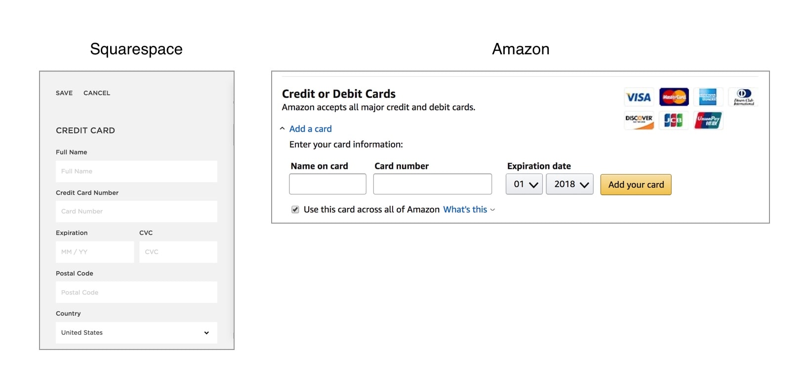
Both Squarespace and Amazon place labels above form fields so they’re permanently visible and accessible to screen readers.
More on Accessibility…
For more on accessibility guidelines, check out w3c’s accessibility on the web and mobile accessibility guidelines.
