If you’re new to UX design, the rules, principles, and terminology can be overwhelming. But there are so many ways to leverage basic design concepts and best practices to elevate your UX.
When you pick up your phone or open your laptop to accomplish a task, you inevitably have an experience. Maybe it’s a smooth and successful one, or maybe it’s frustrating and you don’t accomplish what you set out to do. Your smooth digital experiences are usually the result of a designer who has seriously considered how you would think and interact with their product.
Today we’ll look at three key ways that designers can control facets of the user experience. Specifically, I will be talking about affordances, signifiers, and feedback, and how an understanding of these concepts can take your designs to the next level—and how neglecting them can lead to some frustrating user experiences. Let’s get started.
1. What are affordances?
An affordance is the relationship between an object and the actions a person can take with that object.
For example, a button affords pressing, a door handle affords pulling or turning, and a smartphone screen affords all types of interactions like swiping, tapping, pinching, and scrolling.
Affordances rarely exist on their own. Meaning that a product or experience will have functionality built-in, but there are almost always clues designed to orient the user towards affordances. For example, when someone calls you on your cell phone, there is a built-in affordance for you to be able to answer the call and speak with the person on the other line. However, without a signal like a ringtone or your phone screen lighting up—you wouldn’t know when to take advantage of the affordance of answering a phone call. These signals are called signifiers and we will discuss them in more detail shortly.
There are times, especially in digital experiences, when affordances are hidden or implicit. For example, on your tablet screen if you are browsing a web page, it’s very likely if you pinch the screen with your fingers you will be able to zoom in on the content of the page. This is implicit because while the affordance exists and is readily available, you are not being explicitly signalled to interact with the screen in this particular way.
These implicit affordances can exist because of long standing learned behaviours, and unless it is a very common interaction, its best not to hide affordances in your digital interfaces without some signal or clues for how to use them.

A good example of how well-designed affordances can greatly enhance your UX, would be how Amazon prompts you to sign up for a subscription of certain products you’re likely to need again. This is an affordance that not all e-commerce websites have but it saves Amazon users the hassle of remembering to re-order dog food each month. As an extra bonus, it ensures they are a repeat customer for Amazon, win-win. This affordance elevates the UX because it intuits what the user may need and provides it at the perfect time.

Another way to elevate your UX with affordances would be to use something called a negative affordance, which could be a greyed-out ‘Submit’ button—the button’s affordance (clicking) is blocked until you complete the entire form. This is helpful in preventing the user from making an error.
Finally, when designing affordances you should always keep in mind the varying abilities of your users and design with accessibility in mind. Enabling the right features in the right context is important, but so is making sure the right features are available for the right groups of people.
For example, voice activated technology has greatly improved the way people are able to interact with mobile devices. If you were designing an app that is encouraging you to cook a new recipe, you might consider the varying abilities of your users, and design a feature that reads instructions or ingredients aloud. This would help users who may have fewer hands to use in the kitchen, whether that’s a permanent circumstance in their life or whether they find themselves carrying a small child while cooking.
Designing the right affordances can mean a better experience for everyone.
2. What are signifiers?
Once you’ve bestowed your product with affordances, you must then decide how you can give subtle but intuitive clues to your user about how to interact with them. These clues are called signifiers. These can be any kind of perceptible information that signals your user to act in a desired way.
Signifiers can be explicit textual information, sound, texture, lighting, color, symbols, or even proximity of objects to one another. There are examples of signifiers in social situations as well. A queue in front of a store for example, signifies to a passerby that if they want to enter, they need to wait, and that there might be something worth waiting for inside (a sale!?) Now these social signifiers don’t always give 100% reliable information but they do offer you clues to help you decide how to interact with the experience in front of you.
You can see the importance of signifiers in this example of the Kia Optima wireless charging pad. There is an affordance built into the car console that allows you to place your smartphone on top of the grooves and it will charge. So cool.
Now, if that little symbol and rectangular outline was missing from the console, there would be an affordance here but absolutely no clue telling us what it can do. Since wireless charging is relatively new, and cars usually have consoles just like this one to hold spare change; without these explicit hints, you would likely miss out on this feature.

Digital signifiers are very important for great user experiences. With a device that constructs everything in 2 dimensions, it’s especially important to use all kinds of cues to guide a user through complex sequences. With smartphones and laptops, for example, we rely on cues like shading, color, text, sounds, and haptics.
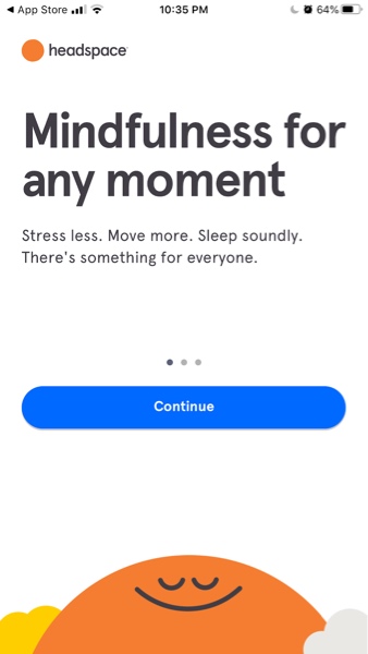
Take the Headspace onboarding page for example. There is a brief message followed by three small dots with different shading. These three dots indicate where you are in the onboarding sequence based on which small circle is shaded. This is important because it tells us there is more information available and the ‘continue’ button is in close proximity which nudges you to explore the app further and access more content.

Text and typography are another way that designers can signify important information to the user. Headings tell you what content to expect in the following paragraph, bold text indicates something the author wants to emphasize, and underlined blue text often indicates an underlying link that exists if you click that piece of text.
From directing us where to read, what to click next, and how to get the most out of our devices—signifiers elevate the user experience by guiding us, but they don’t always guide us in the directions we expect. When we get signifiers wrong, we can cause confusion and sometimes unnecessary stress.
An everyday example of this, is a door that pushes open, but has a handle on the exterior that signals you to pull it.

While this push/pull experience is a source of minimal friction and may just cause you to roll your eyes and open the door moments later—in a digital experience, studies show that when users face friction while using a digital product, they are more likely to ‘bounce’ and leave your website in search of a smoother experience.
Now you see how signifiers and affordances work together, and there is one more factor I want to bring to your attention—one that’s designed after your user follows the clues of your product’s affordances and signifiers.
3. What is feedback?
When a user finally takes an action or interacts with our product, they often get an immediate reward of more content or a completed task. But what about the times when we have complex tasks with several steps or our request takes longer than a few seconds to complete? A well designed user experience offers us feedback that keeps us reassured we are on track.
Think of the Kia charging pad once again. Without the signifier (rectangular grooves and symbol), it is possible that one day you would place your phone down and discover it charged! Magic? Well, if you’ve ever connected your phone to a power source, it likely makes a noise, and then a little lightning bolt flickers over your battery telling you that it’s charging. This is called feedback, and it’s a crucial facet of design. It reassures your user that the action they are trying to complete, is actually happening, and it can stop us from making errors.
In a tangible example, if you’ve ever turned your car key in the ignition and heard the engine purr—that is great feedback, you know then to shift into drive. If you live in Northern Ontario like me, you’ve likely experienced a below zero winter morning and sputtering engine sounds in response…worrisome feedback, but still useful, and it tells me to keep trying.
Why is this so important? Well, other than maybe discovering magical charging pads in your car, clear consistent feedback creates trust. Many of us have grown up with technology, but we know that it isn’t always perfect. Designers can implement signifiers and feedback within products and experiences that build trust with its users which makes it more likely for us to return again and again.
Digitally, feedback appears in the form of loading bars, error messages, vibrations, etc. Feedback is the error message you receive when you type in the wrong password; it’s the delightful pinging sound you hear when you’ve processed a payment in the app store.
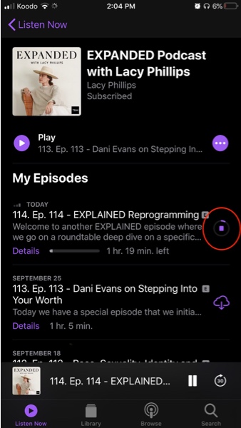
Feedback reassures us that we are making progress. For example, when downloading a podcast, if you didn’t see any type of loading bar you might assume that the content isn’t yours yet or that the app doesn’t allow downloading. This feedback ensures you that the technology has received your request, and it’s now their turn to do some work.

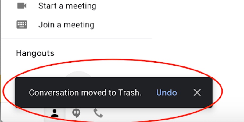
Feedback also can help us correct course before it’s too late. In the Gmail interface, in the bottom left corner you’ll see that Google is telling me that I just sent an email to the trash, and provides me an opportunity to undo that action if it was a mistake.

These are seemingly small details, but they make a huge difference. If you’ve ever doubted that your credit card information was successfully submitted online—only to find that you’ve refreshed the page and purchased the same thing 4 times…you already know why this is so important.
Beyond helping us avoid mistakes, feedback can make you feel really connected to a product and understood. My bluetooth headphones for example: while listening to music, I notice my mother trying to talk to me, so I take one headphone out to better hear her—and to my delight, my music paused automatically! This is a sort of a mixture of affordance and feedback, as the headphone affords pausing when removed from your ear, but sudden silence acts as your immediate feedback, reassuring you that you won’t miss a lyric.
The same thing happens when you turn the volume down on a device. If you can’t immediately hear the difference, you likely can see a volume gauge reacting as you hit the buttons. When there’s lag between action and response, it is especially important to use feedback to keep the user feeling in control of their experience. Without this, we feel like we’re struggling to use technology when it should be making our lives easier.
4. Bringing it all together
There are a number of design concepts to keep in mind when crafting a great user experience, and a lot of them start with the basic factors we discussed here.
Now you know how affordances enable users to interact with an object, how signifiers can help teach us what to do next, and how feedback is a great way of building trust and reassuring the user that they’re on the right track.
The best gift my design education with CareerFoundry has given me, is a change in how I view everyday objects and interactions. My friends often shake their heads when I point out a flawless checkout process on an app, a website with impeccable information architecture, or a billboard on the side of the road with great typography & hierarchy! It may sound silly to them, but understanding great design has really enriched my view of the world and the great user experiences we share within it.
If you’re interested in learning more, check out these articles:
