Many designers strive to create products that are so easy to navigate, their users can flow through them at first glance. To design something with this level of intuitiveness, it’s imperative designers understand affordances—what they are and how to use them. Affordances are found all around us but getting familiar with how they impact UX design is crucial to designing high-quality, user-friendly products.
In order to give you a clear and concise breakdown of affordance in UX design, we’ve broken this guide down into the following sections:
- What is an affordance?
- What types of affordances are there?
- How are affordances used in UX design?
- How to design the best affordances
Ready to learn about affordances in UX design? Let’s get started.
1. What is an affordance?
An affordance is a compelling indicator as to how an item operates and includes both its perceived and actual functions.
For instance, when you see a door handle, you assume its function is to open a door. When you see a light switch, you assume it can be flicked to turn on a light. When looking at a chair, you know it can be sat in. All of these are affordances. Don Norman refers to affordances as relationships in his book The Design of Everyday Things. He goes on to say that, “when affordances are taken advantage of, the user knows what to do just by looking: no picture, label, or instruction needed.”
2. What types of affordances are there?
Affordances are found everywhere, both in physical and digital products. But before we get into affordances specific to UX design, let’s go over the six main types.
Explicit affordances
Explicit affordances are obvious, perceptual features of an item that clue you in on how it is to be used.
With explicit affordances, physical appearance and any accompanying language or text inform the user of how an object is to be used. An example of explicit affordance is a button with the word “Login” on it. The appearance (shape, color, contrast, etc.) and accompanying text make it clear the button is meant to be tapped in order to login. Daily UI 001 by Brandon Charles is an animated flow that illustrates this nicely.
Hidden affordances
Hidden affordances are implicit features of an object. The clues that indicate an items function are not obvious and may not even be displayed until the action is being taken. A common example of hidden affordance is a drop down menu or other clickable feature that only appears when the user is hovering over it.
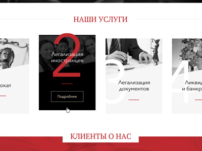
ECG Consulting by cyber-baller
Pattern affordances
Pattern affordances are based on previously established conventions that indicate function. These are widely-used or agreed upon protocols for how things work. Take a camera for example. The shutter button on most if not all cameras will be found on the top right. Another example is underlined, italic, or differently colored text indicating a hyperlink in a body of text.
Metaphorical affordances
Metaphorical affordances rely on imagery of real or original objects to convey purpose. For example: a shopping cart icon to indicate your online purchases, an envelope to signify email or messaging, or an image of a microphone showing the option to record.
Metaphorical affordances are most often found in digital products, but there are some physical applications. For instance, plastic adirondack chairs or front grilles on electric cars.
![]()
Mac OS icons vectorized by Aurelien Salomon
False affordances
False affordances occur when a feature of an item suggests a use that the item can’t actually perform. An example of this would be a button that looks clickable but isn’t, underlined text that doesn’t contain a link, or a TV remote that turns on your lights but not the TV. False affordances are often present by mistake or occur due to lack of effective design techniques.
Negative affordances
Negative affordances are used when conveying a lack of function or interactivity. This type of affordance is typically used when you need more information from a user and want to block them from proceeding to the next step. For instance, a greyed out “Sign In” button that stays inactive until your user finishes inputting data.
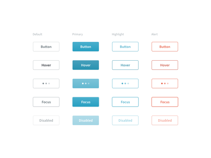
3. How are affordances used in UX design?
Now that we’ve covered the main types of affordances, we’ll go a bit more in depth on how affordances are used in UX design.
Buttons
Buttons are one of the core elements used to suggest interactivity in an interface. Shape, color, shadowing, contrast, and accompanying copy play a huge role in designing an obvious and effective button. It can be easy to accidentally create a hidden affordance by creating a button that doesn’t look clickable or, by contrast, a false affordance by making another item look clickable when it isn’t.
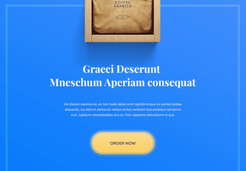
Button- Day 83 #dailyui by Sergiu Radu
Animations
Animated affordances often imitate actions or movements in the real world (swiping, pushing, pulling, dragging, etc.) and range from simple to quite complex. Toggle buttons are simple animated affordances that show a user when something is turned on by the presence or change in color when the toggle is dragged. More complex animations can serve as negative affordances such as a button that shakes, blinks, or causes your phone to vibrate indicating that you cannot proceed just yet.

dailyUI #015 On/Off Switch by Sander Rietdijk
Notifications
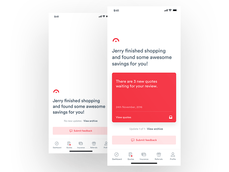
Notifications are used to draw the user’s attention to something or to indicate a change. For example, say a user hasn’t completed setting up their profile, a red dot may appear next to the profile icon on the menu bar. Another good example is a number appearing next to a shopping cart icon when you’ve added something to your cart. Notifications should be obvious enough to notice, but not too distracting.
Input fields
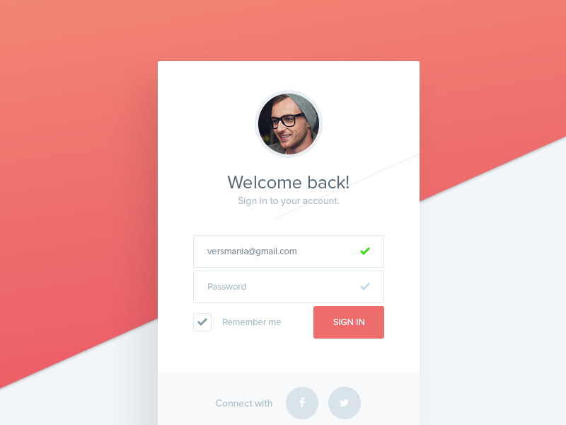
Input fields indicate that a user can enter data. These are often conveyed by the shape of the field and the contrast between the field and it’s background. Furthermore, light or italicized text may be present to indicate exactly what info the user needs to input. Input fields can also appear as a drop down box indicating that the user needs to make a selection.
Icons
Icons often rely on pattern or metaphorical affordance to help a user navigate through an interface. Conventions like using heart or star icons to indicate a “Favorites” page uses pattern affordance while a floppy disk icon as a “Save” button is relying on metaphorical affordance. Icons may also be used to help users understand categorization as users may perceive images faster than text.
![]()
Strava App – Iconography by Zach Roszczewski
Photos
Similar to icons, photos are quick visual cues that help users understand what they can do with a product. For instance, the website for a meal delivery service may have a slideshow with pictures of people cooking or the different meals they provide letting the user know what their product has to offer with just a momentary glance.
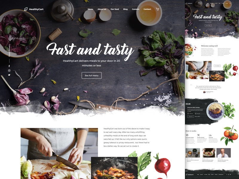
HealthyCart delivery by Valeria Rimkevich
4. How to design the best affordances
Designing with good affordance is all about minimizing user error and friction. Your designs shouldn’t mislead or surprise your user by resulting in a lack of action or an undesired outcome. Interactive elements should stand out and important functions should be obvious. Here are some things to keep in mind when designing good affordance.
Follow conventions
Users have come to expect certain protocols when it comes to their digital interfaces. For instance a magnifying glass or “Search” in a search bar or a clickable brand logo at the top left of a desktop. Following these conventions will help your users flow through your product.
Stick to design principles
Design principles are agreed upon techniques that help create intuitive and easy-to-use designs. From designers to sociologists to psychologists, many experts have come up with simple principles you can follow to help minimize confusion in your users. Laws of UX gives a comprehensive set of established laws and principles you can follow; or you can craft principles that fit your company and product.
Utilize effective copy
If you can’t create effective affordances using visual design due to color constraint, software limitations, budget, etc., pairing things with useful text can help keep your users on track.
Just be sure to keep your language plain and direct so users can interpret it easily.
Sometimes the creation of this copy falls to UX writers, but no matter who writes it, there are many practical ways you can improve your skills in UX writing
Get familiar with Material Design
Google’s Material Designis an Android-oriented design language that optimizes user on-screen touch experience with intuitive yet innovative features. Material Design uses the physical world and it’s textures, meaningful motion, and intentional graphics to help you build a high-quality, user-friendly interface.
Understand your users
Conduct meaningful UX research and learn what your users expect to see when interacting within the context of your product. While there are certain things most users will anticipate with any interface, there may be expected affordances that are unique to your users and the cohort they represent.
Final thought
Affordances are an impactful concept in UX design. The best way to know if your designs have good affordance is to carry out some quality user testing. When your users can accomplish their tasks quickly with minimal fumbling and errors, you’ll know you’re heading in the right direction.
Utilizing good affordances can minimize the amount of thinking and exploring your users have to do so they can achieve their goals swiftly and smoothly. This is an important consideration in both universal and inclusive design.
To learn more about affordances and other elements to amazing UX design, check out these articles:
