Colors influence our thoughts, feelings, and even behaviors. Everywhere we go, each color we see affects our subconscious and can change how we relate to something or even how we choose to act.
The subjective meaning we give to various colors is called color symbolism. Designers use color symbolism to tap into our emotions to evoke a certain feeling or response when viewing their designs. Depending on cultural and societal agreements, every color has its own meaning attached to it.
We’ve created this guide to give you a full breakdown of color symbolism, the meanings behind each color, and how color symbolism can be used in design.
Here’s what we’ll cover:
- What is color symbolism in design?
- The different colors’ symbolism
- How to choose colors for your users
- Final thoughts
Let’s get started.
1. What is color symbolism in design?
Color symbolism is the use of color to represent or mean something. Each color we see has a culturally accepted meaning behind it. It makes us feel a certain way and can alter how we react to a particular situation.
The symbolism of each color is often specific to a particular culture or society and is displayed in their popular sayings or customs. For instance, Western culture often uses the term “so mad they saw red” to describe rage or anger, while Eastern cultures use red in their depictions of luck.
However, some color meanings are primal or biological and influence various cultures. For instance, how blue light can affect us psychologically is the same across societies. This is similar to green, representing growth, vegetation, health, and prosperity.
Yet, history and societal events can also influence how colors are interpreted. A green dye containing arsenic in 18th-century Europe caused people to associate green with death, poison, and caution.
Color symbolism can get even deeper when considering different shades and hues and combining certain colors with others. Each alteration or combination of colors can evoke different emotions and responses.
2. The different colors’ symbolism
Each color’s meaning can give us a look into how a certain culture thinks or how humans respond to the world around us. Below are the unique symbolisms for each color.
Red

Red is often thought of as primal and associated with danger or passion. Think of the blood coursing through your veins when you are angry or excited. As such, the most common associations with the color red are anger, passion, love, desire, power, danger, and heightened emotions.
We can see red being used in stop signs, alerts, alarms, or to indicate something is not working or is inaccessible. It can also be observed when emoting love or passion; think of Valentine’s Day decorations or giving red roses to a loved one. Many food distributors or chain restaurants use red in their branding to stimulate hunger and desire.
However, in different cultures, red is way less alarming and instead is used to portray luck and good fortune. In Asian countries, red is often paired with yellow when celebrating the Lunar New Year or other important holidays. Paired with white, red can represent Christianity in many Latin cultures.
Yellow
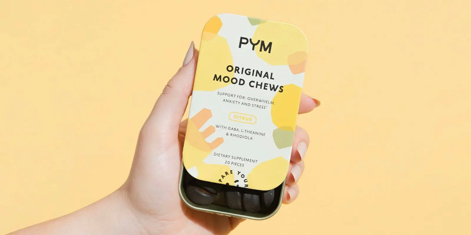
Yellow’s color symbolism varies greatly across the world. In the West, it is often thought of as happy, hopeful, positive, and youthful. It can evoke confidence and optimism and draw a lot of attention. This attention-grabbing energy is why yellow can often be seen when indicating caution, like at stop lights and traffic or warning signs.
In contrast, yellow is seen as the color of mourning in many Middle Eastern and Latin American countries and is commonly used for funeral processions. In Africa, yellow is viewed as a sign of wealth or prosperity.
With colors like yellow that have a wide variety of symbolism, it is crucial to know the audience you are designing for.
Orange

Orange symbolism can be considered a midway point between red and yellow. It’s not quite as alarming or passionate as red, but too bold and zesty to be yellow. Orange can draw attention yet also evokes a sense of safety, which might be why it is a common color for safety equipment like traffic and construction signs.
The main associations with orange are creativity, enthusiasm, warmth, youthfulness, adventure, and spontaneity. The symbolism orange carries is often determined by the hue or shade used.
For instance, neon and energetic oranges are often used to appeal to kids, while deep, muted oranges feel autumnal and earthy. Bright oranges represent caution and safety, as displayed by traffic cones and safety equipment.
Green

Refreshing and revitalizing, green has a fresh and natural feel to it. It is often associated with lush plant growth, a thriving environment, or fresh foods and produce.
As vitality, health, and natural ways of living are often associated with the color green, eco-friendly brands and products often use it.
The color green has a calm, accessible, and affirming feel to it and often represents safety and going ahead or a successful transaction (i.e., traffic light, vacant bathroom sign, or green check mark). In addition, green can also be associated with wealth, prosperity, and stability, which might be why many financial institutions also choose the color green for branding. Occasionally, green can be synonymous with envy, like in the term “green with envy”.
Culturally, the color green is representative of different ideas and religions. For instance, East Asian cultures use it to symbolize youth and fertility, while in the Middle East, it is associated with Islam.
Blue

When most people think of a calming color, blue usually comes to mind. Blue is often described as peaceful, serene, professional, relaxing, and trustworthy. Its coolness can be used to communicate peace and tranquility but also literal coolness like cold temperatures or ice, especially when paired with white.
Due to its calming and professional feel, many brands that seek to earn their users’ trust will use blue in their branding or designs. Therefore, companies in the tech, health, or financial sectors will often use blue to build trust and display dependability.
Around the world, blue has different spiritual associations. For Latin America, it is associated with the Virgin Mary as she is always depicted in blue robes. In India, Krishna is depicted with blue skin and is highly associated with the color. In the Middle East, blue is used to represent heaven.
Purple

Purple is seen as the color of luxury, royalty, nobility, wisdom, imagination, mystery, and spirituality. In dark hues, it can represent richness and decadence. In light shades, it is seen as whimsical and fun. Often associated with magic, it can have a mysterious and otherworldy feel.
The color purple’s association with royalty and wealth spans many different cultures. This regal idea comes from the rarity of purple in nature, resulting in a scarcity of resources needed to create the purple dye.
Therefore, items in shades of purple were expensive and reserved for the noble and wealthy. The lack of purple in nature also adds to its mysterious and exotic feel.
Certain subsets of culture have special meanings for purple as well. Common concepts in new-age spirituality are represented by purple (i.e., third-eye chakra, amethyst stones, and the concept of indigo children). In the LGBTQ+ community, purple is associated with bisexuality.
Black
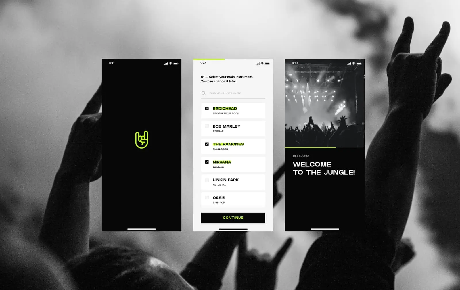
Black is probably the most used color in graphic design. It pairs well with any color and is extremely versatile. Black gives an air of elegance, minimalism, and boldness. It is powerful yet mysterious and is often used by high-end brands to exude a sense of luxury.
Paired with metallics, black can help brands feel refined and sophisticated. When black is paired with bright neons, the contrast gives designs a sense of quirkiness, excitement, and dynamism, great for nightclubs, videogame-related content, or electronic music brands.
While formal and elegant (think “black tie event”), black can also be associated with mystery or death and feel ominous, dark, or sinister. However, this can make it a good choice for design related to rock, heavy metal, or punk music.
White
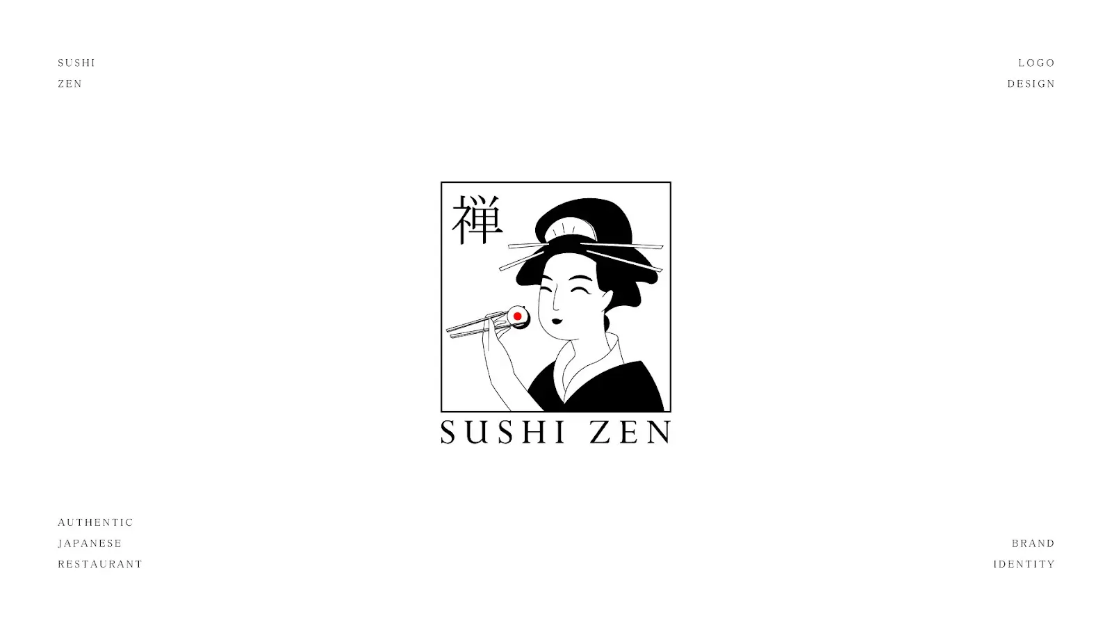
Although our eyes perceive white light as a lack of color, it actually contains all of the colors on the spectrum. The absence of color our eyes perceive makes white a neutral base to host all other colors. It’s simple, clean, minimalistic, and acts as a blank canvas, full of potential for other designs to be hosted on.
White is often used when planning negative space—the space surrounding or within a logo or design. A white background makes the other lines and colors of a design pop and feel fresh and refined.
The color white can also have a spiritual meaning, as it is often associated with purity, hope, and goodness. The white dove is a symbol in many Christian organizations, while other spiritual groups dress in white robes and other garments to symbolize purity and peace.
3. How to choose colors for your users
With so many colors to choose from, it can be overwhelming to decide which ones to include in your designs or to curate your brand. Other than the symbolisms mentioned above, there are a few other concepts to remember when choosing colors for your users.
Consider the goals of the brand
This is probably the most important concept to consider when choosing colors for your users. What the product is, the ideals the brand is trying to convey, and what other competing companies are doing are key to choosing the right color palette. Even identical products will have different design colors depending on the brand’s goal.
Take an online banking app, for example. Say one bank has a feature that saves you money when making monthly donations to an eco-friendly non-profit, while another focuses on crypto investment. The eco-friendly bank would be better off choosing greens and earthy colors, while the other may choose purple and gold to represent wealth and reflect design trends in the industry.
Know your audience
Understanding who will be viewing and interacting with your designs is key to choosing what sort of color palette you’ll be using. For instance, the colors in a product designed for kids will most likely be different than something for an older audience. Or, something intended for country music lovers will involve a different palette than EDM or metal fans.
The best way to get to know your users is via thorough user interviewing and testing. Understanding the desires and behaviors of your target audience will help you determine what colors will appeal to them.
Harmony and color pairing
If using more than one color in your designs, it’s best to have some idea of color theory and what color combinations are most harmonious. Color harmony is an art and science based on the color wheel that helps determine what colors pair well together. This helps your designs be aesthetically pleasing to your users.
Learning about color harmony will help you understand warm versus cool colors, monochromatic harmony (using the same color hue with different tints and shades) versus polychromatic harmony (multiple different colors), as well as opposite versus analogous colors (hues next to each other on the color wheel).
Keep contrast in mind
Color contrast is the difference between the brightness of foreground and background colors. It determines how well colors stand out from one another. Considering contrast is especially important when making your designs not only visually appealing but also accessible and easy to read or interpret.
To help determine optimal color contrast, there are some best practices to consider, like avoiding certain color combinations that are hard for color-blind eyes to view (i.e., red and green, red and purple), using high-contrast colors for backgrounds versus text, and using other means of emphasis besides color (i.e., bold font, hierarchy). There are also online contrast-checking tools that help you find colors that meet WCAG contrast standards.
4. Final thoughts
Color symbolism is crucial in conveying emotions, messages, and brand identities. By understanding the psychological associations of different colors, designers can effectively communicate with their target audience and create visually appealing and impactful designs.
It’s essential to consider cultural context and personal associations with colors when designing, as the interpretation of colors can vary widely depending on individual experiences and backgrounds. As designers, we have the power to use color to evoke emotions and create memorable experiences for our audience.
Dive deeper into the world of design with our free UX design short course or speak directly with a UX program advisor.
Did you enjoy this article? You’ll like these, too:
