Whether you’re a new or seasoned UX professional, you have the power to influence users’ interaction with your company and its products in very real and meaningful ways. One amazing key to unlocking that power: inclusive design.
Inclusive design is gaining attention across the industry as an approach that results in products that are more useful to even more people, and that reduces or eliminates the number of obstacles users encounter on their way to having a productive, easy, and even delightful experience. It’s good for people, it’s good for culture, and it’s good for business.
If you’re new to inclusive design, it can be overwhelming to imagine designing a product or experience that is fully inclusive. We all have gaps in our personal knowledge or experience that leave us insensitive to the kinds of exclusion other people face on a daily basis.
In this guide, I’ll walk you through the basics of designing for every gender. Is gender the only (or most important) consideration for inclusive design? Not necessarily. But it’s a great place to start. Here’s what I’ll cover:
- What is inclusive design and why consider gender?
- Terms and concepts to understand from the start
- Designing forms: How to ask for gender
- Microcopy: How to use gender-inclusive language
- Images: Craft an inclusive vision
- Technologies that exclude
- Products and experiences that are categorized by gender
- A final word
1. What is inclusive design and why consider gender?
In the Beginner’s Guide to Inclusive Design, I defined inclusive design as “the practice of intentionally including the needs of users who likely experience exclusion in many aspects of their daily lives due to being part of an oppressed group or a statistical minority.”
Put even more simply, inclusive design is an approach to design that ensures that you’re creating a product that is as equally engaging, useful, and effective for as many users as possible.
Gender is an important part of our identity, so it concerns all of us—whether we are actively conscious of it or not. Gender-inclusive design is one important dimension of inclusive design because our design decisions in this area directly impact our users (I’ll give some examples later).
Women, trans people, nonbinary folks, and agender individuals exist. We move through this world right next to the people who design the websites, applications, and services we need—and yet those websites, applications, and services are not designed for us. Our identities are often ignored, mistreated, or even mocked.
Designing for all gender identities means acknowledging this and creating experiences that do not discriminate based on gender.
2. Terms and concepts to understand from the start
Before we launch into specifics, there are a few terms and concepts we should clarify from the start. Here they are:
- Gender vs. sex. Although the human experience is not divided into separate biological and socially constructed parts, gender and sex are different things. Broadly speaking, the term “sex” refers to the biological differences between male, female, and intersex people. “Gender” refers to something more complex, more personal and individual—and far more varied than “man or woman.” If you’d like more information about gender, A Little Britt of Education on Gender is a great place to start.
- Cisgender. A “cisgender” person is a person whose gender matches their sex assigned at birth. For example, if you were assigned female at birth (sex) and identify as a woman (gender), you are a cisgender person. If you were assigned female and you identify as a man or nonbinary, you’re not cisgender. This is just one example.
- Gender presentation (or expression). Gender presentation is how a person looks, dresses, and acts in ways that might affect how other people perceive their gender. To learn more about this and other terms related to gender, check out the genderbread person.
- Discrimination. For the purposes of this guide, “discrimination” refers to a lack of recognition or representation, disadvantageous treatment, or lack of action—whether through ignorance or deliberate exclusion. The intent (or absence of it) isn’t ultimately what matters; rather, it’s the consequences that come as a result of our (in)action.
With these ideas established, we can dig into the details: how do you design for every gender?
3. Designing forms: How to ask for gender
Let’s start with an example of what not to do. Note that my examples are not intended to portray any company or product in a negative light; rather, they’re meant to provide practical insight and create conversation about how products and experiences can be designed more inclusively.
The freelance job platform freelancermap requires users to declare their gender if they want to create an account.
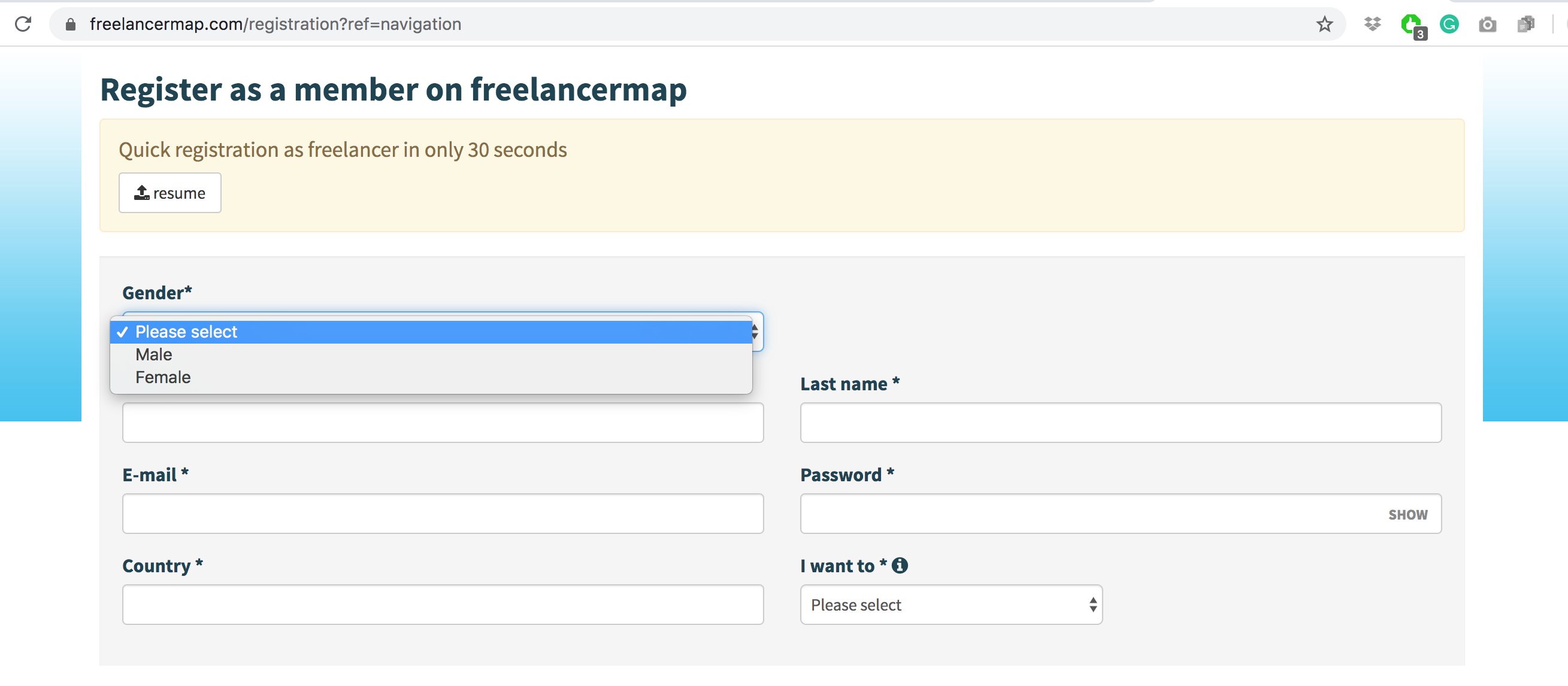
Example from freelancermap. Screenshot taken Feb 25, 2020.
This form shows little understanding of the complexity of gender. Here are the primary problems with this design:
- It’s not apparent why the site needs to know the user’s gender in order to help them find a job or advertise their skills. There is no explanation of why this private, sensitive information is required
- The options listed are semantically disconnected from the label for the field. Male/female refers more accurately to sex than to gender
- Whether the site needs to know gender or sex, the options given are not inclusive. There are more than two genders (nonbinary, genderfluid, agender, etc.) and also more than two sexes (intersex people are very frequently overlooked in these situations). When I contacted the company to ask about this design choice, they said they use this information to assign a salutation to users. In a case like this, it would be far better to ask users for what you really need—as specifically and accurately as possible: ask them to select from a number of inclusive salutation options (Mr, Ms, Mrs, Mx, etc.)
The design system for GOV.uk offers concise and clear instructions on how to ask users for gender, and many companies and teams are following suit. This can only be a beneficial step to take in helping your users feel included.
There are other questions that appear in forms that we need to give special attention to if we’re striving for gender-inclusive design. Asking for a person’s chosen name is one example, but we’ll discuss this further in the next section.
4. Microcopy: How to use gender-inclusive language
UX writing gives us the opportunity to use language as a tool for inclusion. Here, I’ll focus on examples in English—both for this audience and because it’s a language I’m comfortable working in. It’s important to remember, though, that gender is an important consideration for microcopy in any language (even though the considerations change with each language and culture).
Avoid words that are inherently gendered
Words like “guys,” “girls,” “ladies,” “landlord,” “cameraman,” “wife,” and “father” are gendered. They imply that the subject(s) you’re describing fit within a particular (binary) gender. But it’s impossible to know whether an entire group of people (or even a specific person, unless you ask them directly) identifies within the gender identity that word assigns them to.
It’s also impossible to know whether someone appreciates being described with gendered words. The safest and most scalable solution when designing digital products is to avoid addressing people with these terms.
Don’t assume pronouns
Pronouns are another important consideration: she/her/hers, he/him/his, they/them/theirs, etc. Because language is habitual and culture influences our habits of language, it’s easy for many designers to use pronouns that are based entirely on whether the person they’re talking about is expected to be a man or woman. But remember: there are many people who identify outside that binary and even if there weren’t, who are we to assume we know a person’s gender based purely on how we interpret their appearance?
Don’t make an assumption about a person’s pronouns based on gender, sex, or who you think your audience is; and when you’re talking about a sample from a group of people, don’t default to “he or she” or “his or hers”—instead, use the far more inclusive ”they” or “theirs.” It’s easier, it’s faster, and you won’t cause anyone to feel excluded! Instagram decided to do just that.
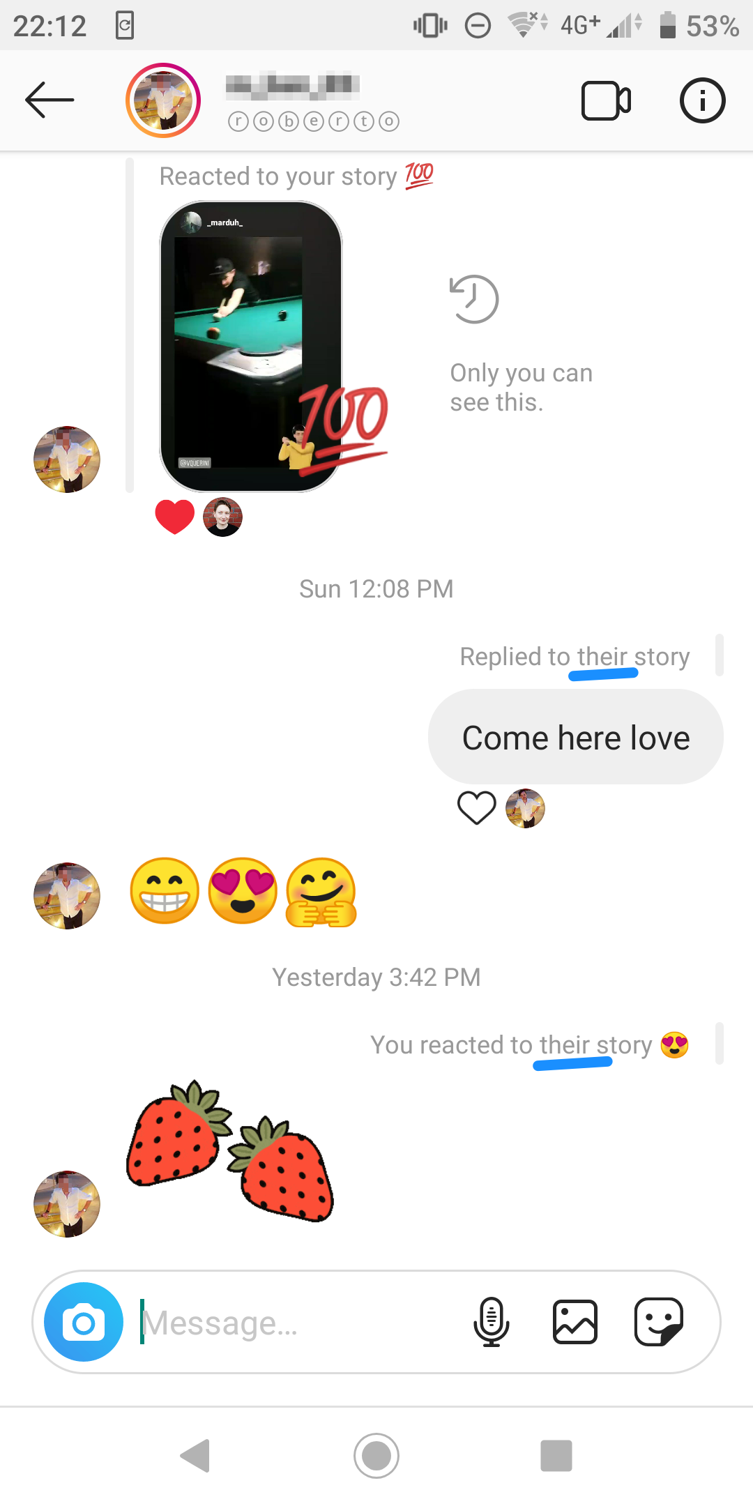
Example from Instagram. Screenshot taken Feb 25, 2020
Ask for chosen names
If we call users by name within the product or in transactional/marketing messages, we need to make sure the name we’re using is actually the name the user wants us to use.
By way of example, my bank knows my legal name because I was required to give my passport information in order to receive banking services. Since I no longer use that name in any context unless it’s legally required, reading emails in which they shout it at me (in all caps) is frustrating.
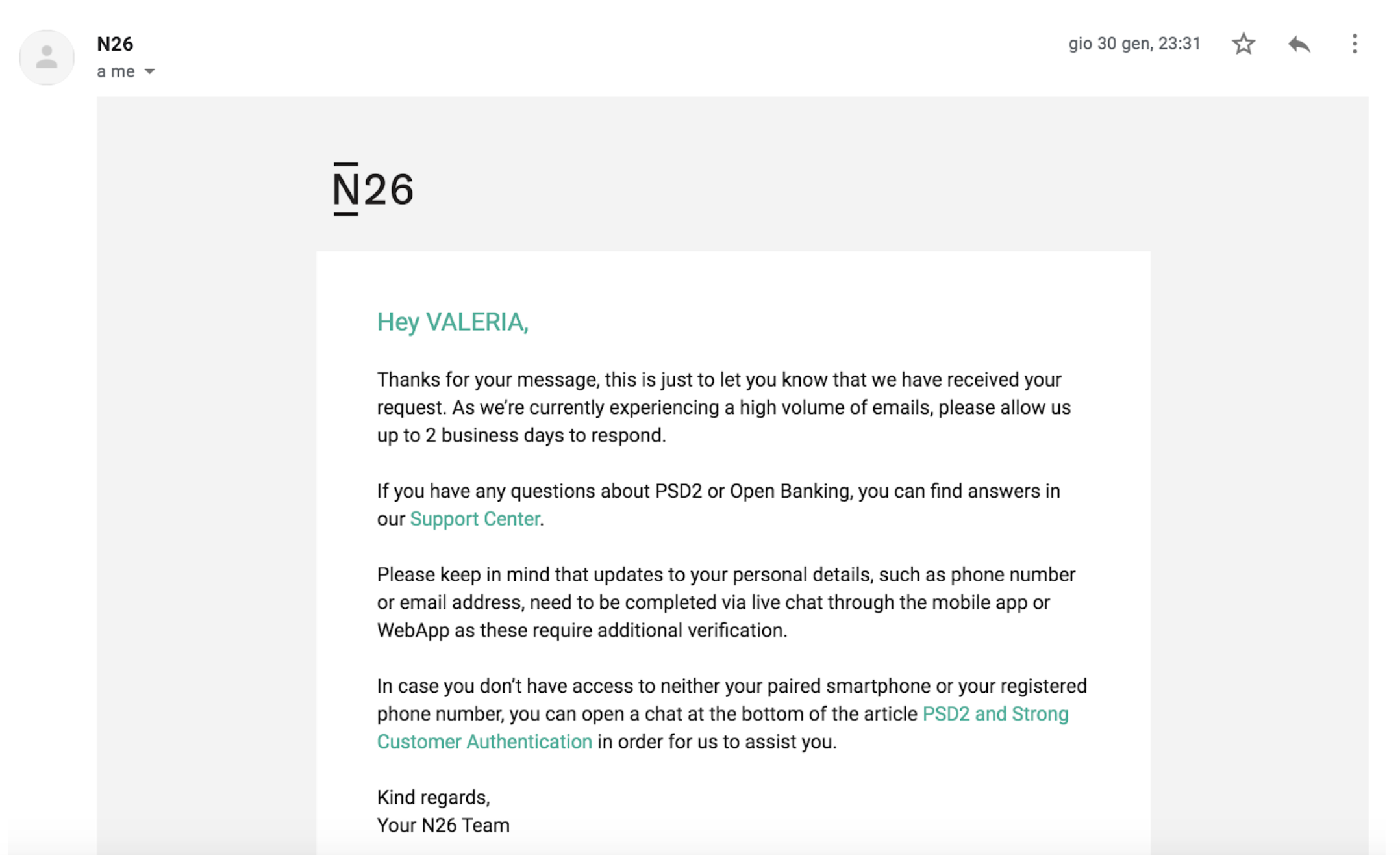 Example from an N26 email to the author, dated January 30, 2020
This has particular impact for individuals who are transgender and have changed their names. Using their former name (known as deadnaming) can, at the very least, be frustrating; for some, this can cause unnecessary distress or even emotional or psychological harm. And the simple solution? Ask what name they want to be used, and then use it.
Some banks and financial corporations like Mastercard are already working on improving the experience of account holders who are not cisgender. This is one small, simple thing to do that makes a big difference for some users—and it benefits any user who goes by another name for any reason (cultural practice, domestic partnerships, etc.).
5. Images: Craft an inclusive vision
People identify and present themselves in quite diverse ways and that’s all you need to know in order to decide to make your imagery gender-inclusive. The fact that people connect better with products/experiences that make room for that identity and presentation (and love the companies that make those products) is a bonus.
To help yourself translate into practice a gender-neutral vision for a brand or digital product experience:
- Don’t sustain gender stereotypes via visual design (choices of color, typography, etc.).
- Use photos and illustrations of people with diverse gender presentations
- Don’t assign images that suggest gender stereotypes to single users or to categories of users (for example, stereotypically feminine or masculine presenting avatars)
- If you are going to use icons that indicate sex or gender, make sure that you fully understand the meaning of the symbols you are using
Clearly, this consideration has more to do with visual design than functionality. But when it comes to inclusion, it’s even more essential that UX and UI designers work together effectively!
6. Technologies that exclude
Because technology is developed by people (and people are biased), technology can carry inherent gender-bias.
For example, the social app Giggles recently received strong critiques for basing its verification system on biometric recognition technology that does not work for transgender people—or really for anyone with a bone structure different from what the technology hasn’t been set up to categorize.
The fact that AI is not able to recognize certain groups is not an excuse. In cases like this, we must choose between either intentionally and rigorously addressing and resolving gender bias in AI or not using that technology at all if it’s not possible to make it work inclusively.
Voice User Interfaces (VUIs) are also gender biased. It’s a matter of how voice assistants speak (in a female-sounding voice, to be perceived as humble and supportive), but also how voice recognition has been developed so that it understands a man’s voice more easily.
Harvard Business Review explains how the significant race and gender biases in speech recognition discriminate against certain speakers in matters like immigration and hiring. But when you consider that the Google Assistant text-to-speech algorithm was trained on female voices—to the point that designing one for a male-sounding voice presents a challenge—it’s clear that we have the capability to design VUIs across the gender spectrum. This means that exclusion in this case is entirely unnecessary and that we can do better.
7. Products and experiences that are categorized by gender
Some online experiences are heavily influenced by the way we categorize people based on assumed gender. The designers of these experiences often treat people’s needs and behaviors in ways that don’t account for the individual existence outside of the widely used “men” and “women” boxes.
Take fashion e-commerce for example: most shops mimic the typical women’s and men’s departments of physical stores.
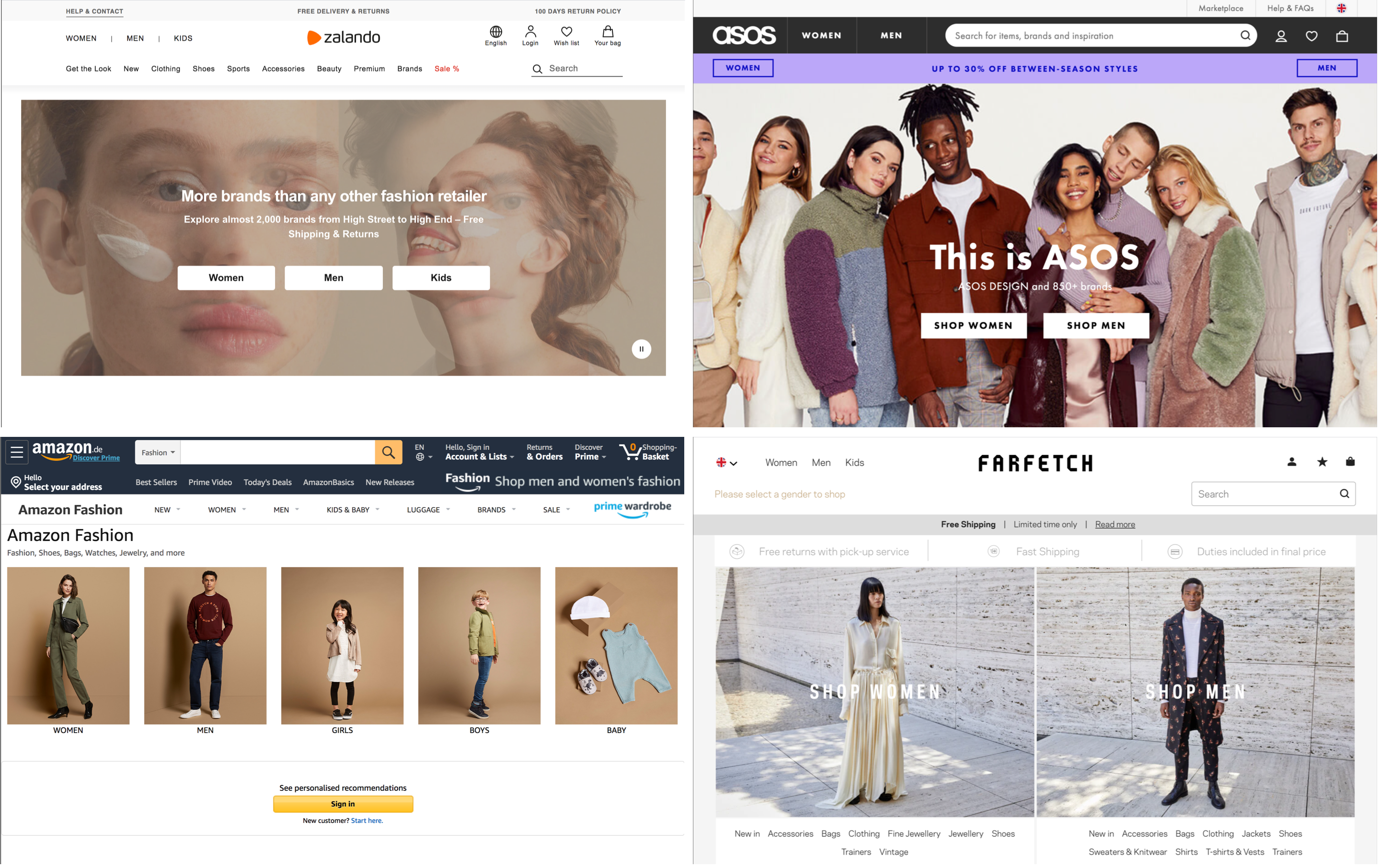
Examples of home screens for Zalando, ASOS, Amazon Fashion, and Farfetch. Screenshots taken Feb 27, 2020.
Some people want to shop across departments and this makes it difficult for them to compare options within a product category (e.g. “t-shirts”). The information architecture of this system results in bad usability.
Additionally, this categorization of clothing reminds users right from the homepage that society expects them to conform to a binary gender system, and (among other things) that certain styles they may want to express themselves with might not be available in sizes/cuts that fit their bodies. This can have a strong emotional and psychological impact on people—including cisgender people, because social pressures around gender presentation affect everyone.
Medical and fitness apps can also take a very gendered approach to the content they offer to their users. Here, biological and anatomical variations can make a difference.
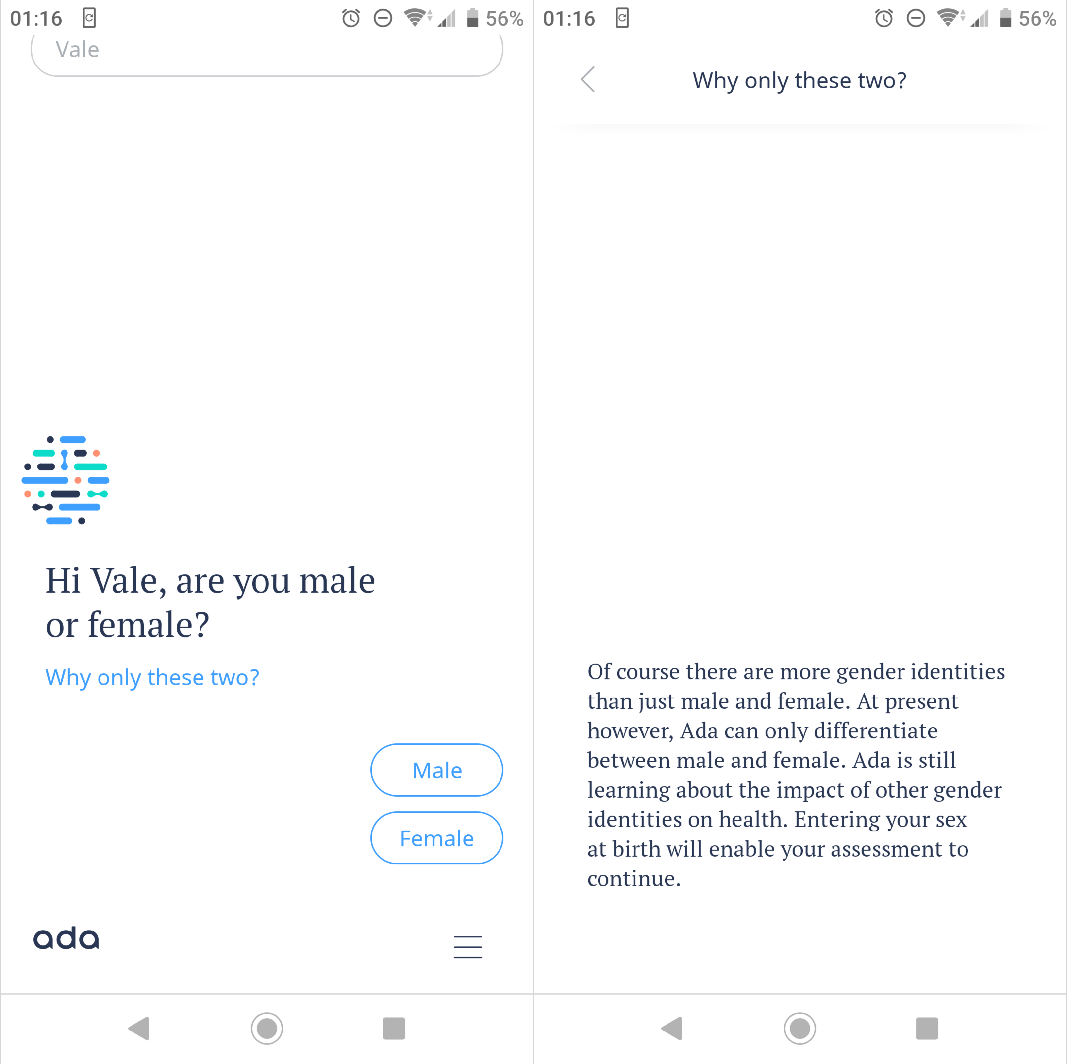
Example from Ada. Screenshot taken Feb 27, 2020.
During signup, new Ada Health users can see an explanation for why the app asks “are you male or female?” Although it’s sad to learn that they don’t yet know how to provide accurate symptom assessments to people outside of the gender binary, this explanation shows that the designers behind it are at least acknowledging the problem.
The gym management app Wodify offers a gender-free athlete experience, making it possible for athletes to toggle between male/female or unfiltered results—resulting in a more inclusive experience.
Clue is a very gender-inclusive period tracking app that’s given a great deal of attention to the language and symbols used throughout the user experience—right down to the icons users select from to indicate sexual activity. The company also publishes content to help and educate people of all genders about menstrual cycle tracking.
8. A final word
When it comes to inclusive design, remember that it is an approach to the design process—meaning that it works better taken from beginning to end. It’s better to design with gender inclusion in mind from the beginning; fixing things later is painful and messy.
If you’re jumping in on design work that’s already out in the world and needs to be more inclusive, remember that our job is to improve the inclusiveness of user experiences even when someone else before us has not taken this into consideration.
And it’s not all on you! Inclusive design is a team sport. Implementing truly and fully inclusive solutions usually takes not only design expertise, but also development skills, a strategic mindset, an understanding of marketing implications, customer support training, and more. Gender-inclusive design is the responsibility of the whole organization!
Besides reflecting on the design challenges I’ve written about here (forms, copy, images), here are some more ideas for ways you can help yourself and your team design for every gender:
- Create personas that generate empathy towards all genders
- Join design communities where you can ask colleagues for advice when faced with inclusion challenges
- Demand that your employer hires people of all genders and fully supports their identities at work
- Maintain a growth mindset. You might make mistakes, you might not know everything; the important thing is to learn from your mistakes and fix things as soon as you do
- Discuss gender and inclusion with the people around you. Share insightful articles with them, listen to their perspectives, and ask challenging questions
To learn more about inclusive design and how you can design well for more people, check out these articles:
