Wireframes, prototypes, and mockups are part of the daily vocabulary of just about any designer working in the digital world. But what do they actually mean? And are the three interchangeable?
Time to dive into more detail about the differences: In this article, we’ll really get to grips with what wireframes, prototypes and mockups are, and take a look at what tools are needed to create each.
Here’s what we’ll cover:
- Why are wireframes, prototypes, and mockups so important?
- What is a wireframe?
- What is a prototype?
- What is a mockup?
- What are some of the most common wireframing, prototyping, and mockup tools?
- Conclusion
Ready? Then let us begin!
1. Why are wireframes, prototypes, and mockups so important
Wireframes, prototypes and mockups form three of the earlier steps of a product development sequence. They offer UX (and UI) designers the opportunity to conduct rounds of user testing at each stage of their design process.
This user testing helps designers to gauge whether their product is appropriate for their target audience, exactly how users navigate and draw value from their product, for what purpose, and whether this meets expectations. Conducting user testing at every iteration of the design; from the earliest, most low-fidelity wireframe to the high-fidelity prototype, will result in a strong, well-rounded product that delivers value to the users. This is the foundation of good UX design. You can learn more about user testing in this guide.
Although their fidelity—the level of detail and realism in the design—is most commonly understood as the main distinction between them, they are fundamentally different, and possess unique characteristics in terms of their design and function in the UX design process.
The human body is an oft-used and helpful analogy for introducing the different roles served by each. The wireframe is the skeleton; the barebone structure of the product. The prototype is the brain; the organ that decides how the human should move and interact with those around him/her. The mockup is the skin, hair, and facial features, or brand, that make the human instantly recognizable.
2. What is a wireframe?
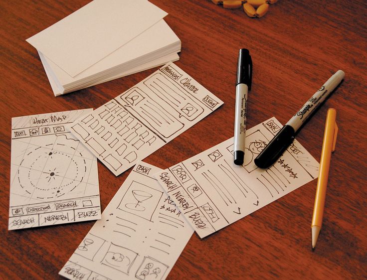
A wireframe is a basic, low-fidelity representation of the initial product concept, containing the essential elements that would feature on a webpage or app.
Wireframes provide a clear outline of the page structure, layout, information architecture, and overall direction. A wireframe traditionally only uses black, white and grey, and can either be drawn by hand or created digitally.

As wireframes turn abstract ideas into tangible concepts, they’re most relevant in the initial stages of the product design process. Rather than focusing on the product’s look and feel, the main purpose of a wireframe is problem-solving.
Conducting user testing during the wireframing phase is incredibly useful for the designer, as it means they can harbor honest feedback that helps to establish the product concept. Often, when a product seems too polished, the user has a heightened sense of awareness surrounding the effort and resources that have played into its creation, making them less likely to provide honest feedback. Without the distractions of color and typography, wireframes facilitate reliable and open input from the user.
For example, in digital wireframes (for mobile apps or websites) some designers will use Lorem Ipsum, a pseudo-Latin text that acts as a placeholder for future content. They’ll then prompt the users with questions like “what would you expect would be written here?” For paper wireframes, questions like “what would you expect to happen if you clicked on this button?” are equally enlightening.
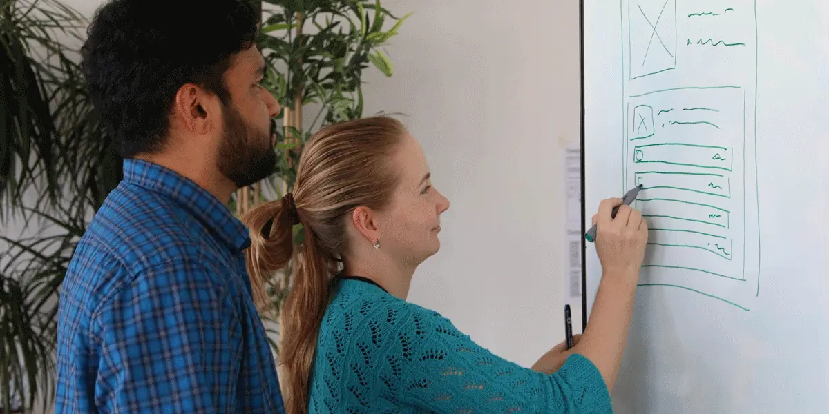
Questions like these mean the designer can iterate based on what feels intuitive for the user, rather than what feels intuitive for them. Head here for our guide on creating your first wireframe, or check out the tutorial below.
3. What is a prototype?
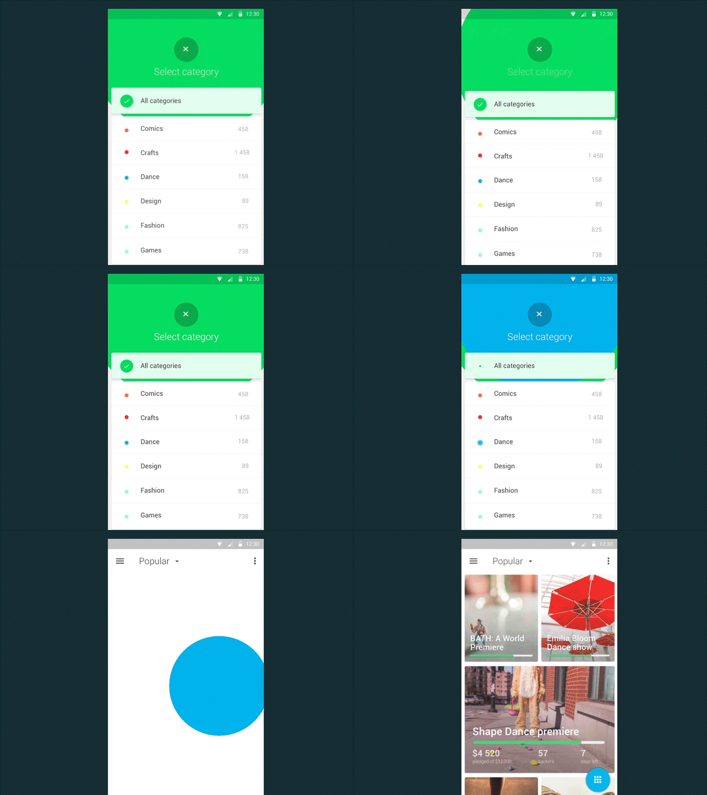
As the next step in the product design process after wireframing, a prototype is a working model of an app or a webpage. Prototyping allows designers to test the user journey, reflect on how the user might move between different actions or tasks to achieve certain outcomes, and pinpoint any potential issues with interaction flow.
Similar to a wireframe, a prototype can be low-fidelity or high-fidelity. Elementary in their design, low-fidelity prototypes can either be static paper sketches, or digital drawings or webpages that are interactive and clickable. Low-fidelity prototypes are vital for generating user feedback, as they allow the user to test the interaction flow without a vast expenditure of time or resources.

High-fidelity prototypes, on the other hand, will include color, text and other content, and often take the form of a fully functioning and coded website or app. A high-fidelity prototype is more likely to be used in the later stages of the design process. As both low and high-fidelity prototypes enable the user to gauge how the product might be used on a daily basis, they are key to refining the product’s usability.
4. What is a mockup?
A mockup is a static, high-fidelity simulation of the finished product that delivers the visual look of the product design—including typography, iconography, color, and overall style.
Where a prototype focuses on interaction design, mockups establish how the users will interpret the brand through its visual identity. During the mockup stage, the UI designers also have the job of creating stylistic continuity between the desktop and mobile interfaces.
During the mockup stage, the designers should have answered a lot of the questions that arose in the wireframing and prototyping phases of the product design process. That’s not to say that mockups don’t generate useful user feedback.
They offer a more realistic perspective to stakeholders and can help reveal problems that weren’t so apparent in the wireframing and prototyping stages; such as color clashes or typography issues. With a highly detailed spectacle of visual storytelling in front of them, users don’t need to rely as much on their imaginations.
In short, mockups are the most effective way to explore the brand’s visual identity before the design decisions are made permanent with the code.
5. What are some of the most common wireframing, prototyping, and mockup tools?
Now that we’ve established their definitions, let’s look at what tools designers use to create wireframes, prototypes, and mockups.
Design tools are constantly being honed and improved for specific purposes—like wireframing and prototyping. Today, many design tools are instead attempting to merge the three, offering mature design software that enables designers to iterate rapidly from low to high fidelity within one platform.
These advanced design systems consist of UI components, such as typography, form elements, button states, and navigation, saving the designer vast amounts of time and allowing them to take advantage of design decisions that have already been made.
Tools like Invision, Balsamiq, and Sketch are prime examples of sophisticated design software. Balsamiq allows designers to build wireframes, largely disregarding the aesthetic quality of the user interface in favor of the layout, intuitive interaction design, and basic information architecture. Sketch is primarily a visual/UI design tool and is frequently used for creating both mockups and wireframes.
Framer is particularly convenient for full-stack designers as it offers the option of adding code in the prototyping stage. Framer also permits designers to explore all possible outcomes in one prototype, as opposed to needing numerous different screens to display possible flows and interactions to the user.
Having the option of changing to code makes updating the page behavior substantially quicker for the designer, and provides developers with code they can reference while building out the page or product feature.
6. Conclusion
By now, you should have a clear understanding of the distinctions between wireframes, prototypes and mockups. A lot of the characteristics of these three processes actually complement each other, which is why it’s good practice to incorporate all three into the design process, rather than favouring one over the other.
To echo the founding principles of user experience design, generating user feedback as early on in the design process as possible means you’ll experience the maximum amount of learning while using the minimum amount of resources. Win-win!
To learn more about UX design, check out some of our related blog posts, or our latest videos:
