Whether you’re an aspiring designer trying to break into the industry or a seasoned UX designer at the peak of your career, your portfolio is arguably one of the most important projects you’ll work on.
Your portfolio is your moment to make the best first impression on potential employers and clients. It’s your chance to showcase your very best design work and highlight your design process.
So how do you create a truly job-winning UX portfolio? Here are five golden rules to help guide you through creating your first UX portfolio—or freshening up an old one!
- Include a memorable introduction
- Feature high-quality case studies
- Demonstrate reflexivity
- Make sure your portfolio website is user-friendly
- Polish it off with excellent UI design
1. Include a memorable introduction

The very first thing potential employers or clients will see is your portfolio introduction—it’s your chance to make a precise and memorable first impression. Concisely highlight the essence of your perspective and skills through the words you choose, how you present those words, and any imagery that accompanies it.
Brevity is your friend. This isn’t the time for a wordy narrative about how you got into UX design. That story matters, and you can certainly weave it into the fabric of your portfolio or present it in a more detailed “about me” section of your portfolio. But at the very start, you need a simple, highly skimable introduction that encompasses who you are, what you do, and what perspective you bring to that work.
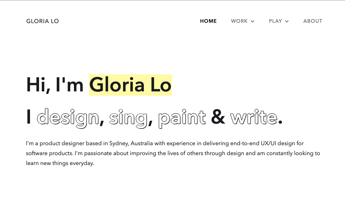
If you’d like an excellent example of a powerful portfolio introduction, check out Gloria Lo’s portfolio.

And finally, make sure your introduction is as precise as possible, accurately representing yourself and all the amazing work you do—which you’ll back up with some awesome case studies as you follow our second golden rule.
2. Feature high-quality case studies
Rather than plopping in some links or screenshots of fully formed, completed projects, you should present your work in the form of case studies.
A case study tells the story of a project. They allow you to take your readers on the journey from start to finish: the original challenge or problem, how you approached it, what you did to discover, design, and test solutions, and what you learned along the way.
This is your opportunity to show potential employers or clients not only the results of your hard work, but your creative and problem solving processes, as well as how you collaborate with others, relate to stakeholders, and reflect on your own work and find ways to improve.
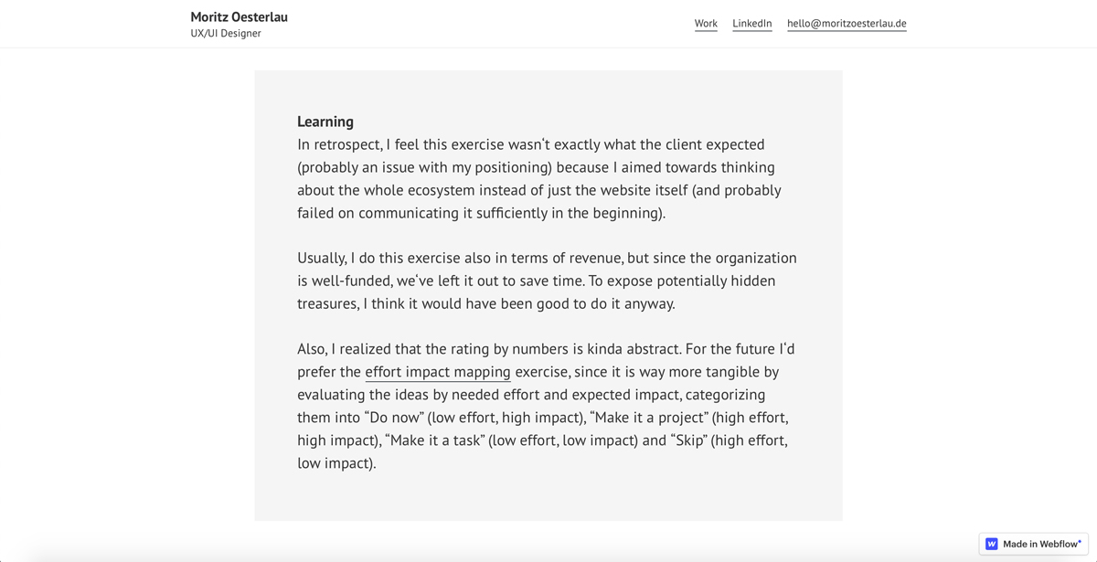
CareerFoundry graduate and UX design tutor Moritz Oesterlau, in his case study on building a website concept through fast-paced workshops, shares the story of this project, including:
- The full context for the project (sector, the key challenge or problem to solve, his role in the project, and the project duration)
- Primary steps and key moments in the project. Readers don’t feel like they’re missing information, but every step that’s included highlights an important skill
- Learnings. Moritz doesn’t pretend everything went perfectly or that his work was flawless. Instead, he showcases his ability to reflect, learn, and iterate on his own processes—a quality known as reflexivity (more on that in a moment).

To create effective and engaging case studies, start by selecting the projects that you believe most vividly demonstrate your most valuable skills (and the skills employers will value most highly—these are often explicitly or implicitly stated in their job postings).
Next, take it one project at a time and make note of what question or problem created the need for that project in the first place. Was it the result of your user research? Was it highlighted by stakeholders? Direct customer feedback?
Consider the first steps you took to understand that challenge/problem and how you went about each stage of the design process, keeping your users’ needs at the heart of things and your stakeholders on board. How did you define your objectives and conduct studies? What deliverables did you produce and why? What artifacts did you produce along the way?
No matter what deliverables you created along the way, gather up those user personas, customer journey maps, wireframes, and style guides. Include the artifacts that will best convey your aesthetic, approach, and results.
As you go along, don’t shy away from exhibiting any special attention you gave to your personas (such as creating persona spectrums), indicating what wireframing and design tools you’re fluent in, or any other specializations or areas of focus that set you apart from the rest of the applicant pool.
Make sure it’s clear what impact your work had on the project or on the company as a whole. Bonus points if you can quantify this in meaningful ways and demonstrate the clear correlation between your work and better user engagement, higher revenue, or any other measurable result.
And finally, note what you learned along the way. What mistakes did you make? How did you course correct along the way? What did you learn that you can or have already implemented in subsequent projects? Showing that you are not only capable of reflection, but that you practice it regularly tells potential employers that you are self-reflective, and that you learn from your experiences.
Gather all of these insights, notes, and artifacts and start to structure them into a story that has a beginning, a middle, and an end. Make that story engaging, but not dramatic; comprehensive, but not rambly. Ideally, you’ll have 3-5 case studies in your portfolio before you send it out into the world. But the key here is quality over quantity.
3. Demonstrate reflexivity

Reflexivity in this context is the ability to be self-aware; to reflect on your work, take mistakes in stride, and let them become learnings that inform your next project and make you a better designer on the whole.
However you choose to structure your case studies, take time to comment on your learnings, the role you played, problems you faced, and how you worked through them. This will show potential employers and clients that you take a design thinking approach to your own design practice, finding places where there’s room for improvement and using those to learn, try new things, and become even better at what you do.
Not only is reflexivity one sign of a great designer, it also makes you a better collaborator and colleague and enhances your appeal to employers and clients alike.
4. Make sure your portfolio website is user-friendly
Your portfolio should itself be a demonstration of your skills in UX design. Make sure you’ve tested its usability and optimized the content and structure of the site to make it as easy and delightful as possible to navigate. At the very least, potential employers and clients should at least not encounter any glitches or barriers to exploring your work. Ideally, though, they will even enjoy perusing your portfolio.
To help ensure a smooth and enjoyable experience for your readers, do what you already do best: craft an excellent user experience. Make sure that:
- The landing page gives a clear and concise vision of who you are and what you do.
- The “next step” is clear to your users (aka: potential employers and clients visiting your portfolio), whether they want to browse your case studies, find you on social media, or contact you directly. Give clear visual indicators and don’t stray too far from the mental models your users already have for where to find the information they’re looking for.
- Your case studies are well-rounded stories of each project that are presented with relevant images and engaging copy.
- You’ve provided a clear and simple way to find out more about you and to contact you, or even your references and former clients.
Finally, don’t forget to do some kind of testing on your portfolio before you release it into the wilds of the job market. Ask friends, family, colleagues, or—better yet—an experienced UX designer or hiring manager to look it over with you. Observe their responses and any questions or problems that arise, and use this information to guide some final improvements and polishing.
If you’d like to see how hiring managers and professionals in the field might see your portfolio, CareerFoundry’s Head of Design conducted a live UX portfolio review that provided a great deal of insight into what hiring managers and senior designers are looking for. Here are a few other portfolio reviews you’ll find helpful:
- Jeff Humble’s review of a CareerFoundry graduate’s UX Portfolio
- Sarah Doody’s Teardown Tuesday: UX Portfolio Reviews
- Ran Segall’s UX/UI Portfolio Review
5. Polish it off with excellent UI design

It’s difficult to imagine a portfolio website that people would enjoy browsing that didn’t have some degree of finesse in its visual design. It’s well worth the time, effort and even money to give your portfolio that extra punch.
You don’t have to be an amazing UI designer or web developer to make this happen! That said, if you’ve already got some solid UI design or web development skills, that’s great—put them to use. If you’d like to become that UX powerhouse, take a specialization course in UI design or one in frontend development that’s geared toward UXers.
If you need to get moving on a tighter schedule, there are some amazing and free UX portfolio websites out there that will help you build a stand-out portfolio efficiently and effectively—even on a budget.
Before you get into the nitty gritty of getting it all put together online, be sure to look at other UX portfolios. Make note of what they’re doing that you love and think your potential employers might appreciate and adopt those ideas in your portfolio. Here are some lists of great portfolios to start with:
A final word
Follow these golden rules and you’ll be well on your way to having a truly amazing UX design portfolio.
If you’d like a little more guidance as go about this process, CareerFoundry’s guide How to Make an Awesome UX Design Portfolio is a good place to start. And if you’re building your very first UX design portfolio and you’re looking for additional guidance, their free portfolio tutorial will help you start on the right foot.
For aspiring UXers with no industry experience, it can be a challenge to come up with projects to feature in case studies. If that’s where you’re at, know that it is perfectly alright to feature case studies for:
- Volunteer projects you’ve complete
- Coursework from a UX design certification
- Product redesigns you’ve done on your own for some of your (least) favorite digital products
And no matter what you do, remember that your portfolio isn’t a one-and-done project. It’s a living documentation of who you are as a designer and what kind of creativity and innovation you’re capable of! Give it a refresh now and then—even if you’re on the hunt for a job. Even well into a job you love for a company you love, your portfolio is an essential aspect of cultivating a supportive and collaborative professional community. You never know what kinds of opportunities might arise!
If you’d like to learn more about how to craft an outstanding UX portfolio, check out these articles:
