User flows are one of the most useful yet misunderstood tools in the UX industry today. Senior designers often avoid them, while junior designers can struggle to get a grip on them.
In reality, user flows don’t have to be so painstakingly challenging. In this article, we’ll bring some clarity to the complex world of user flows and share a clear step-by-step guide on how to create a user flow.
We’ve broken our guide down into the following steps and sections:
- Understand your user
- How to create a user flow outline
- Define the elements of your user flow
- Refine your outline
- What happens next?
Not sure what a user flow is? We’ve put together a good introduction here: What Are User Flows In UX Design?
Ready to learn how to create your own user flows? Let’s get started.
1. Understand your user
To design the best possible user flow, you have to have the best possible understanding of your user. Understanding the user’s needs and motivations allows you to make informed choices when determining how to get users into that flow-like state when interacting with your product. Here are some questions to ask yourself when getting to know your user:
- What are the needs of your users?
- What problems would they like solved?
- What features are most important to them and why?
- What initial questions do they have about your product?
- What information needs to be provided in order for them to effortlessly interact with your product?
Consider all the ways your user could potentially navigate through the site or app so you can identify key pathways. These pathways are generally those that are the most simple and direct. Anticipate the initial information that may be needed, like the input of an email or username versus just a phone number. Think of questions like, “Is this feature absolutely necessary?”. Identifying these key pathways will make creating your user flow a breeze.
2. How to create a user flow outline
To understand how to create a user flow, like most things in design, it’s best to start off with a first draft or outline. Start by writing down a basic flow like a mind map. Each box you draw should represent a step in a user action. It can be helpful to outline and breakdown your flow chart into three main stages: an entry point, steps to completion, and the final step in completing a task or the final interaction.
1. Entry point
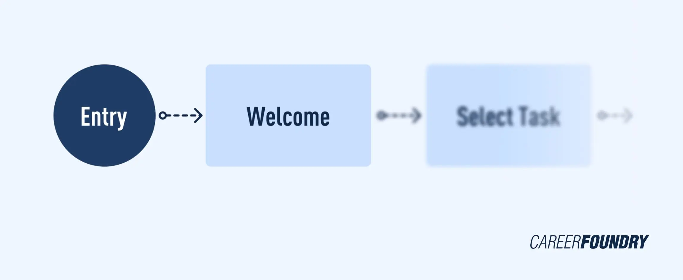
Entry points are the means by which a user accesses the product initially. Websites can have many points of entry, while apps often have limited and distinct entry points. Websites are usually visited by a google search or clicking on product ads and shared hyperlinks. Applications, on the other hand, are most commonly entered from the app store or the downloaded version on a user’s phone. However, points of entry for an application can also be an article, links, or advertisements.
2. Steps to completion
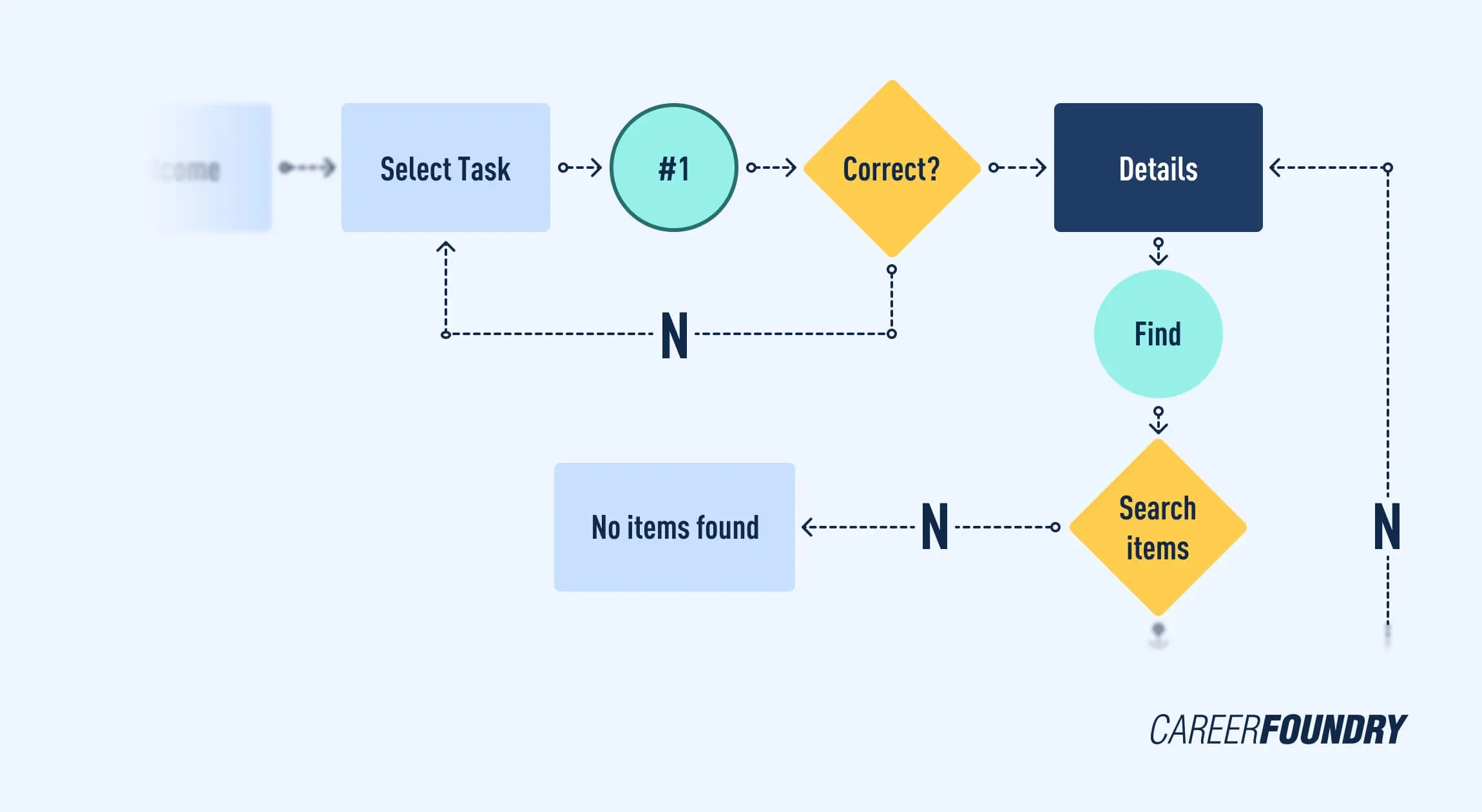
This is the meat of the flow chart. This stage usually consists of a login or signup screens, onboarding, a home screen, and any screens needed to navigate a task to completion. Remember to keep it simple, making sure each step is vital to the task. Your first draft doesn’t have to explore every facet of your platform. For instance, an entire step-by-step outline of password recovery isn’t crucial at this time. Stick to the steps needed for your user to achieve their ultimate goal.
3. The final interaction
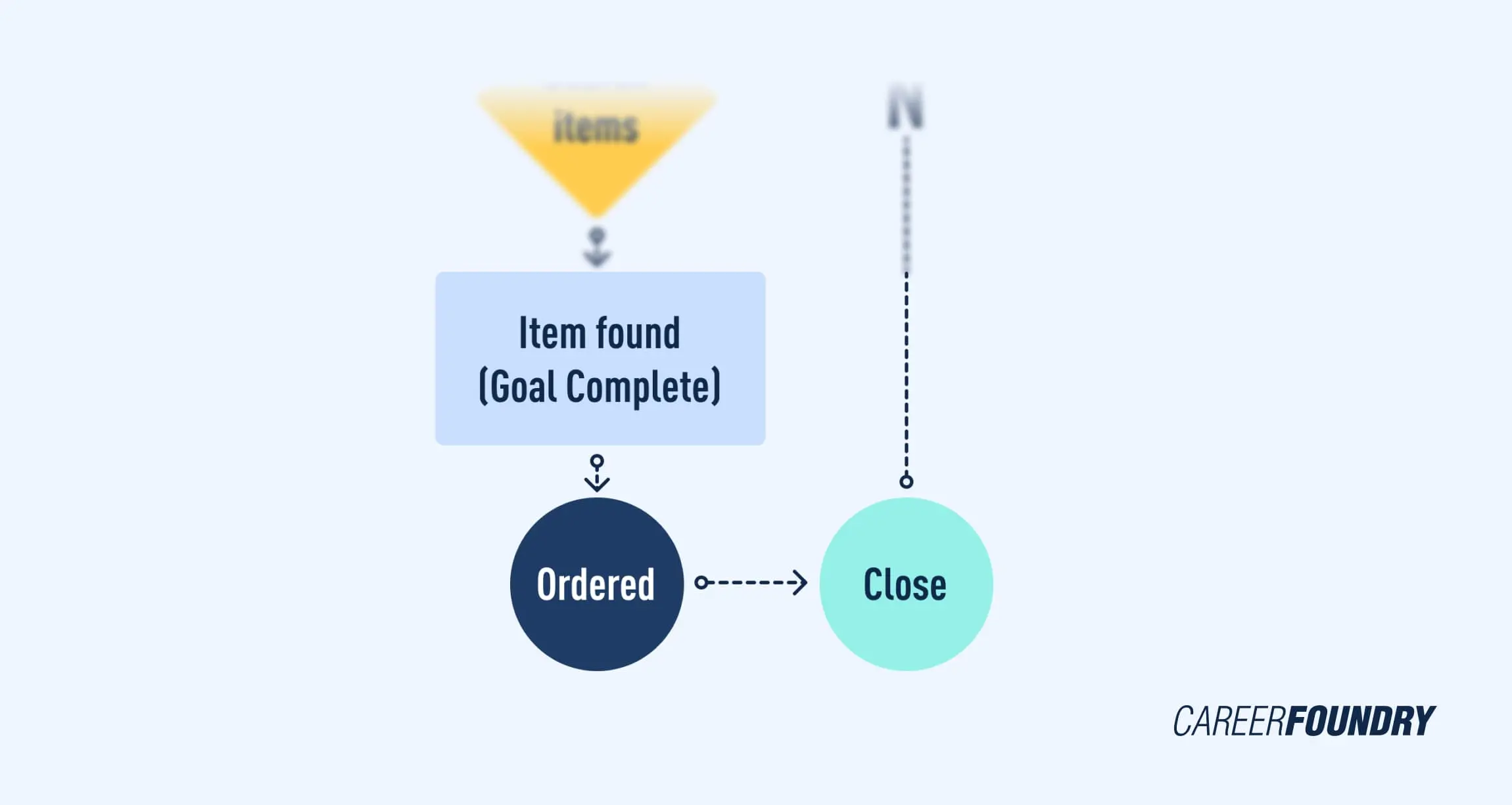
The final interaction is the final screen the user will see when they accomplish the desired task. What screen pops up last to inform them that the task is complete? An example of a final interaction for purchasing an item could be a confirmation screen to inform you that your order has been received. Another example of a final interaction is when completing signing up for an account. Is it best for your product to end with immediate access to the homepage, or would the login page be a better last step?
3. Define the elements of your user flow
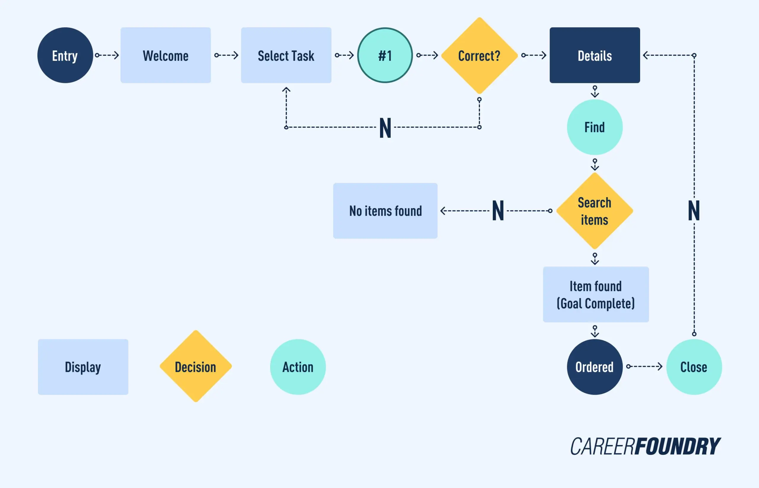
Designers use various shapes and colors to represent a unique set of elements within the interface. Each shape is an interaction or possible interaction and gives the reader more information about what is happening in a particular step. Some shapes are flexible and can be used for multiple actions, like using circles to represent entry/exit points or a connection to a different webpage or screen. Adding a key or legend to your user flow can help your colleagues and clients to better interpret and grasp your diagram. Below, we break down some of the most common shapes used within the industry and when to use them.
Rectangle

The rectangle is arguably the most common shape used in user flows. They usually represent a page or display screen. Unlike circles, there is no action to be taken. Rectangles are best used when depicting things like a homepage, onboarding screen, confirmation page, etc.
Lines with arrows
This is probably the most important part of the user flow as the lines with arrows tie everything together and determine the flow through the chart. Lines with arrows take the reader through the chart from shape to shape, top to bottom, or left to right.
Circle

The circle is used mostly for displaying an action. They show a task that must be completed or steps that must be taken. Use a circle when you want to represent a process, task, or operation. To help determine if you are using a circle properly, check how it is being labeled. Circles are almost always labeled with a verb like “Select Item” or “Send Order”.
Diamonds
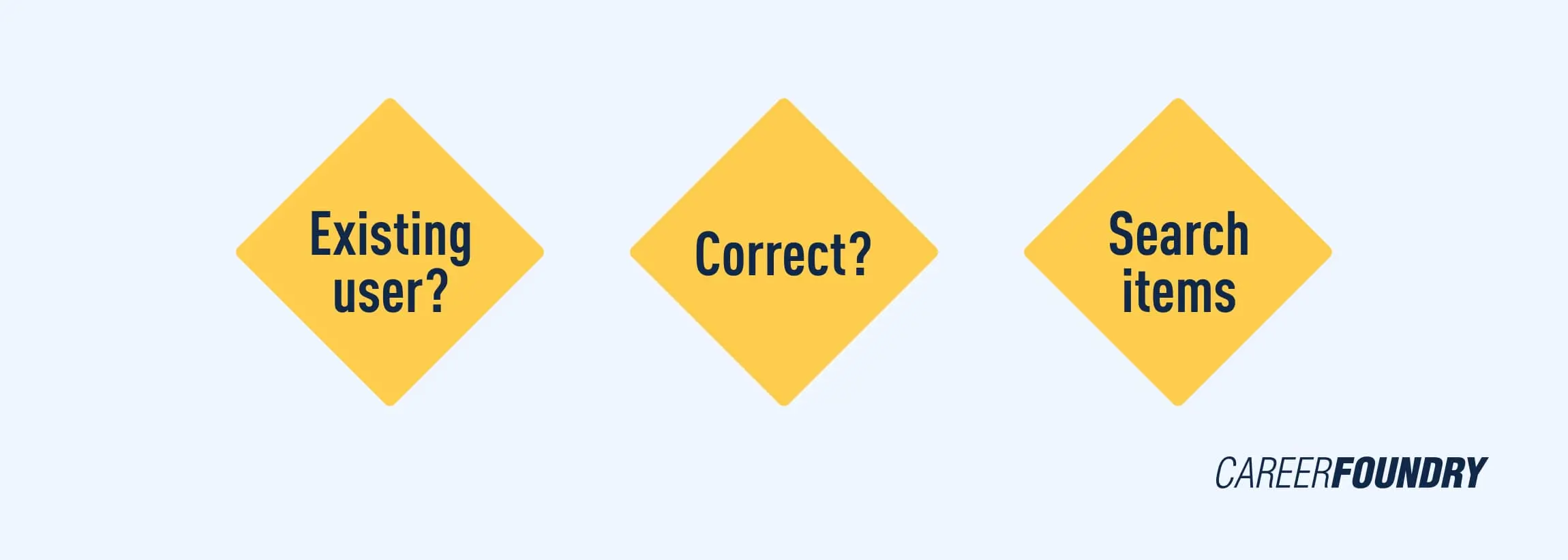
Commonly termed a “decision diamond”, this shape always asks a question. While other shapes may be interchanged for different purposes, the diamond is consistently used to show when a decision needs to be made. The possible answers to the question being asked are represented by the lines extending out of the diamond and determine which path to follow. For instance, you might ask questions like “Do you have an account?” or “Is this correct?” with yes and no arrows extending from each.
It’s important to remember that there is no set rule or guideline for how to create a user flow, and one person’s flow chart may look different from the next. As long as you are consistent with your shapes and the reader can follow and understand the flow, you should have a successful user flow.
4. Refine your outline
The same principles you follow when designing an interface can and should be applied when designing a UX flowchart. Here are our top three must-apply UI design principles.
Make labels meaningful
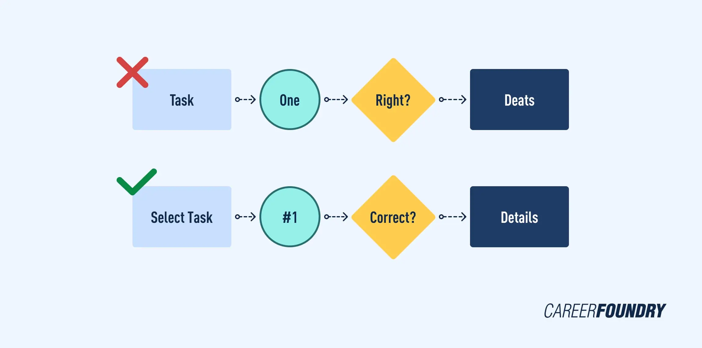
Labels are the reader’s lifeline when going through the user flow. The most important label is the flowchart’s title. Try to use a title that describes exactly what the user flow represents. If you’re not sure if your title is clear, get a colleague to read it over. If they can’t tell you what the flowchart is for, you may want to redo it. Additionally, avoid using all capital letters within labels as this has been shown to decrease readability.
Choose colors wisely
The main purpose of color in a UX flowchart should be to help the reader identify and group resources as well as highlight important user actions. Colors are best used as a coding system rather than for styling.

Be consistent with the visual structure
Keeping your visual structure consistent can help ensure that your user flow is easy to follow and isn’t misleading. For instance, shapes and line elements should always be used for the same purpose and accompanied by a key or legend.
Additionally, consider how you use the real estate of your design. Position elements on the screen logically and consistently for an uncluttered design. Most design tools (including Justinmind) have rulers and grids to help you align the elements on the screen.

5. Creating a user flow: What happens next?
And that’s the long and short of how to create a user flow. In UX, a user flow is a great way to put yourself in the user’s shoes and ensure that your product prioritizes their needs. User flows are also important from a strategic standpoint and are commonly used in UX audits. Making a flowchart at the beginning of the design process can reduce the risk of misunderstanding about design specifications and the need for rework. User flows are often provided with your deliverables to the design team or your client to provide a visual representation of how the product will flow.
When it comes to mastering user experience, there’s absolutely no substitute for practice. Designing effective flows takes time and repetition. Practice making user flows of existing websites or applications to refine your UX skills. If you need a place to start, there are many free user flow templates online.
Want to learn more about the UX design process? Check out the following articles:
