Maybe you’re still looking for that first UX writing job. Or perhaps you’ve made it—you landed the job, and you’re part of the product team. You have, or soon will have, a seat at the table, but you also have all the responsibility and influence that comes along with that.
This means you really need to be at the top of your UX writing game. But how can you do that? In this article, we’ll give you a look at some of the top UX writing practices to focus on in 2025.
- Conversation Mining: What it is and how to do it
- Copy Management: Enhance productivity with copy docs
- Transactional emails: What they are and how to make the most of them
- Design Tools: They aren’t just for designers
- Conclusion
1. Conversation Mining: What it is and how to do it
It seems like there are millions of names for the practice, but we like the term conversation mining since it’s self-explanatory. But no matter the name, the idea is the same: dig into your users’ conversations, wherever they’re having them, and grab words with both hands.
After all, if our aim is to create a conversational user interface, then what better way to do so than by using the words our users use in actual conversations?
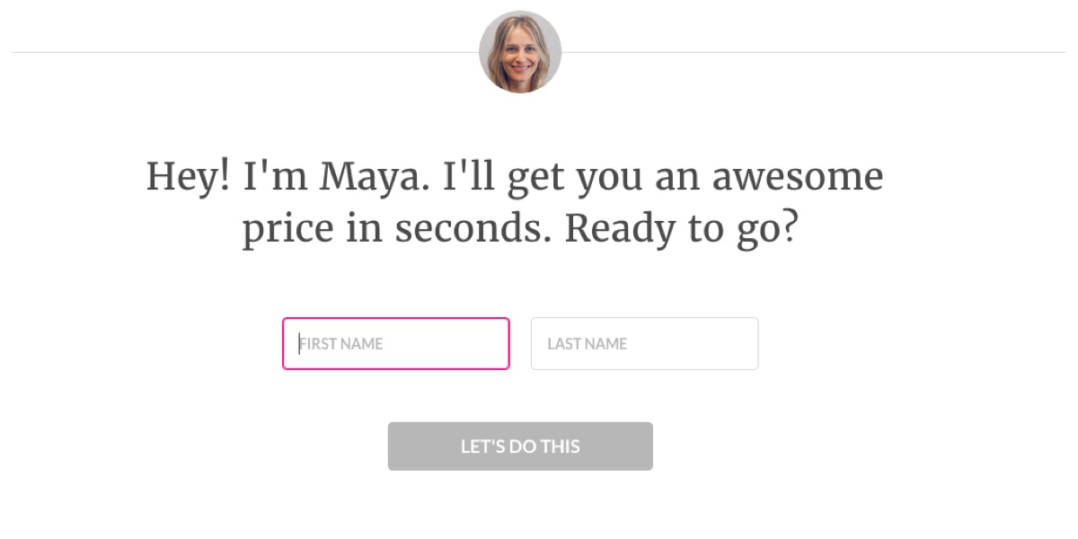
(Example from Lemonade)
For example, let’s say you work for a fashion e-commerce site such as Nasty Gal. You go online and see that someone in your target audience left a popular comment that said, “these pants are SO BOSSY” So, instead of writing “Shop now” you’ll write “So Bossy Tailored Tapered Pants.” Sometimes, it’s as easy as that.

Conversation mining is more than just finding good one-liners, though. We also use it to understand our users’ lingo, explore their pain points, and understand their goals—and, as a result, to give us direction in our general content strategy exploration.
![Fibery.io example (screenshot) Text over graphic background: "Yet another collaboration tool. Claims to be all-in-one, is mediocre at everything. [Sign up anyway]"](https://careerfoundry.com/wp-content/uploads/old-blog-uploads/fiberyio.jpg)
(Example from fibery.io)
To get started with conversation mining, you’ll have to know a bit about your users and target audience. If you’ve already built user personas, that’s great—you probably already have an idea of where your users might gather online. If you don’t have personas built yet, look at any data you do have. Look for the places where you would find them sharing conversations, then dig in and start collecting the words and phrases you want to use in your work.

(Example from Dollar Shave Club)
If you want to learn more about conversation mining, join a free UX writing course with UX Writing Hub.
2. Copy Management: Enhance productivity with copy docs
Newsflash! Part of being a professional UX writer is keeping your copy organized. In reality, a huge part of the job is effectively communicating your decisions. This means you need some kind of system to manage your copy and keep your workflow efficient.
There are countless design tools, localization tools, and text editors out there. But if you don’t use them—and use them well—you’ll soon find your copy is all over the place.
A while back, I had a fantastic chat with Matt Hays on my Writers in Tech podcast. Matt organizes his copy using spreadsheets.
His process is all about creating different content elements and explaining the rationale behind them in a separate column. It’s been our most listened-to episode and many UX writers have mentioned that they’ve implemented the method.
Another way to manage your copy is by using copy docs—a method developed by Andrea from Dropbox. Basically, she takes a sheet of content exploration and connects it to a document that adds ads clarity and context to the project.
If you want to take your copy management even further, try using a tool called Airtable.
I use it regularly now—it’s more or less a spreadsheet app on steroids and has outstanding UX. You can use it for pretty much anything these days—from user research all the way to delivering copy to your design or development team.

(Example of Airtable setup by Yuval from UX Writing Hub)
As a project gets bigger, so does the need to keep your copy and microcopy organized. For example, let’s say you decided to create 10 different copy docs for 10 different scenarios in your product. You can segment and manage them using a tool like Airtable, which will give you an efficient and clear way to present your findings and work.
In addition, you can use these spreadsheets to link to a specific Figma (or any design tool) file so you could visual your content as well.
Whichever you choose, remember to be consistent and really put the method into practice. You, and your team, will be glad you did.
3. Transactional Emails: What they are and how to make the most of them
The role of a UX writer isn’t limited to microcopy; you’re probably going to have to write longer pieces of copy at some point. This is likely to include transactional emails. These are a type of automated and segmented email that’s triggered by some type of event, usually the user taking some type of action in the product. Think of them as the company sending the right email at the right time.
Recently, I noticed a very well-crafted example by a meditation app I use called Headspace. Not long after finishing a meditation—the event that triggered the email—I received the following message. Let’s break it down.
First off, notice how they put an emoji in the headline? This is a great way to increase the email’s open rate. Then, look at how the copy is always consistent with their brand voice.
![Screenshot of email title "It's nice to be nice [orange heart emoji]"](https://careerfoundry.com/wp-content/uploads/old-blog-uploads/seg1.jpg)
Most of the meditations I’ve done lately on headspace have focused on being kind and compassionate, so I get the feeling that this is a highly customized message.
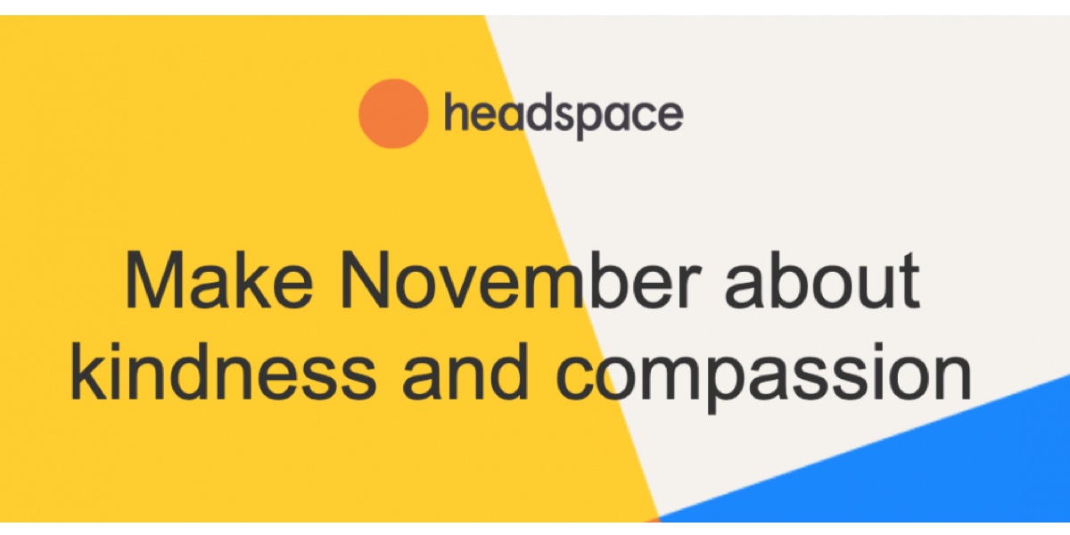
Next, we’ve got some gamification that makes me feel proud about using their product, followed by a clear CTA that brings me back to the app. Even if it doesn’t happen right away, this email greatly increases the chances that I’ll open the app again at some point in the day.
![Email screenshot Features text: "Your lifetime stats: You've meditated 914 minutes in 77 sessions. In this busy time of year, it's hard finding time to stop and appreciate the people around us. But all of our relationships deserve care and compassion, including the one with ourselves. Practice showing kindness with Headspace this month--it goes a long way. [MEDITATE NOW]"](https://careerfoundry.com/wp-content/uploads/old-blog-uploads/seg3.jpg)
Finally, some extra testimonials for a bit of credibility.
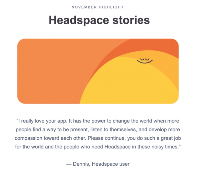
Pretty awesome and effective email that’s full of fantastic copy!
In a recent post, Jim Gallant wrote about the differences between marketing emails and transactional emails. According to Jim, the job of transactional emails is to inform or educate customers by acknowledging their purchases or other actions, providing shipping details, alerting them to events, sharing product updates, and helping them learn to use products quickly.
So take this tip: when you’re dealing with hyper-segmentation, make your copy shine and your emails transactional.
4. Design Tools: They aren’t just for designers
Repeat after me: “Writers are designers, too!”
The term “UX” and the various titles the writers working in tech have acquired is one of the biggest missed-high-fives in tech history.
Visual designers move pixels around to create their designs; content designers and UX writers craft their designs with words.
You see, design isn’t necessarily the art of making something look nice. It’s the art of making things that function well. And this is the job of writers and visual designers, since both the words and the visual elements are part of the product that’s being designed.
So product designers may use words or they may use pixels—either way, they’re still designers.
Got it? Good.
The practice of UX writing is often called content design exactly for that reason. If you want to sharpen these skills a bit more, we’ve created a guide to some content design courses you can take to brush up. This is why I believe that in order for all product team members to be on the same page, writers should know how to work with design tools.
A piece of microcopy may look great in a plain text document, but put it into a design and it might not make a lot of sense. If writers just make a small effort to see what their microcopy might look like as part of a basic visual design, they both become better UX writers and save the whole team a lot of time.
Today, there are cloud-based design tools, such as Figma, that allow you to design collaboratively and share specific screens (they’re called “frames” in Figma) in your copy management documents. This ease in collaboration helps alleviate much of the typical friction between copy and design. That means there’s no need to fight about which will come first since both can be addressed together in real-time! Your life as a product writer has never been easier.
If you want to sharpen your UX writing skills in 2025, learning to work with design tools is a must. Some other great tools you might see your product team using include Sketch, UXPin, and many others. My list of the top 22 prototyping tools is a great place to start.
5. Conclusion
If you’re kicking off 2025 as a (hopeful) UX writer, make sure you are on top of your copy game by managing some killer copy documents, mapping touchpoints for transactional emails, and learning how to work with design tools.
If you want to learn how to incorporate these methodologies into your workflow, you should definitely check out the free UX writing course with UX Writing Hub. And if you’re just starting to explore UX writing courses, get an inside look the experience right here: I Took the Course at UX Writing Hub—Here’s My Honest Review.
Want to learn more about UX writing? Check out these articles:
