As a new or experienced UXer, you know (or will certainly learn) that the copy that appears within digital products and experiences has the power to make or break the overall user experience.
This is as true for the copy that winds up on buttons and tooltips, as it is for the copy that appears on the product page of your website.
But writing a good product page isn’t as simple as writing a list of product features. There’s a bit more to it than that—which is why it’s good to have some pro tips and advice to follow along the way.
Join in on the conversation I recently had with Orlee Gillis, a writer at Elementor. Orlee is a UX writing pro with a wealth of knowledge and insight on how to write an awesome product page. Here’s what we talked about:
1. Meet UX writer Orlee Gillis
2. How does product page writing differ from other types of writing?
3. What should be your main focus when writing a product page?
4. Do you have any tips for implementing your brand’s voice and tone in a product page?
5. Can you give us a few examples of well-written, unique product pages?
6. What are the biggest challenges in writing a product page?
7. What are three things you should avoid at all costs when creating a product page?
Meet UX writer Orlee Gillis
Hi Orlee, thank you for taking the time to do this interview for UX Writing Hub. Let’s start with who you are and what you do.
Hi, I’m Orlee Gillis, a UX writer at Elementor. I’m based in Tel Aviv, Israel. I’m passionate about the fields of UX and writing and how they’ve merged together over the years. I’m also, as you know, a loyal member of the UX Writing Hub community, and am learning so much from your awesome team.
A bit about Elementor, in a nutshell:
Elementor is the leading website builder platform for professionals on WordPress.
Elementor is a pixel-perfect, code-free website building platform. It consists of hundreds of widgets, integrations, templates and features allowing the most versatile, and, mobile-first building capability for professionals.
Our thriving user community includes web professionals—including developers, designers, and marketers—and boasts a new website created every 10 seconds on its platform.
And some background about how we write product pages at Elementor and the significance they have in our marketing and strategic goals:
Elementor is an all-in-one solution that encompasses many different solutions that serve different purposes—from forms, sliders, popups, animations, and more.
This is why it is important to be able to explain in detail each feature. Sometimes the user needs Elementor for a specific purpose, and needs to know if Elementor is able to get the job done.
Thanks, Orlee. Now, for our product page questions and answers.
How does product page writing differ from other types of writing?
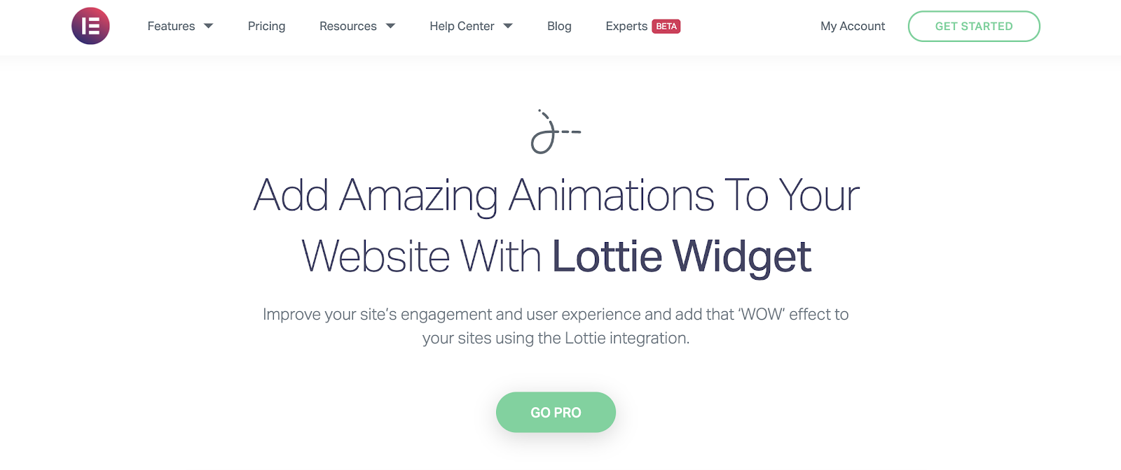
This is a crucial question for UX writers to understand. I can share some of our recent work at Elementor as a good example of how product page writing and article writing are different from each other.
We recently crafted a product page for our Lottie widget, one of the latest features we’ve added to the Elementor Editor.
For our hero text, the objective was to capture the added value of the widget in nine words alone. Essentially, you’re answering an unspoken question: “How will your product help me?” is basically what you need to answer.
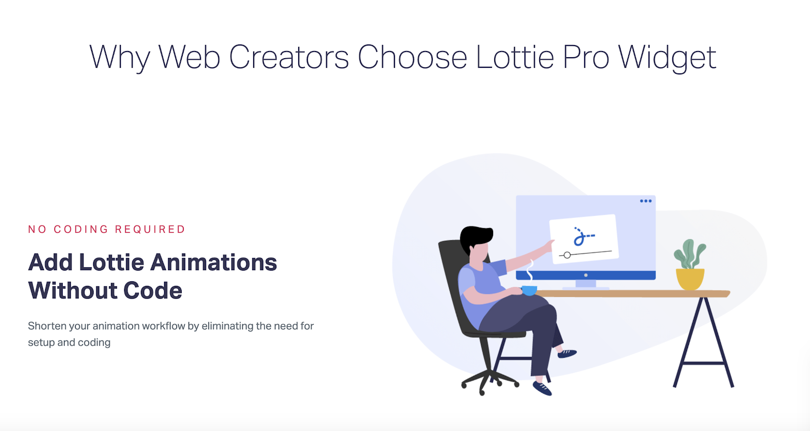
As you proceed down the page, the headings and subheadings which we placed throughout the page are qualifying our first statement. They are answering a refined version of our original ‘how will it help me?’ question, which is, in the first example, “What can I do with your product?”
Our opening statement is the beginning and the end of our story, whereas our content in blog posts or articles open with an introduction, and tell a lengthy story of insight and information about a certain topic or experience, and finally, finish with a conclusion.
The key difference in this sense is that with blog articles, you can’t appreciate the full picture or the conclusion unless you’ve read the beginning as well as the body of the article. With a product page, you’re capturing the entire story in very few words or statements—and each word or statement is representative of the bigger picture.
What should be your main focus when writing a product page?

The main focus when writing a product page can be summed up into two words: differentiation and delight.
What is differentiation?
Product differentiation is the process of distinguishing a product or service from others. This often means identifying the characteristics or qualities that set your product apart from its competitors, and in turn, what it has to offer customers that they can’t find in another product.
You’re answering questions such as:
- “What makes your product different?”
- “How will it enhance my life in a way that other products can’t?”
That’s exactly what you want to convey when choosing words for your product page’s microcopy.
What is user delight?
We can think of user delight as the experience a member of your target audience will have when they realize that your product addresses their pain point. Once they understand how your product is different from the other ones they’ve tried, they finally hit their “bullseye.” That’s when they’re delighted.
Do you have any tips for implementing your brand’s voice and tone in a product page?
The way I see it is that a brand’s voice and tone is really a construct of who their target audience is.
For example, because Elementor’s user base is generally professional web designers who have a decent amount of experience with WordPress, we use terminology that designers will be familiar with, as well as WordPress jargon that will be easy for them to understand.
The style of our brand’s copy on product pages is short sentences that are brief, yet informative—and that, despite being brief, will provide our users with a thorough understanding of each product feature.
We make sure to express all the capabilities the product enables in an easy-to-scan format, finding a balance between summarizing a lot of information on one page without going into too much detail.
All this being said, Elementor is actually going through a rebranding process at the moment, so many of these pages will be changed in the near future. Stay tuned!
Can you give us a few examples of well-written, unique product pages?
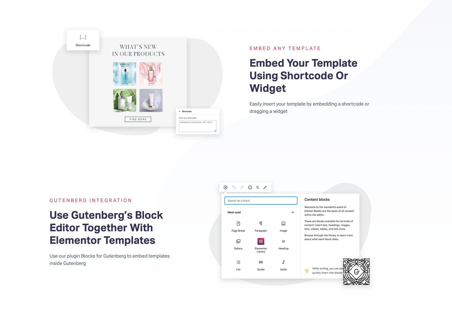
Yes, sure. We recently released Elementor 2.10, which includes two brand new features: Multi-Step Forms and Lottie widget.
Both of these features required new or revised product pages. When crafting the microcopy for these pages, we needed to choose our words very carefully, given the technical nature of the new features.
This is where we hone in on the feature’s added value and ‘bottom line benefit’ for the user, so that every visitor can gain a precise understanding of what the feature (or product) has to offer them and how it will make a difference in their design workflow.
Here’s the new product page for the Multi-Step Forms feature:

What are the biggest challenges in writing a product page?
The first thing that comes to mind is learning to consider microcopy as a brand asset.
Once you receive a wireframe from your colleagues on the product team, you’ll most likely be given a list of well-defined design specifications that indicate the designated areas on the screen or artboard for where there need to be titles, descriptions, button texts, tooltips, etc.
It’s also likely that there will be detailed layout guidelines that will dictate how wide each margin and column should be and what the brand’s grid dimensions are.
You’ll also be given specific font sizes for each type of text element, which will be decided on based on the UX/UI design strategy.
And that’s another challenge—adhering to the information architecture that your words are expected to follow. This is a key component of the messaging to be conveyed in your product page.
These design specifications will very often create some very specific parameters that your writing will need to accommodate, such as:
- A certain line or paragraph width
- Specified CPL (character-per-line count)
- A specified line height
- Specified letter spacing
- Overall word count
But what are these limitations based on? Are they really necessary? Why are there so many rules?
We all know how important layout and alignment are to visual hierarchy.
When you need your heading, your paragraph, and your CTA button to be center-aligned, you’ll want each line to be a certain width, and you could easily be limited to a number of characters that can fit on that line—dependent on the typeface, font size, etc.
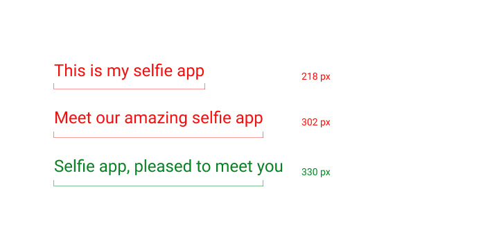
Let’s take a hypothetical example. You’re writing copy for a selfie app. Your task is to devise a sentence for the header that briefly represents what your product is.
Due to design constraints, your header text needs to be sized at 24px, and its line width at 330px. Crafting a header that ticks all of these boxes isn’t as easy as it might sound!
What are three things you should avoid at all costs when creating a product page?
Great question.
1. Extreme superlatives
Avoid using the word “best” when describing your product. This doesn’t mean your product isn’t the best of its kind on the market, but you/your brand shouldn’t need to tell people that it’s the best. You need to show it, or even prove it.
Which of these options do you think has stronger resonance?
“We are the best selfie app on the market” or “The selfie app that users love and cherish”?
When you use concrete words that represent real emotions, such as ‘love’ and ‘cherish’, you’re much more likely to make a lasting impression on whoever is reading your microcopy.
2. Being too vague
Being too vague often steers both the writer and the reader away from the substance of the idea they’re looking to represent.
For example, let’s say a user encounters an error message that appears when they’re trying to sign in to a paid online account—when the form of payment has expired.
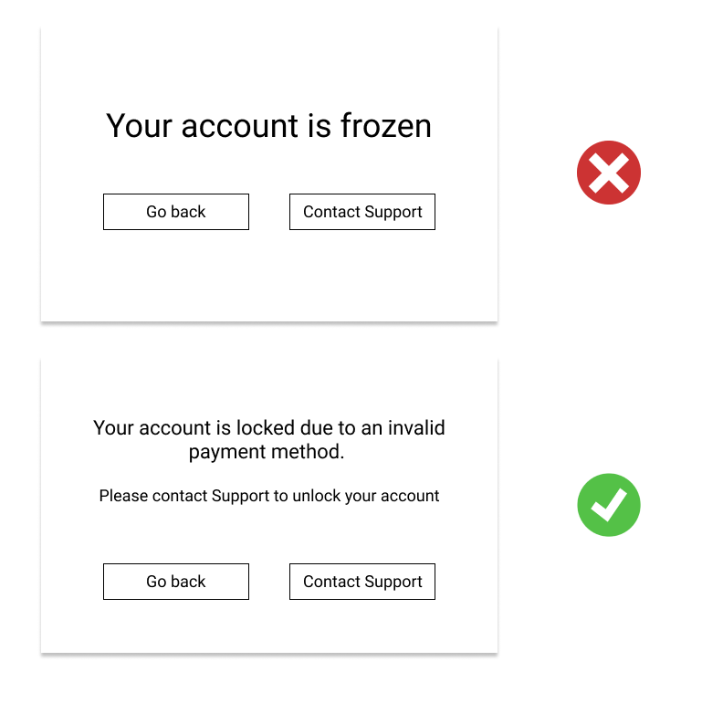
If the user gets an error message that reads: “Your account is frozen,” they won’t understand, at least not intuitively, what the next course of action should be. Should they message support? Should they reset the password? It really isn’t clear.
Alternatively, if the user’s account is frozen and they needs to contact support in order to resolve the issue, it would be much clearer and more informative if the error message read something like this:
“Your account is locked due to an invalid payment method. Please contact support to unlock your account.”
This way, the user knows exactly what to do, and is much more likely to follow through in order to provide an updated method of payment and continue being a customer.
3. “Don’t Make Me Think”
You may have heard of the book Don’t Make Me Think by Steve Krug, a classic work of UX literature that discusses how to make user experiences more simple and accessible to users. One of the key concepts in this book is that things should be obvious to the user—they should be self-explanatory.
This is where the expression “don’t make me think” comes in. People want to understand which immediate action items exist on the screen they’re looking at, and they don’t want to waste any time. Too much thinking means too much time. And nowadays, users expect simple yet speedy user flows that get them straight to the point.
Let’s start writing
We hope this Q&A has given you some helpful tips on writing your next product page. Let us know how it goes!
The irony of the UX Writing field is that although it’s a relatively new concept and subject area, it’s an incredibly in-depth, robust domain that’s already packed with tons of resources, materials, and influencers. Based on the richness of the field, you’d think it had been around for centuries.
If you’d like to learn more about UX writing, take UX Writing Hub’s free UX Writing module and check out these articles:
