From grand buildings to mechanical novelties and even digital realities, some of the most prestigious designers in history have used one key principle to create life-changing designs: keep it simple.
Commonly phrased as “keep it simple, stupid” (KISS), this idea of keeping design elements limited to the essentials has benefits for both the designer and the user.
By getting rid of the unnecessary, you leave space to perfect exactly what the user needs to achieve their goal.
While keeping things simple sounds, well, simple, it can be difficult to determine exactly what a design needs, versus what can be left out. In this article, we’ll clarify the details of the KISS principle and how to use it. Here’s what we’ll cover:
- What is Keep it Simple, Stupid (The KISS principle)?
- How to apply the KISS principle to UX design
- Great UX examples of KISS in action
- Key takeaways
Let’s get started!
1. What is Keep it Simple, Stupid (The KISS principle)?
The concept of simplicity has long been associated with sophistication, refinement, and efficiency. It’s common for artists and designers to mention its importance when creating successful works.
However, the exact phrase “keep it simple, stupid” is thought to have been conceived by an engineer named Kelley Johnson. Johnson was the lead engineer at Lockheed Skunkworks, an aircraft manufacturer responsible for designing revolutionary spy planes, hyper and supersonic technologies, and more.
But how can the design of flying machines for war and reconnaissance be simple? Well, Johnson explained the principle to his team using an easily imagined scenario.
He asked his fellow designers to think of the setting in which their products would be used—a war-torn battlefield or a basic mechanics garage.
Anything they designed should be able to be fixed and operated by novice pilots and mechanics in precarious and rudimentary situations. Anything more would render their designs futile and potentially life-threatening.
Since the birth of the phrase, the KISS principle has been adopted by a wide variety of industries like product design, education, software engineering, healthcare, and more. What’s apparent in each industry is the fact that unnecessary complexities and overcomplicated features can often render designs unusable.
However, this is not to say that designers must avoid complexity in total. When it comes to designing for intricate beings like us humans, complexities are bound to arise. But it is the way in which complex designs can be refined and made accessible to the user that separates a successful product from an unusable one.
2. How to apply the KISS principle to UX design
Often when we start designing an experience for a specific group of users, there are many preconceived ideas of what they might need or want. It can be easy for designers to let their own imaginations and ambitions take over. However, this can frequently lead to overcomplicating a product for the sake of flare and pizazz or an impressive portfolio piece.
While there are many factors to consider when designing an experience for users, one of the best ways to keep the KISS principle in your UX designs is to work backward.
Instead of starting at the beginning and brainstorming a wide range of possible solutions, designers can conceptualize their users interacting with the final product and finding everything they needed to fulfill their goal in an easy, effortless, and enjoyable way.
For instance, a designer may find the addition of a novel 3D animation to be an alluring and enticing feature. While the impressive graphic might lure the user, if the animations do not offer an intuitive path to the end goal, the feature may become an annoyance to the user, pushing them to abandon the product altogether.
KISS and the Minimum Viable Product
A great way to see the application of the KISS principle in UX design is by looking at the minimum viable product (MVP). An MVP is defined as a basic version of a product that contains just enough for the product to be used by early users. The MVP is then adapted and improved upon after testing and customer feedback.
Therefore, the creation of an MVP employs the KISS principle by focusing on only what is needed for the user to successfully and easily solve their problem.
To create an MVP, designers follow a step-by-step approach that goes a bit like this:
- Research the users and the problem they are facing
- Determine the value of the product
- Find only what is needed to solve the problem (via user flows)
- Prioritize integrating the most wanted features
- Launch MVP: Build, measure, learn
The creation of an MVP is by no means the stopping point for designing an intuitive product. Once the MVP is created, more user testing and research are conducted to determine what can be added or altered for greater user enjoyment and engagement.
3. Great UX examples of KISS in action
Below are a few great product designs that showcase how successful keeping it simple can be.
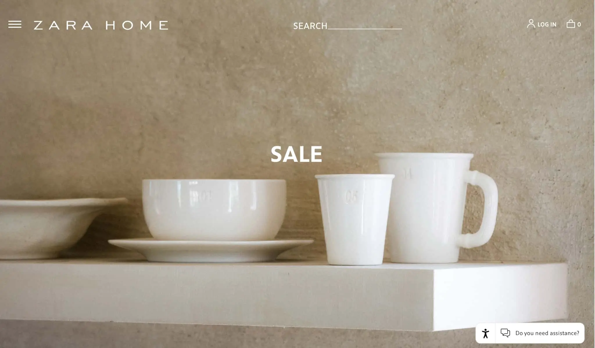
Zara homepage

The fashion industry has often held sophistication in high regard. It only makes sense that a simple yet high-end company like Zara reflects this in their online experiences.
As you can see, their homepage is relatively minimalist yet contains a number of imperative features like a simple menu, search bar, login link, access to the shopping cart, and a basic call to action.
The site provides only what is needed to navigate the site, yet it doesn’t feel lacking or unimpressive.
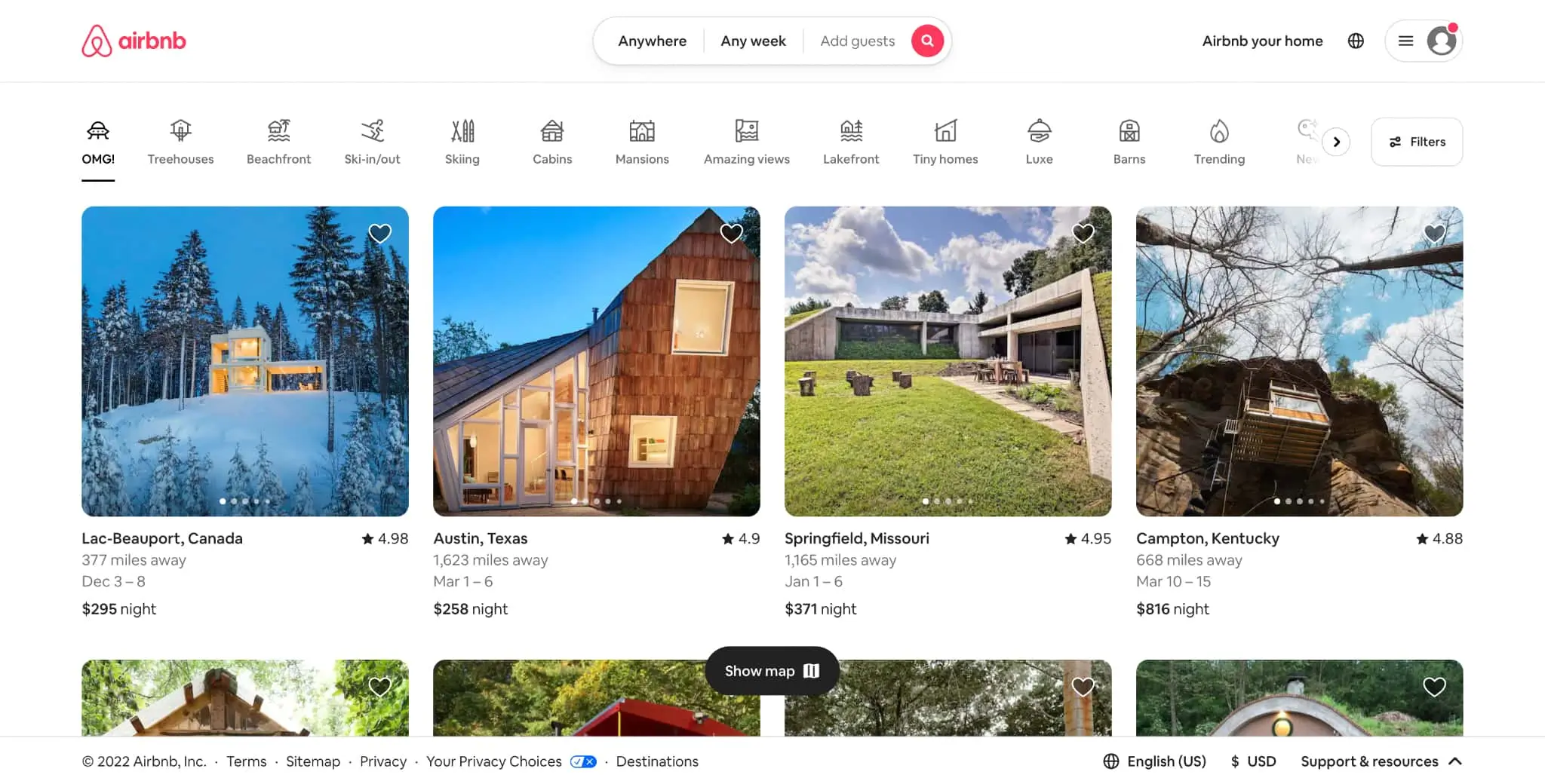
Airbnb homepage

The homepage of vacation rental giant Airbnb is a great example of things that can look alluring and complex, but function very simply and intuitively. Users can access everything they need from one space, while feeling like they have many options and places to explore.
The input fields to search for a destination are easily identified and the icons used to display search categories are intriguing and easy to decipher.
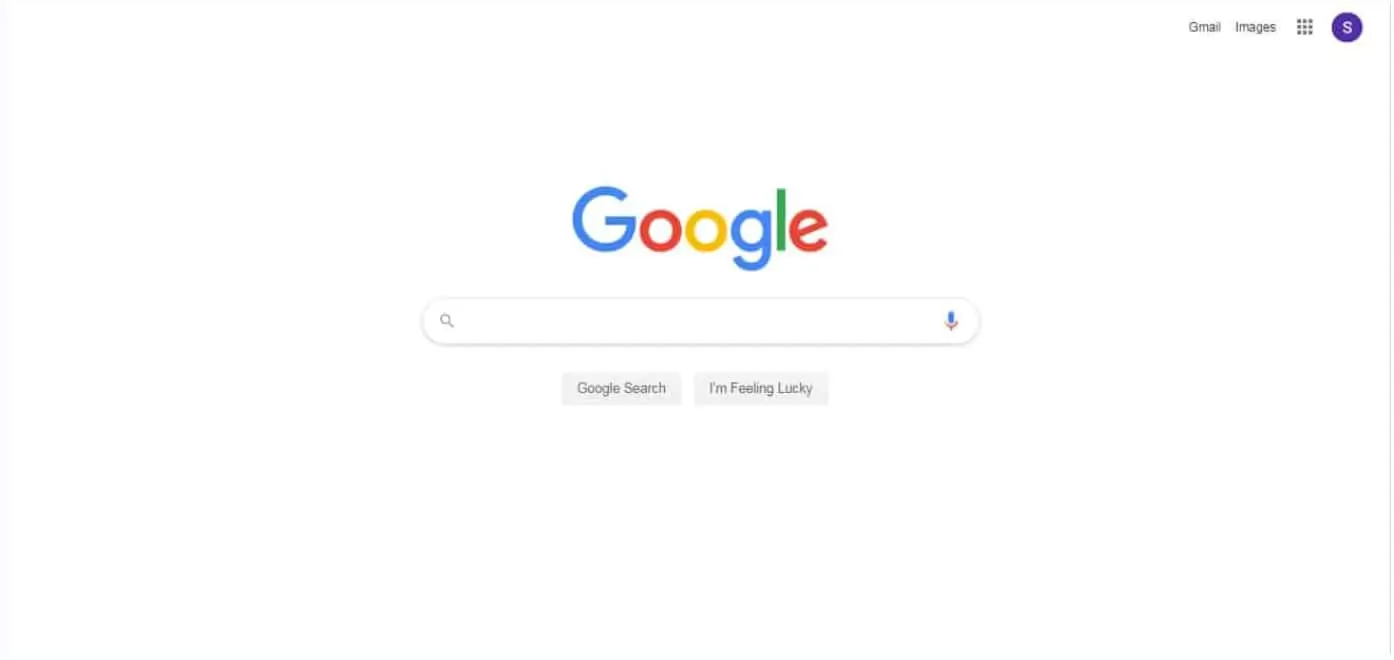
Google homepage

Since its inception, the Google homepage has remained simple and intuitive, which has led to its worldwide success. Onboarding isn’t necessary for users to understand how to navigate such a powerful and encompassing search engine.
The main functions are center-stage with easily interpreted icons for the other priority features.
4. Key takeaways
It’s easy for designers to get swept up in the latest, trending color palettes, animations, and 3D design software.
These may seem like exciting advancements to engage users and attract interest. However, if the simple features needed for them to reach their goals are clouded, overcomplicated, or absent, then product use is likely to decrease and company goals will likely go unmet.
The KISS principle helps designers keep simplicity and accessibility at the forefront of their minds when designing for users from diverse backgrounds.
If you want to learn more about other ways to offer accessible and effective design, be sure to check out our free, introductory UX short course.
And if you want to read more about the other important principles of design and their impact on UX design you might be interested in these articles.
