When it comes to designing a product, understanding how your users behave and perceive the world around them makes all the difference.
As user experience (UX) designers, it’s essential that we design with real users in mind. We need to cast our own assumptions aside and really step into our users’ shoes.
To do so, we observe our target users and try to figure out the motivations behind their actions—a bit like psychologists!
And, believe it or not, we can leverage psychology principles to help us create effective and pleasurable experiences. In this guide, I’ll take you through ten key psychology principles every designer should know. If you want to skip ahead to a particular principle, just use the clickable menu below.
- Hick’s Law
- Jakob’s Law
- Miller’s Law
- Gestalt Principles
- Color Psychology
- Mental Models
- The Von Restorff Effect
- Fitts’s Law
- Peak-End Rule
- The Aesthetic Usability Effect
Ready to become a better UX designer? Let’s dive in!
1. Hick’s Law
“Hick’s law, or the Hick–Hyman law, describes the time it takes for a person to make a decision as a result of the possible choices he or she has: increasing the number of choices will increase the decision time logarithmically. The Hick–Hyman law assesses cognitive information capacity in choice reaction experiments. The amount of time taken to process a certain amount of bits in the Hick–Hyman law is known as the rate of gain of information.”—Wikipedia
Ever walked into a sneaker store and felt completely overwhelmed by the infinite number of choices? Are you going with the red pair? Blue pair? What about the classic white?
Hick’s Law describes how we require more time to make a decision when we face numerous options. The more there is to pick from, the longer we’ll take to select.
Too many options, all styled to feel equally important, tend to overwhelm us. The classic example often cited in UX literature is the TV remote. Traditionally designed to feature every button on the planet, these gadgets often provide a frustrating experience (especially for my sweet grandparents!).
A few, clear options, on the other hand, provide a much better user experience. Think of the sleek and minimalist Apple TV remote.
But what happens when you’ve got a bunch of options, and all must be displayed? In these cases, we can:
- Prioritize recommended options visually and help partially digest content;
- Break the information up in steps;
- Test to validate that you need to present all options
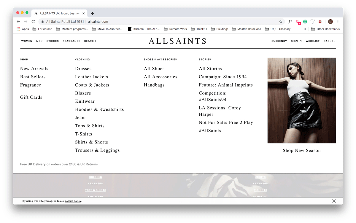
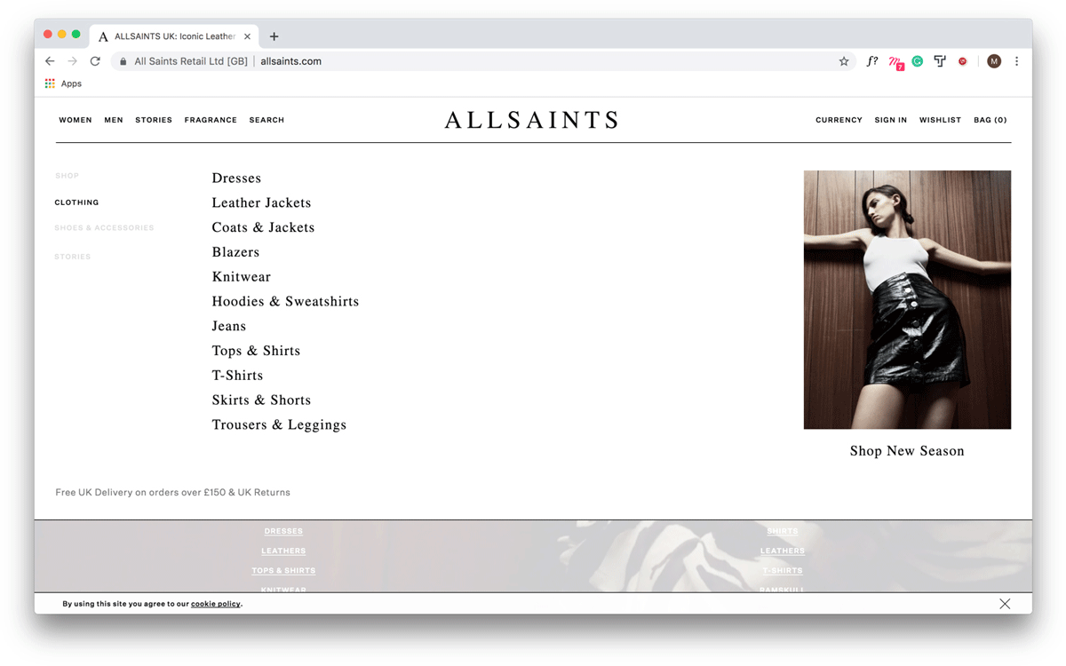
Hick’s law can be especially helpful when it comes to things like creating menus. Consider the large dropdown on the All Saints website below.

Here, links are grouped to facilitate browsing. However, the large number of options can begin to feel overwhelming. To help reduce friction and frustration, we’ve changed the layout of the menu below. Rather than displaying a sea of links, we only display relevant options when the user hovers over a category.

2. Jakob’s Law
As a young designer, it’s tempting to design a completely novel interface. However, an innovative approach can make for some pretty frustrated users.
Jakob Nielsen, principal of the Nielsen Norman Group, is the father of Jakob’s Law. In it, he states that users favor familiar experiences. They tend to prefer sites similar to those they’ve spent time on before. Because they already know how they work, they will require less effort to understand and will therefore feel familiar and comfy.
Does this mean you should set out to copy a popular site? Not quite. Instead, study the big names in the industry you’re designing for by conducting competitor analysis and focus on how your competitors design for similar needs.
If we were designing a new food delivery app, for example, we might want to check out Uber Eats, Grubhub, Deliveroo, and/or DoorDash. Our goal here is to identify popular structures within the industry we’re designing for. Aligning with them will help us prove user expectations right and create familiar experiences.
3. Miller’s Law
Land on a page that requires that you remember too much at a time and you’ll quickly check out. Why? There’s only so much information we are able to hold onto at a time.
Miller’s Law tells us we’re only able to keep around seven items in our working memory. Anything past this is tough to keep track of or recall.
Depending on the product you’re working on, presenting large sets of data or other information to users might be a routine part of your day. To help reduce cognitive load and create a more pleasurable experience, try chunking.
Content presented in groups of 5-7 bits at a time tends to be easier on our brains. That’s why remembering a phone number is easier if we break it up into buckets of 2, 3 or 4 digits.
Want to learn a bit more about the magical number seven? Then check out our full Miller’s Law guide.
4. Gestalt Principles
The Gestalt Principles describe how our minds have a tendency to group and organize elements in predictable ways. The ways in which our mind does so are summarized as the Gestalt Principles. The five Gestalt Principles are:
- Proximity
- Similarity
- Continuity
- Closure
- Connectedness
Take a deep dive into the 5 Gestalt Principles in our guide.
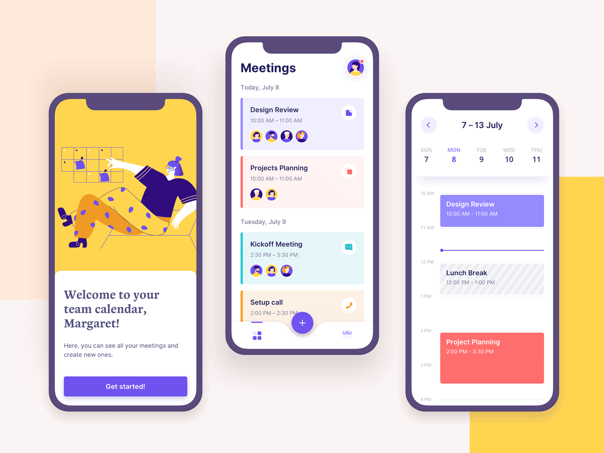
We can use Gestalt Principles to group related content and help organize it visually. Consider the shot below, by Valerya Nasikan.

Each meeting is made up of different elements, like a title, time, and attendee avatars. These elements are perceived as a group because they sit close to each other and are styled similarly.
5. Color Psychology
Color influences perception and feelings. In selecting colors for a brand, UI, or any kinds of product, be mindful of its meaning.
Take green, for example. It is ideal for anything that is good for our planet. However, it might not be the best fit for food. As with anything else, test your color choices to make sure they are working for you and not against you.
In addition to being associated with feelings and emotion, color can also help us communicate activity and states. Grays say “off” or inactive. Color, on the other hand, lets us know that an element is actionable or active.
You can learn more about color psychology in our guide to color theory in design.
6. Mental Models
A mental model describes what a user believes to be true about something. This something can be anything from an app to a doorknob. Mental models aren’t necessarily based on facts; rather, they are shaped by experience. Aligning with mental models helps us create products that are easier to use.
Research can help us understand mental models and how they might shape how users perceive our work. Designing with the “real world” in mind can also help prove users’ expectations right.
A great example of mental models are gestures. Swipes, pinches and taps have all been designed to mimic the actions and motions we use in real life to accomplish similar goals. Aligning with how we do things every day can help us design around mental models.
Another great example of how we can align with mental models is Material Design. It was designed after the physical world, helping us quickly understand how its many components behave.
You can learn more in this guide: What are mental models and how are they used in UX design?
7. The Von Restorff Effect
The Von Restorff Effect states that if we see a group of similar objects, we’ll often remember the one that differs from the others the most.
This principle makes all the difference when we’re trying to help users remember. Let’s say we’re working on a flight booking platform. We want users to recall bits of information, like seat selection, across different steps. Making them visually distinctive might just do the trick.
Think of it this way: differences highlight elements like color would. Anything we highlight we often wish to remember.
8. Fitts’s Law
Fitts’s Law states that the time it takes us to hit a target depends on how close it is to us and its size.
Following Fitts’s Law, size and distance are two key factors to consider in user interface (UI) design.
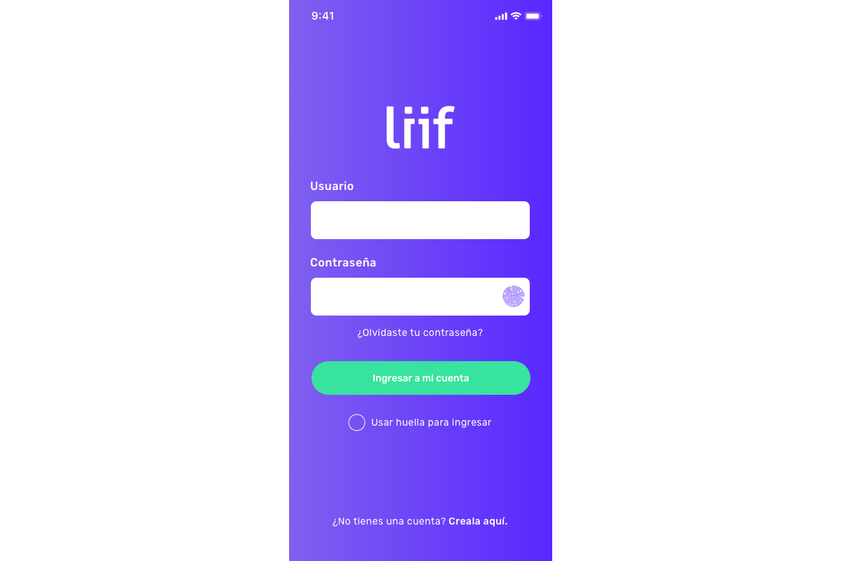
Consider the login screen below. Larger elements in it, like the input fields and button, will be easier to spot because they are larger.
They’ll also be easier to interact with because they are positioned in a region that will likely be close to the user’s thumbs.

If you’d like to learn more about just how this principle works, check out our full guide to Fitts’s Law.
9. Peak-End Rule
We’ll decide how we feel about an experience based on its peak and end. We will remember the “climax” of an experience and the very end over any other moment. It is worth noting that a digital experience can have multiple peaks rather than just one.
This rule can be a little abstract, so let’s walk through an example. Let’s pretend we’re designing a new online clothing store. The steps our users will likely go through as they shop are:
- Head to the store
- Browse through items
- Find a cool new garment
- Add it to cart
- Checkout and pay
- Receive a confirmation
In the list above, some steps will be more memorable than others. The moment we find the perfect new sweater or are entering billing details, for example, might be a little more special or intense. Keeping the PDP (or product detail page) and checkout in mind and designing them to be even more pleasant is then a top priority.
10. The Aesthetic Usability Effect
We tend to be more forgiving of usability issues if we like the visual design of a site. So what’s the problem here? A gorgeous UI can mask usability issues during testing. Left unresolved, these will generate problems down the line.
So how do we tackle this problem? I recommend testing with wireframes, preferably ones created with pencil and paper, very early on. This level of fidelity will help make sure users focus on how easy it is to use a product or why it is not rather than on a great illustration.
If you’re past this stage, watch your users closely as they complete tasks. Your users might not mention that they find a button hard to find, for example. But you’ll be able to notice their struggle as their cursor moves undecidedly.
Final thoughts
Now that you’ve learned about these ten psychology principles, make it a habit to observe them in action in apps and websites. Are any shaping how you interact with them? How so? Could any be used to improve the experience? Sometimes the best way to learn is through observation and the analysis of great examples. And keep exploring UX design laws and principles! Things like affordances, signifiers, and feedback, and the Paradox of Specificity are rooted in psychology, so understanding them will make you an even better designer!
If you’d like more tips and advice on improving your work as a UX designer, check out the following:
