If you’ve been wondering how to make your designs more intuitive or you’ve been wondering why you should opt for a more minimalist design, turn to the serial position effect. This is a design principle that helps you design products that are easy to use and optimized for your users’ attention span and memory capacity.
Have you ever thought about where the “home” button is located on the Instagram app? Ever noticed a sale featured in a banner at the top of a page? Or consider why all of the options on Amazon overwhelm you so you just pick the one that says “featured,” and move on with your life?
If you answered “no” to all of these questions, you’re among the majority. These user experiences were all designed so that you can think less and use (or buy) more. They were informed by the serial position effect. But what is this design principle? What does it look like in practice?
In this article, we’ll consider:
- What is the serial position effect?
- How does the serial position effect make a difference in UX?
- How the serial position effect can be used in UI
- What does the serial position effect look like in practice?
- Key takeaways
1. What is the serial position effect?
The serial position effect describes how a user’s memory is affected by the position of information in a sequence. Essentially, it’s the inclination of a person to recall the first and last items in a list more easily than the items in the middle of the list. This effect is based on two concepts: the primacy effect and the recency effect (we’ll look at these in just a moment).
Origins
The term “serial position effect” was coined by German psychologist Hermann Ebbinghaus in the 1800s. Experimental studies conducted by Ebbinghaus and his successors found that when someone was asked to recall a list of items in any order, most people began with the end of the list.
In fact, they recalled the items at the end of the list the best. The first few items in the list were recalled with the next most frequency and the items in the middle of the list were remembered least often.
Recency effect
The recency effect is a cognitive bias that results in a user recalling information that was presented at the beginning of a list better than information presented later on.
This effect can be reduced by presenting items more quickly and enhanced by presenting items more slowly. Psychologists believe that the items presented at the beginning of a list are effectively stored in long-term memory because they require a greater amount of processing.
Primacy effect
The primacy effect is another cognitive bias that causes users to recall items at the end of a list the best. This effect can be reduced by interfering tasks between the end of the list and the prompt for memory recall.
Psychologists theorize that items at the end of a list are still present in working memory when a person is asked to recall it. Another theory suggests that temporal context can be used as a retrieval clue.

2. How does the serial position effect make a difference in UX?
Understanding the limits of users’ short-term memory can dramatically help the usability of an application. Most users have a relatively short attention span. By using menus with just a few items or grouped options, you can help users navigate a website more quickly or choose a product quickly and easily.
You can utilize the serial position effect in your UX design by:
- Placing the most important items at the beginning or end of a list (i.e., in a navigation menu), and the less important items in the middle.
- Keep the most relevant information visible so that users don’t have to look for it or navigate through multiple options to find it. For example, rulers in photo editing applications and maps in video games might be more frequently used features, so keeping them visible will improve the overall UX.
The serial position effect can also affect your user research. Keep the primacy and recency effects in mind when you’re conducting surveys, especially if people need to choose from a long list. If you can, shuffle long lists for each survey response to nullify the potential error that these effects may induce.
3. How does the serial position effect make a difference in UI?
By integrating the serial position effect into your user interface design, you can make your application, game, or website much more functional and easy to use.
Most users have a small bank of short-term memory. In most cases, it’s better if the user’s brain power is used for making a purchase decision, consuming content, and other aspects of the user journey—not choosing an item from a menu.
In fact, if users find that a given digital product requires this kind of work to navigate, they’re likely to just drop out of the experience or move on to a competitor.
You can help users memorize tasks they complete more often by, for example, simply placing high-traffic buttons in the same place on every page and using consistent icons.
Do you even think about where the “home” button is on Instagram or Twitter anymore? These are actions that become automatic for regular users and are relatively intuitive for others because it’s a familiar concept used on other platforms (otherwise known as a mental model).
You can utilize the serial position effect in your user interface design by:
- Positioning key actions, like navigation, on the far left or far right to prompt memorization. Keeping this positioning consistent throughout will also help.
- Keep your menus as short as possible—ideally, no more three to five items.
- Place calls to action and important information like sales, social proof, and main focuses at both the top and bottom of the page.
4. What does the serial position effect look like in practice?
Using repetitive cues that encourage user recognition
Using the same icons and sounds throughout an application or game helps the user recall key functions without extra effort.
What this looks like
- Task bars
- Consistent case and effect sounds
- Maps in video games
- Speedometers in racing games
Examples
Need for Speed’s speedometer is always on display on the right along with a map on the far left.

And Super Mario Party uses a special gold coin sound when users collect gold coins.

Emphasizing the most important information at the beginning and the end
Putting the most important information at the beginning and the end of a page, guide, or list will help users remember key points.
What this looks like
- Summaries at the beginning and end of guides
- Sales pages organized with most important information at the top and bottom
- Software update summaries that show key info on the first page
Examples
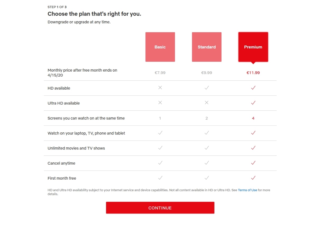
Netflix’s sales page features its most expensive option both highlighted and positioned at the far right side of the page.
Adobe’s Creative Cloud sale is featured prominently at the top of the page in both the hero image and a blue banner above the navigation menu.

Reducing lists to 3-4 items
When you present users with more than 4 items, anything in the middle of the list will probably be lost on them. Keep it short and sweet.
What this looks like
- Simple navigation menus
- Minimalist navigation bars
- Limited package options
Examples
Airbnb offers five menu options with only three grouped prominently in the center more prominently. As a result of the Covid-19 pandemic, their “Online Experiences” option (as of this writing) is featured on the right—presumably to boost its performance.

Spotify offers five menu options but again, groups three of them more prominently.

Keep heavily used and important action items all the way to the left or the right.
Most popularly used tasks should be easily accessible, consistently in the same position, and at the beginning or end of a menu to make it easy for users to navigate.
What this looks like
- Home buttons all the way on the left side of a task bar
- Profile buttons positioned on the right hand side
Examples
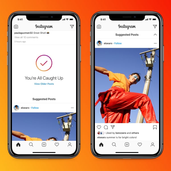
Instagram places heavily-trafficked task buttons on the far left and far right. They got creative and placed the “direct message” button in the upper right hand corner to save room in the lower task bar which is already full.
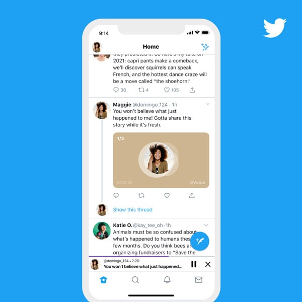
Twitter’s task bar is similar, keeping the “home” button on the far left and the “direct message” button on the far right.
5. Key takeaways
In this very paragraph, you’re seeing the serial position effect in practice! Let’s talk about what you should remember about this theory for your next user experience or user interface design. The serial position effect simply outlines that users will remember items at the beginning and end of a list the best.
You can use the serial position effect in your designs by placing the most important items at the beginning or end of a list. Place these items at the far left, far right, top, or bottom of a page to draw attention to them. Keep your lists short and consistently use icons in the same location throughout your application.
Beyond this, it always helps to learn more about UX design principles like affordances, signifiers, feedback, and more.
If you’d like to learn more about how to design delightful user experiences, take a free micro course in UX design or check out these other articles:
