Once you’ve got a basic understanding of what usability is, you need a firm grasp on how to measure it in your own designs. How do you know if your products are actually usable? Here, we’ll share eleven ways to measure the usability of your products.
At first glance, “usability” may seem too vague or subjective to ever really know if your products are usable. But whether you’re designing a login screen, a search experience, or anything else you can imagine, usability is essential!
This is why there are measures (known as heuristics) to help you understand how usable your products really are. Taken on their own, these heuristics are useful guides. Combined with usability testing, however, these heuristics have the power to (re)shape your designs and result in products that are more usable to more people—and more likely to succeed!
In this guide, we’ll cover Jakob Nielsen’s 10 fundamental usability heuristics, and go beyond these to offer up an eleventh that is critical to a truly usable product.
Here’s what we’ll cover:
- Visibility of system status
- Match between system and the real world
- User control and freedom
- Consistency and standards
- Error prevention
- Recognition rather than recall
- Flexibility and efficiency of use
- Aesthetic and minimalist design
- Help users recognize, diagnose, and recover from errors
- Help and documentation
- BONUS: Accessibility and inclusion
- Wrapping it up
1. Visibility of system status
This heuristic is all about communication. Make your products communicative and transparent about what they’re doing and the status of the users’ request or action. Make the system status clear to your user. This is especially critical in moments when the user has just submitted information or taken an action that they expect to result in something significant—like a transfer of money, the movement of a collection of files from point A to point B, a successful download or upload of content, etc.
Here’s a quick example within the Music app on an iPhone. A user owns an album but wants to download it from the cloud.
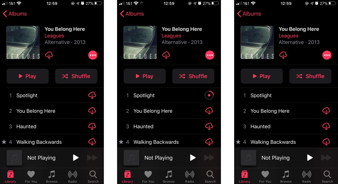
When you download a file, it’s common to see a progress indicator (perhaps one that includes time remaining) along with an icon, color indicator (usually something green), and/or a simple animation of the file “landing” on your hard drive. These are elements that make the system status visible to you.
When you book a flight or complete some other kind of purchase online, you’ve just handed over some pretty sensitive information (bank or card info). When you click that button to complete the purchase, you probably want to be met with more than a static screen. If the successful purchase isn’t immediately confirmed, it’s nice to know that at least your click was effective in initiating the process and how long you’ll need to wait. This is where many products give users a loading page that indicates that the requested action is in process.
So how can you create better visibility of system status for your users? It’s usually a good idea to go beyond simply adding a spinning wheel or a slow-loading progress bar (on their own, these can actually make the waiting worse).
While you probably don’t want to let your users in on every aspect of what’s going on behind the scenes, identify where the process is at and how much longer it will be—with as much specificity as possible.
2. Match between system and the real world
This heuristic ties into the fundamental UX concept of mental models. Your digital products need to work in ways that are congruent with users’ other, dominant ways of understanding the world. Not only should you look at, and in many ways cooperate with, the ways in which your users’ other digital experiences work, but you should also find ways to link their experience of your product to their non-digital realities.
By way of a very clear example, look at the trash bin on your computer. It’s a trash can image that displays full when you’ve tossed files and empty when you’ve permanently deleted those files. This is a very user-friendly way of visualizing the process of deleting files—by utilizing something we can all relate to: taking out the trash.
Even the use of folder icons for those places where we can stash multiple files is a digital approximation of a real world object common to most office or school environments. We understand the concept of a folder and it provides a helpful visual representation for the process of organizing the content of our computers.
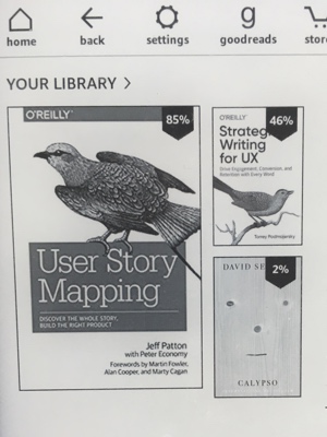
Amazon’s Kindle is a fantastic example of this heuristic. An e-reader is, to some extent, a replacement for bound and published, paper books and periodicals, and the device uses language and images that are congruent with that mental model. The content you purchase is stored in your “library” where the content itself is displayed, visually, as a collection of book covers.
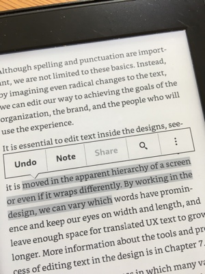
As you’re reading, you can highlight text very much like you would if you were highlighting text in an actual book—with your fingertip as the highlighting instrument.
How can you make your digital products match the non-digital world?
First, look at other digital products. A lot of the work in this area has already been done, meaning that you can simply take care to keep your designs reasonably close to these existing mental models.
If you’re designing a product that doesn’t already have these mental models to rely on, look at the basic functions you need the code to create visual representations of. What are some non-digital metaphors you would use to explain that function to someone new to your product? That can be a good place to start.
3. User control and freedom
Wait. Where did the file go? Oh…no. Did I delete it?!
We’ve all had that moment. Having the ability (built into the system) to go back and undo an action or edit information is critical to good usability. Google Drive does a great job of this when it tells us an action has been completed and gives an option to undo the action, in case it was accidental.
But this heuristic doesn’t only apply to lost files. Let’s say you’re shopping for jogging pants on Amazon and put a pair in your shopping cart (heuristic #2 at work there) to return to later.
A couple days later, you’ve got time to look around again, but you’ve forgotten that you put a pair in your cart already. You shop around the site, only to land on the same pair again (they just look that comfy). So you put them in your cart. Before you checkout, you survey the items in your cart and realize you were about to buy two pairs. Oops!
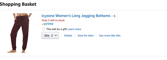
Conversely, maybe you’ve already got one pair of these pants and you decide you want to buy ten more.
Whatever the case may be, Amazon makes it easy for you to adjust the quantity before you complete the purchase.
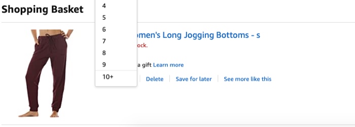
Look for points along the user journey where mistakes are more likely to be made or when users are most likely to want to edit information, and find ways to make that task as easy and simple as possible.
4. Consistency and standards
This heuristic is all about Jakob’s Law: “Users spend most of their time on other sites. This means that users prefer your site to work the same way as all the other sites they already know.”
Your users don’t want your product to function in surprise ways at every turn. In fact, they may not want any surprises at all! Unless you’re designing a very specific kind of product, they haven’t come to your product to solve a riddle. They just want to get something done. It’s important that you make it easy for users to learn how your product works—and even easier to remember after they’ve gone away for a while.
The fastest way to accomplish this is by adhering to the ways most other products accomplish common tasks. And the best way to discover these commonalities is by conducting a competitive UX analysis. This process will help you to find what competing products are doing and what you might be able to improve on.
If you’ve got a revolutionary new way to do onboarding or login for your snazzy new mobile app, take some time to consider how users are accustomed to app onboarding and account login. If your new idea departs too far from what they’re used to, it could be off-putting. If users have to remember how to login to their account every time, they might just stop trying.
Remember: Your ultimate goal is consistency and usability over novelty and surprise. Sometimes really outstanding usability (paired with some great microcopy and other enhancements) is just the surprise your users are looking for.
5. Error prevention
If you’ve ever filled out a poorly designed form and been met with an error message for an incorrect address or phone number, you’ve got first-hand experience in the importance of this heuristic. Directly related to the heuristic of user control and freedom (in terms of providing a way to undo an action or edit information), this heuristic focuses on catching errors before they happen.
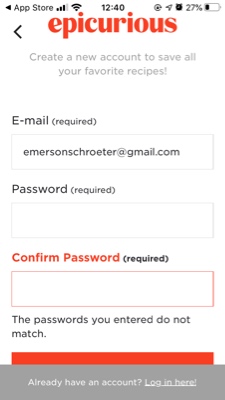
By way of example, when creating an account on the Epicurious app, if a user re-types the password incorrectly, they 1) aren’t notified about the error until after they click to submit, 2) have no way to see what they typed in order to locate the typo and correct it. So they have to type it all in again and hope for the best.
If you’ve ever sent that mortifying, accidental “reply all” email to colleagues or family members, you’ll certainly appreciate that Gmail allows you to decide whether “reply all” is the default for your inbox or if you want to take extra steps to respond to the entire group.
Errors with some products (Epicurious onboarding, for example) are less dire than with others—if you’re designing something for airline pilots to use in flight or for medical personnel to track patient treatment, for example. But no matter the scale of the error or how dire the consequences, if you don’t prevent them before they happen, the consequences are less than desirable (at best).
So consider: What errors are your users likely to encounter? How might you take steps to prevent these errors before they take place?
Start by looking for errors that would have more critical consequences (like booking the wrong flight dates or shutting down an important program), and work your way down to those smaller errors that prove to be simply irritating (these are still important to pay attention to as they increase friction and user frustration with your product).
You don’t want to overdo it with endless dialog boxes, asking users if they’re sure they want to do X. This can be as frustrating as the errors themselves and make users feel like you don’t trust them to do anything on their own. But here are a few ideas for how to prevent errors:
- Change the color of the button to make it stand out
- Give users options in search boxes to help them select the correct search query the first time around rather than finding the correct combination of words on the tenth iteration
- Make forms more forgiving or provide appropriate constraints to show users what kind of information you need
6. Recognition rather than recall
Simply put: don’t make your users work harder than they need to! Give them cues and reminders that help them complete tasks, rather than placing the burden of remembering on them. Your designs should always promote recognition over recall.
Recall is the process of remembering where you left off, who you spoke to last, how to go about this or that process. Recognition is the process of picking up cues that allow you to move forward in appropriate ways. Recognition is far and away the easier option because your brain can work in the moment rather than digging through memory to find your solution.
You can promote recognition over recall both by staying as close to your users’ mental models for how they should go about a given process, and by ensuring you’re organizing and presenting information in ways that make sense to them (this is where some good tree testing and card sorting will come in handy—two fundamental forms of usability testing).
Let’s take an example many readers will relate to.
You realize you need to call a customer service line. This will strike fear and dread into the hearts of some, depending on whose customer service line we’re talking about, but sometimes it just has to be done. Whether it’s your bank, Amazon, a bureaucratic office, or that random store that was selling sweaters or boots on Instagram, you go into the process just hoping that they’ve made themselves easy to contact.
You go to their website and you look for a familiar cue–one that fits your mental model for how a lot of places provide a way to reach them: “Contact us” (or something along those lines). If all goes well, you find that button, click it, and see a list of numbers or means of reaching out to the correct team or department.
But what if you don’t find that cue? Most of us have had the experience of looking all over a website, trying different links, or even hunting through microscopic copy at the bottom of the page to find any shred of copy that might indicate a means of contacting them.
If you’ve been on this particular journey with the same website before, the process relies heavily on your memory of how you finally figured it out last time. And if the last time wasn’t in your recent past—well, good luck.
Recognition over recall. Make sure your navigation is clear, precise, and as simple as possible; provide visual cues; remind them when something time-sensitive needs to be done; alert them when you’ve made changes to a screen or a process.
7. Flexibility and efficiency of use
If you’ve ever used a keyboard shortcut to accomplish something on your computer system, in Photoshop, or anywhere else in your digital world, you know the importance of this heuristic. But even if technology is a mystery to you and you’ve never used a keyboard shortcut in your life, flexibility and efficiency of use is a critical measure of usability.
Here’s an example from Figma. When you first join the platform, you’re given a brief tour that introduces you to the key features and function of the platform. Then you dive in.
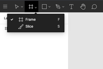
If you’re just getting started, you might click on the grid icon and the click to create a frame. If you’ve used the program for a while, you might just tap “F” on your keyboard to accomplish the same thing.
If you’ve ever tried to use your bank’s mobile app to transfer money, you’ve probably experienced a really great or really terrible example of this heuristic. The banking app N26, for example, makes it easy to see who you’ve sent money to in the past, or to set up a new recipient. If you had to set it up each time, you’d have to dig up bank details and input the information again every time.
8. Aesthetic and minimalist design
This heuristic is all about information hierarchy. A simple 5-second eye test can reveal a lot about the priorities your actual design is communicating. Show the screen you’re designing to someone who hasn’t seen it yet. Give them five second to look at it and then take it away and ask what the screen is about, what it’s for, or what primary action you want users to take here. Chances are, you’ll find at least some small ways to improve your designs—to simplify them, and to give priority to the primary goals of that page. After all, simplicity is often key to good UX design.
Let’s have a look at a stunning example of this usability measure. Try the 5-second eye test on these two images—the GoDaddy homepage in 2015 versus that same page in 2020.
Here’s the homepage on April 16, 2015. Bear in mind that this was only five years ago. If you’d like to really go back in time, have a look at WaybackMachine’s calendar of GoDaddy updates (or try it for any site you’re curious about).
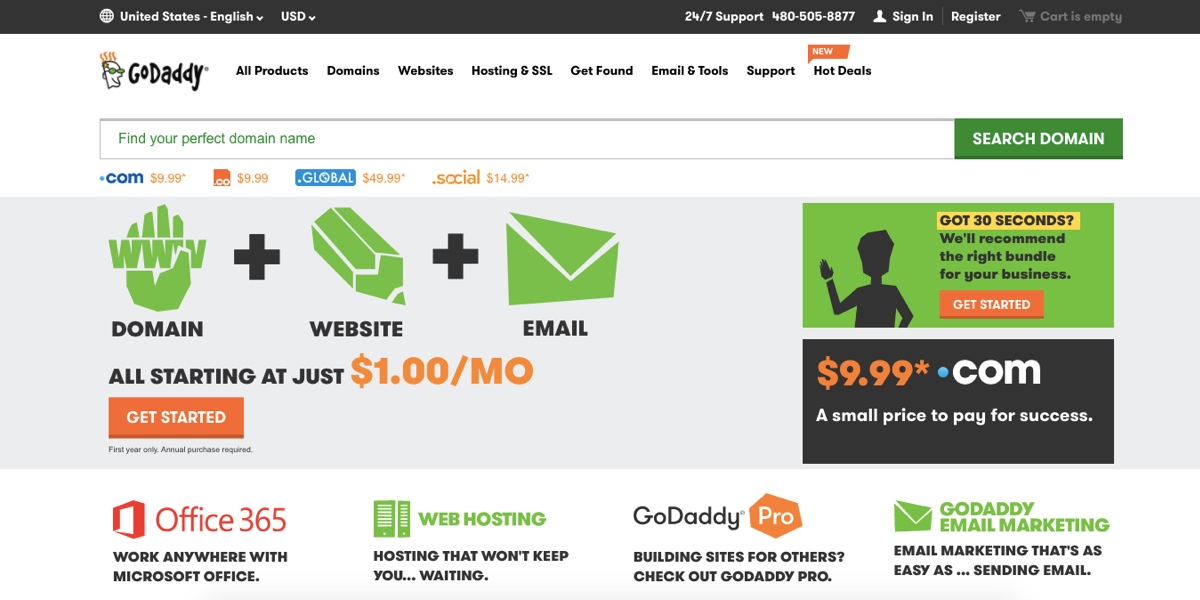
The primary goals of the page are relatively clear, and the design is much improved from GoDaddy’s early days, but most of the elements carry a similar visual weight, causing them to compete for attention. Have a look at the same page on April 16, 2020:
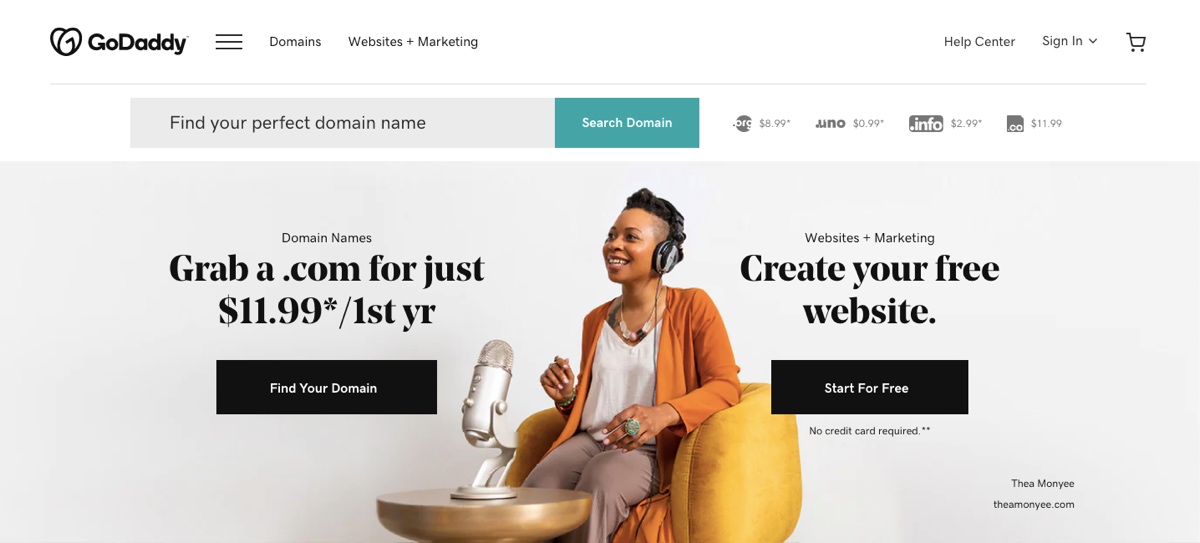
The design is much more minimalist, with clearer emphasis placed on the few things that GoDaddy really wants visitors to see and act on.
As you improve the aesthetic and minimalist design of your products, remember that you need to:
- Place a visual emphasis on the 1-3 things that are most important for users who will see this particular page or screen. And be clear on the hierarchy—run tests to make sure what you think stands out does indeed stand out.
- Keep the most important things “above the fold”—where users won’t have to swipe or scroll to see it.
- Do not underestimate the power of where you place different elements and the size and color of those elements.
9. Help users recognize, diagnose, and recover from errors
We’ve already talked about error prevention—but your designs won’t be very usable if you count on these efforts from keeping any error from ever occurring and don’t design for when errors do occur. Because, despite our best efforts, errors happen.
Think about the last time you encountered an error message that was some string of language that made absolutely no sense to you, with nothing but an “OK” button to click on. Or when you think an error of some kind has occurred, but you’re left with no clue other than a screen that is eerily still—even though you’ve clicked to initiate the action. Thankfully, these scenarios play out less and less often in the design world.
It’s a sign of great design when an error does occur and the system handles it in a user-centric way. If a user makes an incorrect attempt to login to their N26 bank account using touch ID, they’re met with an error message that accomplishes three things:
- It alerts them that there has been an error
- It tells them what the error is
- It gives options for how to correct the error
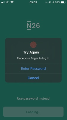
Users are prompted to “try again,” with concise instructions for how to do so, and an alternate means of logging in (“enter password”).
If users enter too many filters to a flight search on Google Flights, they’re met with a message that tells them there’s been an error, indicates why, and provides a fix. Users might click to clear all filters, or they might look to the search options at the top of the screen and modify their search terms from there.
10. Help and documentation
App onboarding pages or walkthroughs, chatbots, popovers, tooltips, videos, and more. These are all means of providing guidance to your users if they hit some kind of block in completing whatever they’ve come to your product for.
Providing clear, concise, and relevant documentation that is easy to access and understand is key to your product’s usability. This is an important and integral part of your product—not an optional “extra.”
If users are at a point of needing or asking for help, they’re not in a position to work hard or fight for that information. Do usability testing on your solutions here to make sure that you’re providing help in the best possible ways.
Asana does a great job of providing help tips that are relevant, easy to access, and even easier to understand. A quick scan of the homepage (post-login), and it’s easy to spot the question mark icon.
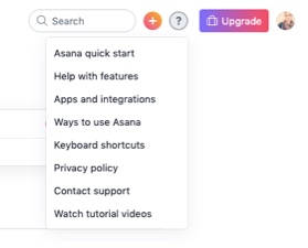
Click on that icon, and you’ll find a menu with a list of options, each of which will take you to a specific section of their help page (nicely named “Asana Guide”), which is itself organized in ways that allow users to tailor their learning to their needs and preferences. If you click on “Help with features,” for example, you’ll be taken to this page:
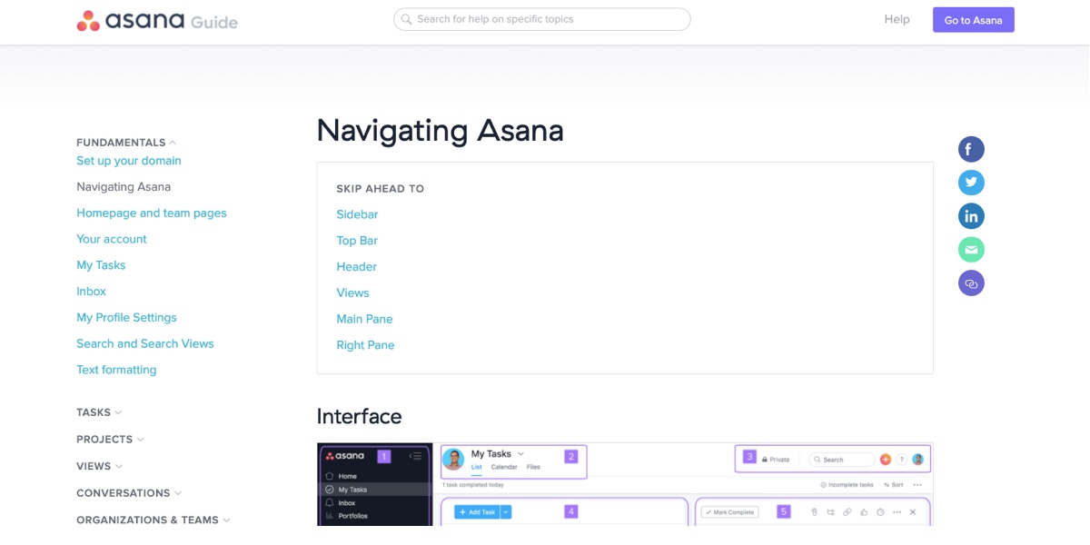
You can learn about the primary navigational features, go to the top of the page to search for other help options, or navigate to new topics in the tree menu along the left side of the screen.
If you type something into the search bar, the system will guess, based on what you’re typing in, what specific help you’re looking for.
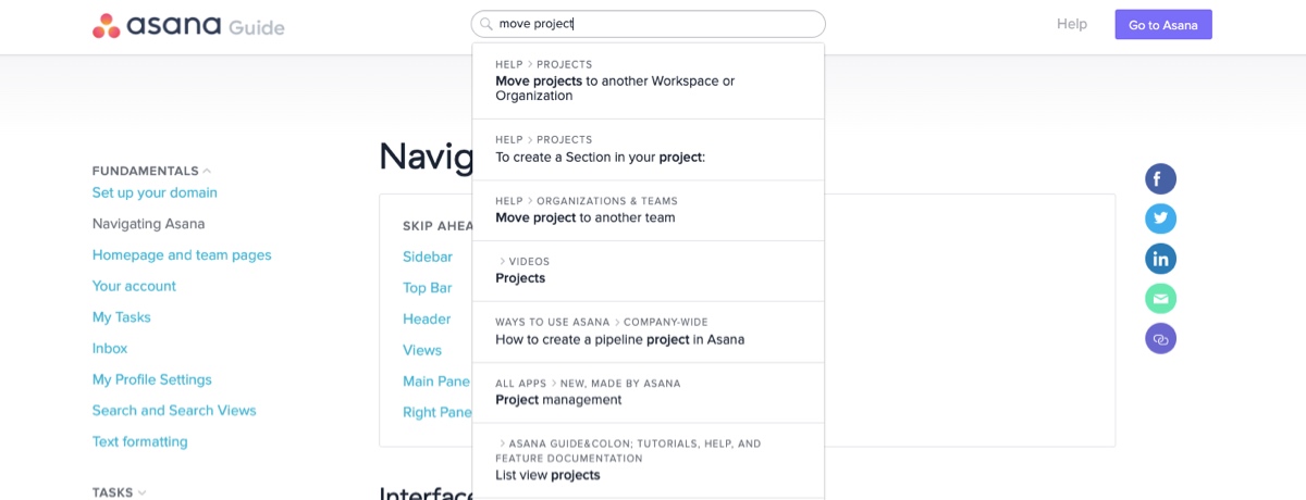
If, however, you type something in that the system doesn’t recognize or that doesn’t match the title or tags, you’ll find yourself on a page similar to a Google search containing a list of articles that might, hopefully, meet your needs. So as great as the help is, it relies to some degree on the user adapting to the system. This is relatively common in help indexes like this.
This is why providing help earlier and along the way can be helpful, through intuitive and responsive onboarding and tooltips. While you don’t want to go overboard and make your helpfulness a nuisance to your users, you do want to make their going to a help page something of a last resort.
As you seek to provide help and documentation to your users, make sure
- It’s easy for users to search for or access your help features—the closer the help is located to the point of confusion or the gap in knowledge, the better (as long as users don’t spend more time hashing through tooltips than they do actually accomplishing their task!)
- Any help you provide is specifically relevant to the task users are trying to complete
- Your guidance gives users concrete steps they can carry out (and provide links and shortcuts when they’re relevant)
11. BONUS: Accessibility and inclusion
Imagine that you’ve designed what you believe is the most perfectly usable product in the world.
Now imagine that a user approaches your product—but they’ve experienced vision loss, hearing loss, or limited use of their body in any capacity. Perhaps they are a person who identifies as a gender that’s different from the one tied to their sex assigned at birth. Perhaps they are not white, middle-class, or native English speaking. Perhaps there are simply aspects of their life, identity, or experience that sets them outside of the statistical majority of the expected users for your product.
Attention to accessibility and inclusion will help you ensure that you haven’t essentially put a locked gate on that whole experience or set it up as Kat Holmes might call an elementary school playground where some kids are excluded for arbitrary reasons.
While Nielsen’s 10 core measures of usability certainly contribute to the accessibility and inclusion of the products and experiences you design, they do not ensure that there are not fundamental barriers users might encounter that prevent them from using your product and enjoying that experience just as much as the next user.
If you haven’t tended well to your image titles, alt text, and captions, your product is not entirely usable.
If you haven’t been mindful of the language you use in anchor text, the kinds of people who are represented in your images and icons, the assumptions that your color choices might make about your users (ie, “it’s an app for women, so it’s pink”), and how you talk about people and the options you give users to represent themselves in forms, it’s likely that you’re unintentionally excluding people from the full and delightful experience you’ve designed.
The aim of designing for accessibility is to ensure that users are not excluded on the basis of their abilities—whether physical, emotional, or cognitive. Close to accessible design is inclusive design, which really just takes the goals of accessibility and applies them to people of various cultural backgrounds, ethnicities, body types, and gender identities.
It is the work of intentionally including these other needs so that we don’t risk unintentionally excluding people based on these other needs (to paraphrase Kat Homes).
If you’d like to learn more about accessibility and inclusion, check out these resources:
- Book: Mismatch by Kat Holmes
- Blog article: A Beginner’s Guide to Inclusive Design, by Vale Querini
- Blog article: How to Design for Every Gender, by Vale Querini
- Medium post: 6 Principles for Inclusive Design, by Lillian Xiao
- Annual report: John Maeda’s Design in Tech Report
12. Wrapping it up
There you have it. Nielsen’s 10 usability heuristics—plus one! Whether you’re simply reviewing your deigns, preparing for usability testing, or conducting a UX audit, these should be helpful in guiding your observations.
Really, the most important thing you can do as you go about your work as a UX designer is to test, test, test the usability of your products. These heuristics are simply helpful guides in helping you see ways to improve your designs and avoid usability pitfalls.
To learn more about UX design, check out these articles:
