UX designers have many tools they use throughout the design process, with each one having a unique effect on the finished product. User flows and wireframes are two of the most talked-about design tools in the UX field, yet they are often misunderstood or over-complicated. Both user flows and wireframes are priceless resources that help foster effective communication within the design team and can increase the speed of your iterations. While wireframes and user flows are often used in conjunction with one another, there are clear differences between these design methods.
This comparative guide will help you understand when to use user flows, when to use wireframes, and why. We’ve broken down this guide to user flows versus wireframes as follows:
- What are wireframes and user flows used for?
- Wireframes vs. user flows: Which one should you use?
- Tools for creating wireframes and user flows
- Wireflows: Combining user flows with wireframes
- Key takeaways
Ready to learn more about wireframes and user flows? Let’s get started.
1. What are wireframes and user flows used for?
Knowing the differences in what user flows and wireframes accomplish when creating an interface can help you determine when to use them. Their functions are needed at different points in the design process for various and unique reasons.
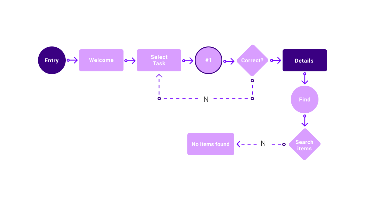
User flows are a great visual representation of how your user will move through your app or webpage. They help determine exactly how many pages you’ll need for the user to effortlessly complete a specific task or achieve a certain goal. Creating a UX flow often means sketching out a diagram that helps you order your web or app screen pages in a way that best fits the users’ needs. Here you’ll determine what pages need to be designed and in what order they will be arranged. These flowcharts layout the product as a whole and give your clients and colleagues a visual representation of how the user will progress through the app or product. You can learn more in this introductory guide to user flows.

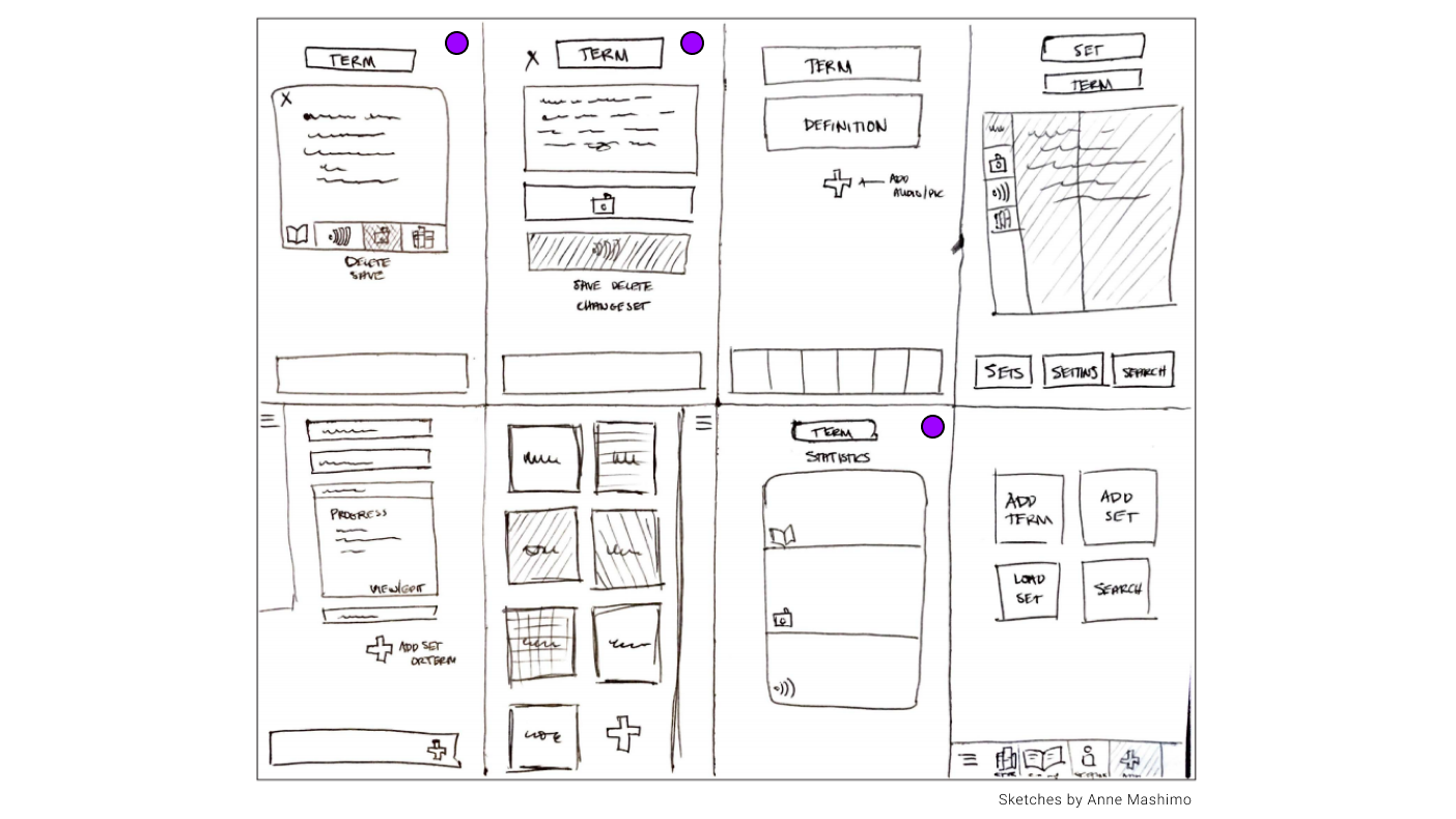
Wireframes, on the other hand, are much more static and help you explore all the different ways you can design a single page. When constructing a wireframe, you’ll decide what images, buttons, or text to include and where on the page they should go. Often, designers will brainstorm as many ways to design the same page as possible by sketching out as many different layouts as they can think of. An example of this is the Crazy 8s exercise where you come up with eight unique layouts for a single screen. You can learn how to create your first wireframe in this guide.

2. Wireframes vs. user flows: Which one should you use?
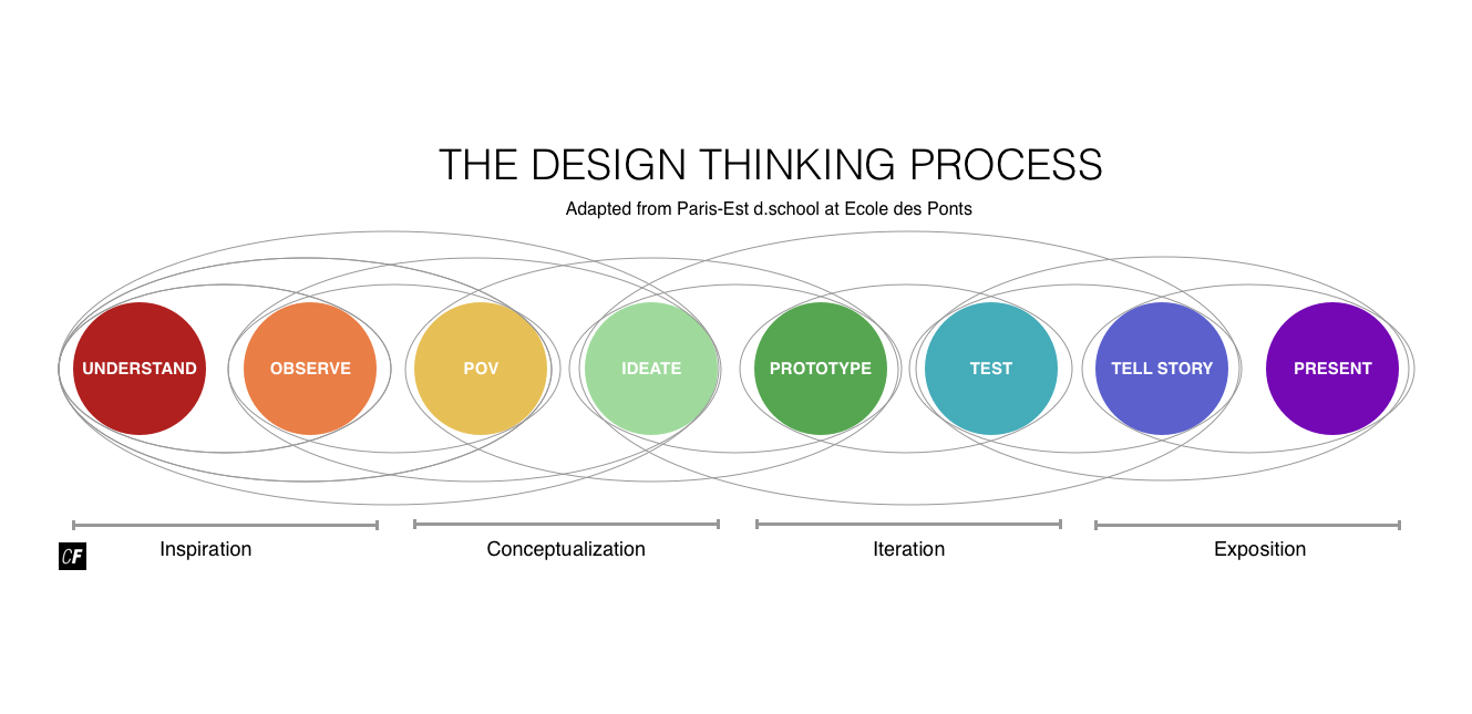
User flows and wireframes come back-to-back in the design process. User flows come early on in the ideation phase once you’ve finished your analysis of what the user’s needs are. Wireframes (whether for mobile apps or websites) are used a bit later once you’ve established how many screens you’ll need for the user to complete a given task.
However, you might say you can’t really have one without the other. User flows give way to the development of your wireframes. Once your flows are solid and you’ve established the number of pages needed as well as what purpose they serve, you can get to designing individual pages to create your wireframes. Then come prototyping and lots of user testing. As you test your wireframes and gain greater insight into the user’s actions, you can move from creating low fidelity mockups to mid-fidelity, and finally, high fidelity wires.

3. What tools do you need to create wireframes and user flows?
There’s not too much of a difference when it comes to what programs to use when creating user flows and wireframes. More than likely, any software you use to make a wireframe, you can use to map out a user flow. However, that rule doesn’t always work in the reverse and there are benefits to using certain programs over others for both wires and flowcharts.
For instance, resources like Figma and Sketch are great tools for creating both wireframes and user flows. They are diverse enough to provide all that you need when diagramming out your user’s movement and designing individual screens. Google Draw and Adobe Illustrator are some other good programs that can be used for making both, yet they lack the prototyping capability needed for user testing and are better reserved for creating user flows. Simple slide presentation software, like Keynote or Google Slides, are some other easily accessible tools to utilize for mapping out your flowcharts.
In terms of programs specific to creating wireframes, Justinmind, Figma and Balsamiq are going to be your best bet, as they are equipped with everything you need to carry your wireframes into the prototyping and testing phase. However, it also depends on what level of fidelity you are working on. For example, when creating low fidelity wires, starting your designs on pencil and paper can be a great first choice before moving to any sort of software to digitize them. We’ve put together a list of the most useful wireframing tools here.
4. Wireflows: Combining user flows with wireframes
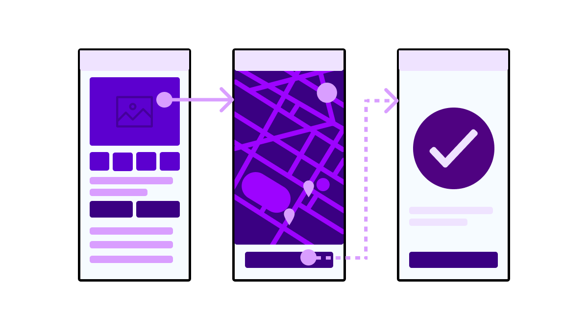
Now that we’ve laid out the key differences between user flows and wireframes, we can look at what happens when these two design tools are combined to create wireflows. Wireflows are a fusion of flowcharts and wireframes that give greater context as to how a product will function, what it will look like, and how users move within it. This alternative deliverable replaces the abstract shapes from your user flow with the corresponding screens from your wireframes. So instead of having a square that just says “Homepage”, a wireflow would incorporate the actual screen you’ve designed for your landing page.
Due to the small size of smartphone screens, wireflows work best for mobile apps but can also be used for websites and desktop apps. Wireflows are able to show lots of detail and work really well when trying to communicate a heavily dynamic interface to clients or colleagues.

5. What next? Key takeaways
Now that you’ve created your user flows, determined the screens you need, and designed them using wireframes, you might be wondering what to do next. As with most things in UX design, your wireframes need to be user tested and analyzed for ease of use and enjoyment. After you’ve done some prototyping and user testing, you may find that you need to adjust or add to your user flows or wireframes—and that’s totally normal! Both of these design methods are very fluid, and having to make changes to them based on your user feedback is to be expected. You’ll also want to start gradually increasing the fidelity of your wireframes if you haven’t already. This usually means working out the details like choosing the images you want to use, deciding on a color scheme and fonts, designing buttons and menus, and finalizing the overall layout.
When it comes to UX design tools, user flows and wireframes are like the skeleton of the iterative process. Everything else branches off and builds upon the framework that’s been laid down by your flowcharts and wires. Your flows and wireframes build off of one another as well. User flows help you navigate and track movement within the app while wireframes assist in laying out how the screens will look. Both of these UX design methods are paramount when creating an app or product that flows well, is pleasant to use, or increases conversion rates for your client. Knowing when and how to use user flows and wireframes can not only improve the quality of your work, but can also make your design experience less tedious and more enjoyable.
If you’re keen to learn more about the design process, check out the following:
