So, you’re looking for some UX portfolio inspiration?
Making sure you’ve got an impressive portfolio to your name is important for both fresh-faced UX designers and seasoned industry veterans.
In this article, we’ll try to inspire you with awesome UX portfolio examples and UX design portfolio best practices.
The 20 Best UX Portfolios
Without further ado, here are our picks of the best UX design portfolio examples.
1. Gloria Lo nails the high-impact introduction

Who is Gloria Lo?
Gloria Lo is a self-taught product designer based in Sydney, Australia. In her own words, she is passionate about improving the lives of others through design and is constantly looking to learn new things every day.
What makes Gloria’s UX design portfolio so great?
One of the first things your UX portfolio should do is introduce you as a designer. Employers and potential clients want to know who you are and what you’re all about—and they should be able to find this out within seconds of landing on your portfolio website.
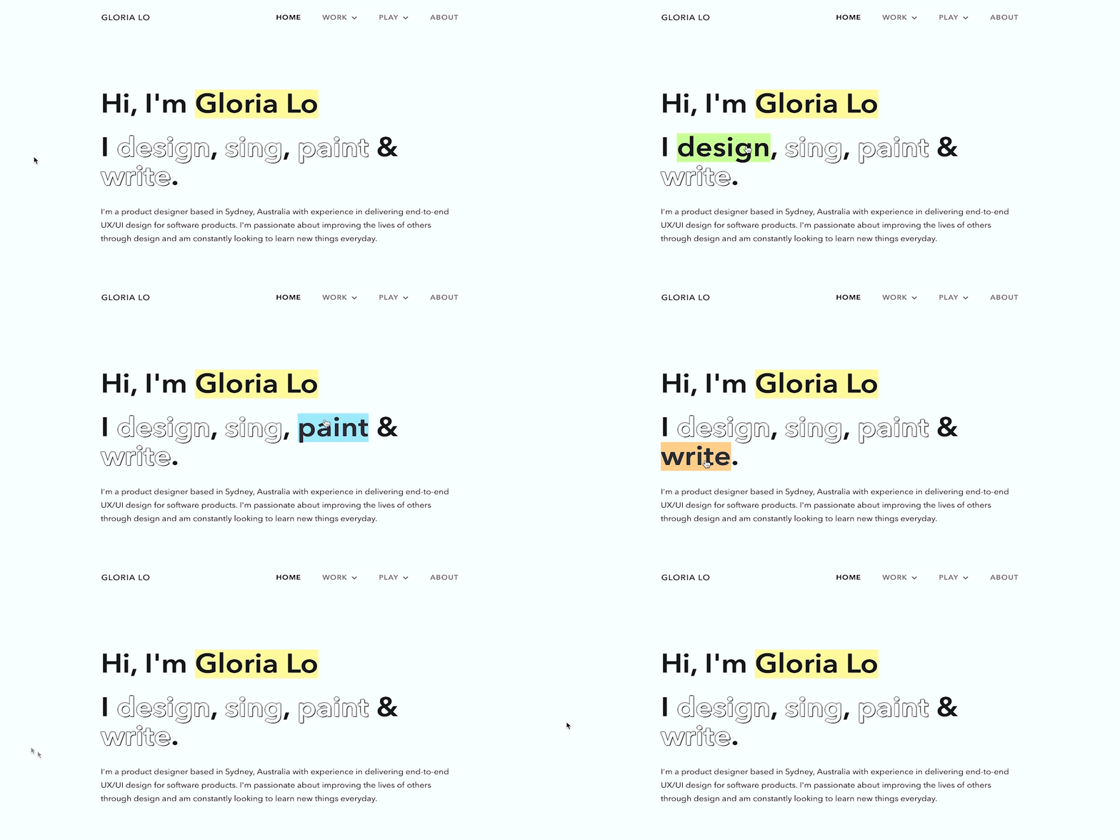
Gloria has nailed her designer introduction with a three-tiered approach. First, she treats us to a bold, eye-catching headline that describes her in terms of her favorite activities.
In just four simple verbs, we know that Gloria is a creative, multi-talented soul with quite a few hobbies in her repertoire. Oh, and these verbs “light up” in different colors when you hover over them—a nice additional dash of personality!
After such an enticing headline, we’re inevitably curious to know more about Gloria—and sure enough, her portfolio delivers. Directly beneath that unmissable heading, Gloria tells us exactly what she does and what she’s passionate about in just two sentences.
Gloria has mastered the delicate art of brevity while still managing to convey the most important information—not an easy feat!
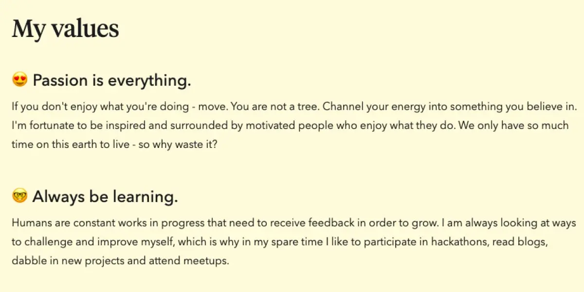
By now, Gloria has well and truly piqued the viewer’s interest. Luckily, her portfolio also features a comprehensive “About” page, complete with a video, a section detailing her values (with the help of emojis), a very thorough testimonial from a former employer, and links to her music and artwork.
What can we learn from Gloria Lo?
When it comes to your own UX design portfolio, make like Gloria and be sure to include a meaningful introduction. Keep it compact yet high-impact on the home page, and then provide more detail in a dedicated “About” section.
Besides crafting a gripping “about me” statement, try to inject a bit of personality into the visual design, too—just like Gloria’s colorful hover effect.
Key takeaway
The viewer should know exactly who you are and what you do within seconds of landing on your UX design portfolio. Craft a compelling headline that provides all the most important information at a glance.
View Gloria Lo’s full portfolio website
2. Moritz Oesterlau masters the art of storytelling through case studies
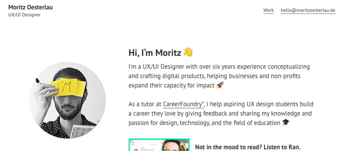
Who is Moritz Oesterlau?
Moritz Oesterlau is a multi-skilled product/UX designer based in Germany. He also dabbles in interface design and frontend development.
Moritz studied UX design with CareerFoundry and is now part of the Global Goals Curriculum 2030 team, helping to shape a democratic, just, and sustainable society through the power of education.
What makes Moritz’s UX design portfolio so great?
Moritz’s portfolio really gets to the heart of what UX design is all about: going through a process to solve a user problem. Moritz doesn’t just show the finished product; he shares, in detail, all the methods and processes that got him there.
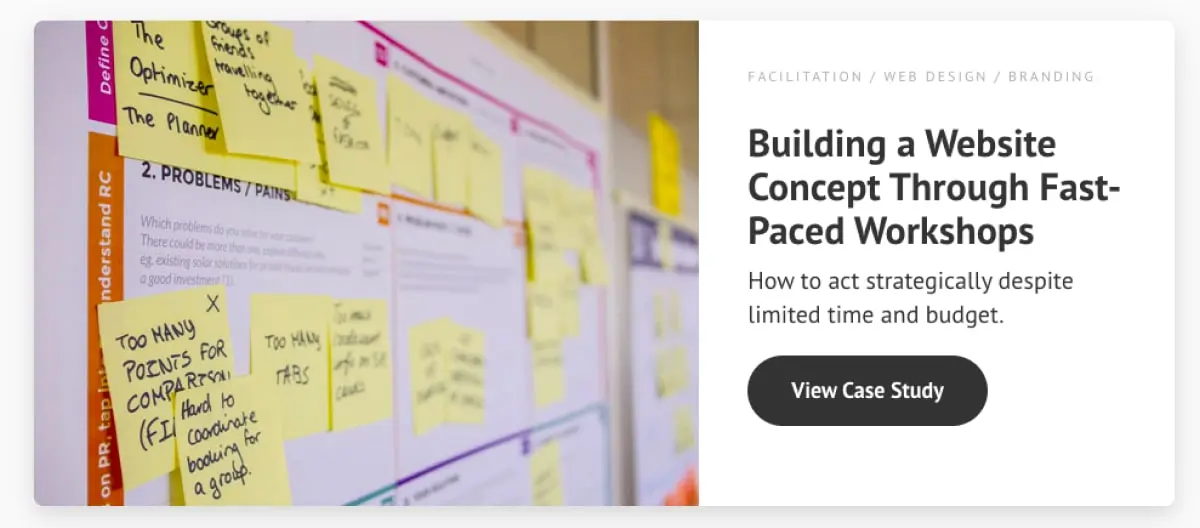
Each project is presented as a case study, which immediately tells us we’re in for a lot more than just eye candy.
Click on any one of these case studies and you almost feel like you’re in the room with Moritz himself—a fly-on-the-wall as he works through his UX design process.
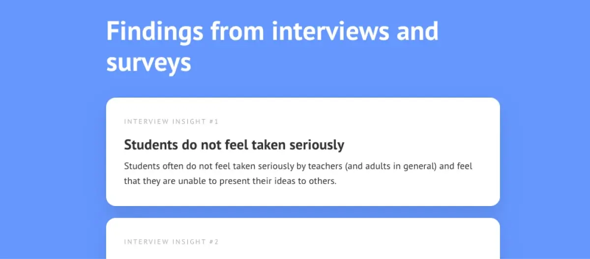
Take the Approach to Digitization in Education case study, for example. Moritz leaves no stone unturned, documenting the project from start to finish.
He takes us on a logical journey, putting the design challenge into context before going through competitor analysis, interviews and surveys, building empathy and creating user personas, defining the information architecture, wireframing, prototyping, and usability testing.
For each step, he explains what he did, why he did it, and what he learned as a result.
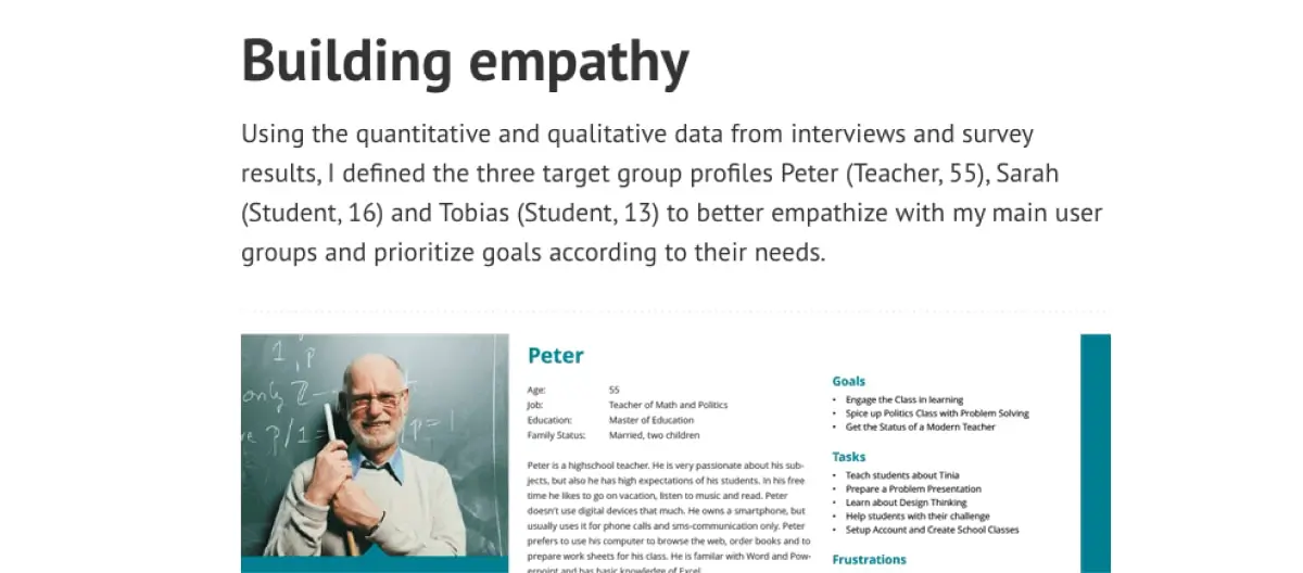
What can we learn from Moritz Oesterlau?
When showcasing your UX design work, follow Moritz’s example and place your process front and center. You’ll notice that Moritz doesn’t show the finished product until the very end of each case study, and that’s because he’s telling a logical story.
With each case study, start from the beginning and guide the viewer through the main steps that led you to the final solution. It’s okay to include screenshots of a beautiful end product, but make sure you’ve documented your process in detail first.
Key takeaway
Showcase your process, not just the finished product. Write about the methods you used, what you learned along the way, the challenges you came up against, and how you solved certain problems. Each case study should tell a complete, logical story.
View Moritz Oesterlau’s full portfolio website
3. Elizabeth Lin reigns supreme with visual storytelling
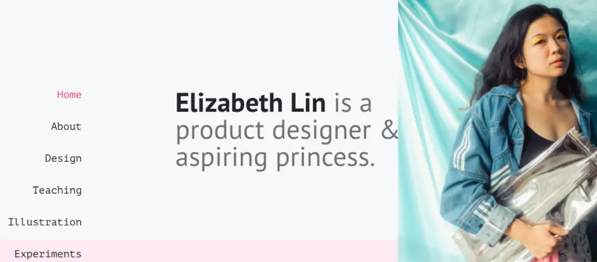
Who is Elizabeth Lin?
Elizabeth Lin is a San Francisco-based product designer and self-proclaimed fashion, teaching, and classical saxophone enthusiast.
What makes Elizabeth’s UX design portfolio so great?
Elizabeth Lin’s portfolio provides another excellent example of storytelling. Just like Moritz, she presents her design work in the form of case studies, documenting her process from start to finish.
What really stands out in Elizabeth’s portfolio, though, is her use of visuals to support the narrative she’s weaving.
Each point in her case study is illustrated with some kind of visual element—be it a virtual wall of Post-it notes, a survey form that was sent to research participants, or early-stage prototypes.
Another effective storytelling technique that Elizabeth uses is to include little bitesized notes and reflections down the right-hand side.
Set in a different font and color to the main body text, these snippets catch your eye as you scroll.
They provide further, more personal insights into the project—such as “It was cool seeing how differently teachers would use this dashboard” or “We didn’t move forward with this exploration because we wanted to validate the base solution first.”
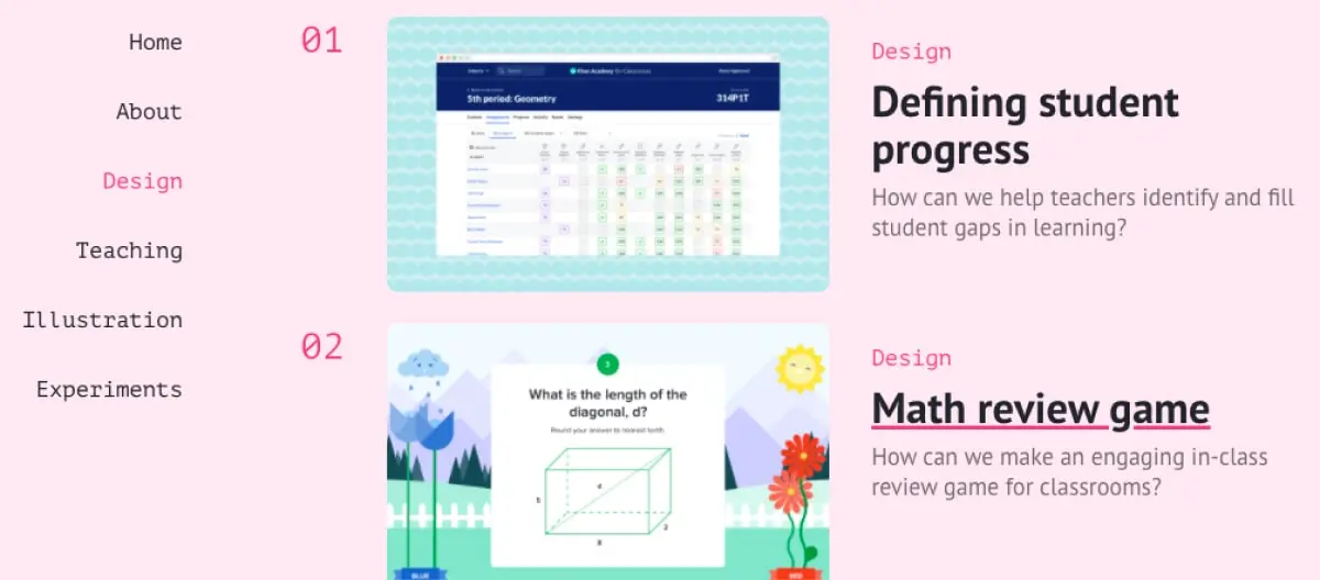
Supporting your case studies with visual artifacts really brings the project to life. Elizabeth’s portfolio illustrates perfectly how visual and textual storytelling should work together to demonstrate your UX design process.
What can we learn from Elizabeth Lin?
The aim of your UX portfolio is to both show and tell. Just like Elizabeth, support each case study with meaningful visuals—that is, real artifacts from your project, not just illustrations.
Every time you work on a new design project, document your process: take screenshots of user research surveys you send out, snap photos of your wall covered in sticky notes after a heavy brainstorming session, and keep hold of your wireframes as they progress from low to high fidelity.
When it comes to adding a new case study to your portfolio, these artifacts will help you tell a logical story.
Key takeaway
Don’t just tell the story of each project; bring it to life with visual artifacts. For each step you go through in your case study, include a photo or screenshot of how it looked in action.
View Elizabeth Lin’s full portfolio website
4. Olivia Truong showcases her approach to problem-solving
Who is Olivia Truong?
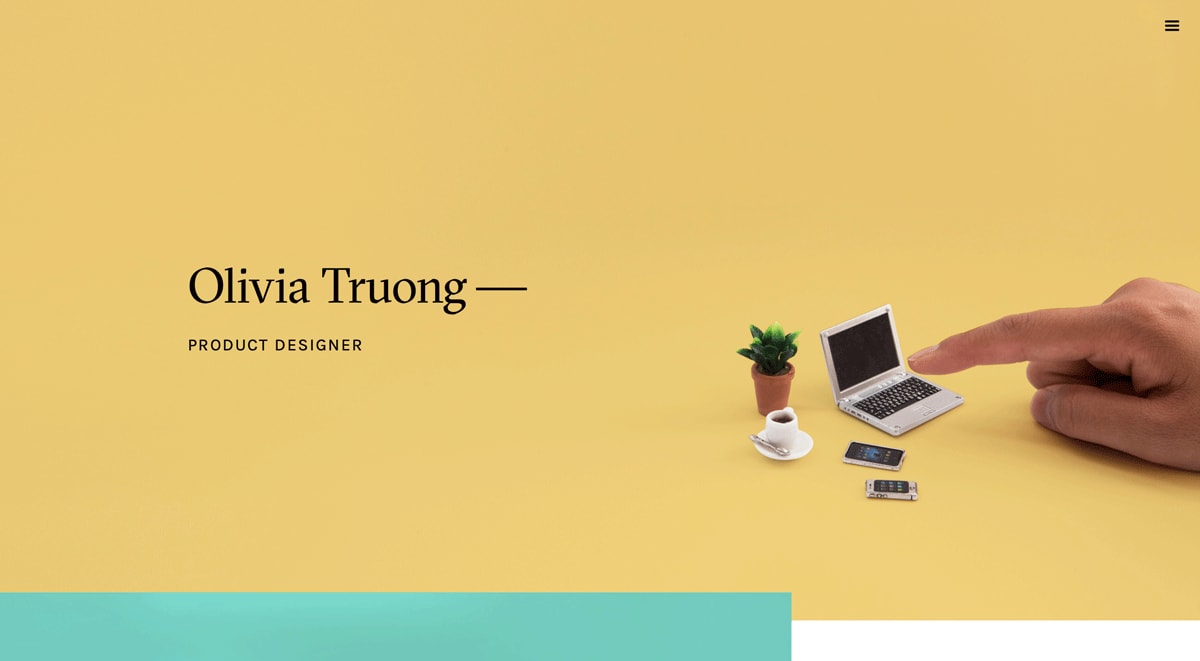
Olivia Truong is a product designer based in Boston, Massachusetts. In her own words, Olivia likes to go out into the world and capture its beauty and weirdness.
What makes Olivia’s UX design portfolio so great?
Above all else, UX designers are problem-solvers. Your UX design portfolio should therefore demonstrate how you identify and tackle a variety of user problems. Olivia’s portfolio does a great job of this, as you’ll see in her Routr case study.
Olivia kicks off her case study by framing the problem in a personal, relatable way. She doesn’t just talk about the “user” problem—she frames it as “our” problem, inviting the reader to step into the user’s shoes, just as she has done.
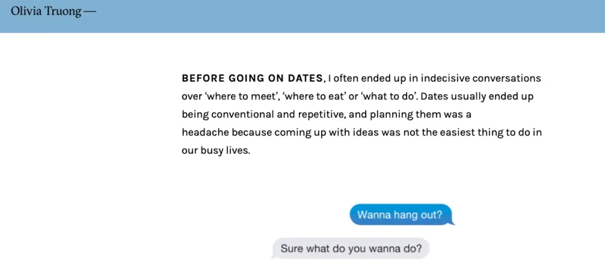
Next, Olivia explains, in detail, how she set about trying to solve this problem—in a section aptly named “There Must Be Something Out There”. We learn how she scoured the internet and App Store for a solution, only to find that none of the existing solutions fit the bill.
In the section that follows, “Taking The Dive”, Olivia shares the next steps in her problem-solving journey: brainstorming the elements of a successful date.
After thoroughly framing the problem and describing her approach to solving it, Olivia moves onto “The Making Of Routr.” Notice how, even when talking about her solution, Olivia consistently refers back to the original user problem.
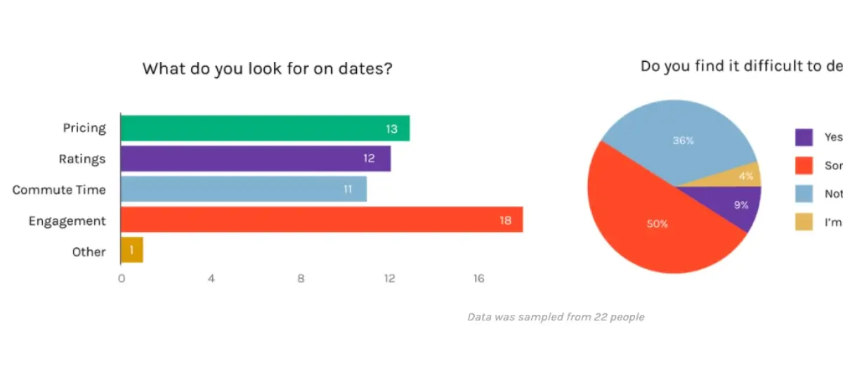
Olivia’s portfolio portrays her as a thoughtful problem-solver—granting her huge bonus points in the eyes of any recruiter or potential client. This focus on problem-solving also conveys another essential UX trait: empathy for the user.
When reading Olivia’s case study, you don’t get the feeling that she’s just going through the motions; she’s genuinely engaged in the problem and how she can solve it for the user. That’s the sign of a passionate UX designer!
What can we learn from Olivia Truong?
UX designers are problem-solvers, so make sure your portfolio reflects that. There are two key lessons we can learn from Olivia’s portfolio: first, start each case study by framing the problem in detail, and second, frame the problem in a way that conveys empathy.
Above all, think about the language you use. Don’t just state the problem; relate to it and put some emotion behind it! Olivia describes how planning dates was a “headache” because “coming up with ideas was not the easiest thing to do in our busy lives.”
This is much more personal and empathy-driven than if she’d said “Users struggle to come up with date ideas because they’re so busy.” Last but not least, refer back to the original problem throughout—even when you progress to the solution.
Key takeaway
Your UX design portfolio should demonstrate your approach to problem-solving. Kick off each case study by framing the problem in detail, using emotive language to convey empathy. Refer back to the problem throughout.
View Olivia Truong’s full portfolio website
5. Priyanka Gupta is the queen of the unsolicited redesign
Who is Priyanka Gupta?
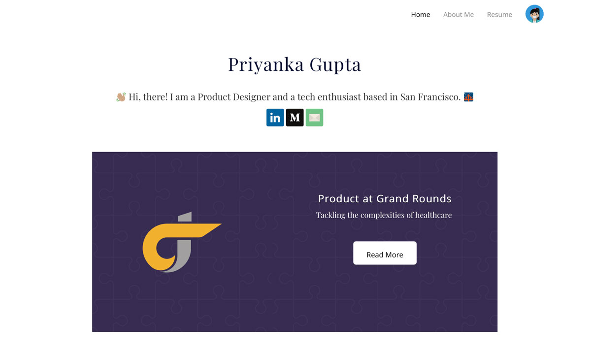
Priyanka Gupta is a product designer and tech enthusiast based in San Francisco. Aside from creating awesome user experiences, Priyanka is also pretty active on Medium.
What makes Priyanka’s UX design portfolio so great?
Early on in your UX career, you might struggle to fill your portfolio with real projects. As your career progresses, you might look for ways to make your portfolio stand out. So what can you do?
Cue the unsolicited redesign à la Priyanka Gupta.
When Priyanka runs into bad UX, she can’t help but do something about it. Where most of us might just abandon ship and find an alternative product, Priyanka goes above and beyond: she redesigns the entire experience!
So, in addition to real client projects, Priyanka’s UX portfolio also showcases some rather impressive unsolicited redesigns.
One can’t help but be impressed by Priyanka’s initiative and drive. She’s gone out of her way to redesign an entire digital experience, just because she’s passionate about good UX—how cool is that?!
What’s also interesting is how Priyanka chooses to showcase these redesigns. She could just stick to the standard case study format, but as we know, she’s the kind of designer who likes to go above and beyond.
Click on one of her unsolicited portfolio pieces and you’ll be taken to a full-on, published blog post. Nice!
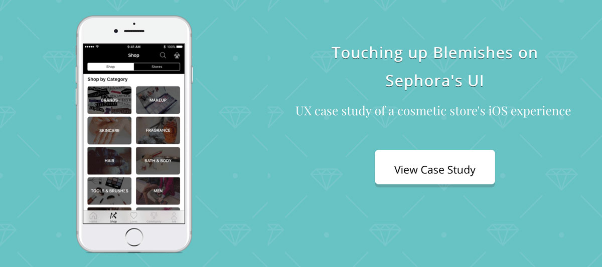
Despite the fact that these unsolicited redesigns are pure “passion projects”, Priyanka lends them the credibility they deserve by documenting her process in detail.
In her redesign of the Sephora iOS app, she starts by framing the problem: “Despite using the app religiously, I had trouble navigating through it. After observing that other people also experienced issues with the app, I pursued this redesign as an opportunity to improve the experience in any way I could.”
What follows is a detailed breakdown of every step she took to redesign the app, from brand analysis, user research, and affinity mapping, right through to persona creation, prototyping, and implementation—not forgetting those all-important visual artifacts that are absolutely crucial to UX storytelling!
What can we learn from Priyanka Gupta?
Priyanka is an experienced UX designer who presumably has plenty of real projects for her portfolio. This doesn’t stop her from conducting unsolicited redesigns when she comes across intolerably bad UX—as she puts it, it’s like an itch she just needs to scratch!
If you’re a new UX designer trying to build up your portfolio, take a leaf out of Priyanka’s book and complete some unsolicited redesigns of your own. This is a great way to demonstrate initiative and show that you’re a proactive designer who is willing to go the extra mile.
Just as Priyanka does, be transparent about the fact that these are unsolicited projects—a simple disclaimer is all you need.
Another valuable takeaway from Priyanka’s portfolio is the power of blogging. Priyanka doesn’t just limit herself to her portfolio website; she also shares her case studies and tips via Medium (where she’s accrued over a thousand followers!).
There are many different ways to share your process, so don’t be afraid to try a multichannel approach.
Key takeaway
Unsolicited redesigns are an excellent way to build up your UX portfolio and demonstrate your initiative as a designer. As always, frame the problem, document your process, and tell a good story—and don’t forget to include a disclaimer.
View Priyanka Gupta’s full portfolio website
6. Lola Jiang delivers measurable outcomes and metrics
Who is Lola Jiang?
Lola Jiang is a California-based UX designer currently working at Google. Lola’s impressive resume includes having worked at YouTube as an interaction designer.
What makes Lola’s UX design portfolio so great?
One of the biggest challenges you’ll face as a UX designer is measuring and demonstrating the impact of your work. You know you’ve improved the user experience, but how do you substantiate that?
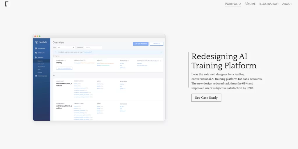
Look no further than Lola Jiang’s portfolio. Lola does an extremely important (yet scarce) thing: she puts the measurable impact of her UX design in the context of business needs.
Take her AI Training Platform case study, for example. Following a brief introduction to the project (literally one sentence), Lola offers the project’s outcomes: “The new design reduced task times by 68% and improved users’ subjective satisfaction by 139%.”
It’s immediate and impactful. Lola then takes us through the flow of the project, outlining the scale and scope of the work. She details the challenges, different iterations, and design, and clearly demonstrates the motivations behind decisions.
Lola rounds off her case study with a post-relaunch analysis, using concrete data to validate the final redesign: “With the original design, the set of tasks took 19 minutes. With the new design, the set of tasks took 6 minutes. Nearly 68%. Users’ subjective satisfaction with the new design (4.3/5) was 139% higher than the original design (1.8/5).”
What can we learn from Lola Jiang?
Lola does a great job of showing how she works in a business setting. This is crucial if you want to practice UX for a living, but it’s a trick that many designers tend to miss. While it’s true that you’re there to advocate for the user, it’s also important to recognize that companies have their own goals to meet—and you need to show how UX contributes to that.
If, like Lola, you can demonstrate how your work brings value, you’ll set yourself up for some serious bonus points. If you have data related to the project, this will be easy—but what if there aren’t any concrete metrics to showcase?
Even without data, you can frame your work in a business context. Set a business or product goal at the start of the case study. What do you hope your work will achieve? This is separate from the user goal, but the two should go hand in hand.
For example, creating a more pleasant app experience for the user should help to boost customer retention.
Likewise, establish a few success metrics before you begin. How will you measure the impact of your work? What tell-tale signs will you look out for after you’ve launched or relaunched the product? The best UX designers are those who can advocate for the user while meeting the needs of the business, so try to convey this throughout your portfolio.
Key takeaway
Use your portfolio to demonstrate how you add value to the business. Set business goals and success metrics for each case study, and, where possible, include data and tangible outcomes.
View Lola Jiang’s full portfolio website.
7. Daniel Autry features “just the right amount” of portfolio projects
Who is Daniel Autry?
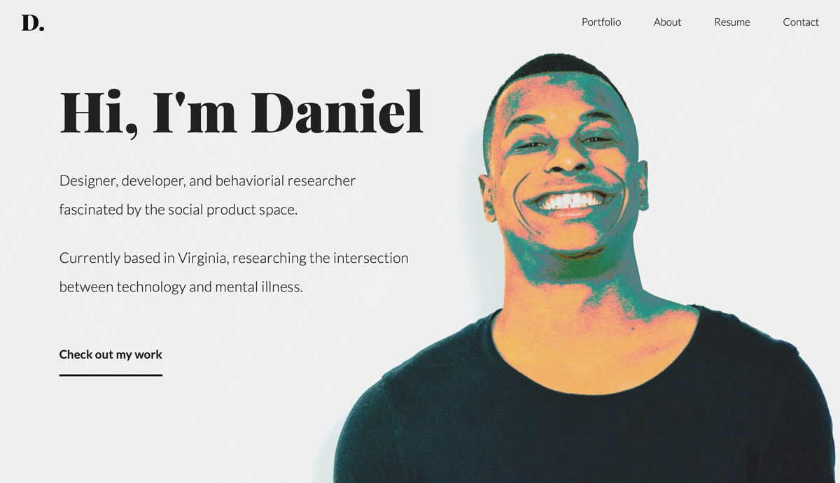
Daniel Autry is a designer, developer, and behavioural researcher based in Charlottesville, Virginia. He is fascinated by the social product space and is currently researching the intersection between technology and mental illness.
What makes Daniel’s UX design portfolio so great?
Daniel Autry’s portfolio features some remarkable work in the mental health space, but that’s not the only reason he’s made it onto this list. Daniel’s portfolio also helps to answer that all-too-common conundrum: What’s the “right” amount of projects to showcase in your UX design portfolio?
Before we go any further, let’s be clear on one thing: There’s no “magic number” when it comes to portfolio projects. Some people will tell you five, others will say three—you might even hear that one is enough!
Daniel has opted to showcase four projects in his UX portfolio, and while we’re not saying that he’s found THE magic number, it is a magic number of sorts.
In other words, Daniel has found the number that works for him: He features just enough projects to showcase his range as a designer while still keeping it limited enough so as not to overwhelm the user—smart UX design in action!
In the space of just four featured case studies, we see that Daniel is a versatile designer who has worked on a variety of projects across a range of sectors—from mental health to financial trading to e-learning. So, it’s not just about how many projects you showcase; it’s just as important to pick a good variety.
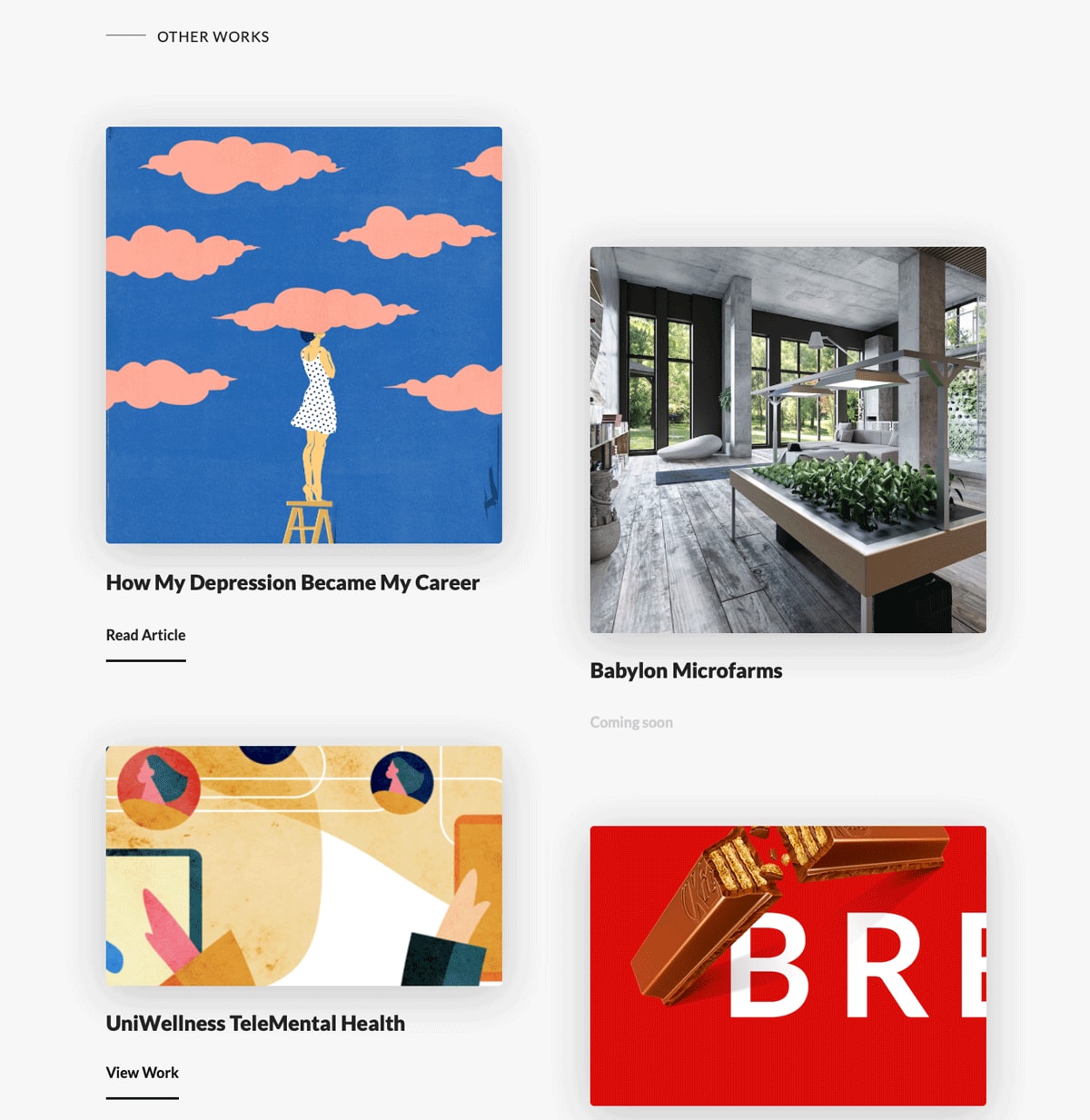
Besides his four featured projects, Daniel’s portfolio also includes a section dedicated to “Other Works”. Here, he links to articles he’s written on Medium, additional projects he’s worked on, as well as upcoming endeavors.
This is a great way to divide your portfolio, especially if you’re struggling to decide which of your best work should feature!
What can we learn from Daniel Autry?
Daniel’s portfolio teaches us an important lesson about the “right” number of portfolio projects: There isn’t one! Every UX designer is unique, and your portfolio should reflect that.
Don’t get too hung up on whether you should include three projects or five; focus instead on selecting a handful of projects that best showcase who you are as a designer.
If you want to brand yourself as a versatile, adaptable designer, feature as diverse a variety of projects as possible.
If you see yourself as a specialist in a certain industry, highlight the projects that demonstrate this. At the same time, don’t overwhelm the viewer: a hiring manager looking through your portfolio probably won’t browse through ten UX case studies, so choose wisely!
Key takeaway
There is no hard-and-fast rule when it comes to how many projects you should feature in your portfolio. Choose a good enough variety to showcase your skillset, while keeping it minimal enough so as not to overwhelm the user. If you’ve got lots more work you want to showcase, add a separate section.
View Daniel Autry’s full portfolio website
8. Vera Chen highlights the importance of context
Who is Vera Chen?
Vera Chen is a product designer and former Facebook intern. She has a Master’s degree in Human-Centered Design and Engineering, and has also dabbled in singing and acting.
What makes Vera’s UX design portfolio so great?
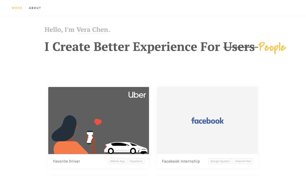
Not only is Vera’s portfolio a beautiful thing to behold (just look at those illustrations!); it also highlights the importance of context when presenting your UX work.
Vera doesn’t just outline the problem statement for each case study—she steeps it in a solid back story, describing the events that led her there. She also clearly explains her role on each project, who she worked with, and what design and prototyping tools and methods they used.
Just by including these few extra details, Vera paints a clear picture of what the project entailed and how she contributed. Another excellent example of UX storytelling!
Let’s take Vera’s Wedding Library case study, for example. See how she dedicates two whole sections to setting the scene? First, there’s the project background which lays out the scope of the project. Then there’s the context section, a detailed story about newlyweds Murphy and Diana and the frustrations they faced when planning two weddings.
Vera doesn’t just tell us what the problem is. She shows us exactly how it came to light, and in what capacity she was employed to help solve it. By the time we scroll down to Vera’s process, it’s easy to see where each step fits into the overall project.
It’s a bit like reading a novel: you need a little bit of background before you can start relating to the characters and the plot.
What can we learn from Vera Chen?
There are two very simple yet effective takeaways to be had from Vera’s portfolio. First and foremost, provide plenty of background context—this works wonders when telling the story of each case study.
Vera doesn’t start with the problem statement; she sets the scene, describing the people, events, and circumstances that surround and lead up to this particular design challenge. Aim to precede your problem statement with a small paragraph dedicated to “setting the scene”.
Secondly, state your role on each project. What were you commissioned to do? Where did you fit into the overall team? At the same time, listing your teammates is a nice touch; UX design is a highly collaborative field, so it’s important to demonstrate individual value while acknowledging that the end result was a team effort!
Key takeaway
For each case study in your UX portfolio, provide as much context as you can. Set the scene with a brief backstory before launching into your problem statement. This includes stating your role on the project and, if necessary, who you worked with.
View Vera Chen’s full portfolio website
9. Zara Drei bedazzles with awesome UX and UI
Who is Zara Drei?
Zara Drei is a London-based UX designer. When she’s not solving problems with beautiful, user-centric web products, you can find her playing around with electronics, making video loops, building ceramic and metal sculptures, or producing electronic music.
What makes Zara’s UX design portfolio so great?
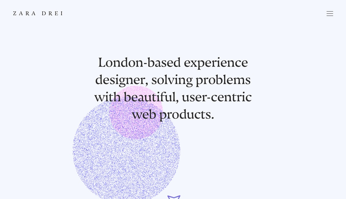
We’ve talked a lot about the importance of showcasing your UX design process. Now it’s time to contemplate the power of beautiful UI! This brings us to Zara Drei’s portfolio—the epitome of digital elegance.
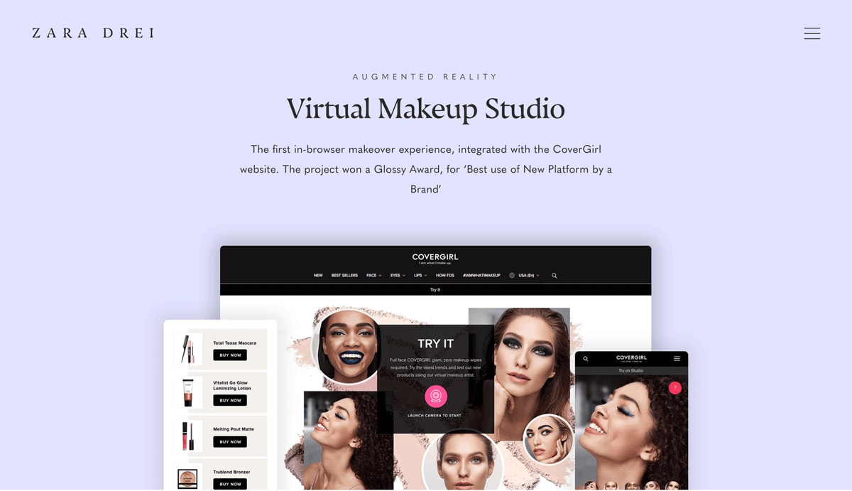
Zara specializes in creating digital products and experiences for luxury, fashion, and beauty brands, and this is reflected in every detail of her portfolio.
In fact, scrolling through Zara’s portfolio is like wandering through the beauty department of a high-end store, or flipping through the pages of a glossy magazine—and that’s no accident.
She has given as much thought to her color palette, typography, and imagery as she has to writing up her case studies and sharing her process. The result? A flawless portfolio that truly makes its mark.
What can we learn from Zara Drei?
Your UX design portfolio is not just a website—it’s part of your personal brand. Like your case studies, the overall aesthetic of your portfolio should tell a story about who you are as a designer. Consider how Zara uses color and imagery to evoke a sense of luxury throughout her portfolio; how can you create a similar effect?
Spend some time figuring out your personal brand. Are you fun and quirky? Artsy and edgy? Corporate and serious? Perhaps you’re all about eco-friendly design.
Once you’ve got a theme in mind, you can start to think about the kinds of colors and imagery that will help to convey this. Just because you’re a UX designer doesn’t mean you can neglect the visual design of your portfolio.
Your portfolio should embody your personal brand, so treat it like any other UX project and give it the high-shine finish it deserves!
Key takeaway
Your portfolio website should reflect your personal brand, and visual design plays a crucial role. The best portfolios offer the full package—detailed case studies wrapped in stunning UI design and flawless UX—so aim to tick all the boxes!
View Zara Drei’s full portfolio website
10. Minimalism from Victoria Kazakova
Who is Victoria Kazakova?
Victoria Kazakova is a Polish UX designer, web developer, and photographer.
What makes Victoria’s UX design portfolio so great?
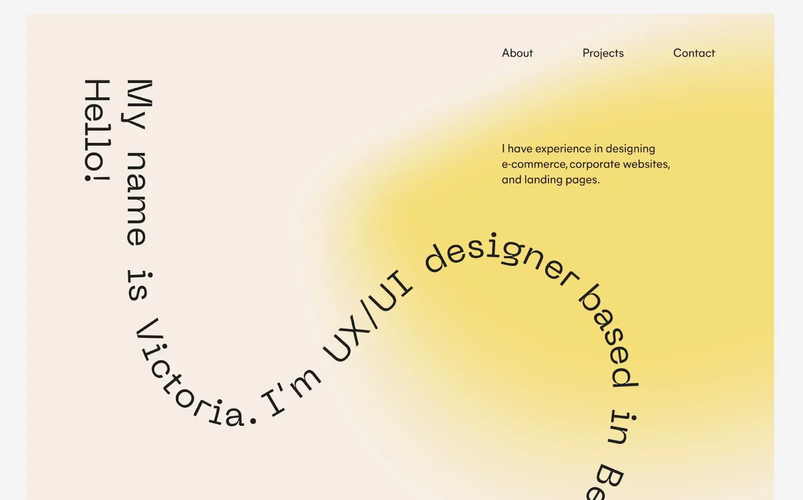
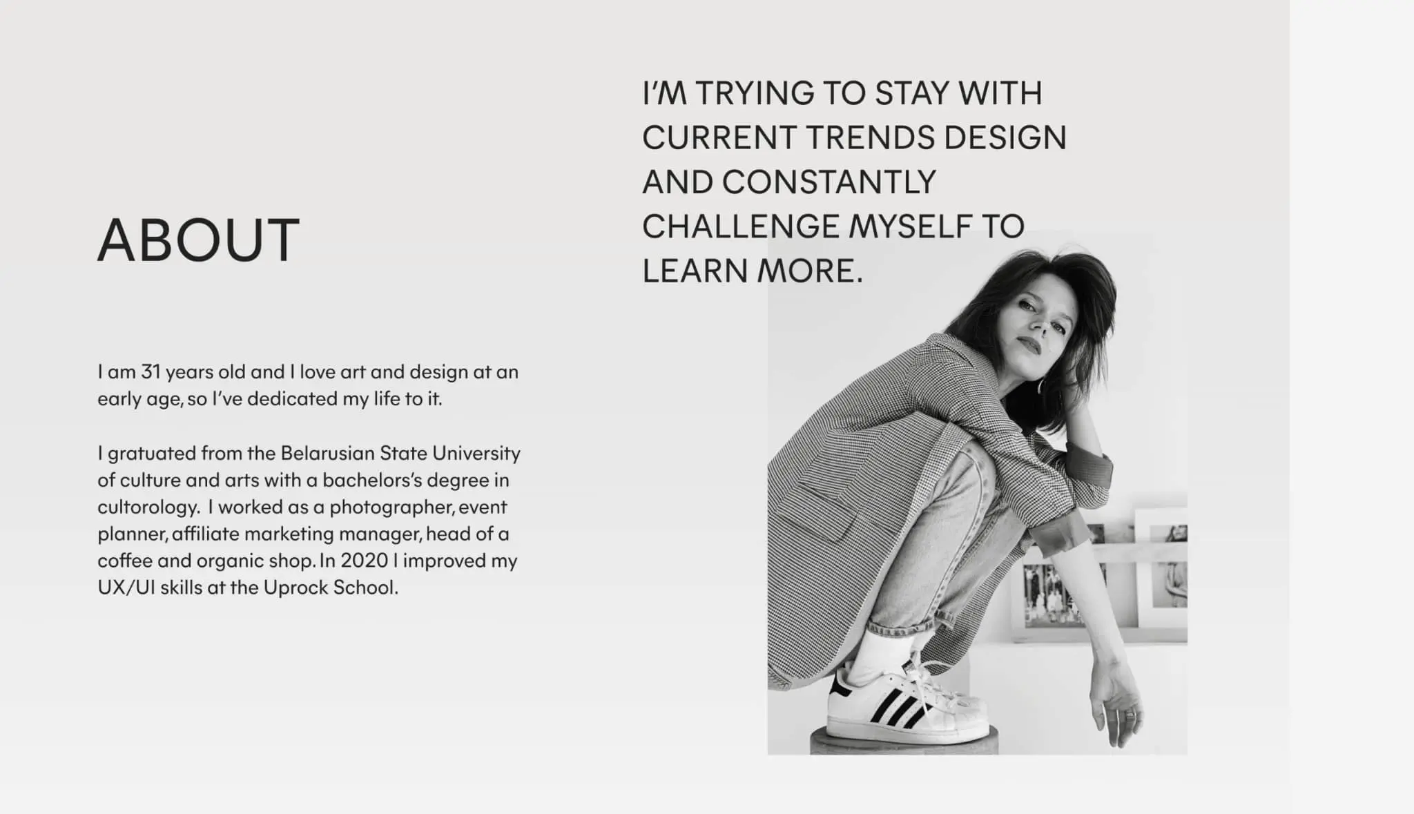
In the enormous and sometimes confusing online world we trawl through daily, Victoria Kazakova’s UX portfolio wins the prize for clarity and ease of understanding.
Throughout Victoria’s portfolio, she sticks to a minimalist design palette and clear signage, a simplicity that makes for a delightfully smooth read.
Better still, words that spring up on command stroll through the portfolio, leading the reader from section to section.
Charts and graphics displaying her skills and experience are so simple they appear iconic. There’s no chance the reader could feel lost or confused.
What can we learn from Victoria Kazakova?
When it comes to graphic design, sometimes simplicity is best. The last thing you want to happen when someone reads over your portfolio is for them to feel overwhelmed with data.
Victoria’s portfolio is a great example of how responsive screens can ease the user’s journey through pages of information.
Key takeaway
Don’t be tempted to overload. Stick to two classy fonts and an inoffensive colorway. These simple building blocks can lead the user’s eye as they navigate your work.
View Victoria Kazakova’s full UX portfolio
11. Yu-Hsuan offers zero-gravity UX
Who is Yu-Hsuan?
Yu-Hsuan is a UX designer, currently working for Google as an interaction designer.
What makes Yu-Hsuan’s UX design portfolio so great?
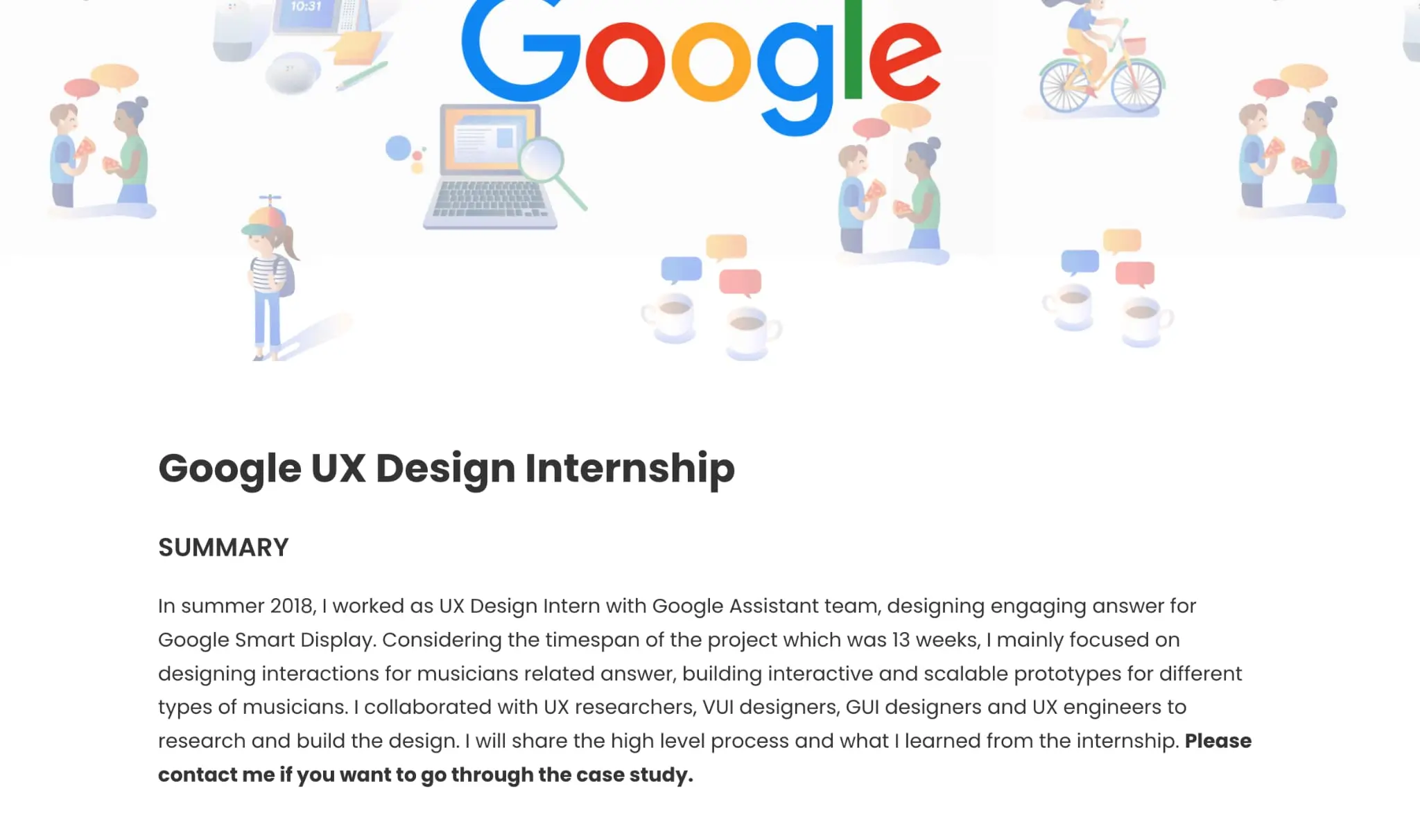
Yu-Hsuan’s impressive role at Google means that many of her current projects are “locked” due to non-disclosure agreements. This is a common problem in the UX design community and a hurdle many designers face when putting together their portfolios.
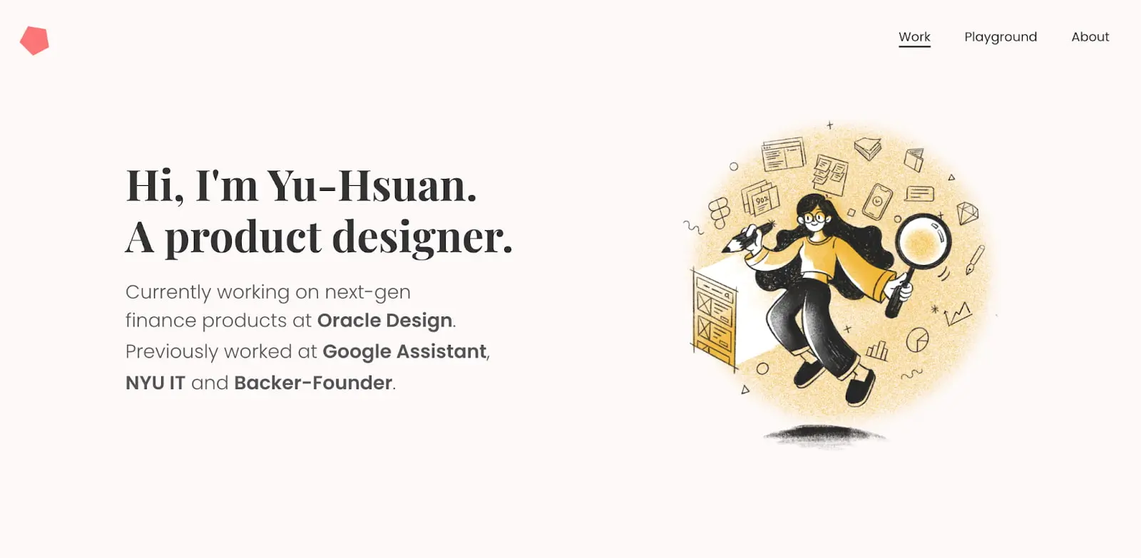
Yu-Hsuan’s deft solution is to focus on the illustrative side of her UX portfolio, which showcases her passion and side projects as a graphic designer and game designer.
She also uses her illustrations to depict the otherwise locked aspects of the projects she’s describing. This gives a lovely cohesion with the rest of the content in her portfolio and reduces the jarring effect locked projects can sometimes have.
The floating designer illustration that seems to hover over the portfolio is very cool and points at a sense of fun and creativity necessary to succeed in illustration and gaming.
What can we learn from Yu-Hsuan?
Through her illustrations, Yu-Hsuan has subtly displayed her UX skills in her portfolio itself.
This visual approach means the separate parts of the portfolio hang together perfectly, even when some of the projects are locked off.
Another tip from Yu-Hsuan is to be approachable in your portfolio. Dropping in the line “Please contact me if you want to go through the case study” gives a real sense of openness, collaboration, and sharing.
Key takeaway
If you can’t show direct evidence of a project, don’t hesitate to get creative. A strong visual style not only shows off your design chops but helps a large portfolio hang together nicely. Also, be approachable!
View Yu-Hsuan’s full UX portfolio
12. A holistic introduction to Cristina Gafitescu
Who is Cristina Gafitescu?
Romania-based Cristina Gafitescu is a junior UX designer with a playful approach to visual design.
What makes Cristina Gafitescu’s UX design portfolio so great?
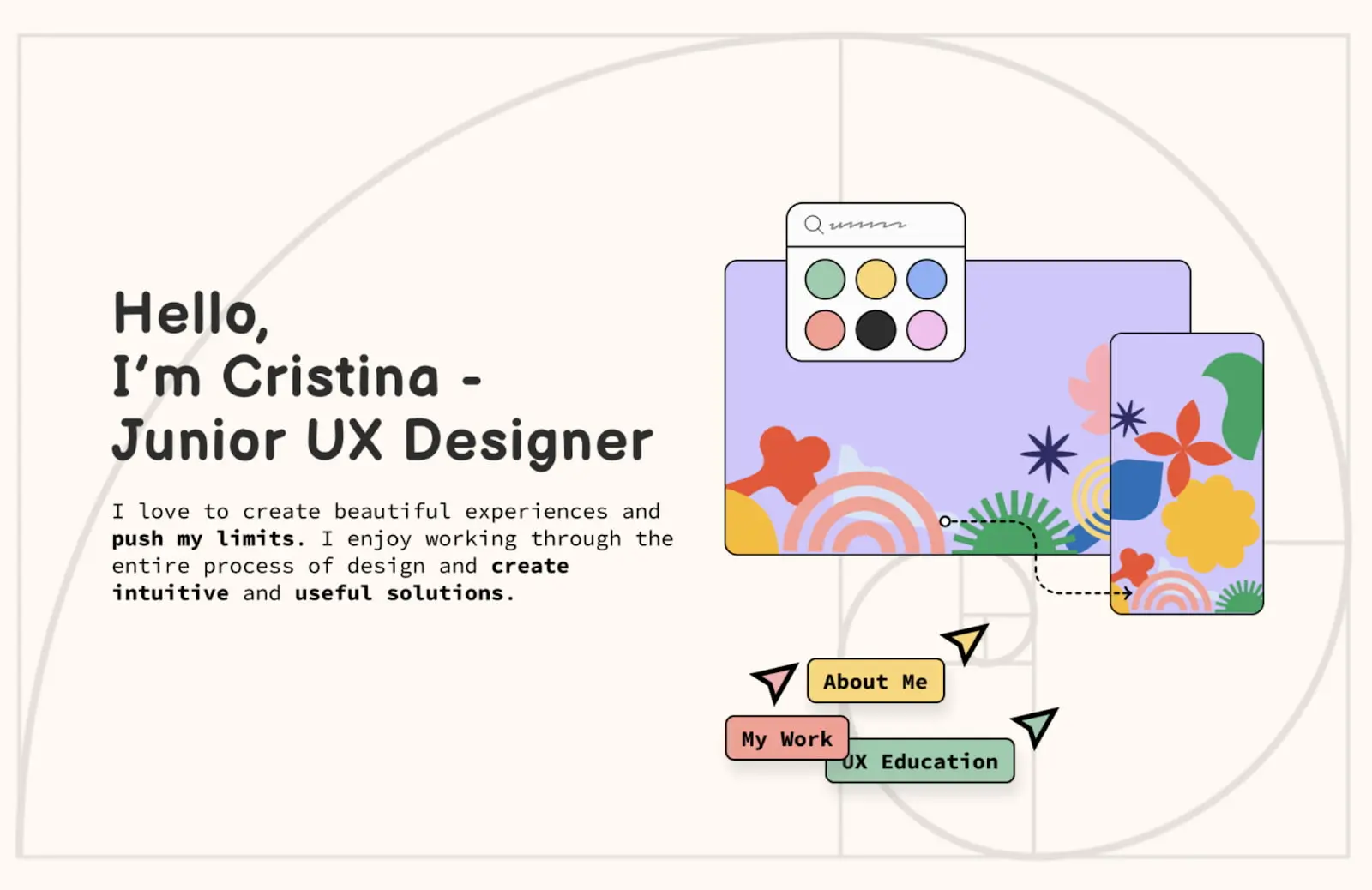
Cristina’s UX portfolio makes a great first impression as it tells her story in an interesting-to-follow, visually engaging way.
Her playful page layouts and graphics show Cristina’s panache as an illustrator and designer. They also provide a great backdrop as she offers a holistic introduction to herself.
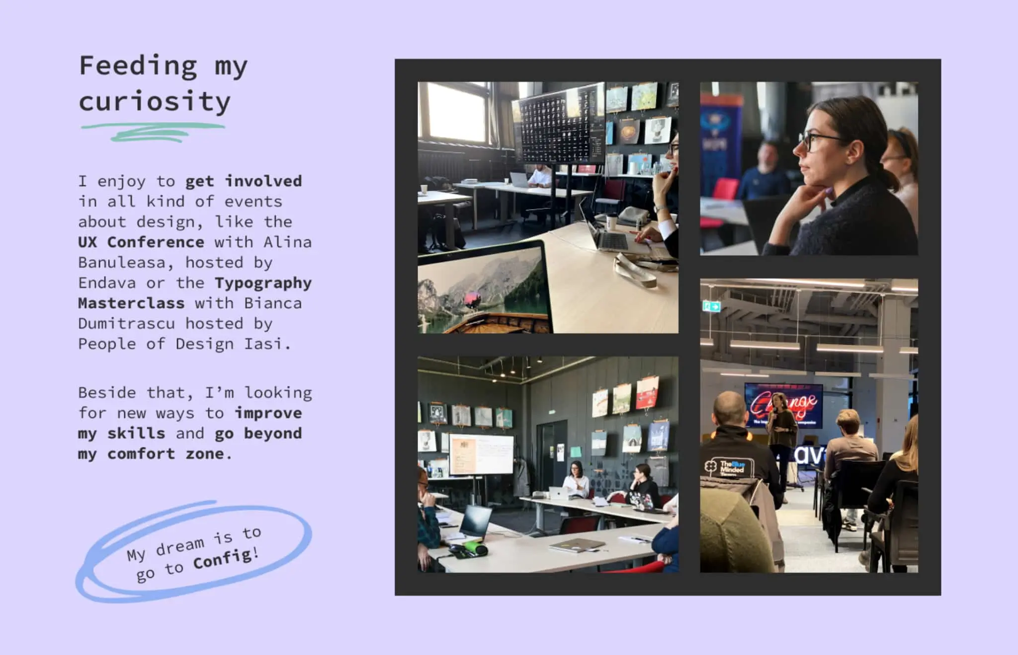
Through a post-it note, almost diaristic approach, the reader really gets a feel for what kind of person Cristina is, her education and experience, and what attracted her to UX in the first place.
That’s not to say this portfolio is totally informal. Cristina also does a great job of showing her processes, identifying problems (with a focus on UX research), solutions, and testing.
Key takeaway
When the temptation may be to opt for oblique, abstract graphics that display your design chops in the coolest terms, save a thought for a more intimate approach.
Cristina’s portfolio is emotionally honest, charming, and informative. The effect on recruiters—especially those suffering from portfolio fatigue—is likely persuasive.
View Cristina Gafitescu’s full UX portfolio
13. The spatial awareness of Rucha Moghe
Who is Rucha Moghe?
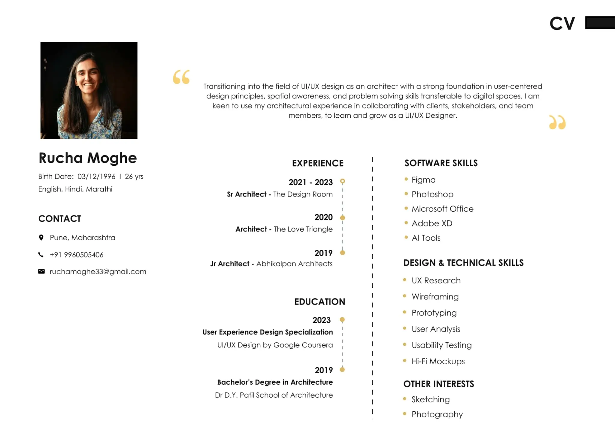
Rucha Moghe is a UX designer with a background in architecture based in India.
What makes Rucha Moghe’s UX design portfolio so great?
From start to finish, Rucha’s UX portfolio ticks all the right boxes. It’s visually strong and easy to digest. Her user journey map is smart and in context, and the user flows, wireframes, and usability study are all useful.
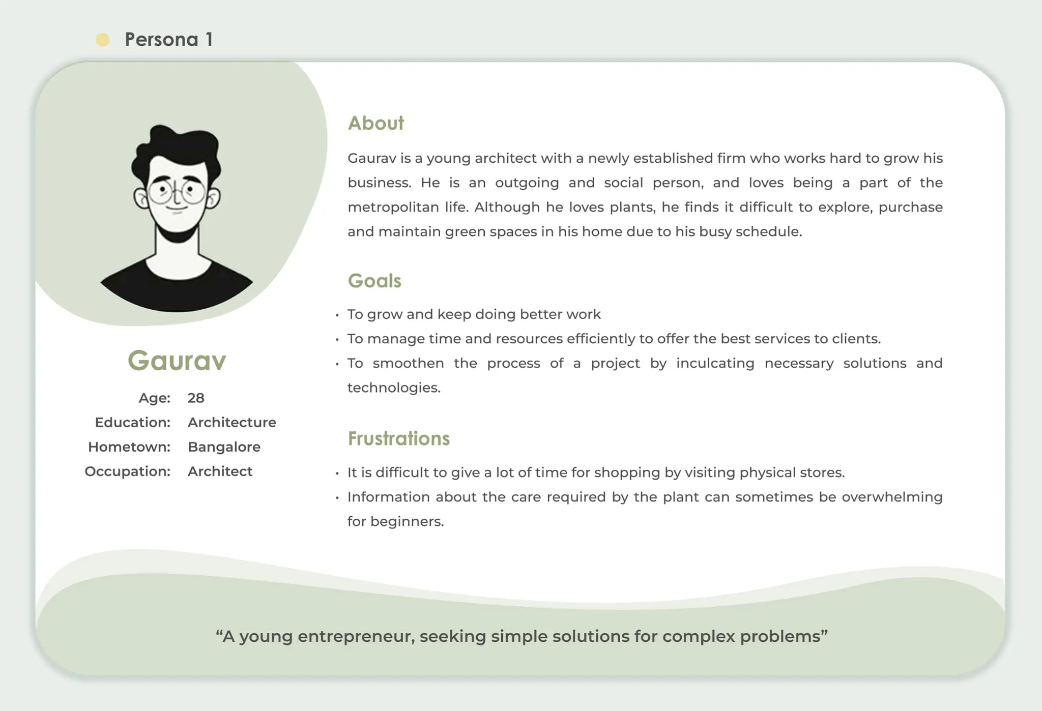
Tehni: A Plant App is an especially great case study and easy to follow. On the whole, Rucha’s portfolio is incredibly strong on user personas.
As Rucha suggests, her background as an architect provides her portfolio with a great sense of user-centered design principles, spatial awareness, and problem-solving skills transferable to digital spaces.
No space feels wasted, nothing is jumbled, and the reader never feels lost or confused. This is architectural elegance in portfolio form.
Key takeaway
Reinventing the wheel in your portfolio isn’t necessarily a good idea. Rucha’s portfolio nails the basics: it’s logical with an easy-to-follow narrative that shows how user problems were solved. It’s bold and eye-catching and features great user personas.
View Rucha Moghe’s full UX portfolio
14. Nguyen Duc Thang’s deep case studies
Who is Nguyen Duc Thang?
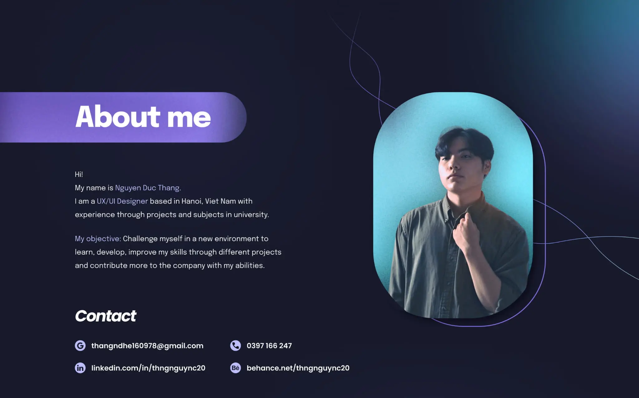
Nguyen Duc Thang is a UX designer based in Hanoi, Vietnam. Although just starting in his career, Nguyen Duc Thang knows how to put together a really strong portfolio.
What makes Nguyen Duc Thang’s UX design portfolio so great?
Much like Rucha Moghe, Nguyen Duc Thang’s UX portfolio gets the basics right despite the difference in experience.
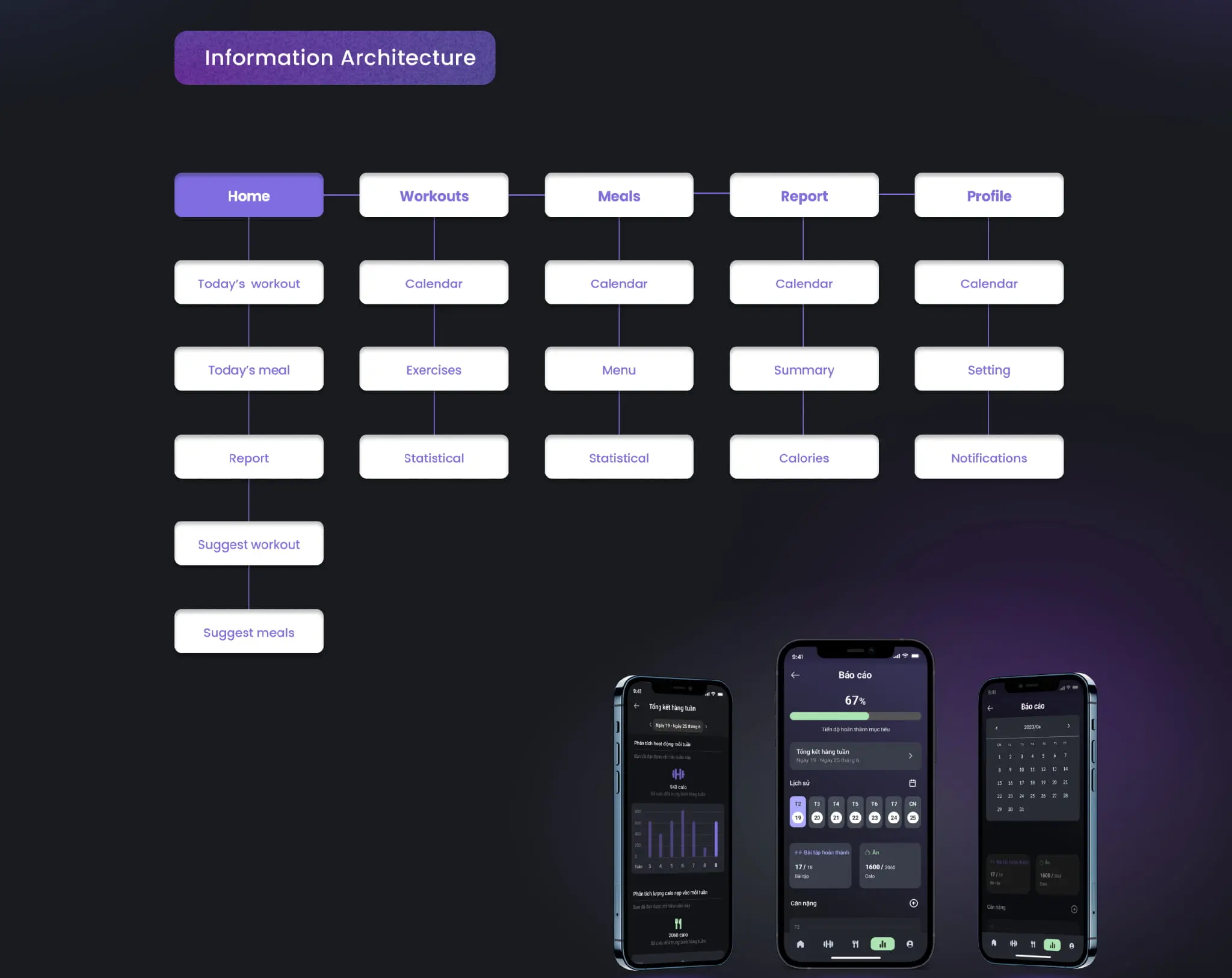
Nguyen Duc Thang’s branding is particularly strong, with eye-catching graphics consistently holding the content together throughout the document.
After introducing himself, Nguyen Duc Thang covers his skills and qualifications before launching into extensive case studies. No stone is left unturned in these exhaustive examples, which detail wireframing, prototyping, testing, user personas, visual design, and information architecture. Bravo!
Key takeaway
Don’t scrimp on your case studies. Tell the world how you nailed that project, from top to tail.
View Nguyen Duc Thang’s full UX portfolio
15. Precocious design from Gilbert Christian
Who is Gilbert Christian?
Gilbert Christian is an Indonesian UX design student in the early stages of his career. As Gilbert mentions in his portfolio, he’s open to all manner of part-time, voluntary work, or UX internship programs.
What makes Gilbert Christian’s UX design portfolio so great?
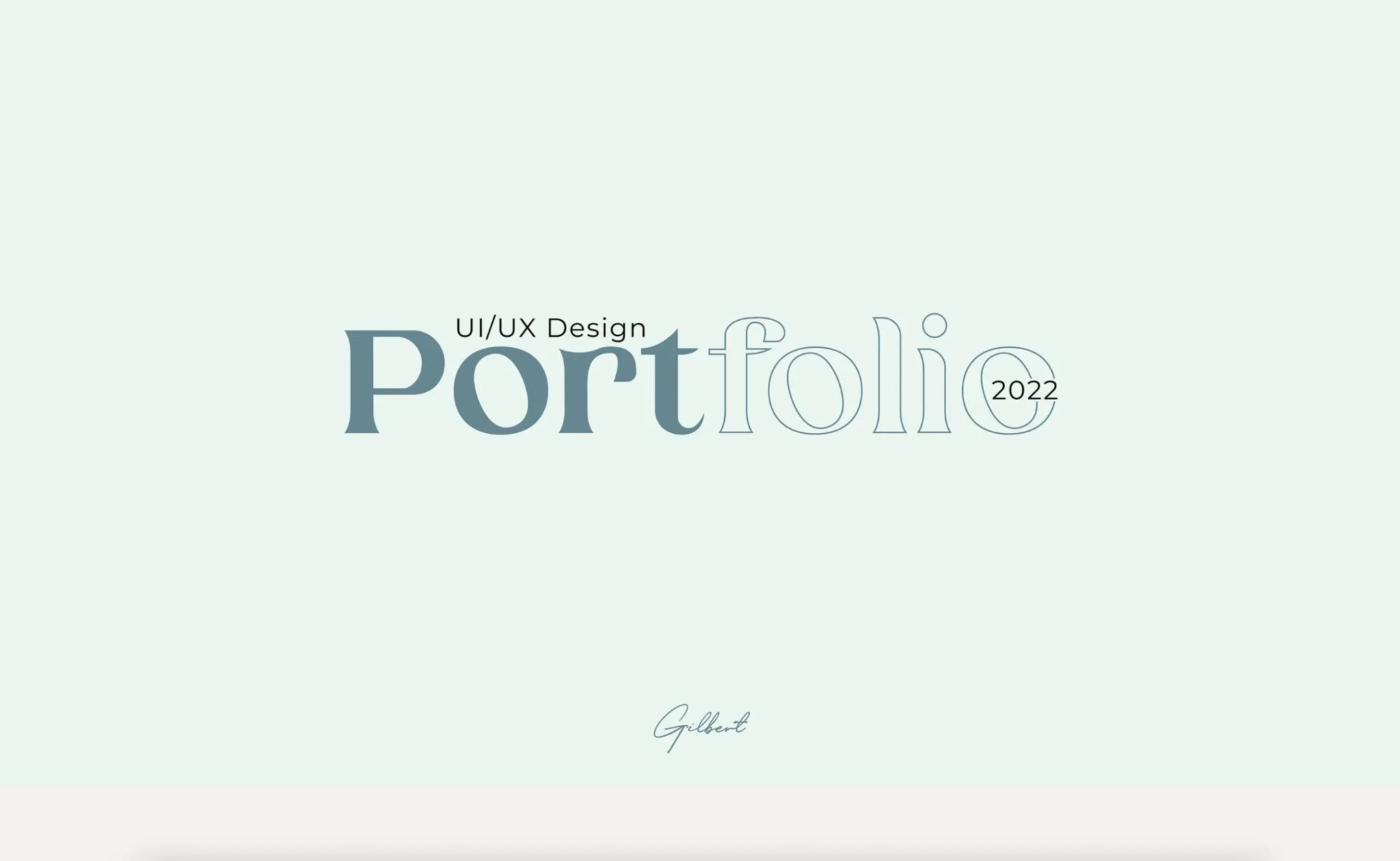
Despite his relative inexperience, Gilbert’s UX portfolio is extremely easy on the eye, with strong data visualization and imagery leading you from one page to the next.
Gilbert’s case studies show a maturity beyond his experience, with thorough documentation giving us insight into his work processes.
Gilbert’s portfolio is stunning and applies the same key UX design principles present in his work.
Key takeaway
If in doubt, build a logical narrative showing how a problem was understood, defined, and solved.
View Gilbert Christian’s full UX portfolio
16. Valentina Gigli’s bold branding
Who is Valentina Gigli?
Valentina Gigli is a junior UX designer based in Argentina.
What makes Valentina Gigli’s UX design portfolio so great?
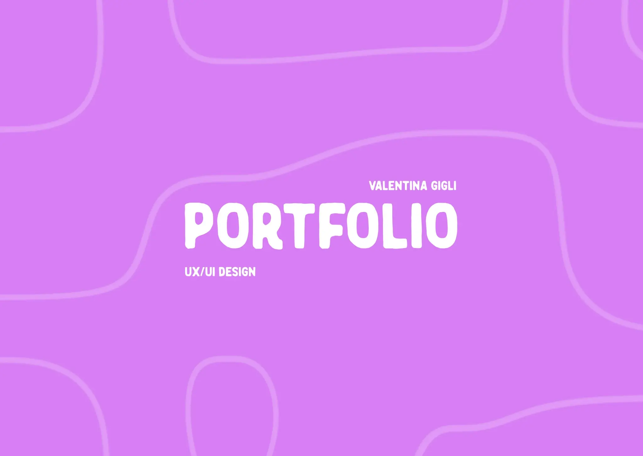
Aside from the bold color scheme and font choice, Valentina keeps things simple with her portfolio.
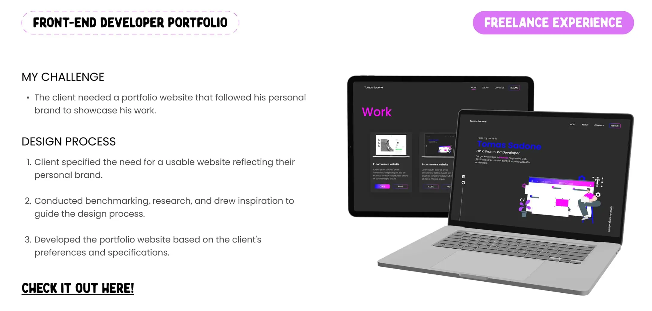
After introducing herself, Valentina discusses her “aptitude palette”, before moving on to her design examples.
Whether you’re a fan of purplish magenta or not, the bold titles and lurid colors certainly make for clear signposting and remain in the mind’s eye for some time after looking away, a key sign of successful branding.
Key takeaway
When it comes to color schemes and fonts, it’s tempting to play it safe. Taking some risks may mean your portfolio pops out from the crowd.
View Valentina Gigli’s full UX portfolio
17. Aleyna Aykanat raises a smile
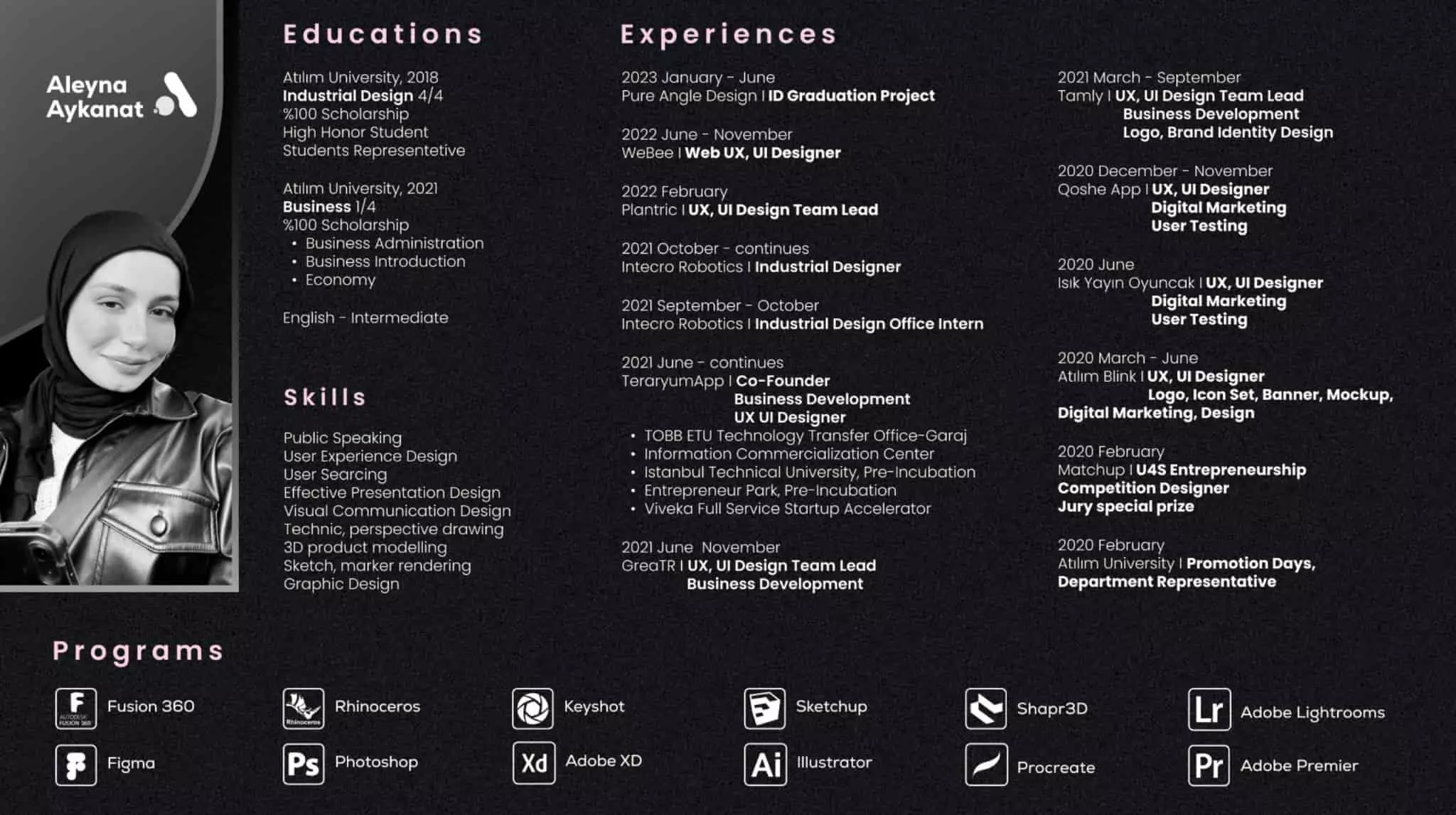
Who is Aleyna Aykanat?
Akeyna Aykanat is a Turkish UX designer with skills in public speaking, 3D product modeling, and graphic design.
What makes Aleyna Aykanat’s UX design portfolio so great?
Aleyna’s work is in monochrome black and white, with grainy charcoal textures offering depth to each slide.
The result feels mature and assured—and Aleyna has the content to match it, too.
After what feels like a serious offering, Aleyna offers something of a UX visual joke at the end of her portfolio, including a fake loading page, before bidding us farewell.
Overall, it leaves one with the impression of Aleyna as a fun-loving lateral thinker—just the kind of person we’d like on our team.
Key takeaway
Many UX design portfolios are made using guidelines shared amongst tens of thousands of junior designers at bootcamps and other learning establishments.
These cookie-cutter portfolios can feel a little soulless and may result in recruiters developing a kind of portfolio fatigue.
As Aleyna shows so elegantly, including a curveball element—in this case, the joke towards the end of her portfolio—shows the portfolio has been assembled with care and craft, not painted by numbers.
View Aleyna Aykanat’s full UX portfolio
18. Sharon Kravanja’s scrapbook stylings
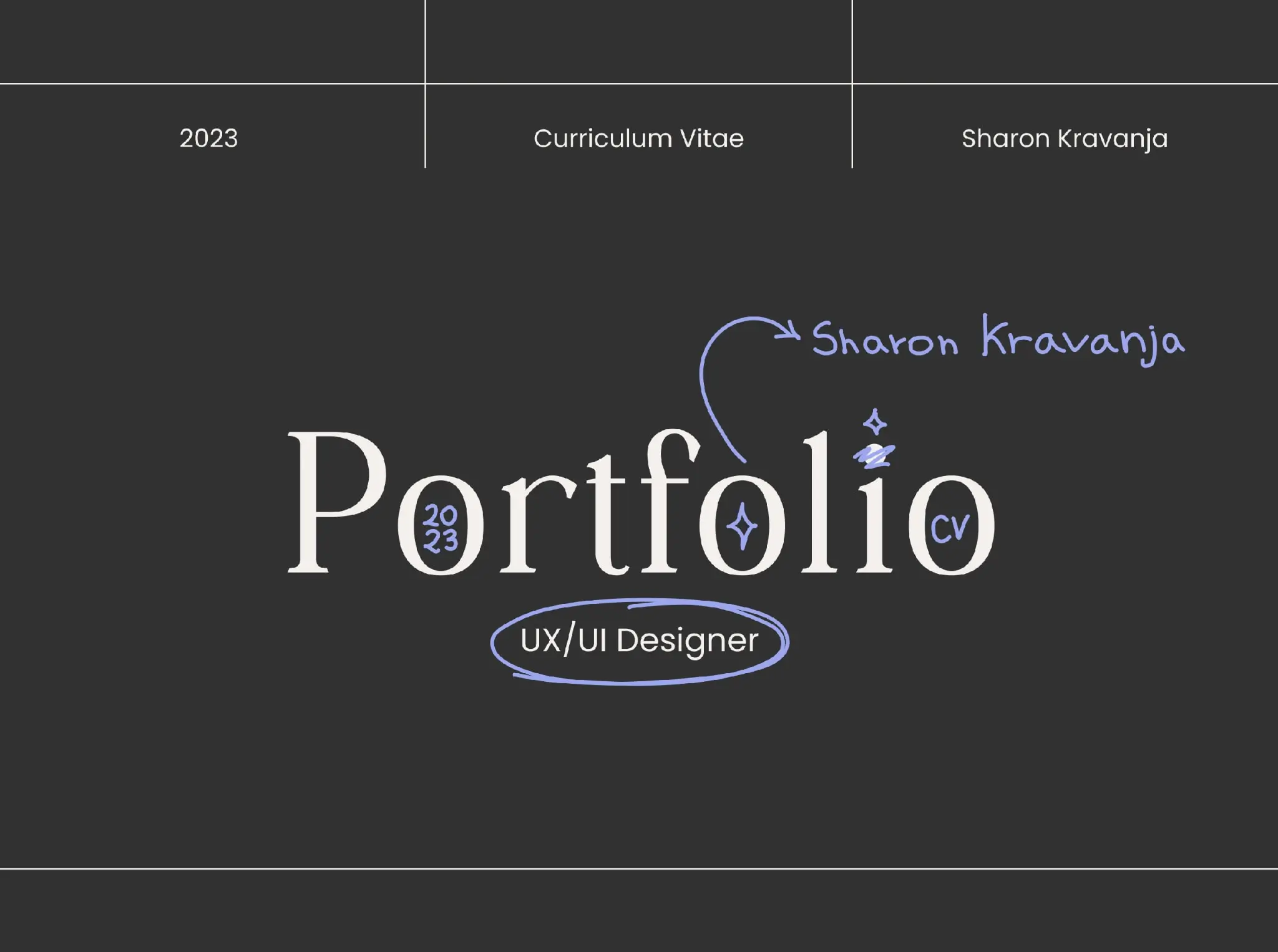
Who is Sharon Kravanja?
Sharon Kravanja is a Parisian UX designer at the beginning of her career.
What makes Sharon Kravanja’s UX design portfolio so great?
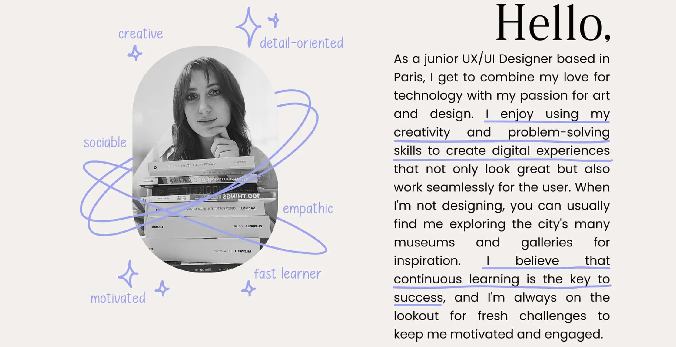
From the outset, Sharon makes no bones about her very junior status as a UX designer. This is reflected in her opening statement and the primitive doodles that annotate and decorate each portfolio page.
Despite this seemingly youthful approach, Sharon’s visual scrapbook style demonstrates impressive self-branding. Scribbles and sweeps bring cohesion to all the moving parts of the portfolio while playfully communicating Sharon’s self-awareness as an inexperienced but sincere and brave designer.
Key takeaway
Be yourself. A recruiter will sooner remember Sharon’s somewhat youthfully exuberant portfolio over safer designs.
View Sharon Kravanja’s full UX portfolio
19. Sophisticated graphics from Anna Hlushko
Who is Anna Hlushko?
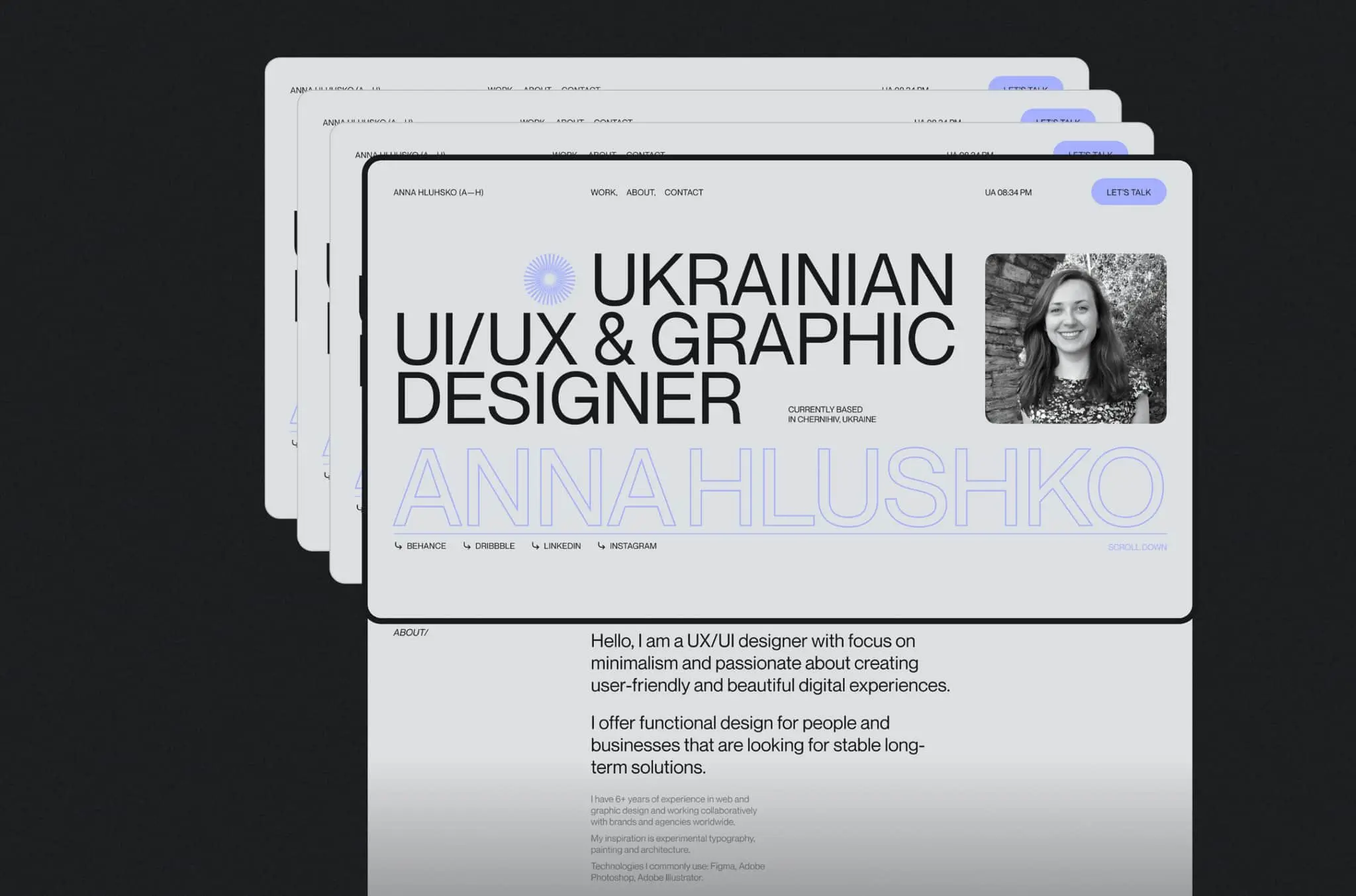
Anna Hlushko is a Ukrainian UX designer with a self-professed focus on minimalism.
What makes Anna Hlushko’s UX design portfolio so great?
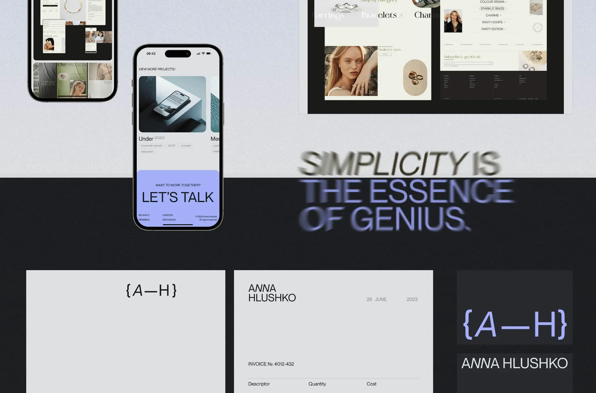
Anna Hlushko’s portfolio speaks of a detail-oriented UX designer with serious design chops.
Modernist typography and dark, grainy hues glue the elements of this portfolio in place. Anna’s graphic design skills are at the higher end of the spectrum, and these pages wouldn’t look out of place in a MoMA brochure.
Beyond the slick exterior, Anna also touches on her approach to tackling stages of work, including research, and details some case studies.
Key takeaway
Play to your strengths. If visual design is your thing, make sure your portfolio pops. This may be the one chance you have to show off your chops.
View Anna Hlushko’s full UX portfolio
20. Thorough research by Hoàng Kỳ Phong
Who is Hoàng Kỳ Phong?
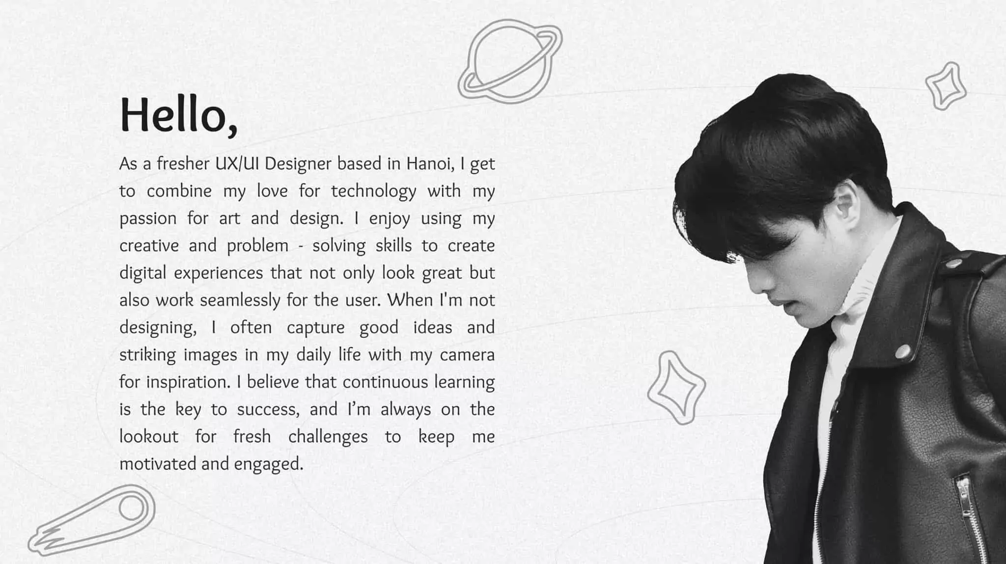
Hoàng Kỳ Phong is a Hanoi-based UX designer passionate about art and design.
What makes Hoàng Kỳ Phong’s UX design portfolio so great?
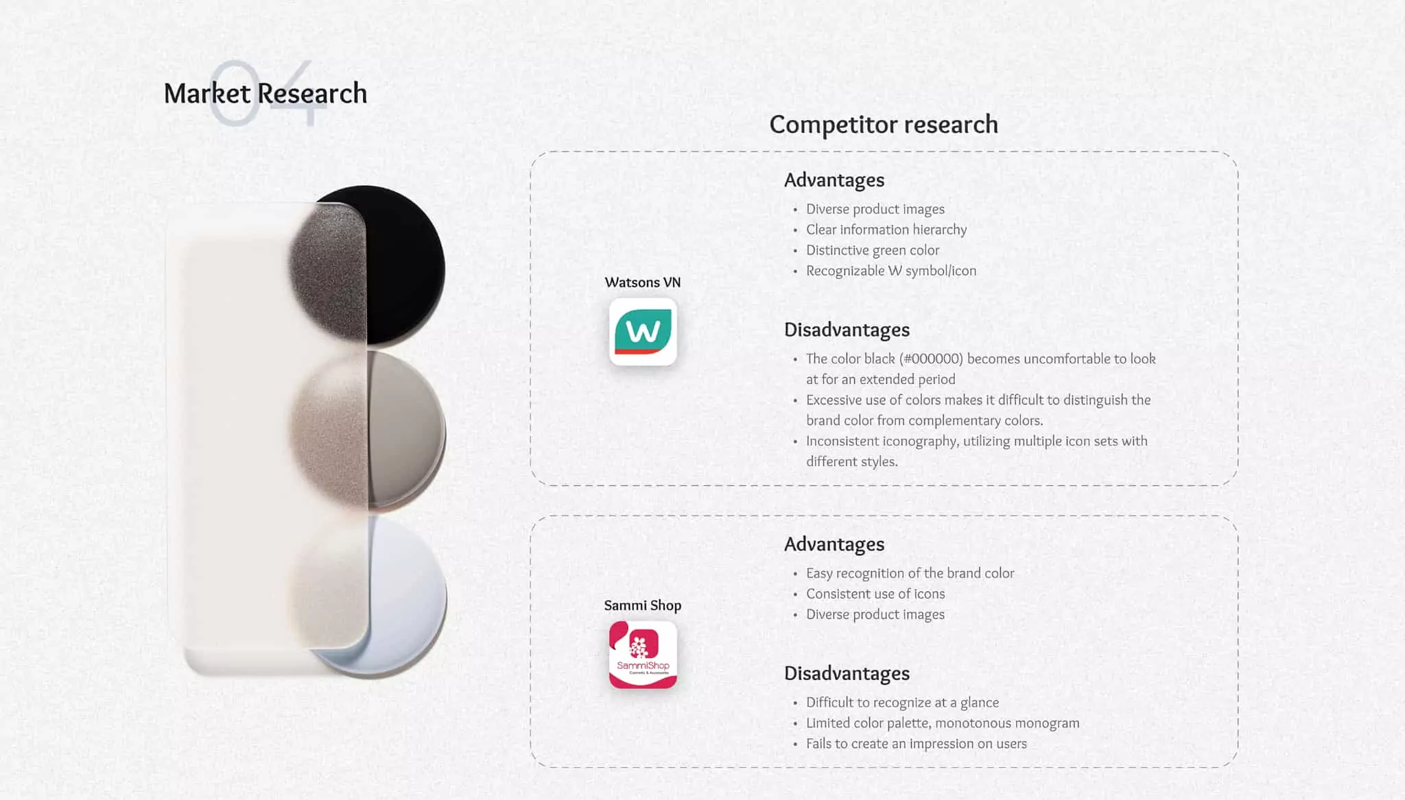
With black and white images projected onto a backdrop of cartridge paper, Hoàng Kỳ Phong’s portfolio has a classic feel.
Structurally, it is a masterclass in logical layout and digestible design. Extra marks are awarded for detailed market research and survey information.
Key takeaway
Consider the user at every step by demonstrating the process and results.
View Hoàng Kỳ Phong’s UX portfolio
Why do you need a UX design portfolio?
When creating an impressive UX portfolio, it’s important to understand exactly what your portfolio should achieve. What information should your portfolio present? What do you want people to learn about you and your work when they land on your portfolio?
Your UX design portfolio is not just a virtual gallery of all your most beautiful work. It’s a carefully crafted story that offers a behind-the-scenes look at your methods and processes.
How do you tackle different UX design challenges? What’s your approach to solving problems? Are you user-centric?
It should introduce you as a designer and give the viewer an understanding of your work. And, of course, all of these insights should come gift-wrapped in a visually engaging, user-friendly package.
How to build an amazing UX portfolio
Since a portfolio is all about showcasing your work as a designer, it’s obvious that you need to get some experience so that you have work to spotlight in the first place.
But what if you don’t have any industry experience (yet)? Not to worry.
It’s entirely possibly to build a strong portfolio, break into the industry, and succeed without previous UX design experience. One great place to start is by taking a free UX design short course to make sure you’re cut out for this area of the design field.
Next, you can then to enroll in a UX design certification program—preferably one that provides personalized UX mentorship and portfolio reviews.
To see a live portfolio review with a seasoned UX designer, check out this video:
Beyond this, you want to make sure that your portfolio meets these criteria:
- Includes a memorable introduction
- Consists of just the right number of high-quality UX case studies
- Demonstrates reflexivity—shows your ability to reflect and learn
- User-friendly format (practice what you preach)
- Excellent UI design—shows you know what a good, polished final product looks like
To learn more about these five criteria (and how to meet them), read more in this guide: Five Golden Rules to Build a Job-Winning UX Design Portfolio.
Where else can you look for UX design portfolio inspiration?
That just about concludes our selection of awesome UX design portfolios from around the web. We hope this list has given you a feel for some of the most important UX design portfolio best practices and left you feeling suitably inspired.
For more portfolio inspiration, check out websites like Bestfolios, Behance, and Dribbble. For further tips and advice on building your own UX design portfolio, check out these articles:
And finally, if you’re a UX designer looking to specialize, we’ve also written guides to build portfolios for UX writing and UX research. If you spot any further examples of great portfolios while navigating the web, do let us know so we can add them to the list.
Want to keep exploring UX design? Here are a few other articles you might like:
And if you’re on the hunt for even more UX design inspiration, here are 15 quotes from design masters.
Frequently asked portfolio (FAQ) about UX portfolios
What should be in a UX portfolio?
A UX portfolio should showcase your expertise, understanding, and passion for UX. A portfolio can include elements like case studies, design, personal projects, examples of your process, and should be presented in a visually pleasing way.
How do I start a UX portfolio for beginners?
A beginner’s UX portfolio is a vital tool for entering the industry. Highlight your passion and motivation for the UX design, include your personal approaches, and if you have minimal case studies to present, include personal projects.
How do I build my UX portfolio?
With the amount of free templates available online, building your UX portfolio has never been easier. However, it’s important to not limit yourself to a standardized approach and showcase your own unique talent.
First and foremost, choose your projects and case studies carefully. Then present them in a logical narrative that tells a story about your design process. In your descriptions, highlight your motivations and thought processes.
Across your portfolio, focus on showcasing your design skills and problem-solving abilities, and keep your portfolio up-to-date with your latest work. Be sure to customize your portfolio for the audience.

